AI Prompts for Instagram Carousel Covers: 15 Templates That Increase Saves
Written by
Jay Kim

15 copy-paste AI prompts for Instagram carousel covers that increase saves. Covers business, wellness, finance, design, tech, fitness, personal brand, and more.
Saves are the most undervalued metric in Instagram content strategy, and carousel covers are the most underdesigned element in most creators' posts. Every time someone saves a carousel, Instagram's algorithm treats it as the highest-value engagement signal available, stronger than a like, stronger than a comment, and stronger than a share. Saves tell the algorithm that the content is genuinely useful to the point where the viewer wants to come back to it later, and the algorithm rewards that signal with meaningfully extended reach.
The problem is that most carousel covers look like afterthoughts. A creator writes excellent educational content across ten slides, then drops a generic image on the first slide and types the title over it. That cover communicates nothing about the quality of what is inside. The visual design of the first slide is the primary factor a viewer uses to decide whether to swipe and whether to save, and most carousel covers are losing saves before anyone reads the first word of the actual content.
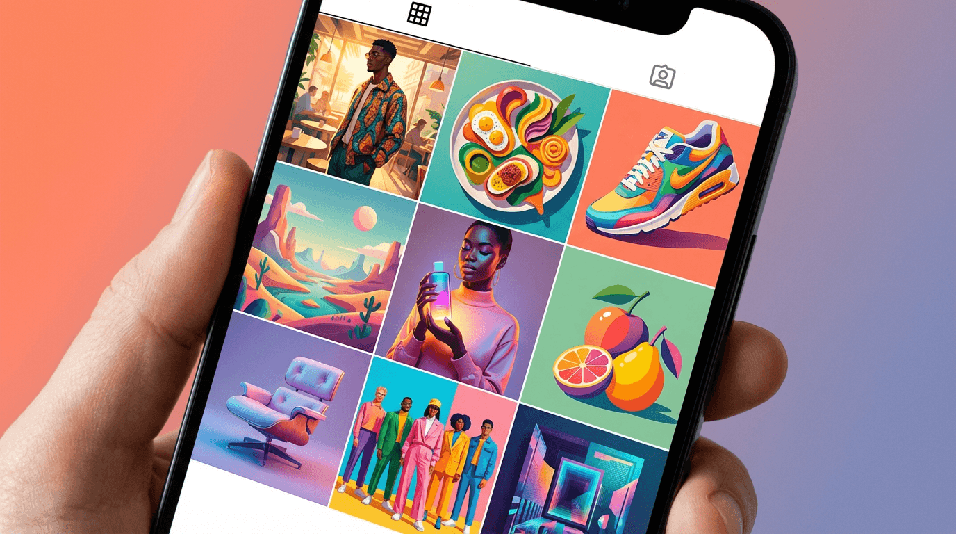
This post gives you 15 ready-to-use AI prompt templates for Instagram carousel cover backgrounds across the most important content niches, from business education and marketing strategy to wellness, personal finance, creative design, technology, fitness, and personal brand. Every prompt generates a visual background optimized for text overlay, designed to communicate content quality and value at a glance, and built to signal the kind of educational or lifestyle content that Instagram users consistently save for future reference. You can generate all of them in the AI image generator on Miraflow AI without any setup.

Why Saves Matter More Than Any Other Carousel Metric
Understanding the specific mechanics behind Instagram's save behavior changes how you think about carousel cover design entirely.
When someone saves a carousel post, they are making a future-value judgment: this content is useful enough that I will want to reference it again later. That judgment happens before they finish reading the slides, and for educational and tips content, it often happens entirely based on the first slide. The visual quality and content promise of the cover determines whether the viewer expects the rest of the carousel to be worth saving before they have read it.
This creates a specific design requirement for carousel covers that is completely different from regular Instagram posts. A regular post needs to stop the scroll and generate a reaction in the present moment. A carousel cover needs to do that, and additionally needs to communicate a specific future value: this is the kind of content that belongs in your saved folder. The visual design of the cover needs to signal reference-worthy, organized, high-quality educational content before a word is read.
Instagram's algorithm weights saves so heavily because they are the clearest signal of genuine utility. A like is a passive reaction. A comment requires effort but does not indicate future use. A save indicates that the viewer found the content useful enough to invest the organizational effort of storing it for later access. The algorithm interprets this as content worth pushing to more people because it predicts that other viewers will find it equally useful.
According to research on Instagram content performance, carousel posts consistently generate the highest save rates of any content format on the platform, particularly educational carousels covering professional development, marketing, finance, wellness, and how-to content. The cover design is the first and most important factor determining whether that save happens.
What High-Saving Carousel Covers Communicate Visually
Before getting into the prompts, it helps to understand what specific visual signals trigger saving behavior on Instagram, because these signals should be built deliberately into every carousel cover background you generate.
Perceived content density. Carousel covers that visually suggest organized, multi-part information, through clean layouts, structured background geometries, or visual cues that imply a system or framework, communicate that there is more valuable content inside than a single slide can hold. This creates the expectation of depth that motivates both the swipe and the save.
Creator investment signal. A carousel cover that looks professionally designed communicates that the creator takes their content seriously. This is a proxy signal for content quality: if the creator invested effort in the visual design, the viewer assumes they invested similar effort in the actual information. The reverse is equally true: a visually careless cover signals careless content.
Aesthetic category recognition. Every content niche on Instagram has developed a visual vocabulary that its community associates with high-quality content. Business and marketing educators use bold, structured, clean aesthetics. Wellness creators use botanical, soft, natural aesthetics. Design creators use graphic, geometric, typography-forward aesthetics. Building the correct aesthetic vocabulary for your niche into your carousel cover signals that you belong to the high-quality tier of that niche's content ecosystem.
Clear text zone. The most immediately practical quality of a high-saving carousel cover is that it has an obvious, clean area where the carousel title sits legibly. A background that fights with the text overlay, whether through busy patterns, inconsistent tones, or insufficient contrast, reduces readability and undermines the entire communication purpose of the cover.
Mobile-first composition. Instagram is consumed primarily on mobile devices, and carousel covers display at approximately 375 to 390 pixels wide in most mobile feed contexts. The visual composition needs to communicate clearly at this small size, which means bold visual hierarchy, high contrast, and compositional simplicity rather than detailed imagery.
Understanding the Carousel Cover Format Requirements
Instagram carousel posts can be published in either square 1:1 format or portrait 4:5 format, and the choice of format has implications for cover design.
Portrait 4:5 format fills more vertical screen space in the feed, which increases the probability of scroll stopping and is generally recommended for carousel content where the goal is maximum visibility. The 4:5 format gives slightly more vertical space to work with in the cover composition, which makes it easier to create distinct zones for the visual background element and the text overlay area.
Square 1:1 format is more flexible for repurposing the same content across different platforms and works better when the carousel will also be shared as individual slides. Most educational content creators default to 1:1 for its cross-platform versatility.
For the prompts in this list, all generated backgrounds are designed to work in both formats. Adding "4:5 portrait format composition optimized for mobile Instagram display" or "1:1 square format composition" to any prompt adjusts the aspect ratio of the generated output.
The recommended generation resolution for Instagram carousel covers is 1080x1080 for square format or 1080x1350 for portrait format, as these match Instagram's display specifications exactly and ensure the image appears sharp rather than upscaled on retina mobile displays.
How to Use These Prompts
Every prompt in this post generates a background image designed to support text overlay. The prompts specify a visual subject, a lighting treatment, a color palette, a compositional approach, and a text zone placement. Together these elements produce backgrounds with the professional visual quality that signals high-value carousel content.
To customize any prompt for your specific niche or brand, adjust the color palette to match your brand identity, modify the specific visual elements to align with your content theme for that post, and specify whether you need a particularly clean upper or lower zone for title text placement.
The AI image generator on Miraflow AI supports text-to-image generation for building backgrounds from scratch and image-to-image generation for applying a consistent visual treatment to your own reference images or existing brand assets. Generate five to eight variations per prompt before selecting the one with the best compositional balance for your text placement needs.
15 AI Prompt Templates for Instagram Carousel Covers
1. Premium Dark Educational Background
Dark backgrounds on carousel covers communicate authority, depth, and the premium positioning of the content. This treatment is particularly effective for business, marketing, and professional development educators who want their content to feel like a premium paid resource rather than free social media content.

Prompt
Clean premium editorial background for an Instagram carousel cover, deep charcoal grey or near-black matte background with a subtle abstract geometric texture of thin faint lines forming a barely visible grid or architectural pattern, single very faint warm amber or electric blue accent gradient bleeding in from the lower left corner adding tonal depth without competing with text overlay, the texture is present only as subtle visual richness rather than a distracting pattern, a large central empty zone occupying approximately sixty percent of the frame provides a clean area for carousel title text, the overall impression is premium, minimal, and authoritative without any specific subject matter, deep near-black background with one faint accent tone, editorial educational content aesthetic, the background communicates high-value professional content, no text no logos, mobile-first carousel cover quality
2. Soft Pastel Gradient Abstract Background
Gradient backgrounds signal that a creator has moved beyond generic solid-color carousel designs without being visually overwhelming. Soft, precisely chosen gradients work across most niche audiences and communicate modern visual intelligence.
Prompt
Smooth soft gradient background for an Instagram carousel cover, a seamless gradient flowing diagonally from warm dusty rose or blush pink in the lower left to soft cream or warm white in the upper right, the gradient transition is extremely smooth with no visible banding or color breaks, one very small abstract organic shape or soft geometric element in the lower right corner adds visual interest without becoming a focal point, the majority of the frame is the clean gradient providing an ideal background for text overlay, no harsh lines no textures only the clean smooth gradient quality, warm pastel blush and cream tones, modern personal brand carousel aesthetic, the background communicates a thoughtful, visually considerate creator identity, no text no logos, mobile-first carousel cover quality
3. Business and Leadership Strategy Cover
Business strategy and leadership content carousels need backgrounds that communicate authority and intellectual scale. Abstract architectural or geometric imagery achieves this without using literal business imagery that reads as generic stock photo.

Prompt
Authoritative editorial background for a business and leadership Instagram carousel cover, top-down aerial view of a precisely ruled architectural grid pattern such as a formal plaza, corporate campus pathway system, or geometric tiled floor seen from directly above, the overhead perspective creates a strong abstract graphic quality with clean geometric lines, the image is desaturated to a deep navy and cool grey tone palette, a central empty area or one clean quadrant of the geometric pattern provides space for text overlay, deep navy blue and architectural grey tones, editorial business strategy content aesthetic, the image communicates systems-level thinking and strategic authority through the overhead geometric perspective, ultra-realistic aerial architectural rendering, no text no logos, mobile-first carousel cover composition
4. Marketing and Growth Educator Cover
Marketing and growth content carousels are one of the highest-saving content categories on Instagram because they provide actionable information that professionals want to reference repeatedly. The background needs to communicate forward momentum and strategic intelligence.
Prompt
Sharp editorial background for a marketing and growth Instagram carousel cover, abstract visualization of multiple thin ascending lines or a single bold upward diagonal beam of light cutting across a dark background from the lower left to the upper right, the lines or beam suggest growth momentum and directional progress without using any literal chart or graph imagery, a few scattered small geometric dot or particle elements create depth without becoming a pattern, the lower portion of the frame is darker providing a clean text zone, the upper area catches more of the light beam creating visual hierarchy, deep dark background with one warm gold or electric blue ascending light element, editorial marketing and strategy content aesthetic, the image communicates strategic growth intelligence and forward momentum, no text no logos, mobile-first carousel cover quality
5. Wellness and Mental Health Cover
Wellness content carousels covering stress, mindfulness, mental health, and self-care generate some of the highest save rates on Instagram because viewers want to reference the practices and frameworks when they need them. The background needs to communicate calm, natural authority, and a science-meets-nature credibility.

Prompt
Soft editorial background for a wellness and mental health Instagram carousel cover, extreme close-up macro overhead view of a single large smooth green leaf with visible detailed vein structure, the leaf fills the frame with soft natural morning light illuminating the texture from slightly above, very soft focus at the leaf edges letting them dissolve into a clean light green and white background area, the upper third of the frame shows the lightest tones of the leaf and background providing a clean zone for white or dark text overlay, fresh botanical green tones softening to near white at the edges and upper area, editorial wellness and mindfulness content aesthetic, the image communicates natural calm and botanical expertise, ultra-realistic leaf texture and natural light rendering, no text no logos, mobile-first carousel cover composition
6. Personal Finance and Wealth Education Cover
Personal finance carousel covers need to communicate aspiration without appearing flashy, and trustworthiness without looking like a bank advertisement. Visual imagery that uses precision instruments or architectural perspective communicates financial intelligence more effectively than literal money imagery.
Prompt
Sophisticated editorial background for a personal finance Instagram carousel cover, close-up side perspective of a clean precise compass or architectural ruler on a dark warm leather or dark wood surface, single focused warm directional light from the upper right creating warm specular highlights on the precision instrument hardware, the surrounding surface is slightly out of focus emphasizing the central precision element, the upper portion of the frame shows clean dark surface area suitable for white text overlay, the lower frame shows the warm leather or wood texture in soft focus, deep warm dark tones with warm gold brass accent highlights, editorial personal finance and wealth education content aesthetic, the image communicates financial precision and guided expertise, ultra-realistic brass and leather texture rendering, no text no logos, mobile-first carousel cover quality
7. Creative and Design Professional Cover
Design educators and creative directors need carousel covers that demonstrate their visual skills before anyone reads the content. A cover that is itself a well-designed object communicates design expertise more effectively than any text claim.

Prompt
Graphic editorial background for a creative and design Instagram carousel cover, bold precisely constructed geometric abstract composition using a restrained palette of deep navy, warm terracotta, and clean cream white, large overlapping geometric forms including a circle, rectangle, and diagonal line element arranged with deliberate asymmetric tension using evident grid logic, the shapes are flat with clean hard edges and no gradients or textures, generous white or cream space in the upper portion of the frame provides a clean text zone, the geometric elements concentrate in the lower two thirds of the frame, the overall composition demonstrates Bauhaus-influenced design literacy through its own structure, deep navy and warm terracotta on clean cream, editorial design professional content aesthetic, the composition itself communicates design authority, no text no logos, mobile-first carousel cover quality
8. Technology and AI Education Cover
Technology and AI content is one of the fastest-growing categories of high-saving educational carousels on Instagram. The visual aesthetic needs to communicate digital intelligence and the feeling of being ahead of what is happening in tech.
Prompt
Digital editorial background for a technology and AI Instagram carousel cover, abstract visualization of a luminous branching data tree or node network rendered in electric blue and soft teal against a deep near-black background, the network structure is dense at a center-lower focal point and branches upward and outward becoming more diffuse toward the upper frame edges, the upper portion of the frame shows the darkest background area where the network has diffused into single scattered glowing points, this dark upper area provides a clean zone for text overlay, deep near-black background with electric blue and teal node glow tones, editorial technology and AI education content aesthetic, the image communicates digital intelligence and technical authority, ultra-realistic luminous particle network rendering, no text no logos, mobile-first carousel cover composition
9. Fitness and Transformation Content Cover
Fitness and body transformation content carousels generate strong save rates because viewers want to return to workout protocols and transformation frameworks. The background needs to communicate physical energy, precision, and the specific confidence of someone who gets results.

Prompt
Bold editorial background for a fitness and body transformation Instagram carousel cover, dramatic close-up detail of geometric shadow lines from a fitness environment such as the precise shadow pattern cast by venetian blind light across a clean surface, or the graphic shadow pattern of a barbell or pull-up bar on a light concrete or gym floor surface, high contrast light and shadow creating a strong graphic quality, warm natural athletic light, deep shadow areas provide clean zones for light text overlay, strong contrast between the bright lit areas and the deep shadow bands, cool grey and bright white high contrast tones, editorial fitness and transformation content aesthetic, the image communicates physical precision and training authority through graphic shadow geometry, no text no logos, mobile-first carousel cover quality
The AI image generator on Miraflow AI supports image-to-image generation, which lets you start from an existing brand asset or reference image and apply the carousel cover treatment described in a prompt. This is useful when you want to maintain a consistent visual identity across a carousel series while varying the specific visual subject between posts.
10. Feminine Personal Brand Cover
Personal brand carousels from female educators and coaches in business, lifestyle, and professional development generate consistently strong save rates when the visual brand communicates both warmth and authority. The aesthetic needs to avoid both corporate coldness and generic lifestyle softness.
Prompt
Warm editorial background for a feminine personal brand Instagram carousel cover, soft intimate close-up view of a elegant flat lay on a warm cream or natural linen surface, a single stem of dried pampas grass or neutral dried botanical placed diagonally across the lower frame, a thin gold ring or small ceramic object positioned in the lower right, the upper two thirds of the frame show the clean warm linen or cream surface as a large uncluttered zone for carousel title text, soft natural window light from the left creating gentle texture across the linen surface, warm cream and oatmeal linen tones with a warm gold accent detail, editorial feminine personal brand content aesthetic, the image communicates warmth expertise and deliberate personal brand quality, ultra-realistic natural linen texture and warm light rendering, no text no logos, mobile-first carousel cover composition
11. Scandinavian Minimalist Clean Cover
Ultra-minimal carousel covers communicate confidence through restraint. A creator who uses extreme visual simplicity for their carousel covers is implicitly claiming that the content quality is sufficient without visual decoration, which is itself a strong authority signal.
Prompt
Ultra-minimal editorial background for an Instagram carousel cover, clean white or very soft warm white surface with a single precisely placed small element in the lower right quadrant, the element being either a perfect circle of shadow, a single dried seed pod or small stone, or a small geometric ceramic piece, the element occupies no more than ten percent of the total frame, the remaining ninety percent of the frame is clean empty surface with the barest suggestion of natural light directionality visible as an extremely faint tonal gradient across the white, the upper three quarters of the frame is completely uncluttered providing maximum text zone clarity, warm white and very faint natural shadow tones, editorial Scandinavian minimalist carousel aesthetic, the extreme restraint of the composition communicates confident authority through intentional emptiness, ultra-realistic natural surface and light rendering, no text no logos, mobile-first carousel cover quality
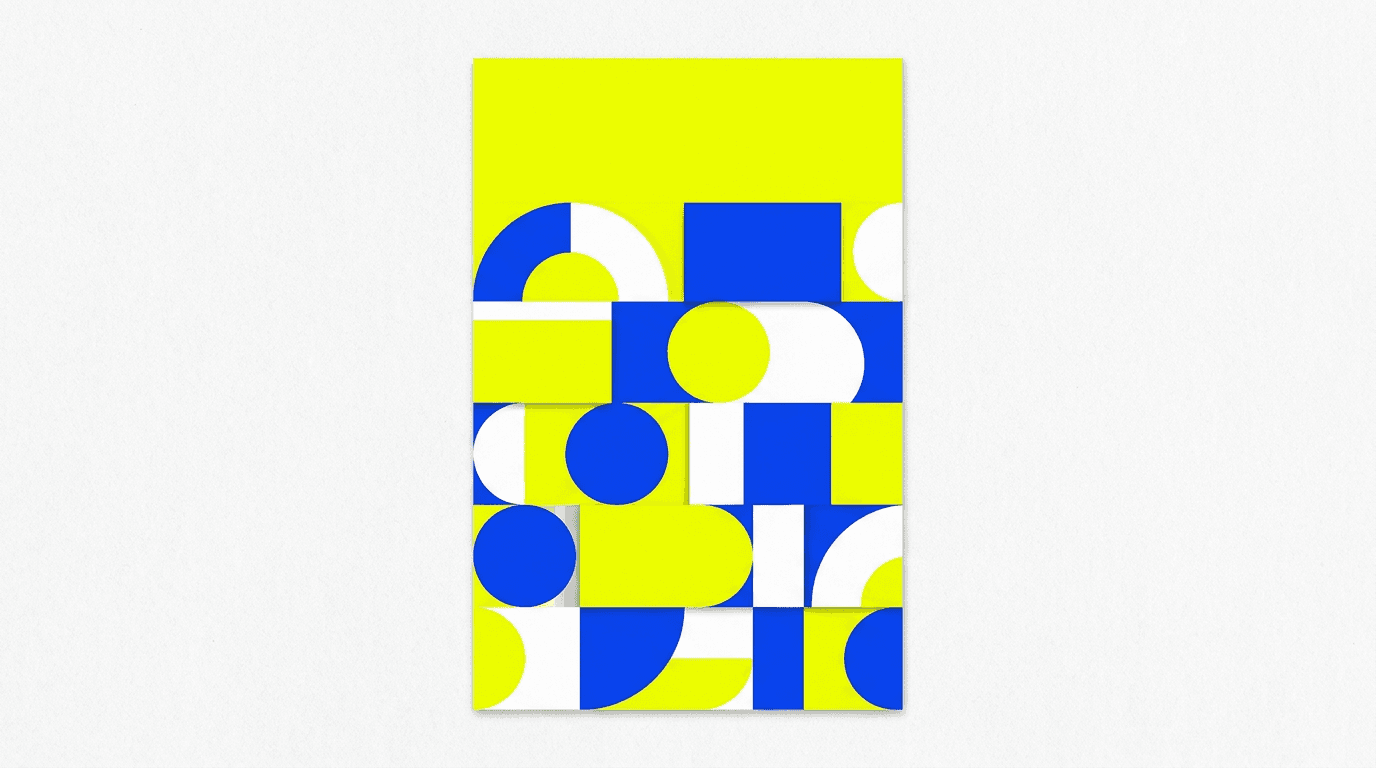
12. Bold Colorful High-Energy Cover
Bold, vibrant carousel covers perform particularly well for younger audiences and for content categories where energy and personality are central to the creator's brand. The visual dynamism needs to be bold enough to stop the scroll while maintaining a clear text zone.
Prompt
Bold vibrant editorial background for an Instagram carousel cover, abstract layered composition with confident flat-color overlapping shapes in electric yellow, vivid cobalt blue, and clean white, the shapes create a dynamic rhythmic pattern across the lower two thirds of the frame building from simple geometric elements, a clean band of one of the palette colors or white at the top of the frame provides a consistent text zone, the composition has high visual energy without becoming chaotic, the colors are fully saturated but the composition uses them with clear graphic logic rather than random placement, electric yellow and cobalt blue on white, editorial bold personal brand and education content aesthetic, the image communicates confidence and creative personality through bold graphic decision making, no text no logos, mobile-first carousel cover quality
13. Abstract Artistic Brand Identity Cover
For creators whose personal brand is built around creative sophistication, an abstract artistic background communicates a visual intelligence that generic carousel templates cannot match. This signals to like-minded creative audiences that the content is from someone who thinks in a genuinely original way.
Prompt
Artistic editorial background for an Instagram carousel cover, abstract organic textural composition created by soft overlapping ink or watercolor washes in a restrained two-tone palette of deep forest green and warm cream or dusty warm grey, the washes create organic natural edge patterns that have a handmade quality without looking rough or unfinished, the upper portion of the frame shows lighter, more diffuse wash tones providing a clean area for text placement, the lower portion has the deeper, richer wash tones creating visual weight at the base, the overall composition has the quality of a considered abstract painting rather than a background texture, deep forest green and warm cream tones, editorial artistic personal brand carousel aesthetic, the image communicates visual intelligence and creative depth through abstract materiality, no text no logos, mobile-first carousel cover quality
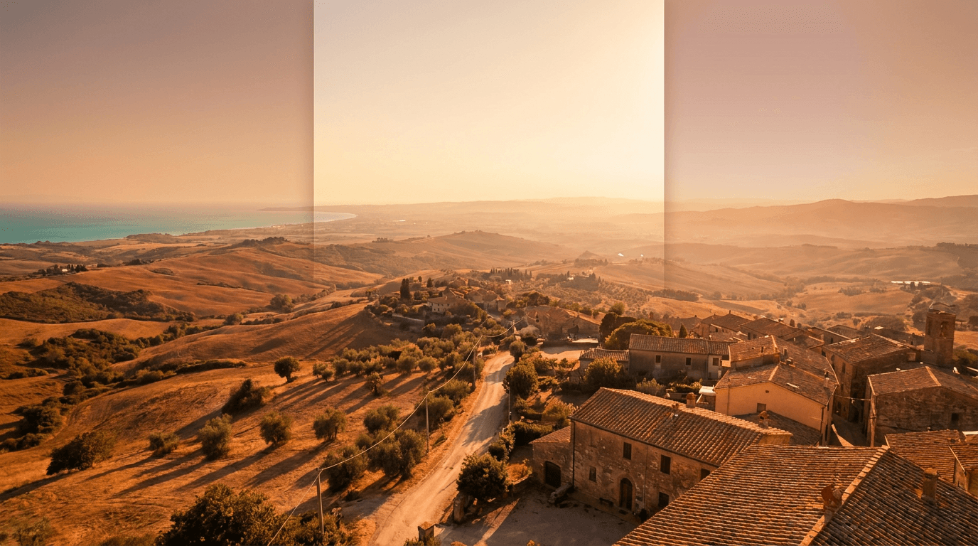
14. Travel and Lifestyle Discovery Cover
Travel and lifestyle carousels covering destination guides, cultural discoveries, and global perspective content generate strong save rates from audiences planning future travel or collecting aspirational destination references. The background needs to communicate the specific feeling of discovery and place without showing a specific identifiable location.
Prompt
Atmospheric editorial background for a travel and lifestyle Instagram carousel cover, warm golden hour aerial or elevated landscape view of a generic warm-toned terrain, such as terracotta rooftops receding to a distant horizon, a sandy coastal landscape with water meeting land, or a warm valley seen from elevation with atmospheric haze in the distance, the image has strong warm golden light from a low sun angle creating long soft shadows, the upper portion of the frame shows the lightest warm sky or horizon tones providing a text zone, the lower portion shows the richest warm landscape or architectural detail, warm terracotta and golden amber landscape tones, editorial travel and lifestyle discovery content aesthetic, the image communicates the feeling of arrival in a beautiful unknown place without showing a specific recognizable landmark, ultra-realistic warm atmospheric landscape rendering, no text no logos, mobile-first carousel cover composition
15. Universal Carousel Cover Background Template
This flexible foundation prompt works for any content niche, creator category, or post theme not specifically addressed by the fourteen prompts above. Replace the bracketed sections with your specific requirements.
Prompt
Editorial background for an Instagram carousel cover in the [describe your niche: business education, wellness, personal finance, creative design, technology, fitness, lifestyle, travel, food, or personal brand] content category, [describe the primary visual element: abstract geometric pattern, botanical close-up, architectural perspective, digital visualization, warm lifestyle surface, bold graphic composition, or atmospheric landscape], [describe the lighting: single warm directional studio light, soft diffused natural daylight, dramatic spotlight from one direction, or clean even neutral studio light], the color palette consists of [describe two or three specific tones: deep navy and warm gold, soft botanical green and clean white, deep charcoal and electric blue, warm blush and cream, or your specific brand colors], the upper [third or half] of the frame provides a clean tonal zone of [lighter or darker] tones suitable for [white or dark] carousel title text overlay, the lower frame holds the primary visual interest while keeping the composition balanced, editorial [your niche] content aesthetic, the background communicates [describe the quality signal: authority, warmth, creative intelligence, technical expertise, aspiration, or calm expertise], no text no logos, mobile-first Instagram carousel cover quality
How to Add Text to These Generated Backgrounds
Generating a strong visual background is the first half of creating a high-saving carousel cover. The second half is the text design, and the quality of the text overlay determines whether the cover actually communicates the content promise that triggers a save.
Write a Specific, Outcome-Focused Title
The carousel title on your cover should communicate a specific outcome or piece of knowledge the viewer will gain by swiping through the slides. The most save-triggering carousel cover titles follow a specific pattern: they name a number, identify a subject, and promise a transformation. Examples include "7 habits that doubled my productivity," "How I paid off debt on an average salary," or "The photography rule nobody teaches you." This structure communicates density of useful information and a specific before-and-after value that motivates both swipes and saves.
Vague or clever titles that require the viewer to have already read the carousel to understand the value proposition consistently perform worse than direct, specific value-communication titles. The cover should tell the viewer exactly what they will get before they decide whether to swipe.
Use High-Contrast Typography Against the Background
Text legibility is the non-negotiable requirement for carousel cover text design. The most common failure is a creator choosing a text color that looks fine on their design screen but becomes unreadable in the compressed, variable-brightness environment of mobile feeds. White text on a dark background or near-black text on a light background are the two most reliable combinations. If your brand color is mid-toned, adding a semi-transparent text background box or a text shadow effect preserves brand identity while ensuring legibility.
Keep the cover title to a maximum of eight to ten words. Longer titles compress to illegibility at mobile feed sizes and lose the impact of their first three to four words, which is all most viewers will consciously register before deciding to swipe.
Establish Visual Hierarchy Through Font Weight
Most high-performing educational carousel covers use a single bold large font for the main title and a significantly smaller secondary font for any subtitle or byline text. The contrast between the large bold title and the small secondary text creates visual hierarchy that guides the reader's eye through the information in the right order: main value proposition first, context second.
Avoid using more than two font styles on a single carousel cover. More than two styles creates visual fragmentation that reduces the overall professional quality signal that motivates saves.
Building a Consistent Carousel Brand Identity System
The greatest authority-building benefit of consistent carousel cover imagery comes from the cumulative effect of visual recognition. When followers see your carousel appear in their feed and immediately recognize it as yours before they read the title, you have built a visual brand identity that communicates trust and familiarity before the content has even been engaged with.
Define three visual rules for your carousel cover system: a consistent color palette of two to three tones, a consistent background treatment category such as always dark and abstract, always botanical, or always geometric, and a consistent typography system including font choice and size hierarchy. Apply these rules across every carousel you publish and evaluate consistency quarterly.
Using a small set of prompt templates from this list as your regular rotation, generating fresh variations of the same prompt for each new carousel post, produces the visual system consistency that builds brand recognition while keeping each cover feeling fresh rather than repeated.
The AI image generator on Miraflow AI is well-suited to this systematic approach because you can save your core prompt templates and run new variations for each post without rebuilding the visual brief from scratch. The image-to-image workflow is particularly useful for this because it allows you to start from a previous carousel cover that worked well and generate a variation that maintains the visual DNA while producing something new enough to feel distinct.
Extending Carousel Content Into a Full Platform Strategy
A high-performing Instagram carousel is a content asset that can be extended across multiple formats and platforms with relatively small additional effort. The Miraflow AI platform provides the tools to build a complete content ecosystem around each carousel.

The Cinematic AI Video Generator on Miraflow AI lets you turn the visual concept from your carousel cover into a short video asset for Instagram Reels and TikTok. A slow cinematic push into the carousel cover design, or a short visual teaser video using the same background aesthetic, creates promotional content for each carousel that can drive additional traffic to the original post and increase the save rate by reaching audiences who prefer video over static content.
For creators who consistently produce educational carousel content, Text2Shorts on Miraflow AI generates complete vertical short videos from a topic description in a single workflow. A carousel about productivity habits becomes a sixty-second Reels voiceover video with matching visuals in the same aesthetic. This extends the reach of each carousel topic across the short-form video audience that does not consume static post content, building a more comprehensive content presence around each piece of educational material.
The YouTube Thumbnail Maker on Miraflow AI is useful for carousel creators who also maintain YouTube channels. Applying the same visual identity system from your Instagram carousel covers to your YouTube thumbnails creates a recognizable brand presence across both platforms, which accelerates audience cross-pollination and builds the kind of multi-platform authority that converts followers into genuine subscribers.
Many educational content creators also record longer explanations of their carousel topics as video essays or podcast-style audio. AI Clipping on Miraflow AI automatically identifies the most compelling moments from these longer recordings, crops them to vertical format with animated captions, and scores them by engagement potential. This turns a single long-form explanation video into multiple short-form clips that can function as previews or extensions of the carousel content across all short-form platforms.
For creators building a broader brand identity across video content, the AI Music Generator on Miraflow AI generates original background tracks in under a minute in any described style. A warm acoustic background for wellness and personal development content, a clean minimal electronic track for business and productivity content, or an upbeat contemporary rhythm for fitness content all contribute to the sonic brand identity that makes a creator's video content feel professionally produced and consistent.
The Miraflow AI blog covers visual content strategy, platform-specific approaches, and prompt techniques in depth, which is useful alongside this prompt library for developing a systematic content creation approach.
Platform Algorithm Context: Why Carousel Saves Matter in 2026
Instagram's algorithm has become increasingly focused on evaluating content quality signals that predict whether content is genuinely useful to users rather than simply popular. Within this framework, saves function as one of the clearest quality signals available because they directly indicate that a viewer found the content worth storing for future reference.
According to data from Instagram's own creator resources and social media research platforms like Sprout Social, carousel posts generate on average three times more engagement than single image posts and significantly more saves than any other static content format. The algorithm interprets high save rates as evidence of content utility and distributes carousel posts more broadly as a result.
For educational content creators, this creates a clear strategic directive: optimize for saves over likes by focusing on content depth and visual quality signals rather than immediate emotional reaction. The carousel cover is the primary visual quality signal, and a cover that communicates premium educational content motivates both the swipe and the save that drives algorithmic distribution.
Understanding the relationship between cover quality, save behavior, and algorithmic reach clarifies why investing in professional-quality carousel backgrounds produces better long-term account growth than any other single visual improvement available to content creators.
Common Mistakes That Reduce Carousel Cover Save Rates
The background competes with the text overlay. The most common practical failure in carousel cover design is a background that is too visually busy for text to sit on legibly. Every prompt in this list includes a specific text zone description that ensures the generated background has a clean area for the title. After generating, check whether your title text reads clearly on the background at mobile size before using the cover.
The visual aesthetic does not match the content niche. A business strategy creator using soft botanical wellness backgrounds, or a wellness creator using hard digital technology aesthetics, creates a disconnection between the visual language and the audience's category expectations. Review which niche your content belongs to and use the prompt from that category rather than choosing the cover that looks most attractive to you personally.
The title is too vague to motivate a save. No background design can compensate for a title that fails to communicate specific value. The most beautifully designed carousel cover will not generate saves if the title communicates "Some thoughts about productivity" rather than "5 productivity habits that gave me an extra three hours per day." Review the title specificity independently of the visual design.
The cover does not look different from competitors in the niche. If every business educator in your niche uses the same dark background with gold text aesthetic, using the same approach makes your carousel invisible in the visual vocabulary it is supposed to stand out within. Using the AI image generator on Miraflow AI to generate variations of the standard niche aesthetic, with specific color palette adjustments or compositional shifts, creates a recognizable brand identity within the niche rather than blending into it.
The cover is optimized for desktop viewing rather than mobile. Instagram is a mobile-first platform, and carousel covers that look balanced on a desktop screen often have the most important text in areas that get compressed or partially hidden on mobile displays. Always preview carousel covers at mobile size before publishing, and adjust the text zone position in the prompt if the cover generates important visual elements in the lower portion of the frame where Instagram's interface overlays appear.
How Different Content Niches Perform on the Save Metric
Not all carousel content generates saves equally, and understanding which content categories have the strongest baseline save behavior helps you prioritize where to invest in visual quality.
Educational content covering professional skills, career development, and business strategy generates the highest save rates among working adult audiences because it contains actionable information that viewers know they will want to reference when implementing the advice in their own professional context. Finance, marketing, and productivity content in particular generates repeat saves from audiences who return to reference frameworks and tactics.
Health and wellness content generates strong saves from audiences building new habits or managing specific health challenges. Content covering sleep, stress management, nutrition frameworks, and mental health tools gets saved and referenced repeatedly over months as viewers implement the practices.
Creative and design educational content generates saves from an audience that is actively building skills and wants to reference technical information. Tutorial-style carousels covering specific techniques in photography, design, illustration, or video editing get saved as reference materials by learners at all skill levels.
Personal finance content generates very high save rates because financial decisions have long-term consequences and viewers want to return to specific advice before making decisions. Carousels covering debt reduction, investment basics, and budgeting frameworks are consistently among the most saved content categories on the platform.
Understanding where your content sits in this save behavior hierarchy helps you allocate your investment in visual quality: the higher the expected save rate for your content category, the more the visual cover quality functions as a multiplier on that baseline save behavior.
FAQ
What image dimensions should I generate for Instagram carousel covers?
For square format carousels, generate at 1080x1080 pixels. For portrait format carousels, generate at 1080x1350 pixels. Both sizes match Instagram's recommended dimensions exactly and ensure the cover appears sharp on all mobile devices including retina displays. The AI image generator on Miraflow AI lets you specify the output dimensions or aspect ratio before generating.
Should the carousel cover match the visual style of the interior slides?
Yes, maintaining visual consistency between the cover and the interior slides creates a professional, cohesive carousel experience that reinforces the save behavior by delivering on the quality promise the cover makes. The most effective approach is to develop a slide template system where all interior slides use the same background color, typography, and graphic element style as the cover, then generate the cover background from the prompts in this list as the visual anchor of that system.
How often should I change my carousel cover aesthetic?
For account growth, maintaining a consistent carousel aesthetic for a minimum of twelve to sixteen weeks before evaluating a change is recommended. Visual brand recognition compounds over time, and changing the aesthetic too frequently prevents the recognition buildup that drives the save rate improvements associated with a recognized creator identity. When you do update your visual system, changing the color palette and compositional approach simultaneously while keeping the content quality consistent creates a clear visual era distinction that your audience can recognize.
Can these backgrounds also be used for Instagram Story slides or Reels covers?
Yes, with format adjustments. For Instagram Stories and Reels covers, the preferred format is 9:16 portrait with key visual elements and text positioned in the upper and central portions of the frame, away from the interface elements at the top and bottom of the screen. Adding "9:16 vertical format with key visual elements in the upper two thirds of the frame" to any prompt generates a version optimized for Stories and Reels cover use.
How do I make my carousel covers recognizable across my account grid?
Consistency in three elements creates grid-level recognition: color palette, background treatment category, and typography. If every carousel uses a deep navy and warm gold palette with an abstract geometric background category, the visual identity is recognizable as a coherent series at grid scale. Viewers who visit your profile and see a grid of consistently designed carousels experience this as a strong authority signal independent of any individual post's performance.
What is the relationship between carousel cover quality and follower growth?
Strong carousel covers drive save behavior, and saves drive algorithmic distribution to non-followers in the Explore feed and in recommendations. When a non-follower discovers your carousel through a recommendation, the visual quality of the cover is their first impression of your content. A professional-quality cover creates a positive first impression that significantly increases the probability of a profile visit and follow. This means carousel cover quality has both a direct impact on per-post save rates and an indirect impact on follower growth through the algorithmic distribution that saves generate.
Do I need to redesign all my existing carousel covers using these prompts?
Redesigning historical carousel covers after publishing them is generally not recommended since it can confuse followers who have already saved or shared those posts. The most practical approach is to apply these visual templates to new carousels going forward while maintaining continuity with your existing visual identity where possible. If your current carousel aesthetic is significantly below the quality level you want to establish, a clear visual rebrand announcement post that signals the improvement to your audience can make the transition feel intentional rather than inconsistent.
How do I generate different seasonal or campaign variations while maintaining brand consistency?
Develop a seasonal variation within your core brand palette. If your standard palette is deep navy and warm gold, a summer campaign variation might use the same navy with a warm amber or coral accent replacing the gold. A winter variation might use the navy with a cool silver-white accent. This creates seasonal freshness while maintaining the core brand recognition that your audience has built association with. Adding the seasonal accent color adjustment to your core prompt template generates these variations without rebuilding the entire visual brief.
Conclusion
Carousel covers that increase saves are not beautiful by accident. They are visually intelligent by design: they use the correct niche aesthetic vocabulary, they communicate specific future value through their compositional clarity, they maintain a clean text zone that lets the title promise be read instantly, and they signal through their visual quality that the content inside is worth saving for future reference.
The 15 prompt templates in this post cover every major content creator niche and visual approach in the Instagram educational carousel landscape, from premium dark educational backgrounds and bold geometric design covers to botanical wellness aesthetics, technology visualizations, feminine personal brand styles, ultra-minimal Scandinavian designs, and abstract artistic identities. Every prompt is built to generate a background that communicates content quality before a word is read and provides the functional text zone that makes the cover usable as a practical carousel layout.
The principles that make every carousel cover in this list work are consistent: choose the visual vocabulary specific to your content niche, maintain compositional restraint that leaves space for text clarity, develop a template system that builds recognition across multiple posts, and treat the cover as the quality promise that your content needs to fulfill rather than as an afterthought to the slides.
All of these prompts work directly in the AI image generator on Miraflow AI, where text-to-image generation creates new cover concepts from scratch, image-to-image workflows apply consistent visual treatment across a series, and inpainting refines specific elements of a generated background after generation. From there, the full Miraflow AI platform extends your carousel content into short-form video, Reels, YouTube thumbnails, and promotional music, building a complete multi-platform content presence from the same educational material that drives your Instagram carousel saves.