AI Prompts for Instagram Reels Covers: 15 Tap-Worthy Thumbnails (Copy & Paste)
Written by
Jay Kim

15 copy-paste AI prompts for Instagram Reels cover images. Lifestyle, food, fitness, tech, travel, business, and more — scroll-stopping thumbnail backgrounds you can generate today.
Every Instagram Reel you publish enters the world twice. The first entrance is the video itself — the motion, the audio, the hook, the content that delivers value or entertainment over fifteen or sixty or ninety seconds of viewing time. The second entrance, the one that happens before anyone ever presses play, is the cover image. That single static frame is what represents your Reel in the profile grid, in the Reels tab, on the Explore page, and in the home feed. It is the movie poster for your short film. It is the book cover for your chapter. It is the storefront window that determines whether the person scrolling at the speed of a distracted thumb actually stops, processes, and taps.
An Instagram Reels cover is the very first impression people get of your content, even before they hit play. On Instagram, first impressions don't start with captions or hashtags — they start with visuals. How your content looks at a glance determines whether people tap or scroll past.[4] This means that a Reel with extraordinary content behind a mediocre cover is a Reel that underperforms its potential. The content quality earns the completion rate, the saves, the shares. But the cover earns the tap. Without the tap, the content never gets its chance.
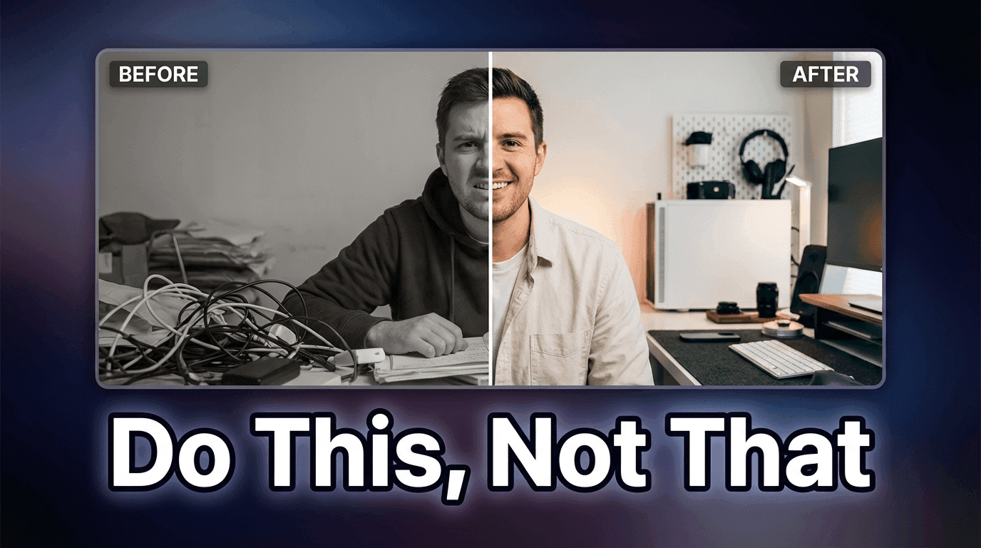
This is a problem that most creators handle poorly, and the data reflects it. Well-designed Reels covers can increase click-through rates by up to 40% compared to random auto-generated thumbnails.[9] When you let Instagram auto-select a frame from your video — a freeze on a mid-sentence expression, a blurred transition moment, an awkward hand gesture — you are handing your first impression to an algorithm that has no understanding of visual composition, brand consistency, or emotional appeal. The creators and brands that consistently outperform on the platform understand that the cover is not an afterthought. It is a designed asset, treated with the same intentionality as the content itself.
AI image generation has made it possible to create visually stunning, on-brand Reels cover backgrounds in minutes. Rather than spending time searching for stock images, staging photos, or wrestling with design tools to create compelling cover visuals, you can generate exactly the scene, mood, color palette, and visual composition your Reel topic demands — then add your title text and brand elements on top. This post provides 15 ready-to-copy prompt templates for AI-generated Reels cover images, spanning the most popular content categories on Instagram. Each template is engineered to produce a visually striking, scroll-stopping background image that makes your Reel impossible to ignore.
If you have worked with AI prompts for other Instagram applications — such as Instagram post images or Instagram Story images — the generation workflow will feel familiar, but Reels covers have unique dimensional requirements and design constraints that demand specifically calibrated prompts. The templates in this post are built for those constraints, producing images that survive Instagram's cropping behavior across every placement where your cover appears.
Why Your Reels Cover Is the Most Undervalued Asset in Your Content Strategy
The Instagram interface presents your content in multiple contexts, and your Reels cover appears differently in each one. Understanding these display contexts explains why the cover image carries so much strategic weight.
An Instagram Reels cover, also known as a thumbnail, is the static image that represents your video in the Reels tab, the main feed, and your profile grid. It works a lot like a YouTube thumbnail — it's what people see before they decide whether to watch.[7] Unlike a YouTube thumbnail that appears consistently at one aspect ratio, your Reels cover gets cropped and reformatted depending on where it appears on the platform.
Here is the trap. You upload a 9:16 cover with a perfect title at the top. On the Reels tab it looks fine. On your profile grid it gets cropped to a 1:1 square from the center, and your title is gone. The fix: keep the most important visual element of the cover in the central 1080 × 1080 square.[3] This cropping behavior means that a cover designed only for full-screen vertical display may lose its most important elements when viewed on the profile grid — exactly the place where potential followers are evaluating whether to explore more of your content.
Your profile grid is where the cumulative impact of your covers becomes most visible. A thoughtfully designed cover makes your profile look polished, builds brand recognition, and gives viewers an immediate sense of what your content is about.[7] When a potential follower visits your profile and sees a grid of consistently designed, visually cohesive Reels covers with clear titles, they form an instant impression of a professional, organized creator who delivers value. When they see a grid of random freeze-frames with no visual consistency — an open mouth here, a blurred hand there, an indecipherable mid-action shot somewhere else — they form the opposite impression.
These covers serve as visual navigation tools, helping your audience quickly identify and access the content they're looking for. When someone visits your profile, they're essentially window shopping through your covers before deciding what to watch.[9] This means covers are not just about attracting new viewers — they also serve your existing audience by making your content library browsable and scannable. A viewer who enjoyed one of your Reels and visits your profile to find more should be able to visually scan your covers and immediately identify which topics interest them.
Technical Specifications for Reels Cover Images
Before working through the templates, understanding the exact technical requirements for Reels covers ensures that every generated image will display correctly across all Instagram placements.
Under the Instagram Reels tab on a profile, thumbnails are displayed at the full 9:16 ratio. That's why Instagram Reels cover images work best at 1080 x 1920 pixels — the same size as the video itself.[2] This is your design canvas: a full vertical frame at 1080 pixels wide by 1920 pixels tall.
However, the critical design constraint is what happens when that full vertical canvas gets cropped for other display contexts. Design your cover at 1080 × 1920, but keep every important element — faces, text, your product — inside the central 1080 × 1080 square. That area survives every crop Instagram throws at it.[4] This means the AI-generated background image needs to have its most visually compelling content concentrated in the center of the frame, with the top and bottom areas serving as extensions that add to the full-screen presentation but are not essential to the cover's impact.
For text on your cover, avoid the top and bottom 480 pixels. That space gets cut off in 3:4 grid display.[4] Since you will typically add title text to your cover after generating the background image, knowing this safe zone ensures your text placement does not get cropped. The AI-generated image should provide a clean, visually organized background that leaves space for text in the center of the frame.
For the prompts in this post, generate at 9:16 aspect ratio (vertical/portrait orientation) in the Miraflow AI Image Generator to match the native Reels cover dimensions. The generated image serves as your cover's visual foundation — the background scene, mood, and composition — onto which you will add title text, brand elements, or overlay graphics using a design tool like Canva, Figma, or Adobe Express.

Design Principles for High-Performing Reels Covers
The covers that earn the most taps share a consistent set of visual characteristics. Understanding these principles helps you evaluate generated concepts and customize prompts for maximum impact.
Visual clarity at thumbnail size is the supreme requirement. Your Reels cover will be viewed at full screen only in the Reels tab. In the profile grid, the Explore page, and the home feed, it appears as a small thumbnail. Every element of the cover — the color contrast, the compositional focal point, the visual mood — must read clearly at that reduced size. This means bold, high-contrast imagery with a clear subject and uncluttered composition. Busy, detailed backgrounds with many competing elements collapse into visual noise at thumbnail scale. The prompts in this post consistently specify clean compositions with strong focal points and ample negative space for text because these are the visual qualities that survive the thumbnail reduction.
Color contrast drives scroll-stopping power. The Instagram feed is a visually dense environment. Your cover is competing for attention against dozens of other thumbnails, posts, and interface elements. The covers that stop thumbs use bold, high-contrast color palettes that pop against both white and dark mode backgrounds. Vibrant colors against dark backgrounds, warm tones against cool tones, bright accents against neutral fields — these contrast relationships create the visual interruption that makes a scrolling user pause. Desaturated, muddy, or low-contrast covers blend into the feed and disappear.
Negative space is text real estate. Since you will add title text to most Reels covers, the AI-generated background needs to provide areas of visual calm where text can sit without competing with busy imagery. The best Reels cover backgrounds are composed with intentional negative space — areas of soft gradient, solid color, shallow depth of field blur, or minimal texture — positioned in the center and upper-center of the frame where title text typically appears. This is why the prompts specify compositional arrangements that concentrate the primary visual subject in specific areas of the frame, leaving text-friendly zones elsewhere.
Emotional tone must match content promise. The cover's visual mood sets an expectation for the content behind it. A warm, golden-lit food scene promises a cozy recipe tutorial. A high-contrast, dramatic fitness shot promises intense workout content. A clean, minimal tech flat lay promises organized, informational content. When the cover's emotional tone matches the content's actual delivery, the viewer feels satisfied. When they mismatch — a dramatic cover leading to mundane content, or a dull cover hiding excellent content — trust erodes in both directions. Each template specifies visual moods calibrated to the content category it represents.
Brand consistency across covers builds recognition. The most effective Reels strategies maintain visual consistency across covers — not identical designs, but a recognizable family of visual treatments that share color palette, compositional style, or mood. When you find a template that works for your brand, customizing it with your brand colors and generating all your covers within that visual framework creates the profile grid coherence that signals professionalism. You need to maintain a consistent brand aesthetic across all your Reel covers. This creates a professional and organised look on your profile grid. You can achieve this through the consistent use of your brand's colour palette, fonts, a specific photo editing style, or a recurring layout template.[5]
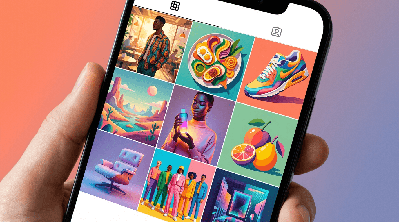
15 AI Prompt Templates for Instagram Reels Covers
Each template includes the content category, the design concept, the complete ready-to-copy prompt, and deployment notes. All prompts are formatted for the Miraflow AI Image Generator and are compatible with any high-quality AI image generation tool. Generate at 9:16 vertical aspect ratio for native Reels cover dimensions.
Template 1: Bold Lifestyle and Self-Improvement Cover
The self-improvement and personal development niche thrives on visual energy and aspiration. The cover needs to communicate motivation, momentum, and the promise of transformation — the visual equivalent of the feeling you get when you decide to become a better version of yourself. This template produces a dramatic, aspirational background that frames motivational or how-to Reels content with confident visual authority.

Prompt:
dramatic cinematic lifestyle photograph of a person silhouetted against a vivid sunrise or golden hour sky, shot from a low angle looking upward to create a sense of power and aspiration, the figure stands confidently at the edge of an urban rooftop or elevated viewpoint with a city skyline softly blurred in the background, the sky dominates the upper two-thirds of the frame with rich warm tones of deep amber burnt orange and soft gold blending into a deep navy blue at the top creating a natural gradient, the lower third features the dark silhouette and rooftop edge creating strong contrast against the bright sky, the composition leaves generous open space in the center and upper-center of the frame where title text can be placed against the smooth sky gradient, the overall mood is inspirational powerful and forward-looking, cinematic color grading with rich saturated warm tones, shot on a professional camera with a wide-angle lens, dramatic natural lighting from the sunrise behind the subject, vertical 9:16 composition optimized for Instagram Reels cover, high resolution sharp details, no text no watermarks no graphic overlays
Best for: Personal development tips, morning routine Reels, goal-setting content, mindset and productivity advice, motivational content, life hack compilations, career advice, habit-building tutorials
Template 2: Recipe and Food Tutorial Cover
Food content is among the most tapped categories on Instagram, and the covers that perform best combine appetite appeal with clean composition. The goal is to make the viewer hungry and curious simultaneously — a beautiful dish presented in a way that promises both visual satisfaction and actionable instruction. This template produces a warm, appetite-triggering food scene with intentional space for recipe titles.

Prompt:
overhead flat lay food photography of a beautifully plated dish on a rustic wooden table surface, the main dish is positioned in the lower-center of the frame on a ceramic plate with organic natural styling, surrounded by scattered fresh ingredients such as herbs leaves spices and small bowls with sauces or garnishes arranged in an artful asymmetric composition, the upper half and center of the frame feature the warm wooden table surface with enough clean space for text overlay, warm soft natural window light from the upper left creates gentle shadows and highlights that give dimension to the food, the color palette is warm and appetizing with rich earthy browns from the wood surface, vibrant greens from fresh herbs, and the natural colors of the dish creating visual warmth, shallow depth of field keeps the main dish sharp while peripheral ingredients soften slightly, steam or warmth haze rises subtly from the dish adding life and freshness, the mood is cozy inviting and homemade with professional food photography quality, vertical 9:16 composition optimized for Instagram Reels cover with the main subject concentrated in the center and lower portion of the frame, high resolution sharp details, no text no watermarks no graphic overlays
Best for: Recipe tutorials, cooking tips, meal prep content, kitchen hack Reels, restaurant reviews, food product features, healthy eating content, baking tutorials, cuisine exploration Reels
Template 3: Business Tips and Entrepreneurship Cover
Entrepreneurship and business content needs covers that communicate credibility, strategic thinking, and the polished confidence of someone who knows what they are talking about. The visual language borrows from corporate editorial photography — clean workspaces, strategic props, intentional lighting — while maintaining the approachability that Instagram's audience expects.

Prompt:
clean modern workspace flat lay photograph shot from directly above, a minimal desk scene on a matte white or light marble surface, carefully arranged business items including a sleek laptop partially visible at the bottom edge, a premium notebook with a quality pen, a smartphone showing a clean interface, and a small potted succulent or minimal plant for organic warmth, the items are arranged in the lower third of the frame with intentional negative space dominating the upper two-thirds creating a clean area for title text, the color palette is sophisticated and professional using soft neutral tones of white cream and light gray with strategic accents of muted gold or soft navy blue in the accessories, bright even overhead lighting with soft shadows creating a clean editorial feel, every element is precisely positioned with the deliberate spacing of a styled editorial shoot, the mood is productive professional organized and aspirational, a workspace that suggests strategic thinking and business success, vertical 9:16 composition optimized for Instagram Reels cover with generous clean space in the center and upper frame, high resolution sharp details, no text no watermarks no graphic overlays no clutter
Best for: Business strategy tips, entrepreneurship advice, marketing tutorials, side hustle ideas, productivity hacks, financial tips for business owners, social media strategy content, freelance and consulting advice, startup lessons
Template 4: Fitness and Workout Cover
Fitness content covers need to pulse with physical energy. The visual language of fitness branding uses dramatic lighting, dynamic composition, bold contrast, and the visual vocabulary of athletic performance to create covers that make the viewer feel the intensity of the workout before they tap play. This template produces a high-energy, dramatically lit fitness scene that promises serious results.

Prompt:
dramatic fitness photography in a modern gym or training environment, a strong athletic figure captured mid-exercise in a powerful dynamic pose, the subject is positioned in the lower half of the frame with dramatic side lighting creating bold highlights on muscle definition and deep shadows that add dimension and intensity, the gym environment behind the figure is dark with selective moody lighting, perhaps neon-accented overhead lights in deep blue or electric red that create colored light streaks and atmospheric depth, the upper half of the frame transitions into a darker moody area with soft colored light gradients providing clean space for text overlay, the color palette is bold and high-contrast with deep blacks rich shadows and selective color accents of vibrant red or electric blue creating an intense energetic mood, the composition creates a powerful upward visual flow from the exercising figure toward the open space above, sweat particles or atmospheric mist catch the dramatic lighting adding texture and rawness, the mood is intense powerful motivational and performance-driven, shot with a fast lens creating slight background separation, vertical 9:16 composition optimized for Instagram Reels cover with the subject in the lower frame and text space in the upper frame, high resolution sharp details, no text no watermarks no graphic overlays
Best for: Workout tutorials, exercise demonstrations, gym motivation, transformation challenge Reels, fitness tips, home workout content, athletic performance content, personal training promotions, supplement and nutrition Reels
Template 5: Beauty and Skincare Routine Cover
Beauty and skincare content lives in a visual world of luminous skin, soft light, clean products, and the promise of transformation through care. The cover needs to feel simultaneously luxurious and accessible — premium enough to signal expertise, approachable enough to feel achievable. This template produces a soft, glowing beauty scene that communicates both the science and the sensuality of skincare.

Prompt:
elegant beauty and skincare product arrangement photograph with a soft luminous aesthetic, premium skincare bottles and containers in minimalist frosted glass or clean white packaging arranged in the lower-center of the frame on a smooth surface of pale pink marble or soft white stone, soft dewy water droplets and fresh botanical elements such as small green leaves or delicate flower petals are scattered naturally among the products, the background is a soft gradient of blush pink fading to warm cream or soft white creating a luminous ethereal atmosphere that dominates the upper portion of the frame leaving generous space for text, soft diffused lighting from above creates a gentle glow on the product surfaces with no harsh shadows, subtle reflections on the smooth surface add depth and luxury, the overall color palette is soft and feminine using blush pink warm cream soft white and touches of gold in product caps or accents, the mood is clean luxurious glowing and spa-like evoking the feeling of a premium skincare ritual, shallow depth of field keeps foreground products sharp while the background dissolves into soft luminous blur, vertical 9:16 composition optimized for Instagram Reels cover with products in the lower portion and clean gradient space above for text, high resolution sharp details, no text no watermarks no graphic overlays
Best for: Skincare routine Reels, beauty product reviews, makeup tutorials, get-ready-with-me content, dermatologist tips, beauty brand promotions, morning and evening routine content, product unboxing, beauty hack compilations
Template 6: Travel Destination Reveal Cover
Travel content covers must accomplish the specific emotional task of transporting the viewer — making them feel, in a single glance, the awe and possibility of a place they have not yet visited. The visual language uses sweeping landscapes, dramatic natural light, and the kind of breathtaking composition that triggers the immediate response of "I need to go there." This template produces a cinematic travel scene that demands the tap.

Prompt:
breathtaking cinematic travel landscape photograph from an elevated viewpoint overlooking a stunning natural destination, the composition shows a dramatic sweeping vista with layered depth, a winding path or road leading the eye from the foreground into a magnificent backdrop of mountains coastline or ancient architecture bathed in warm golden hour light, the sky occupies the upper third of the frame with dramatic clouds lit from below in warm peach gold and soft lavender tones creating a natural text-friendly gradient, the middle section features the destination's most striking visual element in sharp focus, the lower portion shows a foreground element such as wild flowers a stone wall or a scenic overlook railing that grounds the composition and adds depth, the color palette is warm and cinematic with golden amber tones in the light cool blue-greens in shadow areas and rich earthy tones in the landscape, atmospheric haze between landscape layers creates a sense of vast distance and scale, the mood is adventurous awe-inspiring and wanderlust-inducing, shot on a professional camera with a wide-angle lens capturing the full grandeur of the scene, vertical 9:16 composition optimized for Instagram Reels cover with the sky providing text space and the destination as the visual anchor, high resolution sharp details, no text no watermarks no graphic overlays
Best for: Travel destination guides, hidden gems Reels, travel tips and hacks, packing lists, flight deal alerts, itinerary planning content, road trip Reels, digital nomad content, travel photography tips, hotel and resort reviews
Template 7: Tech Review and Gadget Cover
Tech content covers need to balance the visual appeal of sleek hardware with the editorial credibility that signals informed expertise. The aesthetic is clean, modern, and precise — the visual equivalent of the careful analysis the content delivers. This template produces a polished tech product scene that communicates both the excitement of new technology and the authority of expert review.

Prompt:
sleek modern technology product photograph in a dark moody studio setting, a premium tech device such as a smartphone laptop headphones or smartwatch is positioned in the lower-center of the frame on a matte dark surface, dramatic studio lighting from the side creates precise highlights along the device edges and surfaces revealing material quality and design details, the background is a deep gradient of charcoal black fading to dark navy or very dark teal creating a sophisticated premium atmosphere, subtle colored accent lighting in cool blue or soft purple provides secondary illumination that adds depth and a futuristic technological feel, the device surface shows subtle reflections of the colored lighting, the upper two-thirds of the frame is dominated by the dark gradient background providing ample clean space for title text that will stand out in white or bright font, the overall color palette is dark and premium with black charcoal and deep blue as the foundation and cool accent lights providing visual interest, the mood is premium authoritative and cutting-edge, the lighting and composition suggest a high-end product launch or editorial tech review, vertical 9:16 composition optimized for Instagram Reels cover with the device in the lower frame and dark gradient above for text, high resolution sharp details, no text no watermarks no graphic overlays
Best for: Tech product reviews, gadget unboxings, app tutorials, tech comparison Reels, coding tips, software walkthroughs, smart home content, tech deals and recommendations, digital tool reviews, AI tool demonstrations
Template 8: Fashion and Outfit of the Day Cover
Fashion content covers live at the intersection of editorial photography and personal expression. The cover must communicate style, taste, and the visual sophistication of someone whose aesthetic judgment is worth following. This template produces a fashion-editorial-inspired scene that elevates outfit content from casual mirror selfie to curated visual statement.

Prompt:
editorial fashion photograph with a modern street style aesthetic, a stylish figure photographed from mid-distance against an architecturally interesting urban background such as a textured concrete wall a minimalist storefront or a clean geometric building facade, the subject is positioned slightly off-center in the lower two-thirds of the frame wearing a curated outfit with interesting textures and layering, the background features clean architectural lines and muted urban tones that complement rather than compete with the outfit, soft natural daylight creates even flattering illumination with gentle shadows that add dimension, the upper portion of the frame shows the clean architectural background extending upward providing space for text overlay against the muted wall or building surface, the color palette is sophisticated and curated with the outfit colors coordinated against the neutral urban backdrop, warm earth tones such as camel beige cream and olive combine with strategic pops of a single bold accent color, the composition has the deliberate framing of a fashion editorial with intentional negative space and precise subject placement, the mood is confident effortlessly cool and fashion-forward, shot with a medium telephoto lens creating natural background compression and slight bokeh, vertical 9:16 composition optimized for Instagram Reels cover, high resolution sharp details, no text no watermarks no graphic overlays
Best for: Outfit of the day Reels, style tips, seasonal fashion guides, thrift haul content, capsule wardrobe tutorials, trend analysis, shopping recommendations, accessory showcases, fashion brand collaborations, styling tutorials
Template 9: Educational How-To Tutorial Cover
Educational and tutorial content is the workhorse of many successful Instagram strategies. The covers for this content need to immediately signal "you will learn something valuable here" through visual cues of organization, clarity, and expertise. The aesthetic is clean and informational — the visual equivalent of a well-organized lesson that respects the learner's time.

Prompt:
clean organized overhead photograph of hands working on a creative or educational project on a bright clean desk surface, the workspace shows organized tools and materials relevant to the tutorial topic arranged with editorial precision, hands in the lower portion of the frame are actively engaged in a process such as writing drawing crafting or organizing, the desk surface is clean white or light natural wood with the materials creating intentional pops of color, the upper portion and center of the frame show the clean desk surface extending openly with a few small organized items near the edges leaving generous clear space for text overlay, the lighting is bright even and natural with soft shadows that add gentle dimension without drama, the color palette is fresh and organized with a clean neutral base and two to three coordinating accent colors in the materials and tools creating a curated educational feel, small elements like colored markers a ruler sticky notes or craft supplies add visual interest without clutter, the composition is tidy organized and purposeful suggesting methodical expertise, the mood is bright instructive approachable and empowering, the scene promises clear organized knowledge sharing, vertical 9:16 composition optimized for Instagram Reels cover with the workspace activity in the lower frame and clean surface above for text, high resolution sharp details, no text no watermarks no graphic overlays
Best for: Step-by-step tutorials, DIY project Reels, educational content, skill-building series, creative process Reels, organizing tips, study tips, craft tutorials, digital tool tutorials, professional development content
Template 10: Home Decor and Interior Design Cover
Interior design and home decor content attracts an audience that cares deeply about visual beauty, which means the cover itself must be a demonstration of the aesthetic sensibility the content promises. The visual language uses carefully composed interior scenes with magazine-quality styling that makes the viewer want to inhabit the space they see.

Prompt:
beautifully styled interior design photograph of an elegant living space captured at a slight angle that shows depth and dimension, the room features a cohesive contemporary design with carefully curated furniture and decor elements, a stylish seating area or vignette occupies the lower and center portion of the frame with decorative objects such as a sculptural vase fresh eucalyptus branches design books and textured throw pillows adding visual interest, the wall behind the vignette is a sophisticated muted tone such as warm greige sage green or dusty rose that provides a beautiful clean background extending into the upper portion of the frame creating space for text overlay, natural window light enters from the side creating warm highlights and soft shadows that give the space warmth and dimension, the color palette is carefully curated with a cohesive scheme of three to four complementary tones creating a harmonious livable aesthetic, materials include natural textures such as linen wood ceramic and brass that add tactile richness, the composition uses the rule of thirds with the styled vignette anchoring the lower frame and the clean wall above serving as text space, the mood is warm sophisticated aspirational and livable, styled like a page from an interior design magazine, vertical 9:16 composition optimized for Instagram Reels cover, high resolution sharp details, no text no watermarks no graphic overlays
Best for: Room makeover Reels, decorating tips, furniture recommendations, small space solutions, rental-friendly decor, seasonal decorating, home organization, before-and-after room reveals, design trend content, home DIY projects
Template 11: Motivational Quote and Mindset Cover
Motivational and mindset content operates in the emotional register of inspiration, and the cover needs to create the visual atmosphere that primes the viewer for reflective, empowering content. The aesthetic uses dramatic atmospherics, evocative natural scenes, and cinematic color grading to generate the emotional resonance that makes someone pause their scroll and absorb a meaningful message.

Prompt:
atmospheric moody nature photograph with a contemplative meditative quality, a serene landscape scene featuring a calm body of water such as a still lake or gentle ocean horizon at dawn or dusk, the water surface is smooth and reflective creating a mirror effect, the sky takes up the upper two-thirds of the frame with dramatic cloud formations illuminated by soft warm light from a sun positioned near the horizon, the clouds create organic texture and visual interest while the spaces between them provide clean areas for text overlay, the horizon line sits in the lower third of the frame with the reflective water below creating a grounding base, the color palette uses a sophisticated muted tonal range of soft dusty rose muted lavender warm amber and deep slate blue creating an emotional contemplative atmosphere, subtle mist or atmospheric haze near the horizon adds depth and a dreamlike meditative quality, the overall composition is centered and symmetrical creating a sense of balance and peace, the mood is reflective empowering contemplative and deeply calming, cinematic color grading with lowered saturation and slightly lifted blacks for a polished editorial feel, vertical 9:16 composition optimized for Instagram Reels cover with the expansive sky providing ample text space, high resolution sharp details, no text no watermarks no graphic overlays no people
Best for: Motivational content, mindset tips, affirmation Reels, journaling prompts, mental health awareness, meditation and mindfulness content, gratitude practice Reels, self-care reminders, life lessons, philosophical reflections
Template 12: Behind-the-Scenes and Day-in-the-Life Cover
Behind-the-scenes content draws its appeal from authenticity — the feeling of getting an insider look at how things really work. The cover needs to signal this authenticity while still maintaining enough visual quality to look intentional and worth watching. The aesthetic is documentary-inspired: real environments, natural light, genuine activity, captured with a photographer's eye for composition.

Prompt:
candid documentary-style photograph of a creative professional at work in their studio workshop or office space, the person is positioned in the lower half of the frame engaged in a genuine work activity such as arranging materials on a table reviewing something on a screen sketching or crafting, captured from a slightly elevated angle that shows both the person and their workspace, the environment is authentically lived-in but visually interesting with tools equipment and work materials visible in an organized chaos that tells a story, natural light from a large window to the side creates warm directional illumination with natural shadows that add depth and authenticity, the upper portion of the frame shows the studio environment walls or window providing space for text overlay against a naturally occurring lighter area, the color palette is warm and authentic with natural tones amber browns warm whites and the organic colors of the workspace creating a lived-in documentary feel, slight film grain or a subtle analog quality adds to the authentic behind-the-scenes mood, the composition feels caught rather than posed suggesting a real moment in a real creative process, the mood is authentic intimate inspiring and relatable, shot with available light and a medium lens creating a natural documentary perspective, vertical 9:16 composition optimized for Instagram Reels cover, high resolution with natural film-like quality, no text no watermarks no graphic overlays
Best for: Day-in-the-life Reels, creative process content, studio tours, behind-the-scenes of a business, making-of content, artist workflow Reels, small business daily operations, freelancer life content, content creation process Reels, entrepreneurship journey content
Template 13: Product Launch and Brand Announcement Cover
Product launches and brand announcements demand covers with the visual impact and polish of a campaign asset. The cover must communicate that something significant and exciting is happening — the visual equivalent of an invitation to something exclusive. This template produces a premium, campaign-ready product scene that elevates any launch or announcement Reel.

Prompt:
premium product reveal photograph with a luxurious editorial aesthetic, a beautiful product or gift box positioned in the lower-center of the frame on an elegant surface of dark marble or rich velvet fabric, the product is styled with minimal complementary props such as scattered dried flowers metallic confetti a satin ribbon or small decorative elements that suggest celebration and premium quality, dramatic studio lighting creates a spotlight effect on the product with the surrounding area falling into rich elegant darkness, the background transitions from the moody dark tones near the product upward into a smooth deep gradient of rich dark navy or deep burgundy providing a luxurious dark canvas for text overlay in the center and upper frame, subtle warm accent lighting in gold or warm amber highlights the product edges and surface details adding dimension and premium quality, metallic or reflective elements in the scene catch the light creating small bright highlights that add visual sparkle and excitement, the color palette is rich and premium using deep darks warm metallics and a sophisticated accent color that suggests exclusivity, the mood is exciting luxurious exclusive and announcement-worthy, the scene suggests an unveiling or reveal moment, vertical 9:16 composition optimized for Instagram Reels cover with the product anchoring the lower frame and the dark gradient above providing text space, high resolution sharp details, no text no watermarks no graphic overlays
Best for: Product launch announcements, new collection reveals, brand collaboration announcements, limited edition drops, sale and promotion Reels, unboxing content, giveaway announcements, milestone celebration Reels, rebrand reveal content, seasonal collection launches
Template 14: Podcast Clip and Conversation Cover
Podcast clips and conversational Reels have exploded as a content format, and the covers need to communicate the intellectual energy and personality of a compelling conversation. The visual language borrows from professional podcast studio photography — atmospheric lighting, quality microphones, and the intimate feeling of being let into an important discussion.

Prompt:
atmospheric podcast studio or interview setting photograph with professional broadcast-quality aesthetics, a quality condenser microphone on a desk-mounted arm is the primary subject positioned in the center-lower portion of the frame with shallow depth of field keeping it sharply focused, the background shows a professionally styled podcast studio environment with warm moody lighting, subtle colored accent lights in deep amber or warm orange create atmosphere along the walls and shelving, a comfortable seating arrangement is softly blurred in the background suggesting an intimate conversation setting, acoustic panels or textured wall treatment in the background add visual depth, the upper portion of the frame shows the moody studio environment with enough visual calm for text overlay, the lighting is warm and intimate with directional key light and subtle colored fill creating a professional broadcast atmosphere, the color palette is warm and moody with rich dark tones amber and warm brown as the foundation accented by warm orange or deep gold lighting, the composition focuses on the microphone as an iconic symbol of conversation and voice with the atmospheric studio creating context, the mood is intimate intellectual engaging and professional, the scene promises a conversation worth listening to, vertical 9:16 composition optimized for Instagram Reels cover, high resolution sharp details, no text no watermarks no graphic overlays
Best for: Podcast clip Reels, interview highlights, hot take and commentary content, storytelling Reels, conversation snippets, expert insight clips, debate and discussion content, voiceover-driven educational Reels, audio content promotion, thought leadership clips
Template 15: Before-and-After Transformation Cover
Transformation content is inherently compelling because it promises proof of change — the visual evidence that a process, product, or effort actually works. The cover needs to immediately communicate this transformation premise through visual design that signals a dramatic comparison is coming. This template produces a clean split-composition background that frames transformation content with visual clarity.

Prompt:
split composition photograph designed for before-and-after content with a clean dramatic visual divide, the frame is divided into two distinct halves by a soft diagonal or vertical transition, the left side features a muted cool-toned environment with desaturated colors dim flat lighting and a slightly chaotic or unfinished quality suggesting the before state, the right side features a vibrant warm-toned environment with rich saturated colors bright beautiful lighting and a polished refined quality suggesting the after state, the transition between the two halves is a smooth gradient blend or a clean geometric line that creates a satisfying visual divide, both sides show the same type of environment such as a room corner a workspace surface or a styled area but in dramatically different states of refinement and beauty, the left before side uses cool blue-gray desaturated tones while the right after side uses warm golden saturated tones creating an instant visual story of transformation, the center of the frame where the two halves meet provides a natural focal point with enough visual transition space for text overlay, the composition is balanced with equal visual weight on both sides, the mood communicates dramatic positive transformation and impressive results, vertical 9:16 composition optimized for Instagram Reels cover with the split running through the center, high resolution sharp details, no text no watermarks no graphic overlays
Best for: Room makeover Reels, fitness transformation content, skincare results, organizational before-and-afters, editing tutorial Reels, design process reveals, cleaning and decluttering content, hair transformation Reels, renovation projects, skill progression content
Customizing These Templates for Your Brand
The templates provide the compositional structure, visual style, and mood calibration for each content category. Making them work for your specific brand requires customization along several key dimensions.
Align the color palette to your brand colors. The most impactful customization you can make is adjusting the color descriptions in the prompt to match your brand's color palette. If your brand uses a deep teal and coral color scheme, replace the default color descriptions with those specific tones. This ensures that every generated cover reinforces your brand identity and creates visual consistency across your profile grid. Be specific with color descriptions — "deep ocean teal with warm coral accents" produces more targeted results than "blue and orange."
Adjust the subject matter to your niche. While each template targets a content category, the specific visual elements should reflect your exact niche. A food template can be customized for vegan cuisine by specifying "colorful plant-based ingredients, vibrant vegetables, and whole grains" instead of generic food descriptions. A fitness template can be tailored for yoga by replacing the gym environment with "a serene bright yoga studio with natural wood floors and soft natural light." The more specific you are about your niche context, the more relevant and authentic the generated covers will feel.
Maintain compositional text zones. All templates are designed with specific areas left open for text overlay. When customizing, maintain this compositional principle. If you move the primary visual subject, ensure that you are still leaving a clean, uncluttered area in the center or upper portion of the frame where your title text will sit. A visually stunning background that has no clean space for text is not functional as a Reels cover.
Match the energy level to your brand voice. A calm, educational brand should gravitate toward templates with soft lighting, neutral tones, and peaceful compositions (Templates 3, 9, 10, 11). A high-energy brand should lean into templates with dramatic lighting, bold contrast, and dynamic compositions (Templates 1, 4, 6, 13). Matching the visual energy of your covers to the energy of your content and brand personality creates a coherent experience that builds trust with your audience.
Create a series template for recurring content. If you have recurring Reels series — weekly tips, monthly roundups, regular tutorials — create a customized version of the most relevant template and use it consistently for that series. This gives the series visual branding within your profile grid, making it easy for viewers to identify episodes of content they enjoy. Adjust only small details between episodes (a different food item, a different color accent) while keeping the overall composition and mood consistent.
Adding Text and Brand Elements to Generated Covers
The AI-generated image is your cover's visual foundation. Transforming it into a complete, tap-worthy Reels cover typically requires adding text and brand elements in a design tool. Here is the workflow that produces professional results.
Import the generated image into a design tool such as Canva, Figma, Adobe Express, or Photoshop. Set your canvas to 1080 by 1920 pixels to match the Reels cover dimensions, and place the AI-generated image as the background layer.
Add your title text in the center safe zone. Through testing, keeping the main text in the center of the cover works best, with text kept super short — three to four words max.[1] Your title should be the hook that explains what the viewer will get from the Reel. Make it specific and benefit-driven: "5 Morning Habits" is stronger than "Morning Routine," and "Beginner Bread Recipe" is stronger than "New Video." Stick with bold fonts instead of thin or script styles that become difficult to read when resized.[4]
Keep text within the grid-safe zone. Title text, faces, and logos go in the middle. Decorative elements can live at the top and bottom.[3] The center 1080 by 1080 pixel area of your canvas is the zone that survives every crop, so your title text must live within this area. The prompts in this post are designed to leave this zone visually open for exactly this purpose.
Apply brand-consistent typography. Use the same font across all your Reels covers. This typographic consistency is one of the strongest visual branding tools available and creates immediate recognition as viewers scroll through your grid or the Explore page. Choose a bold, highly legible sans-serif for maximum impact at thumbnail size.
Add a subtle text background if needed. If the AI-generated background image has visual complexity in the text zone, add a semi-transparent shape (a rounded rectangle, a frosted glass effect, or a color block) behind your text to ensure legibility. This technique preserves the visual richness of the background while keeping text sharp and readable.
Include minimal brand elements. A small logo mark in a consistent corner position adds professional brand presence without cluttering the cover. Keep it subtle — the cover's primary job is to earn the tap, not to serve as a brand advertisement. Consistent placement across all covers (for example, bottom-right corner at a small size) creates a signature element without competing with the title.
Optimizing Covers for Instagram's Multiple Display Contexts
Understanding how Instagram displays your cover in different contexts allows you to design covers that perform well everywhere, not just in one placement.
Your cover might look great in full 9:16 format, but that is not how most people will first see it. On your profile grid, Instagram crops Reel covers more tightly, so text and key visuals near the edges can easily get cut off. To avoid awkward cropping, keep your text, face, logo, and other important elements centered. Leave breathing room around the edges, especially at the top and bottom. When designing, always think about how the cover will appear on your profile first, not just in the Reel feed.[7]
The profile grid is the most demanding display context because it crops the most aggressively. Before publishing any Reel, use Instagram's built-in grid preview feature to check how the cover will appear in your profile. You can click on the Post Grid tab to preview and adjust how the cover image will look on your grid.[6] This ten-second check can prevent the frustrating experience of publishing a cover that looks perfect in full screen but loses its title text in the grid crop.
For cross-platform repurposing, the good news is that Instagram Reels and TikTok use the same 9:16 aspect ratio, so your AI-generated cover backgrounds can serve double duty. Instagram Reels and TikTok use the exact same video dimensions: 1080 x 1920 pixels with a 9:16 aspect ratio. This is great news for content creators because you can create one video and post it to both platforms without any resizing or reformatting.[8] Generate one high-quality background image and adapt it with platform-specific text overlays for each platform.
Common Mistakes That Undermine Reels Cover Performance
Awareness of these recurring pitfalls helps you generate stronger concepts and avoid the design errors that reduce tap-through rates.
Cluttered, busy backgrounds that fight with text. The most common mistake is generating a visually stunning image that has no clean space for text. When you layer title text over a complex, detailed background, neither the image nor the text serves its purpose. Both become harder to read, and the cover collapses into visual noise at thumbnail size. The prompts in this post are specifically designed to create images with intentional visual calm in the center frame, but if you customize prompts, always maintain descriptions of clean space, negative space, or gradient areas where text will sit.
Inconsistent visual style across covers. A profile grid with covers in wildly different styles — one moody and dark, one bright and colorful, one warm and vintage, one cool and minimal — looks chaotic rather than eclectic. Choose two to three templates that share a compatible visual family and use them consistently. Your profile grid is a portfolio of covers, and visual consistency makes it look curated and intentional.
Text too small or too wordy. Limit your text to just a few words. Focus on a keyword or phrase like "5 Editing Tips" or "Tricks of The Trade."[4] At thumbnail size, any text smaller than a bold headline disappears. If your cover title needs more than four to five words to communicate the Reel's value, the title needs editing, not smaller font. Be ruthlessly concise. The best performing Reels covers use the minimum number of words needed to create curiosity and communicate value.
Low contrast between text and background. White text on a light background, dark text on a dark area, or any combination where the text does not strongly contrast with the image behind it reduces legibility and kills tap-through. If you add white text, it must sit against a dark or deeply saturated area of the image. If you add dark text, it must sit against a light or bright area. The prompts in this post create backgrounds with predictable tonal zones (dark areas for white text, light areas for dark text), but always verify contrast before publishing.
Using AI-generated text within the image. AI image generators frequently produce garbled, misspelled, or visually inconsistent text when text is included in the prompt. Never rely on the AI to generate your cover's title text within the image. Use the AI exclusively for the visual background, then add clean, properly typeset text in a design tool where you have complete control over fonts, sizing, spacing, and placement.
Ignoring the emotional mismatch between cover and content. A dramatic, high-energy cover on a calm, informational Reel creates a disconnect that feels like clickbait. A subdued, quiet cover on a high-energy, exciting Reel undersells the content. Match the cover's visual intensity to the content's actual energy level. The templates are categorized by content type to help maintain this alignment, but within each category, calibrate the drama level to match your specific content's tone.
Building a Cover System for Your Brand
The most efficient and effective approach to Reels covers is not designing each one from scratch but building a repeatable system — a small set of cover templates that you rotate through, customizing only the specific elements that change from Reel to Reel.
Select two to three core templates. From the 15 templates in this post, identify the two or three that best match your content categories and brand personality. These become your recurring visual frameworks. A fitness creator might use Template 4 for workout Reels, Template 1 for motivational content, and Template 9 for educational tips. A food creator might use Template 2 for recipes, Template 12 for behind-the-scenes kitchen content, and Template 3 for business and brand-building Reels.
Generate a library of backgrounds. For each core template, generate five to ten variations so you have a ready-made library of backgrounds to pull from when creating covers. This batch approach is faster than generating individual backgrounds for each Reel and ensures you always have a fresh cover ready without the production bottleneck of generating on demand. Store these in a designated folder organized by content category.
Establish your text treatment. Define a consistent text style that you use across all covers: the same font, the same weight, the same color (or a consistent system of two colors — one for dark backgrounds, one for light), the same positioning, and the same approximate text size. This typographic system is the thread that ties your covers together even when the background images vary. Save this as a template in your design tool so applying it to a new background takes seconds.
Color-code your content categories. If you cover multiple topics, consider using color as a category signal. All workout covers use a red accent, all nutrition covers use green, all mindset covers use purple. This helps your audience navigate your content by visual category and adds an additional layer of organizational logic to your profile grid.
Refresh periodically. While consistency is important, visual fatigue is real. Every two to three months, generate fresh background variations within your established template framework, or adjust your color palette or text treatment slightly to keep the visual system feeling current without losing brand recognition. Evolution, not revolution — your covers should feel like the same brand growing, not a different brand each quarter.
FAQ
What is the correct size for an Instagram Reels cover image?
You should design Reels covers at 1080 × 1920 pixels (9:16), keeping all important elements inside the central 1:1 square. This way, your Reel will survive the crop when it shows on your profile grid and on the audience's personal feed.[1] Generate your AI backgrounds at 9:16 vertical aspect ratio to match this specification natively.
Can I change a Reels cover after it has been published?
You're not locked in. You can update an Instagram Reel's cover image anytime — even after it's already live. Just tap on the menu in the top right corner of the Reel, select Edit cover to either choose a new frame from the Reel or upload a new image from your camera roll.[2] This means you can retroactively improve older Reels covers as you develop your visual system, or test different covers to see which earns better engagement.
Should I add text to my Reels covers or keep them image-only?
For most content categories, adding a short text title to your Reels cover significantly improves tap-through rate because it tells the viewer what they will get before they commit to watching. Text can make a big difference in whether someone taps or scrolls past. A short, specific hook tells people what they will get from the Reel before they even press play, which can help increase click-through rate.[7] The exceptions are purely aesthetic content — fashion, art, photography, travel — where a stunning image alone can be sufficient. For educational, how-to, tips, and informational content, text on the cover is almost always beneficial.
What aspect ratio should I generate these images at?
Generate at 9:16 (vertical/portrait) aspect ratio to match the native Instagram Reels cover dimensions of 1080 × 1920 pixels. All templates in this post are designed for this vertical composition, with visual subjects and text zones positioned for the 9:16 frame. If your AI generation tool offers specific pixel dimension settings, use 1080 × 1920 directly.
Can I use these cover backgrounds for TikTok and YouTube Shorts too?
Yes. All three platforms use the same 9:16 vertical aspect ratio, so the generated background images work across platforms without resizing. However, each platform has slightly different UI overlay positions and cropping behavior, so you may want to adjust text placement slightly for each platform. The center-safe-zone principle remains consistent: keep important elements centered and they will survive the crop on all platforms.
How many covers should I batch-generate at once?
For efficiency, generate a library of ten to twenty background images across your two to three core templates in a single session. This gives you enough variety to cover several weeks of content without the overhead of generating a new background for every Reel. Store them organized by content category and pull from the library as needed. Replenish the library monthly or when you start running low on fresh options.
Do Reels covers actually affect my reach and engagement?
Covers do not directly affect algorithmic reach — Instagram's algorithm prioritizes watch time, engagement, and content relevance. However, covers indirectly affect reach by influencing tap-through rate. When you ignore covers, your Reels may still get some views. But when you customize them, you give your content a significant edge.[4] A higher tap-through rate means more initial views, which gives the algorithm more engagement data to work with, which can lead to broader distribution. The cover starts the engagement flywheel.
Should all my Reels covers look identical?
Not identical, but visually consistent. The goal is a recognizable family of covers that share key visual elements — color palette, typographic style, compositional structure, and mood — while varying the specific imagery and text for each Reel. Think of it like a television show's episode thumbnails: each one is different, but they clearly belong to the same series. This balance between consistency and variety keeps your grid looking cohesive without becoming monotonous.
What if I need to generate a cover for content that does not fit any of these templates?
Use the template closest to your content's energy and mood as a starting point, then customize the descriptive elements to match your specific topic. The compositional principles — centered safe zones, intentional text space, contrast relationships, vertical 9:16 format — are universal across all Reels cover designs. Maintain those structural principles while adjusting the visual content, color palette, and mood descriptors to fit your unique content category.
Conclusion
Every Reel you post enters a competition for attention against millions of other thumbnails in profiles, feeds, and discovery surfaces. The cover is your entry in that competition — the single static frame that determines whether someone taps into your content or scrolls past it forever. Treating the cover as an afterthought, letting Instagram auto-select a random freeze-frame, and hoping the content speaks for itself are strategies that leave performance on the table.
The 15 templates in this post give you a production-ready system for generating scroll-stopping Reels cover backgrounds across the content categories that define Instagram: lifestyle and self-improvement, food and recipes, business and entrepreneurship, fitness and workouts, beauty and skincare, travel, tech, fashion, education, home design, motivation, behind-the-scenes, product launches, podcasts, and transformation content. Each template is designed for the specific technical requirements of Instagram Reels covers — the 9:16 vertical canvas, the center-safe zone that survives grid cropping, the intentional text space that accommodates title overlays, and the bold visual impact that stops scrolling thumbs.
Copy the template that matches your content, customize it with your brand's colors, niche details, and energy level, generate it inside Miraflow AI, add your title text and brand elements in a design tool, and publish a cover that earns the tap your content deserves. Build a library of backgrounds, establish a consistent text treatment, and maintain the visual system across your Reels to create the kind of cohesive, professional profile grid that signals to every visitor that your content is worth following.
Your Reels are only as discoverable as the covers that represent them. Make every cover earn its tap.