AI Prompts for Newsletter Cover Images: 15 Templates That Build Authority
Written by
Jay Kim

15 copy-paste AI prompts for newsletter cover images that build authority. Covers business, tech, finance, wellness, arts, personal brand, and more for editorial quality results.
Most newsletters fail to build authority before a reader clicks open. The cover image is the first visual impression a subscriber gets when the email lands in their inbox, and in the fraction of a second before they decide whether to keep reading, that image is already communicating something about whether the content inside is worth their time. A generic stock photo communicates that the sender grabbed something convenient. A deliberately designed, visually intelligent cover image communicates that this newsletter is a publication worth taking seriously.
The challenge for most newsletter creators, from independent thought leaders to brand-managed publications, is producing cover imagery that looks editorially credible rather than templated and forgettable. The visual language of authority is specific. It uses precise compositions, controlled color palettes, meaningful conceptual relationships between the image and the content, and a level of visual intention that signals the creator understands design thinking, not just content writing.
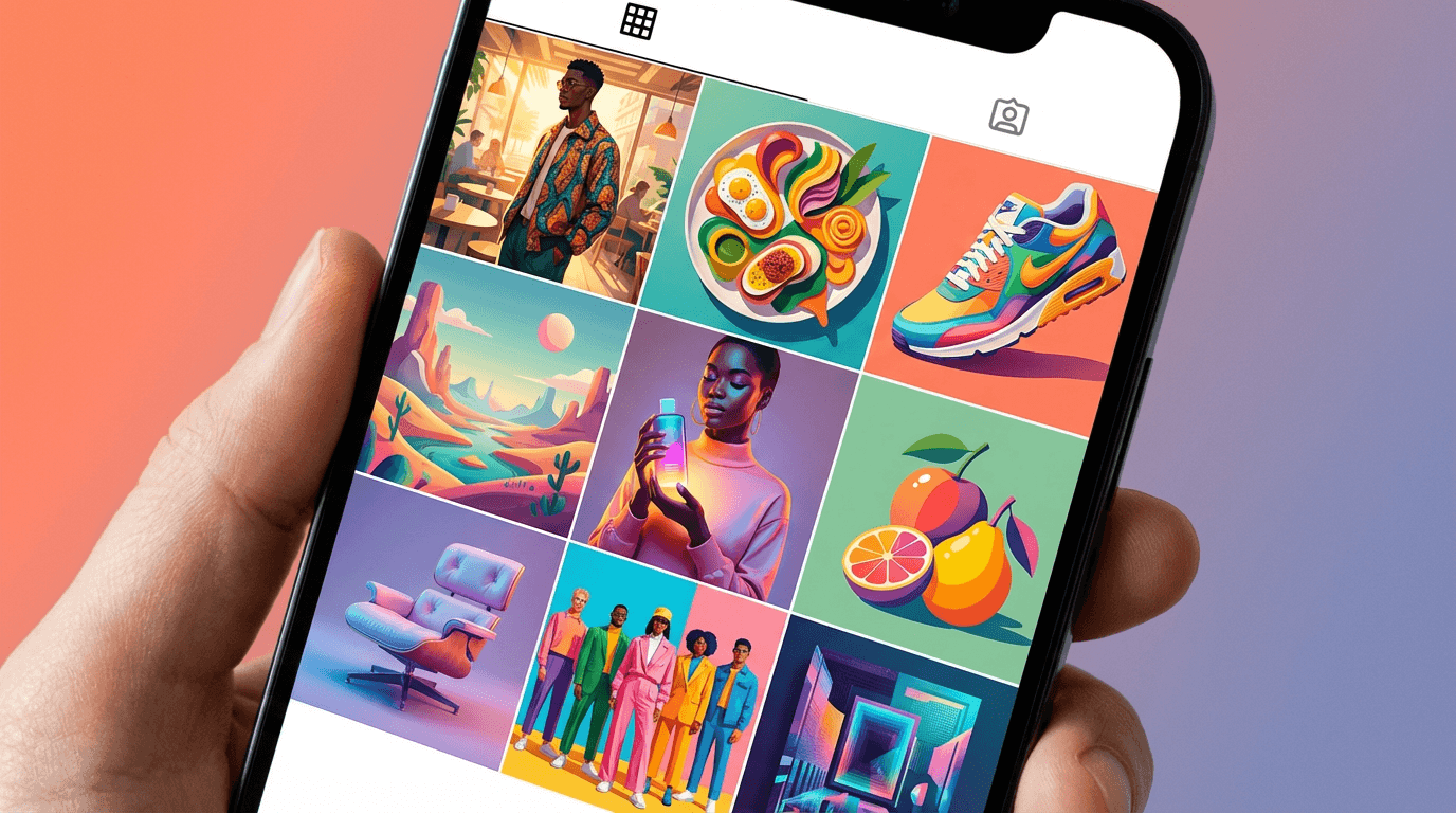
This post gives you 15 ready-to-use AI prompt templates for newsletter cover images across the most important content niches, from business leadership and technology to personal finance, wellness, political analysis, cultural commentary, and personal brand thought leadership. Every prompt is built to generate cover imagery that communicates credibility and editorial quality. You can run all of them directly in the AI image generator on Miraflow AI without any setup.

What Newsletter Cover Images Actually Do for Authority
Understanding the specific authority-building functions of newsletter cover imagery helps you make better decisions about which visual approaches to use and why.
They establish publication identity before a word is read. A newsletter that uses consistent, high-quality cover imagery across every issue trains its subscribers to recognize and anticipate its visual brand. Over time, that recognition creates the same kind of authority signal that a magazine masthead creates: the feeling that you are reading a real publication with editorial standards, not just email from a person.
They set expectations for content quality. Readers make unconscious judgments about content quality based on presentation quality before they read a single word. A cover image that looks like it was chosen thoughtfully, with genuine attention to composition, color, and conceptual relevance, sets an expectation of the same thoughtfulness in the writing. A generic or careless cover image sets the opposite expectation.
They communicate niche expertise through visual language. Every professional niche has a visual vocabulary that its members recognize and respond to. Finance and investment audiences recognize the specific palette and aesthetic of premium financial publications. Technology and AI audiences recognize digital visualization aesthetics. Academic and research audiences recognize the clean precision of scientific publication design. Building these niche-specific visual signals into your cover imagery communicates that you belong to the professional world you are writing about.
They create emotional engagement before the intellectual engagement of reading begins. The best newsletter cover images create a moment of genuine visual interest, curiosity, or aesthetic pleasure that puts the reader in a receptive state before they encounter the text. This emotional priming effect is subtle but consistent and is one of the reasons visually sophisticated newsletters achieve better open-to-engagement ratios than visually mediocre ones.
They signal the investment the creator makes in their work. Readers can tell the difference between a newsletter creator who spent five minutes on their cover and one who spent genuine creative energy on it. That signal of investment communicates that the writing receives the same level of care, which is the fundamental trust premise that converts occasional openers into committed subscribers.
The Visual Language of Authority by Content Category
Different professional niches have developed specific visual aesthetics that communicate credibility within those communities. Understanding the visual language of your specific niche is as important as the technical quality of the image itself.
Business and leadership authority visuals use architectural scale, deep navy and charcoal tones, precision and geometry, and imagery that communicates institutional weight and strategic perspective. The visual vocabulary draws from financial journalism, executive communication, and the design language of premium business publications.
Technology and science authority visuals use precise digital visualizations, clean geometry, data-suggestive patterns, cool chromatic palettes with electric accent colors, and the aesthetic of scientific publication. These images communicate intelligence and rigor rather than warmth or aspiration.
Wellness and health authority visuals use clean botanical imagery, natural light, restraint, and a palette that communicates purity, vitality, and evidence-based thinking rather than wellness marketing excess.
Creative and design fields authority visuals use deliberately composed abstract geometry, controlled color relationships, and visual compositions that demonstrate design literacy through their own structure. The image is itself a demonstration of the design thinking the newsletter covers.
Cultural and arts authority visuals use the specific aesthetic vocabulary of fine arts, editorial photography, and cultural institutions. They communicate connoisseurship and depth through visual reference and material quality rather than through explicit representation.
Personal brand thought leadership authority visuals use the premium editorial portrait aesthetic of premium business and ideas publications, with controlled studio lighting, strong compositional confidence, and the visual gravitas of someone whose perspective commands attention.
Understanding which visual language belongs to your niche and building it deliberately into your prompts produces cover imagery that speaks to your audience's existing sense of what authority looks like in their world.
How to Use These Prompts
Every prompt below is structured to generate a visual background suitable for a newsletter cover with space for text overlay including the publication name, issue date, and headline. Each prompt includes a text zone specification so the generated image works practically as a cover layout rather than just a beautiful image.
To customize any prompt for your specific newsletter, adjust the color palette to match your brand, modify the descriptive details to align with your specific niche or content theme, and ensure the text zone placement corresponds to where your newsletter template places the publication name and issue information.
The AI image generator on Miraflow AI supports both text-to-image and image-to-image generation. Text-to-image works well for generating new cover concepts from scratch. Image-to-image is useful when you want to apply an authority aesthetic treatment to an existing image that relates to a specific issue theme.
Generate five to eight variations of each prompt before selecting your final, since compositional balance, color saturation, and light quality vary meaningfully between generations.
15 AI Prompt Templates for Newsletter Cover Images
1. Business and Leadership Newsletter
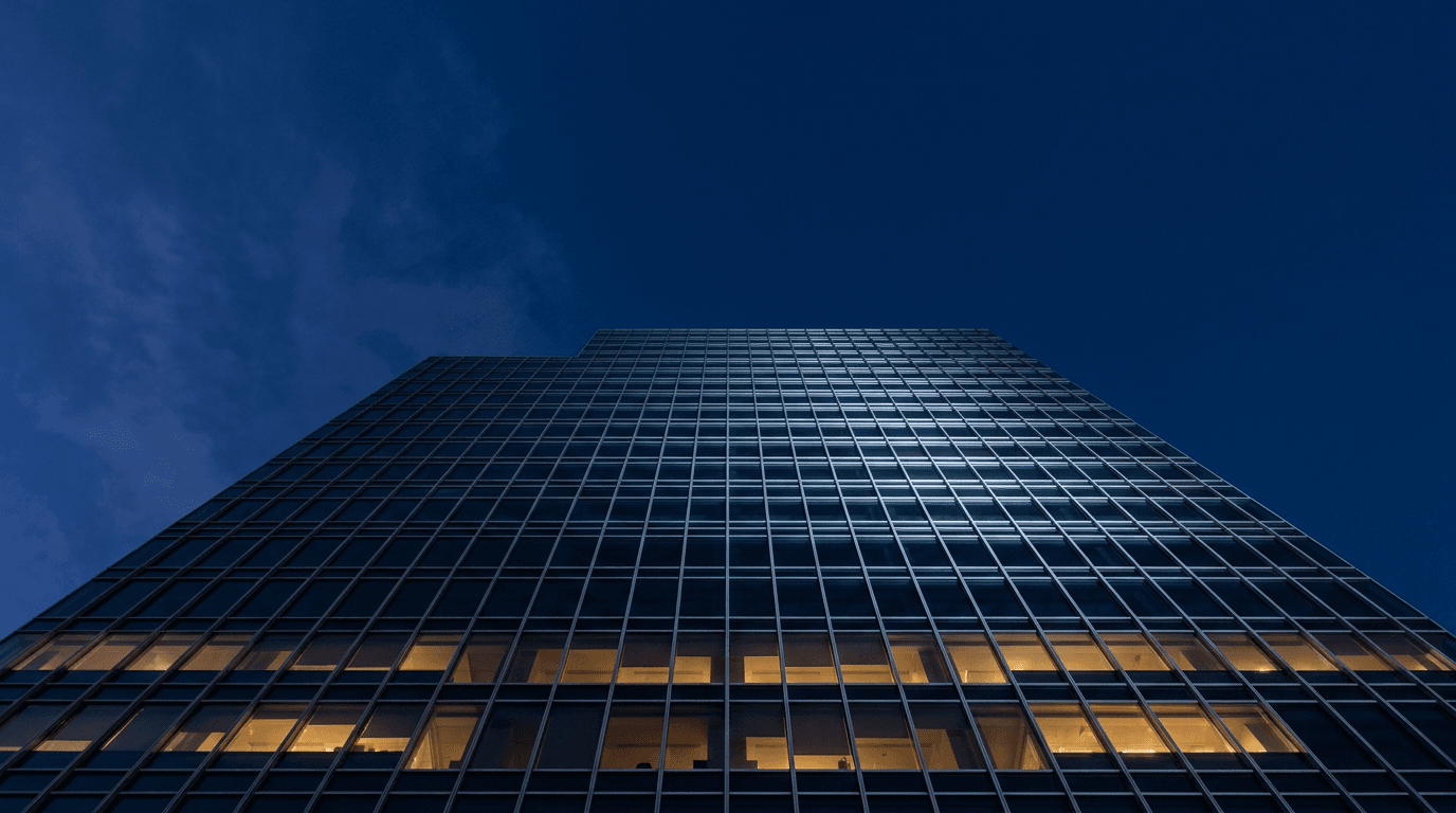
Leadership newsletters need cover imagery that communicates institutional authority and strategic scale without feeling corporate or cold. Architectural photography achieves this by placing the reader at the vantage point of someone who sees the bigger picture.
Prompt
Clean authoritative editorial newsletter cover background, dramatic low angle upward perspective of a modern glass office tower against a deep navy blue pre-dawn sky, the building's geometric glass facade reflecting the morning light in precise grid patterns that create a strong graphic quality, the architecture communicates scale and institutional weight, strong vertical composition with the building dominant and clear deep navy sky occupying the upper third of the frame suitable for newsletter name and issue text placement, deep navy blue and cool silver-grey tones with warm amber building interior light visible behind the glass at lower floors, editorial premium business publication aesthetic, the image communicates organizational authority and strategic clarity, ultra-realistic architectural glass and sky rendering, no text no logos
2. Technology and AI Newsletter
Technology newsletters build authority through visual imagery that communicates intellectual depth and technical intelligence. Abstract data visualizations achieve this more effectively than literal technology imagery because they suggest complexity and systems thinking.
Prompt
Abstract editorial newsletter cover background, visualization of a dense glowing neural network with thousands of interconnected nodes and connection lines rendered in electric blue and soft cyan on a near-black deep background, the network structure is visually complex and organically dense at the center and diffuses gradually toward the frame edges, a gentle sense of motion or pulse in the connection glow suggests active processing, clear dark areas at the upper portion of the frame for newsletter title text placement, deep near-black background with electric blue and soft cyan accent tones, editorial technology and AI publication aesthetic, the image communicates intellectual depth and technical intelligence without using literal computer or screen imagery, ultra-realistic digital particle and connection light rendering, no text no logos
3. Personal Finance and Investing Newsletter
Finance newsletter covers need to communicate precision, trustworthiness, and the specific expertise of navigating complex systems. Conceptual imagery that uses precision instruments or navigation metaphors achieves this more effectively than literal financial imagery.

Prompt
Sophisticated editorial newsletter cover background, close-up macro photograph of a vintage brass compass resting on dark aged leather, the compass face showing precise degree markings and a sharply pointing needle, warm directional studio light from the upper left creating characteristic brass specular highlights along the compass rim and bezel, the surrounding leather surface showing fine grain texture and natural patina, the compass glass reflecting a subtle warm light, warm amber and deep aged brown tones with bright brass accent, editorial premium financial publication aesthetic, the image communicates precision guidance and the expertise of navigating toward a specific destination, clear dark leather area in the upper portion of the frame suitable for publication title text overlay, ultra-realistic brass instrument and leather texture rendering, no text no logos
4. Health and Wellness Newsletter
Health and wellness newsletters occupy a crowded visual space where generic wellness photography is everywhere. Authority in this niche comes from visual restraint, scientific precision, and botanical imagery that communicates natural expertise rather than aspirational lifestyle.
Prompt
Clean editorial newsletter cover background, aerial macro photograph of a carefully arranged selection of fresh botanicals and medicinal herbs including flat leaf parsley, whole black peppercorns, fresh bay leaves, dried rosemary, and small chamomile flowers arranged in a deliberate but natural pattern on a clean white surface, soft even natural daylight from above creating clean botanical texture across every leaf and stem, the arrangement is complex enough to reward close inspection while maintaining an overall clean impression, fresh botanical green and clean white tones with warm herb earth tone accents, editorial health and science publication aesthetic, generous white space in the upper third of the composition for publication name text, the image communicates botanical knowledge and evidence-based natural expertise, ultra-realistic plant texture rendering in clean natural light, no text no logos
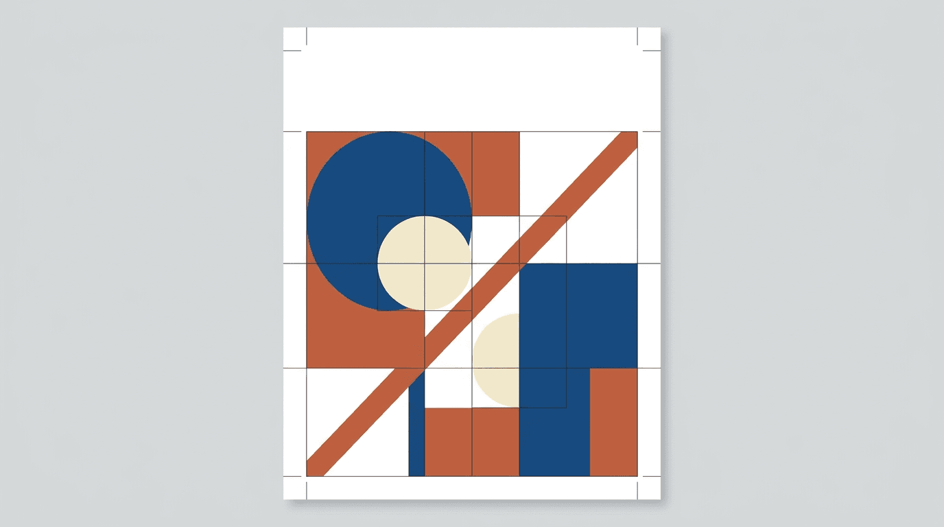
5. Creative and Design Newsletter
Design industry newsletters can demonstrate authority through their own visual design before a reader processes the content. A cover image that shows genuine design literacy in its composition and color relationships is itself a credibility signal.
Prompt
Bold graphic editorial newsletter cover background, precisely composed abstract geometric arrangement using overlapping circles, rectangles, and diagonal lines in a restrained three-tone palette of deep blue, warm terracotta, and pale cream on a clean white background, the shapes are placed using evident grid logic and classic proportion relationships creating visual tension through deliberate asymmetry, the composition has a strong Bauhaus and Swiss design tradition quality that communicates design literacy, white negative space in the upper portion of the frame for publication name text, no gradients no textures only flat precise geometric forms, editorial design and creative industry publication aesthetic, the image communicates visual intelligence and design authority through its own compositional structure, graphic design precision, no text no logos
6. Political Analysis and Current Affairs Newsletter
Political and current affairs newsletters build authority by connecting to the visual language of serious journalism and institutional accountability. Classical architecture communicates the weight of public institutions and the solidity of the systems being analyzed.
Prompt
Authoritative editorial newsletter cover background, close-up detail photograph of the capital and upper column shaft of a classical stone architectural column against a cool grey-blue overcast sky, the pale limestone surface showing age and the weight of institutional history, a single shaft of cold white light cutting across the column face from the left creating strong architectural shadow that reveals the carved detail quality, the composition is tightly cropped to emphasize the materiality of the stone and the precision of the classical stonework, cool grey-blue sky and pale weathered limestone tones, editorial political journalism publication aesthetic, open sky visible in the upper portion of the frame suitable for publication name text overlay, the image communicates institutional authority and the gravity of civic analysis, ultra-realistic stone surface texture and architectural detail rendering, no text no logos
7. Marketing and Growth Strategy Newsletter
Marketing and growth newsletters need to communicate strategic intelligence and evidence-based thinking. Imagery that suggests systematic forward momentum rather than excitement or hype better serves authority building in this professional niche.
Prompt
Sharp editorial newsletter cover background, abstract top-down aerial photograph of a formal garden or architectural plaza with strong geometric paths, hedgerows, or paving patterns creating a precise geometric grid that suggests planned systems and strategic design, the image is taken from directly above creating a flat graphic quality, the geometric pattern fills the frame with one strong diagonal element creating visual momentum, deep green and pale stone or warm terracotta tones, editorial strategic business publication aesthetic, the overhead perspective communicates systematic thinking and the ability to see the full structure of a problem, clear light or dark area in the upper portion of the frame suitable for newsletter name text, ultra-realistic aerial texture rendering, no text no logos
The Miraflow AI image generator lets you use image-to-image generation once you have a strong base cover concept, adjusting color palette, light quality, or compositional balance to create variations for different issues while maintaining a consistent visual identity across the series.
8. Science and Research Newsletter
Research and science newsletters build authority by communicating the precision and wonder of empirical discovery. Close-up natural geometry provides this by showing the mathematical precision underlying natural systems.
Prompt
Elegant scientific editorial newsletter cover background, extreme macro photograph of a natural mineral or crystal structure showing precise atomic lattice formation patterns, single warm directional light from the left side creating dramatic specular highlights along the crystal facets and casting deep shadows between the geometric planes, the crystal structure communicates both natural complexity and mathematical precision simultaneously, deep near-black background making the crystal geometry the sole luminous element in the frame, the crystal face pattern is highly specific and geometrically regular communicating natural law and scientific order, warm crystal mineral tone on a deep black background, editorial science and research publication aesthetic, clear dark area in the upper frame suitable for publication title text placement, ultra-realistic mineral crystal surface and facet light rendering, no text no logos
9. Startup and Venture Capital Newsletter
Startup and VC newsletters speak to an audience that values strategic perspective and the ability to see patterns at scale. Overhead architectural compositions communicate the investor's perspective of seeing the whole board rather than a single piece.

Prompt
Bold editorial newsletter cover background, high-altitude aerial photograph looking directly straight down into the geometric atrium or courtyard of a modern architectural complex, the overhead view reveals precise geometric shadow patterns cast by the structure onto the floor below, tiny human figures visible at the base providing scale, the composition creates a strong graphic quality through the pure geometry of architecture seen from above, cool grey-blue and warm stone tones with deep shadow geometry, editorial entrepreneurship and investment publication aesthetic, the overhead perspective communicates strategic overview and systems-level thinking, clear geometric area in the upper portion of the frame for newsletter title text, ultra-realistic architectural aerial rendering, no text no logos
10. Cultural Commentary and Arts Newsletter
Arts and culture newsletter authority comes from demonstrating connoisseurship: the ability to recognize and communicate quality in creative work. Using fine art material as visual subject positions the newsletter as operating at the level of serious cultural discourse.
Prompt
Refined editorial newsletter cover background, extreme close-up photograph of the surface of an oil painting on canvas, single raking warm side light from the left revealing the three-dimensional quality of thick impasto paint application, the brushstrokes show decisive mark-making in deep warm tones of raw sienna, burnt umber, deep ultramarine, and titanium white, the canvas weave texture visible in the thinner paint areas and the paint thickness building to significant relief in the heavy strokes, the composition is entirely abstract in the close-up, warm earth painting pigment tones on a canvas ground, editorial fine arts and cultural criticism publication aesthetic, clear area in the upper frame suitable for publication name text overlay, the image communicates aesthetic depth and curatorial authority through material quality, ultra-realistic oil paint surface and canvas texture rendering, no text no logos
11. Career and Professional Development Newsletter
Career and professional development newsletters build authority by communicating intentionality, growth orientation, and the specific aesthetic of purposeful professional life rather than generic office stock photography.

Prompt
Clean professional editorial newsletter cover background, aerial flatlay photograph of a minimal desk workspace on a light natural oak surface, a quality leather-bound notebook open to a blank page with a precise fine-line pen resting across it, a small geometric ceramic cup beside the notebook, a single stem of a simple botanical plant in a thin glass vase at the upper corner, soft natural window light from the upper left creating gentle directional texture across the leather and wood surfaces, the desk is deliberately spare with nothing unnecessary in the composition, warm natural oak and warm cream leather tones, editorial professional development publication aesthetic, generous empty space in the upper frame for newsletter title text, the image communicates professional intentionality and considered clarity of purpose, ultra-realistic leather notebook and wood grain surface texture rendering, no text no logos
12. Sustainability and Environmental Newsletter
Sustainability newsletters build authority by connecting to the scale and beauty of the natural systems they advocate for. Aerial landscape photography achieves this by communicating both the grandeur of the planet and the fragility of the systems within it.
Prompt
Powerful environmental editorial newsletter cover background, aerial landscape photograph of a dramatic coastal or river delta geography where deep blue ocean or clear river water meets pale sandy terrain creating a strong graphic boundary across the frame, the aerial perspective reveals the precise geometry of natural landforms and water channels creating an abstract quality at altitude, the water shows deep rich tonal blues and the land shows warm pale natural tones, the composition communicates natural scale and the systemic interconnectedness of earth's physical geography, deep ocean blue and warm pale earth tones, editorial environmental and sustainability publication aesthetic, clear tonal area at the upper frame edge suitable for publication name text, the image communicates environmental authority through the scale and beauty of natural systems rather than through alarm or urgency, ultra-realistic aerial landscape water and terrain rendering, no text no logos
13. Food Industry and Hospitality Professional Newsletter
Food industry professional newsletters, as distinct from consumer food publications, need a more austere and technically serious visual language. The authority signal is professional kitchen precision rather than lifestyle cooking aspiration.

Prompt
Sophisticated culinary industry editorial newsletter cover background, close-up side profile photograph of a skilled hand gripping a professional chef's knife in a precision cutting grip with visible knuckle curl over the blade, the hand is photographed against a dark professional kitchen counter background, single focused warm overhead light creating a dramatic highlight on the blade upper face and the knuckles, deep dark professional kitchen tones with warm skin tone and bright blade highlight, editorial professional culinary industry publication aesthetic, the composition communicates professional skill and culinary precision at an industry rather than consumer level, clear dark area in the upper frame for publication title text, ultra-realistic blade steel and skin texture rendering, no text no logos
14. Personal Brand Thought Leadership Newsletter
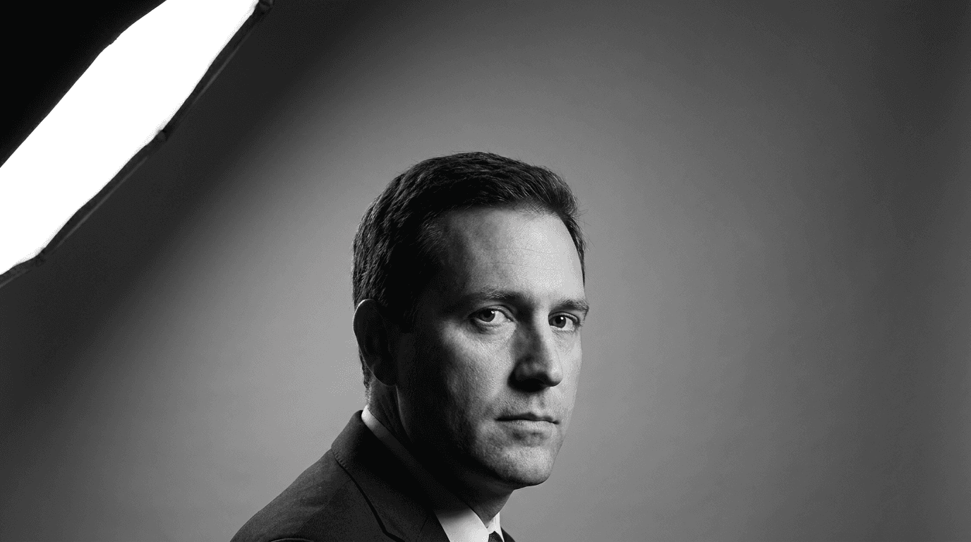
Personal brand newsletters build authority through the editorial portrait aesthetic of premium ideas publications. The visual language needs to communicate that the person behind the newsletter is someone whose thinking is worth dedicated attention.
Prompt
Premium personal brand editorial newsletter cover background, dramatic black and white studio portrait of a professional figure photographed from the upper chest upward, single strong Rembrandt-style studio key light from a 45-degree upper left angle creating precise facial modeling with a distinctive triangular cheek shadow on the shadow side, a clean mid-grey studio background, the figure is positioned at a three-quarter angle with a direct camera gaze and a composed, intellectually neutral expression, the portrait has the specific visual weight and gravitas of editorial portraits in premium business and ideas publications, editorial thought leadership portrait photography aesthetic, the composition is tight but not claustrophobic with clear tonal gradient space in the upper frame for publication title, ultra-realistic black and white tonal rendering with precise studio light modeling, no text no logos
15. Universal Newsletter Cover Authority Template
This flexible foundation prompt works for any newsletter niche or content category not covered by the prompts above. Replace each bracketed section with your specific publication positioning and visual direction.
Prompt
[Describe the core conceptual or thematic visual subject that represents your newsletter's area of expertise, for example: precision instrument, natural system, architectural form, abstract data visualization, fine art material, or deliberate still life] as the primary visual subject of an editorial newsletter cover background, [describe the lighting quality: single directional warm studio light, cold architectural natural light, soft even diffused natural light, dramatic single overhead spotlight], [describe the background: deep near-black for drama and authority, clean white for precision and clarity, muted natural tone for warmth and expertise, deep navy for institutional gravitas], the composition places the visual subject in the lower two thirds of the frame leaving a clear tonal zone in the upper portion for newsletter title and issue date text overlay, [describe the color palette: two or three specific tones that communicate the authority register of your professional niche], editorial [name your niche] publication aesthetic, the image communicates expertise and credibility through visual precision and intentional composition, ultra-realistic material and surface texture rendering, no text no logos
Tips for Building Authority Through Cover Image Consistency
Develop a Visual Template System Across Issues
The most powerful authority-building effect of newsletter cover imagery comes not from any single outstanding image but from the consistent application of a recognizable visual system across many issues over time. When subscribers see your newsletter arrive in their inbox and immediately recognize its visual identity before they read the subject line, you have achieved the same brand recognition that major publications spend decades building.
Define a consistent set of visual rules that apply across every issue: a consistent color palette range, a consistent compositional approach, a consistent text zone placement, and a consistent level of visual abstraction. The content of the cover image can change with each issue to reflect the theme of that edition, but the visual system governing how that content is presented should remain constant.
Building this system with AI image generation is practical because you can develop a core set of two or three authority prompt templates for your newsletter and then generate variations of each for different issue themes. The consistency comes from the shared visual DNA of the prompts rather than from using the same image repeatedly.
Choose Abstraction Level Strategically
The level of abstraction in your cover imagery communicates something about your relationship to your content. Very literal, direct imagery, a photograph of a specific person or event, communicates reporting and documentation. Highly abstract imagery, geometric patterns, digital visualizations, close-up material details, communicates conceptual depth and ideas-level thinking.
Most authority-building newsletter covers sit at a middle level of abstraction: imagery that is clearly connected to a conceptual domain rather than a specific event, but that has enough visual specificity to communicate a distinct sensibility. The compass for finance, the crystal for science, the architectural column for political analysis, all operate at this level of productive specificity.
Control Color Palette for Tonal Consistency
Color is the primary carrier of brand identity in newsletter cover imagery because it is recognized faster than composition or subject at the small sizes and quick scroll speeds of email preview contexts. Developing a signature color palette for your newsletter, two or three specific tones that appear consistently across all covers, is one of the most effective ways to build the visual recognition that underpins authority over time.
Specifying your exact palette in every prompt using descriptive color language like "deep navy blue," "warm aged brass gold," and "cool pale limestone grey" rather than generic terms produces consistent color results across multiple generations and establishes the visual identity across the issue series.
Reserve Space for Text Thoughtfully
Every newsletter cover needs to work as a functional layout with text overlaid on the generated image. The most common mistake is generating a visually compelling image that has no clean tonal area for the publication name to sit legibly. Specifying the text zone in every prompt, including its position in the frame and the tonal quality needed for text legibility, ensures every generated image is practically usable as a newsletter cover rather than just visually attractive.
For most newsletter layouts, text sits in the upper third or upper half of the cover image. Specifying "clear [dark or light] tonal area in the upper [third or half] of the frame suitable for white/dark text overlay" in every prompt solves this layout requirement at the generation stage rather than after.
Email Client Rendering Considerations for Newsletter Cover Images
Newsletter cover images operate within a specific technical context that is different from every other image format discussed in this prompt library, and understanding the constraints of that context helps you generate images that perform well in practice rather than just in preview.
Email clients render images differently. Outlook, Gmail, Apple Mail, and mobile email clients all handle image rendering with varying quality. Images with very fine detail, subtle gradients, or complex color gradations can appear slightly different across clients. The most robust newsletter cover images use bold compositions with strong tonal contrast and clear visual hierarchy rather than relying on subtle detail that may not survive inconsistent rendering.
Image width and compression affect quality. Standard newsletter cover images are typically 600 pixels wide for desktop email clients and 375 to 390 pixels wide for mobile. At these sizes, fine details compress and disappear. Bold, clear, strongly composed images communicate their authority signal effectively at small sizes. Intricate, detail-dependent images lose their character when compressed.
Many email clients block images by default. A significant percentage of email opens happen with images turned off, which means the cover image is invisible until the reader enables it or clicks through. For this reason, newsletter cover images should enhance and amplify authority rather than being the sole carrier of it. The publication name, subject line, and first visible text in the email all need to carry the authority signal independently of whether the image loads.
Image file size affects deliverability. Very large image files can trigger spam filters or cause slow load times that reduce engagement. Generating cover images at a maximum width of 1200 pixels and compressing appropriately ensures the visual quality is maintained without creating deliverability issues.
Building a Complete Newsletter Content Ecosystem
A newsletter cover image is the visual anchor of a content brand that can extend well beyond the email format itself. The Miraflow AI platform provides the tools to turn a newsletter visual identity into a complete multimedia content ecosystem.

The Cinematic AI Video Generator on Miraflow AI lets you extend the visual concept from your newsletter cover into short video content for social media promotion. A slow atmospheric push into the cover image concept, a cinematic visualization of the issue theme, or a brief visual identity piece that accompanies the newsletter announcement post all create a richer brand presence for newsletter promotion on social platforms.
Many of the most successfully growing newsletters drive subscriber acquisition primarily through short-form social content, and Text2Shorts on Miraflow AI generates complete vertical short videos from a topic description in a single workflow. Teaser content around issue themes, subscriber value propositions, and thought leadership content clips all perform consistently well for newsletter growth on TikTok, Instagram Reels, and YouTube Shorts.
For newsletter creators who also produce YouTube content around their area of expertise, the YouTube Thumbnail Maker on Miraflow AI lets you apply the same authority visual aesthetic from your newsletter cover identity to your video thumbnails. Consistency between the newsletter visual language and the YouTube channel visual language creates a cohesive personal brand presence that reinforces authority across every platform where your audience encounters your work.
Creators producing podcast or video essay content alongside their newsletter can use AI Clipping on Miraflow AI to automatically identify the most compelling and quotable moments from longer recordings, crop them with animated captions for vertical format, and distribute them across social platforms. This turns a single long-form content production into multiple social assets that drive newsletter discovery and subscriber growth.
For newsletter brands that use video content for their archive or subscriber community, background music quality contributes to the overall perceived production value of the content. The AI Music Generator on Miraflow AI produces original tracks in any described style in under a minute, allowing creators to generate authority-appropriate background music that matches the visual tone of their newsletter brand.
The Miraflow AI blog covers prompt strategies, visual content approaches, and brand building techniques for creators and brands in depth, which is useful alongside this prompt library for developing a complete newsletter authority building strategy.
Common Mistakes That Undermine Newsletter Cover Authority
Using generic stock photo aesthetics. The most common authority-destroying mistake in newsletter cover imagery is selecting a photo that looks like it came from a standard stock library. Generic handshake photos, vague skyline silhouettes, and obvious metaphor photos like lightbulbs for ideas all communicate the opposite of authority because they signal that no specific creative thinking went into the visual choice. The prompts in this list are specifically designed to avoid this register by using material detail, conceptual precision, and niche-specific visual language that cannot be mistaken for generic stock.
Choosing imagery that conflicts with the niche visual vocabulary. A technology newsletter with warm, organic, nature-forward imagery, or a wellness newsletter with cold architectural imagery, creates a dissonance between the visual language and the audience's expectations for their niche. The authority signal depends on using the visual vocabulary that the specific professional community associates with credibility.
Overloading the image with visual complexity. Authority communicates through restraint as much as through quality. An image that tries to include too many elements, too many colors, or too much detail competes with itself for attention and communicates visual indecision. Every prompt in this list uses a limited palette and a single clear visual subject for this reason.
Ignoring the text zone requirement. An image that is beautiful but has no clear space for the publication name to sit legibly is unusable as a newsletter cover in practice. Every prompt in this list includes a text zone specification, and checking this requirement at the generation stage prevents the frustration of generating a strong image that cannot be used without heavy text overlay.
Changing visual direction between issues without a system. Inconsistent imagery across issues, where each cover looks unrelated to the previous one, undermines the brand recognition that is the primary authority-building benefit of consistent cover imagery. Using a defined prompt system rather than generating each issue independently produces the visual consistency that builds recognition over time.
How to Build a Newsletter Cover Template System
The most practical approach for newsletter creators using this prompt library is to build a personal cover template system rather than selecting a single prompt and using it forever.
Start by identifying two or three prompts from this list that best match your newsletter's niche and authority positioning. Generate five to eight variations of each prompt and evaluate which ones best represent your brand's visual identity. Select one or two as your core cover templates for the first quarter of the year.
From these core templates, develop a variation system. The core template defines the visual treatment: background, lighting, color palette, and compositional approach. The variation comes from the specific subject matter within that treatment. For a technology newsletter, the core template might always use the dark background with electric blue digital visualization, but the specific visualization subject can shift from neural networks to data grids to geometric fractal structures across different issues.
This approach produces a visual system that is consistent enough to build brand recognition but varied enough to feel fresh with each issue, which is the visual publishing rhythm that the most authoritative newsletters maintain.
The AI image generator on Miraflow AI makes this systematic generation practical because you can develop your core templates, save the exact prompt text, and then generate issue-specific variations by adjusting only the visual subject within the established treatment framework.
FAQ
What image dimensions work best for newsletter cover images?
Standard newsletter cover image width is 600 pixels for full-width desktop display, though some templates use 560 or 580 pixels with side padding. Height is variable, but most newsletter covers use a landscape 16:9 or 2:1 ratio for a horizontal banner, or a portrait 3:2 or 4:3 ratio for a taller visual. The most important consideration is that the image is generated at a minimum of 1200 pixels on the longest edge and then scaled down for email use, which ensures quality even after compression.
How do I make sure my cover image looks good in dark mode email clients?
Dark mode rendering in email clients can invert or adjust image colors in unexpected ways. The safest approach is to test your generated cover image in both light and dark mode previews before using it in production. For newsletter covers that use dark backgrounds as a design element, like the technology and political analysis prompts in this list, dark mode rendering typically maintains the design intent well. Covers with white or very pale backgrounds are most susceptible to dark mode rendering changes.
How often should I create a new cover image for my newsletter?
For weekly newsletters, updating the cover image with each issue creates the visual freshness signal that communicates an active, invested editorial operation. For bi-weekly or monthly newsletters, a cover image that changes with each issue is even more important as a quality signal because the longer gap between issues means each open needs to immediately communicate that something new and valuable has arrived. Using a consistent template system makes this practical even at high publication frequency.
Can I use these cover images for newsletter landing pages and social media as well?
Yes. Newsletter cover images designed for email use work equally well as social sharing assets, landing page hero images, and promotional content for subscriber acquisition. Generating the cover image at a high base resolution gives you the flexibility to crop and adapt it for different format requirements across platforms. The AI image generator on Miraflow AI produces images suitable for multi-platform use across email, web, and social media contexts.
How do I add my newsletter name text to these generated images?
Once you have generated your cover image, you can add your publication name, issue number, and other text elements using any graphic design tool. Free browser-based options including Canva, Adobe Express, and Figma all let you upload the generated image and add typography layers on top of it. For consistent typography treatment across issues, creating a template in your chosen design tool with your publication's font and color specifications applied saves significant production time.
What makes a cover image feel authoritative rather than just well-designed?
The authority signal comes from three things working together: niche-appropriate visual language, compositional precision, and conceptual relevance. An image that uses the correct visual vocabulary for its professional domain, that has been composed with evident care and intention, and that has a meaningful conceptual relationship to the content it represents communicates authority. An image that is technically well-executed but uses generic or niche-inappropriate visual language fails the authority test even if it is technically beautiful.
How do I maintain visual consistency if I change my newsletter's design template or color scheme?
When updating a newsletter's overall design, update the core cover image prompt templates at the same time to reflect the new color palette and visual direction. Generate a complete set of issue covers for the first month or quarter under the new system before launching, so you have assets ready and can evaluate whether the new visual identity is consistent before subscribers see it. A soft launch with the new visual identity, applied to one or two issues before a full rollout, helps identify any inconsistencies in the new system before they become established patterns.
Can a newsletter cover image double as a social media graphic for newsletter promotion?
Yes, and this is one of the most practical uses of a strong newsletter cover image. The same image can be posted to Instagram, LinkedIn, and Twitter as a preview of the new issue, used as a Pinterest graphic for newsletter content discovery, and applied as the cover image in newsletter recommendation platforms. Generating the cover image at a 1:1 square crop in addition to the standard landscape or portrait newsletter format gives you a social-ready version alongside the email-ready version in a single generation session.
Conclusion
Newsletter cover images that build authority are not just visually attractive. They are doing specific, functional work: communicating niche expertise, signaling editorial investment, establishing brand recognition across repeated opens, and setting the expectation of quality that converts occasional readers into committed subscribers. The 15 prompt templates in this post cover the most important newsletter niches and authority visual languages, from business leadership and technology to personal finance, wellness, political analysis, cultural commentary, and personal brand thought leadership.
The principles behind every authority-building cover image are consistent: use the visual vocabulary that your specific professional niche associates with credibility, apply compositional restraint and precision, develop a template system that creates recognition across issues, and ensure the image always functions practically as a layout with a clear text zone for publication identity.
All of these prompts work directly in the AI image generator on Miraflow AI, where text-to-image generation creates new cover concepts from scratch, image-to-image workflows apply authority aesthetics to issue-specific visual concepts, and inpainting refines specific elements like color temperature or compositional balance after generation. From there, the full Miraflow AI platform extends your newsletter visual identity into social media video content, short-form subscriber acquisition content, YouTube thumbnails, and promotional music, building a complete authority publishing ecosystem around the newsletter brand you are developing.