AI Prompts for Podcast Cover Art That Gets Clicks: 15 Templates (Copy & Paste)
Written by
Jay Kim

15 copy-paste AI prompts for podcast cover art that gets clicks. Covers true crime, business, wellness, comedy, tech, history, and more with ready-to-use templates.
Your podcast cover art is working before a single person presses play. On every major platform, including Spotify, Apple Podcasts, and Pocket Casts, listeners are scanning rows of thumbnails and making split-second decisions about which show deserves their attention. A cover that does not immediately communicate what the show is about, what kind of person hosts it, and whether it belongs in that listener's world gets scrolled past without a second look.
Most podcast cover art fails at this job because it tries to be too clever, too busy, or too generic. The covers that consistently earn clicks use clear visual language, bold composition, and genre-specific aesthetic cues that speak directly to the target listener before they have read a single word of the show description.
This post gives you 15 ready-to-use AI prompt templates for podcast cover art across the most popular genres, from true crime and business to wellness, comedy, technology, and history. Every prompt is designed to generate a strong visual background that you can add your show title and host name to using any text tool, and it is written to produce results that work at both large display sizes and the small thumbnail sizes you encounter in podcast platform feed views.
You can generate all of these directly in the AI image generator on Miraflow AI without any setup or software installation.

What Makes Podcast Cover Art Actually Get Clicks
Before getting into the prompts, it helps to understand the specific visual logic that drives click behavior on podcast platforms, because this is different from other types of image design.
Podcast covers live primarily at small sizes. On Spotify and Apple Podcasts, most discovery happens through search results, category listings, and recommendation rows where covers display at roughly 50 to 80 pixels wide. At that size, fine detail disappears entirely and only bold shapes, strong color contrast, and clear composition survive. A cover that looks beautiful at full size but relies on intricate details or small text to communicate its message will be invisible at the sizes that matter most for discovery.
Genre recognition is faster than reading. Before a potential listener reads your show name, they are already reading the visual language of your cover. True crime audiences recognize dark, high-contrast, investigation-style visuals immediately. Business podcast listeners are accustomed to clean, confident, high-contrast covers with bold typography potential. Comedy listeners expect energy, color, and personality. This genre-visual vocabulary is well established, and working with it rather than against it is one of the fastest ways to reach the right audience.
Color does most of the work at small sizes. When a cover is displayed at 60 pixels, color is the primary surviving signal. A distinctive color combination, a bold color-on-color contrast, or a single dominant color that stands out from the surrounding row of thumbnails all contribute to click-through. Many of the most successful podcast covers use one strong primary color as their visual anchor.
Text must be legible at thumbnail scale. The show name on your cover art needs to be readable at small sizes, which means the visual background behind it needs to provide sufficient contrast and clear space. The best podcast cover backgrounds leave a readable contrast zone where white or black text can sit without competing with the image. This is one of the key differences between podcast cover art prompts and other types of image prompts.
Understanding these principles changes what you specify in a prompt. Rather than asking for a beautiful image, you are asking for a bold, clear, genre-specific composition that supports text overlay and communicates the show's identity at thumbnail scale.
Technical Requirements to Keep in Mind
Podcast platforms have specific technical requirements for cover art, and knowing these helps you understand why certain prompt decisions matter more for this format than for other types of image generation.
Most platforms require a minimum image size of 1400x1400 pixels and recommend 3000x3000 pixels for the best display quality across all devices. The format is always square, which means your AI generation should target a 1:1 aspect ratio.
The dominant text contrast requirement is also worth building into your prompts. Your show title and host name will be added to the image, so the visual composition needs to create a readable zone for text. This usually means either a clean dark area at the top or bottom of the image, a solid-color band across part of the composition, or a consistent background tone that provides enough contrast for legible text overlay.
According to Apple Podcasts artwork requirements, cover art must be a square JPEG or PNG image with a minimum resolution of 1400x1400 pixels, representing your show accurately and complying with their content policies.
15 AI Prompt Templates for Podcast Cover Art
1. True Crime Podcast
True crime is one of the most competitive podcast categories on every platform, which means the visual language needs to work hard to stand out. The best true crime covers use dark, high-contrast imagery that communicates investigation, tension, and unresolved mystery.
Prompt
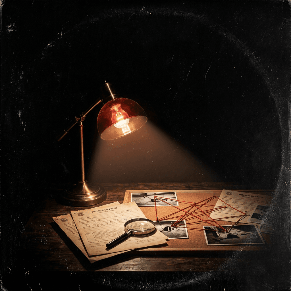
Dark cinematic podcast cover art background, single vintage desk lamp casting a warm cone of light on a dark wooden surface covered with scattered crime scene documents, photographs, and red string connections, the surrounding darkness is deep and atmospheric with no detail in the shadows, vintage gritty texture overlay on the entire image, blood red accent color in the lamp light, dark charcoal and near-black tones with warm amber in the light zone, clear dark upper area suitable for white text overlay, bold dramatic composition with strong light-dark contrast, editorial investigative true crime aesthetic, ultra-realistic photography quality, no text no logos, square 1:1 format
2. Business and Entrepreneurship Podcast
Business podcasts need to communicate authority, ambition, and forward-thinking energy. The visual language is bold, confident, and premium without being cold. High contrast and strong geometric compositions work well in this category.
Prompt
Clean bold podcast cover art background, dramatic upward perspective shot of a modern glass and steel skyscraper against a deep navy blue sky with a single bright sun flare at the upper frame edge, strong geometric lines of the building creating dynamic diagonal energy, deep navy and warm gold tones, cloud detail in the sky above the building, strong center-weighted composition with the building vertically dominant, clear dark sky area at the top suitable for white text overlay, professional business brand aesthetic, ambitious and authoritative visual energy, ultra-realistic architectural photography quality, no text no logos, square 1:1 format
3. Wellness and Mindfulness Podcast
Wellness podcast covers need to communicate calm, intention, and a sense of elevated living without feeling cold or clinical. Natural light, botanical elements, and soft palettes are the visual vocabulary of this category.
Prompt
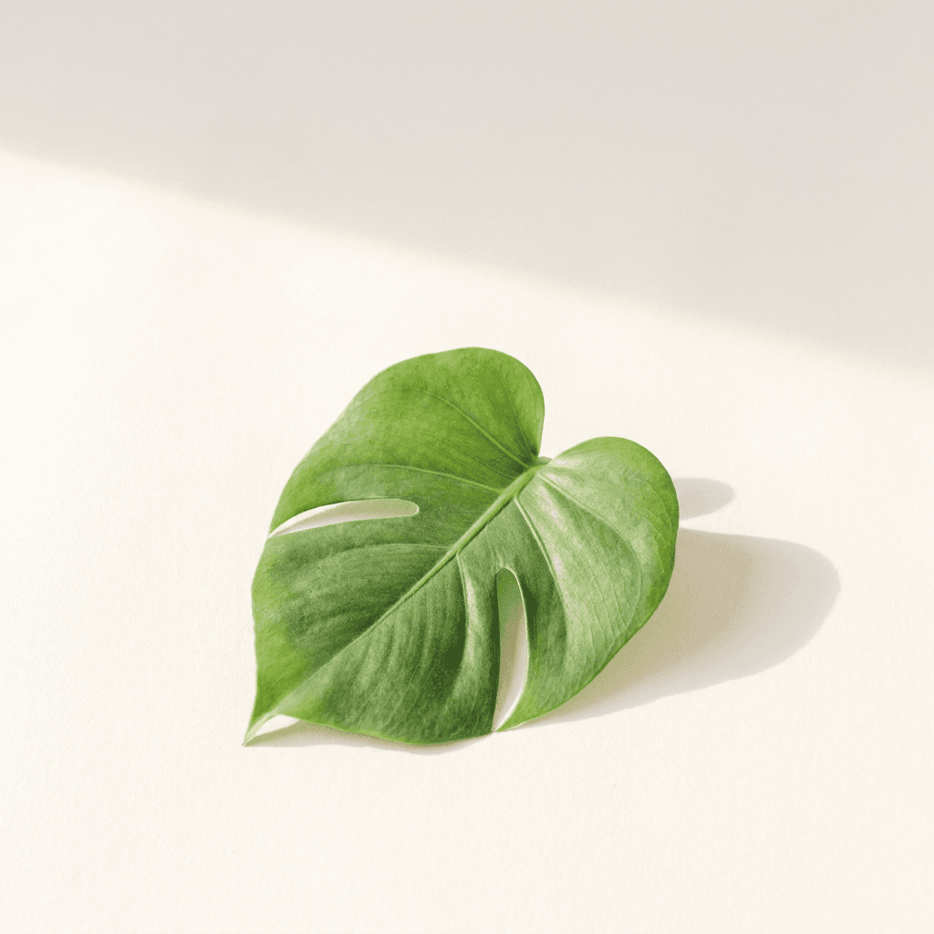
Soft bright podcast cover art background, aerial view of a single green tropical leaf on a clean white surface, soft natural morning light casting a gentle diffused shadow to the right, warm cream and fresh botanical green tones, minimalist composition with the leaf slightly off-center and generous white negative space above for text placement, ultra-realistic leaf vein and surface texture detail, calm and intentional visual atmosphere, editorial wellness brand aesthetic, bright airy soft quality to the light, no harsh shadows, professional wellness podcast cover aesthetic, no text no logos, square 1:1 format
4. Comedy Podcast
Comedy podcast covers need personality, energy, and a sense of fun that communicates immediately at thumbnail scale. Bold colors, expressive compositions, and a slightly irreverent quality distinguish good comedy covers from the more serious visual language of adjacent categories.
Prompt
Bold vibrant podcast cover art background, an abstract explosion of bright confetti shapes, paint splashes, and geometric color bursts in electric yellow, cobalt blue, coral red, and white against a clean white background, the elements radiate outward from a central focal point creating kinetic energy and movement, generous empty center zone for overlaid show title text, some confetti elements overlapping the center zone but leaving sufficient contrast for dark text, bold graphic illustration style, playful and high-energy visual character, poster-quality graphic design aesthetic, bright and saturated color palette, no text no logos, square 1:1 format
5. Technology and AI Podcast
Technology and AI podcasts occupy a wide visual spectrum, but the most effective covers use imagery that communicates intelligence, systems thinking, and a sense of being on the frontier of what is happening. Digital, clean, and forward-facing visuals dominate the category.

Prompt
Dark futuristic podcast cover art background, abstract digital neural network visualization with glowing electric blue and cyan node connections spreading across a deep black background, the nodes and connections form a loose sphere or brain-like structure at the center of the composition, subtle code or data stream elements visible at the frame edges in muted dark tones, bright electric blue and deep black color palette, central composition with clear dark surrounding negative space suitable for white text overlay, cinematic digital technology aesthetic, ultra-detailed light glow and particle effects on the nodes, professional technology brand visual quality, no text no logos, square 1:1 format
6. History and Storytelling Podcast
History podcasts benefit from visual imagery that communicates depth, time, and the weight of significant events. Vintage aesthetic treatments, aged textures, and warm editorial tones are the visual language of this category.
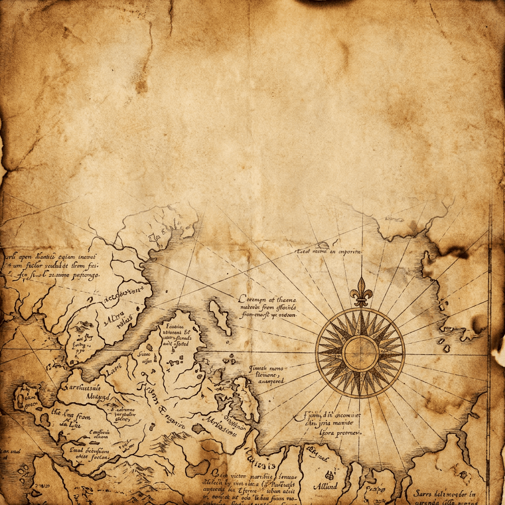
Prompt
Rich vintage editorial podcast cover art background, aged antique map detail close-up filling the frame with sepia ink lines showing coastlines, compass rose, and cartographic text markings, subtle burn and age marks at the map edges, warm amber and deep brown tones with one accent of dark red or aged gold at the compass rose detail, the aged paper texture is the dominant surface throughout the composition, clear aged paper area in the upper portion suitable for dark brown or black text overlay, editorial antiquarian aesthetic, ultra-realistic aged paper and ink texture rendering, scholarly and evocative visual character, no modern elements, no text no logos, square 1:1 format
The YouTube Thumbnail Maker on Miraflow AI uses a similar visual composition logic to podcast cover art, since both formats require bold imagery that communicates clearly at small display sizes. If you are creating both podcast covers and YouTube content for your show, you can maintain a consistent visual identity across both platforms using the same image generation workflow.
7. Sports and Performance Podcast
Sports podcast covers need to communicate energy, competition, and physical intensity. Dynamic lighting, motion blur, and bold high-contrast imagery are characteristic of the visual language that sports audiences recognize and respond to.
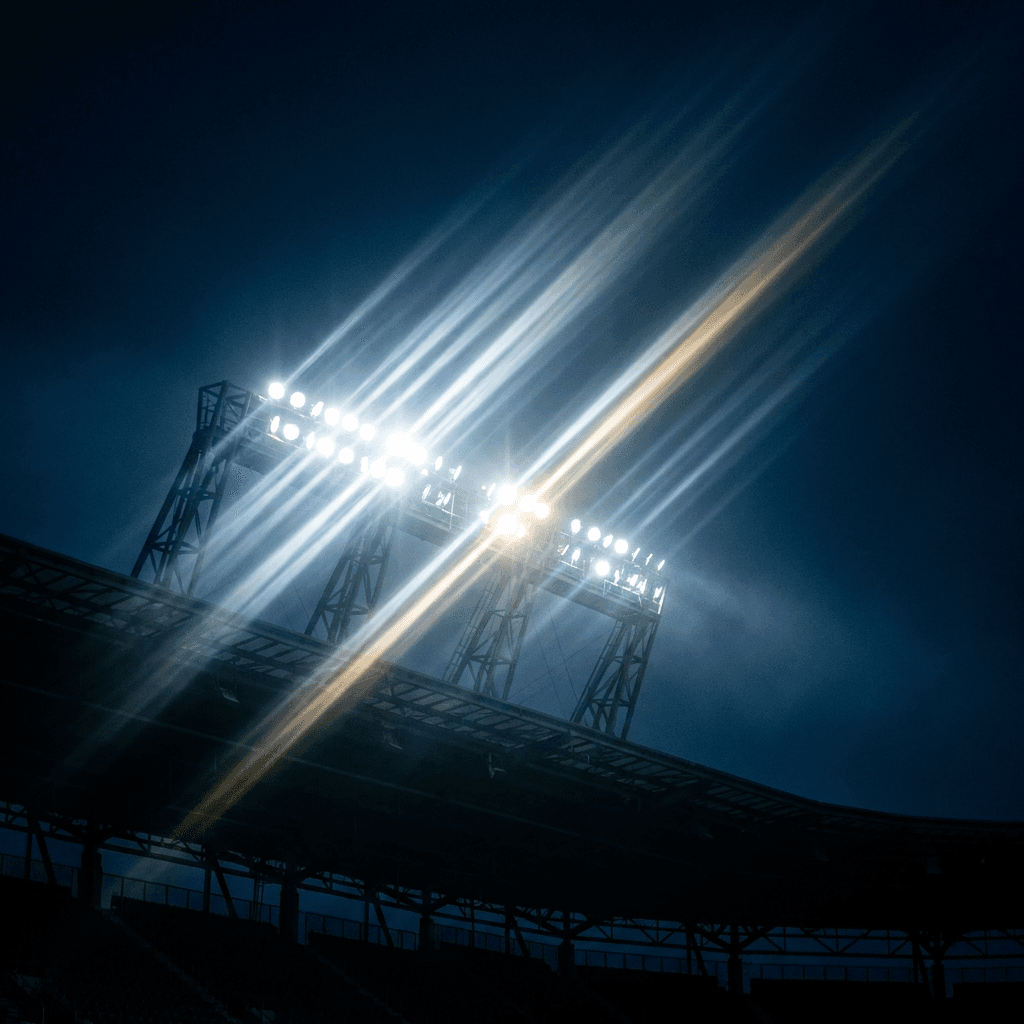
Prompt
High-energy cinematic podcast cover art background, dramatic close-up of stadium floodlights from a low angle looking upward, bright white light rays beaming outward from the lights against a deep dark navy sky, the stadium structure partially visible in the lower frame as a bold silhouette, electric white and deep navy tones with one gold accent in the light rays, strong upward diagonal energy in the composition, clear dark sky area in the upper portion suitable for white text overlay, cinematic stadium photography quality, the image communicates scale and spectacle, motion-charged visual atmosphere, professional sports brand visual aesthetic, no text no logos, square 1:1 format
8. Personal Finance and Money Podcast
Finance podcast covers walk a line between communicating aspiration and communicating trust. The most effective covers in this category use clean, confident visuals that feel premium rather than flashy and authoritative rather than intimidating.
Prompt
Clean aspirational podcast cover art background, overhead flatlay close-up of a simple leather notebook, a quality pen, and a single gold coin or abstract golden geometric shape on a dark charcoal textured surface, single directional spotlight from the upper left creating a professional dramatic shadow, deep charcoal and warm gold tones, minimal composition with generous dark negative space in the upper half suitable for white or gold text overlay, financial planning and aspiration visual language, editorial business publication aesthetic, ultra-realistic leather texture and gold material rendering, authoritative and refined visual character, no charts no numbers no logos no text, square 1:1 format
9. Horror and Paranormal Podcast
Horror and paranormal podcasts need covers that signal their genre immediately to their audience while standing out in what is a genuinely crowded category. Atmosphere, darkness, and a sense of unease are more effective than explicit horror imagery.
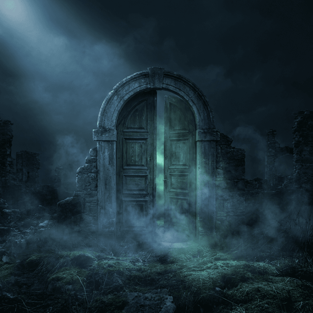
Prompt
Dark atmospheric podcast cover art background, abandoned stone doorway or old wooden door slightly ajar in the center of the frame, thick supernatural fog and mist filling the space beyond the door and spilling forward toward the viewer, single cold moonlight from above illuminating the top of the doorway and casting deep blue-grey shadows, deep black and cold blue-grey tones with a faint greenish supernatural glow visible through the gap in the door, clear dark foreground area in the upper frame suitable for white text overlay, eerie atmospheric horror aesthetic, cinematic supernatural thriller quality, ultra-realistic fog and stone texture rendering, a sense of dread created through atmosphere rather than explicit imagery, no text no logos, square 1:1 format
10. Motivational and Self-Help Podcast
Motivational podcasts need covers that communicate energy, upward momentum, and the possibility of transformation. The visual language should feel empowering and aspirational rather than preachy or clinical.
Prompt
Bold uplifting podcast cover art background, dramatic wide landscape of a mountain peak at golden sunrise, the summit emerging above a sea of soft clouds lit from below by warm amber and orange sunrise light, single bright sun or sun glow at the horizon line creating strong warm backlight, deep blue sky transitioning to warm gold at the horizon, the composition is vertical with the peak in the lower two thirds and clear bright sky in the upper portion suitable for dark or white text overlay, cinematic landscape photography quality, ultra-realistic cloud and mountain texture detail, the image communicates scale, achievement, and the feeling of a breakthrough moment, professional motivational brand visual, no text no logos, square 1:1 format
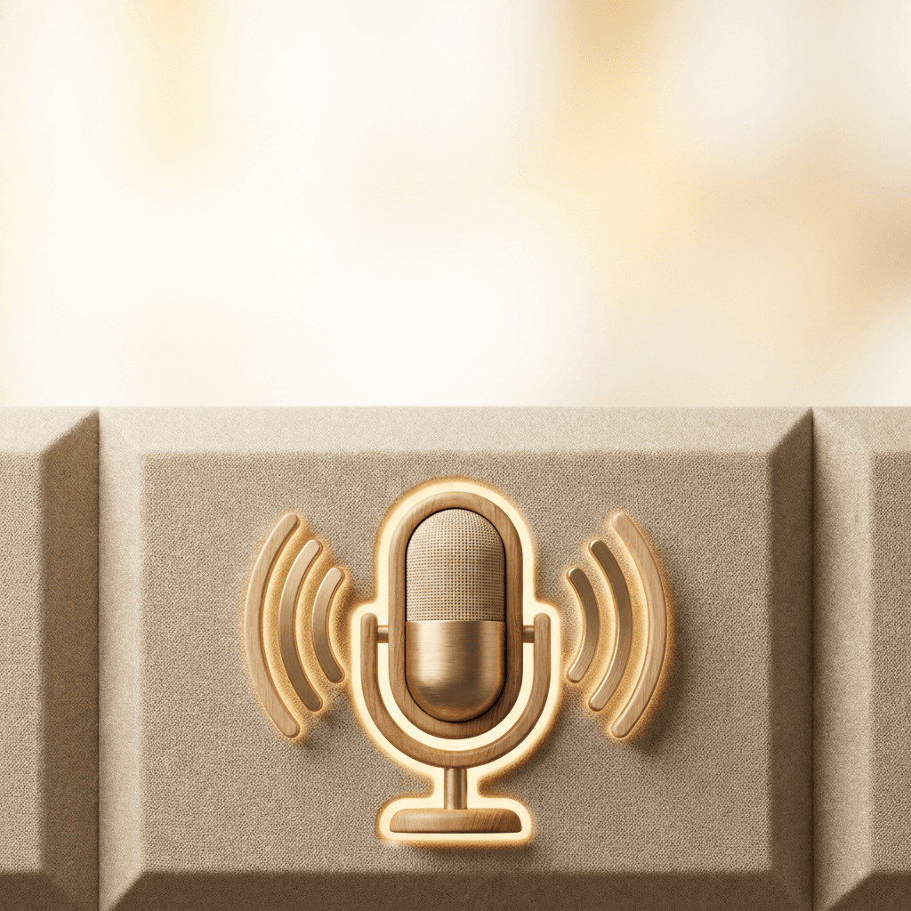
11. Interview and Conversation Podcast
Interview podcasts where the format itself is the brand benefit from cover art that communicates warmth, access, and a sense of being in the room with interesting people. Visual representations of conversation, space, and human connection work well in this category.
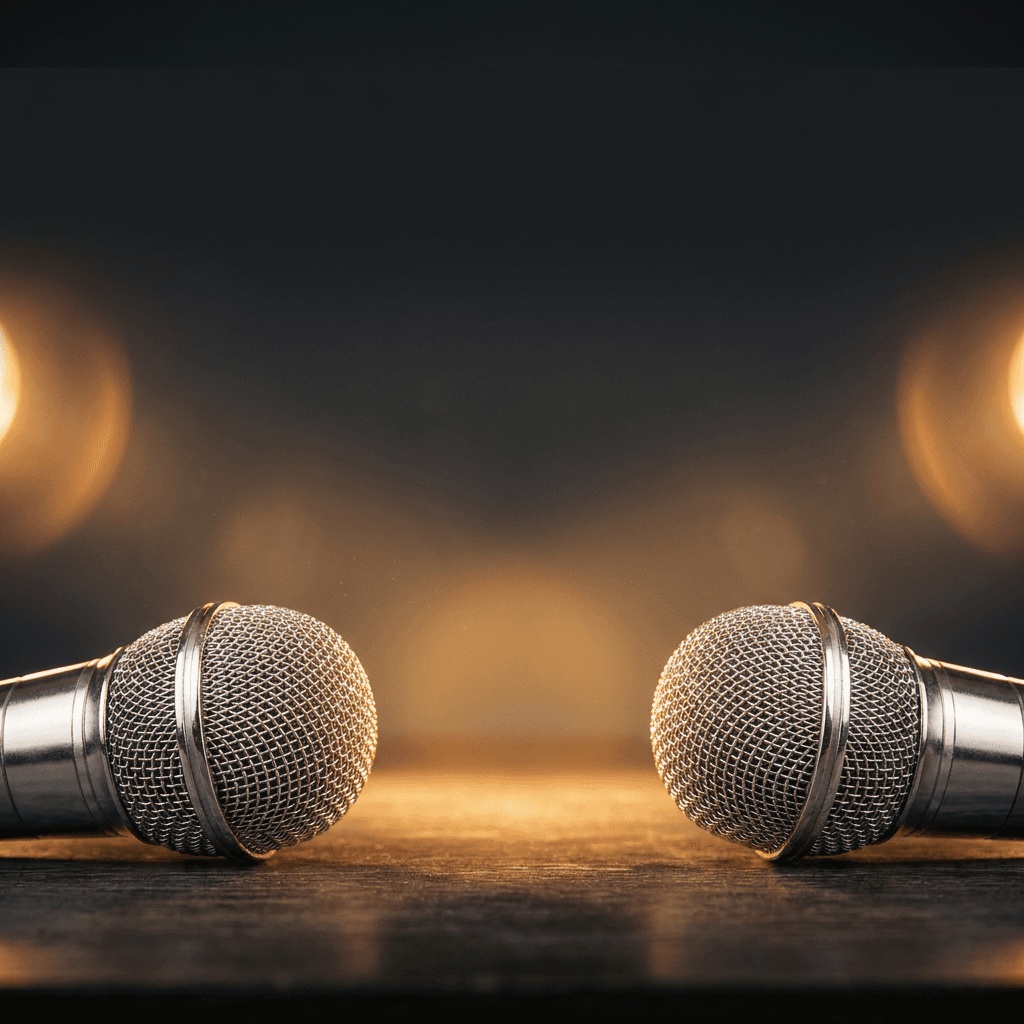
Prompt
Warm editorial podcast cover art background, close-up of two vintage microphones facing each other on a dark studio desk surface, warm studio spotlights creating a soft amber glow around each microphone with the area between them brightly lit, the dark studio background fades to black at the frame edges, warm amber and deep charcoal tones, the composition of the two microphones facing each other communicates dialogue and conversation, clear dark upper frame area suitable for white text overlay, editorial radio and audio studio aesthetic, ultra-realistic metal microphone chrome and mesh texture detail, intimate and inviting visual atmosphere, professional podcast brand quality, no text no logos, square 1:1 format
All of these prompts are optimized for the AI image generator on Miraflow AI, where you can generate multiple variations and use image-to-image workflows to refine the composition, adjust colors to match your brand, or change elements like the surface material or background tone without rebuilding the prompt from scratch.
12. Education and Learning Podcast
Education podcasts benefit from covers that feel organized, bright, and curious rather than academic or institutional. The visual language should communicate intellectual energy and accessibility rather than textbook seriousness.
Prompt
Bright clean podcast cover art background, overhead flatlay of an open illustrated atlas or detailed reference book on a warm natural wood surface, a single sharpened pencil and small geometric yellow ruler placed precisely beside the open pages, soft even natural light from above, warm natural wood tones with clean cream paper and a bold yellow accent element, minimal composition with the book centered and generous warm wood surface visible around it for text placement context, modern editorial education brand aesthetic, ultra-realistic paper texture and wood grain surface detail, curious and intellectually energetic visual character, bright and inviting rather than formal or institutional, no text no logos in the image itself, square 1:1 format
13. News and Current Events Podcast
News podcasts need to communicate immediacy, authority, and relevance. The visual language should feel urgent and credible without being overwhelming. Strong graphic compositions and confident color choices work best in this category.
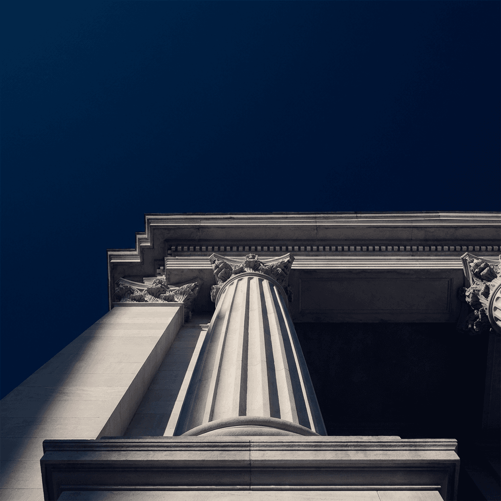
Prompt
Bold authoritative podcast cover art background, dramatic low angle view of a large classical stone column or architectural facade against a deep dark navy blue sky, the stone is pale and clean with precise architectural detail, a single shaft of bright white light cutting diagonally across the column from one side creating strong architectural shadow, deep navy blue sky occupying the upper half of the frame, pale stone and deep navy tones with no other colors in the composition, the image communicates authority and institutional weight, clear dark navy upper area suitable for white text overlay, editorial news publication aesthetic, architectural photography quality with precise tonal control, bold and credible visual impression, no text no logos, square 1:1 format
14. Travel and Adventure Podcast
Travel podcast covers need to communicate the feeling of being somewhere expansive and extraordinary. Wide landscapes, atmospheric light, and the suggestion of endless possibility are the visual cues that attract travel audiences.
Prompt
Expansive cinematic podcast cover art background, wide aerial view of a winding dirt road cutting through a vast green landscape toward distant mountains in a warm golden afternoon light, the road draws the eye from the lower portion of the frame toward the mountains on the horizon, warm golden and deep green tones with blue sky above the mountain range, the composition creates strong linear movement from near to far giving the image a sense of journeying forward, clear bright sky in the upper portion suitable for white or dark text overlay, cinematic travel photography quality, ultra-realistic landscape detail and atmospheric perspective haze on the distant mountains, the image evokes the feeling of setting out and discovering something new, no text no logos, square 1:1 format
15. Universal Podcast Cover Template
This flexible prompt works as a starting foundation for any podcast genre not covered above. Replace the bracketed descriptions with your specific show concept and adjust the color palette and visual mood to match your target listener.
Prompt
[Describe the visual concept, mood, or symbolic element that represents your podcast topic] as the central visual element of a podcast cover art background, placed in the lower or center portion of the frame, [describe the lighting: dramatic and dark, bright and clean, warm and natural, or bold and colorful], [describe the color palette: two or three specific tones that match the mood and genre of your show], generous clear space in the upper portion of the composition suitable for text overlay of the show title, no props or elements that do not directly serve the visual concept, bold and legible at small thumbnail sizes, genre-appropriate visual language that speaks to the target audience immediately, professional podcast cover art quality, ultra-realistic material and texture rendering, no text no logos, square 1:1 format
Tips for Text Overlay on Podcast Cover Art
Generating a strong visual background is half the job. The other half is making sure the text you add on top of it, your show title, subtitle, and host name, actually reads clearly and contributes to the overall design rather than competing with it.
Plan for Text Zones in the Prompt
Every prompt in this list includes a phrase about where text can be placed. When you are generating a custom prompt, explicitly describe the text zone you need. Most podcast covers place the show name in the upper third of the image and the host name at the bottom, which means you need either a clean dark or light area in the upper portion of the background, or a composition where the main visual element occupies the center and lower portions of the frame with open space above.
Adding phrases like "clear dark area in the upper third suitable for white text overlay" or "open negative space at the top of the frame for show title placement" directly into your prompt prevents the generator from filling the entire frame with visual detail that makes text placement difficult later.
Match Text Color to Background Tone
The background your prompt generates will determine whether white or dark text works better as an overlay. Dark, atmospheric covers like true crime and horror work with white or light-colored text. Bright, clean covers like wellness and education work with dark text. Bold solid-color backgrounds allow for either depending on the specific color.
When you are planning your prompt, decide on your text color first and then generate a background that creates sufficient contrast for that text to sit on.
Keep Show Name Short Enough to Read at 60px
At thumbnail scale, the readable character count for a show name is roughly six to ten characters with large, bold typography. Longer show names need careful typographic treatment to remain legible at small sizes. When generating your background, request compositions with more central open space so your show name can be set at a larger size without running into the visual elements.
How to Create a Complete Podcast Visual Identity
A podcast cover is the anchor of a visual brand system that should extend consistently across every platform where your show appears. Once you have a strong cover design generated from one of these prompts, you can extend the visual identity in several directions using the tools in the Miraflow AI platform.

The Cinematic AI Video Generator can take the visual concept from your podcast cover and turn it into a short video clip for promotional content. Podcast audiograms, episode announcement posts, and social media trailers that use the same visual language as the cover create a cohesive brand presence across platforms and help potential listeners recognize your content in social feeds where the cover is often not displayed.
Short-form video content is one of the primary ways podcast creators build audience outside of the podcast platforms themselves. Text2Shorts on Miraflow AI generates complete vertical short videos from a topic description, which is useful for creating promotional Reels, TikToks, or YouTube Shorts that tease episode content and drive listeners to the full show. The same visual tone and color palette from your cover design can inform the visual style used in these short-form videos to maintain brand consistency.
The YouTube Thumbnail Maker is directly useful for podcast creators who publish video versions of episodes to YouTube. A visual identity system where your YouTube thumbnails, podcast cover art, and social media imagery all share the same color palette, typography style, and visual language creates a much stronger brand impression across every platform where potential listeners encounter your content.
For video podcast creators who upload full episode recordings, AI Clipping automatically identifies the most engaging moments in your full episode video, crops them vertically, adds animated captions, and scores them by viral potential. This turns every full episode into several short-form clips without any manual editing work, which is one of the most efficient ways to consistently drive discovery of new episodes across short-form platforms.
Many podcast creators also generate custom intro and outro music for their show, and the AI Music Generator on Miraflow AI produces original licensed tracks in any described style in under a minute. You can specify tempo, mood, instrumentation, key, and whether the track is purely instrumental, which makes it straightforward to create a signature intro that matches the visual tone of your cover design.
Why Podcast Cover Art Drives Long-Term Discovery
Podcast discovery does not work the way social media discovery does. A podcast cover is a persistent brand asset that appears every time your show is recommended, searched for, or listed on any platform. Unlike a social media post that has a short attention window, a podcast cover works continuously across months and years of potential listener exposure.
This means the investment in getting the cover right compounds over time. A cover that converts at a higher rate across millions of platform impressions over a year's worth of listener recommendations, playlist inclusions, and search result appearances produces a meaningfully different audience growth trajectory than one that performs at an average rate.
The visual vocabulary of your cover also signals to the algorithm on many platforms. Apple Podcasts and Spotify categorize and recommend shows partly based on human editorial curation, which means covers that clearly communicate their genre to the humans making those curation decisions tend to get included in more category lists and recommended playlists.
Research from digital audio industry analysis suggests that visual branding consistency across podcast platforms, websites, and social media channels is one of the clearest markers that separates growing shows from those that plateau at modest audience sizes. Listeners develop a visual recognition of shows they follow, and a cover that is immediately recognizable at a glance in a recommendation row is a passive discovery tool working continuously on your behalf. Podcast industry publications like Podcast Business Insider cover visual branding trends and cover art best practices in depth for creators looking to develop their visual strategy further.
Genre-Specific Color Psychology for Podcast Covers
Color is doing the heaviest lifting in your podcast cover at thumbnail scale, and understanding the color associations for different podcast genres helps you make deliberate choices in your prompts rather than defaulting to personal preference.
True crime and thriller podcasts consistently use deep blacks, dark reds, and cold navy blues because these colors communicate danger, urgency, and the nighttime atmosphere of investigation. Warm amber accent lights in a dark field are a visual signature of the genre.
Business and entrepreneurship podcasts use navy blue, deep charcoal, gold, and clean white because these tones communicate authority, premium quality, and professional confidence. Bright orange is sometimes used as an energy signal in this category, particularly for more motivational business content.
Wellness and mindfulness podcasts use sage green, soft blush, warm cream, and pale blue because these tones communicate calm, nature, and intentional living. Saturated or high-contrast colors undermine the category's visual language.
Comedy and entertainment podcasts use bold, saturated primary and secondary colors, particularly combinations of yellow, red, and blue, because high color energy communicates fun, personality, and the lack of seriousness that the genre promises.
Technology podcasts use dark backgrounds with electric blue, cyan, and neon accents because these tones communicate digital systems, futuristic thinking, and technical precision. All-white minimal covers are also common in the premium or design-adjacent end of this category.
History and education podcasts use warm amber, deep brown, aged cream, and muted earth tones because these colors communicate depth, time, and the accumulated weight of knowledge.
Building these color associations deliberately into your prompts through specific palette descriptions makes a meaningful difference in how accurately the generated cover communicates your show's genre to its target audience.
Common Podcast Cover Art Mistakes
The cover is beautiful at full size but unrecognizable at thumbnail scale. Add "bold and legible at small thumbnail sizes" and "strong color contrast that survives at 60 pixels wide" to any prompt. Also check your results by scaling the generated image down to 80x80 pixels before committing to the design.
The show name does not have a clear place to sit. Specify the text zone explicitly in the prompt. Adding "clear dark area in the upper third suitable for white text overlay" or "open negative space at the top of the frame" prevents this problem at the generation stage.
The cover looks too similar to a stock photo. Add specific compositional instructions, unusual perspectives, and distinct genre-specific visual elements to move the result away from generic imagery. Specific light quality descriptions, unusual viewing angles, and precise color palette specifications all push the result toward something more distinctive.
The color palette does not match the show's genre. Use the genre-specific color associations described above to write more deliberate palette specifications. Replacing a general description like "dark and moody" with "deep charcoal, near-black shadow, and single warm amber light source" produces a much more genre-accurate result.
The composition is too centered and symmetrical. Add specific off-center placement instructions for the visual element, or use an asymmetric perspective like a low angle or slight diagonal to create more visual energy than a flat, centered composition produces.
FAQ
What image size should I generate for podcast cover art?
Generate at 3000x3000 pixels in a 1:1 square aspect ratio for the best quality across all podcast platforms. Most platforms require a minimum of 1400x1400, but generating at 3000x3000 future-proofs the asset for higher-resolution platform displays and gives you flexibility to crop without losing quality. The AI image generator on Miraflow AI lets you specify the generation dimensions and aspect ratio.
Should I use my photo on the podcast cover art?
Including a host photo on the cover is a strong choice for interview-format, personality-driven, and solo host shows because it creates immediate human connection and helps listeners put a face to the voice. For shows where the topic rather than the host personality is the primary brand driver, a strong conceptual or thematic illustration without a photo often performs as well or better. If you want to include a photo, the image-to-image feature in the Miraflow AI image generator lets you incorporate a photo reference into the generated visual.
How often should I update my podcast cover art?
Many successful shows update their cover art once every one to two years to reflect growth in production quality and visual branding sophistication, while maintaining enough continuity that existing subscribers still recognize the show. A complete visual rebrand is worth considering if the original cover no longer accurately reflects the show's topic, format, or quality level.
Can these prompts be used for any AI image generator?
Yes. These prompts are written in a general format that works with most text-to-image AI tools. They follow standard prompt structure with subject, composition, lighting, color palette, and style descriptors. The AI image generator on Miraflow AI supports all of these parameters in a browser-based workflow with no installation required.
What file format should podcast cover art be saved in?
JPEG at maximum quality is the standard format accepted by all major podcast platforms. PNG is also accepted on most platforms and is preferable if your cover art includes elements with sharp edges, flat colors, or text that could suffer from JPEG compression artifacts. Always export at the full 3000x3000 resolution and only compress if the platform requires a specific file size limit.
How do I add text to a generated podcast cover image?
Once you have generated your cover background, you can add show name text using any graphic design tool. Free browser-based options include Canva, Adobe Express, and Figma, all of which let you upload your generated image and add typography on top of it. For YouTube-specific text treatments, the YouTube Thumbnail Maker on Miraflow AI has built-in text and overlay tools designed specifically for this type of composition.
How many cover art variations should I generate before choosing?
Generate at least ten variations of your chosen prompt before selecting a final result. Compositional framing, light quality, and color balance vary meaningfully between generations even with identical prompts, and the tenth generation is often significantly stronger than the first. Evaluating options by scaling them down to 80x80 pixels in any image viewer simulates the actual thumbnail context where most listeners will encounter the cover.
Can the same visual template be used for episode artwork as well?
Yes. Many podcast platforms display episode-specific artwork alongside the main show cover for individual episode listings. Using a consistent visual template with episode-specific color or element variations creates a visual system that reinforces the show brand while giving each episode its own visual identity. The image-to-image workflow in the Miraflow AI image generator is ideal for generating episode artwork variations from a consistent visual template.
Conclusion
Podcast cover art is one of the few brand assets in your content strategy that keeps working continuously without any additional effort. Every platform impression, recommendation row placement, search result, and listener-shared link exposes potential new listeners to your cover before they hear a single word of your content. Getting the visual communication right from the start compounds across every episode you publish and every month your show grows.
The 15 prompt templates in this post cover the most important podcast genres and visual styles, with every prompt engineered to produce bold, genre-legible compositions that work at thumbnail scale and leave clear space for text overlay. The core principles behind each one are the same: bold readable imagery, genre-specific color and visual language, deliberate text zone planning, and strong composition that communicates the show's identity at a glance.
You can generate all of these directly in the AI image generator on Miraflow AI, using text-to-image for new visual concepts, image-to-image when you want to incorporate your actual photo or reference materials, and inpainting to refine specific elements like background color or composition after generation. The full Miraflow AI platform gives you everything you need to extend your podcast visual identity into social media content, short-form videos, YouTube thumbnails, and intro music from the same browser-based workflow.