AI Prompts for Podcast Cover Art: 15 Designs That Stand Out on Spotify & Apple
Written by
Jay Kim
15 copy-paste AI prompts for podcast cover art that stands out on Spotify and Apple Podcasts. Genre-specific designs for true crime, business, comedy, wellness, and more.
Your podcast cover art is doing more work than you think. Before a listener reads your description, checks your episode count, or looks at your ratings, they see your cover. On platforms like Spotify and Apple Podcasts, where over 4.5 million shows compete for attention, your cover art is often the only factor a listener uses to decide whether to click or scroll past. In a directory like Apple Podcasts or Spotify, heavily saturated with over 4.5 million shows, your artwork is often the only factor a listener uses to decide whether to click "Play" or scroll past.[7]
The numbers back this up. Recent studies in late 2025 showed that 62% of new listeners judge the quality of a podcast solely by its cover art before ever listening to a second of audio. Furthermore, shows with professional, high-contrast artwork see a 35% higher click-through rate in search results compared to those with generic or cluttered designs.[7] That is a massive gap between podcasts that look professional and podcasts that look thrown together, and it translates directly into downloads, subscribers, and growth.
AI image generation has made it possible for independent podcasters to create professional-quality cover art backgrounds without hiring a designer for every concept iteration, without purchasing expensive stock photography, and without spending hours in Photoshop. You can generate the visual foundation of your cover, the background, the key visual element, and the mood, and then add your show name and branding using a design tool where you have full control over typography and layout.
This post gives you 15 ready-to-copy AI prompt templates organized by podcast genre. Each prompt is engineered to produce a cover-ready square image that matches the visual conventions listeners in your category expect, works at both full size and tiny thumbnail scale, and leaves appropriate space for your show title. If you have used similar prompt-based workflows for other visual content such as YouTube thumbnails, Instagram post images, or blog featured images, the process will feel familiar. But podcast covers have unique constraints around square format, extreme thumbnail readability, and cross-platform display that require carefully adapted prompts.
Why Podcast Cover Art Matters More Than Most Creators Realize
Podcast cover art operates in a uniquely challenging visual environment. Unlike a YouTube thumbnail that appears alongside a title and view count, or a book cover that sits on a detailed product page, your podcast cover often appears in isolation. It appears in search results, the browse directory, episode listings, and as the main image when someone views your podcast page. On Spotify, it displays at sizes ranging from 40px (library) to 300px (podcast page header).[3] That means it needs to communicate your show's topic, tone, and quality level completely on its own, at sizes ranging from a postage stamp to a full-screen display.
Your podcast cover art is the first thing a potential listener sees. Before they read your show description or hear a single second of audio, your cover has already made an impression. A bad one loses the click. A strong one builds trust before you've said a word.[5]
The visual language of podcast covers has matured significantly. Different genres have developed distinct aesthetic conventions that listeners recognize instantly when scrolling through directories. Color is the most immediate visual cue in podcast directories. Browse any category in Apple Podcasts and you'll notice that the most recognizable shows have a distinctive primary color. Red dominates news and commentary. Dark colors pervade true crime. Bright, optimistic palettes appear in wellness and self-help.[3] Understanding these conventions and building them into your AI prompts is the difference between a cover that attracts the right listeners and one that confuses them.
Technical Specifications for Podcast Cover Art in 2026
Before generating any cover imagery, you need to understand the exact technical requirements for the platforms where your podcast will live. Getting these wrong can result in rejected submissions, blurry displays, or artwork that disappears against dark backgrounds.
The recommended podcast cover art size is 3000 × 3000 pixels (1:1 aspect ratio). This size works across all major platforms: Spotify, Apple Podcasts, YouTube Music, and Google Podcasts. The minimum is 1400×1400 pixels for Apple Podcasts and 640×640 for Spotify, but 3000×3000 is the universal safe choice.[3]
For file format and size, design at 3000×3000px, which satisfies Apple Podcasts, Spotify, and all other platforms simultaneously. Export as JPEG at 80-90% quality to stay under the 512KB file size limit. Use bold text and high-contrast colors, as podcast covers are often viewed at very small sizes.[3]
The reason for these specifications extends beyond just meeting platform minimums. Podcast listening on Smart TVs grew by 18% in 2025. On a 65-inch 4K TV, low-res art looks amateurish and pixelated. CarPlay and Android Auto dashboard screens are large and right in the driver's face. Blurry text looks unprofessional and decreases perceived audio quality.[7]
For the AI prompts in this post, generate your images at 1:1 square aspect ratio in the Miraflow AI Image Generator. After generation, you can resize to exactly 3000 × 3000 pixels if needed, and export as JPEG at 80-90% quality to meet the file size requirements across all platforms.

One additional consideration that many podcasters miss: over 80% of users now use Dark Mode on their devices. If your cover art has a transparent background or a very dark border, it might disappear against the dark background of Spotify or Apple Podcasts. Always test your art against a pure black and dark gray background. Ensure your text pops against dark surroundings.[7]
Design Principles That Make Podcast Covers Convert at Thumbnail Size
The fundamental challenge of podcast cover design is that your artwork needs to function across a vast range of display sizes simultaneously. Your design must read clearly at all of these sizes simultaneously. This constraint drives most of the best podcast cover art decisions.[3]
One visual idea, instantly recognizable. The best podcast cover art has one visual idea that makes it instantly recognizable in a crowded search result page: a distinctive primary color that stands out in your genre, one strong image, illustration, or graphic element, and minimal complexity where every element earns its place.[3]
Typography that survives shrinking. If your show name appears on the cover (and it usually should), the text must be readable at 80 pixels wide. Sans-serif fonts like Montserrat Bold, Oswald, and Bebas Neue outperform serif fonts at small sizes. Serif details become visual noise below 100 px. Test your typography at thumbnail size before finalizing.[3]
Minimal text only. To maintain clarity across different platforms, limit text to five words or fewer to ensure readability.[6] This is a much stricter text budget than other visual formats like YouTube thumbnails where you have more room to work with. Your cover needs your show name and possibly one descriptor word at most.
Avoid the microphone cliche. Microphones are the most overused element in podcast cover art. They signal "podcast" but tell the listener nothing about your show. Use imagery that reflects your topic instead.[5] Every prompt in this post uses topic-relevant imagery rather than generic podcasting equipment.
Leave the bottom fifth clear. Avoid putting important artwork elements at the bottom fifth of your image as they may be obscured by play progress, labels, or subscription offerings.[10] All of the prompt templates below are designed to keep the primary visual interest in the upper two-thirds and center of the frame, with the lower area either simple enough or dark enough to accommodate platform UI overlays.
15 AI Prompt Templates for Genre-Specific Podcast Cover Art
Each template includes the genre, the visual concept, the ready-to-copy prompt, and notes on customization. All prompts are designed for 1:1 square format and optimized for the Miraflow AI Image Generator. Generate at 1:1 aspect ratio, then export at 3000 × 3000 pixels.
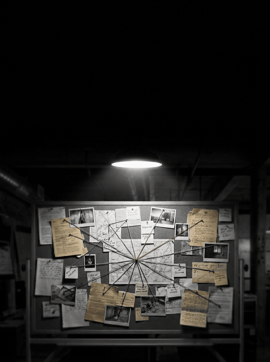
Template 1: True Crime
True crime is one of the most visually distinctive podcast genres. The covers run dark, moody, and atmospheric, using restrained palettes built around blacks, deep reds, and cold desaturated tones. Listeners scanning the true crime category expect covers that feel ominous and investigative.
Prompt:
dark atmospheric square composition of a dimly lit evidence desk from a slightly elevated angle, a single case file folder partially open revealing old photographs and typed documents, a flashlight beam creates a harsh cone of cold white light illuminating the papers while the surrounding environment falls into deep shadow, the desk surface is dark worn wood with scratches and age marks, a single red evidence tag and a coiled length of red string provide the only warm color accents against the otherwise cold desaturated palette, the background is pure deep black fading from the desk edges, the upper portion of the frame features dark negative space suitable for bold white or red title typography, fog or haze adds atmospheric depth in the middle ground, the color palette is severely restricted to deep blacks cold grays and desaturated tones with strategic dark red accents, the mood is tense investigative ominous and coldly compelling, noir documentary photography aesthetic with harsh directional lighting, square 1:1 aspect ratio, high resolution, no text no watermarks no typography no letters
Best for: True crime, cold case, investigative journalism, forensic science, criminal psychology, unsolved mysteries, courtroom drama
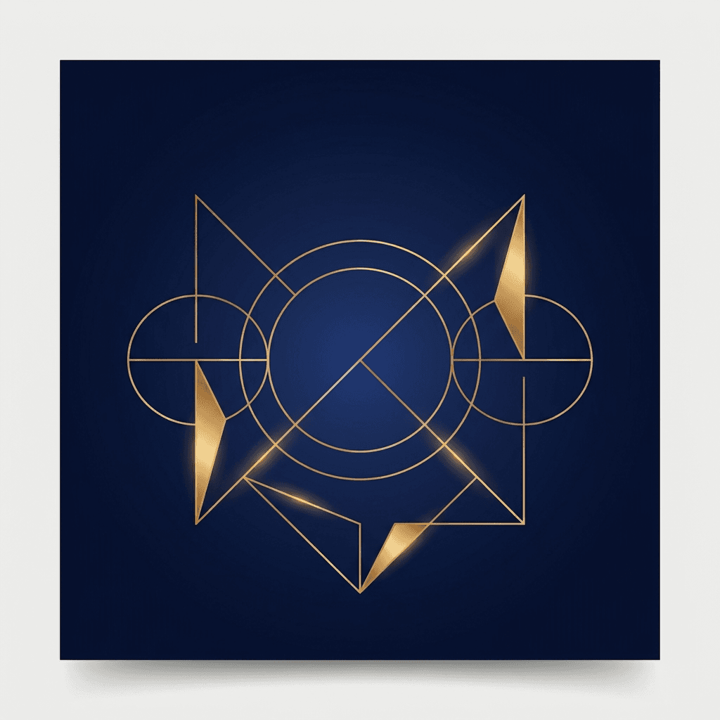
Template 2: Business and Entrepreneurship
Business podcast covers signal authority, professionalism, and strategic thinking. The visual language is clean, modern, and structured, using dark backgrounds with crisp typography-friendly contrast. A finance or leadership podcast aimed at professionals might benefit from a sleek, minimalistic design that signals credibility and expertise.
Prompt:
sleek modern square composition of a minimal abstract geometric design on a rich deep navy blue background, clean golden geometric shapes including thin lines circles and angular forms create a sophisticated pattern in the center of the frame, the shapes are rendered in warm metallic gold with subtle light reflections suggesting premium quality, the geometric elements are arranged with intentional whitespace between them creating an open airy feel despite the dark background, the navy blue background is smooth and gradient with slightly lighter tones in the center creating subtle depth, the upper-center area has ample clean dark space for white or gold title text to sit prominently, the composition feels balanced modern and authoritative like the cover of a premium strategy report, the color palette uses only deep navy and warm metallic gold creating a two-tone professional premium aesthetic, the mood is confident strategic polished and executive, clean digital design with sharp edges and smooth gradients, square 1:1 aspect ratio, high resolution, no text no watermarks no typography no letters
Best for: Business strategy, entrepreneurship, leadership, investing, fintech, startup culture, career development, executive coaching, marketing strategy
Template 3: Comedy and Pop Culture
Comedy covers thrive on energy, color, and visual personality. The palette runs bright and bold, the compositions feel playful and dynamic, and the overall aesthetic communicates that this show is fun and approachable. Comedy and pop culture shows thrive on bright colors and playful layouts.[7]
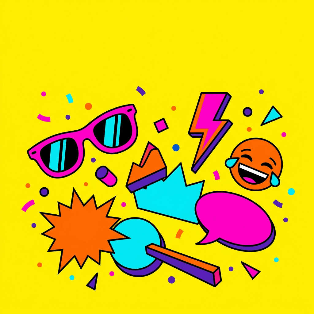
Prompt:
vibrant energetic square composition with a bold bright yellow background, a collection of playful pop art style objects and icons are arranged in a dynamic scattered pattern across the center of the frame including oversized retro sunglasses a speech bubble shape a lightning bolt a star burst and a laughing emoji face rendered in a flat graphic illustration style, the objects are rendered in contrasting bold colors of electric pink hot orange bright cyan and deep purple against the yellow background, the illustration style is clean flat and graphic with thick outlines giving it a modern pop art comic book aesthetic, the arrangement leaves the upper third of the frame relatively open with just the bright yellow background showing providing clean space for bold dark title typography, scattered small confetti dots and geometric shapes add energy and movement throughout the composition, the mood is loud fun irreverent and instantly attention-grabbing, bold flat graphic illustration style with saturated colors and clean shapes, square 1:1 aspect ratio, high resolution, no text no watermarks no typography no letters
Best for: Comedy podcasts, pop culture commentary, entertainment news, celebrity gossip, movie and TV reviews, gaming culture, internet culture discussion
Template 4: Health and Wellness
Wellness podcast covers communicate calm, vitality, and positive transformation. The palettes lean toward soft naturals, warm earth tones, and clean whites with organic accents that feel nurturing without being clinical.
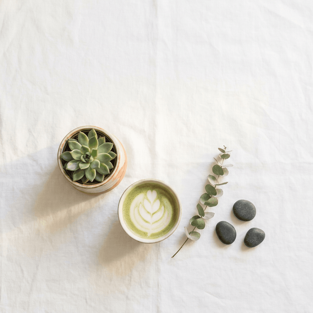
Prompt:
serene calming square composition of a minimal wellness-inspired flat lay arrangement on a soft white linen surface, a small green succulent in a ceramic pot a cup of matcha tea with beautiful foam art a sprig of dried eucalyptus and a few smooth zen stones are arranged with generous breathing room between each object in the center-lower area of the frame, warm soft natural light from above creates gentle even illumination with delicate shadows beneath each object, the white linen background extends through the entire frame with natural subtle texture visible, the upper half of the frame is predominantly clean white linen providing an ideal area for dark typography, the color palette is soft natural and calming with sage greens warm clay tones soft whites and the muted green of the matcha creating a wellness spa aesthetic, every object is carefully placed with editorial precision creating a feeling of intentional calm and mindfulness, the mood is peaceful grounding nourishing and gently aspirational, clean lifestyle photography with soft natural lighting, square 1:1 aspect ratio, high resolution, no text no watermarks no typography no letters
Best for: Wellness, meditation, mindfulness, mental health, yoga, nutrition, holistic health, sleep science, self-care routines, therapy-adjacent shows
Template 5: Technology and AI
Tech podcast covers communicate innovation, intelligence, and the excitement of what comes next. The visual language uses futuristic tones, clean digital aesthetics, and abstract technological imagery that feels cutting-edge without being cold. This visual approach relates to the kind of AI-related content that performs well across creator platforms.

Prompt:
futuristic abstract square composition of a glowing neural network or circuit pattern on a deep dark background, interconnected nodes and pathways made of thin luminous lines create an organic yet technological web pattern spreading from a bright central cluster outward toward the edges of the frame, the nodes glow in electric cyan and bright teal with connecting pathways in softer blue tones, the brightest cluster sits in the center of the frame with the network density decreasing toward the edges creating natural dark space in the corners and along the top for title typography, the deep background is a rich near-black with subtle deep blue gradient adding depth, tiny floating particles of light surround the network adding dimension and atmospheric technology feel, the overall aesthetic feels like looking into an active AI neural network or advanced processor visualization, the color palette uses only deep dark backgrounds with electric cyan bright teal and touches of warm white light at the brightest nodes, the mood is intelligent innovative cutting-edge and fascinatingly complex, digital art with clean luminous rendering, square 1:1 aspect ratio, high resolution, no text no watermarks no typography no letters
Best for: Technology news, AI and machine learning, cybersecurity, software development, startup tech, gadget reviews, future of tech, digital transformation, data science
Template 6: History
History podcast covers transport listeners to another era through visual atmosphere and period-appropriate aesthetic choices. The covers use rich, warm, aged tones that communicate timelessness and the weight of stories from the past.
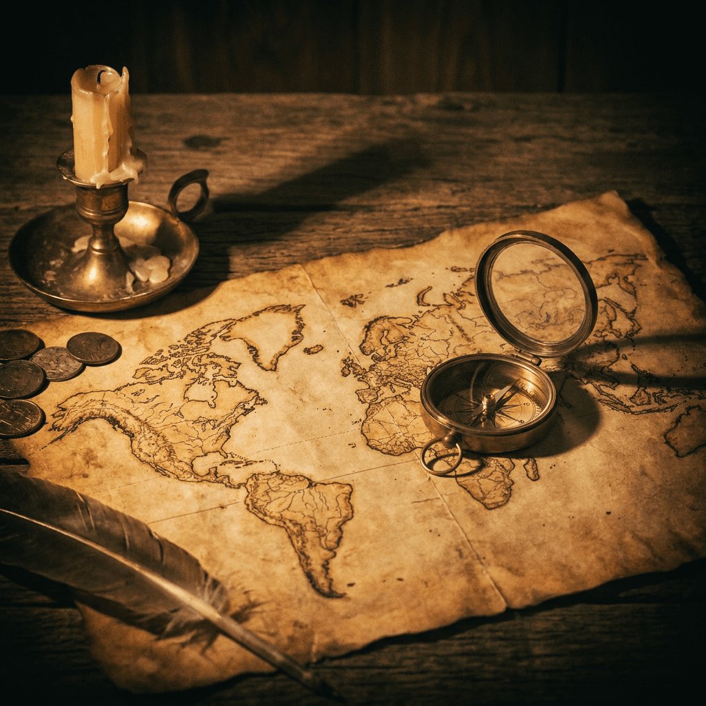
Prompt:
atmospheric vintage square composition featuring an old world map spread across a weathered oak desk surface, the map is aged and yellowed with beautiful hand-drawn cartographic details visible in warm sepia and umber tones, an antique brass compass sits on the map with its needle catching soft warm light, a melted candle in a vintage holder casts warm amber light across the scene from one side creating dramatic directional shadows, the edges of the frame darken into rich shadow creating a natural vignette effect, the upper portion of the frame shows the darker aged wood surface and shadow providing space for warm-toned title text, a few scattered old coins and a quill pen add historical authenticity without cluttering the composition, the color palette is rich and warm with deep amber burnt sienna aged parchment yellow and dark wood brown tones creating a distinctly historical atmospheric quality, the overall image has a slightly desaturated vintage quality as though the scene itself belongs to another century, the mood is scholarly adventurous mysterious and richly atmospheric, cinematic period still life photography with warm directional lighting, square 1:1 aspect ratio, high resolution, no text no watermarks no typography no letters
Best for: History podcasts, ancient civilizations, military history, historical biography, archaeology, world history, historical mysteries, period-specific storytelling
Template 7: Personal Development and Motivation
Personal development covers need to feel both aspirational and accessible, communicating the promise of growth and transformation. The visual approach shares principles with the kind of motivational fitness content that performs well visually, adapted for a more introspective context.
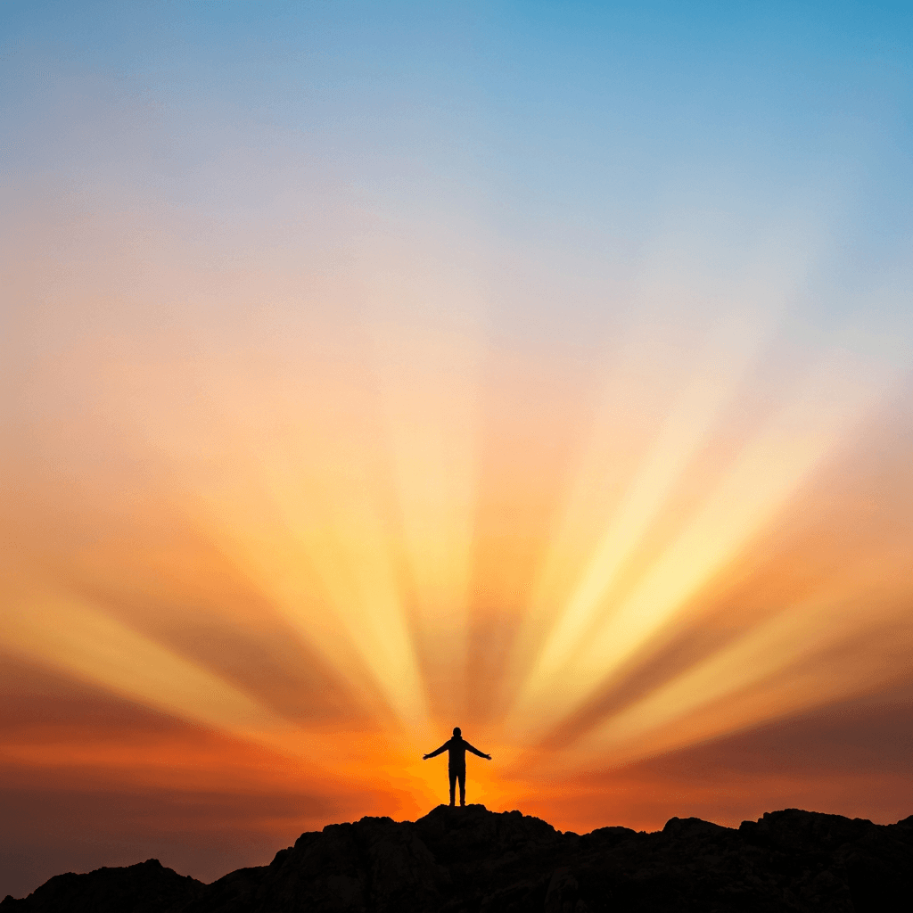
Prompt:
bright inspiring square composition of a single person silhouette standing at the peak of a mountain or hilltop with arms slightly open, the figure is small and centered positioned against a vast dramatic sunrise sky, the sky fills the majority of the frame with rich warm gradients moving from deep burnt orange at the horizon through golden amber into soft warm peach and finally into clean light blue at the very top, the sunrise creates dramatic god rays of golden light radiating outward from behind the figure's silhouette, the mountain beneath the figure is rendered as a dark simple silhouette along the bottom edge of the frame, the overall composition emphasizes the vastness of possibility with the small figure representing individual potential against the infinite sky, the upper portion of the frame features the lighter warm sky tones providing excellent contrast for dark title typography, the color palette is warm vibrant and uplifting with sunrise oranges golds and warm blues creating maximum emotional impact, the mood is empowering hopeful expansive and deeply motivational, cinematic landscape photography with dramatic natural lighting, square 1:1 aspect ratio, high resolution, no text no watermarks no typography no letters
Best for: Personal development, motivation, life coaching, goal setting, productivity, mindset, habit building, self-improvement, success stories, overcoming adversity
Template 8: Science and Education
Science and education podcast covers need to feel intellectually stimulating, visually engaging, and credible. The aesthetic balances wonder with rigor, using imagery that sparks curiosity while maintaining a professional tone.

Prompt:
captivating square composition of a beautiful abstract molecular or atomic structure floating in deep dark space, the structure consists of glowing spherical nodes connected by luminous bonds creating a complex three-dimensional molecular model, the central molecule is rendered in translucent glowing amber and warm white tones with connecting bonds in softer golden light, smaller molecular fragments and individual atoms float around the main structure at varying distances creating depth, the deep background transitions from rich midnight blue at the edges to slightly lighter deep blue near the central structure, subtle particle effects and soft bokeh points of light add cosmic scale and atmosphere, the central structure sits in the middle-lower portion of the frame with the deep dark space above providing clean area for light-colored title typography, the color palette blends deep space blues with warm amber and golden molecular glow creating a beautiful contrast between cold space and warm scientific discovery, the mood is curious wonder-filled intellectually stimulating and beautifully complex, digital scientific visualization art with cinematic lighting, square 1:1 aspect ratio, high resolution, no text no watermarks no typography no letters
Best for: Science podcasts, physics, chemistry, biology, space science, environmental science, educational content, research discussions, STEM topics, popular science
Template 9: Storytelling and Fiction
Narrative storytelling podcast covers create atmospheric worlds that draw the listener into a story before the first word is spoken. The visual approach is cinematic, moody, and evocative, using lighting and composition to suggest narrative tension and mystery.
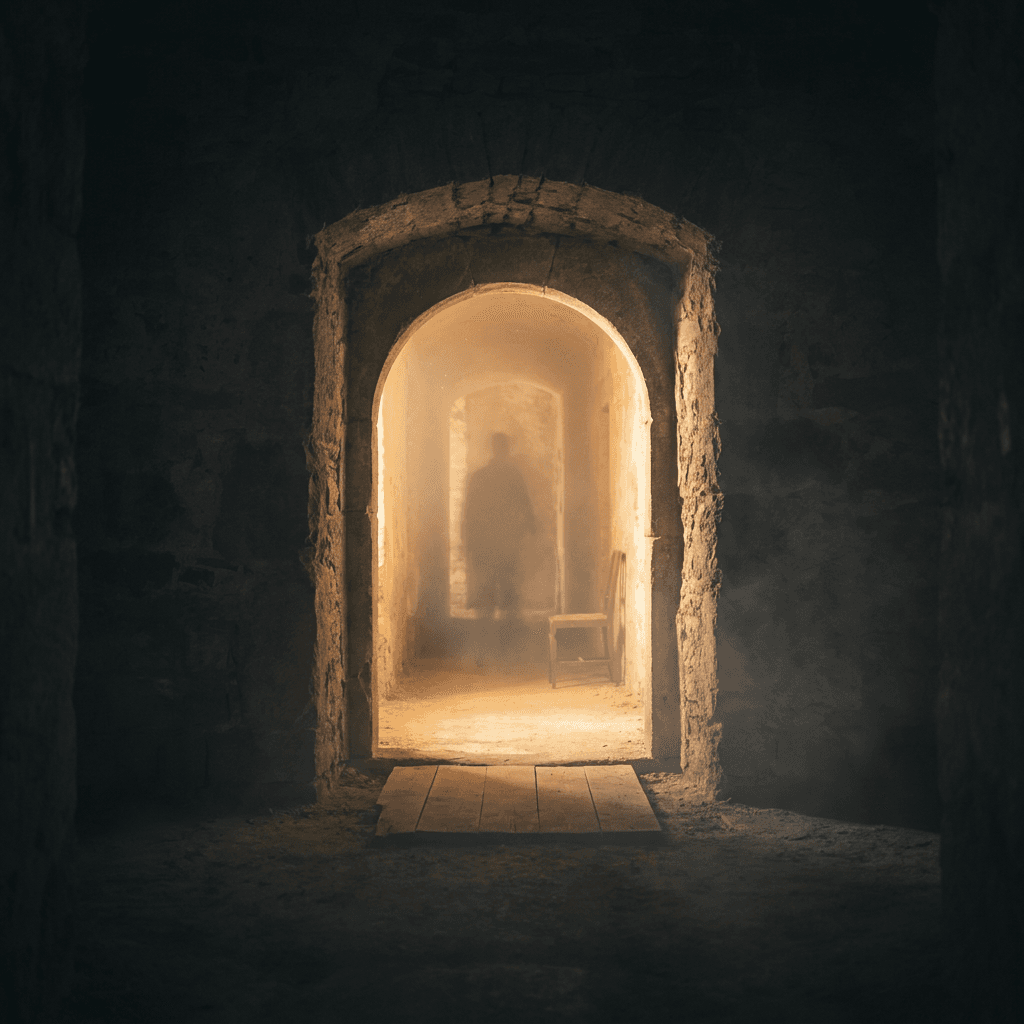
Prompt:
atmospheric cinematic square composition of a mysterious doorway or archway leading into a softly glowing corridor beyond, the archway is made of old weathered stone or dark wood and is positioned in the center of the frame, warm golden light emanates from beyond the doorway creating a compelling inviting glow that contrasts with the darker surrounding environment, the foreground and sides of the frame are darker creating a natural frame-within-a-frame effect that draws the eye toward the illuminated passage, dust motes and soft atmospheric haze float in the golden light beam adding ethereal storytelling quality, the floor shows old stone or wooden planks leading toward the doorway creating depth and perspective, subtle hints of mystery such as a shadow cast by an unseen figure or a single chair visible through the doorway add narrative intrigue, the upper portion of the frame shows the dark stone or wall above the archway providing space for title text against the darker tones, the color palette contrasts deep moody shadows in charcoal and deep brown with the warm golden amber light beyond the doorway, the mood is mysterious inviting narratively charged and deeply atmospheric, cinematic photography with dramatic lighting contrast, square 1:1 aspect ratio, high resolution, no text no watermarks no typography no letters
Best for: Fiction podcasts, audio drama, serialized storytelling, horror fiction, mystery stories, fantasy audio, literary fiction, anthology shows, narrative nonfiction
Template 10: Sports
Sports podcast covers need energy, intensity, and the unmistakable visual language of athletic competition. The palette typically runs bold and high-contrast with stadium-style lighting that communicates the excitement of live sports.
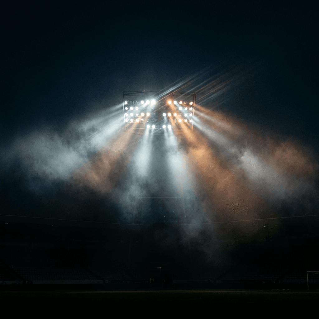
Prompt:
high energy dynamic square composition of a dramatic close-up view of a sports arena or stadium floodlight system at night, powerful stadium lights create intense beams cutting through atmospheric haze and mist in the night air, the main cluster of lights is positioned in the upper portion of the frame with their beams radiating downward and outward through the frame, the light beams interact with atmospheric moisture creating visible shafts of intense white and warm amber light against the deep dark sky, the lower portion of the frame fades into rich deep darkness suggesting the vastness of the arena below, lens flare effects add authenticity and energy to the bright light sources, the very top of the frame maintains enough dark sky area for light-colored title text to be prominently visible, the color palette is high-contrast with deep blacks dark navy sky and intense bright white and warm amber light beams creating the unmistakable atmosphere of nighttime competitive sports, the mood is intense electric competitive and dramatically charged with the anticipation of performance, cinematic sports photography with atmospheric lighting effects, square 1:1 aspect ratio, high resolution, no text no watermarks no typography no letters
Best for: Sports analysis, fantasy sports, sports commentary, basketball, football, soccer, MMA, combat sports, sports culture, athlete interviews, World Cup content
Template 11: Parenting and Family
Parenting podcast covers communicate warmth, relatability, and the beautiful messiness of family life. The palette runs warm and inviting with soft, approachable colors that feel nurturing and genuine.
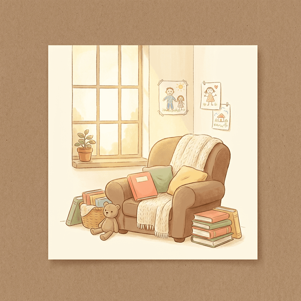
Prompt:
warm charming square composition in a soft illustrated style of a cozy home scene, a comfortable reading nook with an overstuffed armchair surrounded by a small pile of colorful children's books a stuffed animal and a warm blanket draped over the chair arm, a window behind the chair lets in soft warm golden afternoon light that bathes the scene in gentle warmth, a small potted plant sits on the windowsill and simple child's drawings are pinned to the wall nearby adding authentic family life detail, the illustration style is warm and slightly stylized with soft rounded shapes and gentle textures creating an inviting storybook quality that feels both modern and timeless, the overall composition places the reading nook in the center-lower frame with the warmly lit wall and window in the upper portion providing clean space for friendly title typography, the color palette uses soft warm tones including warm cream buttery yellow soft coral gentle sage green and cozy warm brown creating a palette that feels like a warm hug, the mood is warm comforting authentic and gently humorous suggesting the real and beautiful experience of family life, warm illustrated lifestyle art with soft natural lighting, square 1:1 aspect ratio, high resolution, no text no watermarks no typography no letters
Best for: Parenting podcasts, family life, motherhood, fatherhood, child development, family wellness, kids' activities, pregnancy, work-life balance, family relationships
Template 12: Finance and Money
Finance covers must balance approachability with credibility. The visual language uses clean, structured aesthetics that communicate financial intelligence and trust without feeling cold or intimidating. The color conventions lean toward deep blues, greens, and blacks with metallic accents.
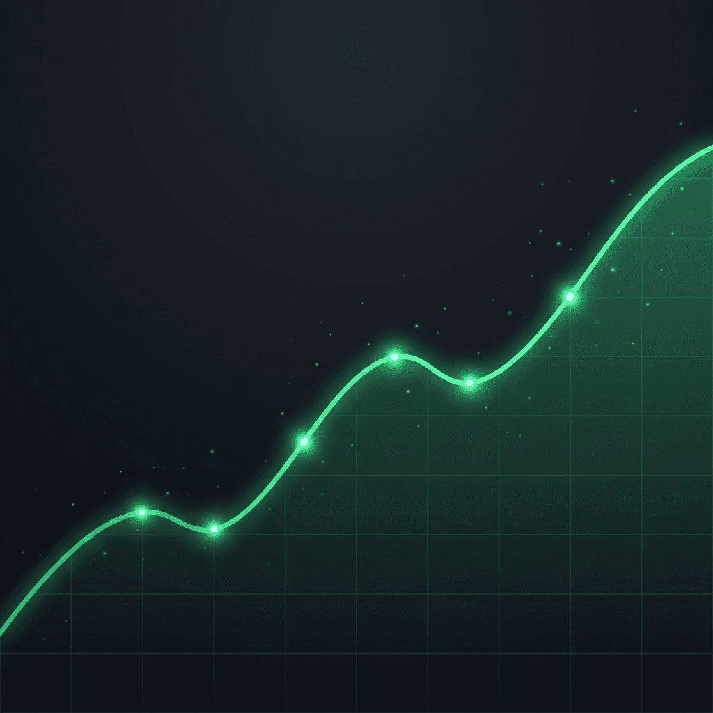
Prompt:
sophisticated clean square composition of an abstract rising graph or chart visualization rendered in glowing emerald green against a deep rich dark background, the graph line rises from the lower-left to the upper-right of the frame in a smooth upward trajectory with the line rendered as a luminous bright green with a subtle glow effect, small data points along the line pulse with brighter light at key inflection points, a subtle grid pattern in very faint dark green lines creates structure beneath the graph suggesting organized financial data, the area beneath the rising graph line has a soft gradient fill of translucent dark green creating depth, the upper-left portion of the frame features the dark background with ample clean space for white or green title text, scattered small particles of light float around the rising portion of the graph suggesting momentum and positive energy, the color palette uses deep dark backgrounds of near-black and dark charcoal with bright emerald green as the primary accent creating the distinctive visual language of financial growth and market performance, the mood is confident strategic optimistic and financially sophisticated, clean digital visualization aesthetic with glowing elements, square 1:1 aspect ratio, high resolution, no text no watermarks no typography no letters
Best for: Personal finance, investing, stock market, cryptocurrency, financial literacy, real estate investing, budgeting, economic analysis, fintech, wealth building
Template 13: Food and Cooking
Food podcast covers need to be appetizing, warm, and visually rich. The imagery should make the viewer hungry, using the vibrant colors of fresh ingredients and the warm lighting of a home kitchen. This visual approach is closely related to the principles behind great food photography prompts.
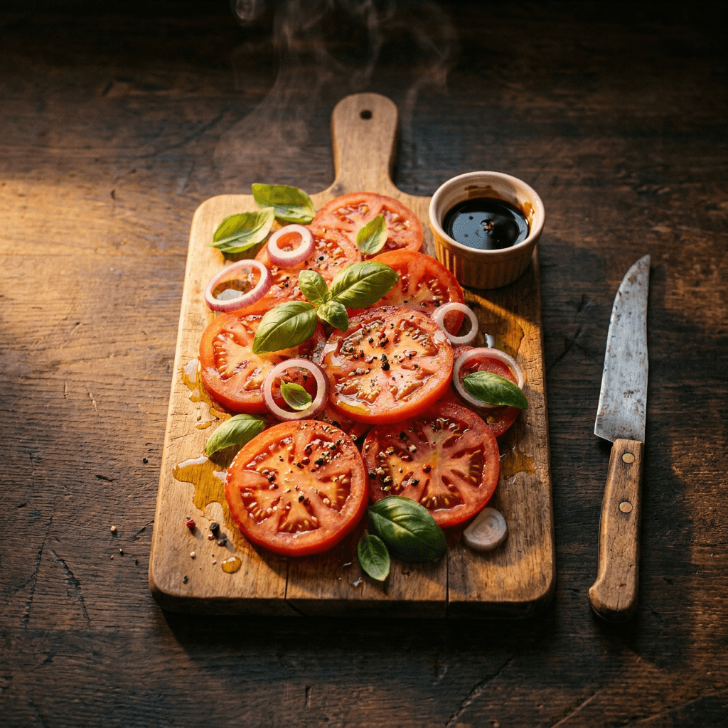
Prompt:
warm appetizing square composition overhead view of a beautiful rustic cutting board centered on a dark wooden kitchen surface, the cutting board holds a vibrant arrangement of freshly sliced colorful ingredients including bright red tomato slices vivid green basil leaves rich purple onion rings golden olive oil drizzle and scattered peppercorns, a small ramekin of rich sauce and a vintage knife sit alongside the board, the ingredients are arranged with editorial food styling precision but feel natural and abundant, warm side lighting from the left creates beautiful highlights on wet surfaces and gentle shadows that add depth and dimension to the food textures, the dark wooden surface extends to all edges of the frame with the upper and side areas providing darker space suitable for light-colored title text, steam or aromatic haze subtly rises from the freshly prepared ingredients adding life and warmth, the color palette is rich and appetizing with the natural vibrant colors of fresh food against warm dark wood tones creating maximum appetite appeal, the mood is warm inviting homemade and deliciously abundant, professional overhead food photography with warm directional lighting, square 1:1 aspect ratio, high resolution, no text no watermarks no typography no letters
Best for: Cooking podcasts, food culture, restaurant reviews, recipe shows, food science, culinary travel, baking, home cooking, food industry, chef interviews
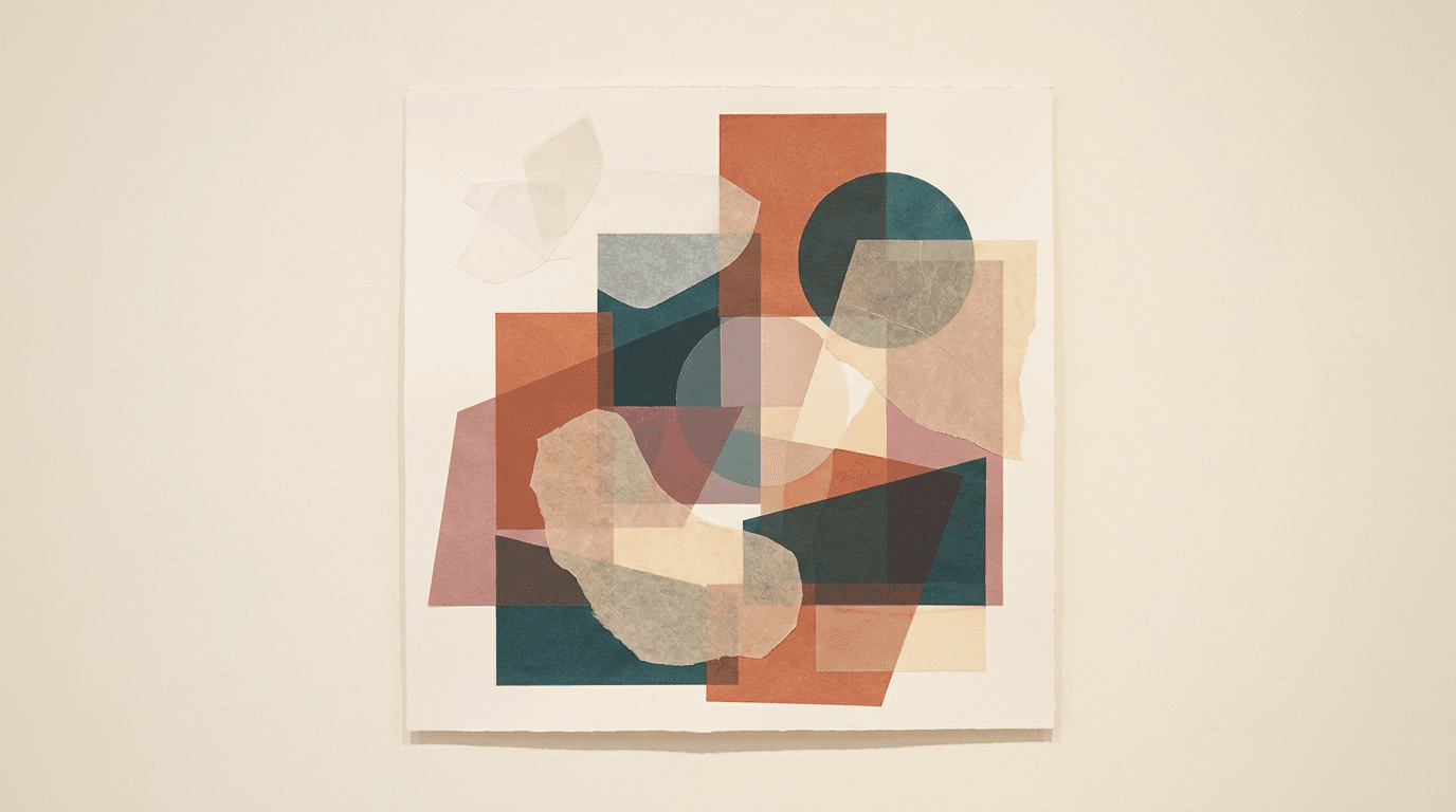
Template 14: Society and Culture
Society and culture podcasts explore the human experience through conversations about identity, relationships, social dynamics, and cultural trends. The covers need to feel thoughtful, visually interesting, and contemporary, using imagery that suggests connection, diversity, and the complexity of modern life.
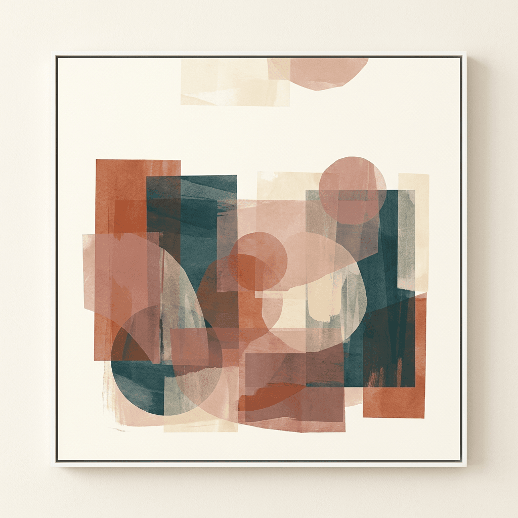
Prompt:
thoughtful contemporary square composition of an abstract collage-style arrangement featuring layered geometric shapes and organic forms in a modern editorial aesthetic, overlapping semi-transparent rectangles circles and irregular organic shapes create a dynamic layered composition suggesting connection intersection and complexity, the shapes are rendered in a sophisticated palette of warm terracotta deep teal dusty rose and warm cream with varying opacity creating depth through layering, the overall arrangement is centered with elements extending toward but not reaching the edges creating a natural border of cleaner background space, the background is a warm off-white or soft cream creating a gallery wall aesthetic, the upper portion maintains relatively cleaner space with perhaps one or two lighter shapes providing area for dark title typography, the layered overlapping shapes create the visual metaphor of diverse perspectives coming together and intersecting, the mood is thoughtful contemporary intellectually curious and culturally aware, modern editorial graphic design aesthetic with sophisticated color relationships, square 1:1 aspect ratio, high resolution, no text no watermarks no typography no letters
Best for: Society and culture discussion, social commentary, relationship podcasts, identity and community, cultural criticism, interview shows, philosophical discussions, current affairs, cultural trends
Template 15: Travel and Adventure
Travel podcast covers communicate wanderlust, discovery, and the beauty of exploring the world. The visual language uses stunning destination imagery with warm, inviting lighting that makes listeners want to pack their bags. The visual concept relates to the kind of destination scenes used in scroll-stopping video backgrounds.
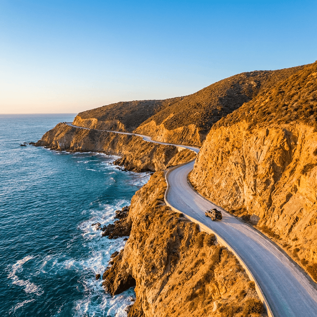
Prompt:
stunning travel square composition of a breathtaking aerial view looking down at a winding coastal road hugging dramatic sea cliffs, the road curves beautifully along the cliff edge in the lower half of the frame with the vast turquoise ocean stretching into the distance beyond, the cliffs are dramatic and textured with warm golden rock faces catching late afternoon sunlight, the ocean below transitions from deep sapphire blue near the horizon to bright turquoise and white foam where waves meet the cliff base, a tiny vehicle on the coastal road adds human scale and a sense of adventure and journey, the sky in the upper portion of the frame is clear with warm golden hour light creating a bright clean area suitable for dark title typography against the sky, the road and cliff composition creates a natural leading line through the frame adding dynamic visual flow, the color palette is warm and vivid with turquoise ocean warm golden cliffs the gray-white of the road and warm blue sky creating a palette that immediately triggers travel desire, the mood is adventurous free breathtaking and deeply wanderlust-inducing, cinematic aerial travel photography with golden hour lighting, square 1:1 aspect ratio, high resolution, no text no watermarks no typography no letters
Best for: Travel podcasts, adventure stories, backpacking, digital nomad lifestyle, travel tips, destination guides, road trip podcasts, travel culture, expat experiences, travel interviews
Customizing These Templates for Your Specific Show
These templates provide genre-calibrated visual foundations. Getting the best results for your specific podcast requires adjusting them along several dimensions.
Match colors to your specific brand. If you already have brand colors from your website, social media, or existing marketing materials, swap the color descriptions in the prompt to include your brand palette. Use the same colors, fonts, and images in your podcast artwork that you use on your website and on social media.[2] Consistency across your entire visual presence helps listeners recognize your podcast wherever they encounter it.
Adjust imagery for your specific niche. If you host a health podcast focused specifically on running rather than general wellness, replace the generic wellness imagery with running-specific elements. If your tech podcast covers specifically cybersecurity, swap the neural network for security-related visual metaphors. The genre conventions (color palette, mood, overall feel) should remain while the specific visual content changes to match your show's focus.
Plan for text placement before generating. Look at where your show title needs to sit on the final cover and make sure the prompt leaves that area clean. All templates in this post are designed with upper-area text zones, but if your show name works better at the bottom or center, adjust the compositional descriptions accordingly. You can also use the AI image inpainting tool to adjust specific areas of a generated image after the fact, for example, cleaning up a busy area where you need to place text.
Test everything at dark mode. Since the vast majority of listeners use dark mode on their devices, every generated cover should be evaluated against a dark background. If your cover's edges blend into black or dark gray, consider adding a subtle lighter border element or ensuring your background color at the edges is distinct enough to create a visible boundary.
Generate multiple variations. For each show, generate at least five to eight variations from the same prompt. Each generation will produce slightly different compositions and details. Review all options at both full size and tiny thumbnail size, and select the ones that read most clearly when shrunk down to the size of a postage stamp. A cover that looks stunning at full size but loses readability at 55 × 55 pixels will not perform well in podcast directories.
Adding Your Show Name and Branding
The AI-generated image is your cover's visual foundation. Transforming it into a complete, upload-ready cover requires adding your show name and branding in a design tool. Here is the approach that creates professional results.
Import into a design tool. Open Canva, Adobe Express, Figma, or Photoshop and create a canvas at 3000 × 3000 pixels. Place your AI-generated image as the background layer and resize it to fill the canvas completely.
Choose genre-appropriate typography. Typography plays a significant role in defining your podcast's personality. The font choice should be legible and also reflect the tone of your content. Whether you go for something bold and modern or classic and understated, typography sets the mood for potential listeners before they even hit play.[4] For most podcasts, bold sans-serif fonts perform best because they maintain readability at small thumbnail sizes.
Keep text to an absolute minimum. A good podcast cover can quickly get overwhelmed with too much text and it doesn't have space for the podcast title, tagline, and host's name. Limit yourself to using a maximum of seven words to ensure legibility.[2] In practice, the most effective covers use even fewer words than that. Your show name is the priority. A tagline is optional and should only appear if it's very short and fits without compromising title readability.
Ensure maximum contrast. If you are using text on your cover, make sure the color contrasts well with the background. Limit yourself to using no more than two fonts. Use a combination of sans serif and serif for the best results.[5] White text on dark backgrounds or dark text on light backgrounds provides the strongest readability. If the background is mixed, add a subtle shadow or overlay behind your text to ensure it pops.
Do the thumbnail test. Most listeners discover podcasts on a phone. Shrink your cover to postage-stamp size. Can you still read the title? Is the key visual still clear? If not, simplify.[5] Export your finished cover and view it at approximately 55 × 55 pixels. If the title is unreadable or the visual concept is unclear at that size, go back and simplify.
Creating Episode-Specific Cover Art
Beyond your main show cover, many podcasters also create episode-specific artwork to highlight individual episodes, special guests, or seasonal themes. If you produce episode-specific covers, the series name, colors, and fonts should stay consistent. Listeners should recognize your show before they read the title.[5]
The most effective approach is to create a template system based on your main cover's visual identity. Keep the same background color or treatment, the same font and text placement for your show name, and the same overall style. Then swap a single element for each episode, such as a different central image or a guest-specific visual detail. This maintains brand recognition while keeping your feed visually fresh.
You can generate a library of episode-specific background visuals using modified versions of your genre template. For example, if you run a true crime podcast, you might generate ten variations of the dark investigation aesthetic, each with slightly different props or lighting, to use across your next season of episodes. Store these in organized folders using your media library for quick access when new episodes drop.
Cross-Platform Promotion for Your Podcast
Your podcast cover imagery is not just for Spotify and Apple Podcasts. The same visual foundation can be adapted for promotional content across social media platforms. You can reformat your cover's visual style for Instagram post images at 1:1, create Facebook ad creatives with the same aesthetic for paid promotion, or generate complementary 16:9 visuals for YouTube channel banners if you also publish your podcast as video.

If your podcast produces video episodes, Miraflow's Text2Shorts tool can help you turn episode highlights into short-form promotional content for YouTube Shorts, Instagram Reels, and TikTok. You can also use the AI Clipping tool to automatically identify the most engaging moments from long-form podcast video recordings and turn them into shareable clips. For background music in promotional content, the AI Music Generator can create royalty-free tracks that match your podcast's mood and energy.
Many successful podcasters in 2026 maintain a multi-platform content strategy where their podcast is the core content piece and short-form video is the discovery engine. Understanding what makes short-form content go viral and how platform algorithms distribute content can help you use your podcast's visual brand to drive growth across platforms.
Common Mistakes That Kill Podcast Cover Performance
Understanding recurring errors helps you evaluate your generated covers critically and avoid the pitfalls that underperform in podcast directories.
Cluttered compositions with competing elements. Regardless of the type of imagery and style you choose, you want to keep your design simple. Designs with lots of elements tend to lose visual punch, especially when seen in smaller formats. It's in your best interest to keep your podcast artwork clear and easy to process.[1] Every template in this post specifies a single focal visual element because simplicity survives the thumbnail reduction that kills complex designs.
Generic imagery unrelated to the show's topic. Generic stock photos and a generic image of a city skyline or a handshake says nothing about your show. Use imagery tied directly to your topic.[5] The AI prompts in this post are topic-specific because generic imagery makes listeners scroll past without a second look.
Text that disappears at small sizes. If your show name requires a magnifying glass to read at thumbnail scale, the cover fails at its most important job. Always test at 55 × 55 pixels before uploading. If the text is unreadable, increase font size, simplify the text, or improve the contrast between text and background.
Ignoring dark mode display. A cover that looks great on a white background but vanishes against the dark surfaces of Spotify and Apple Podcasts is a cover that is invisible to the majority of listeners. Always evaluate your finished cover against dark backgrounds.
Inconsistent episode art. Episode-specific covers should share the same visual DNA as your series cover. Treat it like a brand system.[5] If you create episode-specific art that varies wildly in style, color, or quality, your feed looks disorganized and undermines the professional impression your main cover established.
FAQ
What size should podcast cover art be for Spotify and Apple Podcasts?
The recommended podcast cover art size is 3000×3000 pixels (1:1 square). Works on Spotify, Apple Podcasts, and all platforms.[3] Apple requires minimum 1400×1400, maximum 3000×3000, in JPEG or PNG, RGB color space, under 512KB. Spotify is more lenient (640px minimum, up to 10,000px), but designing at 3000×3000 satisfies all platforms simultaneously.[3]
What file format and size should I use?
The 512KB file size limit is the trickiest constraint. At 3000×3000, a PNG will almost certainly exceed this. Use JPEG at 80-90% quality to stay under the limit while maintaining visual clarity.[3] Export as JPEG in RGB color space for maximum compatibility across all podcast platforms.
Should I include text in my AI-generated image?
No. AI image generators frequently produce garbled or inconsistent text. Generate a text-free visual background using the prompts in this post, then add your show name and any branding elements in a design tool like Canva, Adobe Express, or Photoshop where you have complete control over typography, placement, and sizing.
How do I know if my cover works at thumbnail size?
Your cover art will often be seen as a tiny thumbnail, sometimes just 50 pixels wide in a "You Might Also Like" sidebar. Zoom out until your design is the size of a postage stamp. Can you still read the title?[7] If the answer is no, simplify your design by increasing text size, reducing visual complexity, or improving contrast.
How many words should appear on my podcast cover?
Limit text to five words or fewer to ensure readability.[6] In practice, the most effective covers show only the show name. Skip taglines, episode numbers, and host names unless they are absolutely essential to communicating what the show is about.
Can I change my podcast cover art after publishing?
Yes. Unlike a book cover, podcast cover art can be updated at any time.[3] Update the artwork in your podcast hosting platform, and it will propagate through RSS to all directories. Allow a few hours for changes to appear across all platforms. Many successful podcasters refresh their cover art periodically, especially when rebranding, entering a new season, or when analytics suggest the current cover is underperforming.
What aspect ratio should I use in the AI image generator?
Generate at 1:1 (square) aspect ratio. This is the required format for all podcast platforms. The Miraflow AI Image Generator supports 1:1 as a standard option. After generating, resize to exactly 3000 × 3000 pixels in your design tool before exporting.
Should I use a photo of myself on the cover?
For personal brand or interview-style shows, a confident portrait often performs well. Crop tight so your face fills most of the square, add bold text for the show name, and ensure the photo is well-lit and high resolution.[3] If your show is personality-driven and your audience connects with you as the host, using your photo can strengthen recognition. For topic-driven or faceless shows, topic-relevant imagery typically works better.
What colors work best for my podcast genre?
Warm tones (reds, oranges) excite and energize, ideal for true crime or motivational series. Cool tones (blues, greens) calm and reassure, perfect for business, wellness, or educational podcasts.[7] Business and finance podcasts typically use professional colors like blues, grays, and blacks. Comedy or entertainment shows can use bold, energetic colors. Limit your palette to 2-3 main colors to avoid visual clutter.[9]
Does my cover art affect discoverability on Spotify or Apple Podcasts?
Cover art does not directly influence algorithmic recommendations. However, it heavily influences click-through rate when your show appears in search results, browse listings, and recommendation sections. 62% of new listeners judge the quality of a podcast solely by its cover art before ever listening to a second of audio. Shows with professional, high-contrast artwork see a 35% higher click-through rate in search results.[7] Higher CTR means more listens, which signals quality to the algorithms and fuels further recommendations.
Conclusion
Your podcast cover art operates in one of the most challenging visual environments in digital content. It needs to communicate genre, quality, and topic in a square frame that is often viewed at the size of a postage stamp, against dark backgrounds, alongside dozens of competing shows. The covers that win clicks in this environment are simple, bold, genre-appropriate, and built around a single clear visual idea with typography that survives extreme size reduction.
The 15 templates in this post give you a production-ready system for generating professional podcast cover backgrounds across the categories that dominate podcast directories: true crime, business, comedy, wellness, technology, history, personal development, science, storytelling, sports, parenting, finance, food, culture, and travel. Each template is built around the visual conventions that listeners in each category recognize and respond to, with compositions designed for the 1:1 square format and intentional space for your show name.
Copy the template that matches your genre, customize it for your specific show, generate it inside Miraflow AI, add your show name and branding in a design tool, and publish a cover that earns clicks and communicates exactly what your podcast delivers. Test every cover at thumbnail size before finalizing, evaluate against dark backgrounds, and maintain visual consistency across your show cover, episode art, and social media presence.
Your podcast deserves a cover that works as hard as your content does. Make every pixel count.