10 Viral AI YouTube Thumbnail Styles for More Views in 2026
Written by
Jay Kim

Learn 10 viral AI YouTube thumbnail styles that actually get more clicks in 2026. See when to use each style, how they impact CTR, and how to generate them fast with AI thumbnail tools like Miraflow’s YouTube Thumbnail Maker.
YouTube thumbnails are still one of the biggest levers for getting more views.
You can have a great topic, strong hook, and solid watch time, but if the thumbnail doesn’t get clicked, the video never gets a chance. In 2026, that’s even more true because viewers scroll faster, and competition is higher across Shorts, long-form, and livestreams.
The good news is, you don’t need to be a designer anymore.
With AI thumbnail tools (like the YouTube Thumbnail Maker in Miraflow AI), you can generate multiple high-quality thumbnail options in minutes, if you know what style you’re aiming for.
This guide breaks down 10 AI YouTube thumbnail styles that consistently attract clicks in 2026, plus prompt templates you can copy into your AI thumbnail workflow.
Why Thumbnail Style Matters More Than Ever
Most creators just think about text:
“What big words should I put on the thumbnail?”
But in 2026, your style (composition, colors, subject placement, visual rhythm) matters just as much:
- Viewers scroll through feeds full of thumbnails; styles that look too similar get ignored.
- Some styles work better for education, others for reaction, others for tools & tutorials.
- Once you lock in 2–3 styles that fit your brand, you can repeat them across videos so your channel looks consistent.
AI is perfect for this: you can define styles with prompts and re-use them across countless videos.
If you’re using Miraflow’s YouTube Thumbnail Maker, each style below maps cleanly to:
- Thumbnail Prompt → visual direction for the image
- Thumbnail Text → short, punchy words on top of the thumbnail
Let’s get into the 10 viral styles.
1. Clean Creator Close-Up (Education & Tutorials)
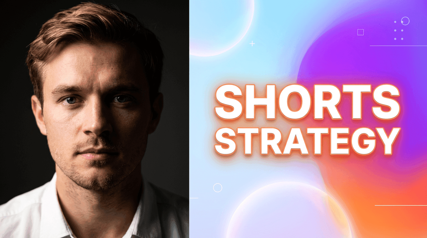
This is the modern classic YouTube look:
- Your face (or a person) large and central
- Clean background with subtle gradients
- 2–4 words of big, readable text
- One strong emotion: curious, surprised, confident, skeptical
Why it works
- Human faces still stop scrolls quickly.
- Works great for tutorials, opinions, breakdowns, and “I’ll explain this” content.
- Looks professional without being noisy.
When to use it
- How-to videos
- Strategy / breakdown content
- X vs Y comparisons
AI settings
- Mode: Image Compositing (upload your photo) or Text to Thumbnail with creator close-up
- Aspect ratio: 16:9
Thumbnail Prompt example
YouTube thumbnail showing a close-up of a creator’s face on one side with a clean, bright gradient background on the other side. Soft, high-contrast lighting on the face, minimal shapes in the background, modern SaaS-style, vibrant accent colors, soft shadows, space for bold text on the opposite side.
Thumbnail Text ideas
- "Shorts Strategy"
- "Stop Doing This"
- "Views Exploded"
2. Shocked Reaction + Big Contrast Text (Commentary & Drama)
The classic reaction style, updated:
- Big, expressive face
- Dramatic background (screenshots, blur, or abstract explosion)
- High color contrast
- Text that feels emotional, not descriptive
Why it works
- Emotion pulls attention instantly.
- Viewers can feel the tone before they even read the title.
- Especially effective for commentary, news, breakdowns, 'this happened' Shorts.
When to use it
- Commentary on updates, drama, trends
- “Reacting to ___” content
- Breaking down viral clips or news
Thumbnail Prompt example
YouTube reaction thumbnail with a large expressive face on one side, eyes wide in surprise, and a dramatic abstract background with blurred shapes and bright bursts of color on the other side. High contrast lighting, vivid accents, soft glow around the subject, space for bold text, modern YouTube reaction style.
Thumbnail Text ideas
- “THIS IS CRAZY”
- “You Won’t Believe This”
- “They Changed It”
3. Minimal Object + Bold Text (Tools, Products, Do This)
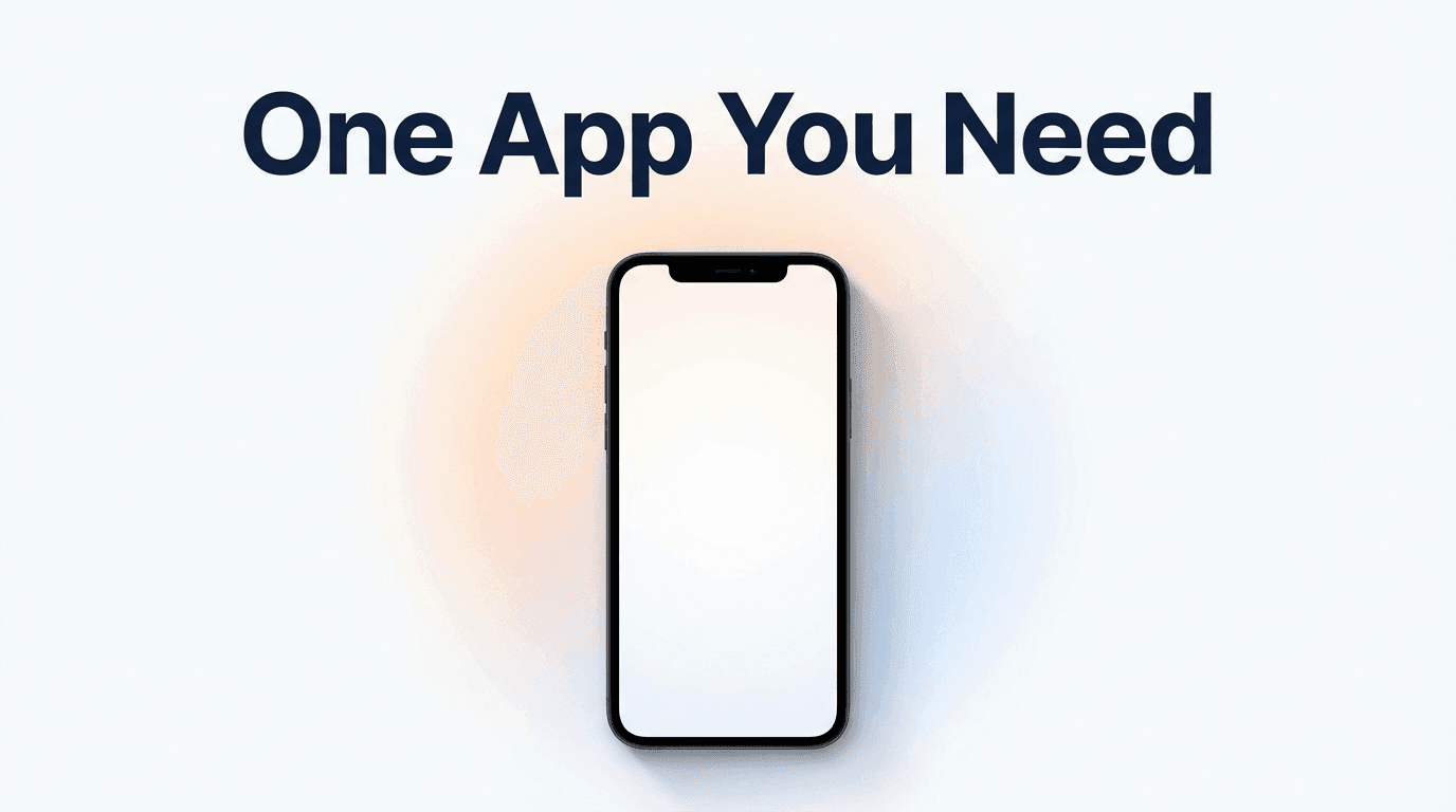
This style focuses on a single object instead of a face:
- A phone, laptop, app window, or product
- Big, minimal composition
- Strong contrast between object and background
- Clean space for text
Why it works
- Feels direct and professional.
- Perfect for SaaS, AI tools, tutorials on specific features.
- Great when you don’t want to use a face at all (faceless creator style).
When to use it
- Tool-review videos
- How to use X tool
- Product updates, feature demos
Thumbnail Prompt example
Minimal YouTube thumbnail featuring a single smartphone in the center of the frame, screen facing forward, on a clean white background with a soft gradient halo behind it. Modern flat style, soft shadows, vibrant accent color around the phone, plenty of empty space for bold text above or to the side, no clutter.
Thumbnail Text ideas
- “Use This Tool”
- “AI Did This”
- “One App You Need”
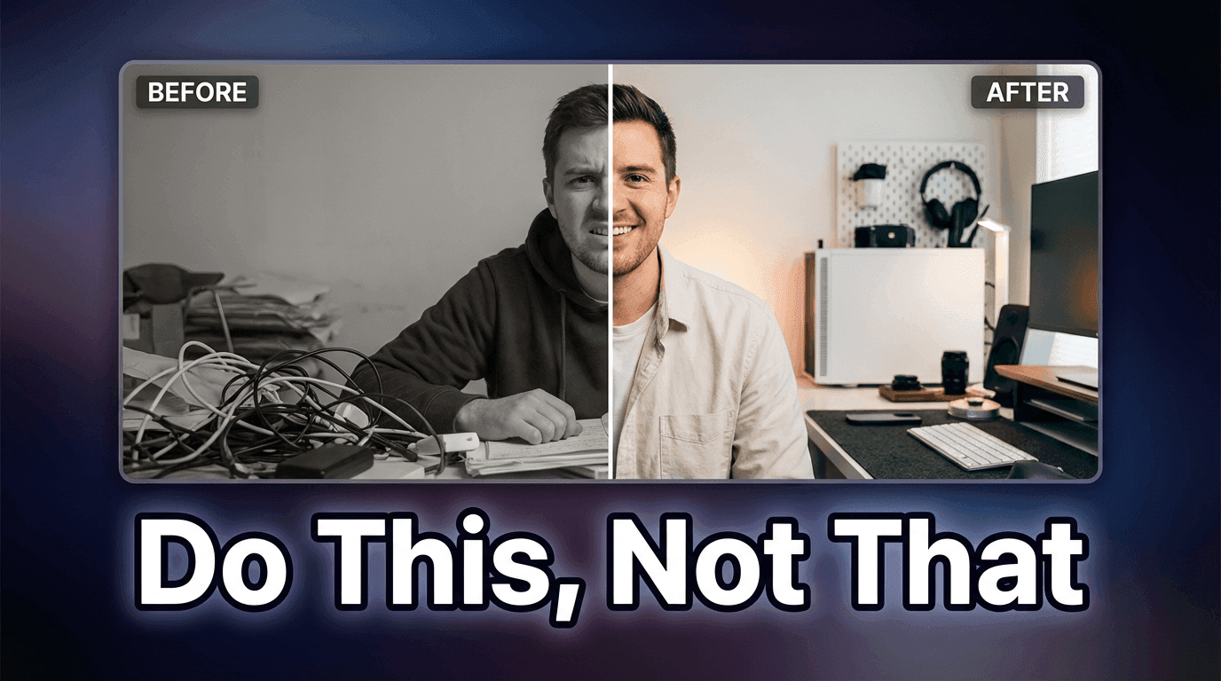
4. Before / After Split (Transformations & Case Studies)
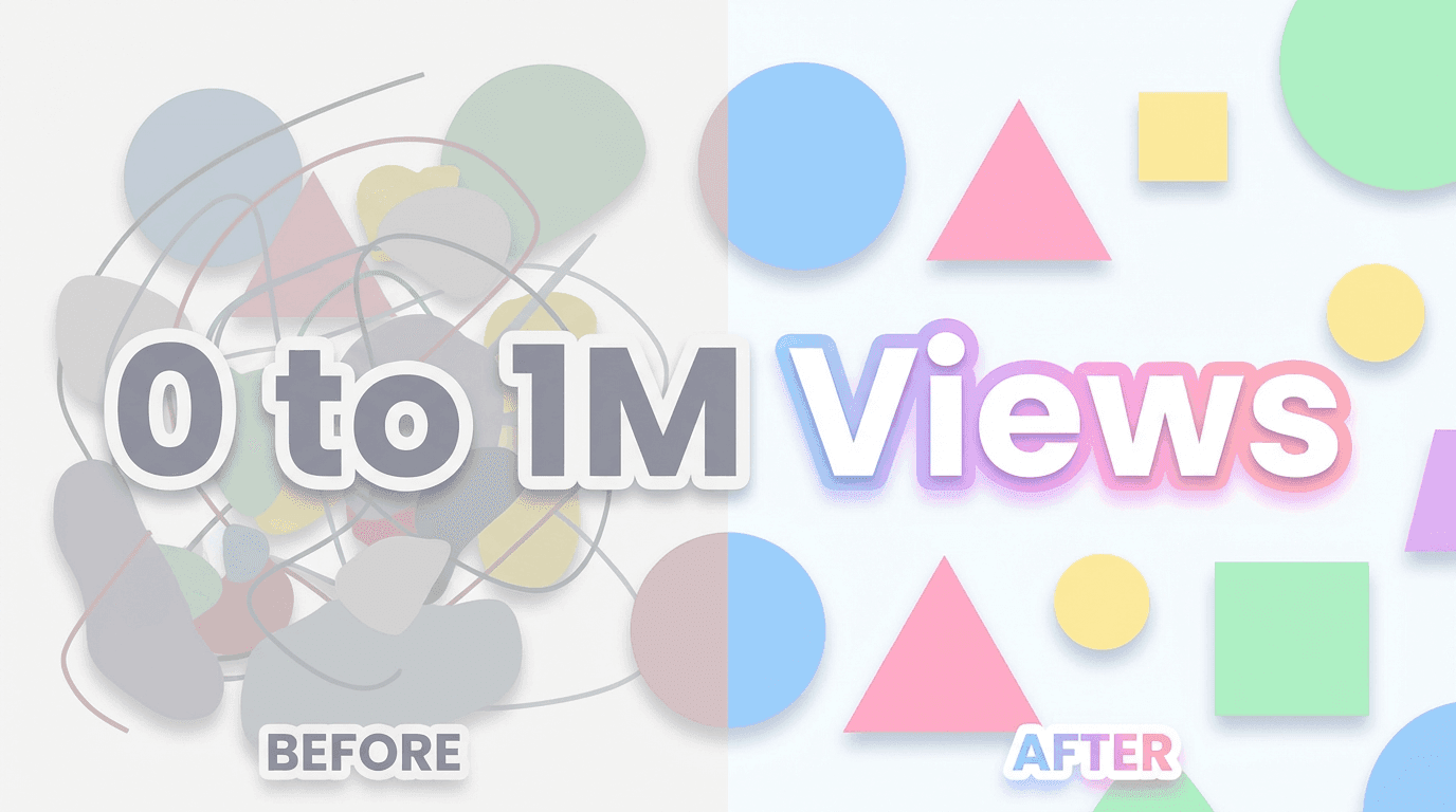
Visually split the thumbnail into two halves:
- Left: “before” (messy, dull, low numbers)
- Right: “after” (clean, upgraded, high numbers)
- Clear visual change, even without reading text
Why it works
- Transformation is instantly understood.
- High curiosity: “How did they go from left → right?”
- Works for anything where you improved something: views, designs, processes, thumbnails, etc.
When to use it
- Case studies
- I tried X for 30 days
- Makeovers (channels, content, workflows, visuals)
Thumbnail Prompt example
YouTube thumbnail with a clear vertical split down the middle: the left side looks dull and low-contrast with a messy layout, and the right side looks bright, sharp, and polished. Use simple abstract shapes to represent “before” and “after” states, with the right side clearly more appealing. White background overall, pastel accents, soft shadows, modern flat style, space for bold text.
Thumbnail Text ideas
- “Before / After”
- “0 to 1M Views”
- “Old vs New”
5. Chart & Dashboard Style (Analytics & Growth Content)
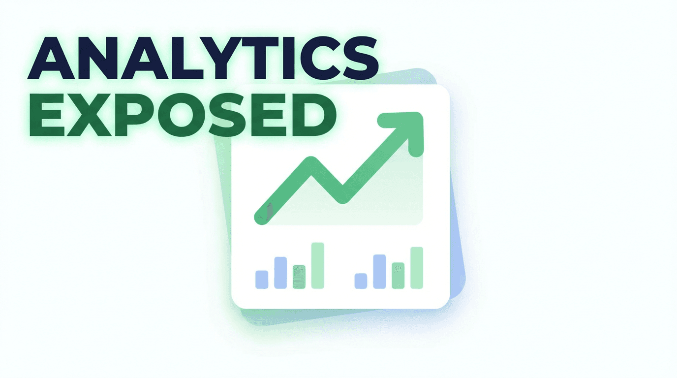
This is your data content style:
- Simple line chart or bar graph
- Clean dashboard elements
- One main chart, not 10 tiny ones
- Maybe a subtle upward arrow or highlight
Why it works
- Immediately signals “numbers” and “growth”.
- High relevance for Shorts analytics, monetization, retention content.
- Looks professional & clickable for creators who care about performance.
When to use it
- Analytics breakdowns
- Revenue or RPM videos
- What I learned from my Shorts data
Thumbnail Prompt example
YouTube thumbnail showing a clean dashboard-style card with a large upward trending line graph and a few simple bar charts. White background, pastel green and blue accents, flat modern analytics design, soft shadows, minimal layout, space for bold text in one corner, no tiny details.
Thumbnail Text ideas
- “My Real Numbers”
- “Views vs Watch Time”
- “Analytics Exposed”
6. Big Emoji + Simple Concept (Fast-Scroll Shorts)
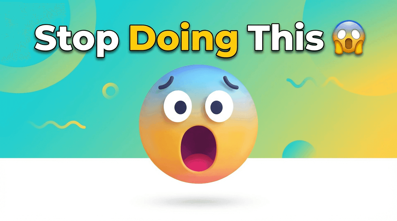
Emojis still work, when used intentionally:
- One large emoji (🔥 😱 💰 🤯 🧠)
- Simple object or background behind it
- Short text that matches the emotion
Why it works
- Very readable on mobile.
- Clickable for Shorts, especially in more casual / playful topics.
- Great for quick tips, reactions, hot takes.
When to use it
- Short “one tip” videos
- Quick reactions
- “Did you know?” style Shorts
Thumbnail Prompt example
YouTube thumbnail featuring one large 3D-style emoji in the center, with a soft gradient background and a few subtle abstract shapes around it. Bright, playful colors, modern flat-3D hybrid style, soft shadows, clean layout, space for bold text above or below the emoji, no clutter.
Thumbnail Text ideas
- “Stop Doing This” (with 😱)
- “Do This Daily” (with ✅)
- “AI Hack” (with 🤖🔥)
7. Screenshot + Highlight (Tutorials & UI Walkthroughs)
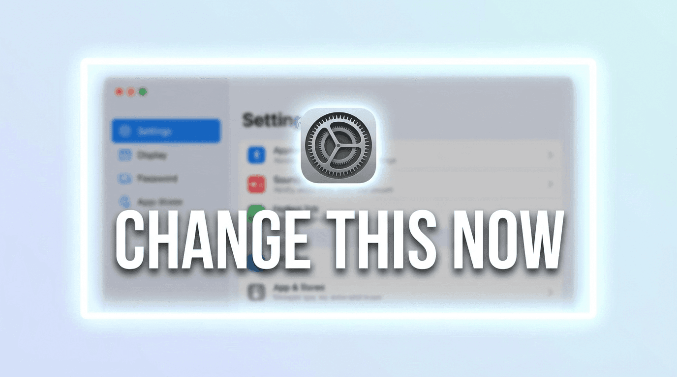
For UI-heavy videos, this style uses:
- A simplified or stylized screenshot of your tool / website / dashboard
- A big highlight (rectangle, circle, arrow) around the key area
- Background slightly blurred or abstracted
Why it works
- Viewers instantly know it’s a tutorial, not a vlog.
- They can tell if the tool or page matches what they’re searching for.
- Very high intent clicks.
When to use it
- How to use [software]
- Secret setting inside [tool]
- Fix this setting in your dashboard
Thumbnail Prompt example
With an uploaded screenshot:
YouTube thumbnail using the uploaded interface screenshot as the main element, with a soft blur and a bright rectangular highlight or circle around one key area of the screen. Add a subtle glow around the highlighted area, white or light gradient background, modern UI tutorial style, clean and minimal overall, space for bold text.
Thumbnail Text ideas
- “Change This Now”
- “Hidden Setting”
- “Fix This First”
8. Dark Subject on Light Background (High Contrast, Clean Look)
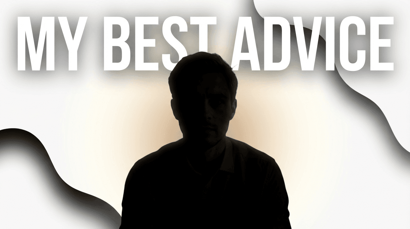
This style leans on contrast:
- Darker object or person
- Light/white background
- Clear separation between subject & background
- Very little clutter
Why it works
- Pops even in crowded feeds.
- Looks premium and modern (Apple / SaaS aesthetic).
- Good for serious tutorials & brand content.
When to use it
- Thoughtful explainers
- Brand-positioning videos
- Content where you want to look high quality instead of hype
Thumbnail Prompt example
YouTube thumbnail with a single dark-toned subject (person silhouette or object) centered on a bright white background with a soft circular gradient. Minimal abstract shapes around the subject, soft shadows, high contrast between subject and background, modern premium style, space for bold text near the top or side.
Thumbnail Text ideas
- “Do This First”
- “Shorts Strategy”
- “My Best Advice”
9. Bold Color Blocks & Cutouts (Trendy, High-Energy Look)
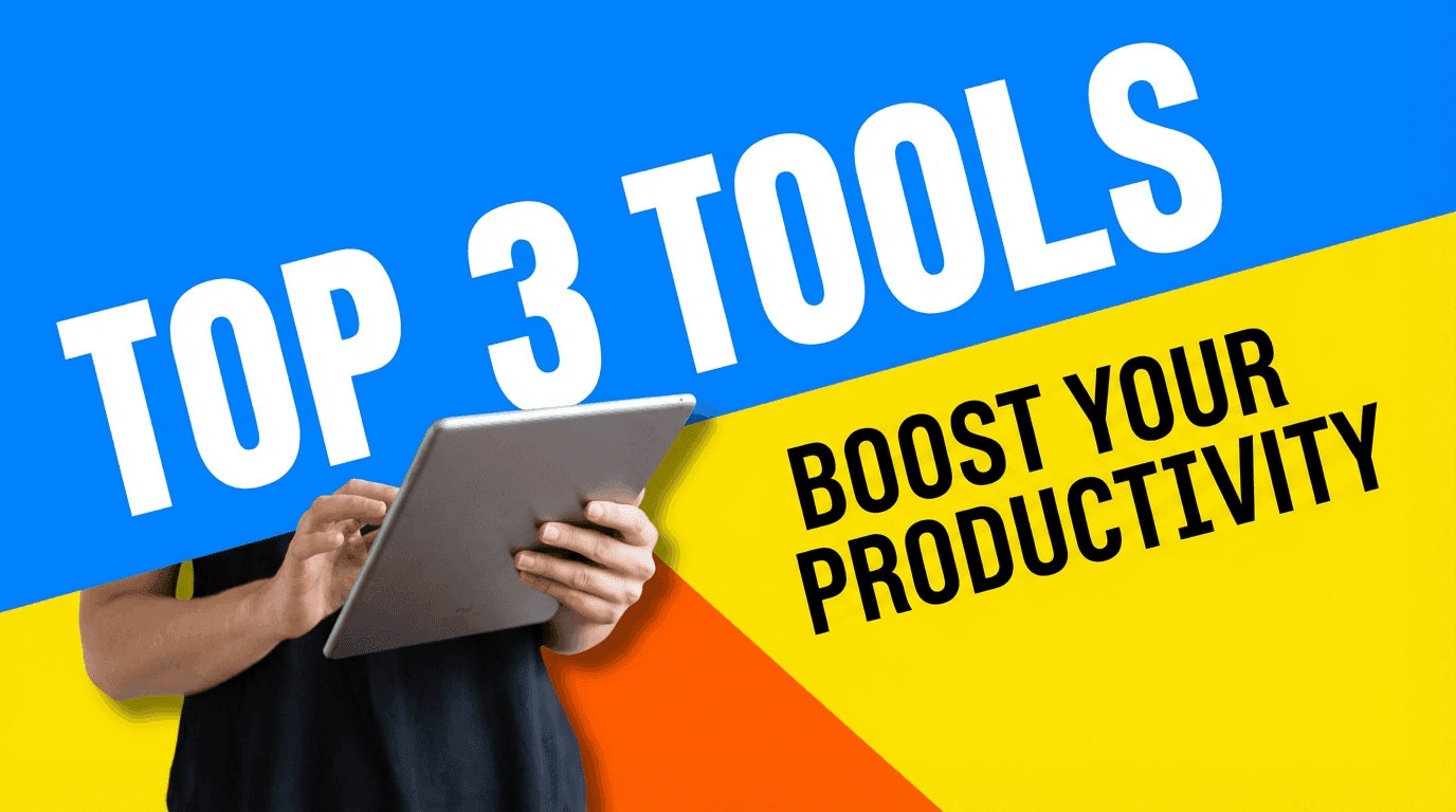
Very 2026 looking:
- Two or three bold color blocks
- Cutout-style subject or object on top
- Feels like a collage, but still clean
- Great for Shorts and fast content
Why it works
- Feels fresh and modern.
- Works even without a face.
- Eye-catching on mobile feeds.
When to use it
- AI tools & productivity hacks
- Top 3 lists
- Fast-paced content with energetic editing
Thumbnail Prompt example
YouTube thumbnail with big diagonal color blocks in the background (two or three bold colors), and a cutout-style subject (person or object) placed on top with a soft shadow. Modern collage style, clean edges, bright and energetic, lots of contrast, space for bold text in one of the color blocks, no clutter.
Thumbnail Text ideas
- “Top 3 Tools”
- “My AI Stack”
- “Best 5 Tips”
10. Mystery Silhouette & Question (Curiosity Hooks)
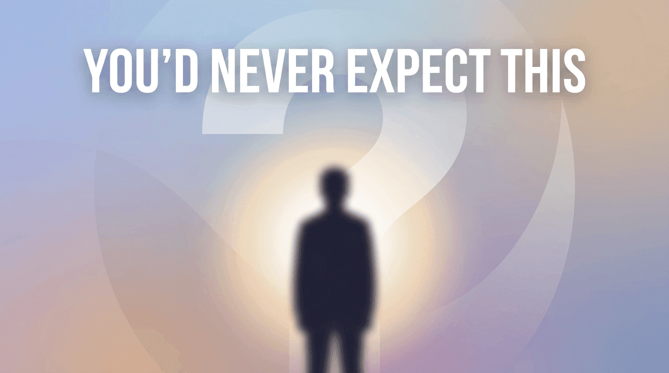
For more “what is this?” style videos:
- Silhouette or blurred subject
- Question mark or mysterious highlight
- Darker subject, but still readable on a lightish background
- Strong curiosity in the text
Why it works
- Suggests something hidden or surprising.
- Encourages the click to reveal the answer.
- Useful for experimental topics & “I tried X” content.
When to use it
- You won’t believe what happened when…
- Guess which of these performed better
- Secret strategies, unusual tools, experiments
Thumbnail Prompt example
YouTube thumbnail showing a dark silhouette or blurred figure in the center, with a bright soft glow behind them and a large faint question mark shape in the background. Light background overall with subtle gradients, mysterious but clean look, modern flat style, space for bold text near the top, minimal details.
Thumbnail Text ideas
- “This Surprised Me”
- “Guess Which Won”
- “You’d Never Expect This”
How to Generate These Styles Fast with AI (Miraflow Workflow)
To generate these thumbnail styles quickly using AI:
- Go to Miraflow AI → YouTube Thumbnail Maker
- Set Aspect Ratio to 16:9 for regular YouTube videos.
- Copy one of the Thumbnail Prompt templates above and tweak it for your topic.
- (Optional) Upload any image you want to use as a reference image.
- (Optional) Enter short Thumbnail Text (3–5 words) to match the thumbnail’s emotion or promise.
- (Optional) Open Show Advanced Settings and add a negative prompt like:
blurry, low quality, messy background, too much text, dark theme, distorted faces, clutter - Click Generate Thumbnail and check your result in My Thumbnails.
- Try 2–3 variations for important uploads and choose the one that’s clearest at a small size.
Once you find 2–3 styles that fit your brand (for example, “Clean Creator Close-Up” + “Chart & Dashboard” + “Minimal Object”), you can reuse the same prompts with small tweaks for future videos.
That’s how big channels keep their thumbnails consistent without designing from scratch every time.
If you want a full walkthrough of the tool itself, from choosing modes to downloading final images,check:
👉 How to Generate YouTube Thumbnails with AI: Step-by-Step
Conclusion
You don’t need magic to get more views, you need more chances to be clicked.
AI thumbnails are not about making something crazy each time. They’re about:
- Choosing proven styles that match your content
- Using prompts to generate those styles consistently
- Testing small variations (text, color, composition) to see what your audience responds to
Start by picking one or two styles from this list that feel natural for your niche:
- Education / explainers → Clean Creator Close-Up, Minimal Object, Chart & Dashboard
- Tools & AI content → Minimal Object, Screenshot + Highlight, Bold Color Blocks
- Commentary & reactions → Shocked Reaction, Mystery Silhouette
Then:
- Build your prompt library
- Generate thumbnails with AI
- Focus your energy on ideas and content, not pixel-perfect design
The more you systemize your thumbnail styles, the easier it is to ship videos fast, and give every upload a real chance to be clicked.
If you’re specifically focused on vertical content, you’ll also want to think about how thumbnails work in the Shorts feed:
👉 YouTube Shorts Thumbnail Strategy in 2026: What Actually Matters