AI Prompts for Product Packaging Upgrades: 15 Before-and-After Visuals
Written by
Jay Kim

15 copy-paste AI prompts for product packaging upgrade visualizations. Covers skincare, coffee, food, candles, spirits, tech, fashion unboxing, and more for before-and-after content.
Packaging is the first physical touchpoint a customer has with a product, and it does more conversion work than most brand owners realize. Before anyone opens a box, a bottle, or a bag, the packaging itself has already communicated a price point expectation, a quality assumption, and a brand identity signal that directly affects whether the customer believes the product is worth what they paid. An upgrade from generic to premium packaging is not an aesthetic decision. It is a pricing strategy, a conversion strategy, and a retention strategy packaged into one design decision.
The challenge for most brands considering a packaging upgrade is the cost and time required to visualize the options before committing to physical production. Traditionally, seeing what a packaging redesign actually looks like required a designer, a mockup artist, and sometimes a physical prototype. AI image generation has changed this completely. You can now generate photorealistic visualizations of what premium packaging would look like across different materials, formats, and brand aesthetics before a single sample has been ordered.
This post gives you 15 ready-to-use AI prompt templates for product packaging upgrade visualizations, covering skincare, coffee, artisan food, candles, tea, wellness supplements, spirits, sustainable packaging, tech accessories, pet food, fashion unboxing, children's products, stationery, luxury confectionery, and a universal template. Every prompt is designed to generate a photorealistic visualization of the premium version of a product's packaging. You can use these visuals for design presentations, client approvals, social media before-and-after content, and investor materials. Run all of them in the AI image generator on Miraflow AI without any setup.

Why Packaging Is a Brand and Revenue Multiplier
The connection between packaging quality and product pricing power is one of the most direct and underutilized levers in brand building. Multiple studies on consumer purchasing behavior consistently show that packaging quality is among the top three factors influencing perceived product value, particularly in categories where the product cannot be evaluated before purchase.
This means the same product in better packaging commands a meaningfully higher price. A skincare serum in a heavy glass bottle with a precision-fit brushed gold cap can charge three to five times more than an identical formula in a plastic squeeze bottle. A specialty coffee in a heavy matte kraft bag with a letterpress label can charge twice what the same beans sell for in a printed plastic bag. The product has not changed. The value perception has changed entirely because of the packaging.
Understanding this relationship changes how you think about packaging upgrade investment. The question is not whether premium packaging costs more to produce. It always does. The question is whether the price increase it enables, the conversion rate improvement it drives, and the brand equity it builds outweigh the higher unit cost. For most brands that have reached product-market fit, the answer is clearly yes, and the larger risk is actually staying with generic packaging that caps the price ceiling and signals commodity-level quality.
AI visualization changes the economics of exploring packaging upgrades by removing the front-loaded design and prototype cost entirely. You can visualize twenty different packaging directions in an afternoon, present the most compelling options to stakeholders, gather feedback, and only invest in physical sampling and production for the directions that have genuine internal alignment. This is how the largest brands have always operated with their design agencies. AI makes the same workflow available to any brand, at any stage.
What Premium Packaging Communicates Visually
Before getting into the prompts, understanding the specific visual signals that communicate premium quality across packaging categories helps you write more precise prompts and evaluate the generated results more accurately.
Material quality is the primary premium signal. The difference between cheap and expensive packaging is usually material before design. Heavy glass communicates differently from thin plastic. Matte rigid card stock communicates differently from glossy coated card. Metal communicates differently from plastic. The specific material choice and its visual rendering quality determines whether the packaging reads as premium or commodity before any design element is processed.
Precision of construction communicates quality. Flush-fit lids, tight seams, precisely aligned closures, and the specific quality of a wax seal, a satin ribbon, or a magnetic closure all communicate the level of care and investment in the packaging. These construction details are the equivalent of joinery quality in furniture. They are not the first thing a buyer consciously notices, but they are what their hands and eyes register as they handle the package.
Restraint in surface design signals premium positioning. Commodity packaging often uses maximum surface coverage with large type, multiple colors, and comprehensive information display. Premium packaging uses far less. A single material, a limited palette, generous empty space, and a minimal typographic approach communicate that the brand is confident enough to let the material and construction do the work. The degree of restraint in surface treatment is one of the most reliable signals of brand tier.
Environmental coherence in photography amplifies the material signal. Packaging photographed on the right surface, in the right light, with the right styling accents communicates more about quality than the packaging alone. A glass bottle on white Carrara marble reads differently from the same bottle on a generic grey surface. This is why the styling and surface descriptions in these prompts are as specific as the packaging descriptions.
How to Use These Prompts for Before-and-After Content
The "before-and-after" concept in packaging works in two directions that are both commercially valuable.
Direction one is design visualization. Generate the premium version of your current packaging across multiple material and aesthetic directions, evaluate which best fits your brand positioning and target price point, and use the generated images in design briefs, stakeholder presentations, and supplier discussions. This removes the visual ambiguity from packaging redesign decisions and dramatically accelerates the alignment process.
Direction two is social content. Before-and-after content performs consistently well across Instagram, LinkedIn, and TikTok for brand accounts because it tells a transformation story that audiences find satisfying to watch. Showing your actual original packaging alongside an AI-generated visualization of the premium version creates shareable content around your brand evolution. Using the AI image generator on Miraflow AI to generate the premium visualization and then pairing it with your existing product photography creates the before-and-after pair for social content without waiting for the actual redesign to be complete.
Generate at least five to eight variations of each prompt before selecting finals, since material rendering, light placement, and styling balance vary meaningfully between generations.
15 AI Prompt Templates for Packaging Upgrade Visualizations
1. Premium Skincare Brand Packaging Upgrade
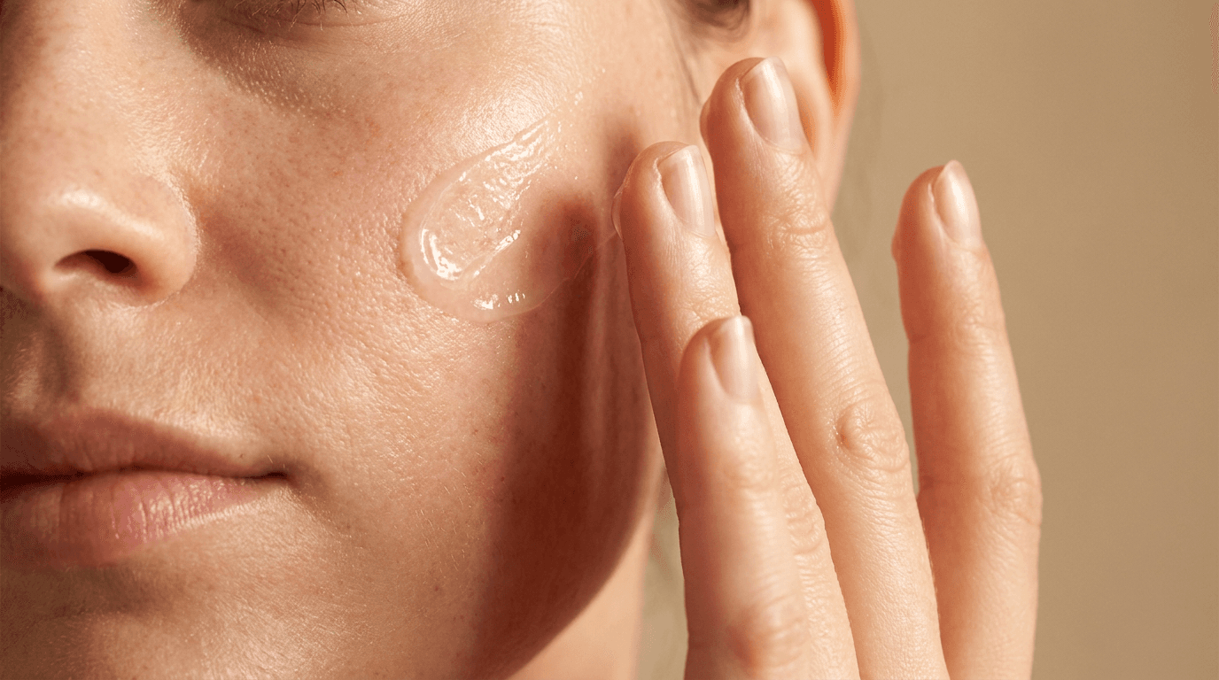
The skincare category is one of the most competitive packaging environments in retail and e-commerce. The visual gap between commodity and premium packaging is wider in skincare than almost any other category, and the price premium that premium packaging commands is correspondingly large.

Prompt
Premium skincare product packaging upgrade visualization, an elegantly proportioned frosted glass serum bottle with a matte surface finish and a precision-fit magnetic closure cap in brushed warm gold, the bottle resting on a clean white Carrara marble surface with natural grey veining, single soft diffused studio spotlight from directly above creating a gentle specular reflection along the glass bottle edges and a precise warm highlight on the gold cap hardware, two fresh white orchid petals placed naturally at the bottle base for scale and botanical context, the bottle label area is intentionally minimal communicating clean beauty brand restraint, warm white marble and warm brushed gold tones with clear frosted glass, editorial luxury skincare brand product photography, ultra-realistic frosted glass surface and precision gold hardware rendering, the packaging communicates premium clean beauty brand positioning through material quality and construction precision, no text no logos, product packaging visualization quality
2. Specialty Coffee Brand Packaging Upgrade
Coffee packaging has become one of the most contested brand identity battlegrounds in consumer goods, and the visual distance between mass market and specialty coffee packaging is significant. The right materials and surface treatment transform the perceived value of the product inside completely.
Prompt
Premium specialty coffee brand packaging upgrade visualization, a matte black heavyweight kraft paper stand-up flat-bottom coffee bag with a precision heat-seal header and a natural tin-tie closure, the bag standing upright on a dark natural oak wood surface, warm natural window light from the left side raking across the surface texture of the bag material and creating a clean shadow at the bag base, a small scatter of single-origin whole coffee beans placed naturally beside the bag on the wood surface, a circular embossed round label area visible on the front of the bag in a complementary warm cream tone, the bag material texture is the primary quality signal with no decorative elements competing with the material quality, deep matte black bag and warm natural wood surface tones with warm cream label accent, editorial specialty coffee brand packaging photography, ultra-realistic matte kraft paper texture and surface rendering, the packaging communicates specialty roaster brand positioning through material weight and purposeful restraint, no text no logos, packaging upgrade visualization quality
3. Artisan Food Preserve and Jar Packaging Upgrade
Artisan food products compete directly on packaging quality in specialty retail and farmers market contexts where a premium jar immediately commands a higher price point than an equivalent product in generic commercial jars.

Prompt
Premium artisan food product packaging upgrade visualization, a heavy clear glass hexagonal jar with a broad flat base, a precision-fit natural wood lid sealed with a deep red wax dip closure, sitting on a warm natural unbleached linen surface, soft natural diffused light from a window above creating clean even illumination that reveals the glass weight and wall thickness quality and the warm amber color of the preserve content visible through the glass, a small fresh herb sprig and a short length of natural jute twine tied casually around the lid neck, the quality of the glass itself communicates the premium artisan positioning, warm amber food content visible through clear heavy glass and natural linen surface tones, editorial artisan food brand packaging photography, ultra-realistic glass weight and wax seal rendering, the packaging communicates premium artisan food positioning through material quality and the warmth of natural closure materials, no text no logos, packaging upgrade visualization quality
4. Luxury Candle and Home Fragrance Packaging Upgrade
Candle packaging upgrades represent one of the highest conversion ROI changes a home fragrance brand can make because the premium unboxing experience itself becomes part of the product's value proposition for gifting occasions.
Prompt
Luxury candle packaging upgrade visualization, a clean matte white rigid paper board box with a precise flush-fit lid and a wide natural oat linen ribbon closure tied in a flat bow on top, the lid slightly ajar at a natural angle revealing a premium matte black ceramic candle vessel sitting precisely in a white tissue paper nest inside, the box and ribbon sitting on a dark polished marble surface, single warm focused studio spotlight from directly above creating precise clean shadows from the box edges and a warm specular highlight on the linen ribbon surface, the construction quality of the box corner seams is visible and precise, warm white matte box and natural linen ribbon tones against dark marble, editorial luxury home fragrance brand packaging photography, ultra-realistic matte rigid paper board and natural linen fabric rendering, the packaging communicates luxury gifting positioning through rigid box quality and the layered reveal quality of the interior, no text no logos, luxury packaging upgrade visualization quality
5. Premium Specialty Tea Brand Packaging Upgrade
Tea packaging upgrades from generic tea bags to premium tin or rigid box presentations represent one of the most dramatic packaging ROI opportunities available because the price premium achievable is substantial and the material cost difference is relatively modest.
Prompt
Premium specialty tea packaging upgrade visualization, a matte deep forest green cylindrical metal tin with a precision flush-fit press lid, the tin surface showing a very fine embossed botanical pattern visible only in the raking light, sitting on a warm natural pale oak wood surface beside a small hand-thrown ceramic tea cup, warm natural afternoon window light from the upper left creating characteristic metal specular highlights along the tin shoulder and lid edge, a few dried botanicals including small dried chamomile heads and a rosemary sprig placed naturally at the tin base on the wood surface, the tin's matte finish and embossed surface detail are the primary quality communication elements, deep matte forest green metal and warm natural oak surface tones, editorial premium tea brand packaging photography, ultra-realistic metal tin surface and fine embossed pattern rendering in natural light, the packaging communicates premium specialty tea brand positioning through material precision and botanical restraint, no text no logos, packaging upgrade visualization quality
6. Clean Label Wellness Supplement Packaging Upgrade
The wellness supplement category is transitioning rapidly from clinical pharmaceutical aesthetics toward clean label brand identities, and the packaging is the primary signal of which tier a product occupies in the consumer's mind.
Prompt
Premium clean label wellness supplement packaging upgrade visualization, a slender amber glass dropper bottle with a brushed aluminum precision dropper cap, sitting on a clean white honed marble surface, single soft diffused studio light from directly above creating a clean amber glass glow and precise brushed aluminum cap highlight, a small sprig of dried botanical herb placed naturally beside the bottle base, a second smaller glass bottle of the same amber glass material leaning slightly against the primary bottle creating depth, the amber glass quality and the brushed aluminum cap precision are the primary premium quality signals, warm amber glass and cool brushed aluminum tones on white marble, editorial clean wellness brand product photography, ultra-realistic amber glass and brushed metal rendering, the packaging communicates clean wellness brand positioning through glass material and precision hardware over plastic commodity equivalents, no text no logos, supplement packaging upgrade visualization quality
The AI image generator on Miraflow AI supports image-to-image generation, which lets you start from a reference photograph of your actual current packaging and apply the premium packaging treatment described in these prompts around your real product shape and color. This is particularly useful when specific brand colors or product dimensions need to appear accurately in the upgrade visualization.
7. Premium Spirits and Wine Packaging Upgrade
Spirits and wine packaging upgrades communicate the brand's positioning relative to the broader category and directly determine the price range a product can occupy in retail contexts. Bottle weight, label material, and closure quality are the three primary signals of tier in this category.

Prompt
Premium spirits packaging upgrade visualization, an elegant dark amber or deep green glass bottle with a notably heavy base and a precise cylindrical neck form, a premium cream textured paper label with a visible letterpress print quality and a small wax seal medallion at the paper neck wrap, the bottle standing on a dark charcoal slate surface, single warm directional studio spotlight from the upper left creating characteristic dark glass specular reflection along the bottle shoulder and a warm highlight on the wax seal, a clean white ceramic plate visible at the lower frame edge for scale, the bottle weight and the letterpress label paper quality communicate the premium positioning, deep dark glass and warm cream paper label tones on dark slate surface, editorial premium spirits brand packaging photography, ultra-realistic dark glass and letterpress paper texture rendering, the packaging communicates premium spirits positioning through bottle weight and label material quality over printed commodity label equivalents, no text no logos, spirits packaging upgrade visualization quality
8. Eco and Sustainable Packaging Upgrade
Sustainable packaging upgrades communicate premium brand values and environmental commitment simultaneously, and the most effective premium sustainable packaging looks more considered and higher quality than the commodity plastic it replaces rather than appearing as a sacrifice.
Prompt
Premium sustainable packaging upgrade visualization, a compact product unit wrapped precisely in unbleached natural kraft paper with crisp clean fold lines at the corners communicating careful construction, a circular seed paper hang tag with a pressed botanical element attached with natural cotton string, the wrapped package sitting on a rough pale limestone or unfinished stone surface, soft natural diffused outdoor light creating even illumination that reveals the kraft paper grain and the texture of the seed paper tag, a small cluster of dried wildflowers placed naturally beside the package, the overall composition communicates that sustainable packaging can communicate premium quality through material consideration, warm natural kraft paper and pale stone surface tones, editorial sustainable premium brand packaging photography, ultra-realistic kraft paper grain and seed paper texture rendering, the packaging communicates premium eco brand positioning through material thoughtfulness and the specific warmth of natural materials, no text no logos, sustainable packaging upgrade visualization quality
9. Premium Tech Accessory Packaging Upgrade
Technology accessory packaging has been permanently benchmarked by Apple's packaging design, and the consumer expectation of a premium unboxing experience in the tech category is higher than almost any other consumer goods segment. Rigid precise boxes communicate product quality before the device is seen.

Prompt
Premium technology accessory packaging upgrade visualization, a clean matte white rigid paper board box with a precision sleeve-style outer that slides off smoothly, the sleeve partially removed to reveal the precise inner box beneath, both components on a clean light brushed concrete or pale grey surface, single cold clean studio light from directly above creating precise minimal shadows from the clean box geometry, a small molded paper tray partially visible inside the inner box holding a product precisely in position, the construction precision of the sleeve slide and inner box corners visible and exact, clean matte white box components on cool pale concrete surface, editorial premium technology brand packaging photography, ultra-realistic matte rigid paper board and precise construction rendering, the packaging communicates premium technology brand positioning through construction precision and material restraint communicating the same design intelligence as the product inside, no text no logos, tech packaging upgrade visualization quality
10. Premium Pet Food Brand Packaging Upgrade
Premium pet food packaging has become one of the most rapidly evolving brand identity categories because it directly signals to pet owners how much the brand cares about ingredient quality before they read the label.
Prompt
Premium artisan pet food packaging upgrade visualization, a matte natural kraft flat-bottom stand-up pouch with a precision resealable zip seal at the top and a clean bottom gusset creating stable self-standing geometry, a small natural kraft and recycled paper hang tag attached with natural cotton cord at the top seal, the pouch standing on a warm natural wood surface with a small ceramic pet bowl beside it, warm natural lifestyle light from a side window, a small scatter of natural ingredient accents such as dried herbs or grain seeds placed near the base, the matte surface texture of the heavy kraft material and the hang tag quality communicate premium artisan positioning, warm natural kraft and wood surface tones, editorial premium pet food brand packaging photography, ultra-realistic heavy kraft pouch surface and paper hang tag rendering, the packaging communicates premium artisan pet food positioning through material weight and the natural material quality signals, no text no logos, pet food packaging upgrade visualization quality
11. Luxury Fashion Brand Unboxing Packaging Upgrade
Fashion brand packaging upgrades transform the purchase from a transaction into an experience, and the unboxing moment has become a significant social media content opportunity for both brands and consumers. Premium unboxing packaging generates organic content that commodity packaging cannot.

Prompt
Premium fashion brand unboxing packaging upgrade visualization, a rigid matte deep navy or matte black paper board box with precise construction at the lid corners and edges, a wide satin ribbon in warm champagne gold crossing the box base and top and tied into a precise flat bow on the lid surface, the lid partially lifted at a natural angle revealing layered white tissue paper with a visible satin tissue quality and the top edge of a small folded card tucked inside, sitting on a clean dark surface, single warm focused studio spotlight from directly above creating warm ribbon highlights and a precise geometric lid shadow on the dark surface, the ribbon precision and rigid box construction quality communicate luxury fashion brand positioning, deep matte navy or black box with warm champagne satin ribbon tones, editorial luxury fashion brand packaging photography, ultra-realistic matte rigid paper board and satin ribbon rendering, the packaging communicates luxury fashion brand unboxing positioning through material and construction quality, no text no logos, luxury fashion packaging upgrade visualization quality
12. Premium Children's Product Packaging Upgrade
Premium children's product packaging communicates to the parent rather than to the child, and the most effective premium approach uses considered natural materials and warm illustration quality that communicates thoughtfulness and safety rather than loud plastic toy-aisle aesthetics.
Prompt
Premium children's product packaging upgrade visualization, a rounded smooth natural white card stock box with a clean die-cut window revealing a portion of the product inside, a gentle hand-crafted organic illustration style pattern visible on the exterior card stock in soft warm botanical tones suggesting warmth and nature without bright primary colors, a simple natural cotton ribbon pull tab at the lid edge, sitting on a warm natural pale oak surface, soft natural warm light from above, the construction quality of the rounded corners and die-cut window precision communicate premium product positioning, warm natural white card stock with soft warm illustrated botanical tones and natural cotton ribbon, editorial premium children's brand packaging photography, ultra-realistic natural card stock and cotton ribbon texture rendering, the packaging communicates premium family brand positioning through material consideration and illustration warmth over loud commodity toy packaging aesthetics, no text no logos, children's product packaging upgrade visualization quality
13. Luxury Stationery and Paper Goods Packaging Upgrade
Premium stationery packaging upgrades elevate a functional product into a gifting item, significantly expanding the market opportunity and the price ceiling available to the brand.

Prompt
Premium stationery packaging upgrade visualization, a quality hardbound notebook or journal enclosed in a precise natural marble-pattern paper belly band with clean straight edges and a small circular die-cut window that reveals the texture and color of the notebook cover beneath, the belly-banded notebook sitting on a clean pale honed stone surface, soft studio light from directly above creating even illumination that reveals the quality of the marble pattern paper and the visible notebook cover texture, a single quality pen resting naturally beside the enclosed notebook, the belly band construction precision and marble paper quality communicate premium stationery positioning, cool pale stone and warm natural marble paper pattern tones, editorial premium stationery brand packaging photography, ultra-realistic marble pattern paper and die-cut window edge rendering, the packaging communicates premium stationery gifting positioning through paper quality and the elegant reveal of the belly band window, no text no logos, stationery packaging upgrade visualization quality
14. Luxury Confectionery and Chocolate Packaging Upgrade
Luxury confectionery packaging communicates the care and craft of the product inside through material precision and the specific pleasure of the opening ritual. The packaging is part of the luxury experience itself.

Prompt
Luxury confectionery packaging upgrade visualization, a flat precise matte deep burgundy or matte black rigid paper board box with a precision-fit flush lid, a thin gold satin ribbon crossing the box exterior with a precise flat ribbon accent at the center top, the lid partially lifted to reveal precisely arranged individual chocolate pieces in individual molded black paper cups forming a perfect grid inside the box, sitting on dark polished marble, single warm focused studio spotlight from directly above creating a soft warm glow on the ribbon and precise geometric shadow from the lid edge on the marble surface, the rigid box construction quality and the ribbon precision communicate luxury confectionery positioning, deep matte burgundy or black box with warm gold ribbon and dark molded paper interior on dark marble, editorial luxury confectionery brand packaging photography, ultra-realistic matte rigid board and satin ribbon rendering, the packaging communicates luxury confectionery brand positioning through rigid box precision and the interior quality reveal, no text no logos, luxury confectionery packaging upgrade visualization quality
15. Universal Packaging Upgrade Visualization Template
This flexible foundation prompt works as a starting point for any product category, packaging format, or material upgrade direction not specifically covered by the fourteen prompts above.
Prompt
Premium packaging upgrade visualization for a [describe your product category: skincare, food, beverage, candle, supplement, tech accessory, fashion, or other] product, the packaging takes the form of a [describe the packaging format: glass bottle, rigid box with lid, metal tin, stand-up pouch, paper wrap, or composite container] in [describe the premium material: heavy glass, matte rigid card stock, brushed metal, heavy kraft paper, or natural wood component] with [describe the closure or construction detail that signals quality: precision flush-fit lid, magnetic closure, wax seal, ribbon closure, satin ribbon, or natural string tie], sitting on a [white Carrara marble, dark slate stone, warm natural oak wood, clean pale concrete, or natural linen surface], [describe the lighting: single soft diffused spotlight from above, warm natural window light from the left, cold clean studio light, or single warm directional spotlight from the upper left], [describe the styling accent: botanical elements at the base, scattered natural ingredients nearby, a second complementary product, or no additional elements for maximum minimalism], the packaging communicates [describe the brand positioning: premium luxury, clean wellness, artisan craft, sustainable natural, precision tech, or heritage premium], deep [describe the primary color palette: warm material tones against a contrasting surface], editorial brand packaging photography, ultra-realistic [describe the primary material] surface texture rendering, no text no logos, premium packaging upgrade visualization quality
How to Create Before-and-After Content Using These Prompts
The most commercially and socially valuable use of these packaging upgrade visualizations is pairing them with photographs of your actual current packaging to create before-and-after content that tells your brand evolution story. This type of content performs strongly across platforms because it documents genuine transformation and invites engagement around the change.
Building the Before Image
The before image in your before-and-after pair should show your current packaging in as honest a light as possible. Avoid the temptation to style and edit your current packaging to look better than it does in reality. The contrast between an honest before and a premium after is what makes the content compelling and what gives the upgrade story its emotional impact.
Photograph your current packaging in similar conditions to the after visualization: the same type of surface, similar lighting direction, and comparable composition. The similarity in conditions makes the design difference between the two versions the clear visual story rather than a staging or photography quality difference.
Generating the After Image
Use the relevant prompt from this list to generate the premium upgrade visualization, adjusting the color palette and material choices to match your actual brand identity rather than generating a generic version. The after visualization should feel like a genuine vision of your brand's premium future rather than a random premium packaging option.
The AI image generator on Miraflow AI supports image-to-image generation using your actual product photograph as a reference, which allows the generated upgrade visualization to maintain your product's specific shape, color, and proportions while applying the premium material and styling treatment. This produces a more convincing and brand-accurate before-and-after comparison than generating a completely new product from scratch.
Structuring the Social Content
For Instagram carousel format, place the before image on the first slide and the after visualization on the second slide. The reveal structure drives swipe behavior and save behavior simultaneously, since the promise of the transformation is the incentive to swipe and the quality of the after version is the incentive to save.
For Instagram Stories or Reels, a brief before-and-after swipe transition or reveal animation amplifies the transformation effect. Using the Cinematic AI Video Generator on Miraflow AI to create a short cinematic reveal video from the after visualization concept creates a more compelling video asset than a static image pair.
The Visual Hierarchy of Premium Packaging Across Categories
Different product categories have different visual signals of premium positioning, and knowing which specific signals matter most in your category helps you prioritize the right details in your prompts.
Skincare and beauty prioritize glass over plastic, precision hardware over simple caps, and material finish quality including frosted, matte, and clear glass over colored generic equivalents. The closure detail, cap weight, and glass wall thickness are the highest-signal quality elements.
Food and beverage prioritize packaging format first, with glass beating plastic and rigid box beating flexible film, and then closure quality including wax seals, cork, and metal press lids over snap caps and foil seals. Natural material accents like twine, kraft paper, and seed paper tags communicate artisan positioning.
Tech accessories prioritize rigid construction, precise sleeve and lid geometry, and the unboxing ritual quality. The sound and feel of a precisely fitted lid sliding from a sleeve is the primary premium signal in this category, and visualizations that show the sleeve partially removed communicate this quality even in a still image.
Fashion and gifting prioritize ribbon and tissue quality, rigid box construction, and the layered reveal structure of the unboxing ritual. The packaging needs to feel like it justifies the investment being made and rewards the gift giver and recipient simultaneously.
Wellness and supplements prioritize glass over plastic above all else, followed by metal over plastic caps, and then the material restraint of minimal label design that communicates clean ingredient confidence rather than information overload.
Building a Packaging Upgrade Content Strategy with Miraflow AI
A packaging upgrade visualization series can anchor a significant content marketing campaign that builds brand anticipation and drives customer engagement around the transformation of the product experience. The Miraflow AI platform provides the tools to extend these static packaging visualizations into a full multi-format content series.

The Cinematic AI Video Generator on Miraflow AI transforms the static packaging upgrade visualization concept into short cinematic video content. An atmospheric unboxing reveal video, a slow-motion close-up of the packaging material quality, or a cinematic product reveal sequence all communicate packaging premium quality in a format that performs strongly on Instagram Reels, TikTok, and YouTube. Video content for packaging reveals generates significantly higher engagement than static photography alone across all major platforms.
For brands building social media presence around the packaging upgrade journey, Text2Shorts on Miraflow AI generates complete vertical short videos from a topic description. Content covering why the brand is upgrading its packaging, what the new materials communicate about the brand's values, and how the unboxing experience has changed all perform well as short-form educational and brand storytelling content.
For YouTube channels covering brand building, product development, or entrepreneurship, the packaging upgrade journey is consistently high-performing content. The YouTube Thumbnail Maker on Miraflow AI lets you create compelling thumbnails for these packaging journey videos that maintain the premium visual identity of the new packaging across the video content as well.
For founders and brand builders who produce longer video content covering their packaging upgrade decision process, AI Clipping on Miraflow AI automatically identifies the most engaging moments, crops them for vertical format with captions, and distributes them across short-form platforms. A single twenty-minute video about a packaging redesign process becomes multiple short-form clips that drive ongoing brand awareness and follower growth across TikTok and Reels.
For brand video content, the AI Music Generator on Miraflow AI generates original tracks in under a minute. A clean, minimal ambient track for a luxury packaging reveal video, a warm acoustic piece for an artisan food brand packaging story, or a confident contemporary beat for a tech accessory packaging launch all create the sonic brand context that amplifies the visual quality of the packaging upgrade content.
The Miraflow AI blog covers brand visual content strategy, AI image generation techniques, and product photography approaches in depth, useful alongside this prompt library for developing a comprehensive packaging upgrade content plan.
How Packaging Upgrades Affect E-Commerce Performance
The relationship between packaging quality and e-commerce performance is more direct than most founders appreciate. In physical retail, customers can pick up and handle packaging before deciding. In e-commerce, the packaging photography on the product listing is the only tactile proxy available. The quality that the listing photography communicates determines whether the customer believes the price is reasonable before they purchase.
According to research on e-commerce product presentation, packaging design is one of the most significant factors in perceived product quality for online shoppers, with premium packaging consistently associated with higher price tolerance, lower return rates, and higher repeat purchase rates. The visual presentation of packaging in listing photography is the primary driver of these effects because the actual packaging is not experienced until after purchase.
This creates a specific opportunity for brands using AI packaging upgrade visualizations. By generating the premium version of packaging before it is produced, you can update your product listing photography with the upgraded visual ahead of the actual packaging production, testing whether the visual upgrade improves conversion before committing to full production. This testing approach is used by sophisticated e-commerce brands and is now accessible to any brand with AI image generation tools.
For additional resources on packaging design and brand equity, the Packaging Digest publication provides comprehensive industry coverage of packaging innovation and brand value creation across all major consumer goods categories.
Common Mistakes in Packaging Upgrade Visualization Prompts
The generated packaging looks too generic rather than brand-specific. Generic packaging visualizations produce useful reference points but not actionable design directions. Adding specific brand color descriptions, material finish details, and construction specifics to every prompt produces results that feel like genuine brand directions rather than stock packaging illustrations. Replace descriptions like "premium bottle" with "heavy amber glass dropper bottle with brushed aluminum cap and a natural kraft belly band label" for dramatically more specific results.
The surface and styling do not match the brand's positioning tier. A luxury packaging visualization on a generic grey studio surface undercuts the premium quality signal the packaging itself creates. Every prompt in this list pairs the packaging with a surface and styling context appropriate to the brand tier. Using dark marble for luxury, warm natural wood for artisan, clean pale concrete for tech, and white marble for clean beauty consistently reinforces the packaging positioning rather than working against it.
The visualization does not reflect realistic production possibilities. AI-generated packaging visualizations occasionally produce forms that look beautiful but are not manufacturable within reasonable cost constraints. Reviewing generated visualizations against known packaging format and material categories before presenting to stakeholders prevents disappointment when the supplier conversation happens. The prompts in this list specify manufacturable packaging formats throughout.
The before-and-after comparison uses different photography conditions. A before shot taken in poor natural light with a phone camera compared to an AI-generated after visualization in perfect studio conditions creates a misleading comparison where the improvement seems larger than it is. This can undermine trust with your audience if the before-and-after content is perceived as manipulative. Presenting the before and after in similar conditions, even if this means styling the before image more carefully, produces a more credible and more compelling comparison.
The text zone planning is ignored for packaging photography designed for social media. When these packaging visualizations will be used with text overlay for social media content, the composition needs to include a clean zone for the text. Adding "generous clear space in the upper third of the frame suitable for brand name and tagline text overlay" to any prompt adapts the composition for social media use.
FAQ
Can I use these visualizations as actual product listing images before the new packaging is produced?
Yes, with an important qualification: the image should be clearly represented as a visualization or render rather than a photograph of the actual product in stock. For product listing use, labeling the image as "packaging design preview" or "new packaging coming soon" maintains honesty with buyers while still benefiting from the improved visual quality. For social media content and design presentations, no qualification is needed since these uses do not constitute product claims.
How do I make sure the color of my actual brand identity appears correctly in the generated packaging?
Describing your brand colors in very specific terms produces the most reliable color matching. Rather than saying "green packaging," describe the specific tone: "deep forest green with no blue undertone" or "warm sage green with grey undertone." For maximum color accuracy, using the image-to-image workflow in the Miraflow AI image generator with a color-accurate reference image produces results closest to your actual brand palette.
How do I show my actual product inside the packaging in the visualization?
The image-to-image workflow is the most reliable approach for incorporating your actual product into a packaging visualization. Upload a photograph of your actual product, then use a prompt that describes the packaging surrounding it. This keeps the product accurate while the generator creates the premium packaging context around it.
What is the most cost-effective packaging upgrade for most brands to start with?
For most consumer goods brands, the single highest-ROI packaging upgrade is the primary material change: moving from plastic to glass for liquid products, from flexible film bags to rigid boxes for premium gift positioning, or from coated commodity card to matte heavy board for paper packaging. The material change alone, before any design change, typically produces the strongest perception upgrade per dollar spent because material quality is the primary signal that consumers process before design.
How many packaging directions should I generate before presenting to stakeholders?
Generating three to five distinct packaging directions from different prompts in this list, then refining the most promising two directions with multiple variations each, produces the right scope for a productive stakeholder conversation. Too few directions limit the creative exploration, and too many overwhelm the decision process. Three clear direction boards, each with three to four strong variations, is the standard for professional packaging design presentations.
Can I generate packaging upgrade visualizations for shapes and formats not covered in these prompts?
Yes. Using the universal packaging upgrade template at the end of this list and specifying your exact packaging format, material choice, and construction detail produces results for any packaging type. For unusual or highly specific packaging formats, describing the construction in as much physical detail as possible, including the number of components, how they fit together, and the specific closure mechanism, produces the most accurate results.
How do I use these visualizations for investor presentations?
Packaging upgrade visualizations work effectively in investor presentations to demonstrate brand development thinking and the brand's planned trajectory from commodity to premium positioning. Pairing the current packaging image with two or three generated upgrade directions, along with a brief explanation of how each direction serves a specific retail or price tier strategy, communicates sophisticated brand building thinking. Presenting these as "design directions under exploration" rather than confirmed upcoming packaging manages expectations appropriately.
Conclusion
Packaging is not the container around a product. It is the brand's first physical argument for the product's value, and in e-commerce contexts it is often the only physical evidence available to the buyer before they purchase. The gap between commodity packaging and premium packaging is one of the most direct and high-ROI brand investments available to consumer goods brands at every stage, and visualizing what that upgrade looks like before committing to production is one of the most valuable uses of AI image generation for brand builders.
The 15 prompt templates in this post cover every major consumer goods category where packaging upgrades have the strongest impact on perceived value and price positioning, from skincare, coffee, and artisan food to candles, tea, wellness supplements, spirits, sustainable materials, tech accessories, pet food, fashion unboxing, children's products, stationery, and luxury confectionery. Every prompt is built to generate photorealistic upgrade visualizations that communicate the specific premium quality signals of each category through material choice, construction precision, surface styling, and lighting quality.
All of these prompts work directly in the AI image generator on Miraflow AI, where text-to-image generation creates fresh packaging upgrade concepts from scratch, image-to-image workflows incorporate your actual product and existing packaging as reference points, and inpainting refines specific elements like surface color or closure detail after generation. From there, the full Miraflow AI platform extends your packaging upgrade visuals into cinematic brand reveal videos, short-form social content, YouTube thumbnails, and brand music, building a complete brand evolution content series that turns your packaging upgrade journey into a significant marketing moment.