AI Prompts for Supplement & Vitamin Brand Content: 15 Clean Visuals That Convert (Copy & Paste)
Written by
Jay Kim

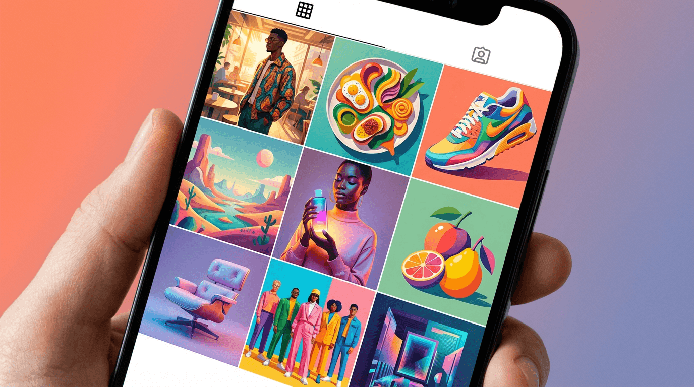
15 copy-paste AI prompts for supplement and vitamin brand visual content. Hero product shots, ingredient origin compositions, lifestyle integrations, capsule macros, powder textures, range displays, morning rituals, athletic performance contexts, gut health imagery, immune support compositions, beauty supplement aesthetics, sleep atmospherics, subscription boxes, transformation contexts, and scientific credibility visuals designed for supplement brands, vitamin companies, nutraceutical startups, wellness DTC brands, and health-focused e-commerce businesses seeking clean professional visuals that build trust and convert browsers into subscribers.
15 copy-paste AI prompts for supplement and vitamin brand visual content. Hero product shots on clean wellness surfaces, ingredient origin and natural source compositions, lifestyle wellness routine integrations, capsule and tablet macro beauty shots, powder and scoop textural compositions, bottle and packaging shelf displays, morning ritual context scenes, athletic performance and recovery positioning, gut health and digestive wellness imagery, immune support seasonal compositions, beauty and skin supplement aesthetics, sleep and relaxation supplement atmospherics, subscription box and bundle arrangements, before-and-after transformation context, and scientific trust and clinical credibility visuals designed for supplement brands, vitamin companies, nutraceutical startups, wellness DTC brands, health food companies, sports nutrition labels, adaptogen and mushroom brands, collagen and beauty supplement lines, prenatal and women's health brands, men's health supplement companies, nootropic and cognitive wellness brands, probiotic and gut health companies, plant-based supplement brands, functional food brands, and health-focused e-commerce retailers.
The supplement bottle sits on the shelf — amber glass or matte white or clean kraft — and it contains something invisible. This is the fundamental visual challenge of the supplement industry and the reason that imagery carries more commercial weight in this category than in almost any other consumer goods vertical. The customer cannot see the product working. They cannot taste the difference between a high-quality magnesium glycinate and a cheap magnesium oxide by looking at the capsule. They cannot observe the probiotic colonies thriving in the opaque bottle. They cannot watch the ashwagandha reducing their cortisol in real time. The product's value is entirely invisible — molecular, biological, gradual, internal — and the only thing the customer can evaluate before purchase is the brand's visual presentation. The imagery does not just sell the product. It is the product, experientially, until the customer has been taking it long enough to notice the effects. The visual identity is the trust mechanism, the quality signal, the efficacy proxy, and the differentiation strategy — simultaneously. A supplement brand with extraordinary formulations and amateur visual content will lose to a mediocre formulation with professional, clean, trust-building imagery every single time, because the customer cannot evaluate formulation quality from the outside. They can only evaluate what they can see. And what they can see is the content.
This reality creates both the pressure and the opportunity that defines supplement brand visual strategy. The pressure: every visual touchpoint must communicate clinical credibility, ingredient quality, brand sophistication, and wellness authority simultaneously — across product photography, social media content, website heroes, email marketing, paid advertising, and retail packaging. A single amateur image in the ecosystem — a poorly lit product shot on Amazon, a low-quality Instagram post, a blurry hero on the website — cracks the trust that the invisible product relies upon entirely. The opportunity: because the product itself offers limited visual interest (bottles, capsules, powders — functionally similar across brands), the brand that invests in superior visual content achieves disproportionate differentiation. Two identical-quality fish oil supplements on the same shelf or in the same search results will sell at dramatically different rates based entirely on which brand's visual presentation communicates higher quality, greater clinical authority, and more sophisticated wellness positioning. The imagery is not supporting the product. The imagery is the competitive moat.
If you have worked with AI prompts for product photography, e-commerce visuals, or social media content, the methodology will be familiar. Copy the prompt, adjust the details to match your specific brand — your actual product format (capsules, tablets, powders, liquids, gummies), your brand color palette, your ingredient story, your packaging design, your target demographic, your wellness positioning, your aesthetic direction — generate, and deploy. What distinguishes these prompts from general product photography is that every element has been engineered specifically for the supplement and wellness context: the clean, clinical aesthetic that communicates purity and precision, the natural ingredient compositions that build origin-story credibility, the lifestyle integrations that normalize supplementation as a sophisticated daily practice, the textural beauty shots that make capsules and powders visually compelling despite their inherent simplicity, the scientific trust signals that differentiate from unregulated supplement-market noise, the wellness atmosphere that positions the brand within the broader health-conscious lifestyle rather than as a medicinal intervention, and the overall visual language that transforms a commodity bottle into a premium wellness brand with perceived authority and quality. These are not general product photography prompts applied to supplements. They are images designed to solve the specific commercial challenge of selling invisible benefits through visible brand quality.
A note on regulatory considerations and health claims: These prompts generate visual content that communicates wellness, vitality, and lifestyle quality. They do not generate imagery that constitutes health claims, medical advice, or disease treatment promises. Supplement brands must ensure that their visual content — like all marketing materials — complies with relevant regulations (FDA, FTC, EFSA, TGA, or equivalent regulatory bodies in their market). Visual content should support the brand's positioning and aesthetic identity without implying specific medical outcomes, diagnostic capability, or disease treatment. Before-and-after imagery, transformation claims, and clinical result implications carry particular regulatory sensitivity and should be reviewed for compliance before deployment. Consult your regulatory counsel regarding visual content that approaches claim boundaries.
Why Clean Professional Visuals Are the Primary Trust Signal for Supplement Brands
The relationship between visual quality and purchasing behavior in the supplement category operates through a trust mechanism that is more critical here than in almost any other consumer product category. The customer is ingesting the product — putting it inside their body — based on the brand's representations about what the product contains and what it does. This act of trust is mediated almost entirely by visual signals.
The supplement customer is evaluating safety and quality with every visual impression. Unlike a clothing brand where amateur photography might mean the shirt is unflattering but harmless, amateur photography for a supplement brand triggers a more primal concern: if the brand cannot maintain quality in their visible communications, can they be trusted to maintain quality in their invisible formulations? The leap from "this looks unprofessional" to "this might be unsafe or ineffective" happens instantly and unconsciously in the supplement buyer's mind. Professional, clean, precise visual content communicates the manufacturing standards, quality control protocols, and scientific rigor that the customer cannot observe directly. Every pristine product photograph is indirect evidence of pristine manufacturing processes.
Visual parity with pharmaceutical brands establishes credibility. The most effective supplement brands visually position themselves closer to pharmaceutical companies than to general consumer goods brands. Clean backgrounds, precise product photography, clinical-quality ingredient visualization, and sophisticated minimalist design — these visual choices borrow the trust associations of pharmaceutical marketing (rigorous, regulated, scientifically validated) while maintaining the approachability and lifestyle warmth that distinguishes supplements from medications. The brand that achieves this visual position — clinical enough to trust, warm enough to invite — occupies the premium tier that commands the highest margins.
Amazon and marketplace search results are won on thumbnail quality. For supplement brands selling through Amazon (which dominates supplement e-commerce), the product listing thumbnail is the primary conversion variable in search results. The customer searching "vitamin D3 5000IU" sees dozens of competing products at similar price points with similar formulations. The thumbnail that appears cleanest, most professional, most sophisticated, and most trustworthy earns the click. The click is the conversion funnel's top — without it, nothing below matters. Brands with professional product photography (clean white or lifestyle backgrounds, readable labels, quality lighting, sophisticated composition) consistently outperform brands with amateur or cluttered thumbnails in click-through rate, which compounds into higher organic search ranking, which compounds into more sales, which compounds into more reviews, which further compounds ranking advantage. Visual quality is the flywheel's starting energy.
Social media content must communicate authority in a saturated market. The supplement and wellness space on Instagram, TikTok, and Pinterest is extraordinarily saturated. Thousands of brands post daily — many with commodity-identical products and overlapping health positioning. In this saturated environment, visual quality is the primary differentiation mechanism available to every post. The brand whose Instagram grid presents consistent, clean, professionally-quality visual content is perceived as more authoritative, more established, and more trustworthy than the brand with inconsistent or amateur visual content — regardless of whether their formulations are superior. The grid is the brand's storefront, and the visual quality of the grid is the storefront's architecture and cleanliness.
Subscription conversion depends on premium perception. The supplement industry's most profitable business model — recurring subscription — depends on the customer perceiving the brand as premium enough to commit to monthly purchases. This premium perception is built and maintained through visual content across every touchpoint: the product photography that first attracted them, the website aesthetics that converted them, the social media content that reinforced their choice, and the unboxing experience that validated their investment. At every stage, the visual quality either reinforces the premium perception that sustains the subscription or erodes it toward cancellation. Professional visual content is not a marketing expense — it is subscription retention infrastructure.
Retail shelf competition is won in the visual periphery. For supplement brands with retail presence (Whole Foods, Sprouts, independent health stores, pharmacy chains), the shelf environment presents intense visual competition. The customer's eye scans dozens of competing products in seconds, and the brands that arrest attention through superior visual design — clean label design, sophisticated color palettes, premium material finishes, consistent visual language across the product range — earn the pickup-and-examine moment that precedes purchase. The visual content created for digital channels (photography, lifestyle content, ingredient compositions) informs and reinforces the physical packaging design, creating omnichannel visual consistency that builds brand recognition across the customer's discovery journey.
Influencer and affiliate content sets visual expectations. When health influencers, wellness podcasters, and affiliate partners share supplement products with their audiences, the visual content they use (often provided by the brand) becomes the customer's first impression. Brands that provide professional, beautiful, ready-to-use visual assets to partners ensure consistent quality representation across all channels. Brands that rely on partners to photograph products themselves — under variable conditions with variable skill — lose control of their visual quality standard at the exact moment the visual quality matters most: the first impression.
The Visual Language of Supplement and Wellness Brand Photography
Supplement visual content operates within a specific aesthetic language that has evolved over the past decade from the industry's early amateur days (gold bottles with aggressive claims on plain backgrounds) to the current premium standard (minimalist, clinical, natural, sophisticated). Understanding this visual language is essential to creating content that positions a brand correctly within the market.
Clean minimalism signals formulation purity. The dominant visual language of premium supplement brands is reductive minimalism — clean backgrounds, generous negative space, precise product positioning, limited color palettes, and the absence of visual clutter. This minimalist approach is not merely aesthetic preference but functional communication: the visual simplicity says "our formulation is pure — nothing unnecessary, nothing hidden, nothing to distract from the quality of what is inside." Cluttered, busy, information-dense visual content communicates the opposite: the brand is compensating with noise for a product that cannot stand on its own simplicity.
Natural ingredient visualization builds origin credibility. The most powerful visual strategy unique to supplement brands is ingredient-origin photography — compositions that show the raw botanical, mineral, or food source alongside or surrounding the finished product. Turmeric root arranged beside curcumin capsules. Fresh blueberries scattered around an anthocyanin supplement. A split-open mushroom revealing the mycelium beside a reishi capsule bottle. These compositions create a visual narrative that connects the finished product back to its natural source, communicating: this is what is inside, it comes from nature, the ingredient is real and recognizable and whole. For customers who cannot evaluate the product's internal quality, these visual origin stories provide the credibility bridge between "a bottle of capsules" and "a concentration of this specific, recognizable, natural ingredient."
Clinical precision signals scientific backing. Visual elements that communicate laboratory and scientific contexts — precise measurement, clinical cleanliness, structured arrangement, mathematical symmetry — trigger trust associations with scientific rigor. A product shot where capsules are arranged in a perfectly measured line, a composition where the bottle sits on a clean surface with precisely placed ingredients, a laboratory-adjacent aesthetic with glass vessels and precise lighting — these visual choices say "this product was developed with scientific precision" without making explicit clinical claims. The visual language does the work that explicit claims cannot legally do.
Warm lifestyle integration normalizes daily supplementation. While clinical precision builds trust, excessive clinical coldness can alienate the wellness consumer who sees supplementation as part of a warm, holistic, life-affirming daily practice — not a medical intervention. The visual balance that premium supplement brands achieve is clinical enough to trust but warm enough to invite: the supplement bottle in a bright kitchen beside a morning smoothie, the capsules in a hand against a backdrop of natural light, the powder being stirred into a warm beverage in a beautiful ceramic mug. These lifestyle integrations say "this is part of a good life" rather than "this is a medical necessity," positioning the brand within wellness culture rather than sick-care.
Color palette communicates category and positioning. Supplement brand visual content relies heavily on color to communicate both the specific product category and the overall brand positioning. Green tones communicate plant-based, natural, earthy wellness. White and pale tones communicate clinical purity and pharmaceutical-grade quality. Warm amber and gold tones communicate premium, heritage, and traditional wellness wisdom. Deep navy and charcoal communicate masculine positioning, clinical authority, and scientific precision. Soft pastels (blush, sage, lavender) communicate women's wellness, beauty, and gentle care. The brand's color system — expressed consistently across all visual content — becomes a recognition signal and a positioning statement simultaneously.
Texture and material surfaces communicate quality tier. The surfaces, backgrounds, and materials in supplement photography communicate the brand's quality positioning more powerfully than the product itself. Premium supplement photography places products on surfaces that signal quality: natural marble or travertine (premium, clean, substantial), warm wood (natural, artisanal, craft-quality), concrete or terrazzo (modern, architectural, design-forward), linen or textured fabric (soft, approachable, premium), glass surfaces (clinical, precise, transparent). Budget supplement photography defaults to plain white backgrounds — functional but generic. The surface choice is a quality declaration that the viewer absorbs before consciously examining the product.
Transparency and openness communicate nothing-to-hide confidence. Visual choices that show the product openly — capsules visible outside the bottle, powder in an open container, ingredients displayed beside the product, the label clearly legible, the formulation details visible — communicate a brand that is confident in its product and has nothing to hide. Conversely, visual content that obscures the product — hiding the label, never showing the capsules, keeping everything sealed and unopened — can trigger the unconscious sense that the brand is concealing something. Premium supplement photography shows the product: open bottles with capsules visible, scoops of powder in full textural detail, ingredient panels legible, raw ingredients displayed with pride.
Ritual and routine framing creates daily purchase justification. Supplements are daily-use products, and the customer must justify the ongoing expense by believing the daily ritual is valuable — not just the product but the practice of taking it. Visual content that frames supplementation as a meaningful daily ritual — a curated morning routine, a mindful evening practice, a pre-workout protocol, a beautiful bedside arrangement — elevates the act of taking supplements from "swallowing pills" to "practicing wellness." This ritual framing justifies premium pricing because the customer is not just buying capsules but buying a daily practice of self-care.
15 AI Prompt Templates for Supplement & Vitamin Brand Visual Content
Each template includes a content concept, the full copy-paste prompt, and deployment guidance. All prompts are formatted for the Miraflow AI Image Generator and compatible with any high-quality text-to-image tool. Adjust the bracketed descriptive elements in each prompt to match your specific product format, brand aesthetic, ingredient story, packaging design, and target demographic. Generate at 1:1 for Instagram feed and product thumbnails, 4:5 for Instagram and social media maximum-impact feed posts, 3:2 or 16:9 for website heroes and banner ads, 9:16 for Stories and vertical video thumbnails, and 2:3 for Pinterest.
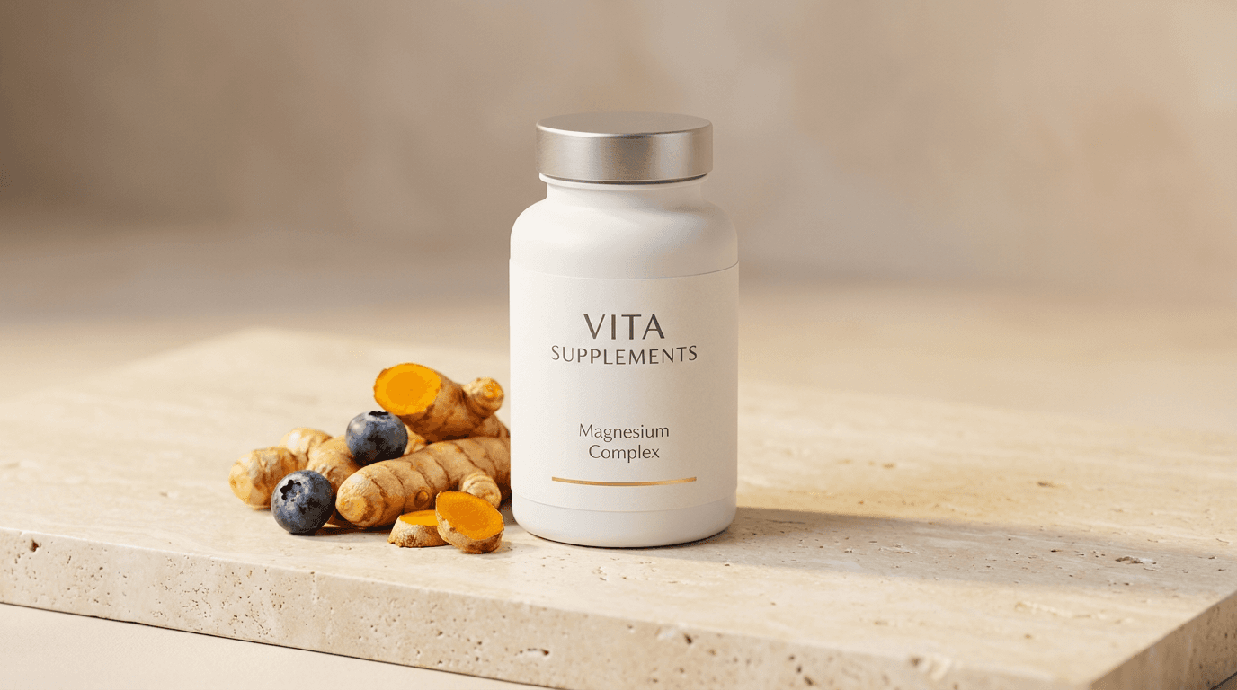
Template 1: The Hero Product Shot — Clean Premium Surface
This is the foundational product photograph — the clean, elevated product shot that establishes the brand's visual quality standard and serves as the primary product image across e-commerce, social media, and marketing materials. Every visual in the brand ecosystem references this core aesthetic.
Prompt:
premium supplement product photograph of [a sleek matte white bottle with a clean minimal label — the bottle is a modern soft-touch finish cylinder with gently rounded shoulders and a flat disc cap in brushed aluminum or matte white, the label is minimalist and sophisticated: the brand name in a clean sans-serif or refined serif typeface in soft charcoal or deep navy, the product name (such as "Magnesium Complex" or "Daily Multi" or "Omega-3") in a smaller elegant weight below, subtle accent color used sparingly — perhaps a thin line, a small botanical illustration, or a color-coded dot indicating the product category, the label occupies only a portion of the bottle's front surface leaving generous white space that communicates the minimalist purity of the brand, the bottle is positioned as the hero subject on a premium surface — a slab of natural travertine stone in warm cream with subtle natural pitting and variation, or a clean piece of Italian marble with soft grey veining on white, or a smooth terrazzo surface in warm white with subtle aggregate flecks — the surface communicates premium materiality and the quality tier of the brand, beside the bottle a small arrangement of the product's key raw ingredient in its natural form: if the product is a turmeric supplement then a few pieces of fresh golden turmeric root with one piece cut to reveal the vivid orange interior, if a berry antioxidant then a small scatter of fresh dark blueberries and raspberries with natural bloom, if an omega-3 then a small piece of fresh fish or a few golden fish oil capsules loose on the surface catching light, if a mushroom supplement then a dried lion's mane or reishi mushroom section with visible gill structure, if a green supplement then a few fresh leaves of the key botanical — the raw ingredient serves as the visual origin story connecting the finished product to its natural source and communicating the ingredient's reality and quality, the arrangement is minimal — the bottle dominates as the hero with the ingredients serving as supporting context, not competing for attention, the background beyond the surface is clean and simple — a soft warm gradient from the surface color into a slightly lighter tone above, or a subtle architectural element (the edge of a wall, a soft shadow indicating depth) that adds three-dimensionality without distraction, the overall scene communicates: this is a premium product, made from real natural ingredients, presented with clinical precision and design sophistication, from a brand that values purity, minimalism, and quality in everything visible — and by extension, everything invisible] in a precise, elevated product-hero composition, the bottle is positioned slightly off-center in the frame — creating a balanced asymmetry that is more sophisticated than dead-center placement, the bottle occupies approximately one-third to one-half of the frame's height — large enough to show label detail but surrounded by enough negative space to communicate premium breathing room, the raw ingredient arrangement extends from beside or slightly behind the bottle — creating a visual connection between product and source without cluttering the hero subject, the camera angle is slightly elevated — perhaps 15-20 degrees above horizontal — showing the top of the cap, the full label, and the surface in a natural, product-photography perspective that shows the bottle's form and the surface beneath, the depth of field is moderately shallow — the bottle and immediate ingredients in crisp sharp focus with the background and far edges softening into gentle blur, communicating photographic sophistication, a single ingredient element may extend slightly toward the camera in the foreground — creating a subtle depth layer that adds dimensionality to the otherwise clean composition, the label text is legible but not the focus — the overall form, color, and brand aesthetic communicate rather than specific text information, the surface extends to the frame edges or nearly so — providing the visual stage without visible table edges or boundaries that would shrink the perceived world of the product, the lighting is the hero-shot's defining quality — a primary soft light source from above and slightly to one side, creating gentle directional illumination that models the bottle's cylindrical form with a soft gradient from light to shadow across its surface, the matte bottle finish responds to the light with even, soft luminosity rather than harsh specular highlights — communicating the premium soft-touch texture, the cap catches the light with its specific material response — brushed aluminum with a subtle metallic gleam, or matte white with even smooth illumination, the label catches the light evenly — the text and graphics clearly illuminated without glare or hot spots, the raw ingredients catch the light with natural, organic response — the turmeric's cut surface with rich amber translucence, the berries with natural skin sheen and color saturation, the mushroom's texture with directional shadows revealing gill or pore structure — the natural material responding to the light in ways that communicate freshness and quality, the stone surface catches the light with warm, diffuse response — the travertine's or marble's natural variation visible under even illumination, catching a subtle warmth from below that opens the shadows, the shadow beneath the bottle is soft and natural — not harsh or cut off, gradually dissipating outward, the overall light quality communicates studio precision with natural warmth — controlled, flattering, even, without the harsh clinical quality that would make the scene feel medical rather than wellness, clean matte white bottle surface with charcoal or navy label typography warm cream or white stone surface with natural variation (travertine warmth or marble grey veining) ingredient-specific natural color accent — golden turmeric or deep blue-purple berries or warm amber oil or earthy mushroom brown or vivid botanical green — brushed aluminum cap accent soft warm background gradient and the minimal premium clean palette of a sophisticated supplement brand hero shot on natural stone with ingredient story in precise studio lighting as the color palette, the mood is precisely premium clinically clean naturally credible and the specific trust-building quality that a supplement hero shot must achieve — the viewer immediately perceives quality, purity, design sophistication, and the natural ingredient credibility that says this brand is trustworthy, this product is well-made, and the formulation inside is as pure and intentional as the visual presentation outside — the photograph as the visible evidence of invisible quality, professional product and commercial photography with precise soft directional studio lighting and moderately shallow depth of field keeping the bottle and immediate ingredients in sharp focus with subtle background softening, composed as a slightly elevated clean product-hero with asymmetric placement and ingredient context, the matte bottle quality and the natural ingredient freshness and the premium surface material as the simultaneous quality signals, clean minimal premium tones with single natural ingredient accent, no text overlays, no logos outside the product label, no watermarks
Best for: Primary e-commerce product image (Amazon, Shopify, brand website), Airbnb-style hero listing image across all platforms, social media product introduction and announcement posts, paid advertising primary product creative, email marketing product feature header, wholesale and retail buyer presentation, PR and media kit product imagery, print catalog and brochure primary product photograph
Template 2: The Ingredient Origin — Natural Source Composition
This template creates the visual credibility bridge between the finished product and its natural source — the image that answers the customer's implicit question: "what is actually in this, and where does it come from?" The ingredient-origin composition is one of the most powerful trust-building visual strategies available to supplement brands.
Prompt:
natural ingredient origin photograph for a supplement brand showing [fresh turmeric roots arranged on a warm natural surface — multiple whole turmeric rhizomes with their knobby organic form and papery golden-brown skin, one or two pieces cut cleanly to reveal the vivid deep golden-orange interior flesh that demonstrates the concentration and potency of the curcumin within, the cut surfaces are fresh and moist — their color saturated and vivid with the quality that communicates recently harvested, fresh, whole-food source material rather than dried or degraded ingredients, beside or among the turmeric roots a few pieces of fresh black pepper — whole peppercorns in a small scatter — referencing the piperine that enhances curcumin absorption (a detail that demonstrates formulation knowledge and ingredient synergy awareness), the arrangement is organic and natural — not rigidly geometric but flowing with the natural forms of the rhizomes, placed as if recently gathered and set down on the surface for examination, with perhaps a few small green turmeric leaves or a stem fragment adding botanical completeness, the surface beneath is warm and natural — a rough linen in warm cream, a wooden cutting board in warm timber, a clay plate in warm terracotta, or a stone slab in warm grey — the surface communicating natural, kitchen-adjacent, whole-food contexts rather than laboratory sterility, a small amount of bright golden turmeric powder may be present — a pinch scattered on the surface or in a small dark wooden spoon — showing the bridge between the whole root and the concentrated form that goes into the capsule, the overall composition tells the ingredient story: this is what we put in our product, it comes from this recognizable, beautiful, natural source, it is fresh and potent and real, we know our ingredients intimately enough to show them to you in their whole form] in an organic natural ingredient composition, the photograph is taken from directly above or at a slight angle — the overhead or near-overhead perspective that shows the full arrangement of roots, cuts, powder, and surface in a food-photography editorial style, the composition is centered but organic — the ingredients flow within the frame with natural asymmetry, some elements extending toward frame edges creating a generous, abundant feeling, the cut turmeric surfaces face upward — presenting their vivid color directly to the camera as the composition's color focal point, the black peppercorns are scattered intentionally — not measured precisely but placed with editorial attention to create visual rhythm among the larger root forms, the powder (if present) adds a textural layer — the fine golden dust contrasting with the solid root forms and the round peppercorns, creating textural variety that holds visual interest, the surface or fabric beneath provides warm textural backdrop — its own character (linen weave, wood grain, clay surface) adding material richness without competing with the ingredient subjects, the arrangement extends to fill the frame generously — this is not a single root on an empty surface but an abundant composition that communicates ingredient generosity and source quality, the lighting is warm, natural, and food-photography quality — a soft directional light from one side creating gentle shadows that reveal the three-dimensional form of the roots, the texture of the cut surfaces, the roundness of the peppercorns, and the grain of the surface beneath, the cut turmeric surface catches the light with a rich, almost translucent quality — the deep golden-orange color at its most vivid and saturated where the light penetrates slightly into the fresh-cut flesh, the whole root surfaces show their papery texture in the directional light — the natural wrinkles and ridges casting tiny shadows that communicate organic, unprocessed authenticity, the peppercorns catch the light as small dark spheres — their surface slightly glossy with natural oils, each one catching a tiny highlight, the powder catches the light as a fine golden surface — almost glowing with the concentrated color of the curcumin, the surface beneath is evenly lit with warm tones — the linen's weave or the wood's grain visible in the soft illumination, the overall light quality communicates natural warmth and food-quality freshness — this is ingredient photography that makes the raw materials look appetizing, beautiful, and worthy of being consumed, vivid golden-orange turmeric interior as the dominant color — rich saturated and warm — golden-brown turmeric skin exterior dark black-grey peppercorn accents bright golden turmeric powder warm cream linen or warm timber surface or warm terracotta clay green leaf accent if present and the warm natural abundant palette of fresh turmeric ingredient-origin photography in soft directional natural light as the color palette, the mood is naturally abundant freshly vivid botanically credible and the specific ingredient-trust message — this is real, this is fresh, this is what goes into the product you are considering, we show you our ingredients because we are proud of their quality and their source, we understand our botanicals deeply enough to present them to you in their whole natural form — the ingredient photograph as the transparency gesture that builds formulation trust, professional food and ingredient photography with soft warm directional natural light and moderate depth of field keeping the primary ingredient surfaces in rich detailed focus with peripheral elements in gentle natural softness, composed as an overhead or near-overhead organic ingredient arrangement on a warm natural surface, the vivid fresh-cut color and the botanical form and the natural abundance as the ingredient-credibility focal points, warm golden-orange with natural brown and warm surface tones, no text, no logos, no watermarks
Best for: Social media ingredient storytelling content (one of the highest-engagement content types for supplement brands), website product page ingredient section imagery, email marketing ingredient-feature content, paid advertising ingredient credibility creative, blog and educational content illustration, packaging interior ingredient photography, retail point-of-sale educational materials, Amazon A+ content ingredient sections
Template 3: The Lifestyle Integration — Morning Wellness Routine
This template places the product within a aspirational daily routine context — showing how the supplement integrates into the customer's existing life rather than disrupting it. The lifestyle shot normalizes supplementation and creates desire through associating the product with an attractive, well-practiced wellness routine.

Prompt:
warm lifestyle supplement photograph of [a beautiful morning wellness routine scene on a bright kitchen counter or a sunlit breakfast table — the supplement bottle and a few capsules placed naturally within the context of a morning ritual: the bottle sits on a warm marble or light wood surface beside a glass of water (clear, fresh, perhaps with a slice of lemon visible through the glass), a few capsules — two or three — rest on the surface beside the water glass or in a small ceramic dish or on a folded cloth napkin, positioned as if just removed from the bottle and about to be taken, the surrounding scene creates the morning-routine context: a bowl of fresh fruit or overnight oats or yogurt with berries nearby (the healthy breakfast that accompanies the supplement), a mug of coffee or matcha latte (the warm morning beverage that is part of the ritual), perhaps a folded newspaper or a phone face-down suggesting the mindful pause before the day begins, a small potted plant or a vase of fresh flowers adding natural life to the scene, the surface is bright and clean — bathed in warm morning light from a nearby window, the window light creating the specific fresh, hopeful quality of a morning beginning well, the setting is domestic but elevated — a well-designed kitchen or breakfast area that communicates taste and health-consciousness without ostentation, the background shows hints of the kitchen or dining space — soft focus but recognizable as a bright, clean, well-maintained home, the person taking these supplements is implied but not shown — the routine is visible through its elements: the prepared breakfast, the water glass, the supplements ready to take, the morning light indicating the start of a new day, the overall scene communicates: this is what your morning looks like when you incorporate this supplement into your daily wellness routine — simple, bright, clean, healthy, intentional, and pleasurable rather than medicinal] in a warm bright lifestyle product composition, the photograph is taken from a slightly elevated angle — looking down at the counter or table surface at approximately 30-45 degrees, the perspective of someone standing at their counter surveying their prepared morning routine, the supplement bottle and the capsules are prominently placed but not centered — they are part of the scene rather than isolated subjects, integrated into the routine alongside the food and beverage elements, the water glass creates a clear, bright vertical element — the clean water communicating hydration and the simple health-conscious act of taking supplements with water, the breakfast elements provide warm, appetizing context — the fruit colors, the smooth yogurt surface, the coffee's warm tone — creating an appealing overall scene that the product is part of, the morning light enters from one side — creating warm directional illumination that crosses the surface, catching the water glass with bright refracted light, warming the food with appetizing glow, and illuminating the supplement bottle with natural brightness, the depth of field is moderate — the supplement bottle and immediate capsules are in clear focus with the surrounding breakfast and beverage elements in slightly softer but still identifiable focus, and the background kitchen in gentle warm blur, the overall composition reads as lifestyle editorial — the quality and style of a wellness magazine or a high-end food blog, not a clinical product photograph, the morning light is the emotional driver — its fresh warm brightness communicating the start of a good day, the health-conscious morning that begins with intention and care, the light catches the supplement capsules with subtle translucence — if they are softgel capsules their amber or golden color glows with the light passing through, if they are opaque capsules their smooth surfaces reflect the morning brightness cleanly, the water glass catches and refracts the window light — creating bright caustic patterns on the surface beneath and a clear vertical line of light that draws the eye, the breakfast foods are lit appetizingly — the berries with color saturation, the yogurt with smooth luminosity, the oats with warm texture, the fruit with natural sheen, warm bright morning natural light throughout — golden-warm window light on a clean surface — supplement bottle matte white or amber with minimal label water glass clear and bright with lemon yellow accent fresh fruit colors (berry reds, blueberry purples, citrus yellows) warm coffee or matcha green in a ceramic mug clean marble or light wood surface warm green plant accent morning-bright background kitchen tones and the fresh warm healthy palette of a morning supplement routine in generous natural window light as the color palette, the mood is freshly intentional healthily bright routinely pleasurable and the specific lifestyle-integration message — taking these supplements is not a medical chore but a natural and pleasurable part of a well-designed morning, it sits alongside the good coffee and the fresh fruit and the morning light as part of a life lived with intention and health-consciousness — the lifestyle photograph as the aspiration that the product facilitates, professional lifestyle and editorial photography with warm directional morning window light and moderate depth of field keeping the product and immediate context in clear lifestyle focus, composed as a slightly elevated kitchen-counter or table-top morning scene with the supplement integrated among routine elements, the morning light quality and the healthy routine context and the natural product integration as the lifestyle-brand focal points, warm bright morning tones with natural food color accents, no text overlays, no logos outside product label, no watermarks
Best for: Social media lifestyle content (the most relatable and shareable content type for supplement brands), website homepage lifestyle hero imagery, email marketing daily-use and routine content, paid advertising lifestyle and aspiration creative, influencer brief visual reference and brand guidelines, Pinterest wellness and routine boards, blog and editorial wellness content illustration, subscription marketing daily-habit content
Template 4: The Capsule Macro — Textural Beauty Close-Up
This template elevates the humble capsule or tablet into a subject of visual beauty through extreme close-up macro-style photography. The capsule macro makes the product itself visually compelling and communicates formulation quality through the precision and beauty of the capsule's form.
Prompt:
macro beauty photograph of supplement capsules showing [a close-up arrangement of premium quality capsules in rich detail — the capsules are two-piece gelatin or HPMC vegetarian capsules in a warm amber-gold color (suggesting omega-3 or curcumin or vitamin D in oil carrier), their surfaces smooth and pristine with the quality that communicates pharmaceutical-grade manufacturing precision, the capsules are arranged in a deliberately aesthetic pattern — perhaps flowing in a gentle curved line across the frame, or scattered in an organic cluster with deliberate negative space, or arranged in a precise grid that communicates manufacturing exactitude, the capsule surfaces are flawless — no visible imperfections, no powder residue, no seam irregularities — communicating quality control standards that the viewer interprets as formulation quality, the capsule's two-piece join seam is visible but clean — a subtle line running around the capsule's circumference that communicates the engineering of the delivery format, inside the capsule the contents are subtly visible — the amber transparency of the gelatin allowing a hint of the golden oil or the herbal powder within to show through, communicating that there is a real substance inside rather than an empty shell, the surface beneath the capsules is clean and premium — perhaps a frosted glass surface, a clean white pharmaceutical surface, a pale marble, or a soft linen — providing contrast that makes the capsules' warm amber color vivid, a few capsules overlap each other gently — creating depth layers and shadows between them that add three-dimensionality, some capsules catch the light differently based on their angle — some showing bright specular highlights along their curved surfaces, others in slight shadow with their color deepened, the overall composition treats these capsules as objects of beauty — the same visual attention given to jewelry or luxury cosmetics, elevating the product format from functional to beautiful] in an extreme close-up macro-beauty composition, the photograph fills the frame with the capsules at a scale that makes each one appear substantial and detailed — individual capsules are large in the frame, filling perhaps one-quarter to one-third of the image height, the tight crop and large scale communicate intimacy with the product — the viewer can examine the surface quality, the color consistency, the manufacturing precision at a level that communicates the brand's confidence in showing the product this close, the arrangement has compositional flow — the capsules' elongated oval forms create directional movement within the frame, leading the eye along their collective arrangement, the depth of field is very shallow — one to three capsules in sharp crisp focus with others falling into beautiful soft blur, creating the bokeh-rich macro photography aesthetic that communicates premium photographic craft, the focused capsules show their full surface detail — the smooth gelatin texture, the subtle amber translucence, the clean seam, the rounded end caps — each detail visible with precision, the blurred capsules provide warm amber color mass and form without competing for attention — their soft shapes creating a beautiful background for the sharp hero capsules, the negative space between capsules adds sophistication — the clean surface visible between the forms, providing the visual breathing room that premium product photography requires, the lighting is precise and beauty-grade — a primary soft light source creating a bright specular highlight along the curved top surface of each capsule (the "beauty line" that communicates the capsule's three-dimensional form and surface smoothness), this highlight is soft-edged and follows the capsule's curve — not a sharp harsh reflection but a gradual luminous gradient that communicates smooth, premium surface quality, secondary fill light opens the shadow side of the capsules — preventing them from going completely dark and maintaining visible color and form throughout, the amber capsule color is at its richest and most beautiful — warm, golden, translucent where the light catches the thinner curved edges, deeper and more opaque in the thicker center sections, the surface beneath catches soft ambient light — providing clean contrast without distraction, perhaps with subtle shadow underneath each capsule grounding them on the surface, the overall lighting makes the capsules look precious and beautiful — the visual treatment typically reserved for cosmetics, perfume, or jewelry applied to supplement capsules, elevating their perceived value, rich warm amber-gold capsule surfaces with subtle translucent depth bright soft specular highlights along curved forms deeper amber in shadowed or thicker areas clean white or pale surface beneath subtle shadow between and beneath capsules warm overall ambient tone and the premium amber-gold macro-beauty palette of pharmaceutical-quality capsules in precise studio beauty lighting as the color palette, the mood is precisely beautiful formulation-confident premium-quality and the specific elevation that macro-beauty photography brings to supplement products — transforming a functional capsule into an object of visual desire, the craftsmanship of the capsule communicating the craftsmanship of the formulation inside — the macro photograph as the quality-confidence statement, professional macro and beauty photography with precise soft directional studio lighting creating beauty-line highlights and very shallow depth of field with one to three capsules in sharp focus and others in soft amber bokeh, composed as a close-up capsule arrangement with flow and deliberate negative space, the surface quality and the amber translucence and the manufacturing precision as the close-up quality focal points, warm amber-gold premium tones throughout, no text, no logos, no watermarks
Best for: Social media product close-up content (high visual impact and engagement), website product detail imagery, email marketing product quality communication, paid advertising product quality creative, Amazon A+ content detail photography, packaging insert and promotional material imagery, brand identity and style guide hero product shots, PR and media kit detail photography
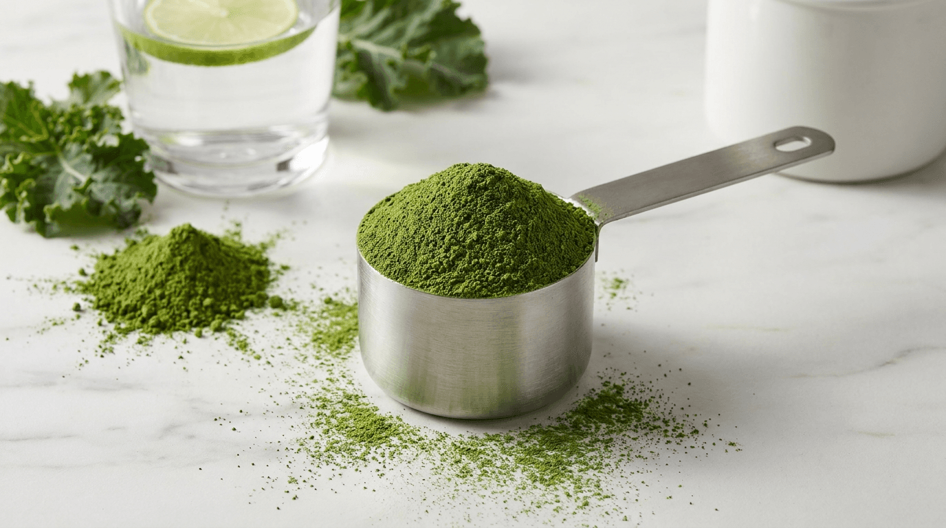
Template 5: The Powder Scoop — Textural Composition
For supplement brands selling powdered products (protein, greens, collagen, adaptogen blends), the powder scoop composition showcases the product's texture, color, and quality in a way that makes the functional format visually compelling and appetizing.
Prompt:
textural powder supplement photograph of [a beautiful composition featuring a supplement powder in its most visually appealing state — a scoop or measure of fine, richly-colored powder: the powder is a vibrant green (a greens blend or spirulina or matcha-based supplement) with the deep, saturated color that communicates concentrated nutrition and ingredient density — the green is rich and alive, not pale or grey or dusty, suggesting fresh, potent ingredients, a measuring scoop in clean brushed stainless steel or matte black holds a perfectly rounded mound of the powder — the scoop full but not overflowing, the powder's surface smooth and even, the heap catching the light with a gentle curve that shows the fine texture, the scoop rests on or beside the surface of the powder within the container — a clean white or clear tub or bag opening showing the abundant powder within, or the scoop rests on a clean marble or concrete surface beside a small mound of powder that has been deliberately placed for visual effect, additional powder is artfully scattered — a light dusting on the surface around the scoop creating textural interest and color spread, perhaps a thin stream of powder captured in mid-pour or a small pile showing the powder's fineness and flow quality, the surrounding composition adds context: a glass of water or a smoothie in preparation nearby suggesting the powder's intended use, a few pieces of the key ingredient in whole form (fresh spirulina if available, or kale leaves, or matcha powder beside the blended greens) creating the ingredient-origin connection, a clean minimal container or bag with sophisticated branding partially visible in the background, the surface is clean and creates color contrast — white marble or light concrete or a pale ceramic surface that makes the vibrant green powder pop with maximum visual impact, the overall composition celebrates the powder as a material — its texture, its color density, its fine quality, its concentrated nutrition made visible through the intensity of its hue] in a textural close-range powder composition, the photograph is taken from a slightly elevated angle — approximately 30-45 degrees — showing both the top of the powder mound in the scoop and enough of the surface to display the scattered powder texture, the scoop is the primary subject — positioned prominently with the powder's mounded form creating the composition's visual anchor, the powder's color is the photograph's emotional driver — the vivid green (or whatever the product's specific color) is the brightest, most saturated element in the frame, drawing the eye immediately, the texture of the powder is visible — at this close range the fine granular quality is perceptible, the way the powder catches light on its surface revealing whether it is silky-fine or slightly coarse, the scattered powder on the surface adds artful imperfection — the slightly messy quality that makes the scene feel real and active rather than sterile and staged, the depth of field is moderately shallow — the scoop and immediate powder in sharp focus with surrounding elements in gentle supporting blur, the powder container or context elements in soft background, the negative space around the main composition allows the powder's color to breathe — the clean surface providing contrast that intensifies the green (or product-specific color), the lighting is soft and even with directional quality — the primary light from one side or above creating gentle shadows that reveal the powder's texture and the scoop's form, the powder surface catches the light with a fine, almost velvety quality — the way fine powder absorbs and softly reflects light creating a rich matte luminosity rather than a shiny reflection, the color appears at its most saturated and vivid in this lighting — the green is deep and alive, communicating freshness and potency through pure color intensity, the stainless steel or matte black scoop catches the light with its material-specific response — a clean metallic sheen or a matte absorption that contrasts with the powder's organic texture, the scattered powder on the surface catches the light as individual fine particles — creating a slightly different textural response than the mounded powder, more diffuse and atmospheric, the surrounding context elements (water glass, whole ingredients) catch the light in supporting roles — providing context without competing with the powder's textural and chromatic hero status, vibrant deep saturated green powder as the dominant color (or product-specific: purple for berry blends, warm brown for cacao or mushroom, golden for turmeric, pale cream for collagen) — brushed stainless steel or matte black scoop clean white or pale marble or concrete surface contrast subtle powder scatter texture whole ingredient accent colors if present clear water or smoothie accent and the vivid textural palette of a premium supplement powder in detailed close-range photography with maximum color impact as the color palette, the mood is vibrantly potent texturally rich nutritionally dense and the specific visual argument of powder product photography — this is concentrated nutrition you can see, the color tells you the potency, the texture tells you the quality, the fine even powder tells you the manufacturing standard, and the visual richness promises nutritional richness — the powder photograph as the visible density of invisible nutrition, professional food and product photography with soft directional studio light and moderately shallow depth of field keeping the scoop and powder surface in rich textural focus, composed as a close-range elevated-angle powder composition with textural detail and color impact, the powder color saturation and the textural fineness and the scoop precision as the product-quality focal points, vivid product color against clean neutral surface, no text overlays, no logos outside product container, no watermarks
Best for: Social media product showcase content (powder products are inherently more visual than capsules), website product page hero and detail imagery, Amazon product listing main images and A+ content, email marketing product feature and launch content, paid advertising product differentiation creative, recipe and usage content visual headers, influencer brief product photography reference, retail and wholesale presentation materials
Template 6: The Shelf Display — Product Range Architecture
This template showcases the brand's product range as a cohesive collection — the visual merchandising composition that communicates brand completeness, design consistency, and the systematic approach to wellness that a well-designed product line represents.
Prompt:
clean supplement brand shelf display photograph of [a curated arrangement of multiple products from the same supplement brand — five to seven bottles of varying sizes and formats displayed as a cohesive product family: the bottles share a consistent design language — the same clean packaging aesthetic across the range with variations in accent color, label detail, and bottle size that indicate different products while maintaining unmistakable brand family coherence, the range might include: a larger bottle of a daily multivitamin, a standard-size bottle of a specific mineral supplement, a smaller bottle of a concentrated specialty supplement, a tub of powder, and perhaps a box of individual packets — the variety of formats demonstrating the brand's range and capability while the consistent design demonstrates brand integrity, each product has a distinct color-coded accent — a thin colored band, a colored cap, a category-indicating color element — that identifies the specific product (green for energy, blue for cognitive, orange for immune, purple for sleep, pink for beauty, for example) while the dominant white or neutral base maintains brand consistency, the products are arranged with deliberate merchandising intelligence — perhaps in a graduated height line from tall to short, or in a slight arc that creates visual rhythm, or in an asymmetric cluster with clear primary and supporting product hierarchy, the surface beneath is clean and sophisticated — a white or light-toned shelf, a marble counter, a clean architectural surface — communicating the retail or bathroom-shelf context where these products will live, the background is clean — a soft neutral wall or a subtle gradient that provides the backdrop for the product range without competing for attention, the arrangement communicates: this is a complete wellness system from a single trusted brand, each product is designed with the same quality and care, the range addresses multiple health needs within a cohesive visual and formulation philosophy] in a clean structured product-range composition, the photograph is taken from straight-on or very slightly elevated — the traditional product display angle that shows the labels clearly and communicates the height variation and format diversity across the range, the products are arranged in a line or gentle arc — their spacing deliberate and consistent, creating rhythm and order that communicates manufacturing precision and brand system thinking, the tallest or hero product may be positioned slightly forward or central — establishing the range hierarchy while the supporting products flank and complement, each product's label is visible and facing forward — the brand identity consistently presented across all products, the color-coding system clearly communicable across the range, the spacing between products allows each to be individually read while maintaining the group composition — not so close they become a mass, not so far they lose family connection, the surface creates a clean base line — all products resting on the same surface communicating equality within the range, the background is simple enough to not distract — allowing the product range to be the undivided focus, the lighting is even and product-photography standard — consistent illumination across all products so that no single bottle is more brightly lit than another (which would create unintended hierarchy), the even light shows each label clearly and each bottle form accurately, the light falls with soft directional quality from slightly above and to one side — creating gentle shadows behind the products that add depth and separate them from the background without creating dramatic contrast, each bottle's surface responds consistently to the light — the matte or semi-matte finish providing even, non-reflective illumination across the range, the color-coded accents catch the light consistently — each colored element visible and vibrant at the same intensity, communicating the systematic color strategy, the surface reflects or absorbs light cleanly — providing a stable visual base without distracting reflections or patterns, the background receives soft even illumination — lighter above, slightly warmer below, creating a subtle gradient that frames the product range without visible light sources or equipment, consistent brand-white or brand-neutral bottle surfaces across the range with distinct color-coded accents per product (green, blue, orange, purple, pink, or brand-specific accent palette) — clean charcoal or navy typography consistent across all labels — clean white or marble surface beneath — soft neutral background — subtle shadow depth behind products — and the systematic cohesive organized palette of a complete supplement brand range displayed with merchandising precision in even studio light as the color palette, the mood is systematically cohesive brand-complete professionally organized and the range-display message — this brand has a complete wellness system, each product is part of a considered family, you can trust the whole range because the design consistency implies formulation consistency, the brand thinks systematically about your health — the range photograph as the brand completeness and system-trust statement, professional product and commercial photography with even soft directional studio lighting and deep depth of field keeping all products in consistent clear focus across the full range, composed as a straight-on or slightly elevated product-line display with deliberate spacing and hierarchy, the brand consistency and the color-coding system and the range completeness as the simultaneous brand-trust signals, clean neutral base with systematic color accents, no text overlays, no additional logos, no watermarks
Best for: Website homepage product range showcase, brand deck and investor presentation imagery, wholesale and retail buyer presentation materials, Amazon storefront and brand store hero imagery, social media brand introduction and range posts, email marketing full-range promotion and new customer orientation, print advertising and catalog range display, PR and media coverage brand imagery, retail shelf strategy and planogram reference
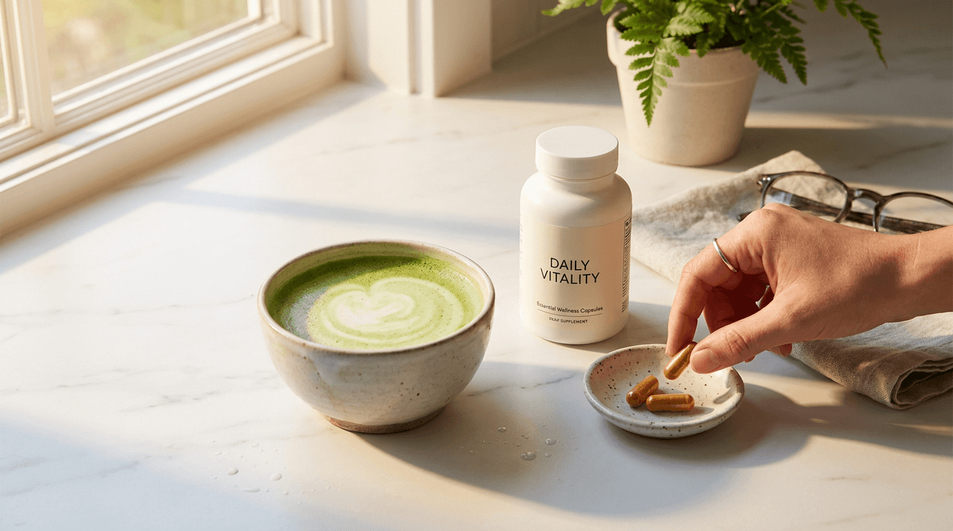
Template 7: The Morning Ritual — Supplement and Beverage Pairing
This template creates the specific high-converting content type that pairs the supplement product with the morning beverage ritual — coffee, matcha, smoothie, or lemon water — that most wellness consumers already practice. The pairing normalizes supplementation as part of an existing pleasurable routine.
Prompt:
warm morning ritual photograph of [a supplement moment paired with a morning beverage — the specific daily intersection where taking supplements becomes part of an already-pleasurable morning practice: a clean white or marble surface holds the morning beverage: a warm matcha latte in a beautiful handmade ceramic bowl or cup — the vibrant green liquid with a thin foam surface and perhaps a subtle latte-art swirl, or a pour-over coffee in a clear glass cup showing its warm amber color, or a golden turmeric latte in a warm earthen mug — the beverage chosen to complement the supplement brand's wellness positioning, beside the beverage the supplement bottle sits with its label facing forward — clean, minimal, sophisticated, clearly identifiable as the brand's product, two or three capsules rest on a small ceramic dish or directly on the surface beside the bottle — the day's dose, prepared and ready to take with the next sip, the arrangement suggests a ritual in progress — the beverage is half-finished or freshly poured, the capsules are out of the bottle, the moment captured is the pause between pouring the drink and taking the supplements, a human hand may hold the cup or be reaching for the capsules — adding the human element without showing the face, the hand is clean and well-groomed, perhaps wearing a minimal ring or bracelet that communicates the demographic without showing a specific person, alternatively the scene is hand-free — the ritual suggested through the arrangement rather than the action, the morning light enters from a window — warm, directional, golden-fresh, creating the specific quality of early-day illumination that communicates this is the first ritual of the day, a small supporting element adds warmth — a folded linen napkin, a small plant, a book set aside, a pair of glasses — the details of a morning that is unrushed and intentional, the surface has a few beautiful water droplets or a small spill mark from pouring — the natural evidence of an active moment rather than a styled still life, the overall scene communicates: this is how it feels to start the day well — with something warm to drink, something good to take, morning light, and the quiet intentional moment before the day accelerates] in a warm close-range morning-ritual composition, the photograph is taken from slightly above — perhaps 30 degrees from horizontal — showing both the beverage surface and the supplement arrangement from the natural perspective of someone standing at their counter or sitting at their table, the composition is intimate — the frame is filled with the immediate ritual elements without showing the full room or excessive context, the beverage and the supplement are co-stars — neither dominates, they share the frame as equals in the morning practice, the capsules are clearly visible and identifiable as supplements — their form and color communicable even at social media viewing sizes, the hand (if present) adds scale and human warmth — the viewer can project themselves into the scene through this partial human presence, the morning light is the atmospheric director — entering from the side to create warm directional quality, casting gentle long shadows (morning shadow angle), warming everything with the golden quality of early day, the beverage surface catches the morning light with material-appropriate beauty — the matcha's green reflecting light as a smooth vivid surface, the coffee's amber showing depth and warmth, the turmeric latte's golden surface glowing, the ceramic cup or bowl catches the light with handmade warmth — the subtle glaze variations, the organic form, the warm color of the clay or the clean white of the porcelain, the supplement capsules catch the morning light with their specific material response — gelatin catching golden warmth, matte capsules reflecting even soft brightness, the supplement bottle's label is legible in the morning light — the brand identity clear and the product name visible without being the primary subject, the surface warmth — marble veining, wood grain, or linen texture — is visible in the gentle directional light, adding material richness, warm golden morning light throughout — beverage-specific warm tone (green matcha or amber coffee or golden turmeric) — clean ceramic cup in warm glaze or white — supplement bottle matte white with minimal branding — amber or neutral capsule tones — warm surface material (marble warmth or wood honey or linen cream) — human hand warm skin tone if present — small green plant accent — morning shadow warmth — and the warm intimate paired palette of a morning supplement-and-beverage ritual in fresh golden window light as the color palette, the mood is warmly ritualistic intentionally morning quietly pleasurable and the specific supplement-routine message — taking your supplements is not separate from your morning pleasure but part of it, it belongs alongside the good coffee and the beautiful cup and the morning light, this is a practice worth building and a brand worth inviting into your daily ritual — the morning-ritual photograph as the habit-building visual invitation, professional lifestyle and editorial photography with warm directional morning window light and moderate-to-shallow depth of field keeping the beverage and supplements in intimate warm focus with the supporting scene in gentle background, composed as an intimate elevated-angle morning-ritual scene with beverage and supplement as co-stars, the morning light warmth and the ritual pairing and the intimate human-scale moment as the lifestyle focal points, warm golden morning tones with beverage and capsule specifics, no text overlays, no logos outside product label, no watermarks
Best for: Social media daily routine content (exceptionally high engagement for supplement brands — relatable and aspirational simultaneously), Instagram Stories morning routine series, email marketing habit and routine messaging, paid advertising lifestyle targeting wellness-interested audiences, influencer brief visual reference for integration-style content, blog and editorial daily wellness content, Pinterest morning routine and wellness boards, subscription marketing daily-ritual reinforcement
Template 8: The Athletic Performance — Sport and Recovery Context
This template positions supplement products within the athletic and fitness context — the pre-workout, intra-workout, or recovery moment that resonates with the fitness-focused supplement consumer. The athletic composition communicates performance-level quality and serious workout support.
Prompt:
athletic supplement context photograph of [a post-workout recovery scene with supplement products positioned in the fitness context — the image communicates sport-level performance support and the serious athlete's recovery routine: a gym bag or workout towel on a clean bench or wooden surface, slightly rumpled from use — the evidence of a completed workout, a shaker bottle or a clean glass containing a protein or recovery drink — perhaps a subtle purple-pink of a berry-flavored BCAA, or the creamy white-beige of a blended protein shake, or the clear amber of a collagen peptide dissolved in water — the drink prepared and partially consumed, the supplement container (a tub of protein powder or a bottle of capsules or a packet of electrolytes) positioned beside the prepared drink — the product clearly identifiable and connected to the recovery moment, the athletic context elements: a pair of clean training shoes at the edge of frame, a resistance band or a small weight, a water bottle with condensation suggesting cold hydration — these elements establishing the workout context without requiring a gym environment, the setting is clean and light — perhaps a bright home gym space, a clean minimalist living room where home workouts happen, a bright kitchen counter where the post-workout shake is prepared, or a gym locker room bench (clean and well-lit rather than dark and grungy), the overall atmosphere is post-effort — the calm after intensity, the recovery moment, the body being nourished after being challenged, the supplement product as the bridge between workout stress and adaptation, a towel draped over a surface or hanging from a hook — slightly damp, suggesting recent use, the clean evidence of physical effort, the person is implied through their equipment and the prepared recovery nutrition — rather than showing a body that might create comparison anxiety or demographic limitation, the overall scene communicates: this product supports serious training, this is what smart recovery looks like, the athlete who uses this product is intentional about their recovery as about their training] in a bright athletic-context composition, the photograph is taken from a slightly elevated natural angle — the perspective of someone surveying their post-workout recovery setup, or reaching for their prepared shake, the supplement product is clearly positioned and identifiable — it is the hero alongside the prepared drink, the two together communicating the complete recovery moment, the athletic context elements (shoes, equipment, towel) provide setting without dominating — they are recognizable but in supporting positions, perhaps at frame edges or in soft background, the prepared drink shows its color and consistency clearly — the viewer can identify what type of product it is (protein, BCAAs, collagen) through its appearance, the clean bright setting communicates health rather than grime — the athletic context is aspirational and clean rather than dark and intimidating, making it accessible to the serious recreational athlete as well as the competitive one, the lighting is bright and energetic — clean natural light or bright ambient light that communicates vitality and the active quality of the athletic lifestyle, the light is cooler and more energetic than the warm golden light of morning-routine photographs — communicating the different energy of the athletic context: dynamic, vital, performance-oriented, the prepared drink catches the light with its specific liquid quality — translucent or opaque, colored or clear, the liquid surface showing freshness, the supplement container is well-lit with its label clearly visible — the product identifiable at this scale for marketing purposes, the athletic equipment catches the light with material-appropriate response — metallic weight surfaces with clean reflections, fabric textures visible, rubber or silicone materials with matte absorption, the towel texture is visible — the soft fabric catching the light with the dimensional quality that communicates real physical texture, bright clean ambient or natural light — supplement container in brand colors or clean white — prepared drink in product-specific color (berry purple-pink or protein cream-beige or clear amber) — athletic equipment tones (black, grey, metallic) — clean white or natural wood surface — towel in white or grey — water bottle clear with condensation — bright energetic background tones — and the clean bright athletic palette of a supplement in post-workout recovery context in vital energetic light as the color palette, the mood is vitally athletic cleanly recovered intentionally nourished and the specific performance-context message — this product is for people who take their training seriously, who understand that recovery nutrition is as important as the workout itself, who invest in their performance through quality supplementation — the athletic photograph as the performance-audience connector, professional lifestyle and sports photography with bright clean natural or ambient light and moderate depth of field keeping the supplement and prepared drink in clear focus with the athletic context in supporting clarity, composed as a post-workout recovery scene with the supplement product as the nutrition hero, the athletic context and the prepared drink and the clean bright energy as the performance-positioning focal points, bright clean athletic tones with product-specific color, no text overlays, no logos outside product container, no watermarks
Best for: Social media fitness and performance content, paid advertising targeting athletic and gym-going audiences, website product page for sports nutrition and recovery products, Amazon listing imagery for fitness-positioned supplements, influencer brief for fitness and athletic creators, email marketing performance and training segment content, YouTube thumbnail for fitness content creators who supplement, retail and gym environment point-of-sale materials
Template 9: The Gut Health — Digestive Wellness Visual
This template addresses the visual challenge of the gut health and probiotic category — communicating digestive wellness without clinical or unappetizing imagery. The approach uses clean, natural, nourishing visual metaphors that communicate gut health through association with whole foods, fermented ingredients, and internal comfort.
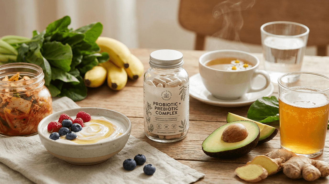
Prompt:
clean gut health supplement photograph of [a calming, nourishing composition that communicates digestive wellness and probiotic quality — the visual language of gut health rendered through clean, appetizing, natural imagery: the supplement product — a bottle of probiotic capsules or a packet of prebiotic powder or a gut health complex — positioned on a warm natural surface beside elements that visually communicate healthy digestion and microbiome nourishment: fermented food elements — a small ceramic bowl of yogurt with a swirl of honey and a few berries on top, or a small jar of kimchi or sauerkraut with visible fermented vegetable texture, or a glass of kombucha with visible bubbles and culture strands — these fermented foods connecting the supplement to the broader practice of gut health through diet, fresh fiber-rich ingredients — a sliced avocado showing its smooth interior, a few pieces of fresh ginger root (a natural digestive aid), leafy greens, a banana, or prebiotic-rich foods like garlic or onion — communicating the whole-food approach to digestive health that the supplement complements, the surface and setting communicate comfort and nourishment — a warm kitchen counter or a rustic wooden table that feels domestic, nourishing, kitchen-adjacent, the kind of surface where healthy food is prepared and supplements are taken as part of a digestive-wellness routine, the color palette leans toward calming, natural, digestive-comfort tones — soft greens, warm creams, gentle earth tones — avoiding anything harsh, aggressive, or clinical that would create discomfort in a digestive-health context, the composition is calm and balanced — no visual tension, no harsh angles, no aggressive colors, the overall aesthetic matching the internal calm and balance that gut health supplements promise, a glass of clean water or a cup of warm herbal tea (ginger, peppermint, or chamomile) adds the hydration context essential to digestive wellness messaging, the overall scene communicates: this product supports your digestive comfort through the same philosophy as the nourishing foods around it — natural, gentle, effective, nourishing — the supplement as the concentrated expression of a whole-food digestive wellness approach] in a calming natural gut-health composition, the photograph is taken from a gently elevated angle — looking down at the surface arrangement at approximately 30-45 degrees, the overview perspective that shows the full nourishing composition in its domestic context, the supplement product is clearly positioned and prominent — it is the commercial subject, surrounded by the food context that reinforces its positioning but not buried among the supporting elements, the fermented food elements provide visual interest and gut-health connection — their textures and forms communicating the living, cultured quality of beneficial bacteria, the fresh whole-food ingredients add natural color and vitality — the green of avocado, the gold of ginger, the white of yogurt — warm natural food colors that communicate nourishment, the glass of water or tea adds the hydration element — calm, clear, gentle, the beverage equivalent of the composition's overall calming quality, the arrangement flows naturally across the surface — organic and relaxed rather than rigid or clinical, matching the gentle, comfortable mood that gut health content should communicate, the depth of field is moderate — the product and immediate food context in clear focus with background elements in gentle softness, the lighting is soft, even, and warm — the gentle quality of diffused natural light that makes food look nourishing and appealing without harsh shadows or clinical brightness, the fermented foods catch the light with their specific textures — yogurt's smooth surface, kombucha's bubbles, fermented vegetables' moist texture — each communicating the living, cultured quality of probiotic-rich foods, the supplement product catches the light cleanly — its label visible, its form identifiable, positioned prominently in the warm illumination, the fresh ingredients are lit with appetizing warmth — the avocado's smooth green, the ginger's golden skin, the greens' vital chlorophyll color — each enhanced by the gentle diffused light, the overall light quality is nurturing rather than dramatic — soft, even, warm, the visual equivalent of the internal comfort that gut health products promise, soft natural greens (avocado, leafy greens, herb accents) — warm cream (yogurt, fermented foods, surface) — golden warmth (ginger, honey, warm light) — gentle purple or pink (berry accents) — clean supplement bottle or packet in brand colors — clear water or amber tea — warm natural surface (wood or warm countertop) — and the calming nourishing natural palette of a gut health supplement in domestic wellness context with soft warm natural light as the color palette, the mood is calmingly nourishing gently effective digestively comfortable and the specific gut-health-category visual message — digestive wellness through natural, gentle, living-food approaches concentrated in a quality supplement, the product as part of a broader nourishing practice rather than a clinical intervention for a problem — the gut health photograph as the comfort-and-nourishment visual that avoids clinical discomfort while communicating digestive support, professional food and lifestyle photography with soft warm diffused natural light and moderate depth of field keeping the product and immediate food context in clear nourishing focus, composed as a gently elevated domestic surface arrangement with the supplement among fermented and whole-food gut-health elements, the calming palette and the nourishing food context and the gentle lighting as the gut-health-category appropriate focal points, soft warm natural nourishing tones throughout, no text overlays, no logos outside product label, no watermarks
Best for: Social media gut health and digestive wellness content, website product page for probiotic and prebiotic products, Amazon listing lifestyle and context imagery for digestive supplements, email marketing digestive health segment content, paid advertising targeting gut health and digestive wellness audiences, blog and educational content about microbiome and probiotics, influencer brief for gut health and nutritionist creators, Pinterest wellness and digestive health boards
Template 10: The Immune Support — Seasonal Wellness Composition
This template addresses the immune support category — one of the largest and most seasonal supplement segments — with visual content that communicates protection, vitality, and the natural defense-building approach without making clinical immune claims.
Prompt:
vibrant immune support supplement photograph of [a bright, vitality-rich composition that communicates immune strength and seasonal wellness — the visual language of natural defense rendered through colorful, vitamin-rich, energizing imagery: the supplement product — a bottle of vitamin C, a zinc complex, an elderberry syrup, or an immune support blend — positioned prominently on a bright surface surrounded by the vivid natural sources of immune-supporting nutrition: fresh citrus — sliced oranges and lemons showing their vivid cross-sections with visible juice cells and rich color, a whole blood orange cut to reveal its dramatic red-streaked interior, or grapefruit halves in vivid pink, the citrus providing the most immediately recognizable visual shorthand for vitamin C and immune support, fresh berries with immune-supporting associations — elderberries in a small dark cluster, blueberries with their antioxidant-rich deep purple, fresh goji berries in vivid orange-red — the berries adding color variety and communicating the range of protective phytonutrients, fresh ginger and turmeric — the golden immune-supporting roots in their whole form, perhaps with a slice cut to show the vivid interior, communicating the anti-inflammatory and immune-modulating botanicals, fresh herbs — perhaps a sprig of thyme or rosemary or a few leaves of sage — traditional immune-supporting botanicals in fresh green form, a glass of fresh-squeezed orange juice or a warm cup of herbal immune tea (golden, steaming slightly) — the beverage form of immune support connecting the supplement to the dietary practice, the surface is bright and clean — white marble or a bright wooden cutting board — the brightness communicating health, vitality, and the energetic quality of strong immunity, the overall composition is abundant and colorful — rich with the vivid hues of vitamin-dense fruits and botanicals, communicating through pure chromatic energy the vitality and protective strength that immune supplements provide, the arrangement is generous and overflowing — not minimal and sparse but lush and bountiful, the abundance itself communicating the generous nutrition that builds immune resilience] in a bright abundant immune-support composition, the photograph is taken from above or near-overhead — the perspective that maximizes the visible color spread of all the citrus, berries, and botanicals, showing their cut surfaces, their colors, and their abundance across the frame, the composition fills the frame generously — ingredients extending to or beyond the frame edges, creating the sense of overflowing abundance and nutritional density, the supplement product is positioned clearly within the abundance — perhaps centered or placed prominently with ingredients radiating outward from it, the product as the concentrated form of all this surrounding natural nutrition, the citrus cross-sections are the visual stars — their vivid geometric segments and juice-cell patterns creating the most visually compelling elements, their colors (orange, yellow, pink, red-streaked) providing maximum chromatic impact, the berries add darker color notes — deep purples and blues and reds contrasting with the bright citrus yellows and oranges, the ginger and turmeric add golden warmth — their roots and cut surfaces providing warm tones that link to the traditional wisdom of immune-supporting spices, the herbs add fresh green — the vital, alive quality of fresh plants communicating freshness and natural potency, the overall color spread is rainbow-adjacent — the full range of warm colors from the immune-supporting palette creating visual energy and vitality, the lighting is bright and clear — the vivid, saturated, energetic quality of direct or slightly diffused natural light that maximizes the color saturation of the fresh ingredients, the citrus catches the light with translucent beauty — the juice cells and membranes showing through where the flesh is thin, the segments catching light differently creating dimensional interest within each slice, the berry surfaces catch the light with natural bloom and shine — the tiny highlights on each berry suggesting freshness and the natural waxy coating of just-picked fruit, the fresh-cut surfaces of ginger and turmeric glow with their specific amber and gold — the light penetrating slightly into the flesh showing the concentrated color of the rhizome interior, the supplement bottle or product catches the bright light cleanly — its label visible and identifiable within the colorful abundance, the glass of juice or tea catches the light with liquid transparency — amber or golden, glowing with concentrated nutrition-color, the overall brightness and color saturation communicates vitality, energy, and the kind of robust health that strong immunity provides, vivid bright citrus colors — orange segments, yellow lemon, pink grapefruit, red blood orange — deep berry purples and blues — golden ginger and turmeric — fresh herb greens — bright white or natural wood surface — supplement bottle in brand colors — amber juice or golden tea — and the vivid, abundant, vitamin-rich palette of an immune-support supplement surrounded by its natural ingredient sources in bright vital light as the color palette, the mood is vibrantly vital abundantly protective energetically healthy and the specific immune-support visual message — natural defense through concentrated nutrition, the brightness and color representing the vitality and energy that strong immunity provides, this product concentrates the protective power of all these natural sources into a daily supplement — the immune photograph as the vitality-and-protection visual that communicates defense-building without clinical disease claims, professional food and product photography with bright clear natural or studio light maximizing color saturation and moderate depth of field keeping the full arrangement in vivid clear focus, composed as an overhead abundant ingredient-and-product arrangement filling the frame with immune-supporting color and abundance, the citrus color impact and the ingredient abundance and the product positioning as the immune-category focal points, vivid warm vitamin-rich colors throughout against clean bright surface, no text overlays, no logos outside product label, no watermarks
Best for: Social media seasonal immune content (highest engagement during fall and winter), website product page for vitamin C, zinc, elderberry, and immune complex products, Amazon listing main and lifestyle images for immune category, email marketing seasonal wellness campaigns, paid advertising during cold and flu season targeting immunity-concerned audiences, retail point-of-sale seasonal immunity displays, blog and educational content about immune support nutrition, influencer brief for wellness and immune-health creators
Template 11: The Beauty Supplement — Skin and Glow Aesthetics
This template addresses the beauty-from-within supplement category — collagen, biotin, vitamin E, astaxanthin, and skin-focused blends — with the aesthetic language borrowed from luxury skincare and beauty marketing that this category's consumer expects.
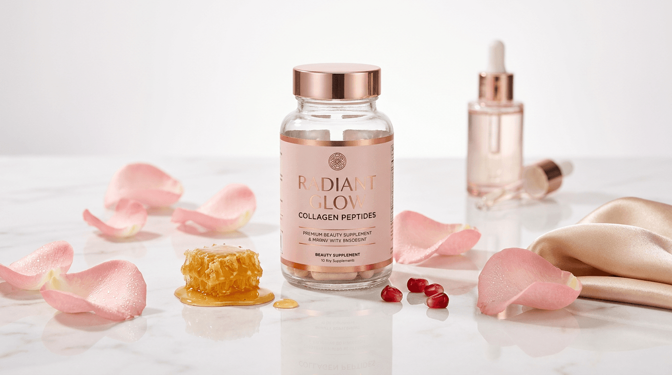
Prompt:
luxurious beauty supplement photograph of [an elegant, beauty-forward composition that communicates skin radiance, collagen support, and the beauty-from-within positioning — the visual language of premium skincare applied to ingestible beauty: the supplement product — a bottle of collagen peptides, a beauty-blend capsule, or a marine collagen powder — in packaging that reflects the beauty-category positioning: perhaps blush pink or rose gold accents, elegant typography, soft sophisticated design elements that distinguish it from general-health supplements and place it adjacent to luxury skincare, the product is positioned on a premium surface with beauty-adjacent elements: a few loose rose petals in soft blush pink scattered on a marble or glass surface — the rose as a universal beauty symbol, fresh and slightly dewy, a small piece of honeycomb or a drizzle of golden honey — communicating the golden nourishment and the sweet indulgence of beauty supplementation, a few fresh berries (strawberries or pomegranate seeds in vivid ruby red) — antioxidant-rich beauty foods with jewel-like color, a silk or satin fabric element — perhaps the product resting on a folded piece of champagne-colored silk that adds the textural luxury of beauty product photography, a small glass vessel (like a cosmetic dropper bottle or a perfume flacon) in the background suggesting the beauty-routine context — the supplement sitting alongside skincare, part of the same beauty practice, the surface is reflective or semi-reflective — glass, polished marble, or a mirror element — creating subtle reflections that add the luminous quality associated with skin radiance, the color palette is firmly in the beauty register: blush pinks, rose golds, warm champagne, cream whites, soft pearls — the palette of luxury skincare and beauty marketing that signals to the beauty consumer: this product is for you, it belongs in your beauty routine, the overall composition is elegant and sparse — generous negative space, few elements but each one chosen for beauty and luxury association, the visual approach of luxury skincare advertising applied to supplement photography] in an elegant beauty-brand composition, the photograph is taken from a low or eye-level angle — the perspective of luxury beauty product photography that makes products appear monumental and aspirational, the composition is spare and elegant — few elements, generous space, the luxury-brand visual approach where less communicates more, the product is the undisputed hero — positioned with the visual importance and space that luxury brands give their hero products, the beauty elements (rose petals, honey, berries, silk) provide supporting beauty context without cluttering the premium positioning, the reflective surface adds luminosity — the product and elements creating soft mirror reflections that double their visual presence and add the glowing quality associated with radiant skin, the depth of field is shallow — the product in crisp focus with supporting elements falling into soft, luminous blur that adds to the dreamy beauty-brand aesthetic, the composition may include a subtle glow or haze — the slightly soft, diffused quality that beauty photography uses to suggest radiance and the luminous skin quality the product promises, the lighting is soft, luminous, and beauty-grade — the specific quality of beauty and skincare photography: predominantly frontal soft light that minimizes hard shadows and maximizes the smooth, glowing quality of every surface, the product catches the light with premium surface response — the packaging materials (glass, matte, metallic accents) reflecting with beauty-appropriate luminosity, the rose petals catch the light with translucent delicacy — their thin edges glowing with light passing through, their color deepening in shadows, the beauty of organic material rendered with cosmetic-photography precision, the honey catches the light with amber translucent viscosity — glowing with internal warm light, the richest warm point in the composition, the silk or satin surface catches the light with the characteristic long soft highlight that runs along fabric curves — communicating tactile luxury, the marble or glass surface catches the light with subtle luminosity — clean, bright, and slightly warm, the overall light quality communicates radiance — the skin-glow, the luminous health, the internal warmth that beauty supplements promise made visible in the light quality itself, soft blush pink rose petal tones — warm champagne gold (honey, metallic accents, silk) — cream and pearl white (marble, product surface, negative space) — ruby red berry jewel accents — rose gold metallic accents — subtle luminous glow quality throughout — and the luxurious soft radiant palette of a beauty-from-within supplement in premium beauty-grade lighting with skincare-adjacent visual positioning as the color palette, the mood is luminously elegant beautifully radiant luxuriously nourishing and the specific beauty-category visual message — this supplement belongs in your beauty routine alongside your serum and your moisturizer, it works from within to create the same radiance that topical products address from without, it is a luxury beauty product that you ingest rather than apply — the beauty supplement photograph as the skincare-adjacent positioning visual that speaks the beauty consumer's visual language, professional beauty and luxury product photography with soft frontal luminous studio lighting and shallow depth of field keeping the product in elegant sharp focus with beauty elements in soft radiant background, composed as a low-angle or eye-level beauty-hero with spare elegant supporting elements on a reflective premium surface, the luminous glow quality and the beauty-adjacent elements and the premium sparse composition as the beauty-category positioning focal points, soft blush and champagne and pearl with ruby and gold accents, no text overlays, no logos outside product label, no watermarks
Best for: Social media beauty and skincare content (targeting the beauty-interested supplement consumer), website product page for collagen, biotin, and beauty-positioned supplements, paid advertising on beauty and skincare platforms and audiences, influencer brief for beauty and skincare creators adding ingestibles, Pinterest beauty and wellness boards, Instagram beauty community content, email marketing beauty-segment content, retail beauty-adjacent shelf positioning materials, PR and beauty editor outreach imagery
Template 12: The Sleep Supplement — Evening Calm Atmosphere
This template addresses the sleep and relaxation supplement category — melatonin, magnesium, L-theanine, valerian, and sleep-blend products — with the atmospheric evening-calm visual language that communicates restfulness and the gentle transition from waking to sleeping.
Prompt:
atmospheric sleep supplement photograph of [a calming evening bedside scene that communicates relaxation, wind-down ritual, and the gentle transition toward sleep — the visual language of rest rendered through warm, dim, intimate nighttime imagery: the supplement product — a bottle of magnesium complex, a sleep-blend capsule, a sleep tea supplement, or a melatonin product — positioned on a bedside table or nightstand in the soft warm glow of evening, the nightstand surface holds the elements of a sleep ritual: the supplement bottle with a capsule or two placed beside it ready for the evening dose, a glass of water (still, room temperature, the hydration for taking the supplement), a small cup of herbal sleep tea (chamomile, lavender, or a sleep-blend) with subtle steam rising in the warm lamp light — the warm beverage as the wind-down trigger, a book resting with its pages slightly open or a page marked — the reading-before-sleep habit that signals intentional wind-down, a small candle burning with a gentle warm flame — lavender-scented or natural beeswax, its warm light contributing to the intimate dim atmosphere, the bed is partially visible in the background — fresh white linens, perhaps slightly pulled back as if about to be entered, plump pillows inviting, the bed promising the comfort that the supplement will facilitate, a small plant (a lavender stem in a bud vase, or a small snake plant — a bedroom-appropriate plant) adds natural life, the lighting is the key atmospheric element: warm, dim, amber-toned — the specific quality of bedtime illumination that signals to the body and mind that the day is ending, the room beyond the nightstand recedes into gentle warm shadow — the reduced visibility communicating the privacy and intimacy of the bedroom at night, the overall scene communicates: this is the ritual that leads to deep sleep — the tea, the supplement, the soft light, the book, the prepared bed — each element part of the deliberate practice of transitioning into rest] in a warm intimate nighttime bedside composition, the photograph is taken from bed level or slightly above — the perspective of someone lying in bed or sitting up against their pillows, looking at their nightstand arrangement, the intimate angle of the sleep ritual moment, the composition is tight and intimate — showing only the nightstand surface and its elements with the bed and room in soft warm background, the frame limited to the bedside world that is the last thing seen before sleep, the supplement product is clearly positioned among the ritual elements — prominent enough to be identified but natural among the book, the tea, the candle — part of the routine rather than isolated, the candle flame provides the warmest, most intimate point of light — its flickering quality (captured as a soft warm glow) the most atmospheric element in the composition, the book suggests the slowing of the mind — the intentional transition from active thinking to passive receiving that precedes sleep, the tea adds warmth and aroma suggestion — the steam visible as a subtle wisp in the warm amber light, the bed in the background is inviting — the linens visible enough to communicate comfort and freshness, the prepared sleep environment waiting, the depth of field is shallow — the nightstand surface in warm detailed focus with the bed and room in soft warm blur, creating the intimate limited-world quality of pre-sleep awareness, the lighting is entirely warm and dim — the dominant amber-gold quality of a single warm lamp or candle providing the only illumination, there is no natural light — this is an interior nighttime scene, the light comes from the warm artificial sources on or near the nightstand, the candle provides the warmest, most orange-amber light — flickering quality captured as a soft warm glow that illuminates the nearest surfaces with intimate warmth, the lamp (if present) provides a slightly wider warm ambient — perhaps a warm-bulbed bedside lamp with a shade that directs light downward onto the nightstand surface, the supplement bottle and capsules catch the warm light on their surfaces — the amber illumination making even a white bottle appear warm and restful, the glass of water catches the warm light with subtle refraction — perhaps a warm amber glow visible through the glass, the tea surface catches the warm light with gentle reflection — its warm liquid color enhanced by the amber illumination, the book pages catch the warm light with soft cream luminosity — the text visible but unreadable, the pages a warm rectangle of reflected ambient, the bed linens in the background catch distant warm light — glowing softly with reflected amber that makes them look warm and inviting, the overall light quality communicates: the day is over, the stimulation has ceased, the warm dim intimate world of pre-sleep is all that remains, and within this world the supplement is the gentle aid that completes the transition, warm deep amber-gold candle and lamp glow as the dominant light — soft white supplement bottle and capsules in warm reflected light — clear water glass with warm amber refraction — warm tea gold in ceramic cup — cream-white book pages in warm light — white bed linens in distant warm glow — dark warm background shadows — small plant green dimmed to warm olive in low light — and the intimate warm dim nighttime palette of a bedside sleep ritual in amber candlelight and lamp glow as the color palette, the mood is deeply calming intimately warm restfully transitional and the specific sleep-category visual message — this is the gentle ritual that leads to deep rest, the supplement is the knowledgeable final element in a complete wind-down practice, taking it is an act of self-care that signals to the body: we are preparing for sleep now — the sleep photograph as the calm-invitation visual that communicates restfulness without showing a sleeping person, professional still life and atmospheric photography with warm amber candlelight and dim lamp lighting and shallow depth of field keeping the nightstand ritual in intimate warm focus with the bed and room in soft distant amber blur, composed as a bedside-level intimate nightstand scene with the sleep supplement among evening ritual elements, the warm dim amber atmosphere and the ritual elements and the bed-invitation beyond as the sleep-category positioning focal points, deep warm amber and gold dim nighttime tones throughout, no text overlays, no logos outside product label, no watermarks
Best for: Social media evening and sleep content (best posted in evening hours for audience timing alignment), website product page for melatonin, magnesium, and sleep-blend products, email marketing evening and wind-down segment content, paid advertising targeting sleep-concerned and relaxation audiences, influencer brief for sleep and relaxation content creators, Pinterest sleep and self-care boards, blog and editorial content about sleep hygiene and supplementation, subscription marketing bedtime-routine reinforcement, seasonal marketing during high-stress periods
Template 13: The Subscription Box — Unboxing and Bundle Display
This template showcases the subscription or bundle packaging experience — the curated collection of products that arrives monthly and the unboxing moment that reinforces premium brand perception and sustains subscription retention.
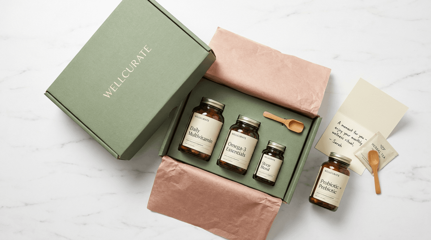
Prompt:
premium supplement subscription box photograph of [a beautiful unboxing moment — a curated subscription box or product bundle arranged to show the complete monthly wellness delivery experience: an elegant outer box in quality material — perhaps a matte white or soft sage or warm kraft cardboard box with the brand logo subtly debossed or printed in a single color, the box open with its lid resting behind or beside it showing the organized interior, inside the box the products are arranged with care — tissue paper in the brand's accent color (blush, sage, or champagne) partially folded back to reveal the products nestled within, three to five products visible in the box: the monthly supplement bottles in their consistent brand packaging, perhaps a new or seasonal addition highlighted with a small card explaining it, the products standing upright in the box or nestled in custom inserts that hold them securely and present them beautifully, beside or in front of the box a few products have been removed and placed on the surface — giving the viewer a clear look at individual products while showing the box they came from, a personalized note or card from the brand is partially visible — a handwritten or elegant printed message that communicates the personal-service quality of the subscription experience, a small bonus item may be included — a single-serve packet sample of a new product, a small wellness item (a tea bag, a branded scoop, a wellness guide card), or a seasonal gift that delights beyond the expected products, the surface beneath is clean and premium — marble, a clean desk surface, a bright countertop — the place where the monthly box is opened and the ritual of receiving wellness arrives, the box's interior is as designed as its exterior — the care in presentation communicating that this brand values the unboxing experience as much as the formulation, the overall scene communicates: receiving this monthly delivery is a moment of premium self-care, the brand has curated and packaged your wellness with the same care they formulate it, this is not just pills in the mail but a wellness experience delivered to your door] in a bright overhead or slightly elevated subscription-box composition, the photograph is taken from above or near-overhead — showing the full box interior, the arranged products, the tissue paper, the note, and the surface around the box in the classic flatlay-unboxing perspective, the composition shows the box as the central element — open and revealing its curated contents, the products organized beautifully within, a few products placed outside the box provide individual product visibility — their labels facing up or forward for identification, creating a visual spread that shows the range of the subscription, the tissue paper or interior packaging material adds color and texture — its folds creating visual interest and the evidence of a carefully packaged experience, the note or card adds the personal touch — its text partially legible or its brand design visible, communicating personalization, the bonus item (if present) adds the delight element — the unexpected extra that makes subscription customers feel valued, the overall arrangement is generous but organized — abundant enough to communicate value but organized enough to communicate curation, the lighting is bright and even — the flat overhead illumination that shows products clearly and makes the unboxing moment feel fresh and exciting, even bright light across the full box and product arrangement — no harsh shadows within the box that would hide products, clear illumination of every element, the tissue paper catches the light with its specific paper quality — slightly matte or slightly sheen depending on its finish, its color consistent and brand-specific, the product bottles and containers catch the even light with consistent clarity — each label visible, each brand element identifiable, the box material catches the light with its specific surface quality — matte cardboard absorbing softly, debossed logo creating subtle shadow, the overall brightness communicates the excitement and freshness of the unboxing moment — the bright positive energy of receiving something curated and beautiful, brand-consistent packaging colors (matte white or sage or kraft box) — brand tissue paper accent color (blush or sage or champagne) — consistent product bottle colors across the range — warm note card or cream paper — clean premium surface beneath (white marble or bright wood) — brand logo color in subtle application — and the bright curated premium palette of a supplement subscription box unboxing in clear even overhead light as the color palette, the mood is excitingly curated premium-delivered delightfully organized and the specific subscription-retention visual message — this monthly delivery is worth looking forward to, the brand puts the same care into packaging and presentation as they do into formulation, this is not a commodity subscription but a curated wellness experience, the unboxing itself is a moment of self-care — the subscription-box photograph as the retention and acquisition visual that makes both current subscribers feel validated and potential subscribers feel curious, professional product and flatlay photography with bright even overhead studio lighting and deep depth of field keeping all products and box elements in clear focus, composed as an overhead or near-overhead unboxing flatlay showing the complete subscription-box experience from box to products to note to bonus, the curated organization and the premium packaging and the product range visibility as the subscription-value focal points, bright clean brand-consistent tones throughout, no text overlays, no additional logos, no watermarks
Best for: Social media subscription and unboxing content (high shareability and engagement), website subscription page hero and feature imagery, email marketing subscription sign-up and retention campaigns, paid advertising subscription acquisition creative, influencer unboxing content brief and reference, YouTube unboxing video thumbnails, subscription comparison and review site imagery, new subscriber welcome email visual, subscription gift and referral promotional imagery
Template 14: The Transformation Context — Before and After Lifestyle Visual
This template addresses the results-communication challenge without making explicit health claims — showing the lifestyle context of wellness improvement through visual energy, vitality, and quality-of-life indicators rather than clinical before-and-after comparisons.
Prompt:
aspirational wellness transformation photograph of [a vibrant, energetic lifestyle scene that communicates the quality-of-life improvement associated with consistent supplement use — the "after" without an explicit "before": a person (shown from the chest or shoulders down — no face — or from behind or in silhouette) in an active, vital, outdoor moment: walking energetically on a bright morning path or trail, arms relaxed and posture confident, clothing suggesting athletic-casual active lifestyle, or stretching outdoors in morning light with the fluid ease that suggests energy and flexibility, or hiking with visible stamina and enjoyment on a scenic trail, or simply standing with confident posture in bright natural light with a green smoothie or water bottle in hand — the body language communicating vitality, energy, and well-being, the outdoor setting is bright and expansive — a sunlit path through green trees, a coastal cliff walk, a morning city park, an open field — the environment communicating the active outdoor life that supplementation supports, the natural light is generous and golden — either golden hour warmth or bright clear morning light that bathes the scene in the warm vitality-communicating illumination, the clothing is clean, fitted, and active-lifestyle appropriate — suggesting the person who moves their body, eats well, and takes care of their health as a daily practice, the supplement product may be subtly present — held in a hand, visible in an athletic bag, or absent entirely with the brand connection made through caption rather than product presence, the energy of the scene is unmistakable — the posture is upright and relaxed, the movement is fluid and purposeful, the overall body language communicates someone who feels good, has energy, sleeps well, and is enjoying the physical experience of being alive and healthy, the setting includes natural elements that echo wellness — green trees, sunlight, fresh air, open space — the external environment matching and reflecting the internal state that consistent supplementation supports, the overall scene communicates without words: this is how it feels when your nutrition is optimized, when you sleep well, when your gut is healthy, when your inflammation is managed, when your energy is consistent — this is the daily experience that quality supplementation makes possible] in a bright aspirational lifestyle-wellness composition, the photograph captures the active figure in the environment — wide enough to show the setting and communicate the outdoor lifestyle context, the person is the subject but not identifiable — shot from behind, from chest down, in silhouette, or at enough distance that individual features are not distinct, making the image universal and projectable (the viewer imagines themselves as this person), the movement or posture communicates vitality — the specific quality of the body that feels good and has energy, not posed but captured in natural motion or confident stance, the environment fills the frame with natural beauty — the green, the light, the space, the freshness of the outdoors communicating the broader wellness lifestyle, the composition has movement and energy — perhaps the person walking through the frame, or the camera angle creating dynamic lines, or the environment providing visual flow that matches the kinetic energy of the scene, the time of day communicates intentionality — this is an early morning or golden-hour scene, suggesting someone who wakes with purpose and energy, not a midday snapshot, the lighting is the emotional driver — warm, golden, vital, the specific light quality that makes skin glow and environment gleam and communicates the warmth of living well, golden hour or morning light wraps the figure warmly — creating a gentle rim or backlight that outlines the person's form with golden luminosity, suggesting an inner glow made visible by the light's cooperation, the environment catches the golden light with natural beauty — leaves filtering sunlight, path surfaces gleaming with warm tones, the air itself appearing golden with particulate warmth, the person's clothing catches the light with athletic-fabric response — the clean lines and fitted forms enhanced by the directional golden warmth, any visible product (smoothie, water bottle) catches the light with freshness — the green of a smoothie vivid, the water clear and bright, the overall image radiates warmth and vitality — the specific quality that supplement brands want to associate with their products without making explicit physical claims, warm golden natural light throughout — vital green environment (trees, plants, grass) — active-lifestyle clothing tones (clean neutrals, soft athletic colors) — warm skin tones where visible — golden light rim and backlight — bright path or natural surface — expansive blue sky or warm light-filtered canopy — and the vibrant vital golden-green palette of an active wellness lifestyle in warm natural outdoor light as the color palette, the mood is vibrantly vital actively energetic warmly alive and the specific transformation-context message — this is the life that consistent wellness practices (including supplementation) enable and support: the energy to be active, the vitality to enjoy movement, the well-being to appreciate the morning and the outdoors and the simple pleasure of a healthy body in a beautiful environment — the lifestyle photograph as the aspirational result without the explicit claim, the visual goal that the customer desires and the product implicitly supports, professional lifestyle and athletic photography with warm golden-hour or morning natural light and moderate depth of field keeping the figure in clear active focus with the environment in warm atmospheric supporting clarity, composed as a wide active-lifestyle scene with the vital figure in warm natural light and expansive wellness-communicating environment, the energy and vitality and golden warmth as the transformation-context focal points, warm golden-green vital tones throughout, no text overlays, no logos, no watermarks
Best for: Social media aspirational wellness content (the highest-engagement content type beyond close-up product shots), website homepage hero and brand story imagery, paid advertising targeting wellness-aspiration audiences across all demographics, email marketing inspiration and motivation content, brand identity and positioning visual materials, billboard and out-of-home advertising, influencer brief lifestyle-reference for results-focused content, Pinterest fitness and wellness aspiration boards, annual report and investor presentation brand imagery
Template 15: The Scientific Trust — Clinical Credibility Visual
This template addresses the credibility gap that plagues the supplement industry — distinguishing evidence-based brands from unsubstantiated claims through visual language that communicates scientific backing, clinical precision, and research-supported formulation without being sterile or unapproachable.
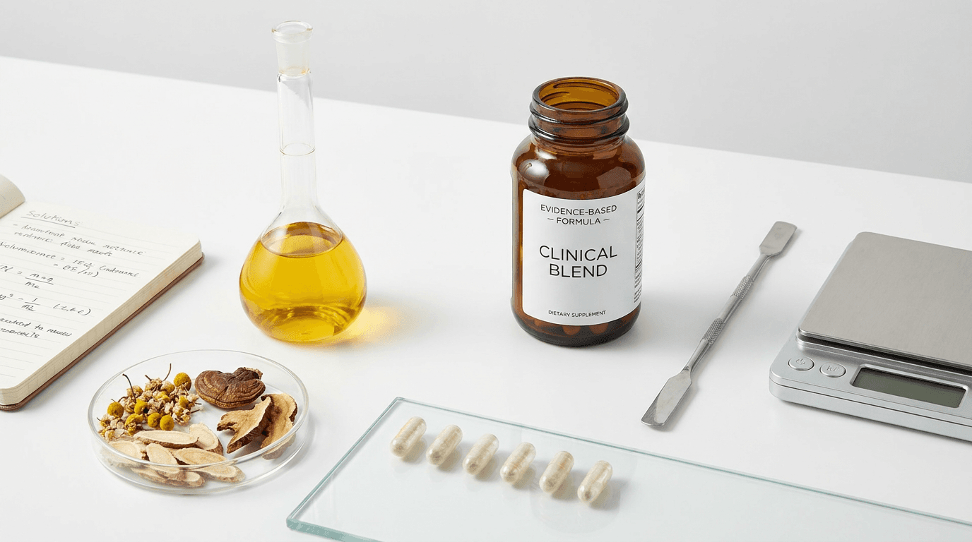
Prompt:
clinical credibility supplement photograph of [a precise, trust-building composition that communicates scientific backing and formulation expertise — the visual language of evidence-based supplementation rendered through clinical-adjacent but approachable imagery: the supplement product positioned on a clean, precise surface with elements that communicate research and scientific formulation: a laboratory-quality glass beaker or volumetric flask containing a liquid — perhaps a golden oil supplement in a precise glass vessel, or a clear liquid with subtle botanical infusion visible, the glass vessel communicating measurement precision and scientific process, dried botanical specimens arranged with scientific precision — individual herbs, leaves, or mushroom sections laid out as if for identification and quality assessment, each piece separate and identifiable, arranged with the careful ordered spacing of a botanical reference or a quality-control inspection, a small notebook or journal (open, with handwritten formulation notes or ingredient lists partially visible) suggesting the research and development process behind the finished product — the human intellectual work of creating an effective formula, the supplement capsules or powder arranged in a precise line or measured amount — communicating exact dosing, consistent manufacturing, and the precision that distinguishes a scientifically-formulated supplement from a random blend, a magnifying glass or a small precision instrument (scale, measuring spoon, or glass pipette) adding the scientific-process visual language without being overtly clinical, the surface is clinical-clean — white, marble, or glass — communicating laboratory-grade cleanliness and the sterile precision of quality manufacturing, the arrangement is ordered and precise — nothing random or casually placed, every element positioned with the intentionality of a research setup or a quality-control documentation photograph, the color palette is restrained and credible — predominantly white, glass-clear, and natural-botanical with minimal brand-color accent, the visual restraint itself communicating scientific sobriety and the confidence of a brand that lets evidence speak rather than marketing noise, a subtle reference to third-party testing or research — perhaps a printed certificate edge visible, or a testing-reference code, or a published study page partially visible — communicating the external validation that distinguishes evidence-based brands from those relying solely on marketing claims, the overall scene communicates: this product was developed through rigorous research, its ingredients are measured with precision, its quality is verified through scientific processes, the people who formulated this are knowledgeable and careful and evidence-driven] in a precise clinical-trust composition, the photograph is taken from a slightly elevated angle — showing the surface arrangement in its organized entirety, the perspective of a researcher or formulator surveying their work, the composition is organized with scientific precision — elements arranged in deliberate order, clear spacing, clean relationships between objects, the visual order communicating the mental order and rigor behind the formulation, the supplement product is positioned as the output — the finished result of the research and precision visible in the surrounding elements, the glass vessels are positioned to show their transparency and precision — the volumetric markings, the clear liquid, the precision of scientific glassware, the botanical specimens are individually distinguishable — each herb or ingredient separate and identifiable, communicating the brand's intimate knowledge of each component, the notebook or journal adds human intelligence — the handwriting or printed notes visible enough to communicate research effort without being legible as specific text, the measurement tools communicate precision — the exact, repeatable, consistent manufacturing approach that distinguishes pharmaceutical-grade from commodity production, the overall arrangement has the aesthetic of a clean laboratory or a research desk — ordered, precise, and intelligent, the lighting is bright, even, and clinical-quality — the clear, neutral, honest illumination of documentation or laboratory photography, the light is whiter and more neutral than the warm amber of lifestyle photographs — this deliberate neutrality communicates objectivity and scientific honesty, the glass vessels catch the light with transparent clarity — the contents visible, the liquid levels precise, the glass surfaces clean and flawless, the botanical specimens are evenly lit — their natural forms and colors visible with documentary clarity, each texture and structure identifiable for what it is, the capsules or powder catch the even light with consistent, uniform illumination — communicating manufacturing consistency and quality control that produces identical products every time, the white or neutral surface reflects light cleanly — no shadows or warm tones that would suggest subjective atmosphere rather than objective documentation, the notebook pages catch the light evenly — readable as text without being specifically legible, the precision instruments catch the light with clinical metallic clarity — the steel or glass of measurement tools reflecting with the clean precision of maintained equipment, clean clinical white surface — glass-clear vessels with subtle liquid tones (golden oil or clear botanical) — natural botanical specimen colors (dried herb greens and browns, root earth tones, flower subtle dried tones) — supplement product in brand-neutral or minimal color — metallic precision-instrument accents (steel, chrome) — cream or white paper and notebook — minimal restrained accent color — and the precise clinical neutral palette of a scientific-credibility supplement composition in clear even documentation-quality lighting as the color palette, the mood is precisely credible scientifically rigorous quietly confident and the specific trust-building message of the scientific-credibility visual — this brand is different from the noise of the supplement market because it is built on research, measurement, evidence, and precision, the formulation was developed by knowledgeable people who understand their ingredients at a molecular level, the manufacturing is precise and consistent, and the quality is verified through scientific processes that the brand is confident enough to reference visually — the scientific photograph as the trust differentiator that separates evidence-based brands from marketing-driven competitors, professional still life and product photography with bright even neutral studio lighting and deep depth of field keeping all elements in clinical clear focus, composed as a slightly elevated precise arrangement on a clean white or clinical surface with scientific-process elements surrounding the hero product, the precision arrangement and the glass-vessel transparency and the botanical-specimen identification as the clinical-credibility focal points, clean neutral clinical tones with natural botanical and glass accents, no text overlays, no logos outside product label, no watermarks
Best for: Website about-page and science-page imagery, paid advertising targeting educated and skeptical consumers who value evidence, Amazon A+ content brand-story and quality sections, email marketing trust-building and brand-story content, PR and media outreach imagery for science-focused publications, investor and partner presentation materials, social media "behind the formulation" and transparency content, blog and educational content about formulation methodology and quality standards, retail buyer presentations and quality documentation, brand differentiation content for competitive positioning
How to Customize These Prompts for Your Specific Supplement Brand
The templates generate compelling supplement brand visuals, but the most effective content reflects your actual brand — its genuine products, its specific aesthetic, its real ingredients, its authentic positioning, and the particular customer it serves. Customization transforms these templates from generic wellness photography into content that accurately represents your brand's unique identity and commercial objectives.
Replace generic product descriptions with your actual packaging. If your bottles are amber glass rather than matte white, specify that. If your label uses a serif typeface in forest green rather than sans-serif in navy, describe it precisely. If your product format is soft-touch black bottles with metallic gold typography, or clear glass with minimal etched text, or recycled kraft paper with letterpress printing — include these details. The generated imagery should look like your products or your aspirational packaging direction, not a generic supplement brand.
Specify your actual ingredients and their visual character. If you sell a lion's mane mushroom supplement, replace the generic ingredient descriptions with specific lion's mane imagery: the white cascading spine structure, the brain-like mushroom form, the clean cultivation environment. If you sell a marine collagen, specify the clear dissolved collagen in water, the oceanic-association elements, the specific clean blue-and-white color world. If your product contains a proprietary blend with a signature ingredient, that ingredient becomes the visual hero in your ingredient-origin compositions.
Match the demographic and lifestyle positioning to your customer. If your brand targets menopausal women, the lifestyle imagery should reflect that demographic's aspirational self-image — active, vital, confident, elegant — rather than generic young-fitness visuals. If your brand serves serious athletes, the athletic context should be specific to your sport focus — endurance running, CrossFit, swimming, cycling — rather than generic gym content. If you serve new parents, the lifestyle integration should show the realistic (but elevated) morning of a parent managing their wellness alongside their caregiving.
Adjust the aesthetic temperature to your brand positioning. If your brand is warm, natural, earth-toned, and botanically focused, lean into the natural-ingredient and warm-lifestyle templates with surfaces of warm wood and terracotta and textiles of undyed linen. If your brand is clinical, minimal, pharmaceutical-grade, and science-focused, lean into the clean-surface hero shots and scientific-credibility compositions with surfaces of white marble and glass and backgrounds of clinical neutrality. If your brand is luxury and beauty-adjacent, lean into the beauty-supplement aesthetics with reflective surfaces and soft focus and champagne-toned light. Your brand's visual temperature should be consistent across all fifteen template types — the same foundational aesthetic expressed in different contexts.
Incorporate your actual brand colors precisely. If your brand uses a specific shade of sage green and warm terracotta as its signature accent palette, these exact colors should appear as the accent tones in every composition — in the tissue paper of the subscription box, in the surfaces chosen for product photography, in the natural elements selected for ingredient compositions, in the lifestyle context tones. Color consistency across all visual touchpoints is one of the most powerful brand-recognition tools, and every generated image should reinforce your specific palette.
For your actual products, photograph and enhance rather than replace. Generate AI imagery to establish your visual benchmarks and style guides — the standard of quality, composition, and atmosphere that your real product photography should achieve. Then photograph your actual products (real bottles, real capsules, real powders, real packaging) in environments and lighting informed by the generated references. Use the Image Inpainting tool to enhance your real product photographs to professional standard — improving lighting uniformity, cleaning up surface imperfections, enhancing color consistency, removing distracting background elements, or adding subtle atmospheric quality while preserving your authentic products and packaging. This workflow gives you the credibility of real product photography with the visual quality of professional commercial imagery.
Platform-Specific Deployment for Supplement Brands
Each platform where supplement brands compete has specific visual requirements, display contexts, and audience behaviors. Deploying the right content type in the right format optimizes conversion at every customer touchpoint.
Amazon product listing optimization. Amazon remains the dominant e-commerce channel for supplements, and its listing image requirements are specific: the primary image (thumbnail) must show the product on a pure white background, but the additional gallery images (A+ content slots) allow lifestyle, ingredient, and infographic imagery. Use Template 1 (adapted to white-background requirements) for the primary listing image, and deploy Templates 2 (ingredient origin), 3 (lifestyle), 4 (capsule detail), 5 (powder texture), and 6 (range display) across the additional image slots and A+ content sections. Amazon's algorithm rewards listings with complete image galleries that reduce return rates by setting accurate expectations. Generate product images at 1:1 (1000x1000 minimum, 2000x2000 recommended) for Amazon compliance.
Shopify and DTC website deployment. For brands selling directly through their own Shopify or custom e-commerce site, every template has a deployment position: Template 1 as the product page hero, Template 6 as the homepage collection showcase, Templates 3 and 7 as homepage lifestyle sections, Template 14 as the brand-story page hero, Template 15 as the science-page supporting visual, Templates 11 and 12 as product-specific category page heroes. The website is the brand's most controlled visual environment and should represent the highest-quality imagery with the most consistent brand expression. For comprehensive e-commerce visual strategies, additional guidance covers DTC-specific optimization.
Instagram feed and grid strategy. The supplement brand's Instagram grid functions as a visual storefront and brand credibility reference. Maintain a grid ratio of approximately 40% product and ingredient content (Templates 1, 2, 4, 5, 6), 30% lifestyle and routine content (Templates 3, 7, 8, 14), 20% education and trust content (Templates 9, 10, 15), and 10% community and UGC content. Alternate between close-up product shots and wider lifestyle contexts to create visual rhythm across the grid. Use 4:5 for feed posts to maximize screen real estate. The grid should be visually coherent when viewed as a whole — consistent color temperature, consistent editing style, consistent brand presence. For Instagram-specific strategies, additional guidance covers platform optimization.
TikTok and Reels for supplement content. Short-form video is increasingly important for supplement brands — ingredient-origin storytelling, routine videos, "what I take and why" content, manufacturing transparency, and educational content about supplement science. The visual quality of video thumbnails and the first three seconds of any video determine whether the viewer stays. Use these templates as thumbnail references and opening-frame compositions for video content. The Text2Shorts tool creates supplement-education and product-showcase short-form content. The Cinematic Video Generator produces atmospheric ingredient-origin and product-beauty videos. For TikTok-specific content, additional strategies cover short-form optimization.
Pinterest for supplement discovery and education. Pinterest functions as both a discovery platform and an evergreen traffic driver for supplement brands. The most effective pin formats are 2:3 vertical images showing ingredient compositions (Template 2), lifestyle routines (Templates 3, 7), product beauty shots (Templates 1, 4, 5), and educational content about specific supplements or health topics. Supplement-related searches on Pinterest are consistently high-volume, and well-optimized pins with strong visual quality drive significant website traffic and direct sales. Pin with keyword-rich descriptions including supplement type, health benefit association, ingredient names, and lifestyle context.
Email marketing visual strategy. Supplement brands rely heavily on email for subscription retention, cross-sell, education, and seasonal campaigns. Each email type requires specific visual content: welcome sequences use Templates 1 and 6 (introduction to the brand and range), subscription renewal and retention uses Templates 13 and 7 (reinforcing the ritual and the delivery experience), seasonal campaigns use Templates 10 and 12 (immune support in fall/winter, sleep support during stress periods), educational content uses Templates 2, 9, and 15 (ingredient credibility, category education, scientific trust), and cross-sell uses Templates 11, 8, and 3 (beauty expansion, athletic expansion, general daily wellness).
Paid advertising creative across platforms. Supplement brands invest heavily in paid social and search advertising, and creative quality is the primary variable in cost-per-acquisition efficiency. Facebook and Instagram ads perform best with Templates 3, 7, and 14 (lifestyle integration that stops the scroll), while retargeting ads use Templates 1, 4, and 6 (product-focused creative for audience already familiar with the brand). Google Shopping uses white-background product shots (Template 1 adapted). YouTube pre-roll uses compelling opening frames from Templates 14 and 2 (aspiration and ingredient credibility). TikTok ads perform best with authentic-feeling lifestyle content (Templates 3, 7, 8). Each platform's algorithm rewards creative that generates engagement, and professional-quality visual content consistently achieves lower cost-per-click and cost-per-acquisition than amateur alternatives.
Retail and wholesale presentation materials. For brands with or seeking retail distribution, presentation materials for buyers require specific visual content: Template 6 (range architecture and shelf display) demonstrates how the brand will appear in store, Template 1 (hero product shots) shows individual product quality, Template 15 (scientific credibility) communicates formulation quality to knowledge-able buyers, and Template 13 (subscription and bundle) may inform retail bundle strategies. These materials require the highest resolution and print-quality generation settings.
Common Mistakes in Supplement Brand Visual Content
Supplement brand photography fails in specific ways that directly impact trust, conversion, and brand positioning. These mistakes are particularly costly in the supplement category because visual quality is the primary proxy for product quality.
Using stock photography that appears in competitors' content. The supplement industry's heavy reliance on stock photography means that identical images of turmeric roots, green smoothies, woman-taking-capsule, and generic wellness scenes appear across dozens of competing brands. When a customer sees the same stock image on your brand and a competitor's brand, the trust in both brands erodes — neither appears authentic or invested in their own visual identity. Custom imagery (generated specifically for your brand or photographed with your actual products) is essential for differentiation.
Inconsistent visual quality across platforms. A supplement brand with professional website imagery but amateur Amazon listing photos, or strong Instagram content but poor email marketing visuals, creates a trust inconsistency that the customer notices — consciously or not. The customer who discovers the brand through a professional Instagram ad and then clicks through to an amateur Amazon listing experiences a quality drop that reduces conversion. Visual quality must be consistent everywhere the brand appears.
Over-claiming through visual implication. While regulatory text claims have clear guidelines, visual implications of medical treatment, disease cure, or dramatic physical transformation can also attract regulatory attention. Images that imply medical settings, clinical treatment, dramatic before-and-after body changes, or disease symptom resolution — even without text claims — can position the brand in regulatory risk territory. Visual content should communicate wellness, vitality, and lifestyle quality rather than medical intervention or disease treatment.
Neglecting ingredient visualization for commodity products. Many supplement brands, particularly those in commodity categories (vitamin D, magnesium, omega-3), present only the bottle — failing to differentiate through ingredient-origin storytelling. A vitamin D bottle on a white background is interchangeable with every competitor's vitamin D bottle on a white background. The brand that shows the lichen from which its plant-based D3 is extracted, or the clean ocean water from which its omega-3 fish source comes, or the organic soil from which its magnesium-rich ingredients grow, creates ingredient credibility that commodity competitors cannot match.
Using clinical or pharmaceutical aesthetics exclusively. While clinical credibility is essential, brands that lean exclusively into pharmaceutical visual language — sterile whites, laboratory imagery, cold lighting, clinical precision — risk alienating the wellness consumer who approaches supplementation from a warm, holistic, lifestyle perspective rather than a medicinal one. The visual balance must maintain clinical trust while expressing the warmth, naturalness, and lifestyle integration that wellness consumers seek.
Photographing products in cluttered or personal environments. Supplement products photographed on messy bathroom counters, cluttered kitchen surfaces, or personal environments with visible household items communicate the opposite of the purity and precision the brand should represent. Every product photograph should be carefully staged with intentional surfaces, purposeful supporting elements, and clean negative space that communicate quality control and brand sophistication.
Ignoring format-specific visual opportunities. Powder supplements, liquid supplements, and gummies offer significantly more visual interest than capsules in bottles — yet many brands photograph all formats identically (bottle on surface, label forward). Powders can be shown in vivid textural scoops, liquids can demonstrate their color and consistency, gummies can be arranged in appealing colorful patterns. Each format has visual opportunities that should be exploited for maximum engagement.
Failing to show human context or scale. Supplement bottles are relatively small objects, and without human context or scale reference, product photographs can feel disconnected from real-life use. A hand holding a capsule, a bottle beside a coffee cup (providing scale), a product on a nightstand (providing domestic context) — these human-scale references connect the product to actual use and make the imagery relatable rather than clinical.
Using aggressive or anxiety-inducing visual language. Some supplement brands use fear-based visual approaches — dark, urgent, problem-focused imagery designed to create anxiety about the health concern the product addresses. While this approach may generate initial conversions, it creates negative brand associations and attracts customers who churn quickly. Positive, aspirational, quality-focused visual content attracts customers who are proactive about their health rather than reactive to fear — and these proactive customers have higher lifetime values and lower churn rates.
Inconsistent lighting temperature across the product range. When different products in the same brand are photographed under different lighting conditions (some warm, some cool, some bright, some dim), the range loses its family coherence. Professional supplement brand photography maintains consistent lighting temperature, quality, and style across all products, creating the visual family consistency that communicates systematic brand thinking and quality control.
Building a Complete Supplement Brand Visual Content Pipeline
A successful supplement brand requires not just an initial set of product photographs but an ongoing visual content ecosystem that supports product launches, seasonal campaigns, customer education, subscription retention, and brand evolution.
Establish the foundational product photography library first. Every product in the range needs a core set of images: the clean hero shot (Template 1), the ingredient-origin composition (Template 2), a lifestyle-integration context (Template 3 or 7), and a detail or texture shot (Template 4 or 5). This foundation — four to six strong images per product — provides the minimum visual asset base for e-commerce listings, website product pages, and basic marketing deployment.
Build the brand-level visual library second. Beyond individual product photography, the brand needs imagery that communicates brand-level messages: the range display (Template 6), the scientific credibility (Template 15), the subscription experience (Template 13), the lifestyle aspiration (Template 14), and category-specific wellness contexts (Templates 8, 9, 10, 11, 12) relevant to the brand's product categories. This brand-level library supports homepage content, about pages, brand story communications, investor materials, and advertising creative.
Plan seasonal content in advance. The supplement industry has strong seasonal patterns: immune support peaks in fall/winter, energy and weight management in January, beauty and collagen in spring/summer, stress and sleep during high-pressure periods, athletic support in pre-summer fitness season. Plan and generate seasonal visual content one to two months before peak demand, ensuring platform-ready imagery when seasonal advertising budgets activate and customer demand peaks.
Create content for every stage of the customer journey. Discovery (social media, paid ads) requires aspirational lifestyle content (Templates 3, 7, 14) that stops the scroll. Consideration (website, Amazon, comparison) requires product quality and credibility content (Templates 1, 4, 5, 15) that builds trust. Conversion (product page, checkout) requires complete product information imagery and lifestyle context that reduces hesitation. Retention (email, subscription) requires routine-reinforcement and value-communication content (Templates 7, 13) that sustains the daily habit. Each journey stage has different visual content needs, and a complete pipeline addresses all of them.
Develop video content for emerging discovery channels. Short-form video on TikTok and Reels has become a primary supplement discovery channel — ingredient-origin stories, manufacturing transparency, "day in my supplement routine" content, and educational content about specific supplements drive awareness and trust. The Cinematic Video Generator creates atmospheric ingredient-origin videos, product-beauty cinematics, and lifestyle-context scenes. The Text2Shorts tool produces educational and product-feature short-form content. The AI Music Generator creates custom ambient audio for brand videos — clean, modern, wellness-appropriate soundscapes that avoid generic stock music and reinforce brand sophistication. The AI Clipping tool extracts key moments from longer brand videos into platform-optimized clips.
Maintain content freshness through regular generation cycles. Social media algorithms and customer attention both reward content freshness. Plan monthly content generation cycles that produce new imagery for social posting, email marketing, and advertising creative rotation. Even within the same product range and brand aesthetic, varying the compositions, contexts, and ingredient arrangements keeps the visual content fresh without breaking brand consistency.
Document and photograph real manufacturing for trust content. Beyond AI-generated imagery, real photographs of your actual manufacturing facility, quality control processes, ingredient sourcing, and team create authenticity that generated imagery cannot replicate. Use real manufacturing photography alongside generated atmospheric and lifestyle content for a complete trust-building visual ecosystem.
Emerging Trends in Supplement Brand Visual Marketing
The supplement visual landscape is evolving rapidly as consumer sophistication increases, platform behaviors shift, and new aesthetic and trust paradigms emerge.
Transparency and supply-chain visualization. Consumers increasingly want to see the full journey from raw ingredient to finished product — the farm where ashwagandha grows, the facility where it is extracted, the laboratory where it is tested, the clean room where it is encapsulated. Brands that create visual content showing this supply chain (real or generated-reference) build a depth of trust that simple product photography cannot achieve. This transparency trend drives demand for ingredient-origin content, manufacturing-process visualization, and source-verification imagery.
Personalization and custom-formulation visuals. The rise of personalized supplement services (quiz-based formulations, DNA-informed recommendations, custom daily packs) requires visual content that communicates individualization — the pack made specifically for this customer, the formulation based on their unique needs. Template 13 (subscription box) adapts to this personalization trend with customized pack imagery showing individually-labeled daily portions and personalized information cards.
Minimalist packaging as visual identity. The aesthetic trend toward extreme minimalism in supplement packaging — fewer words, more white space, subtler typography, architectural bottle forms — is itself a visual content strategy. The packaging becomes the photography: so beautifully designed that the product photograph is simply the product existing in clean light on a premium surface. This trend favors brands that invest in packaging design as their primary visual asset.
Video-first brand building. The shift from static-image-first to video-first brand communication means supplement brands must develop motion-content strategies alongside still photography. The same compositions and atmospherics that work in still photography translate into video: slow-motion powder pours, time-lapse capsule manufacturing, atmospheric ingredient-source landscapes, and ritual-routine documentation in motion. Brands building video libraries alongside still imagery are positioned for the platforms' continued prioritization of video content.
Microbiome and molecular visualization. As consumer understanding of supplement mechanisms becomes more sophisticated (particularly in probiotics, nootropics, and adaptogens), visual content that communicates molecular or microbiome-level processes — abstract representations of bacterial colonies, neural pathway illustrations, cellular-level metaphors — becomes more relevant. This scientific-illustration approach (not clinical photography but abstracted visualization) communicates mechanism without making specific claims.
Community and UGC integration. Brands that integrate customer-generated content (real photographs of products in real lives, real routine documentation, authentic review imagery) alongside professional brand content create a visual ecosystem that balances aspiration with authenticity. The professional content sets the quality standard, and the community content provides the social proof that the professional content alone cannot deliver.
Sustainability and eco-communication through materials. As sustainability becomes a purchasing criterion, visual content that communicates environmental values — recycled packaging materials, minimal plastic, refillable systems, carbon-neutral shipping, regenerative ingredient sourcing — becomes commercially important. Photographs that naturally show sustainable packaging choices (glass bottles, recycled paper, minimal materials) communicate values through visual evidence rather than claims text.
Adaptogenic and functional mushroom visual language. The rapid growth of the adaptogen and functional mushroom category has developed its own visual vocabulary: earthy, forest-adjacent, mycelium-network imagery, warm browns and forest greens, wood surfaces, dried mushroom specimens, and the intersection of ancient-wisdom aesthetics with modern-science precision. Brands in this category benefit from category-specific visual language that signals their position within the adaptogen and mushroom space.
How Miraflow AI Supports Your Supplement Brand Visual Workflow
Every prompt in this post can be generated inside Miraflow AI. Open the AI Image Generator, paste your customized prompt with your specific brand's packaging design, ingredient story, color palette, product format, and positioning aesthetic, select the appropriate aspect ratio for your target platform, and generate. Multiple aspect ratios including 1:1, 4:5, 16:9, 9:16, and 5:4 are available, covering every deployment from Amazon product listings to Instagram feed posts to website heroes to Pinterest pins to email headers.

For the most effective supplement brand visual workflow, these AI-generated images serve as style guides, mood boards, and compositional references for your actual product photography. They establish the lighting quality, the surface choices, the ingredient styling, the atmospheric approach, and the compositional standard that your real product photographs should achieve. When you photograph your actual bottles, capsules, powders, and packaging, use these generated images as your benchmark — match the precision, the cleanliness, the premium surface quality, and the ingredient-context approach.
For your real product photographs that need targeted enhancement — improving the label legibility under specific lighting conditions, removing an unwanted reflection from a glass bottle, adjusting the color temperature to match your brand's warm or cool positioning, cleaning up surface dust or minor packaging imperfections visible at close range, or adding subtle atmospheric quality to a flat product shot — the Image Inpainting tool allows precise editing of specific image regions while preserving your authentic product, packaging, and label design. This tool is particularly valuable for supplement brands because product authenticity is trust-critical — customers must see your real products, but those real products should be presented at the highest possible visual quality.
The recommended workflow operates in three phases. The reference phase uses these AI prompts to generate visual benchmarks for every content type — showing you what professional-quality supplement photography looks like for each template category. The photography phase captures your actual products (real bottles, real capsules, real powders, real ingredients) in environments and lighting informed by the generated references — matching the surfaces, compositions, and atmospheric quality demonstrated in the AI imagery. The enhancement phase uses inpainting to bring your real photographs to the professional standard — adjusting lighting, removing imperfections, and optimizing the visual quality while maintaining authentic product representation.
For brands building a complete content ecosystem beyond still photography, Miraflow's suite extends the capability significantly. The Cinematic Video Generator creates atmospheric brand videos — slow ingredient-origin reveals, product-beauty cinematics, lifestyle-context scenes, and manufacturing-quality storytelling in motion. The Text2Shorts tool produces short-form educational and product-feature content for TikTok and Reels — the "why this ingredient matters" explainer, the morning-routine documentation, the ingredient-origin story, the product-launch reveal. The AI Music Generator creates custom ambient soundscapes for brand videos — clean, modern, wellness-appropriate audio that avoids the generic stock music that undermines brand sophistication. The AI Clipping tool extracts key moments from longer brand content into platform-optimized clips with captions. The YouTube Thumbnail Maker creates thumbnails for supplement education, brand story, and product review content. Together, these tools allow a supplement brand to produce a complete visual and audio marketing library that maintains the clean, premium, trust-building quality that converts browsers into subscribers.
FAQ
Can I use AI-generated imagery as my actual Amazon product listing photos?
Amazon's primary product image must show the actual product (real photograph of your real product on a white background). However, the secondary listing images and A+ content sections allow lifestyle, ingredient, and contextual imagery where AI-generated visuals can be deployed. Use real product photography for the primary listing image and the product-identification shots, and use generated or enhanced imagery for the lifestyle-context, ingredient-origin, and brand-story sections of your listing. Always ensure that any generated imagery accurately represents your actual product format and packaging design.
How do I photograph my actual supplements to look as clean as these generated references?
The key elements: use a clean, premium surface (invest in a piece of marble tile or travertine from a stone supplier — $20-50 for a photography-sized piece), photograph in bright indirect natural light (near a large north-facing window or under a white diffusion panel), ensure the product label faces the camera squarely with no wrinkles or misalignment, remove all items from the frame that are not intentionally styled, shoot from slightly above (20-30 degrees) for product-on-surface compositions, and use the widest aperture your camera allows for the slightly-blurred-background quality. A smartphone with a newer camera module, a $15 small tripod, a $30 marble tile, and good window light will produce professional-quality supplement photography.
What is the most impactful visual content type for supplement brand conversion?
Data across DTC supplement brands consistently shows that lifestyle-integration content (Templates 3, 7) drives the highest discovery and awareness engagement, while clean hero product shots (Template 1) and ingredient-origin compositions (Template 2) drive the highest direct conversion. The customer who first discovers the brand through aspirational lifestyle content and then sees the product presented with clean precision and ingredient credibility converts at the highest rate. The combination — lifestyle for discovery, product and ingredient for conversion — outperforms either approach alone.
How should I approach visual content for new product launches?
For new product launches, generate the full suite relevant to the product: hero shot (Template 1), ingredient origin (Template 2), lifestyle integration (Template 3 or 7), format-specific detail (Template 4 or 5), and category-specific context (whichever category template — 8, 9, 10, 11, or 12 — matches the product's positioning). Deploy the hero shot and ingredient origin first (for listing setup and announcement), follow with lifestyle and category content (for social media and advertising), and layer in detail and scientific content (for website deep-dives and email marketing) over the following weeks. This staged deployment maintains content freshness during the critical launch window.
How do I maintain visual brand consistency across a large product range?
Consistency is achieved through controlling the variables that repeat across all products: the same surface type for all hero shots, the same lighting temperature for all photographs, the same negative-space ratio, the same camera angle, the same label-facing orientation, the same editing style (color grading, contrast, warmth). Create a brand photography style guide document that specifies these constants: "All hero shots are photographed on Calacatta marble, from 25 degrees above, with soft light from the upper left, with the label facing 10 degrees left of center." This guide ensures consistency whether you photograph products over weeks or months, or work with multiple photographers or generation sessions.
How do I differentiate my brand visually from competitors using similar aesthetics?
When competitors share similar minimalist-wellness aesthetics, differentiation comes from specificity: your specific surfaces (a distinctive stone or material), your specific ingredient-origin styling (deeper, more detailed, more beautiful than competitors), your specific color temperature (consistently warmer or cooler than category standard), your specific editorial approach (consistently using a distinctive camera angle or composition style), and your specific supporting elements (a signature prop, a recurring material, a distinctive styling detail that appears across all content). The brands that develop one or two distinctive visual elements — a signature material, a unique composition approach, a characteristic color grade — create recognition even when the general category aesthetic is shared.
How important is video content for supplement brands in 2026?
Video has become essential rather than optional. Short-form video content drives the majority of supplement-brand discovery on social media (particularly for customers under 40), and brands without video content are invisible to a large and growing audience segment. The minimum viable video strategy includes: product reveal and introduction videos (15-30 seconds, TikTok and Reels), ingredient-origin story videos (30-60 seconds), daily-routine integration videos (15-60 seconds), and educational content about supplement mechanisms and benefits (60-180 seconds). Professional-quality video content does not require a production team — a smartphone with good lighting, a steady hand or tripod, and platform-native editing produces content that performs well when the compositional and lighting quality matches the still-photography standard.
Should I show people taking supplements in my visual content?
Human presence in supplement visual content increases relatability and helps the viewer project themselves into the routine being shown. However, full-face photographs of models create demographic specificity that can limit audience appeal. The most effective approach: show human presence through hands, partial torso, behind-the-head perspective, or lifestyle-environment suggestion (the prepared space that implies the person) rather than identifiable faces. This approach provides human scale and routine context while keeping the content projectable across demographics. When you do use identifiable models, ensure they represent your actual customer demographic accurately.
How do I handle regulatory considerations in visual content?
The primary regulatory risks in supplement visual content involve implied claims through imagery: before-and-after body images implying weight loss, clinical/hospital settings implying disease treatment, specific body parts highlighted implying targeted medical benefit, or dramatic transformation documentation implying drug-like efficacy. Stay safe by using wellness-lifestyle imagery rather than clinical imagery, vitality and energy visuals rather than disease-cure implications, whole-body healthy-living contexts rather than specific-symptom targeting, and positive aspirational messaging rather than fear-based problem-solution framing. When in doubt, consult your regulatory attorney — the visual content scrutiny has increased significantly as the FTC and FDA increase enforcement in the supplement space.
Conclusion
The supplement bottle contains something invisible — molecules, compounds, botanical concentrates, microbial cultures, mineral forms — and the customer must decide whether to ingest these invisible things based on what they can see. They see the bottle's design. They see the brand's website. They see the Instagram grid. They see the Amazon listing. They see the ingredient story. They see the lifestyle context. They see the scientific credibility. They see the precision, the cleanliness, the sophistication, the naturalness, the warmth, or the authority of every visual touchpoint — and from this accumulated visual evidence, they form their judgment about what they cannot see: the formulation's quality, the manufacturing's precision, the ingredients' purity, and the product's likely efficacy.
This is why visual content is not a marketing supplement for supplement brands. It is the product's external expression. It is the trust mechanism. It is the quality proxy. It is the differentiation strategy. It is the competitive moat. In a market where formulations are often similar and customers cannot evaluate internal quality, the brand that communicates superior quality through superior visual content wins — not because it has deceived the customer, but because visual quality is a legitimate signal of organizational quality, and organizations that invest in excellent visual content tend to invest in excellent products.
The 15 templates in this post address the full range of visual content a supplement brand needs to compete effectively: the clean hero shot that establishes product quality, the ingredient origin that builds formulation credibility, the lifestyle integration that normalizes daily supplementation, the format-specific detail that makes capsules and powders visually compelling, the range display that communicates brand completeness, the morning ritual that pairs supplements with existing pleasures, the athletic context that positions for performance, the category-specific compositions for gut health and immune support and beauty and sleep, the subscription experience that reinforces retention, the transformation context that communicates results aspirationally, and the scientific credibility that differentiates from unsubstantiated competitors.
Copy the templates relevant to your brand. Customize them with your actual packaging design, your genuine ingredients, your specific brand colors, your real product formats, and the authentic positioning that makes your brand worth choosing. Use them as visual references when photographing your real products — matching the surfaces, the lighting, the compositions, and the clean premium quality that these templates establish as the standard. Generate them inside Miraflow AI to create your visual benchmarks, then photograph your actual products to that standard, and enhance your real photography with the Image Inpainting tool to bridge any gap between what your camera captures and what professional commercial photography achieves.
The customer searching Amazon for "best magnesium supplement" sees forty competing thumbnails. The customer scrolling Instagram sees dozens of wellness brands in their feed. The customer Googling "collagen peptides review" encounters hundreds of options. In every one of these discovery moments, the visual quality of your brand's content is the first evaluation the customer makes — before they read a single word, before they check a single review, before they compare a single milligram. The brand whose visual content communicates premium quality, clinical precision, natural ingredient credibility, and sophisticated wellness positioning earns the click, the consideration, and ultimately the subscription. The brand whose visual content is indistinguishable from the commodity competitors loses to whichever competitor invested more in their visible quality.
The investment in professional visual content is not vanity. In the supplement industry, where the product's value is invisible and the brand's credibility is the purchase trigger, visual quality is the most direct, most immediate, and most impactful investment a brand can make in its commercial performance. Make the invisible visible through the quality of what you show.