AI Prompts for Craft Beer & Brewery Brand Content: 15 Tap-Room-Ready Visuals (Copy & Paste)
Written by
Jay Kim
15 copy-paste AI prompts for craft beer and brewery brand visual content. Signature pour shots, taproom atmospheres, can label showcases, flight boards, brewing process behind-the-scenes, seasonal releases, outdoor patio and lifestyle scenes, ingredient spotlights, collaboration brews, merchandise, events and festivals, brewery exteriors, food pairings, brewer portraits, and social media announcements designed for independent craft breweries, microbreweries, brewpubs, taproom operators, beer brands, distributors, bottle shops, festival organizers, and any creative professional building a craft beer brand's visual identity from taproom to shelf to screen.
15 copy-paste AI prompts for craft beer and brewery brand visual content. Signature pour shot photography, taproom atmosphere and interior environment compositions, can and bottle label packaging showcases, flight board lineup and variety displays, brewing process behind-the-scenes production visuals, seasonal and limited release launch imagery, outdoor patio and lifestyle scene compositions, ingredient spotlight and raw materials photography, collaboration brew and partnership visuals, merchandise and branded swag presentations, event and festival social gathering imagery, brewery exterior and architecture sense-of-place shots, food pairing and culinary companion visuals, founder and brewer portrait compositions, and social media announcement and release graphics designed for independent craft breweries, microbreweries, brewpubs, nanobreweries, taproom operators, brewery marketing teams, beer brand managers, craft beer distributors, bottle shop owners, beer festival organizers, homebrew-to-commercial startups, brewery graphic designers, beer bloggers and content creators, hospitality marketing professionals, brewery tour operators, beer subscription services, tap takeover coordinators, craft beverage investors, brewery equipment suppliers, and any creative professional building or supporting a craft beer brand's visual identity from taproom to shelf to screen.
The glass arrives at the table. Before the first sip, the drinker has already made a dozen visual judgments. The color of the liquid — the deep amber of a well-crafted IPA, the impenetrable midnight of an imperial stout, the hazy gold of a New England pale ale suspended with particulate beauty. The head — its density, its color, its persistence, the way it clings to the glass in lace patterns that tell a story about carbonation, protein content, and pour technique. The glass itself — the shape chosen to concentrate or release aromatics, the brewery logo etched or printed on the surface, the vessel as brand artifact. The condensation forming on the outside, the light passing through the liquid, the color it casts on the table beneath. Every one of these visual details communicates something about the beer before the palate confirms or contradicts the impression. The visual experience of craft beer is not peripheral to the drinking experience. It is the overture.
This visual primacy extends far beyond the glass. Craft beer is one of the most visually driven consumer categories in existence. The can label — that compact rectangle of design real estate — must communicate style, flavor profile, brand personality, and shelf differentiation in the fraction of a second a consumer scans a cooler door or a bottle shop wall. The taproom — its lighting, its materials, its spatial design, its atmospheric character — must communicate the brewery's identity and values before a single word is spoken or a single beer is tasted. The social media post — the pour shot, the flight photograph, the taproom scene, the behind-the-scenes brewing image — must stop the scroll in a feed competing against every other visual stimulus for the viewer's attention. The brewery's website, its Untappd profile, its festival presence, its merchandise, its collaboration announcements — every touchpoint is visual, and every visual touchpoint either reinforces or undermines the brand.
If you have worked with AI prompts for product photography, brand content, or social media visuals, the methodology will be familiar. Copy the prompt, adjust the details to match your specific brewery — your beer styles, your brand personality, your taproom environment, your ingredient philosophy, your visual references, your color palette, your regional identity, your brewing tradition, your particular story — generate, and deploy. What distinguishes these prompts from general product photography or food-and-beverage content is that every element has been engineered specifically for the craft beer context: the pour shots that capture the specific visual physics of beer (clarity, haze, head retention, carbonation, color depth), the taproom atmospheres that communicate the particular hospitality culture of brewery spaces, the label close-ups that showcase the packaging design that is arguably craft beer's most important brand asset, the flight boards that display a brewery's range and creative breadth, the brewing process shots that honor the craft in craft beer, the seasonal release visuals that build anticipation for limited offerings, the outdoor and lifestyle scenes that communicate the social context of beer culture, the ingredient photography that tells the sourcing and quality story, the collaboration visuals that celebrate the cooperative spirit unique to craft beer, the merchandise that extends brand identity beyond the glass, the event and festival imagery that captures the communal energy of beer culture, the brewery exterior shots that establish sense of place and architectural identity, the food pairing visuals that expand the brand's culinary relevance, the brewer portraits that put a human face on the craft, and the social media announcement graphics that deliver news within the visual identity. These are not generic beverage prompts applied to beer. They are visual identity systems designed to solve the specific challenge of making a craft beer brand visible, desirable, and memorable across every platform and context where the brand appears.
A note on responsible visual representation: These prompts create brand visuals for craft beer, which is an alcoholic beverage. All visual content should comply with applicable advertising regulations, platform-specific alcohol advertising policies, and industry self-regulatory codes. Visual content should not depict or imply underage consumption, excessive consumption, or consumption in unsafe contexts. The prompts are designed to showcase the product, the craft, the culture, and the brand in ways that celebrate responsible enjoyment and the artisanal quality that defines the craft beer industry.
Why Visual Identity Is the Primary Competitive Advantage for Craft Breweries
The craft beer market operates through visual mechanisms that are more intense and more immediate than nearly any other consumer product category. Understanding how consumers discover, evaluate, choose, and develop loyalty to craft beer brands reveals why visual identity has become the decisive competitive factor.
The cooler door and the bottle shop shelf are visual battlegrounds. A consumer standing in front of a craft beer cooler at a bottle shop, grocery store, or convenience store faces dozens or hundreds of options within arm's reach. The decision-making window is measured in seconds. The consumer scans the visual field — the wall of cans and bottles — and certain packages arrest their attention through visual distinction: an unusual color palette, a striking illustration, a typographic treatment that breaks from the adjacent options, a visual personality that communicates something specific and appealing. The can or bottle that fails to achieve visual distinction at cooler-door distance — that blends into the surrounding options, that reads as generic, that fails to communicate style or personality — is invisible regardless of the liquid quality inside. The visual identity of the packaging is the single most important factor in trial purchase for consumers who do not already have brand loyalty, and it is the recognition mechanism for consumers who do.
Taproom experience is visually immersive before it is gustatory. A consumer visiting a brewery taproom makes their first quality and personality assessment the moment they walk through the door — or often before, when they see the building exterior, the signage, and the entrance. The taproom's visual environment — its lighting quality, its material palette (wood, metal, concrete, brick), its spatial organization, its wall art and graphic design, its cleanliness and maintenance standard, its overall atmospheric character — communicates the brewery's personality, values, production philosophy, and quality standard before the consumer reads the menu or tastes a beer. A taproom that communicates warmth, craft, authenticity, and quality through its visual environment predisposes the consumer to perceive the beer itself as warmer, more crafted, more authentic, and higher quality. The visual environment is not separate from the product — it is the product's context, and context shapes perception.
Social media discovery is image-first for craft beer. Instagram, in particular, has become the primary discovery and engagement platform for craft beer. Beer enthusiasts share pour shots, taproom visits, label close-ups, flight photographs, and brewery experiences as visual content. The brewery's own social media presence competes with and is amplified by this user-generated content. The visual quality and consistency of both the brewery's official content and the user-generated content that their taproom and products inspire directly influence discovery, reputation, and visit-or-purchase intent. A brewery with a strong visual identity generates better user-generated content because the products and environments are more photogenic — the can label photographs well, the taproom has natural visual appeal, the beer itself is presented in vessels and lighting that make amateur photographs look compelling.
Untappd and beer-rating platforms are visual-first interfaces. Untappd, the dominant beer-rating platform, presents beers with their label imagery, user-uploaded photographs, and the brewery's logo. The visual impression on Untappd — the quality of the label design, the appeal of user-uploaded pour shots, the professional quality of the brewery's profile — influences which beers attract attention and which receive the benefit of the doubt from new tasters. A visually compelling Untappd presence drives check-ins, ratings, and the word-of-mouth that is craft beer's primary growth mechanism.
Craft beer is a visual collectible culture. Beer enthusiasts collect can labels, photograph their beer experiences, track and display their tastings, trade limited releases, and participate in a visual culture of beer connoisseurship that parallels vinyl collecting, sneaker culture, and specialty coffee. The visual design of a can or bottle is not merely packaging — it is a collectible artifact, a social media subject, and a cultural object that carries value beyond its function as a beverage container. Breweries whose visual identity and label design achieve collectible status enjoy disproportionate consumer enthusiasm, social media amplification, and pricing power.
Distribution decisions are influenced by visual professionalism. Distributors, retailers, bar managers, and restaurant buyers evaluate prospective brewery partners partly on visual professionalism. A brewery with compelling label design, consistent brand identity, professional marketing materials, and high-quality visual content signals a business that is serious, invested, and ready for broader distribution. A brewery with inconsistent branding, amateur label design, and poor visual content suggests a business that may not be ready for the professional demands of wider distribution. The visual identity literally opens distribution doors.
Events, festivals, and tap takeovers are visual marketing opportunities. Beer festivals, tap takeover events, and collaborative releases are high-visibility moments where dozens of breweries compete for attention simultaneously. The brewery with the strongest visual presence at a festival — the most recognizable signage, the most compelling visual display, the most photogenic pour presentation, the most striking staff apparel — captures disproportionate attention, foot traffic, and social media documentation. The visual identity at events is a direct competitive weapon.
The Visual Language of Craft Beer
Craft beer has developed a sophisticated, genre-specific visual language over the past two decades — a set of visual conventions, aesthetic traditions, and design dialects that communicate information about beer style, brewery philosophy, brand personality, and quality standard. Understanding this language and its variations is essential for creating visual content that communicates effectively within the craft beer context.
Color is the most immediate style signal. The color of the beer itself is the most fundamental visual information — a piece of data that experienced drinkers read instantly and unconsciously. The pale gold of a pilsner, the deep amber of an IPA, the ruby brown of an amber ale, the opaque black of a stout, the cloudy gold-orange of a hazy IPA, the rose blush of a fruited sour, the bright copper of a Märzen — each color communicates a style expectation that the flavor will confirm. In photography and visual content, the accuracy and beauty of the beer's color is paramount. Lighting that shifts the beer's perceived color — making a pale ale look amber, or a stout look brown rather than black — miscommunicates style. The beer's color must be rendered accurately and beautifully, with lighting that reveals the liquid's true character: its clarity or haze, its depth and saturation, the way light passes through or is stopped by the liquid.
Label and packaging design is the brand's most concentrated visual asset. The can label occupies approximately 200 square centimeters — a small rectangle that must contain the brand name, the beer name, the style, the ABV, the required regulatory information, and (critically) the visual design that differentiates this beer from every other can on the shelf. The label design is where the brand's visual personality is most concentrated and most visible. The craft beer industry has produced some of the most creative, diverse, and culturally rich packaging design of any consumer category: from the painterly illustrations of West Coast breweries to the typographic minimalism of European-influenced brands, from the psychedelic maximalism of hazy IPA culture to the clean, architectural precision of German-tradition breweries, from the irreverent cartoon characters of punk-spirit brands to the woodcut-and-letterpress aesthetic of farmhouse traditions. The label is the brand's face, and its design language communicates everything about the brewery's identity in a single glance.
The material palette of craft beer environments communicates production philosophy. Craft beer taprooms and breweries use a consistent vocabulary of materials: raw wood (communal tables, bar tops, wall cladding), industrial metal (exposed ductwork, steel bar elements, corrugated surfaces), concrete (polished floors, raw walls, bar faces), brick (exposed interior walls referencing industrial heritage), and glass (windows revealing the brewing equipment, glass walls between taproom and production). These materials communicate the craft beer values of authenticity (raw, unfinished surfaces), production transparency (visible brewing equipment), industrial heritage (metal and concrete), and communal warmth (wood). The specific balance and treatment of these materials — rough versus refined, dark versus light, minimal versus abundant — differentiates individual brewery environments within the shared material vocabulary.
Lighting quality defines the visual atmosphere of craft beer content. The characteristic lighting of craft beer visual content falls into several distinct modes. Warm, amber taproom lighting creates the inviting, social, golden-hour-permanent atmosphere that makes taprooms feel like the most comfortable room in the world. Dramatic, directional product lighting isolates the glass and the beer with studio precision, creating the hero-shot quality that makes the liquid look its most beautiful. Natural daylight, particularly the warm afternoon light of a patio or beer garden, creates the outdoor-lifestyle context that connects craft beer to leisure, place, and season. Industrial overhead lighting — the functional illumination of a working brewery — creates the authenticity context of production and process. Each lighting mode communicates a different aspect of the craft beer experience, and the visual identity should deploy the appropriate mode for each content type.
Typography in craft beer carries the brand's voice. The typographic choices on labels, signage, menus, and marketing materials communicate the brewery's personality with the same efficiency as the typography on an album cover communicates musical genre. Hand-drawn lettering signals artisanal, handmade, small-batch identity. Bold, blocky sans-serifs signal confidence, modernity, and often a West Coast or urban orientation. Serif and traditional typefaces signal heritage, European influence, and respect for brewing tradition. Script and brush lettering signal warmth, friendliness, and approachability. Distressed or weathered type signals authenticity, age, and the passage of time. The typography must match the brewery's positioning and must be consistent across every brand touchpoint — label, menu, signage, website, social media, merchandise.
The visual culture of beer styles creates genre-specific expectations. Just as music genres have distinct visual traditions, beer styles have developed associated visual cultures. IPAs (particularly hazy and New England-style) are associated with soft, bright, saturated, often playful visual design — bright colors, painterly or graphic illustrations, casual typography. Stouts and dark beers are associated with darker, more dramatic, often more serious visual treatments — deep backgrounds, dramatic lighting, bold contrast. Lagers and pilsners are associated with clean, crisp, often European-influenced design — architectural precision, restrained color palettes, elegant typography. Sours and wild ales are associated with eclectic, often artistic visual treatments — watercolor, abstract art, natural imagery. Farmhouse and saison styles are associated with rustic, traditional visual treatments — woodcut illustration, letterpress typography, pastoral imagery. Understanding these style-specific visual expectations allows breweries to position individual beers within the correct visual tradition while maintaining overall brand consistency.
The visual narrative of craft is transparency and process. Craft beer's founding identity — the craft in craft beer — is communicated visually through transparency and process visibility. Photographs and visuals that show the brewing process (mashing, boiling, fermenting, dry-hopping, packaging), the raw ingredients (grain, hops, yeast, water, adjuncts), the brewer at work, the equipment in operation, and the physical reality of making beer communicate the authenticity that differentiates craft from industrial production. The visual narrative says: real people make this beer with real ingredients in this real place, and we are showing you because we are proud of every step. This transparency is a visual value unique to craft industries, and it should be a consistent element of the visual identity.
15 AI Prompt Templates for Craft Beer & Brewery Brand Content
Each template includes a content concept, the full copy-paste prompt, and deployment guidance. All prompts are formatted for the Miraflow AI Image Generator and compatible with any high-quality text-to-image tool. Adjust the bracketed descriptive elements in each prompt to match your specific brewery — your beer styles, your brand colors, your taproom character, your ingredient philosophy, your visual identity, your regional context, and your brand personality. Generate at 1:1 for social media and Untappd, 4:5 for Instagram feed, 16:9 for website banners and YouTube, 9:16 for Stories and vertical content, 3:2 for editorial and print, and 2:3 for poster and menu art.
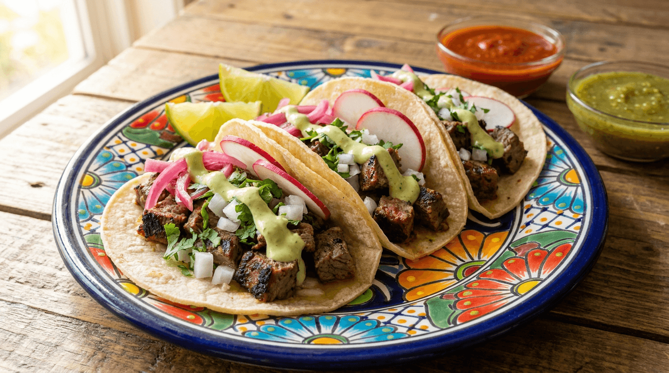
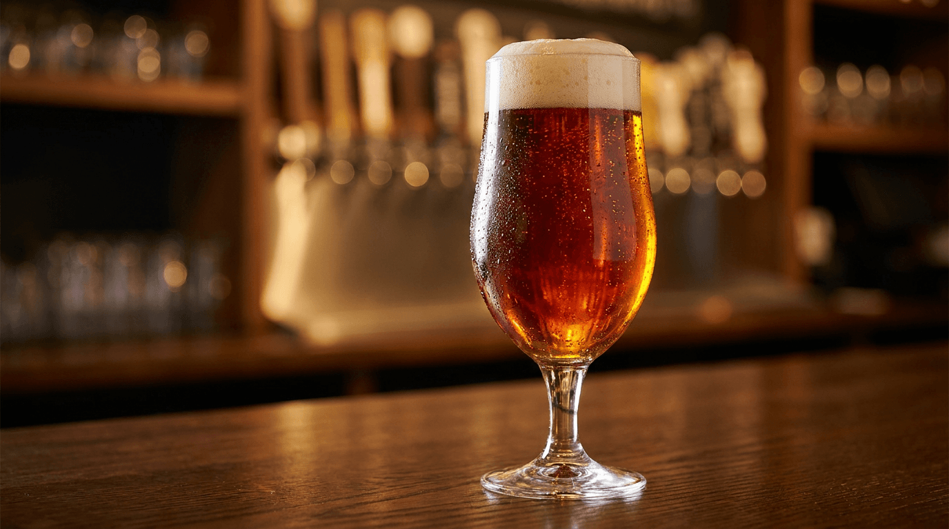
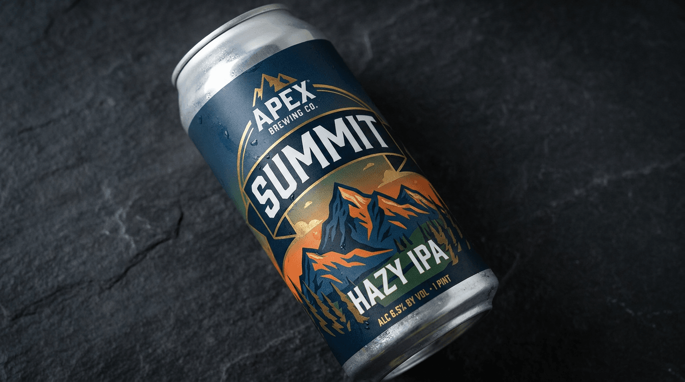
Template 1: The Hero Pour Shot — Signature Beer Photography
This is the foundational beer image — the perfectly lit, beautifully composed pour or pint glass that showcases a single beer at its visual best. This image is the visual equivalent of the first sip: it should communicate style, quality, and desirability in a single frame.
Prompt:
hero pour shot beer photography of [a single glass of beer presented at its absolute visual peak — the liquid, the glass, and the light conspiring to make this beer the most desirable object in the frame: the glass is style-appropriate — a tulip glass for a Belgian or a strong ale, a shaker pint for a classic American ale, a snifter for a barrel-aged stout, a pilsner glass for a lager, a stemless wine glass for a wild ale, a Willi Becher for a German-tradition brew, a wide-mouth stemmed glass for an IPA — the glass choice itself communicating knowledge and care about presentation, the beer fills the glass to the proper level — not brimming over nor half-empty but the correct fill that leaves room for the head and the aromatics, the fill level communicating professional pouring technique, the beer's color is the composition's chromatic anchor — rendered with absolute accuracy and maximum beauty: for a hazy IPA, the opaque golden-orange liquid glows with internal luminosity, the suspended particulate creating a soft, diffused quality that makes the liquid look like captured sunlight filtered through clouds; for a stout, the impenetrable black-brown liquid absorbs the light completely, its depth communicating richness and complexity, only the very thinnest edge where light passes through the glass revealing a deep ruby or mahogany hidden within the darkness; for a pilsner, the crystal-clear pale gold liquid transmits light with pristine transparency, every bubble of carbonation visible as a rising stream of tiny silver spheres from the base of the glass to the surface; for an amber or red ale, the warm copper-ruby liquid catches and holds the light with gemstone richness, the color saturated and inviting, the head sits atop the liquid with style-appropriate character — a thick, creamy, meringue-like white head for a well-carbonated ale, a thin, tight, persistent cap for a lager, a dense, tan, rocky foam for a stout, a delicate, dissolving lace for a wild ale — the head's texture, color, density, and persistence all communicating the beer's carbonation level, protein content, and style expectations, lacing on the glass — the residual foam patterns left behind as the beer level drops — may be visible as evidence that this glass has been enjoyed: the thin, irregular rings of white foam clinging to the interior glass surface, each ring marking a sip, the lacing communicating proper glass cleanliness and beer quality, condensation forms on the exterior of the glass — the fine water droplets that signal the beer is properly cold, the condensation catching the light as tiny individual highlights, the moisture creating a subtle softness on the glass surface that makes the beer look refreshingly cold, the glass sits on a surface that provides context and contrast — a dark wood bar top with visible grain that communicates taproom warmth, or a clean slate surface that provides dramatic contrast, or a copper bar surface that echoes the warm tones of the beer — the surface grounding the glass in a real, tactile environment, subtle background elements may provide depth — the soft blur of a taproom behind the glass, the suggestion of tap handles or bottles on a back bar, the warm ambient glow of the brewery environment — the background adding atmosphere without competing with the glass as the hero subject, the overall composition communicates: this beer is made with care, served with knowledge, and worth your attention — the pour shot as the visual invitation that makes the viewer thirsty] in a clean, dramatic hero-product beer composition, the glass is centered or positioned at a slight rule-of-thirds offset — the beer is the undisputed visual subject, the placement confident and prominent within the frame, the glass occupies a commanding portion of the frame — large enough for the liquid color, head detail, condensation, and lacing to be visible and beautiful, the surface beneath provides the horizontal ground plane — stable, clean, providing the physical context that the glass sits in a real place, the background is shallow-focus atmospheric — present enough to suggest environment (taproom, bar, brewery) without competing for attention, the blurred background adding warmth and context at a non-distracting distance, the depth of field is the critical technical element — moderately shallow, with the glass and beer in crisp, detailed focus and the background falling into smooth, warm bokeh, the shallow depth isolating the product with the visual language of premium product photography, the lighting is the composition's primary tool — dramatic, directional, designed to reveal the beer's liquid beauty: a primary light source from behind or behind-and-to-one-side of the glass — the backlighting or three-quarter backlighting that is essential for beer photography because it illuminates the liquid from within, the light passing through the beer and revealing its color, clarity, and carbonation with luminous beauty, the backlight transforms the beer into a light source — the liquid glowing with transmitted color, the pale gold of a pilsner radiating like liquid light, the amber of an IPA warm and rich as late-afternoon sun, the ruby edge of a stout catching fire where the thinnest layer of liquid allows light through, the head catches the light from above — the foam surface illuminated with soft, directional light that reveals its texture and density, the tiny bubbles and cream-like structure of the foam visible in the overhead illumination, the condensation catches the backlight as a field of individual highlights — each water droplet a tiny lens refracting the light behind the glass, the condensation field creating a sparkling, cool texture on the glass surface, the glass itself catches highlight and reflection — the clean, clear glass showing its shape and quality through the way it handles light: a thin highlight line running along the rim, the base catching a pool of light, the curvature of the glass creating graduated reflections, the surface catches ambient light with its material quality — the wood grain or stone texture or metal surface visible in warm, indirect illumination that provides the horizontal context, the background catches the remaining light with atmospheric blur — the warm, out-of-focus glow of the taproom environment providing the chromatic warmth of the setting, beer-specific color palette centered on the liquid's true color — [describe your specific beer's color: pale gold, deep amber, hazy orange, ruby copper, midnight black-brown, rose blush, honey gold] as the luminous chromatic anchor — white to off-white to tan head foam — clear glass with edge highlights — warm wood or dark stone or copper surface tones — warm, atmospheric background bokeh — and the dramatic, backlit, liquid-luminous palette of a hero beer pour shot in professional product lighting as the color palette, the mood is thirst-inducing beautifully crafted confidently presented and the specific hero-pour message — this beer is worth your attention and your palate, the visual quality matches the brewing quality, the presentation communicates knowledge and care, this is craft at its most visually compelling — the pour shot as the signature product photograph that drives trial, communicates quality, and makes the viewer want to be in the room where this glass is waiting, professional beverage and product photography with dramatic backlighting and moderately shallow depth of field keeping the glass in crisp detailed focus against atmospheric background blur, composed as a hero product shot with beer-specific lighting revealing liquid color and carbonation and head texture, the liquid luminosity and the condensation freshness and the style-appropriate presentation as the product-quality focal points, beer-accurate color palette with dramatic backlit luminosity, no text overlays, no watermarks
Best for: Website homepage hero image, social media primary product posts, Untappd brewery profile and beer listings, menu photography and digital menu boards, print and digital advertising, distributor and retailer sell sheets, beer festival and event promotional materials, email marketing product features, taproom digital signage, press kit product imagery
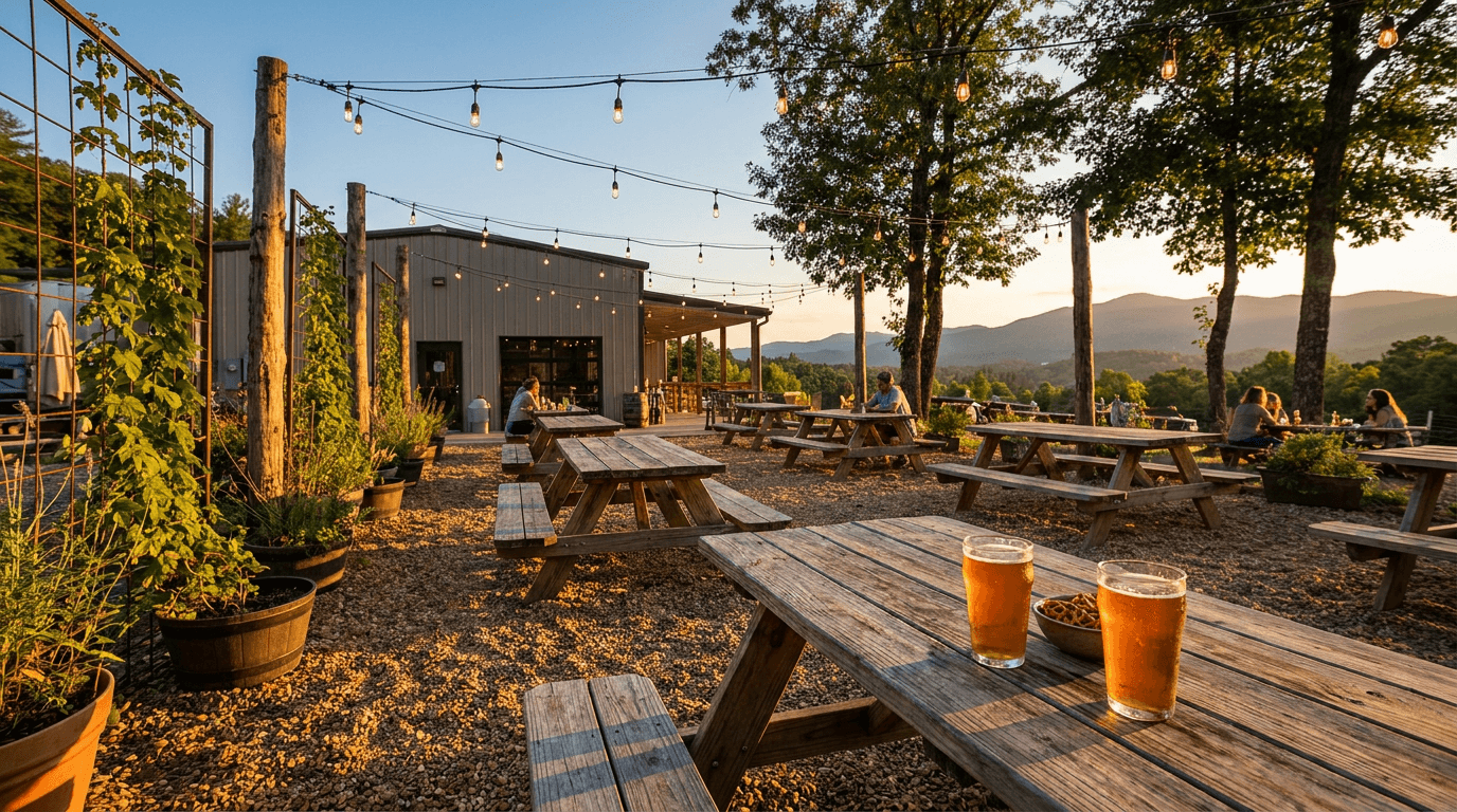
Template 2: The Taproom Atmosphere — Interior Environment Composition
This template captures the taproom as a complete environment — the interior space that communicates the brewery's personality, values, and hospitality culture. The taproom image is the visual invitation that makes a potential visitor decide to come through the door.
Prompt:
atmospheric taproom interior photograph of [a craft brewery taproom rendered as a warm, inviting, visually rich interior environment — the space that communicates who the brewery is and what the experience of visiting feels like: the taproom reveals its design character through the specific combination of materials that craft brewery architecture uses — the interplay of raw and refined, industrial and warm: a long bar stretches across one area of the frame — the bar top a substantial slab of reclaimed wood with visible grain, knots, and the character of a material with history, or a polished concrete surface with the smooth, mineral quality of hardened stone, or a copper-clad surface that has developed the green-edged patina of age and use, the bar top's surface quality communicating craft through its materiality, behind the bar, the tap wall displays the brewery's current offerings — a row of tap handles mounted on a wall or a custom tap tower, the handles themselves designed objects (ceramic, wooden, metal, or the brewery's custom handles), each one representing a beer on draft, the tap wall is the taproom's visual centerpiece and the operational heart of the space, the back bar displays glassware, bottles, cans of the brewery's packaged beer, perhaps a chalkboard or digital display listing current pours with style names and ABV — the information architecture of the beer menu integrated into the bar's design, the seating communicates the brewery's social philosophy — communal tables in heavy wood for shared, social, lively environments; individual two-tops and four-tops for more intimate, conversational settings; bar stools in industrial metal or worn leather for solo drinkers and bar-culture regulars; a mix that accommodates different social modes, the floor anchors the space — polished concrete (the dominant craft brewery floor, its industrial character softened by warmth and use), reclaimed wood planks, or stained concrete — the floor material setting the tonal foundation for the room, the walls tell the brewery's story — exposed brick communicating industrial heritage, raw concrete communicating modern industrial aesthetic, wood paneling communicating warmth and tradition, or a combination — the walls may feature the brewery's logo, local artwork, photographs of the brewing process, chalkboard menus, or neon signage, the ceiling reveals the building's bones — exposed ductwork, wooden beams, industrial pendant lights, or open joists — the honest overhead that says "this is a real building used for real production, not a decorated facade," evidence of the brewery's actual production may be visible — through a window or glass wall, the tanks and vessels of the brewhouse or the fermentation cellar can be seen from the taproom, the visual connection between where the beer is made and where it is served communicating the transparency and proximity that define the craft brewery experience, the taproom is populated with the evidence of life and use — glasses on tables catching the light, a bartender's hand reaching for a tap handle, napkins and coasters scattered naturally, the casual disorder of a space being actively enjoyed — the taproom in use, not a staged showroom, the overall composition communicates: this is a place you want to be, a room designed for the enjoyment of craft beer in good company, a space that takes its beer seriously but its atmosphere warmly — the taproom photograph as the visual welcome that drives visits] in a wide, atmospheric interior composition, the photograph is taken from a natural standing perspective — the eye-level viewpoint of someone who has just walked through the door and is taking in the room, or the seated perspective of someone at a table experiencing the space, the composition shows the full depth of the taproom — from the nearest seating in the foreground through the bar in the midground to the back wall or production area in the background, the spatial depth creating the immersive quality that makes the viewer feel present in the room, the bar and tap wall occupy the compositional anchor position — the focal area that draws the eye first, the functional heart of the space visible and prominent, the seating, floor, walls, and ceiling provide the environmental context — each material visible and contributing to the overall material palette, the decor and signage add the personality details — the artwork, the menu boards, the neon, the branding elements that make this taproom specifically this brewery's taproom, the depth of field is moderate to deep — enough depth to read the bar detail and the tap handles while the foreground and background provide atmospheric context with gentle softness, the overall space in focus enough to be present and inviting, the lighting is the taproom's own atmospheric illumination — the warm, amber, inviting light that well-designed taprooms use to create their characteristic golden-hour-forever atmosphere: industrial pendant lights hang above the bar and tables — their warm Edison-bulb or amber LED glow creating pools of warm light on the surfaces below, the exposed-filament bulbs themselves visible as warm, amber focal points in the room, the warm light reflects off the wood surfaces — the bar top, the tables, the wall paneling glowing with the absorbed and reflected amber illumination, the wood grain visible in the warm light, the warmth of the material and the warmth of the light reinforcing each other, the tap handles and back bar catch the light with their varied materials — metal handles reflecting, ceramic handles absorbing, the glassware on the back bar sparkling with tiny highlights, the concrete and brick surfaces absorb the warm light — their cooler, harder material quality providing the contrast that makes the wood feel warmer, the industrial surfaces softened but not eliminated by the warm illumination, any neon signage provides accent color — the brewery's name or a design element rendered in neon, the colored glow (warm amber, cool blue, or the brewery's brand color) adding a focal point of intense, saturated color to the warm ambient field, the overall light level is the "golden hour taproom" quality — not bright enough to feel commercial, not dark enough to feel bar-dim, the specific warm, comfortable, productive brightness that makes a taproom feel like the most inviting room in town, warm taproom material palette — reclaimed wood amber and honey tones — industrial metal grey and aged patina — exposed brick warm red-brown — polished concrete cool grey — warm pendant amber lighting — neon accent in brewery brand color — glassware sparkle — and the warm, material-rich, industrially-honest palette of a craft brewery taproom in golden-amber interior lighting as the color palette, the mood is warmly inviting authentically crafted socially vibrant and the specific taproom message — this is a destination, not just a bar, a place designed for the appreciation of craft beer in an environment that is itself crafted, the warmth of the room matches the warmth of the hospitality, come in and stay — the taproom photograph as the visit-driving visual that converts digital browsers into physical visitors, professional interior and architectural photography with warm ambient and pendant lighting and moderate-to-deep depth of field showing the full taproom environment, composed from a natural visitor's perspective with the bar and tap wall as the compositional anchor and the full material palette of the space visible, the warm atmosphere and the material authenticity and the lived-in vitality as the environment focal points, warm amber taproom tones with industrial contrast and neon accent, no text overlays, no watermarks
Best for: Website homepage and taproom-visit section, Google Business Profile and Google Maps imagery, social media taproom and environment content, Yelp, TripAdvisor, and review platform imagery, press kit environment photography, event and private-booking marketing, real estate and commercial context documentation, new-visitor and tourism marketing, email marketing taproom-experience content, digital signage and display
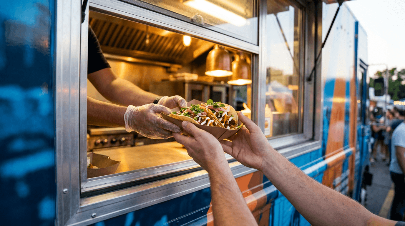
Template 3: The Can and Bottle Label — Packaging Design Showcase
This template showcases the brewery's packaging design — the can label or bottle label presented as a designed object with visual impact that communicates brand personality and demands shelf attention.
Prompt:
craft beer can label showcase photograph of [a single can (or bottle) of beer presented to display its label design at maximum visual impact — the packaging as a designed object that communicates brand identity, beer style, and shelf differentiation: the can is a standard 16oz or 12oz craft beer can — the format that has become craft beer's dominant packaging medium, the aluminum vessel that serves as the canvas for the brewery's most concentrated visual expression, the label wraps the can with the brewery's design — the full visual identity printed on the aluminum surface: the brewery logo positioned with brand-consistent placement (top, bottom, or integrated into the design), the beer name rendered in the brewery's typographic system with the personality and weight appropriate to the specific beer's character, the beer style identified clearly, the ABV and volume stated, and (critically) the visual design element that makes this can visually unique — the illustration, the graphic, the photographic element, the pattern, the color field, or the typographic composition that is the label's visual centerpiece, the label design reflects the brewery's design philosophy — perhaps a bold, full-bleed illustration that turns the can into a gallery piece: a richly detailed scene, a stylized character, an abstract landscape, or an iconic graphic rendered with the skill and personality of fine illustration, the illustration covering the full can surface with color and detail, the can as a miniature poster — or perhaps a clean, typographic, design-forward label: the brewery name and beer name in carefully chosen and carefully spaced typography, the color palette restrained to two or three colors, the negative space and the letter forms doing the visual work, the elegance of restraint communicating sophistication and confidence — or perhaps a label that combines graphic elements with photographic or textural elements: a central graphic on a textured background, a typographic treatment over a color gradient, a pattern-based design that wraps the can with repeating visual rhythm, the can is positioned to show the primary label face — the front of the can where the main design, beer name, and visual identity are centered, the can turned to the exact angle where the label's design reads with maximum clarity and impact, the can may be slightly angled — a three-quarter view that shows both the front label and the curvature of the can, the three-dimensionality of the can visible through the way the label wraps around the curved surface, the printed design following the aluminum's cylinder with the subtle distortion that gives printed cans their physical character, the can's physical quality is visible — the matte or gloss finish of the label printing (matte finishes absorbing light softly, gloss finishes reflecting with sharp highlights), the metallic quality of any unprinted aluminum showing through the design, the seam where the label's print meets the raw aluminum of the top and bottom rims, the can top with its pull-tab visible at the top of the frame — the familiar aluminum circle with its industrial, ready-to-open quality, the surface beneath the can provides contrast and context — a clean, dark surface that makes the label colors pop, or a contextual surface (bar top, stone counter, wooden shelf) that places the can in its consumption or retail environment, the overall composition communicates: this label is designed, this can is an object worth looking at, the visual quality of the packaging matches the quality of the beer inside, this can will stand out on any shelf or in any cooler and make the consumer reach for it] in a clean, design-focused packaging showcase composition, the can is the sole or dominant subject — positioned prominently in the frame, the label visible and legible, the design commanding attention, the can is angled for optimal label visibility — the primary design face fully visible with the three-quarter turn adding dimensional context, the surface beneath is clean and non-competing — providing ground and contrast without visual noise, the background is minimal or contextual — either a clean studio backdrop that isolates the can as a design object or a blurred environmental context that places the can in its world, the depth of field is tight on the can — the label in crisp focus with the background in clean blur, the focus specificity communicating "look at this design," the lighting is designed for label readability and can materiality — the light revealing both the printed design and the physical quality of the aluminum can: a primary soft light from the front-and-side — the directional illumination that reveals the label's colors, illustration detail, and typographic quality with clarity and richness, the print colors saturated and accurate under the balanced illumination, the light wraps around the can's cylinder — the graduated highlight-to-shadow transition across the curved surface showing the can's three-dimensional form, the label following the curve with the printed-on-aluminum quality visible, the metallic elements catch the light — any unprinted aluminum, metallic ink, or foil elements reflecting with the characteristic brightness of metal, the aluminum top and bottom rims catching highlights that frame the label, the matte or gloss finish responds to the light — matte labels with soft, even illumination across the surface, gloss labels with sharper, more defined reflections and highlights that show the surface sheen, any embossed or debossed elements on the label catch the light with their dimensional quality — the raised or recessed surfaces creating tiny shadows that add tactile visual interest, the condensation (if present) catches the light as a field of droplets — the cold-beer freshness signal adding visual interest and the desirability cue of a cold, ready-to-drink beer, the surface reflects the can with soft mirror quality — the can's colors and form reflected in a polished surface beneath, the reflection adding compositional depth and the premium quality of reflective product photography, label design as the chromatic centerpiece — the specific colors of the brewery's label design (describe your brand's actual palette: bold primaries, muted earth tones, neon brights, monochromatic, full-spectrum illustration, etc.) — aluminum silver of can material — clean dark or contextual surface — and the design-focused, label-showcasing palette of a craft beer packaging photograph in balanced directional lighting as the color palette, the mood is design-forward brand-communicating shelf-ready and the specific packaging message — this label is designed with intention and skill, the can is a visual object as much as a beverage container, the brand identity is concentrated and compelling on this surface, pick this up — the label showcase as the packaging-impact photograph that drives shelf recognition, social media sharing, and the visual brand awareness that converts first-time buyers, professional product and packaging photography with balanced directional lighting and tight depth of field keeping the label in detailed focus, composed as a packaging-design showcase with the can angled for maximum label visibility and the print quality and can materiality both visible, the label design and the brand identity and the shelf-ready finish as the packaging focal points, brand-specific label colors with aluminum accents, no text overlays outside the label design, no watermarks
Best for: Website beer listing and online store product pages, social media new-release and beer-highlight posts, Untappd beer listing imagery, distributor and retailer sell sheets, bottle shop shelf-talker and display materials, print and digital advertising, packaging design portfolio and awards submissions, email marketing new-release features, wholesale and distribution sales materials, merchandise and branded content pairing
Template 4: The Flight Board — Lineup and Variety Display
This template presents a flight of beers — the tasting lineup that showcases the brewery's range, creative breadth, and style diversity. The flight is one of craft beer's most photographed and most shared visual subjects.
Prompt:
craft beer flight board photograph of [a flight of four to six beer samples arranged on a serving board — the tasting lineup that displays the brewery's range from lightest to darkest, showcasing the color spectrum and style diversity of the current offerings: the flight board is a designed serving piece — a paddle-shaped wooden board with circular cutouts sized for sample glasses, or a long rectangular plank with indentations, or a custom-designed board with the brewery's logo branded or routed into the wood surface — the board itself an object that communicates the brewery's presentation standards, the sample glasses sit in their positions on the board — small tasting glasses (typically 4-5 oz), each filled with a different beer from the lineup, the glasses identical in shape (the uniformity allowing the beers themselves to be compared by the viewer), the beers are arranged in a deliberate order — traditionally lightest to darkest from left to right (or nearest to farthest from the viewer): the progression from a pale, crystal-clear pilsner or blonde ale at one end through progressively deeper colors — a pale gold session ale, a deeper gold IPA, an amber ale in rich copper, a brown ale in warm chestnut, arriving at a dark stout or porter in near-black at the opposite end — the color gradient across the flight is the composition's visual centerpiece, the progression from light to dark creating a natural visual rhythm that the eye follows, each beer's individual character is visible — the pale beers transmitting light with varying degrees of clarity (crystal clear to hazy), the mid-range beers glowing with their amber and copper warmth, the dark beers absorbing light with their density, each glass a distinct liquid personality within the uniform vessel, the heads on each glass vary by style — thick white foam on the hoppy ales, thin persistent caps on the lagers, tan creamy heads on the stouts — the head character adding another layer of visual variation across the lineup, the board sits on a taproom surface — the bar top or a table that provides the environmental context: the warm wood or cool stone that grounds the flight in the taproom setting, subtle taproom elements may appear in the background — the bar, the tap wall, other patrons in soft focus, the warm ambient glow of the space — the environment adding the social context of the tasting experience, perhaps a tasting card or a small menu listing the flight's beers is visible near the board — the names, styles, and brief descriptions that guide the tasting, the paper or card stock catching the warm light with its printed text, the overall composition communicates: this brewery makes a range of excellent beers, the lineup demonstrates creative breadth and brewing skill, the flight is an invitation to explore and discover, the color progression itself is beautiful — the flight photograph as the variety-showcasing visual that communicates the brewery's range] in a slightly elevated, perspective-rich flight composition, the photograph is taken from a slightly elevated angle — approximately 20-30 degrees above the surface — the perspective that shows the board, the full lineup of glasses, the liquid colors, and the surface beneath, the view that a drinker would have looking down at the flight before beginning the tasting, the board creates the compositional axis — its length or width establishing the primary line of the composition, the flight of glasses arranged along this axis creating the rhythm of repeating forms and progressing colors, the color gradient of the beers is the visual narrative — the eye traveling from light to dark (or the reverse), each glass a chapter in the story of the brewery's range, the individual glass detail is visible — the liquid color, the head character, the clarity or haze of each beer readable as distinct visual information, the board's surface and design add material interest — the wood grain, the logo branding, the cutout details, the craft of the serving piece visible as an extension of the brewery's brand, the taproom environment provides depth — the background falling into warm bokeh behind the focused flight, the environmental context soft but present, the depth of field is specifically calibrated — the flight board and all sample glasses in sharp focus (the full depth of the board from nearest to farthest glass), the background and foreground falling into smooth, warm blur, the focus zone is the flight itself, the lighting is warm and from the side or slightly behind — the directional light that illuminates the beer samples with the backlit luminosity that reveals liquid color: side-to-back lighting that passes through each glass — the transmitted light revealing the color, clarity, and character of each beer, the lightest beers glowing with golden luminosity, the darkest beers showing their opacity, the color gradient beautifully illuminated across the full lineup, the heads catch the overhead light with their foam texture — each glass's head visible as a distinct textural cap, the varied foam characters adding visual interest at the top of each glass, the board catches warm ambient light on its wooden surface — the grain and any branding visible, the warm wood providing the horizontal ground that connects the glasses, the surface beneath catches the transmitted light from the glasses — the colored light passing through the beer and casting soft colored shadows on the table, each glass projecting its beer's color onto the surface, the background catches the warm taproom light — the ambient environmental glow creating the atmospheric backdrop that places the flight in its setting, flight color progression as the chromatic narrative — pale gold to deep amber to dark brown-black across the lineup, with white to tan head variation — warm wood board tones — warm taproom surface — amber environmental background bokeh — and the progressive, range-displaying, warm-ambient palette of a craft beer flight in taproom lighting as the color palette, the mood is exploratory inviting range-celebrating and the specific flight message — this brewery makes many excellent beers, the range is impressive, the progression from light to dark is a journey worth taking, start here and discover what this brewery can do — the flight photograph as the variety-communication visual that drives taproom visits, extended tasting experiences, and the impression of creative brewing breadth, professional beverage and food photography with directional side-to-back lighting and calibrated depth of field keeping the full flight in focus against atmospheric background, composed from a slightly elevated tasting perspective with the color gradient and the board presentation as the compositional structure, the color progression and the style variety and the taproom context as the range-display focal points, progressive beer-color palette with warm wood and ambient tones, no text overlays, no watermarks
Best for: Social media taproom and tasting content (one of the most shareable craft beer image types), website beer-menu and taproom sections, Untappd and review platform content, Google Business Profile and review-site imagery, marketing for taproom visits and tasting experiences, email marketing taproom-experience features, print and digital advertising showing range, event and festival visual materials, tourism and destination marketing, new-visitor attraction content
Template 5: The Brewing Process — Behind-the-Scenes Production Visual
This template captures the brewing process — the production environment and the active work of making beer. This is the "craft" in craft beer made visible, the transparency that communicates authenticity, skill, and the physical reality of the brewing craft.
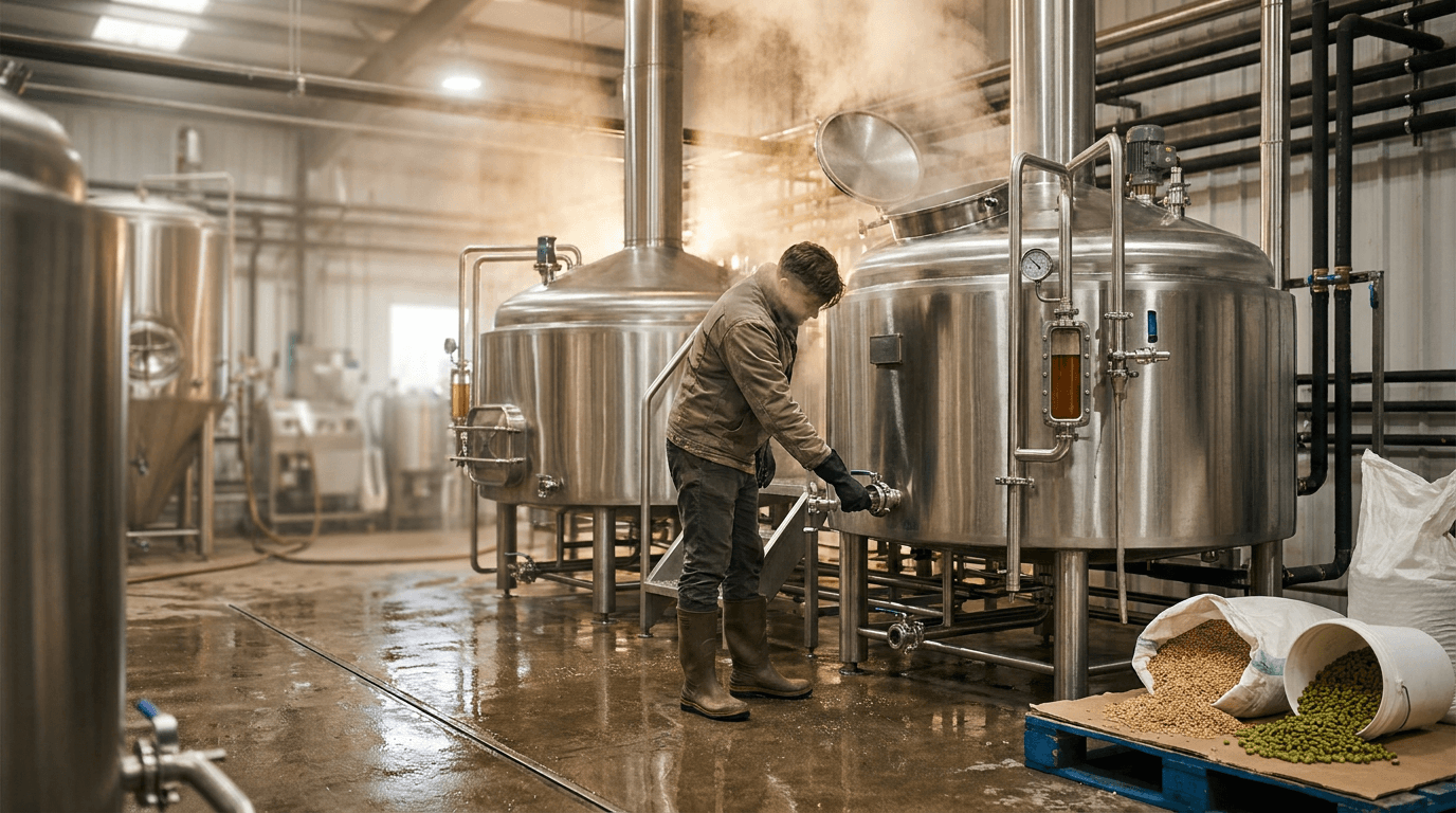
Prompt:
behind-the-scenes brewing process photograph of [the active production of beer in a working brewery — the equipment, the materials, and the physical process of brewing captured with atmospheric, editorial quality that makes the industrial process look both rigorous and beautiful: the brewhouse is the setting — the space where the actual transformation of grain and water into beer occurs: stainless steel vessels dominate the scene — the mash tun, the lauter tun, the brew kettle, the whirlpool — the large, cylindrical, polished stainless steel vessels that are the brewing industry's defining visual objects, their surfaces reflecting the room's light with the curved, warped reflections unique to polished cylindrical metal, the vessels' scale communicates the production's seriousness — these are large pieces of industrial equipment, their size relative to any human figure in the frame establishing the brewery's production capacity and investment, pipes and fittings connect the vessels — the network of stainless steel pipes, valves, tri-clamps, gaskets, and fittings that move liquid between vessels, the plumbing visible and clean, the engineering that connects the vessels as organized and intentional as the recipes that flow through them, gauges, sight glasses, and control elements add detail — pressure gauges with their circular faces and needle indicators, sight glasses showing the liquid level within vessels (the beer visible through the glass as a small, jewel-like window into the sealed vessel), temperature readouts, valve handles — the instrumentation that the brewer reads and adjusts during the process, steam or vapor may be present — the visible output of hot brewing processes: steam rising from an open vessel during a mash or a boil, the vapor catching the brewery's lighting and creating atmospheric haze, the visual signal that heat is being applied, that transformation is occurring, the brewing floor is clean and wet — the polished concrete or epoxy floor with its slight shine, the evidence of water and the obsessive cleanliness that food-grade production requires, a floor drain visible, the industrial-clean aesthetic of a working food production facility, raw ingredients may be present — a bag of malt grain open and ready to be milled, the golden-brown grain spilling slightly from the bag, or a container of hops with their green, resinous, compressed flower cones visible, or a bucket of yeast slurry with its creamy, living appearance — the ingredients before they become beer, their raw material quality communicating the natural, agricultural foundation of brewing, a figure — a brewer at work — may occupy part of the frame: a person in brewery work attire (rubber boots, brewery-branded t-shirt or hoodie, perhaps a leather apron or work gloves) performing a brewing task — checking a gauge, opening a valve, stirring the mash, adding hops to the kettle, taking a sample — the human presence communicating that this process requires skill, attention, and physical labor, the overall scene communicates: beer is made here, by these people, with this equipment, from these ingredients, and the process requires knowledge, investment, and physical work — the brewing process photograph as the authenticity visual that proves the craft in craft beer] in an editorial, atmospheric production-environment composition, the photograph is taken from within the brewery — the camera at floor level or slightly elevated, looking into the working space, the viewer placed inside the production environment, the stainless steel vessels are the visual anchors — their large, reflective surfaces dominating the midground, their scale and material quality establishing the industrial-production context, the pipes, fittings, and instrumentation add technical detail — the engineering visible in the midground and foreground, the complexity of the plumbing system communicating production sophistication, the brewer (if present) provides the human scale and narrative — positioned at work, interacting with the equipment, the body language communicating attention and skill, the raw ingredients (if visible) provide the material origin — the grain, hops, or yeast appearing as natural, agricultural objects within the industrial setting, the floor and the room provide the environmental envelope — the clean industrial space with its specific material palette (stainless steel, concrete, rubber, hose), the steam or vapor (if present) adds atmospheric depth — the haze creating visual layers within the space, the transparency varying with distance, the depth of field is moderate — the primary subject (vessel, brewer, or ingredient) in focus with the deeper brewery space in atmospheric softness, the environmental depth visible but not every element in sharp resolution, the lighting is the brewery's own industrial illumination supplemented by the dramatic quality of steam and reflective surfaces — the overhead fluorescent or LED fixtures providing the functional brightness of a production space, while the reflective stainless steel and the atmospheric steam transform the industrial light into something more dramatic: the overhead lighting reflects in the stainless steel vessel surfaces — the long, curved reflections of fluorescent fixtures or LED panels running across the polished metal, the reflected light creating bands of brightness on the curved surfaces, the stainless steel acting as a complex mirror that reflects the entire room in warped, fluid forms, the steam catches and scatters the overhead light — the vapor creating volumetric light shafts where the illumination passes through the atmospheric haze, the scattered light filling the upper portion of the brewery with a soft, diffused, atmospheric glow, the brewing liquid (if visible through a sight glass or open vessel) catches the light with its liquid quality — the amber or gold of wort glowing in the glass window, the evidence of the product in process, the brewer's figure catches the light from above — the overhead illumination creating the downward modeling that shows the person at work, the human form positioned within the industrial context, the raw ingredients catch the light with their organic texture — the grain with its matte, granular surface; the hops with their green, textured, resinous quality; the yeast with its pale, creamy, biological surface — the natural materials a textural contrast to the industrial stainless steel, the floor reflects the overhead light with its polished, wet surface — the brewing floor acting as a subtle reflector that brightens the space from below, industrial stainless steel silver-grey as the dominant material — polished metal reflections — warm amber or gold of brewing liquid — green of hops or golden-brown of malt grain — concrete grey floor — warm human skin and work-wear tones — atmospheric steam diffusing overhead light — and the industrial, authentic, process-visible palette of a working craft brewery in production lighting as the color palette, the mood is authentically industrial professionally rigorous craft-proud and the specific brewing-process message — this is real production, real equipment, real ingredients, real skill, the beer you drink came through this process and these hands, the transparency of the production is the authenticity of the brand — the process photograph as the craft-credentials visual that communicates brewing seriousness and production investment, professional industrial and editorial photography with overhead production lighting and atmospheric steam effects and moderate depth of field in a working brewery environment, composed from within the production space with stainless steel vessels and brewing activity as the visual subjects, the production scale and the process authenticity and the material quality as the craft-credentials focal points, industrial stainless and concrete with organic ingredient and warm human accents, no text overlays, no watermarks
Best for: Website about/story and brewing-process sections, social media behind-the-scenes and process content, Brewery tour marketing and documentation, press kit production-credentials imagery, email marketing story and process features, distributor and wholesale presentation materials, documentary and video content pairing, anniversary and milestone context content, educational and beer-appreciation content, award and competition submission context
Template 6: The Seasonal Release — Limited Edition Launch Visual
This template creates the visual announcement for a seasonal or limited-release beer — the special offering that generates anticipation, urgency, and the collector energy that drives craft beer culture. The visual must communicate both the beer's specific seasonal character and its limited availability.
Prompt:
seasonal limited release beer announcement visual of [a beer presented within a seasonal environment that communicates its specific time-bound, special-occasion character — the visual that says "this is available now and not forever, and it tastes like this season": the beer is presented in its packaging and/or in a poured glass — both elements may be present: the can or bottle with its seasonal-specific label design (the special label artwork created for this limited release, perhaps featuring seasonal illustration — autumnal leaves and warm harvest imagery for an Oktoberfest or pumpkin ale, snow and frost and warm fire tones for a winter warmer or Christmas ale, bright flowers and sunshine for a summer session beer, fresh green and earthy imagery for a spring saison) alongside a poured glass displaying the beer's seasonal-appropriate color and character, the seasonal environment wraps around the beer — natural, authentic seasonal elements that communicate the specific time of year: FOR AUTUMN — warm, amber-and-red-and-gold fallen leaves scattered on and around the surface, perhaps a rough burlap or linen textile beneath the beer, cinnamon sticks or star anise or small gourds visible as subtle seasonal accents, the warm, compressed, low-angle golden light of October afternoons, the overall warmth and richness of harvest season permeating every element; FOR WINTER — a dark, warm, intimate setting suggesting the interior warmth against cold: a heavy wood surface with character, perhaps a knit textile or blanket visible at the edge, the suggestion of a fireplace glow casting warm amber light from one side, frost or condensation on the glass surface, the darkness of the background suggesting the long nights that call for dark, warming beers; FOR SUMMER — bright, natural, outdoor-adjacent light: a sun-washed surface (light wood, stone, or concrete), citrus slices or fresh herbs as seasonal garnish elements, the bright, high-key quality of summer light with its blue-sky color temperature, condensation heavy on the glass communicating the refreshment-in-heat quality that summer beers offer; FOR SPRING — fresh, green, renewal energy: new growth visible (small plants, herb sprigs, fresh flowers), the light quality bright but softer than summer's intensity, the color palette shifting from winter's darkness toward warmer, lighter tones, the overall freshness communicating new beginnings and seasonal change, the seasonal elements are authentic and specific — not generic "season" signifiers but the actual natural materials, light qualities, and atmospheric conditions of the specific time of year, the details communicating that this beer was designed for this particular moment in the annual cycle, the limited-edition character is communicated through the presentation's specialness — the careful arrangement, the intentional styling, the overall sense that this is not an everyday beer but a special occasion, the visual quality elevated beyond the standard product shot to communicate the event nature of a limited release, the overall composition communicates: this beer is seasonal, special, and available now — the ingredients, the recipe, the label design, and the entire visual presentation are tuned to this specific moment in the year, experience it before it is gone — the seasonal release visual as the anticipation-building, urgency-creating image that drives immediate purchase and the FOMO that limited releases generate] in a styled, seasonal-environment product composition, the beer (can/bottle and/or poured glass) is the central subject — prominently positioned, the packaging and the liquid both visible, the product commanding the frame, the seasonal elements surround and support — the natural materials, the seasonal accents, the textile and surface choices all creating the seasonal context without overwhelming the product, the environmental context is seasonal-specific — the light quality, the color temperature, and the atmospheric quality all communicating the specific season, the styling is elevated but natural — the arrangement appearing effortless while being clearly intentional, the "special occasion" quality visible without feeling over-produced, the depth of field is product-focused — the beer packaging and glass in sharp focus, the seasonal elements in varying degrees of softness based on their distance from the product, the nearest seasonal details sharp enough to be identified, the furthest in atmospheric blur, the lighting is season-specific — the critical element that makes each seasonal version distinct: AUTUMN lighting — warm, amber, low-angle, golden-hour quality: the directional warm light entering from a low angle (replicating the low autumn sun), the amber warmth saturating every surface, the long shadows creating the late-afternoon-in-October atmosphere, the beer's warm color (amber, copper, brown) amplified by the warm light, the autumn elements (leaves, spices, textiles) catching the golden light with their warm, organic surfaces; WINTER lighting — warm, intimate, low-key with fire-like directional warmth: the primary light warm and from one side (suggesting fireplace or candlelight), the overall light level lower than other seasons (the dark-evening intimacy of winter), the beer catching the warm directional light against a dark background, the contrast between warm light and dark space creating the cozy, enclosed quality of winter indoors; SUMMER lighting — bright, high-key, natural daylight with blue-sky color temperature: the abundant, bright illumination of summer daylight, the light quality clean and slightly cool-warm (the balanced daylight of a clear day), the beer's colors vivid under the bright illumination, the condensation sparkling in the strong light, the overall brightness communicating energy and heat; SPRING lighting — bright but soft, the quality of overcast spring daylight: the diffused, gentle illumination of cloud-filtered spring sun, the light quality fresh and slightly cool, the greens and naturals of the spring elements vivid under the soft, even light, season-specific color palette — AUTUMN: amber, gold, burnt orange, deep red, warm brown, harvest tones — WINTER: deep garnet, dark brown, cream, warm amber accent against darkness — SUMMER: bright gold, citrus yellow, fresh green, sky blue, clean white — SPRING: soft green, warm yellow, fresh white, gentle earth tones — each palette applied to both the beer presentation and the seasonal environment, with the brewery's brand colors integrated as the consistent thread across all seasonal variations as the color palette, the mood is seasonally specific limited-edition urgent and the specific seasonal-release message — this beer embodies this season, it is available for a limited time, the seasonal ingredients and the seasonal packaging and the seasonal visual world all come together in this offering, taste the season before it changes — the seasonal release visual as the urgency-creating, anticipation-building image that drives immediate purchase and positions the brewery as seasonally creative and responsive to the rhythms of the year, professional styled food-and-beverage photography with season-specific lighting and product-focused depth of field in a seasonally-styled environment, composed as an elevated seasonal product presentation with the beer and its packaging surrounded by authentic seasonal elements, the seasonal atmosphere and the limited-edition specialness and the product beauty as the seasonal-release focal points, season-specific palette with brand color continuity, no text overlays, no watermarks
Best for: Social media seasonal release announcements and launch posts, website seasonal and limited release sections, email marketing seasonal release campaigns, Untappd limited-release listings, distributor and retailer seasonal sell sheets, in-taproom seasonal menu features, pre-order and reservation-system visuals, collaboration and seasonal event promotions, print and digital seasonal advertising, holiday and seasonal gift-guide features
Template 7: The Outdoor Patio and Beer Garden — Lifestyle and Location Scene
This template captures the outdoor drinking experience — the patio, beer garden, rooftop, or outdoor event space that connects craft beer to lifestyle, leisure, place, and the social enjoyment of beer in the open air.
Prompt:
outdoor beer garden and patio lifestyle photograph of [a craft beer being enjoyed in a beautiful outdoor setting — the patio, beer garden, rooftop, or outdoor space that connects the brewery experience to place, weather, and the open-air social enjoyment that defines warm-weather beer culture: the outdoor space is the brewery's — a patio with character, a beer garden with intention, a rooftop with a view: heavy wooden picnic tables or designed outdoor furniture arranged for communal or intimate groups, the seating worn with the evidence of seasons of use, the wood weathered or the metal patina'd, the furniture communicating that this outdoor space is used and loved, the ground surface is natural or intentionally designed — gravel or crushed stone beneath the tables, concrete pavers in a pattern, natural grass, or the reclaimed materials (pallets, planks, industrial elements) that craft breweries often use to build their outdoor spaces with DIY character, string lights or festoon lights cross the outdoor space — the warm Edison-bulb strings that have become the visual signature of outdoor craft beer culture, the lights creating a canopy of warm points against the open sky, the strings connecting posts or trees or building edges, the warm glow present even in daylight as a design element, plants and greenery integrate with the outdoor space — hop bines growing on a trellis or fence (the visual and functional connection between ingredient and experience), potted plants on tables or along borders, surrounding trees or landscaping, the green natural elements softening the industrial or rustic materials, a beer or beers are present in the scene — a pint glass or two on a table, catching the outdoor light with their liquid beauty, the condensation heavy in the warm-weather context, the beer the connection between the scene and the brand, the setting has a sense of place — the outdoor space communicates its geographic location: a mountain view behind the beer garden, an urban skyline from a rooftop, a rural landscape surrounding a farmhouse brewery, a waterfront or riverside setting, a neighborhood streetscape beyond the patio fence — the location grounding the experience in a specific, desirable place, the social energy of the space is suggested through environmental evidence — additional glasses on distant tables, the arrangement of furniture suggesting groups about to arrive or recently departed, the overall sense of a space designed for gathering, the season and time of day are specific — a warm afternoon with golden light, a summer evening at the transition between day and string-light-illuminated night, a spring day with fresh green surrounding the patio — the temporal specificity making the image an invitation to a particular moment, the overall composition communicates: this is where you want to be on a beautiful day with good beer and good company, the outdoor space is a destination, the brewery experience extends beyond the interior into the air and the light and the landscape — the outdoor visual as the lifestyle image that drives warm-weather visits and positions the brewery as a destination for more than just beer] in a wide, environmental, lifestyle composition, the photograph captures the full scope of the outdoor space — the seating area, the overhead elements (lights, sky, trees), the ground, and the background view, the spatial extent communicating the generosity of the outdoor experience, the beer is present but not dominant — visible in the scene as the connecting element (what you will drink here) without being the compositional center, the environment is the subject, the beer is the reason, the outdoor materials and design details are visible — the furniture character, the ground surface, the string lights, the plants — the design decisions that make this outdoor space appealing all readable in the composition, the sense of place is communicated through the background — the view, the landscape, the urban context, or the surrounding environment visible and contributing to the destination quality of the image, the depth of field is moderate to deep — the outdoor space in comprehensive focus from the nearest table to the background view, the full environmental depth communicating the real, spatial quality of the outdoor experience, the lighting is natural and golden — the warm, flattering, outdoor light that makes everything look its most beautiful: the golden hour light that outdoor spaces receive in the hours before sunset — the warm, directional, amber-tinted illumination that gilds every surface with warm tones, the light entering from a low angle and casting long, gentle shadows that add dimension to the scene, the tables and furniture catch the golden light — the wood surfaces warming under the amber illumination, the metal elements catching golden highlights, the furniture's worn quality visible and enhanced by the raking low light, the beer glasses catch the golden light with luminous beauty — the liquid glowing with transmitted and reflected golden light, the condensation sparkling in the warm illumination, the beer integrating perfectly with the golden-hour color palette, the string lights begin their transition from daytime design element to illuminated fixture — in the golden hour, the Edison bulbs may be just beginning to glow visibly, their warm amber adding to the overhead warmth, the warm-to-blue transition between the golden foreground and the cooling sky beyond creating chromatic depth, the plants and greenery catch the warm light — the leaves and vines translucent where the sun passes through, the green enhanced by the golden ambient, the natural elements luminous, the background view catches the golden light with its specific character — the mountains or skyline or countryside painted in golden-hour warmth, the distant view as beautiful as the immediate space, the ground surface catches the warm light — the gravel or stone or grass bathed in amber, the long shadows of furniture and people stretching across the surface, golden outdoor palette — warm amber-gold natural light — weathered wood honey and grey tones — green plant and hop vine accents — beer liquid gold catching the sun — string light warm amber points — cooling blue sky at zenith — background view in golden warmth — and the warm, golden, outdoor-lifestyle palette of a craft brewery patio in late-afternoon natural light as the color palette, the mood is warmly social location-specific leisurely inviting and the specific outdoor message — this is the place to be when the weather is beautiful and the beer is cold, the outdoor space is a destination in itself, the combination of place and beer and light and company creates an experience that cannot be replicated indoors or at home — the outdoor photograph as the visit-driving lifestyle visual that positions the brewery as a destination for social leisure and seasonal enjoyment, professional lifestyle and environmental photography with golden-hour natural light and moderate-to-deep depth of field capturing the full outdoor environment, composed as a wide environmental scene with the outdoor space, the beer presence, and the background sense-of-place all visible, the golden-light atmosphere and the outdoor-space character and the lifestyle desirability as the visit-driving focal points, golden-hour warm palette with green and sky accents, no text overlays, no watermarks
Best for: Social media lifestyle and environment content (highest engagement category for brewery social), website taproom-visit and experience sections, Google Business Profile and location-based platform imagery, tourism and destination marketing, event space and private booking marketing, seasonal and warm-weather promotional campaigns, email marketing visit-driving features, Yelp and TripAdvisor review-context imagery, print and local advertising, collaboration and event hosting marketing
Template 8: The Ingredient Spotlight — Raw Materials and Sourcing Visual
This template showcases the raw ingredients of brewing — grain, hops, yeast, water, and specialty adjuncts — presented as beautiful, agricultural, natural materials that communicate quality sourcing and the honest foundation of the brewer's craft.
Prompt:
raw brewing ingredient spotlight photograph of [the agricultural and natural materials that become beer — the ingredients presented as beautiful objects that communicate quality, sourcing integrity, and the natural foundation of the brewing process: the primary ingredient subject is [choose: MALT AND GRAIN — a generous mound or cascade of malted barley, the grain presented in abundance: the individual kernels visible in their varied amber, golden, and brown tones (different malts producing different colors: pale malt in light gold, crystal malt in amber, chocolate malt in deep brown, roasted barley in near-black), the grain piled on a rustic surface — a wooden scoop or shovel, a burlap or canvas bag open and spilling, a wooden bowl or a brewer's hands cupped and full — the grain spilling and scattering at the edges of the pile with individual kernels visible, the overall abundance communicating the agricultural generosity of the malting floor, the malt's texture is tactile — the husks slightly rough, the kernel surfaces catching light differently based on their roast level, the lightest grains luminous and bright, the darkest grains absorbing light with their caramelized surfaces; or HOPS — fresh whole-cone hops presented in their intense, green, aromatic glory: the hop cones (lupulin-rich flowers of the hop plant) displayed in abundance — piled in a bowl, cascading from a bag, held in hands, or arranged around a beer glass as a garnish-and-ingredient reference — the cones showing their layered, petal-like structure, the bracteoles (individual petals) slightly open to reveal the yellow lupulin glands within, the green ranging from fresh spring green to the deeper olive-green of dried cones, the sticky, resinous quality suggested by the slight sheen on the cone surfaces, the lupulin visible as a fine golden-yellow dust or glands at the base of the bracteoles — the concentrated aromatic and bittering compound that gives hops their brewing value, the yellow against the green creating a vivid botanical color contrast; or SPECIALTY ADJUNCTS — the distinctive non-standard ingredients that make a specific beer unique: vanilla beans with their dark, wrinkled, aromatic pods; cacao nibs with their broken, dark-brown, irregular pieces; coffee beans in their roasted, glossy, deep-brown beauty; fresh fruit (citrus, berries, stone fruit) in their vivid natural colors; chili peppers with their red, waxy, intense forms; coconut flakes; cinnamon bark; toasted oak chips — the adjunct ingredients that communicate the recipe's creative ambition and flavor direction] — the ingredients are arranged with intentional, food-photography styling — not a flat product display but an abundant, generous, textured composition that makes the raw materials look as beautiful and desirable as the finished beer, the surface beneath the ingredients provides natural, agricultural context — a worn wooden table or cutting board, a stone surface, a linen or burlap textile, a copper brewing vessel surface — the materials communicating farm, craft, and kitchen rather than laboratory or factory, additional context elements may be present — a small glass of the finished beer nearby (connecting ingredient to product), brewing tools (a scoop, a scale, a hop screen), or the packaging of the ingredient with its origin information visible — the context connecting the raw material to the brewing process and the finished product, the overall composition communicates: these are real ingredients, sourced with intention, beautiful in their natural state, and the foundation of everything we brew — the ingredient spotlight as the sourcing-and-quality visual that communicates the natural, agricultural, quality-focused foundation of the brewery's craft] in a close, textural, food-photography-style ingredient composition, the ingredients fill the frame with generous abundance — the raw materials presented at close range, their textures and colors visible in intimate detail, the surface and context provide the natural, agricultural foundation — the organic materials (wood, linen, stone) grounding the ingredients in their pre-industrial, pre-technological state, any beer glass or brewing tool provides the connection to the finished product — the before-and-after implied by the presence of both ingredient and product, the depth of field is moderately shallow — the nearest ingredients in detailed, textural focus with the background and edges softening, the shallow focus creating the intimate, food-photography quality that makes ingredients look beautiful, the lighting is warm and natural — the quality of light that food photography uses to make organic materials look their most appealing: warm, directional, natural or natural-quality light from one side — the side lighting that reveals the texture of every ingredient: the rough husk of grain, the layered structure of hop cones, the glossy surface of coffee beans, the wrinkled pod of vanilla — the directional light creating the tiny shadows and highlights that make textured surfaces three-dimensional and tactile, the grain catches the warm light with its varied malt-color response — the pale golden grains luminous and bright, the amber grains warm and rich, the dark grains absorbing light with deep, caramelized tones, the scattered individual kernels catching individual highlights, the hops catch the warm light with their green, resinous, botanical quality — the cone structures creating tiny internal shadows between their bracteoles, the lupulin glands catching the light with their golden, almost fluorescent brightness, the resinous surface sheen visible in the highlights, the adjunct ingredients catch the light with their specific material responses — vanilla pods with their dark, matte, wrinkled texture; cacao nibs with their dry, fractured, angular surfaces; coffee beans with their glossy, rounded, reflective surfaces; fresh fruit with their vivid, taut, juice-suggesting skins, the surface and textile beneath catch warm, diffused light — the organic materials providing the warm, natural backdrop that makes the ingredients feel connected to agriculture and craft, ingredient-specific natural palette — GRAIN: pale gold, warm amber, deep brown, roasted near-black, with golden harvest warmth — HOPS: fresh green to olive, golden-yellow lupulin, resinous sheen — ADJUNCTS: specific to the ingredient (dark vanilla, deep brown cacao, glossy coffee, vivid fruit) — warm natural surface tones (wood, linen, stone) — and the close, textural, warm-natural palette of raw brewing ingredients in food-photography directional light as the color palette, the mood is naturally beautiful quality-communicating texturally rich and the specific ingredient message — these are the materials that become your beer, sourced with care and beautiful in their natural state, the quality of the ingredients is the foundation of the quality of the beer, we show you what goes in because we are proud of every element — the ingredient photograph as the sourcing-and-quality visual that communicates ingredient-forward brewing philosophy and natural, agricultural authenticity, professional food and still-life photography with warm directional natural light and moderately shallow depth of field keeping the ingredients in textural detail, composed as a close, abundant ingredient display with natural surface context, the textural beauty and the natural quality and the ingredient-to-product connection as the sourcing focal points, warm natural ingredient palette, no text overlays, no watermarks
Best for: Website beer-detail and ingredient-story sections, social media ingredient-focused and educational content, email marketing recipe and sourcing features, press kit ingredient-quality and sourcing-story materials, educational and beer-appreciation content, collaboration and special-ingredient release announcements, tap-handle and shelf-talker descriptive content, menu descriptions and tasting-notes context, farming and sourcing partnership marketing, behind-the-scenes and process content
Template 9: The Collaboration Brew — Partnership and Community Visual
This template creates the visual announcement for a collaboration beer — a brew made in partnership with another brewery, a local business, an artist, or a community organization. Collaboration is one of craft beer's defining cultural values, and the visual must communicate partnership, mutual respect, and the combined creative identity of the collaborators.
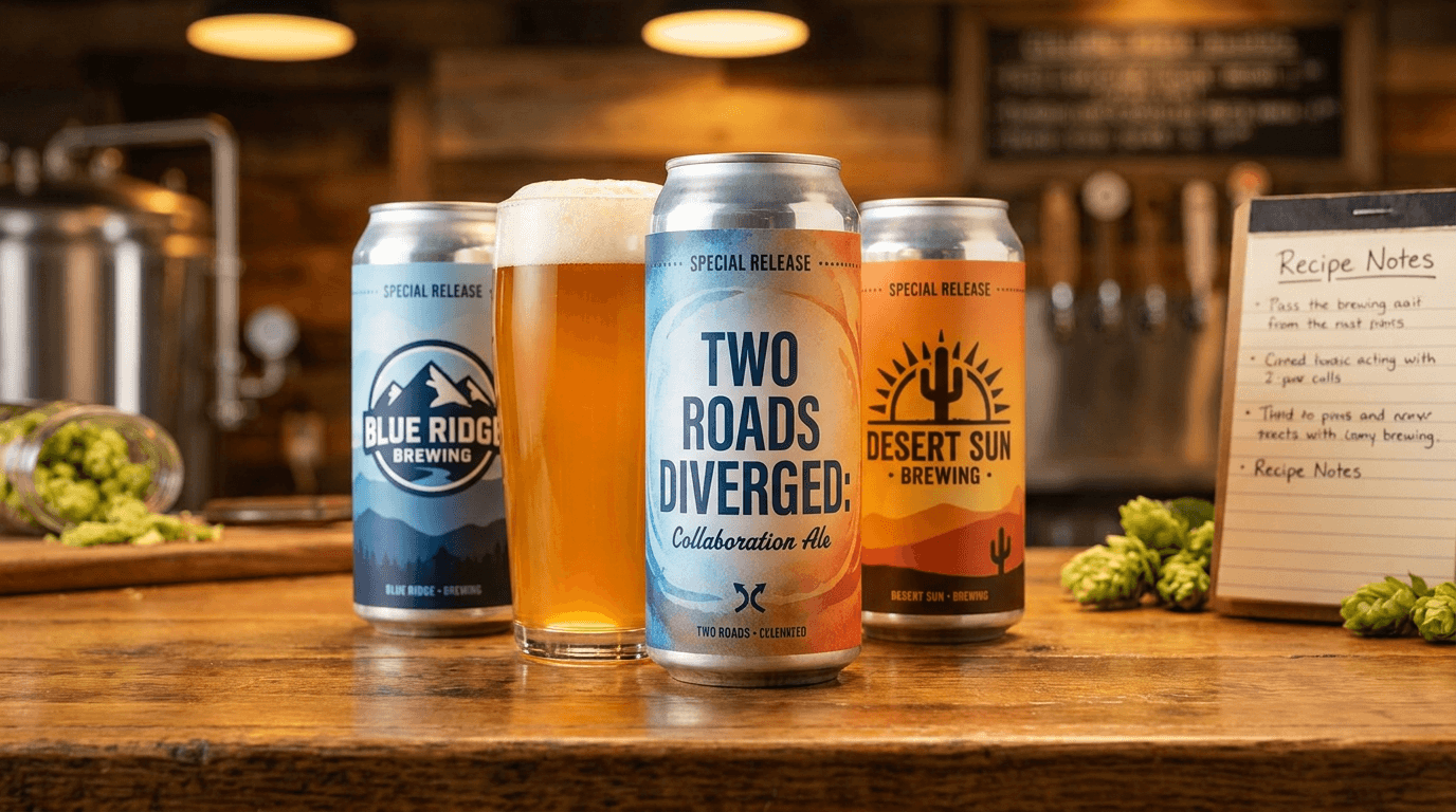
Prompt:
collaboration brew visual of [a visual composition that communicates partnership and combined creative identity — two brands, two approaches, one beer: a paired presentation showing two identities coming together: two cans or glasses side by side — the collaboration beer centered between or presented alongside elements representing both partners: perhaps the collaboration beer can or glass flanked by elements from each brewery (a glass with each brewery's logo, a can from each brewery's existing lineup, branded glassware from both partners), the pairing communicating the "these two came together to make this" narrative, OR a more conceptual composition: a single collaboration beer presented with visual elements that blend both brands — the label design showing both logos, the color palette blending both brands' signature colors, the presentation style combining the visual languages of both partners into something that is recognizably neither and both, the collaboration beer itself is the hero — the product of the partnership, the actual thing that both brands made together, presented with the same care and quality as any hero pour shot, the liquid visible and beautiful, the packaging displaying both brands with equal visual prominence, the setting may communicate the collaboration context — a taproom setting that suggests the meeting of two brewing teams, a production environment where both breweries' names are visible, an outdoor or event context that suggests the social, communal spirit that brings breweries together, evidence of the collaboration process may be present — a handwritten recipe notepad suggesting the recipe development sessions, brewing notes, or the informal, creative, convivial process of two brewing teams working together, the overall composition communicates: this beer is the product of friendship, mutual respect, and combined skill — two breweries who admire each other's work came together to make something neither could make alone, the collaboration is not just a marketing exercise but a genuine creative partnership — the collaboration visual as the partnership-celebrating image that generates excitement around the limited availability and the combined brand equity of both partners] in a balanced, partnership-communicating composition, the composition is symmetrical or balanced — the visual weight of both partners' brand elements equalized, neither brewery visually dominating, the balance communicating the mutual respect of the partnership, the collaboration beer is the compositional center — the product of the partnership occupying the focal position, the combined creation presented as the outcome of the collaboration, the partner elements (cans, glasses, logos, brand colors) flank or surround — the contributing identities visible and recognizable, each brand's visual identity maintained while integrated into the collaborative whole, the setting and context provide the story — where and why this collaboration happened, the communal spirit of the partnership communicated through the environment, the depth of field keeps the collaboration beer in crisp focus — the hero product sharp and detailed, the supporting elements in clear but slightly softer resolution, the contextual background in warm atmospheric blur, the lighting is warm and balanced — even illumination that treats both partners' brand elements equally, no visual favoritism in the light: warm, even, directional light that illuminates the collaboration beer and both partners' elements with equal quality and attention, the backlight reveals the collaboration beer's liquid quality — the same luminous-beer technique from Template 1 applied to the collaboration product, the beer's color and character visible and beautiful, the partner brand elements catch the same light with their respective material and design qualities — each brand's can or glass or logo visible and well-lit, the light treating both with equal attention, the surface and background catch the warm ambient light — the setting communicating the collaborative context with its material quality and atmosphere, blended or balanced dual-brand palette — combining the signature colors of both partners into a harmonious visual field: [describe your brand's colors] alongside [describe the partner's colors] with the collaboration beer as the chromatic bridge — warm, even lighting — partnership-context surface and background tones — and the balanced, dual-brand, partnership-communicating palette of a collaboration brew visual as the color palette, the mood is celebratory collaborative mutually respectful and the specific collaboration message — these two breweries made something special together, the partnership is genuine, the beer combines the best of both, this is a limited-availability result of creative community in action — the collaboration visual as the excitement-building, partnership-celebrating image that generates buzz around the limited release and communicates the cooperative spirit that defines craft beer culture, professional product and editorial photography with warm balanced lighting and partnership-centered depth of field, composed as a balanced dual-brand presentation with the collaboration beer at center, the partnership balance and the product quality and the collaborative spirit as the partnership focal points, blended dual-brand palette with warm ambient tones, no text overlays outside the product packaging, no watermarks
Best for: Social media collaboration announcement and release posts, both breweries' social channels simultaneously, email marketing collaboration features, Untappd collaboration beer listings, press and media collaboration story features, event and tap takeover collaboration promotions, website collaboration and community sections, distributor and retailer collaboration sell sheets, beer festival and collaboration event materials, cross-promotional content for both partners' audiences
Template 10: The Merchandise and Branded Swag — Brand Extension Visual
This template presents brewery merchandise — apparel, glassware, accessories, and branded goods — as desirable lifestyle objects that extend the brewery's visual identity beyond the glass and the can.
Prompt:
brewery merchandise display photograph of [branded brewery merchandise presented as desirable lifestyle and collector objects — the swag that extends the brewery's identity into the everyday life of the customer: the primary merchandise item is a premium garment or accessory — a heavyweight cotton t-shirt, a zip-up hoodie, a snapback or dad hat, a beanie, or a branded apron — displayed with the styling of fashion-adjacent product photography, the garment showing its fabric quality through the weight of its folds and the textile response to light, the brewery's brand printed, embroidered, or patched on the garment with quality that communicates permanence and premium production — screen-printed graphics with opaque, well-registered ink, embroidered logos with dimensional thread work, woven patches stitched with care, the branded glassware is a secondary hero — a pint glass, a tulip, a teku glass, or a branded snifter with the brewery's logo etched, printed, or transferred onto the glass surface, the glass clean and catching the light with its transparent material quality, the logo visible through the glass or on its surface, the glassware communicating the brewery's specific and knowledgeable approach to beer service, additional merchandise items create the collection context — an enamel pin on the garment surface, a branded bottle opener or keychain, a sticker sheet showing the brewery's design range, a tote bag or canvas carryall with the brewery's identity, a branded Yeti or insulated tumbler, a poster or print — the accumulated collection communicating the breadth of the merch offering, the merchandise is arranged on a surface that connects to the brewery's visual world — the taproom bar surface, a rustic wooden table, a concrete or metal surface with the industrial-craft character of the brewery's aesthetic — the surface placing the merchandise in the brand's physical world, a beer may be present alongside the merchandise — a poured glass or a can of the brewery's beer visible near the merch, connecting the merchandise to the product it represents, the beer and the merch existing as parts of the same brand ecosystem, the overall composition communicates: this merchandise is quality-made, design-forward, and worth owning — the branded goods are extensions of the brewery's identity that customers will be proud to wear and use, the merch is not an afterthought but a designed product line — the merchandise visual as the desirability-creating image that drives merch sales and extends the brand into the customer's daily life] in a styled, collection-oriented merchandise composition, the merchandise is arranged with editorial intention — the primary garment or accessory prominent, the glassware and secondary items supporting, the collection creating a curated visual offering, the brand identity is visible across multiple items — the logo, the color palette, and the design language repeated across the merchandise creating the visual consistency that communicates a designed brand system, the surface and context connect to the brewery — the material quality and atmospheric character tying the merchandise to the taproom and the brand, the beer presence (if included) creates the product connection — the merch and the beer visible as parts of the same identity, the depth of field is moderate — the primary merchandise in detailed focus with the collection and the context in complementary softness, the product quality and brand detail visible in the focused items, the lighting is warm and directional — the quality that shows fabric texture, print quality, glass transparency, and the material character of every merchandise item: warm, directional light revealing the textile quality — the cotton weave, the thread of embroidery, the dimensional surface of a patch — each material responding to the directional light with its specific texture, the glassware catches the light with transparent and reflective quality — the glass surface showing its clarity, the etched or printed logo visible through the play of light on the curved surface, the secondary items catch the light with their varied materials — the enamel pin reflecting with its glossy surface, the metal opener catching a highlight, the paper and sticker materials with their matte printed quality, the beer (if present) catches the familiar backlit quality — the liquid glowing in its glass, connecting the merchandise presentation to the product photography of Template 1, warm brand-adjacent palette — merchandise in the brewery's brand colors (describe your specific brand palette as applied to merch: dark tones, earth tones, bold colors, vintage palette) — warm surface material tones — glassware transparency — beer liquid warmth if present — and the styled, brand-consistent, product-quality palette of a brewery merchandise display in warm directional light as the color palette, the mood is desirably styled brand-proud quality-communicating and the specific merchandise message — this merch is designed and made with the same care as the beer, owning it connects you to the brewery and the community, the quality is worth the price — the merchandise photograph as the merch-selling, brand-extending visual that drives online and taproom merchandise purchases, professional fashion and product photography with warm directional lighting and moderate depth of field keeping the primary merchandise in detailed focus, composed as a styled collection display with brand-consistent surface and beer-connection context, the brand visibility and the product quality and the collection breadth as the merchandise focal points, brand-specific palette across merchandise and context, no text overlays outside the merchandise design, no watermarks
Best for: Online merch store product imagery (website, Shopify, Etsy), social media merch announcement and drop posts, taproom merchandise display reference, email marketing merch features and holiday gift guides, event and festival merch table presentation, brand partnership and wholesale merch materials, influencer and press seeding materials, customer loyalty and membership tier reward visuals, crowdfunding and pre-order campaign imagery, bundle and gift-set marketing
Template 11: The Event and Festival — Social Gathering Visual
This template captures the energy of a brewery event — a festival, a tap takeover, a special release party, a trivia night, a live music event, or any social gathering where the brewery serves as the community's gathering point.
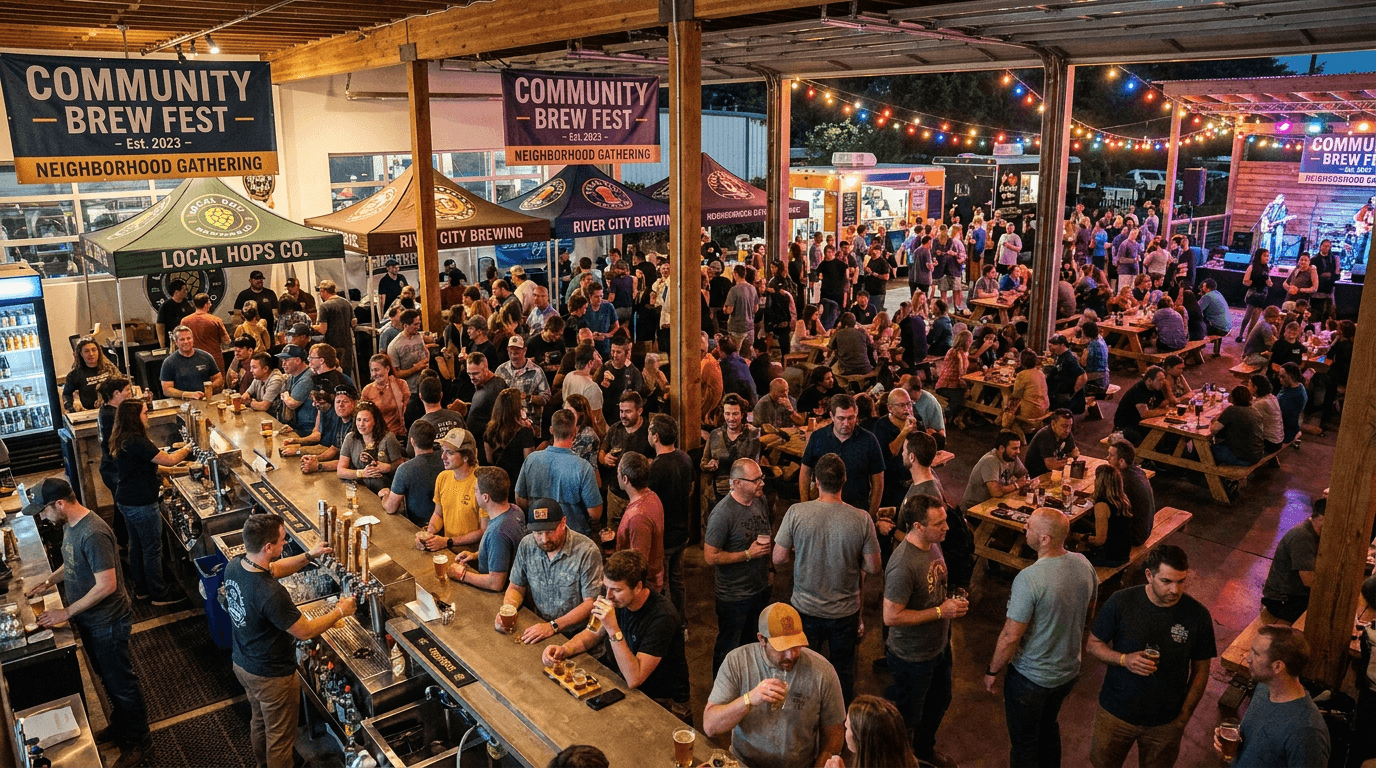
Prompt:
craft beer event and festival atmosphere photograph of [the social energy of a brewery event — the gathering of people, beer, and community spirit that makes the brewery a neighborhood hub and a cultural gathering point: the event space is alive with activity — the taproom, the patio, a festival grounds, or a special event venue filled with the visual evidence of a well-attended, energetic gathering: a crowd of people occupies the space — captured atmospherically rather than individually, the human presence communicated through the collective energy of a full room or filled outdoor space, the crowd seen from above or from a distance with no individual faces in clear focus, the mass of people communicating the event's draw and the community's enthusiasm, banners, signage, and event-specific decoration set the visual scene — the event name or theme communicated through designed elements: a banner across the bar or the entrance, branded signage identifying the event, decorative elements that create the visual distinction between this special event and a regular taproom day, the serving areas are active — bartenders pouring, lines of patrons waiting (the evidence of demand and popularity), the tap wall in action, glasses being filled and passed — the operational energy of high-volume service, the beers themselves are present throughout the scene — glasses in hands, flights on tables, cans being opened, the product visible as the connecting element across every conversation and every group, the beer the reason everyone is here, if it is a festival — multiple brewery stations are visible: vendor-style setups with different breweries serving side by side, each station showing its own branding and signage, the festival format communicating variety and discovery, if it is a tap takeover — the featured brewery's identity is prominent: their tap handles installed, their signage displayed, their beer as the center of the evening's attention, if it is a themed event — the theme elements are visible: trivia screens, live music stage setup, seasonal decorations, special release displays — the event identity expressed through the specific elements, the outdoor extension (if applicable) shows the event spilling beyond the interior — people and activity extending into the patio, the beer garden, the parking lot — the event exceeding the taproom's capacity, the overflow communicating enthusiasm and success, the overall composition communicates: this brewery is a gathering place, the event draws community, the energy is social and celebratory, the beer is the reason but the connection is the reward — the event photograph as the FOMO-inducing, community-celebrating visual that drives future event attendance and positions the brewery as the neighborhood's social hub] in a wide, energy-capturing event composition, the photograph captures the full scope of the event — the crowd, the serving area, the event elements, and the space, the wide angle communicating the event's scale and energy, the crowd fills the space — the human presence occupying most of the frame, the density of attendance communicating the event's success and appeal, the event-specific elements are visible — banners, signage, themed decoration, featured brewery branding — each element adding to the event identity, the serving action provides dynamic energy — the operational movement of pouring, serving, and drinking creating the active quality that distinguishes an event photograph from a static interior shot, the beer is omnipresent — glasses and cans visible throughout, the product woven into every part of the event, the depth of field is deep — the full event space in focus, the crowd, the bar, and the background all visible and contributing, the depth communicating the real, spatial, filled quality of the event, the lighting is event-specific and atmospheric — the combined illumination of the taproom's ambient lighting, any event-specific lighting (colored wash, spot lights, string lights), and the dynamic quality of a space full of people and activity: the taproom's ambient warm lighting provides the base — the same golden, amber quality from Template 2, the foundation of warmth that defines the brewery environment, event-specific lighting adds energy — colored lights, spotlights, or the warm string-light glow of a patio event creating the visual distinction from regular taproom lighting, the event lighting saying "something special is happening," the crowd and the activity catch the mixed lighting — the human forms illuminated by the combined ambient and event light, the movement and energy of the crowd visible in the dynamic lighting, the beer catches familiar warm backlight — the glasses throughout the scene glowing with their liquid colors, the visual consistency of the beer's beauty maintained even in the event context, the signage and banners catch the light with their printed or illuminated surfaces — the event identity visible and legible, the brewery branding prominent, warm taproom base with event-energy accents — amber and gold ambient taproom tones — event-specific accent colors (dependent on event theme and brewery brand) — crowd warmth and movement tones — beer glow throughout — and the warm, energetic, socially-vibrant palette of a craft beer event in mixed ambient and event lighting as the color palette, the mood is socially electric community-celebrating energetically inviting and the specific event message — this happened here, at this brewery, and you should have been there, the community came together around beer and had a great time, the next one is coming and you should not miss it — the event photograph as the FOMO-creating, community-showing, future-attendance-driving visual that positions the brewery as the social hub of its neighborhood, professional event and editorial photography with mixed ambient-and-event lighting and deep depth of field capturing the full event scope, composed as a wide crowd-and-space scene with event-specific elements and active serving visible, the crowd energy and the event identity and the social vitality as the event focal points, warm ambient base with event accent colors, no text overlays, no watermarks
Best for: Social media event documentation and promotion, website events and community sections, email marketing event announcements and recaps, Facebook and Eventbrite event listing imagery, press and media event coverage materials, partnership and sponsor event documentation, annual and recurring event promotional materials, community and neighborhood marketing, tourism and visitor destination marketing, social proof and crowd-drawing visual evidence
Template 12: The Brewery Exterior — Architecture and Sense of Place
This template captures the brewery's exterior — the building, the signage, the architectural presence that establishes the brewery's physical identity and its relationship to its neighborhood, town, or landscape.
Prompt:
brewery exterior and architectural photograph of [the brewery's building and surroundings as seen from outside — the physical presence that a visitor encounters on arrival, the architectural identity that establishes the brewery's place in its location: the building is the composition's subject — the brewery's physical structure communicating its identity through its architectural character: an industrial building repurposed for brewing — a warehouse, a factory, a mill, a garage — the original industrial architecture visible in the building's form (large footprint, high ceilings implied by tall walls, loading dock or large bay doors, industrial-scale proportions), the industrial heritage communicated through the building materials (metal siding, brick, concrete block, large-pane windows) and the honest, functional aesthetic that craft breweries inherit from their industrial predecessors, OR a purpose-built brewery — a newer structure designed for brewing and hospitality: modern materials (metal cladding, wood, glass, concrete) assembled with architectural intention, the building's design communicating the brewery's contemporary identity and investment, OR a historic building adapted — a farmhouse, a church, a school, a gas station, a general store — the original building's character preserved and visible, the brewery identity layered onto the architectural heritage, the building's history part of the brewery's story, the brewery's signage is the visual anchor — the exterior sign displaying the brewery name and logo, the sign designed and crafted to match the brand identity: a large-format sign on the building facade (painted, metal-fabricated, illuminated, or a combination), or a projecting blade sign visible from the street, or a monument sign at the property entrance, or a neon sign casting the brewery's name in colored light — the signage the visual homing beacon that identifies this building as the brewery, the entrance is visible and inviting — the door or doors that welcome visitors, perhaps with menu boards or event announcements flanking the entrance, the entryway communicating "come in" through its design: open doors, warm light spilling from the interior, a welcoming path or approach, outdoor elements provide context — the parking area, the patio or beer garden visible at the building's edge, any outdoor serving area, landscaping or hop bines growing on the building, the relationship between indoor and outdoor spaces visible, the surrounding context grounds the brewery in its location — the adjacent buildings, the street, the neighborhood character, the rural landscape or urban block, the geographic and cultural context that makes this brewery part of this specific place, the time of day creates the atmospheric character — the building photographed at the optimal moment: at dusk with the interior lights glowing warmly through the windows and the signage illuminated against the deepening sky, or on a bright afternoon with the building's materials and architecture in clear, dimensional daylight, or in the warm light of golden hour with the building's surfaces gilded by low-angle sun, the overall composition communicates: this is a real place with a physical presence in a specific location, the building's architecture and signage communicate the brewery's identity before you walk through the door, this is a destination worth visiting — the exterior photograph as the location-establishment visual that drives visit intent and creates the physical-presence identity that all other visual content extends from] in a composed, architectural-and-signage exterior composition, the building is framed to show its architectural character — the full facade or the most identifying portion of the exterior, the building's form and materials visible and communicating identity, the signage is prominently positioned — the brewery name and logo visible and legible, the sign the identifying element that connects the building to the brand, the entrance is visible and welcoming — the access point that the viewer's eye follows from the exterior into the implied interior experience, the surrounding context provides the sense of place — enough of the neighborhood, the street, or the landscape visible to communicate location, the outdoor spaces extend the building — the patio, the beer garden, or the outdoor seating visible as the transition between exterior and interior, the depth of field is deep — the building facade, the signage, and the surrounding context all in focus, the full environmental depth communicating the real, physical quality of the place, the lighting is time-specific and atmospheric — the optimal exterior-photography illumination for the building: DUSK is the optimal exterior moment — the sky retaining color (deep blue with violet and amber at the horizon) while the building's interior lights glow warmly through the windows, creating the inviting contrast between the cool exterior and the warm interior: the building facade is illuminated by the remaining ambient sky light — the blue-hour illumination providing even, soft, cool light on the building's surfaces, the architectural materials (brick, metal, concrete, wood) visible in the cool, even light, the interior lights glow warmly through the windows — the amber, warm light from within radiating through the glass, the contrast between the cool exterior light and the warm interior glow creating the visual invitation to come inside, the signage is illuminated — neon, backlit, or spot-lit, the sign glowing with its designed illumination against the twilight building, the brewery's name bright and visible in the ambient dim, any string lights on the patio or exterior catch the dusk with their warm amber points — the Edison-bulb glow visible against the deepening sky, the familiar craft-brewery string lights marking the outdoor space, the sky provides the atmospheric backdrop — the gradient from amber at the horizon to deep blue at zenith creating the dramatic canopy that makes dusk-exterior photographs so compelling, the building and the sky in visual dialogue, cool-to-warm exterior palette — deep blue dusk sky with amber-violet horizon gradient — cool architectural material tones under blue-hour light — warm amber-gold interior glow through windows — illuminated signage in brand colors — warm string-light amber — and the dramatic, inviting, cool-exterior-warm-interior palette of a craft brewery at dusk as the color palette, the mood is destination-worthy architecturally present warmly inviting and the specific exterior message — this building is the brewery, the signage identifies it, the warm light inside promises the experience, the architecture communicates the brand's character, this is a real place you can visit — the exterior photograph as the location-identity visual that drives navigation, visit intent, and the physical-presence recognition that grounds all other brand visuals, professional architectural and exterior photography with dusk-optimal mixed natural and interior lighting and deep depth of field showing the full building and context, composed to show the building facade, prominent signage, and the inviting glow of the interior, the architectural presence and the signage identity and the warm-interior invitation as the location focal points, cool-to-warm dusk palette with brand signage accent, no text overlays outside existing building signage, no watermarks
Best for: Google Business Profile and Google Maps primary imagery, website homepage and visit/location sections, social media location and visit-driving content, Yelp, TripAdvisor, and review platform imagery, navigation and wayfinding context, press kit location and environment imagery, tourism and destination marketing, real estate and business development context, event and visit marketing, new-visitor attraction and local marketing
Template 13: The Food Pairing — Culinary Companion Visual
This template presents beer alongside food — the pairing that expands the brand's relevance beyond beverage-only and communicates the culinary companionship that elevates both the beer and the food experience.
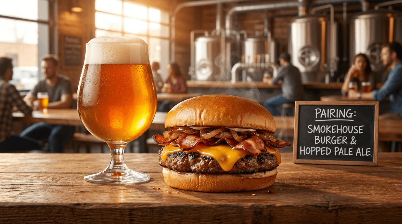
Prompt:
craft beer and food pairing photograph of [a beer and a dish presented together as culinary companions — the pairing that communicates how the beer's flavor profile complements and elevates the food experience: the beer is presented in its appropriate glass — the style-correct vessel filled and beautiful, the liquid catching the light with the luminous quality established in Template 1, the beer positioned as an equal partner to the food, not a secondary beverage, the food is presented with culinary-editorial quality — a dish that pairs with the specific beer style: a juicy, char-crusted burger or smoked brisket alongside an IPA or a smoky porter, the rich protein and the hoppy or roasted beer in complementary contrast; or a plate of artisanal cheese and charcuterie alongside a Belgian tripel or a farmhouse saison, the creamy, umami, cured flavors meeting the beer's effervescent, spicy, dry complexity; or fish tacos or ceviche alongside a crisp pilsner or a lime-accented gose, the bright, acidic, fresh food finding its perfect liquid companion; or a rich chocolate dessert alongside an imperial stout or a barrel-aged barleywine, the indulgent sweetness of both meeting in shared intensity; or a wood-fired pizza with caramelized edges alongside an amber ale or a Vienna lager, the malty sweetness and the roasted dough in natural harmony — the specific pairing communicating flavor logic and culinary knowledge, the food is plated or presented with the casual-elevated quality of craft brewery food — not the formal plating of fine dining but the generous, honest, appetizing presentation of food designed to be enjoyed with beer: the burger stacked and slightly tilted with its juices visible, the cheese board abundant and varied, the tacos casually arranged with their garnishes bright, the dessert rich and dark on its plate, the pizza showing its blistered crust and melting toppings — the food looking real and appetizing and ready to eat, the beer and the food share a surface — a table or bar top that places them in the same physical and visual space, the shared surface communicating that these are meant to be consumed together, complementary, the setting is the taproom or the brewery kitchen context — the warm, inviting environment visible in the background, the specific location adding the context of "eat and drink this here," additional elements may enhance the pairing narrative — a small chalkboard or card noting the pairing recommendation, a condiment or garnish element that bridges both items (a hop sprig, a citrus wedge, a spice element present in both the food and the beer), or the visual evidence of the kitchen (a cast iron skillet, a wooden cutting board) that communicates in-house culinary preparation, the overall composition communicates: this beer is a food beer, it was made to be enjoyed with this kind of food, the pairing makes both better, the brewery understands the culinary role of beer — the food pairing visual as the culinary-expansion image that drives food menu sales, positions the brewery as a dining destination, and communicates the flavor intelligence that guides both the brewing and the kitchen] in a styled, food-and-beverage pairing composition, the beer and the food share equal visual weight — neither dominates, the pairing is the subject, both elements positioned for maximum visual impact, the food is presented at its most appetizing — the food-photography standards applied: the cheese melting, the meat juicy, the vegetables fresh, the dessert rich, the food in its peak-desirability state, the beer is presented in its hero state — the glass full, the head present, the liquid catching light, the beer at its visual best, the shared surface connects the elements — the table or bar creating the physical relationship between beer and food, the pairing context established through proximity, the background is warm and environmental — the taproom or dining context adding atmosphere without distraction, the depth of field is moderately shallow — both the beer and the food in sharp focus, the background and edges in warm atmospheric blur, the pair isolated as the focused subjects, the lighting is warm food-photography standard — the directional, warm light that makes food and beverage look their most appetizing: warm, directional light from behind-and-to-one-side — the classic food-photography lighting angle that creates dimension, texture visibility, and the appetizing warmth that makes food content effective, the beer catches backlight with its luminous liquid quality — the familiar backlit-beer beauty from Template 1, the liquid glowing with style-appropriate color, the food catches the directional light with its culinary surfaces — the charred crust of meat glistening, the melted cheese catching highlights, the fresh vegetables reflecting bright, sharp light, the dessert surfaces showing their rich texture, each food element responding to the directional light with its specific surface quality, the steam or heat evidence (if appropriate) catches the backlight — the warm vapor rising from hot food visible against the darker background, the steam adding the freshness and temperature cue that makes food look just-served, the surface catches warm reflected light — the table or bar illuminated by the same warm directional source, the shared surface unifying the lighting between beer and food, the garnish and bridging elements catch the light with their fresh, natural quality — the bright green of herbs, the vivid color of fruit, the aromatic quality of spices visible under the directional warmth, beer-and-food complementary palette — beer liquid color (amber, gold, dark, hazy) alongside food-specific colors (charred brown, fresh green, melted gold, rich chocolate, vivid tomato, creamy white) on warm surface — warm directional lighting — atmospheric background — and the appetizing, warm, pairing-complementary palette of a craft beer food pairing in food-photography light as the color palette, the mood is appetizingly warm culinarily intelligent pairwise complementary and the specific food-pairing message — this beer and this food were meant for each other, the pairing makes both better, the brewery understands flavor and serves food that matches its beer with intelligence and care, order both — the food pairing photograph as the food-menu-driving, culinary-positioning visual that expands the brewery's relevance from beverage into dining and communicates the complete taproom experience, professional food and beverage photography with warm directional backlighting and moderately shallow depth of field keeping both food and beer in sharp appetizing focus, composed as a balanced pairing with both elements in equal visual prominence on a shared surface, the pairing logic and the appetizing quality and the culinary intelligence as the food-pairing focal points, warm complementary beer-and-food palette, no text overlays, no watermarks
Best for: Social media food menu and pairing content, website food menu and kitchen sections, email marketing food and pairing features, menu design and digital menu board imagery, food delivery and ordering platform listings, Yelp and food-review platform imagery, press and editorial food-and-beer features, collaboration with food partners and chefs, event and pairing-dinner marketing, culinary tourism and dining-destination marketing
Template 14: The Founder and Brewer Portrait — People Behind the Brand
This template creates the atmospheric portrait of the people behind the beer — the founder, the head brewer, the brewing team — the human face of the brand that creates personal connection and communicates the human skill and passion that defines craft beer.
Prompt:
atmospheric brewer portrait of [a figure in the brewing environment — a person presented as the skilled, passionate human being behind the beer, the portrait creating the personal connection that transforms a brand into a story: the figure is positioned in the brewery — not in a studio but in the actual production or taproom space, the environment communicating that this person works here, this is where they make beer: standing beside a brewing vessel with a hand resting on the stainless steel, the gesture communicating familiarity and ownership — this equipment belongs to this person, or they belong to it, OR positioned at the bar with a glass of their beer, the relaxed confidence of someone presenting their own work, the pride-without-arrogance that characterizes the best craft brewers, OR in the brewhouse mid-process, captured in a moment of working attention — checking a hydrometer reading, tasting wort from a sample jar, examining grain or hops, the focused engagement of someone practicing their craft with attention and care, the figure's attire communicates the brewer's world — brewery-branded work wear (a t-shirt or hoodie with the brewery's name or logo), practical production clothing (rubber boots, a leather apron, work pants), the clothing showing the evidence of a production day — not pristine but the honest wear of physical work, the expression is natural and confident — not the frozen smile of a corporate headshot but the engaged, present, slightly intense expression of someone who takes their work seriously and enjoys it, the face of someone you would trust to make your beer, the body language communicates competence — the posture of someone comfortable in their space, the hands positioned with the familiarity of someone who uses this equipment daily, the physical confidence of a person who does skilled physical work, the brewery environment provides the portrait's context — the stainless steel vessels, the pipes and fittings, the taproom back bar, the tanks and fermenters — the working environment visible around and behind the figure, the context communicating "this person's workplace is where your beer is made," personal touches reveal character — perhaps a tattoo visible on an arm (common in craft beer culture), a beard or distinctive personal style, the specific way this individual inhabits their space — the details that make this person an individual rather than a generic brewer figure, the overall portrait communicates: this is a real person who makes real beer with real skill, they are proud of what they do, they care about quality, you can trust the beer because you can see the person behind it — the brewer portrait as the personal-connection visual that humanizes the brand and creates the authenticity that customers connect with] in a composed, environmental portrait composition, the figure occupies the primary compositional position — prominently placed, the face and expression readable, the body language visible, the figure as the undeniable subject, the brewery environment surrounds and supports — the production or taproom context visible around the figure, providing the environmental story without competing with the human subject, the environmental elements add the craft context — the stainless steel, the tap handles, the vessels, the tools — the equipment that defines this person's work visible as supporting visual information, the work-wear and personal details add individual character — the clothing, the physical details, the personal style communicating this specific person, the depth of field is portrait-standard — the figure in crisp focus from face through hands and attire, the environment in moderate to soft blur behind, the human subject isolated with the visual language of editorial portraiture, the lighting is environmental and warm — the brewery's own lighting enhanced for portrait quality: warm, directional light that flatters the face while maintaining the authentic industrial quality of the brewery environment, the natural or existing light of the brewery supplemented by the directional quality of portrait photography, the face catches the primary light with portrait modeling — the dimensional, flattering quality that shows character without harshness, the eyes catching a catchlight, the facial expression readable and engaging, the attire catches the light with its textile quality — the t-shirt or work-wear fabric visible, the brewery branding readable, the honest wear of the clothing communicating the reality of production work, the hands catch the light with their working quality — the hands of someone who does physical work: confident, capable, perhaps rough, definitely strong — the hands touching equipment or holding a glass with the familiarity of daily practice, the brewery equipment catches the light with its industrial material quality — the stainless steel reflecting the portrait light with its curved surfaces, the environment providing the chromatic and textural backdrop, the skin tones are natural and warm — the human element rendered with the warmth and accuracy that portrait photography demands, the person's complexion and skin quality natural under the warm light, warm brewery-portrait palette — warm skin tones under portrait-quality light — brewery-branded work-wear colors — industrial stainless steel and concrete environment — warm ambient brewery tones — and the warm, personal, environmentally-grounded palette of a brewer portrait in the production space as the color palette, the mood is personally authentic professionally skilled warmly confident and the specific brewer-portrait message — this is the person who makes your beer, they are real and skilled and proud, the human connection is the foundation of the brand, trust the beer because you know the brewer — the portrait as the personal-connection visual that humanizes the brand and creates the trust and loyalty that comes from seeing the face and knowing the person behind the product, professional editorial portrait photography with warm environmental-and-directional light and portrait depth of field keeping the figure in crisp detailed focus against the atmospheric brewery environment, composed as an environmental portrait with the brewer positioned in their working space, the personal expression and the craft-competence and the brewery-environment authenticity as the portrait focal points, warm skin and environment tones with industrial brewery context, no text overlays, no watermarks
Best for: Website about/team and story sections, press kit personnel and founder imagery, social media founder and team features, email marketing story and people content, media interviews and editorial features, speaker and panel event headshots, awards and recognition submission materials, partnership and collaboration personal introductions, crowdfunding and investment deck imagery, documentary and video content pairing
Template 15: The Social Media Announcement — Release and News Visual
This template creates the announcement-ready visual canvas — the atmospheric, text-ready composition designed to carry release dates, new beer announcements, event information, and brand news while maintaining the brewery's visual identity.
Prompt:
brewery announcement visual canvas of [an atmospheric, text-ready composition designed as the background for brand announcements — the visual foundation that carries release dates, new beer announcements, seasonal lineup changes, event information, and brand news while maintaining the brewery's visual atmosphere: the image provides a rich but text-supporting background — not blank or minimal but atmospherically layered, the visual complexity creating mood while leaving clear zones for overlaid text: the composition uses the brewery's visual world as its source material — the warm tones of the taproom, the industrial texture of the production space, the material quality of the brand's physical environment translated into a text-compatible visual field: a background built from layered brewery textures — the warm wood grain of the bar, the polished stainless steel of tanks, the rough brick of the taproom wall, the concrete of the brewery floor — one or more of these textures providing the visual foundation, the textures captured at close range or deliberately defocused to create rich-but-non-competing background fields, the brewery's brand colors are integrated — the specific palette (the label colors, the signage colors, the brand's signature tones) present in the composition through colored light, through the natural materials of the brewery, or through subtle color grading that shifts the image toward the brand's chromatic identity, the composition is deliberately zoned for text — the upper portion or center may feature a relatively uniform, darker or lighter field where text will sit with strong legibility, while the lower portion or edges feature more visual activity (the texture, the brewery elements, the atmospheric details), a small but recognizable brand element may anchor the visual — a subtle view of a tap handle, the edge of a glass, a fragment of the brewery's signage or logo in the background, or the glow of the brewery's interior — the visual cue that says "this announcement comes from this brewery" without requiring the viewer to read the text, the overall composition works across announcement types — flexible enough to support a new-beer release announcement ("New Beer Alert"), a seasonal lineup change ("Fall Lineup Now Available"), an event announcement ("Annual Oktoberfest — Date — Tickets"), a milestone celebration ("Thank You for 5 Years"), or a general brand communication — the visual foundation adapting to whatever text is overlaid because its primary function is atmospheric support, the overall design communicates: this is an official communication from the brewery, the visual quality signals that the news matters, the atmospheric consistency maintains the brand identity even in information-delivery content — the announcement visual as the brand-consistent canvas that makes every piece of brewery news feel like it comes from a real, specific, visually coherent brand] in a text-ready, atmospherically-zoned announcement composition, the composition is deliberately structured for text overlay — clear text zones with manageable visual complexity and atmospheric zones with richer visual content, the texture and material elements provide visual interest without text interference — the brewery materials and brand colors creating mood in the background while the foreground or center remains accessible for information, the brand elements provide subtle identification — the brewery's visual signature present in the atmospheric field, recognizable to followers without being the compositional focus, the multi-purpose flexibility means the composition avoids content-specific imagery — nothing that limits the visual to only one type of announcement, the atmospheric quality working for any message, the depth of field is atmospheric — everything in moderate-to-soft focus, the deliberately defocused quality preventing any background element from competing with overlaid text, the lighting is warm and brand-consistent — the same temperature and quality that characterizes the brewery's other visual content: warm, even, atmospheric illumination — the text zones receiving even, predictable light that supports text legibility, the atmospheric zones receiving warmer, more dynamic light that provides the visual interest, the brewery textures catch the warm light with their material quality — wood grain, stainless steel, brick, concrete each responding with their characteristic surfaces in soft, atmospheric focus, the brand colors are visible through the lighting — the color temperature and any colored light sources shifting the overall palette toward the brewery's identity colors, warm brewery-brand palette — brand signature colors as the dominant chromatic identity — warm amber-gold atmospheric base from brewery lighting — industrial material tones (stainless, concrete, brick, wood) in atmospheric soft focus — text-zone areas in manageable contrast (dark enough for light text or light enough for dark text, consistent with brand typography) — and the atmospheric, text-supporting, brand-consistent palette of a brewery announcement canvas as the color palette, the mood is officially atmospheric brand-consistent announcement-ready and the specific announcement message — this is important news from a brewery you know and care about, the visual quality matches the brand quality, the atmosphere maintains the brand even in informational content — the announcement canvas as the text-ready, brand-consistent visual foundation that maintains the brewery's visual identity across every social media announcement, email header, and digital communication, professional atmospheric and graphic-design photography with warm even brand-consistent lighting and soft atmospheric depth of field in a text-zone-structured composition, designed for multi-purpose text overlay with brand-consistent atmosphere, the text readability and the brand atmosphere and the multi-purpose flexibility as the announcement-design focal points, warm brand palette in atmospheric focus, no text overlays in this base image (text to be added for specific announcements), no watermarks
Best for: Social media new-beer and release announcements, event and calendar announcements, seasonal lineup change communications, milestone and celebration posts, brand news and update communications, email marketing headers and hero images, website homepage banner announcements, digital signage and taproom display, Untappd and platform update visuals, partnership and collaboration announcements
How to Customize These Prompts for Your Specific Brewery
The templates produce compelling craft beer visual content, but the most effective imagery reflects your actual brewery — your specific beers, your real taproom, your genuine brand personality, your regional identity, and the particular story only you can tell.
Replace generic beer descriptions with your actual products. If your flagship is not a generic IPA but a West Coast IPA dry-hopped with Simcoe and Mosaic, or a Czech-style pilsner brewed with Saaz hops and floor-malted Moravian barley, describe that specificity. The visual should reflect the actual color, clarity, head character, and presentation of your real beer. A hazy, juicy New England IPA looks fundamentally different from a crystal-clear West Coast IPA, and the prompt should capture that distinction. Name the beer styles you actually brew, the ingredients you actually use, and the glassware you actually serve in.
Define your brand's material and color vocabulary. Every brewery has a material identity — the specific combination of wood species, metal finishes, concrete treatments, and accent materials that defines their physical space and packaging. If your taproom features reclaimed barn wood and black iron pipe rather than polished concrete and stainless steel, describe that material difference. If your brand colors are forest green and cream rather than black and gold, that specific palette should inform every prompt. The material and color vocabulary should be consistent across all fifteen template types, creating the visual coherence that builds brand recognition.
Specify your regional context. A mountain brewery in Colorado exists in a different visual world than a waterfront brewery in New England, which differs from an urban brewery in a converted warehouse in Brooklyn, which differs from a farmhouse brewery in rural Belgium-inspired style. The landscape, the architecture, the light quality, the cultural context, and the agricultural environment of your specific location should inform the environmental elements in your prompts. The regional specificity creates the sense of place that makes your brewery irreplaceable — you cannot get this beer, in this place, with this view, anywhere else.
Match the visual treatment to your brewing philosophy. If you brew traditional German and Czech styles with decoction mashing and extended lagering, your visual treatment should reflect that precision and tradition — clean, architectural, restrained, quality-focused. If you brew experimental sours with wild-caught yeast and unusual adjuncts, your visual treatment should reflect that exploratory, creative, boundary-pushing approach — more experimental, more colorful, more visually adventurous. The visual treatment is a brewing-philosophy statement.
For portraits of your actual team, photograph yourselves and enhance. Use AI-generated portrait imagery as reference for lighting, composition, and atmospheric quality, then photograph your actual founders, brewers, and team members in your real brewery with those references guiding the shoot. The Image Inpainting tool can enhance the atmospheric quality and technical standard of real photographs while preserving the authentic faces and spaces that customers connect with. Authenticity is essential for craft beer brands — your people must be your real people, and your spaces must be your real spaces.
Platform-Specific Deployment for Craft Breweries
Each platform where craft beer is discovered, evaluated, and discussed has specific visual requirements and audience expectations.
Instagram is the primary visual platform for craft beer. Craft beer has one of the most active and visually engaged communities on Instagram. The brewery's grid should maintain a ratio of approximately 30% product shots (Templates 1, 3, 4), 25% environment and lifestyle (Templates 2, 7, 12), 20% behind-the-scenes and process (Templates 5, 8, 14), 15% events and community (Templates 9, 11, 14), and 10% announcements and releases (Templates 6, 15). Use 4:5 for feed posts to maximize screen real estate, 9:16 for Stories and Reels, and 1:1 for maximum compatibility. For Instagram-specific strategies, additional guidance covers platform optimization. The visual quality of the brewery's Instagram directly influences visit intent, purchase decisions, and the quality of user-generated content that customers create during visits.
Google Business Profile is the discovery platform. For physical brewery locations, Google Business Profile (appearing in Google Search and Google Maps) is often the first visual encounter potential visitors have with the brand. The primary photo should be Template 12 (exterior) for wayfinding, supplemented by Template 2 (taproom interior), Template 1 (hero beer), and Template 7 (patio/outdoor) for the experience preview. The image quality on Google Business Profile directly influences click-through to the website and physical visit decisions.
Untappd requires beer-specific visual optimization. Every beer listing on Untappd displays the label art or a beer photo. Template 3 (label showcase) creates the optimal listing imagery, while Template 1 (hero pour) provides supplementary visual content. Consistent, high-quality imagery across all Untappd beer listings signals professionalism and encourages check-ins and ratings.
Facebook serves event and community functions. While Instagram handles the visual brand identity, Facebook remains important for events (Template 11), community communication (Template 15), and the older demographic that still uses Facebook for business discovery. Event cover images, group content, and announcement posts all benefit from brand-consistent visual content.
The brewery website is the visual identity hub. The website should deploy Templates 12 (exterior for location/visit), 2 (taproom for experience preview), 1 and 4 (beer for product showcase), 5 and 8 (process for craft-credentials), 14 (team for personal connection), 7 (outdoor for lifestyle), and 13 (food for culinary expansion) across the homepage, about, beer, visit, and events sections. The YouTube Thumbnail Maker optimizes thumbnails for any brewery video content.
Email marketing uses the full template range. Monthly or biweekly brewery newsletters should feature Template 15 or 6 headers for announcements, Template 1 or 3 product features, Template 11 event promotions, and Template 5 or 14 story content. The visual consistency of email marketing reinforces brand recognition across every subscriber touchpoint.
Print and physical materials remain important for local marketing. Coasters, table tents, posters, postcards, tap handle cards, and local print advertising all require high-quality visual content. Templates 1 (pour shot), 3 (can label), 12 (exterior), and 2 (taproom) serve most print needs. Generate at the highest resolution available and maintain 300 DPI at the final print size for all physical materials.
Common Mistakes in Craft Beer Visual Identity
Craft beer visual identity fails in specific, identifiable ways that directly impact shelf presence, taproom visits, social media engagement, and overall brand perception.
Inconsistency between packaging design and all other visual content. A brewery with striking, well-designed can labels that publishes poor-quality social media images, has an outdated website, and sends visually amateur emails undermines the premium impression the packaging creates. The visual quality must be consistent across every touchpoint. If the label is premium, every other visual asset should match that standard.
Photographing beer with incorrect lighting that misrepresents the liquid. Beer must be backlit or side-backlit to reveal its true color and character. Front-lit beer looks flat, murky, and visually dead — the light does not pass through the liquid, so the color and clarity that define the beer's visual identity are invisible. The single most common technical mistake in craft beer photography is flat front lighting that makes every beer look the same shade of brown.
Using the same visual approach for every beer style. An imperial stout and a session blonde ale occupy opposite ends of the flavor, color, and intensity spectrum. They should not be photographed in the same way with the same lighting and the same mood. The visual treatment of each beer should match its style character: dark beers in dramatic, low-key, moody lighting; light, refreshing beers in bright, high-key, fresh lighting; wild and sour beers in more experimental, unconventional visual treatments. The visual approach should vary by style while maintaining overall brand consistency.
Neglecting the taproom's visual photogenicity. A taproom that looks great in person but photographs poorly fails at social media and digital marketing. The lighting, the sight lines, the background details, and the "instagrammable" quality of the space should be considered as design criteria. Small investments — better ambient lighting, a visually clean back-bar display, one photogenic wall or corner — disproportionately improve the quality of both the brewery's own photography and the user-generated content that visitors create.
Over-relying on label design and under-investing in environmental and lifestyle content. A feed full of nothing but can shots becomes visually monotonous and fails to communicate the full brand experience. The visual identity should include the full range of content types — environment, process, people, events, food, lifestyle — that communicates the complete brewery experience. The can is one element of the brand, not the entire brand.
Generic, trend-chasing label design that does not reflect the brewery's actual identity. Following the visual trend of the moment (currently: painterly illustration, gradient backgrounds, surreal cartoon characters) without connecting the design to the brewery's actual identity creates visual noise that does not build long-term brand recognition. Label design should grow from the brewery's genuine personality, production philosophy, and regional context rather than from a design trend that will date the packaging within a season.
Poor food photography undermining the kitchen program. Breweries with excellent food often fail to photograph it with the same quality applied to their beer imagery. The food content should meet the same visual standard as the beer content. Template 13 addresses this specifically — the food deserves the same lighting, composition, and presentation quality that the beer receives.
Inconsistent seasonal visual treatment that fragments the brand. Seasonal releases should feel like chapters of the same story, not unrelated visual events. Maintaining the core brand elements (typography, logo treatment, layout structure) while adapting the seasonal elements (color palette, illustration, atmospheric quality) ensures that every seasonal release is recognizably from the same brewery while expressing its specific seasonal character.
Building a Complete Brewery Visual Identity System
A successful brewery visual identity is a cohesive system that supports every aspect of the business — from product sales through taproom visits through distribution relationships through community building.
Establish the visual foundation before building content. Define the core visual elements: the brand color palette (three to five specific colors with hex codes), the typography system (primary and secondary fonts), the material vocabulary (the wood, metal, concrete, and accent materials that define your physical brand), the photographic treatment (lighting quality, color grading, mood), and the environmental direction (the specific visual world your brewery inhabits). Document these in a simple brand visual guide that ensures consistency across every content piece and every content creator.
Build a content calendar aligned with the brewing calendar. Map visual content needs across the year: seasonal release campaigns (Template 6 for each season), new beer launches throughout the year (Templates 1, 3, 15), taproom events (Template 11), collaborations (Template 9), behind-the-scenes during brew days (Template 5), ingredient spotlights when sourcing new materials (Template 8), team features on a rotating basis (Template 14), food menu updates (Template 13), and the evergreen environment and lifestyle content (Templates 2, 7, 12) that can be deployed between time-specific posts. Having the visual library planned and produced in advance ensures consistent quality and frequency.
Create multi-format versions of every key visual. Every important image should exist in 1:1 (Instagram, Untappd), 4:5 (Instagram feed maximum height), 9:16 (Stories, Reels, TikTok), 16:9 (website banners, YouTube), and print-ready format. Design with crop flexibility in mind — Template 15's approach of strong center with atmospheric extensions applies broadly.
Develop motion content from static visual identity. Video content increasingly drives engagement across all platforms. The Cinematic Video Generator creates atmospheric video content — pour-shot loops, taproom atmosphere videos, brewing-process sequences — from the established visual identity. The Text2Shorts tool creates short-form promotional videos for social platforms. The AI Clipping tool extracts key visual moments from longer video content for platform-optimized clips. The AI Music Generator creates custom audio for video content where licensed music is not practical. The shift toward video makes motion content not optional but essential for brewery marketing.
Invest in user-generated content quality by investing in the photogenicity of the experience. The best brewery visual marketing strategy is creating an experience so visually compelling that customers produce excellent content without prompting. Beautiful glassware, thoughtful lighting, photogenic serving presentations (flights on designed boards, garnished cocktails, well-plated food), and one or two intentionally "instagrammable" moments in the taproom (a feature wall, a unique view, a distinctive tap display) generate ongoing, authentic, social-proof visual content that no amount of produced content can replace.
Emerging Trends in Craft Beer Visual Identity
The craft beer visual landscape continues to evolve as the industry matures, consumer expectations shift, and new platforms and technologies change how visual content is created and consumed.
Sustainability and environmental responsibility are becoming visual themes. Breweries that use renewable energy, source locally, implement water conservation, use recyclable or compostable packaging, and prioritize environmental responsibility are increasingly communicating these values visually — through imagery that shows solar panels on the brewery, local farms supplying ingredients, packaging innovations, and the visual language of environmental stewardship integrated into the brand identity.
Non-alcoholic and low-ABV craft beer is creating new visual language. The growing non-alcoholic and session-strength craft beer segment is developing its own visual identity — often brighter, more wellness-adjacent, more daylight-oriented, and more activity-connected than traditional craft beer imagery. This segment requires visual content that communicates craft quality without the conviviality-centered imagery that characterizes traditional beer marketing.
Video-first content is becoming the standard. TikTok, Reels, YouTube Shorts, and platform algorithm preferences for video mean that breweries must produce video content regularly. The pour shot as a video (the satisfying visual of a perfect pour), the brew-day time-lapse, the taproom walkthrough, the brewer's quick explanation — these short-form video formats are increasingly driving engagement and discovery.
Community-oriented and socially conscious brand identity is growing. Breweries that visually communicate their role in the community — hosting events, supporting causes, creating inclusive spaces, employing local talent, participating in neighborhood life — are building stronger brand loyalty. Visual content that shows the brewery as a community institution, not just a business, resonates with consumers who choose where to spend their money based on values alignment.
Premiumization of visual presentation is raising expectations. As the craft beer market matures and competition intensifies, the visual quality baseline continues to rise. Packaging design, photography quality, social media production value, and overall brand presentation that were considered excellent five years ago may now be merely adequate. Continuous investment in visual quality is necessary to maintain competitive positioning.
Taproom design is becoming more intentional and photogenic. New taproom builds and renovations increasingly consider the photogenic quality of the space — the "instagrammability" — as a design criterion alongside function, flow, and atmosphere. Feature walls, signature lighting moments, curated visual environments, and the deliberate creation of photo-worthy spaces within the taproom are becoming standard practice.
How Miraflow AI Supports Your Brewery Visual Identity Workflow
Every prompt in this post can be generated inside Miraflow AI. Open the AI Image Generator, paste your customized prompt with your specific beer styles, brand colors, taproom materials, regional context, and brand personality, select the appropriate aspect ratio for your target platform, and generate. Multiple aspect ratios including 1:1, 4:5, 16:9, 9:16, and 5:4 are available, covering every deployment from Instagram posts to website banners to print materials.

For the most effective brewery visual identity workflow, these AI-generated images serve as visual direction, mood boards, and quality benchmarks for your complete visual content system. They establish the lighting approach, the compositional style, the color treatment, and the atmospheric quality that your real photography should achieve. When you photograph your actual beers, your real taproom, and your genuine team, use these generated references as the shared visual standard that guides every shoot.
For your real product photography and existing visual content that needs targeted enhancement — improving the lighting quality of a pour shot taken in your taproom, adjusting the color balance across a set of images for visual consistency, extending a composition's background for a wider format, removing an unwanted element from an otherwise strong photograph, or enhancing the atmospheric quality of a taproom interior shot — the Image Inpainting tool allows precise editing of specific image regions while preserving the authentic photographic content. This tool is particularly valuable for breweries because authenticity is the core brand value — customers must see your real beer, your real taproom, and your real team, but those real elements should be presented at the highest possible visual quality.
The recommended workflow operates in three phases. The conceptual phase uses these AI prompts to generate visual direction for every content type — establishing the lighting, the composition, and the atmospheric standard before any production photography begins. The production phase creates your actual brand content — photographing your real beers, your real taproom, your real team, and your real events — informed by the generated visual direction. The enhancement phase uses inpainting to bring your production materials to the highest standard — adjusting atmosphere, correcting color, and optimizing visual impact while maintaining the authenticity that craft beer demands.
For breweries building a complete visual ecosystem including motion and audio content, Miraflow's suite extends the capability. The Cinematic Video Generator creates atmospheric video content — pour-shot loops, taproom atmosphere videos, and brewing-process sequences. The Text2Shorts tool produces promotional short-form video content for TikTok and Reels. The AI Music Generator creates custom audio beds for video content. The AI Clipping tool extracts key visual moments from longer content into platform-optimized clips. The YouTube Thumbnail Maker creates thumbnails for brewery video content. Together, these tools allow a craft brewery to produce a complete visual and motion identity system that maintains atmospheric and aesthetic consistency across every platform and format.
FAQ
Can I use AI-generated beer images as official product photography?
AI-generated beer images can serve as social media content, mood imagery, and visual direction, but they should supplement rather than replace photographs of your actual beer. Craft beer consumers value authenticity intensely — they want to see the actual liquid, the actual can, the actual taproom. The strongest approach is using AI-generated imagery for conceptual direction, seasonal mood content, and announcement backgrounds while using real photography (enhanced with tools like the Image Inpainting tool) for product-specific content where accuracy to your actual beer is essential. Misrepresenting the actual appearance of your beer through AI imagery that does not match the real product creates trust issues that undermine the authenticity craft beer depends on.
How do I maintain visual consistency across dozens of different beer releases?
Consistency comes from the fixed elements of your visual system — the typography, the logo treatment, the layout structure, the photographic approach — while the variable elements (color palette, illustration, seasonal themes) change with each release. Create a label template system where the fixed brand elements maintain their position and treatment while the creative elements adapt to each beer's specific character. Apply the same principle to photography: the lighting approach, the compositional structure, and the environmental context remain consistent while the specific beer (color, glassware, mood) varies by release.
What resolution should I generate images at for different applications?
For social media (Instagram, Facebook, TikTok), 1080x1080 (1:1) or 1080x1350 (4:5) at 72 DPI is the minimum, but generating at higher resolution and downscaling produces better quality. For website use, generate at the widest dimension needed (typically 2000-3000 pixels wide for hero images). For print materials (coasters, posters, menus, packaging), generate at the highest resolution available and ensure 300 DPI at the final print size. For Untappd listings, 1080x1080 minimum. Always maintain master files at the highest available resolution and create platform-specific exports.
How important is video content for brewery marketing?
Video content is increasingly essential. Platform algorithms across Instagram, TikTok, Facebook, and YouTube prioritize video content, meaning video reaches more people than static images on the same platforms. The satisfying visual of a perfect beer pour is one of the most engaging short-form video subjects in food-and-beverage content. Short-form video (under 60 seconds) of pours, brew days, taproom atmosphere, and brewer explanations drives significantly more engagement than static posts. The transition from photo-first to video-first content creation is not optional for competitive brewery marketing.
Should our taproom photography show people or empty spaces?
Both serve different purposes. Empty taproom photography (Template 2 without visible patrons) shows the space's design, materials, and atmosphere clearly — ideal for website "visit" sections, Google Business Profile, and real estate or press contexts. Populated taproom photography (Template 11's approach) shows the energy, the social atmosphere, and the evidence of demand — ideal for social media, event marketing, and social-proof contexts. The empty taproom says "look at this beautiful space"; the full taproom says "look how much people love this place." Both messages are important at different points in the marketing funnel.
How do I create visual identity for a brewery that has not opened yet?
Pre-opening is where AI-generated visual content is most valuable. Use these prompts to create the visual direction for your brand before you have a physical space to photograph: generate taproom atmosphere references (Template 2) to guide your buildout and design decisions, create product photography references (Template 1) to guide your label design and packaging, produce announcement visuals (Template 15) for pre-opening social media and email marketing, and develop the complete visual standard that your actual photography will match once the brewery opens. The pre-opening period is also when you build your social media following, and consistent, high-quality visual content created through these AI prompts establishes the brand's visual identity before a single beer is brewed.
How do I handle visual content for seasonal and one-off releases?
Seasonal releases should follow a visual system that is connected to but distinct from the core brand: maintain the fixed brand elements (logo, typography, layout structure) while adapting the seasonal variables (color palette, illustration, atmospheric treatment) for each season. Template 6 provides the framework, and the customization guidance explains how to adapt the seasonal elements. For one-off releases, the visual treatment can be more experimental — one-off beers are opportunities for visual experimentation that the core brand may not accommodate, similar to the EP-and-mixtape freedom discussed in music visual identity. Use the one-off label and marketing as a creative playground that keeps the brand visually interesting.
Conclusion
The cooler door is a battlefield. The social media feed is a river of competing images. The Google search results page is a grid of brewery thumbnails vying for the click. The Untappd listing is one of thousands in the style search. The festival is a field of tents and banners and competing signage all fighting for the same pair of eyes and the same pair of feet. In every one of these encounters — and in every visit to a taproom, every glance at a menu, every look at a label, every scroll past a social post — the visual impression arrives before the flavor. The eye decides what the palate gets to taste.
This is not an argument that visual identity matters more than the beer itself. The beer is everything. A brewery with stunning visual identity and mediocre beer will fail because the promise the visual makes will be broken by every sip. But a brewery with exceptional beer and poor visual identity will struggle because the beer never gets the chance to prove itself — the consumer never picks up the can, never visits the taproom, never taps the listing, never clicks the post. The visual identity is not more important than the beer. It is the mechanism through which the beer gets its chance.
The 15 templates in this post address the complete visual identity system a craft brewery needs: the hero pour shot that makes the beer look its most beautiful, the taproom atmosphere that makes the space irresistibly inviting, the can label showcase that puts the packaging design front and center, the flight board that displays the brewery's creative range, the brewing process shot that proves the craft, the seasonal release visual that creates urgency and anticipation, the outdoor lifestyle scene that connects beer to place and leisure, the ingredient spotlight that tells the sourcing and quality story, the collaboration visual that celebrates partnership, the merchandise presentation that extends the brand beyond the glass, the event imagery that shows the community gathering, the brewery exterior that establishes architectural presence, the food pairing that expands culinary relevance, the brewer portrait that humanizes the brand, and the social media announcement canvas that delivers news within the visual identity.
Copy the templates relevant to your brewery. Customize them with your specific beer styles, your actual brand colors, your real taproom materials, your genuine regional context, your authentic brewing philosophy, and the particular story that makes your brewery unlike any other. Generate them inside Miraflow AI to establish your visual direction, and use them as the shared reference when photographing your real beers, your real spaces, and your real people. Enhance your production photography with the Image Inpainting tool to achieve the atmospheric quality and technical standard that the generated references establish.
The consumer standing in front of the cooler door scans dozens of options. The person browsing Instagram scrolls past hundreds of posts. The visitor searching Google Maps evaluates a grid of brewery photos. In each of these moments, your visual identity either stops the scan, earns the reach, and gets the chance to pour — or it does not. The beer in the glass may be extraordinary. The taproom may be the warmest room in town. The brewer may be the most talented in the region. But none of that matters if the visual identity fails to create the first impression that brings the hand to the can, the feet to the door, the thumb to the tap.
The beer deserves a visual identity as good as it tastes. These prompts help you build it.