25 YouTube Thumbnail Text Ideas That Get More Clicks in 2026
Written by
Jay Kim

Need better words for your thumbnails? These 25 copy-and-paste YouTube thumbnail text ideas help you create clearer, punchier, higher-CTR thumbnails fast with Miraflow’s YouTube Thumbnail Maker.
You can have a strong video idea, a solid title, and even good editing, and still lose the click because the thumbnail text is weak.
A lot of creators already know their thumbnail image matters. What they often get stuck on is the wording. They open their design, stare at the canvas, and end up typing something vague, boring, or way too long.
That is where a thumbnail text library helps.
Instead of inventing new wording from scratch every time, you use proven text patterns that are short, clear, and made for clicks. In this post, you will get 25 copy-and-paste YouTube thumbnail text ideas you can use inside Miraflow’s YouTube Thumbnail Maker for regular 16:9 videos and 9:16 Shorts.
TL;DR – How to Use These Thumbnail Text Ideas
Use these in the Thumbnail Text field inside Miraflow’s YouTube Thumbnail Maker.
Keep the text short. In most cases, the best thumbnail text feels punchy at a glance, not explanatory.
Match the wording to the video’s actual hook:
- result
- mistake
- comparison
- warning
- curiosity
- speed
- money
- transformation
Pair the text with a strong visual in Thumbnail Prompt:
- face reaction
- before/after
- product close-up
- graph
- phone screen
- bold number
- red X / green check
Choose the right aspect ratio:
- 16:9 Video for normal YouTube videos
- 9:16 Shorts for Shorts and vertical content
If the first version feels weak, do not rewrite everything. Usually, you only need to change the text angle:
- from generic to specific
- from descriptive to curious
- from long to sharp
- from polite to bold
Why Thumbnail Text Still Works in 2026
Thumbnail text is not mandatory on every video, but when it is used well, it can make the idea instantly clearer.
A good thumbnail image grabs attention.
A good thumbnail text line sharpens the reason to click.
The best thumbnail text usually does one of these jobs:
- adds the twist
- highlights the result
- clarifies the contrast
- creates tension
- makes the image easier to understand at a glance
Bad thumbnail text usually tries to summarize the whole video.
Good thumbnail text makes the viewer feel like they understand the promise in one second.
How These Thumbnail Text Ideas Fit Into Miraflow’s YouTube Thumbnail Maker
On Miraflow’s YouTube Thumbnail Maker, you can control both sides of the thumbnail:
Thumbnail Prompt
This controls the visual design, composition, subject, lighting, and style.
Thumbnail Text
This adds the bold, short wording that turns the image into a stronger click package.
That combination matters.
A thumbnail rarely wins because of the image alone or the text alone. It works because the two pieces support each other.
For example:
Thumbnail Prompt:
close-up of a creator pointing at a dramatic analytics graph, bright contrast, clean background, modern YouTube style
Thumbnail Text:
“Why It Died”

That is stronger than using a vague phrase like:
“Analytics Update”
Below, each idea includes:
- when to use it
- copy-and-paste text options
- an optional thumbnail prompt angle you can pair with it
1. The “Do This” Pattern
Best for: tutorials, how-to videos, growth advice, educational content.

Thumbnail Text ideas:
- Do This
- Try This First
- Use This Instead
Optional Thumbnail Prompt:
YouTube tutorial thumbnail with a creator pointing at the correct setting or better result, bright clean background, high contrast, minimal clutter, space for bold text, modern instructional style.
Why it works:
It feels practical immediately. The viewer expects a clear takeaway.
2. The “Stop Doing This” Pattern
Best for: mistake videos, beginner education, productivity, editing, business, creator tips.
Thumbnail Text ideas:
- Stop Doing This
- Biggest Mistake
- Don’t Do This
Optional Thumbnail Prompt:
YouTube educational thumbnail with split-screen layout, left side showing a wrong setup with a red X, right side showing a cleaner better setup, bright background, simple composition, bold visual contrast.
Why it works:
It introduces danger and correction at the same time.
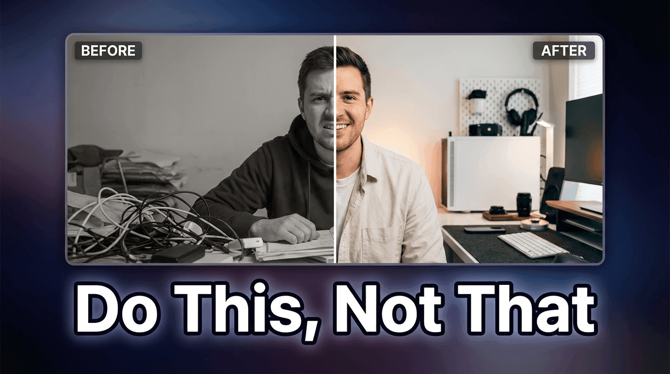
3. The “Before / After” Pattern
Best for: editing, fitness, design, image generation, product upgrades, workflows.
Thumbnail Text ideas:
- Before / After
- From This to THIS
- Huge Upgrade
Optional Thumbnail Prompt:
YouTube transformation thumbnail with side-by-side before and after comparison, left side dull and low contrast, right side bright and polished, clear divider, space for bold text, sharp details.
Why it works:
Transformation is one of the fastest visual stories on YouTube.
4. The “I Was Wrong” Pattern
Best for: commentary, reviews, strong opinions, creator lessons, experiments.
Thumbnail Text ideas:
- I Was Wrong
- I Changed My Mind
- I Take It Back
Optional Thumbnail Prompt:
YouTube reaction thumbnail with close-up of a surprised or reflective face, dramatic lighting, blurred background, strong contrast, modern commentary style, space for text on one side.
Why it works:
It creates emotional reversal. People want to know what changed.
5. The “Worth It?” Pattern
Best for: product reviews, tool reviews, app reviews, course reviews, subscriptions.

Thumbnail Text ideas:
- Worth It?
- Still Worth It?
- Buy or Skip?
Optional Thumbnail Prompt:
YouTube tech review thumbnail with product centered on a clean gradient background, glossy lighting, subtle glow, soft shadow, minimal clutter, space for short text.
Why it works:
It compresses the whole buying decision into a tiny phrase.
6. The “What Changed?” Pattern
Best for: algorithm updates, product updates, platform changes, creator strategy.
Thumbnail Text ideas:
- What Changed?
- New Update
- This Changed Everything
Optional Thumbnail Prompt:
YouTube update thumbnail with creator reacting to a large interface or analytics screen, bold arrows, clean layout, bright contrast, modern creator-news style.
Why it works:
It signals recency and relevance fast.
7. The “Nobody Tells You This” Pattern
Best for: insider tips, creator strategy, career advice, business, monetization.
Thumbnail Text ideas:
- Nobody Tells You This
- Hidden Truth
- The Real Reason
Optional Thumbnail Prompt:
YouTube authority thumbnail with creator slightly off-center, confident expression, clean studio background, subtle gradient, professional lighting, minimal clutter.
Why it works:
It feels like secret knowledge without needing long wording.
8. The “Faster” Pattern
Best for: productivity, editing, automation, AI tools, workflows, templates.
Thumbnail Text ideas:
- Edit Faster
- Grow Faster
- Do It Faster
Optional Thumbnail Prompt:
YouTube productivity thumbnail with stopwatch or motion lines, creator working on laptop, bright background, clean modern style, strong sense of speed, room for text.
Why it works:
Speed is one of the easiest benefits to sell.
9. The “In X Minutes” Pattern
Best for: tutorials, beginner content, setup guides, quick wins.
Thumbnail Text ideas:
- In 10 Min
- In 5 Minutes
- In One Hour
Optional Thumbnail Prompt:
YouTube tutorial thumbnail with timer graphic, simple clean workspace, strong focal subject, bright lighting, easy-to-read composition, minimal clutter.
Why it works:
Time-bound promises feel concrete and easy to evaluate.
10. The “Top 5” Pattern
Best for: list videos, recommendations, ranking content, software picks, creator tools.

Thumbnail Text ideas:
- Top 5 Tools
- 5 Best Picks
- 5 Must-Use Apps
Optional Thumbnail Prompt:
YouTube list thumbnail with large bold number on one side and small icons or objects on the other, bright gradient background, high contrast, clean and click-friendly layout.
Why it works:
Numbers make the value feel organized and fast to consume.
11. The “Best in 2026?” Pattern
Best for: comparisons, reviews, AI tools, creator tools, gear, app roundups.
Thumbnail Text ideas:
- Best in 2026?
- Best Right Now?
- My #1 Pick
Optional Thumbnail Prompt:
YouTube review thumbnail with featured product or app UI highlighted in center, polished tech aesthetic, clean background, slight glow, space for text.
Why it works:
It taps into comparison intent and current relevance.
12. The “Free vs Paid” Pattern
Best for: SaaS, AI tools, templates, subscriptions, app comparisons.
Thumbnail Text ideas:
- Free vs Paid
- Is Free Enough?
- Pay or Pass?
Optional Thumbnail Prompt:
YouTube comparison thumbnail with two product panels, one labeled free-style visually and one premium-style visually, high contrast split screen, clean background, strong clarity.
Why it works:
It mirrors a real buying question people already have.
13. The “Beginner” Pattern
Best for: educational content, new creators, simple explainers, first-step tutorials.
Thumbnail Text ideas:
- Start Here
- For Beginners
- Beginner Setup
Optional Thumbnail Prompt:
YouTube beginner-friendly thumbnail with a clean workspace or starter setup, friendly color palette, simple composition, approachable modern style, space for bold text.
Why it works:
It lowers the intimidation barrier.
14. The “One Rule” Pattern
Best for: expert advice, frameworks, strategy videos, thought leadership.
Thumbnail Text ideas:
- My 1 Rule
- One Simple Rule
- Follow This Rule
Optional Thumbnail Prompt:
YouTube authority thumbnail with creator speaking directly to camera, calm confident expression, clean background, subtle light shaping, minimal distractions.
Why it works:
It feels focused and opinionated.
15. The “I Tested It” Pattern
Best for: experiments, tools, features, creator challenges, AI comparisons.

Thumbnail Text ideas:
- I Tested It
- I Tried 10
- I Tested Them All
Optional Thumbnail Prompt:
YouTube experiment thumbnail with creator next to multiple icons, results chart, or product lineup, bright background, modern creator-testing style, clean composition.
Why it works:
It suggests effort, proof, and comparison.
16. The “The Truth” Pattern
Best for: reviews, myth-busting, creator advice, monetization, platform talk.
Thumbnail Text ideas:
- The Truth
- Honest Review
- What Actually Happens
Optional Thumbnail Prompt:
YouTube commentary thumbnail with expressive face, strong contrast, subtle background blur, clean lighting, serious but modern visual tone.
Why it works:
It feels direct and emotionally loaded.
17. The “This Works” Pattern
Best for: case studies, systems, templates, proven strategies, creator growth.
Thumbnail Text ideas:
- This Works
- It Actually Works
- Proven System
Optional Thumbnail Prompt:
YouTube results thumbnail with upward graph, laptop or dashboard, clean white or dark background, high contrast, minimal clutter, strong visual focus.
Why it works:
It implies validation without being too wordy.
18. The “Why It Failed” Pattern
Best for: postmortems, case studies, dead channel analysis, bad ads, failed products.
Thumbnail Text ideas:
- Why It Failed
- Why It Died
- What Went Wrong
Optional Thumbnail Prompt:
YouTube analysis thumbnail with falling graph, creator reacting, red accents, clean dramatic composition, modern business or creator style.
Why it works:
Failure stories trigger curiosity because people want the lesson.
19. The “Fix This” Pattern
Best for: audits, channel critiques, design makeovers, growth optimization.
Thumbnail Text ideas:
- Fix This
- Needs Fixing
- Quick Fix
Optional Thumbnail Prompt:
YouTube makeover thumbnail with creator pointing at a flawed design, dashboard, or thumbnail, bright contrast, clear subject, room for text.
Why it works:
It promises immediate improvement.
20. The “Hidden Feature” Pattern
Best for: software tutorials, AI tools, editing tools, platform tips.
Thumbnail Text ideas:
- Hidden Feature
- Secret Setting
- You Missed This
Optional Thumbnail Prompt:
YouTube software thumbnail showing a UI panel or app screen with one highlighted feature, clean modern interface look, bright focus area, minimal clutter.
Why it works:
It makes the viewer feel they may be behind.
21. The “Don’t Buy Yet” Pattern
Best for: product reviews, launches, creator gear, software pricing videos.
Thumbnail Text ideas:
- Don’t Buy Yet
- Wait First
- Watch Before Buying
Optional Thumbnail Prompt:
YouTube review thumbnail with product centered and a creator reacting cautiously, clean tech background, high contrast, space for bold text.
Why it works:
It creates protective urgency.
22. The “Results” Pattern
Best for: growth videos, money videos, analytics, business, channel strategy.
Thumbnail Text ideas:
- 100K Views
- $0 to $10K
- 3X Faster Growth
Optional Thumbnail Prompt:
YouTube results thumbnail with large bold number in center, subtle graphs or arrows in background, bright modern palette, clean composition, slight glow around the number.
Why it works:
Specific outcomes are naturally clickable.
23. The “My Setup” Pattern
Best for: desk tours, workflow videos, creator stacks, productivity, editing.

Thumbnail Text ideas:
- My Full Setup
- My Workflow
- My Creator Stack
Optional Thumbnail Prompt:
YouTube setup thumbnail with clean desk, laptop, mic, lights, or apps arranged in a polished composition, bright lifestyle-tech aesthetic, minimal clutter.
Why it works:
People love concrete behind-the-scenes systems.
24. The “Vs” Pattern
Best for: tool comparisons, platform battles, app comparisons, workflow decisions.
Thumbnail Text ideas:
- ChatGPT vs Claude
- Shorts vs Reels
- Cheap vs Premium
Optional Thumbnail Prompt:
YouTube comparison thumbnail with two subjects facing off, split-screen layout, strong contrast, bold visual difference, clear focal points, room for text.
Why it works:
Comparison language is naturally high-intent.
25. The “Use This Template” Pattern
Best for: scripts, prompts, growth systems, editing frameworks, creator resources.
Thumbnail Text ideas:
- Use This Template
- Copy This System
- Steal This Prompt
Optional Thumbnail Prompt:
YouTube template thumbnail with document, prompt box, or simple interface mockup, creator pointing toward it, bright clean background, modern creator-education style.
Why it works:
It gives the viewer something practical they can apply immediately.
How to Write Better Thumbnail Text for Your Niche
You do not need to use these word-for-word forever.
Think of them as reusable structures.
Here is the easiest way to customize them:
Result angle
- 100K Views
- More Sales
- Better Hooks
- Faster Edits
Problem angle
- Why It Failed
- Stop Doing This
- Biggest Mistake
- Low CTR Fix
Comparison angle
- Free vs Paid
- Before / After
- This vs That
- Old vs New
Curiosity angle
- The Truth
- Hidden Feature
- What Changed?
- Nobody Tells You This
Speed angle
- In 10 Min
- Faster Workflow
- Done in a Day
- Quick Fix
Once you know your video’s main angle, choosing thumbnail text gets much easier.
Common Thumbnail Text Mistakes
1. Using too many words
If the text feels like a sentence, it is usually too long.
2. Repeating the title exactly
The thumbnail should support the title, not duplicate it.
3. Being too generic
“Tutorial” or “Review” usually says almost nothing.
“Worth It?” or “Fix This” creates more tension.
4. Sounding too polite
Strong thumbnails are usually clearer and bolder than normal writing.
5. Adding text when the image already says enough
Sometimes the right move is no text at all. Use text when it sharpens the idea.
Using These Thumbnail Text Ideas Inside Miraflow
Here is the simple workflow inside Miraflow’s YouTube Thumbnail Maker:

- Go to YouTube Thumbnail Maker.
- Set the aspect ratio:
- 16:9 Video for regular YouTube
- 9:16 Shorts for vertical content
- Write your image direction in Thumbnail Prompt.
- Paste one of the text lines from this post into Thumbnail Text.
- If needed, open Show Advanced Settings and add a negative prompt like:
- blurry
- low quality
- cluttered background
- messy text
- distorted face
- Generate 2 to 3 versions.
- Compare them at small size and keep the one that reads fastest.
A useful rule is this:
If the thumbnail text cannot be understood in a quick glance, it probably needs to be shorter.
Example Combinations You Can Use Right Away
Example 1 – Tutorial video

Thumbnail Prompt:
YouTube tutorial thumbnail with a creator pointing at a clean editing timeline, bright high-contrast lighting, simple background, space for bold text, modern creator style.
Thumbnail Text:
Fix This
Example 2 – Tool review
Thumbnail Prompt:
YouTube tech review thumbnail with a new AI tool dashboard on a laptop screen, glossy modern lighting, clean gradient background, subtle glow, minimal clutter.
Thumbnail Text:
Worth It?
Example 3 – Shorts growth video
Thumbnail Prompt:
YouTube Shorts growth thumbnail in vertical-first style with a smartphone screen, bright background, upward graph, modern mobile aesthetic, space for text.
Thumbnail Text:
Post This Daily
Example 4 – Comparison video
Thumbnail Prompt:
YouTube comparison thumbnail with two AI tools side by side, split-screen layout, strong visual contrast, clean background, modern creator-tech style.
Thumbnail Text:
Free vs Paid
Example 5 – Creator strategy video
Thumbnail Prompt:
YouTube authority thumbnail with creator sitting slightly off-center, calm confident expression, clean studio background, soft key light, minimal clutter.
Thumbnail Text:
My 1 Rule
Conclusion
You do not need to overcomplicate thumbnail wording.
Most of the time, strong thumbnail text is short, clear, and built around one simple angle: a result, a mistake, a contrast, a warning, or a question.
That is why having a ready-made text library helps so much. It removes the blank-canvas problem and helps you package videos faster.
Use the 25 thumbnail text ideas above as a starting set inside Miraflow’s YouTube Thumbnail Maker. Pair them with strong visuals, generate a few variations, and keep the version that reads best at a glance.
Over time, you will build your own thumbnail language for your channel, and that consistency is what makes your videos easier to recognize and harder to ignore.
FAQ
What is the best length for YouTube thumbnail text?
Usually, shorter works better. The goal is to be readable fast, not to explain the whole video.
Should thumbnail text repeat the video title?
Usually no. The thumbnail text should add tension, contrast, or clarity that the title does not already provide.
Do all YouTube thumbnails need text?
No. Some thumbnails work better with no text at all. Add text when it makes the promise clearer.
What kind of thumbnail text gets the most clicks?
The strongest ones usually create one immediate reaction: curiosity, urgency, contrast, danger, or a clear result.
Can I use these thumbnail text ideas for Shorts too?
Yes. They work for both regular YouTube videos and Shorts. For Shorts, the text usually needs to be even cleaner and more glanceable.
How do I make thumbnail text look better with AI?
Use a strong visual prompt, keep the text short, generate a few variations, and compare them at small size before choosing one.
What should I put in Thumbnail Prompt versus Thumbnail Text?
Use Thumbnail Prompt for the image direction and Thumbnail Text for the short words you want visible inside the thumbnail.
Can I use my own face or product photo with these ideas?
Yes. In Miraflow AI, pair your uploaded image with one of these thumbnail text patterns.