AI Prompts for Children's Toy & Kids Brand Content: 15 Playful Visuals (Copy & Paste)
Written by
Jay Kim
15 copy-paste AI prompts for children's toy and kids brand visual content. Hero product shots, imaginative play scenes, educational learning moments, wooden toy material studies, plush character portraits, packaging displays, nursery integrations, outdoor adventures, creative mess compositions, baby developmental contexts, family game nights, STEM constructions, seasonal gift arrangements, brand flat lays, and parent-trust quality visuals designed for toy brands, children's product companies, educational toymakers, wooden toy artisans, plush designers, baby gear startups, and family-focused e-commerce businesses seeking warm professional visuals that delight children and convince parents.
15 copy-paste AI prompts for children's toy and kids brand visual content. Hero toy product shots on playful styled surfaces, imaginative play scene compositions, educational toy learning-moment contexts, wooden and natural toy tactile beauty shots, plush and soft toy character portraits, packaging and unboxing delight displays, nursery and playroom lifestyle integrations, outdoor adventure and active play scenes, arts and crafts creative mess compositions, baby and toddler developmental milestone contexts, board game and family play night scenes, STEM and building toy construction compositions, seasonal and holiday gift arrangements, brand flat lay collection displays, and parent-perspective trust and quality visuals designed for toy brands, children's product companies, baby gear startups, kids DTC brands, educational toy makers, wooden toy artisans, plush toy designers, children's book and media brands, baby shower gift companies, subscription box services for kids, independent toy retailers, nursery decor brands, children's clothing and lifestyle companies, family-focused e-commerce businesses, and any brand creating products for the youngest humans and the parents who choose for them.
The child does not buy the toy. This is the foundational commercial reality of the children's product industry and the reason that toy and kids brand visual content operates under a dual-audience pressure that exists in almost no other consumer category. The parent holds the credit card, evaluates the safety, assesses the developmental value, judges the brand quality, and makes the purchase decision. The child holds the desire, the imagination, the play impulse, the emotional connection, and the sustained engagement that determines whether the purchase was worthwhile and whether the parent returns to the brand. Every visual touchpoint must speak to both audiences simultaneously — delighting the child's eye while satisfying the parent's judgment. An image that captivates children but looks cheap or unsafe to parents fails at the point of purchase. An image that communicates premium quality to parents but looks boring or sterile to children fails at the point of desire. The visual content must hold both conversations at once, in the same frame, through the same composition, lighting, color, and atmosphere.
This dual-audience challenge shapes every decision in children's product photography in ways that are invisible to brands that have not thought carefully about it. The color palette must be vibrant enough to excite a child's visual system (which is drawn to high saturation and strong contrast) while being sophisticated enough to signal quality to a parent (who associates garish, neon palettes with cheap, disposable products). The composition must show play and imagination (which children respond to) while demonstrating build quality, material safety, and design intelligence (which parents evaluate). The lighting must be warm and inviting (creating the emotional atmosphere of happy childhood) while being clear enough to show product detail, material texture, and construction quality (the information parents need to assess value). The setting must suggest the child's world (playrooms, outdoor adventures, creative messes) while being aspirational enough that parents see the product as belonging in their home (not the cluttered, chaotic reality of most homes with children, but the bright, edited, beautiful version of childhood that parents aspire to create). Every element in the frame serves both audiences or it serves neither.
If you have worked with AI prompts for product photography, e-commerce visuals, or social media content, the methodology will be familiar. Copy the prompt, adjust the details to match your specific brand — your actual product type (wooden toys, plush characters, STEM kits, art supplies, baby gear, board games, outdoor toys), your brand color palette, your material story, your packaging design, your target age range, your play philosophy, your aesthetic direction — generate, and deploy. What distinguishes these prompts from general product photography is that every element has been engineered specifically for the children's product context: the warm, playful aesthetic that communicates joy and safety simultaneously, the imaginative play scenes that show the product in its intended state of use, the tactile material compositions that let parents assess quality through the screen, the developmental context shots that communicate educational value without being didactic, the nursery and playroom integrations that position the product within the aspirational home environment parents are building, the family-interaction scenes that show the social and bonding dimensions of play, and the overall visual language that transforms a product into a childhood experience — a vehicle for imagination, learning, connection, and the specific bright-warm-safe-beautiful quality that parents seek when choosing what to place in their children's hands. These are not general product photography prompts applied to toys. They are images designed to solve the specific commercial challenge of delighting children and convincing parents through a single visual impression.
A note on child representation in AI-generated imagery: These prompts are designed to show products, environments, and play contexts rather than generating images of children. Children's hands, partial figures, or implied presence through play-in-progress scenes may appear, but the prompts intentionally avoid generating identifiable child faces or full figures of minors. Brands using AI-generated imagery should be thoughtful about the representation of children in marketing materials and should consult their legal and ethical guidelines regarding the use of AI-generated images that depict or imply the presence of minors. For content requiring child models, real photography with proper model releases and parental consent remains the appropriate approach.
Why Playful Professional Visuals Are the Primary Purchase Driver for Children's Brands
The relationship between visual quality and purchasing behavior in the children's product category operates through a dual trust-and-desire mechanism that is unique to this market. Understanding how both parents and children process visual information about toys and kids products reveals why professional, intentional imagery is the most powerful commercial tool available to children's brands.
Parents evaluate safety and quality before they evaluate anything else. The first microsecond of a parent's visual processing when encountering a children's product image is a safety scan — unconscious, instantaneous, and decisive. Does this look well-made? Are there visible sharp edges, small detachable parts, toxic-looking paint, flimsy construction, or cheap material finishes? The parent's brain performs this safety assessment before conscious product evaluation begins, and the assessment is based entirely on the visual information available. Professional product photography — clean, well-lit, detailed enough to show material quality and construction precision — passes this safety scan. Amateur photography — poorly lit, blurry, unable to show material detail, shot against cluttered or dirty backgrounds — triggers safety concern regardless of the product's actual quality. In the children's category, visual quality is not just a brand signal but a safety signal, and parents who perceive safety concern from visual quality will not purchase.
Children respond to color, character, and scene before they understand product features. A child scrolling a screen with a parent, pointing at a toy catalog, or seeing a product in a store responds first to chromatic and narrative signals: bright colors, recognizable characters, play scenes that suggest fun, and the overall visual energy that communicates "this is for me, and it will be exciting." Children's visual processing is dominated by color saturation, character recognition, and narrative context (is someone playing? is there a story happening? does this look fun?) rather than the product-specification analysis that adult purchasing involves. Visual content that generates child desire through these channels creates the "I want that" moment that initiates the parent's evaluation process.
The gift-purchase dynamic amplifies visual quality requirements. A significant portion of children's product purchases are gifts — birthday presents, holiday gifts, baby shower contributions, grandparent purchases. Gift buyers are often purchasing for children they see infrequently, whose specific preferences they may not know well, and their purchase decision relies even more heavily on visual signals: does this look like a quality gift? Does it look substantial enough to justify the price? Does it photograph well for the gift-giving moment? Will the recipient's parents approve? Gift buyers select products that look premium, beautiful, and gift-worthy in the product photograph because they cannot evaluate the product in person. The visual content must communicate gift-worthiness at every price point.
Amazon and marketplace competition in the toy category is visually brutal. The toy category on Amazon contains thousands of competing products at every price point, and the search results page presents a wall of colorful thumbnails competing for the parent's click. In this environment, the listing with the cleanest, most professional, most trustworthy thumbnail wins the click — and the click determines everything downstream (conversion, ranking, reviews, organic visibility). Toy brands with professional photography (clean backgrounds, accurate color representation, visible quality details, sophisticated composition) consistently outperform brands with amateur or cluttered thumbnails. The visual quality difference between a $15 brand and a $50 brand should be immediately apparent in the thumbnail — and when it is, both brands sell to the audience they deserve.
Instagram and Pinterest drive aspirational discovery for parent audiences. Parents — particularly millennial and Gen Z parents who dominate the current purchasing demographic — discover children's products through visually-driven social platforms. The Instagram account or Pinterest board with beautiful, warm, aspirational imagery of childhood (bright playrooms, creative play scenes, natural wooden toys in sunlit nurseries, colorful art supplies in use) creates both brand desire and lifestyle aspiration. Parents do not just want the toy; they want the childhood the toy represents. Visual content that sells the experience of play — the bright, warm, creative, connected childhood — converts at significantly higher rates than content that simply shows the product.
The nursery and playroom aesthetic is a lifestyle category. Modern parents approach children's spaces with the same design intentionality they bring to the rest of their home. The nursery, the playroom, the child's bedroom — these are curated environments where every object is chosen not just for function but for aesthetic contribution. Products that photograph beautifully in these environments (that look like they belong in a well-designed nursery, that add visual value to a playroom, that are "Instagram-worthy" in the child's space) command premium pricing and stronger purchase intent. Visual content that shows the product in these aspirational environments sells both the product and the lifestyle it represents.
Subscription and repeat purchase depends on perceived brand quality. The children's product subscription model (monthly activity boxes, book deliveries, toy subscriptions, art supply refills) depends on parents perceiving consistent quality across multiple deliveries. Visual content that establishes and maintains premium brand perception across the subscription lifecycle — from acquisition imagery through monthly unboxing documentation — sustains the recurring revenue that subscription models require. Every visual touchpoint either reinforces the "this is worth it" perception or erodes it.
The Visual Language of Children's Toy and Kids Brand Photography
Children's product visual content operates within a specific aesthetic language that communicates simultaneously to adults and children. This visual language has evolved significantly as the children's product market has shifted from mass-market commodity aesthetics toward design-conscious, material-quality-focused, and developmentally-intentional positioning.
Warm, bright, natural light communicates safety and happiness. The dominant light quality in premium children's product photography is warm, bright, and natural-feeling — the soft, generous illumination of a sunlit room where a child plays. This light quality communicates safety (the child is in a bright, visible, monitored environment), happiness (warm light is psychologically associated with positive emotion), and quality (the product is well-lit enough to show its material and construction details). Harsh, dramatic, or dark lighting — effective in adult product categories — triggers unconscious discomfort in the children's product context because it suggests environments that are not safe, warm, or appropriate for children. Even studio lighting for toy photography should mimic the quality of natural daylight entering a child's room.
Color saturation and palette sophistication work together. The most effective children's brand color palettes achieve a balance that seems contradictory: colors are saturated and vivid (appealing to children's visual preferences) but the palette is curated and harmonious (appealing to design-conscious parents). The palette avoids the garish, random, every-color-at-once approach of cheap toy marketing in favor of a considered color system — perhaps a warm palette of terracotta, mustard, sage, and cream, or a cool palette of dusty blue, soft coral, mint, and white, or a primary palette of true red, clear blue, sunshine yellow, and natural wood — where every color is intentional and the relationships between colors communicate design intelligence. The palette itself says: this brand thinks carefully about every detail, including color.
Natural materials and textures communicate quality and safety. In premium children's product photography, the visibility of natural materials — untreated wood grain, organic cotton texture, natural rubber flexibility, wool felt softness, paper and cardboard weight — communicates both quality and safety. Parents associate natural materials with non-toxic safety, sustainability values, and premium quality. Visual content that shows these material textures clearly — the grain of beechwood, the weave of organic cotton, the soft matte finish of non-toxic paint — allows parents to assess material quality through the screen. The tactile information that the photograph conveys becomes the parent's proxy for holding the product in their hands.
Play-in-progress scenes communicate value and imagination. Static product shots on white backgrounds communicate basic product information but not product value. The most powerful conversion images for children's products show play in progress — a wooden train track built into an elaborate city, building blocks mid-construction with a recognizable structure emerging, art supplies creating a vibrant painting, a plush animal tucked into a blanket fort. These play-in-progress scenes communicate: this is what happens when the toy is in use, this is the imagination it unlocks, this is the engagement it creates, this is how long and how deeply a child will play with this. The play scene sells the experience; the static shot sells the object.
Scale reference and child context show developmental appropriateness. Parents need to understand the physical size of a product relative to a child's body and hands. A small child's hand holding a wooden block, tiny fingers grasping a crayon, a toddler-sized figure beside a ride-on toy — these scale references help parents assess whether the product is appropriate for their child's age and development stage. Without scale reference, many toy products appear ambiguously sized in photographs, creating uncertainty that reduces conversion.
Minimal, clean backgrounds communicate design intelligence. Premium children's brands photograph products against clean, intentional backgrounds — solid colors, natural surfaces (wood, linen, paper), or carefully styled environments — rather than the busy, patterned, or cluttered backgrounds that characterize budget toy photography. The clean background communicates design intelligence: this brand cares about aesthetics, this product is designed to look beautiful, this object will add visual value to your child's space rather than visual noise.
Warmth and softness communicate approachability and comfort. The overall visual temperature of children's product photography skews warm and soft — warm light tones, soft shadows, gentle color transitions, rounded compositions, and the absence of harsh edges or sharp contrasts. This warmth-and-softness approach communicates the emotional qualities parents seek in children's products: comfort, gentleness, approachability, and the safe soft world that good childhood feels like. Even products that are robust and durable (outdoor toys, construction sets, sports equipment) benefit from warm, approachable photography that softens the utilitarian aspects while showing the quality.
Organization and arrangement communicate educational intentionality. The way toys are arranged in photographs communicates whether the brand positions itself as educational or purely entertainment. Products arranged in orderly, purposeful compositions — blocks sorted by color, art supplies organized in rainbow sequence, learning materials laid out in developmental progression — communicate educational intentionality. Products tumbled in random, chaotic heaps communicate "just fun" without educational value. Neither approach is wrong, but the arrangement must match the brand's positioning, and brands that sell developmental value must show visual evidence of that intentionality in their product arrangements.
The "after the child leaves" aesthetic communicates real play. One of the most emotionally effective approaches in children's product photography is the "just played with" composition — a scene where the evidence of active play is visible but the child has momentarily left the frame. Building blocks arranged in an imperfect, clearly child-built tower. Crayons scattered beside an in-progress drawing. A plush animal arranged in a tea-party scene with tiny cups. A blanket fort with cushions and books inside. This approach communicates authentic play without requiring child models, creates warmth and narrative without showing faces, and invites both the parent-viewer (who recognizes these scenes from their own child's play) and the child-viewer (who immediately imagines themselves in the scene) to engage emotionally with the image.
15 AI Prompt Templates for Children's Toy & Kids Brand Visual Content
Each template includes a content concept, the full copy-paste prompt, and deployment guidance. All prompts are formatted for the Miraflow AI Image Generator and compatible with any high-quality text-to-image tool. Adjust the bracketed descriptive elements in each prompt to match your specific product type, brand aesthetic, material story, packaging design, age range, and target parent demographic. Generate at 1:1 for Instagram feed and product thumbnails, 4:5 for Instagram, Pinterest, and social media maximum-impact feed posts, 16:9 for website heroes and banner ads, 9:16 for Stories and vertical video thumbnails.

Template 1: The Hero Product Shot — Clean Playful Surface
This is the foundational product photograph — the clean, elevated product shot that establishes the brand's visual quality standard and serves as the primary product image across e-commerce, social media, and marketing materials. For children's products, the hero shot must balance clean commercial precision with the warmth and playfulness that signals "this is for children" without descending into visual clutter.
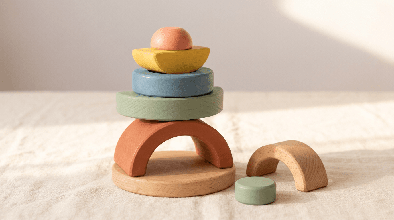
Prompt:
premium children's toy product photograph of [a beautiful handcrafted wooden stacking toy — five to seven rounded, smoothly sanded wooden pieces in a curated palette of soft, modern colors: a warm terracotta, a muted sage green, a dusty blue, a sunshine yellow, a soft coral, and natural unpainted wood — each piece is a different organic geometric shape (rounded arches, half-circles, thick discs, gentle curves) that stack into a satisfying sculptural tower when assembled, the wood grain is subtly visible through the thin, matte non-toxic paint finish on the colored pieces, communicating the natural material quality beneath the color, the unpainted pieces show their full beautiful wood grain — light beechwood or maple with warm honey tones and the smooth satin finish of fine sanding and natural oil treatment, the toy is assembled in its stacking configuration — the complete tower standing as a small sculpture that is immediately recognizable as both a toy and a design object, the pieces fit together with visible precision — the smooth curves meeting cleanly, the balance of the stack communicating craftsmanship and engineering, one or two extra pieces rest beside the base of the tower — perhaps leaning against it or lying flat on the surface — showing individual piece detail and suggesting the interactive nature of the toy (it comes apart, the child builds and rebuilds), the surface beneath is warm and clean — a piece of natural light wood in a warm blonde tone (a maple or birch play surface or table), or a sheet of thick natural kraft paper, or a clean linen in warm cream — the surface communicating the natural, tactile, non-plastic world of the toy, beside the stacked toy a very small, simple contextual element adds warmth without distraction — a single small wooden ball in one of the palette colors, or a tiny felt leaf or star in a complementary tone, or nothing at all if the toy is sufficient as its own visual subject, the background is soft and clean — a warm, slightly textured wall in soft white or very pale warm grey, the subtle texture communicating a real room rather than a digital void, or a simple warm gradient from the surface color to a slightly lighter tone above, the overall scene communicates: this is a premium, design-conscious, beautifully crafted toy made from natural materials with non-toxic finishes, it is as beautiful to look at as it is to play with, it will look beautiful in a nursery or playroom, and it was made with the same care and intentionality that the parent brings to every choice for their child] in a precise, warm product-hero composition, the toy is positioned slightly off-center in the frame — creating a balanced asymmetry that is more sophisticated than dead-center placement while maintaining the visual warmth that centered-heavy compositions lose, the stacked tower occupies approximately one-third to one-half of the frame's height — large enough to show the individual pieces, their colors, their grain, and their stacking precision, but surrounded by enough warm negative space to communicate premium breathing room and the visual calm that design-conscious parents appreciate, the loose pieces beside the tower base create a secondary visual element — lower and more grounded, providing the visual base that anchors the tall tower and suggesting interactive potential, the camera angle is slightly elevated — perhaps 15-25 degrees above horizontal — showing the full tower height, the piece profiles, the surface beneath, and enough of the top to communicate the three-dimensional stacking nature, the depth of field is moderately shallow — the toy and immediate surface in crisp, warm focus with the background softening into gentle blur, the focused area shows full detail: the wood grain visible through the paint, the smooth sanded edges, the precise curves, the clean color application, the natural wood tone of unpainted sections, the surface texture (wood grain, linen weave, or paper fiber) is visible in the focused zone — communicating tactile quality and natural material, the warm negative space above and around the toy breathes — allowing the eye to rest and appreciate the toy as an intentional design object rather than a product crammed into a busy frame, the lighting is warm, soft, and natural-feeling — a primary light source from above and slightly to one side, creating gentle directional illumination that models each piece's rounded form with a soft gradient from light to shadow, communicating three-dimensionality and the smooth tactile surface quality, the warm light catches each colored piece differently — the terracotta glowing warmly, the sage green softening into its shadow, the dusty blue catching a cool-warm interplay, the yellow brightening naturally, the coral warming — each color at its most appealing and true under the gentle directional illumination, the natural unpainted wood pieces respond to the light with the warm amber-honey glow of oiled hardwood — the grain catching light in fine lines, the smooth surface showing a gentle sheen without glossy reflection, the sanded edges catching soft highlights that communicate the hand-finished quality, the surface beneath catches the light with warm, even illumination — its own texture visible without competing, a warm foundation that grounds the toy, the shadow cast by the tower is soft and natural — warm-toned rather than cold grey, gradually dissipating, adding depth without harshness, the overall light quality communicates a bright, warm room — the quality of morning light entering a nursery or playroom, natural and flattering and safe, warm curated toy-palette colors (terracotta, sage, dusty blue, sunshine yellow, soft coral, natural wood honey) against warm light wood or cream linen surface — soft white or warm pale grey background — warm natural shadow tones — and the modern warm natural palette of a design-conscious wooden toy hero shot in soft directional natural-quality studio lighting as the color palette, the mood is warmly premium playfully sophisticated naturally beautiful and the specific quality that children's toy hero shots must achieve — the parent sees premium craftsmanship, natural material quality, design sophistication, and nursery-worthy beauty while the child (or the child-appeal assessment the parent makes on the child's behalf) sees bright appealing colors, interesting shapes, stackable play potential, and the tactile invitation of smooth rounded wood — both audiences served by one image, professional product and commercial photography with soft warm directional studio lighting and moderately shallow depth of field keeping the toy in full warm detailed focus with subtle background softening, composed as a slightly elevated clean product-hero with asymmetric placement on a natural warm surface, the wood grain quality and the color palette curation and the smooth craftsmanship detail as the simultaneous quality signals, warm natural curated tones with the toy's color palette as the chromatic statement, no text overlays, no logos outside the product if applicable, no watermarks
Best for: Primary e-commerce product image (Amazon, Shopify, brand website), social media product introduction and announcement posts, paid advertising primary product creative, email marketing product feature header, wholesale and retail buyer presentation, PR and media kit product imagery, gift guide submission imagery, print catalog and brochure primary product photograph
Template 2: The Imaginative Play Scene — Story in Progress
This template creates the emotionally powerful image type that shows a toy in the act of being played with — a scene of imagination unfolding, a story being told through play. This is the image that sells the experience rather than the object, and it is consistently the highest-engagement, highest-conversion content type for children's toy brands.
Prompt:
warm imaginative play scene photograph of [a miniature world built by a child — a play scene using wooden figurines, blocks, and small toy elements arranged on a floor or low table surface in a configuration that tells a story: small wooden animal figurines (a bear, a fox, a rabbit, a deer — simplified, modern, Scandinavian-style wooden figures in natural wood with minimal painted details) are arranged in a scene beneath a structure built from natural wooden blocks — an arch or a bridge or a small house form that the child has clearly constructed, the arrangement is imperfectly perfect — the child's hand (not visible in the frame) has placed these pieces with the earnest intention of a three-year-old architect, the structure is recognizably a building or bridge but with the charming asymmetry and creative engineering that characterizes genuine child construction, the animal figurines are positioned as if in conversation or on a journey — perhaps walking in a line toward the block structure, or arranged around a small open space as if in a clearing, or positioned on different levels of the block construction as if inhabiting the structure, small additional play elements enrich the scene — a few fabric leaves or felt trees that came with the toy set or were improvised, a small wooden vehicle (a simple car or boat), a tiny blanket or piece of fabric serving as a river or a road — the creative additions that children bring to structured toy sets, the surface is a warm, light-toned wooden floor or a soft play mat in a neutral warm tone — the floor of a playroom or living room where this scene has been built, the scene extends across the surface naturally — the play world occupying a generous space as children's floor play tends to do, with elements spread in the organic pattern of active imagination rather than in a photographer's precise grid, the background shows the soft-focus suggestion of a room — the base of furniture, a wall, warm ambient light — enough to establish "this is happening in a real, bright, warm room" without specific room details competing with the play scene, the time of day suggested by the light is mid-morning or afternoon — the bright ambient quality of a home where play happens during the relaxed hours, the overall scene communicates: a child was here moments ago, building this world with focus and imagination, these toys enabled a story that was entirely the child's creation, the play is open-ended and creative and deeply engaging — and the parent can see all of this in the scene left behind] in a warm floor-level or low-angle play-scene composition, the photograph is taken from a low angle — at or near the level of the play scene, perhaps 10-15 degrees above the floor surface — the perspective of a child sitting on the floor playing, or a parent crouching down to see what the child has built, this low angle makes the miniature world feel important and immersive — the block structure looks architectural, the figurines look like characters in a story, the scale feels intentional, the play scene fills the frame as a cohesive world — the block structure as the central architectural element with the figurines arranged around and within it, the supporting elements (leaves, vehicles, fabric) extending the world toward the frame edges, the depth of the scene creates layers — figurines in the foreground, the structure in the middle ground, additional elements in the background — creating a miniature landscape with depth and narrative progression, the imperfect child-built quality of the arrangement is preserved — blocks not perfectly aligned, figurines tilted slightly, the endearing evidence of small hands building with great intention, the floor surface extends in all directions — the play world existing within the larger context of a room, grounded on a real surface, the depth of field is moderately shallow — the central play scene in warm detailed focus with the foreground and background elements softening naturally, creating the intimate focus that draws the viewer into the miniature world, the lighting is warm and ambient — the general bright warmth of a well-lit room with natural light entering from windows, not a single dramatic source but the overall warm brightness of indoor natural light during the day, the wooden figurines catch the ambient light with their natural wood surface — the grain visible, the simplified forms casting tiny soft shadows on the surface, each figurine's minimal painted details (a dot eye, a colored ear, a painted vest) visible with clarity, the block structure catches the light with the dimensional quality of architecture — light and shadow playing across the stacked blocks, the arch or bridge casting a shadow beneath it, the structural form reading as a real building at this intimate scale, the felt or fabric elements catch the light with soft textile quality — their colors muted and warm, their surfaces absorbing light with the matte quality of natural fiber, the floor surface catches warm ambient light evenly — its own grain or texture visible as the ground plane of the play world, the background room elements are in soft warm blur — recognizable as the base of a sofa or a bookshelf but not detailed enough to distract from the play scene, the overall light quality communicates a bright, safe, warm room — the environment of happy play during a relaxed day, natural wood tones throughout — honey beechwood figurines and blocks with minimal painted accents (perhaps a soft red vest on the fox, a blue scarf on the bear, green felt leaves, a yellow wooden car) — warm light wooden floor or neutral play mat — warm ambient room light — soft background furniture in neutral tones — and the warm natural predominantly-wooden palette of a Scandinavian-inspired play scene on a bright playroom floor with ambient natural light as the color palette, the mood is imaginatively active warmly creative storytelling-rich and the specific play-scene message that is the most powerful content type for children's toy brands — these toys become worlds in a child's hands, the play they enable is creative and open-ended and deeply engaging, this is what happens when you give a child high-quality open-ended toys and the time to play — the play scene photograph as the product-in-use image that sells the experience rather than the object, professional lifestyle and editorial photography with warm ambient natural indoor light and moderately shallow depth of field keeping the central play scene in detailed immersive focus at a low floor-level angle, composed as an intimate low-angle play-world scene with architectural block structure and figurine characters in a warm room context, the narrative quality and the child-built authenticity and the natural material warmth as the play-value focal points, warm natural wood tones with minimal curated color accents, no text overlays, no logos, no watermarks
Best for: Social media storytelling content (the highest-engagement content type for toy brands — parents love and share play scenes), website homepage lifestyle hero imagery, email marketing play-value and imagination content, paid advertising that communicates product value beyond the physical object, influencer brief visual reference for play-in-progress content, Pinterest play idea and toy inspiration boards, gift guide editorial imagery, blog and educational content about open-ended play, subscription marketing play-experience content
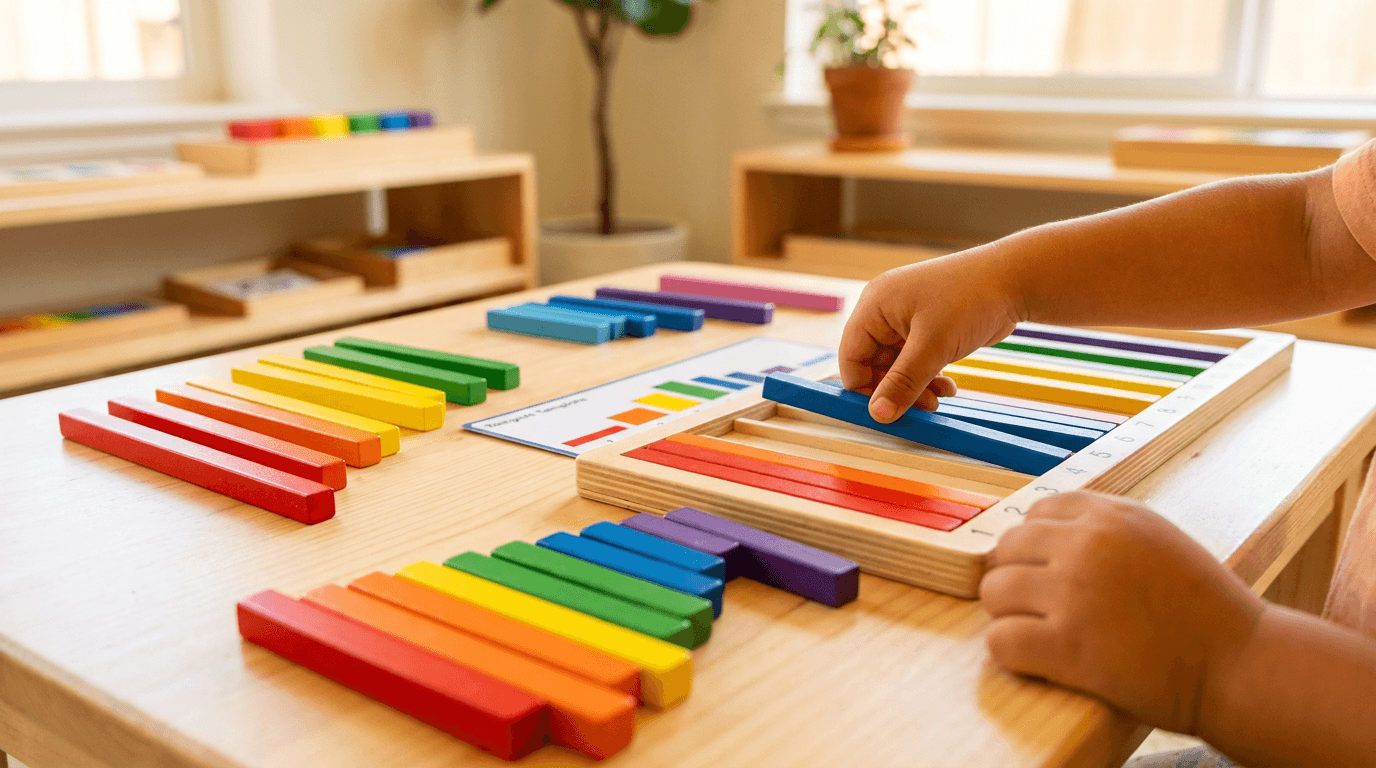
Template 3: The Educational Moment — Learning Through Play Context
This template positions educational toys and learning materials within their developmental context — showing the learning moment happening through play rather than through instruction. The image communicates educational value to parents without looking didactic or boring to children.
Prompt:
bright educational play moment photograph of [a learning-through-play scene with a beautifully designed educational toy in active use — the image captures the moment where play and learning are indistinguishable: a set of colorful wooden counting or math manipulatives arranged on a bright, clean child-sized table surface — perhaps a set of wooden number rods in graduated lengths and rainbow colors (Montessori-style), or a wooden peg board with colorful pegs being sorted by color and count, or a set of wooden pattern blocks being arranged into geometric designs on a template card, the manipulatives are in the process of being used — not pristinely arranged in their packaging configuration but actively sorted, counted, or patterned by a child, some pieces correctly placed and others mid-placement, the scene capturing the process of learning rather than the finished result, a small child's hand is visible at the edge of the frame — reaching for a piece, placing a peg, or holding a block about to be positioned — the hand providing scale, human presence, and the active-learning moment without showing the child's face or identity, the hand is small and soft — clearly a young child's, perhaps three to five years old based on size, the fingers demonstrating the developing fine motor skills that these manipulatives help build, the work surface is bright and clean — a child-sized wooden table in natural light wood, or a white surface with warm wood edges, the kind of prepared learning environment that Montessori and progressive educational approaches recommend, the manipulatives themselves are beautifully designed — the colors are rich and true (a clear red, a pure blue, a vibrant green, a warm yellow, a deep purple, an orange), each piece precisely machined with smooth edges and satisfying weight, the quality visible in the uniformity of the pieces and the richness of the color finish, a template card or activity guide may be partially visible — showing the pattern or sequence being followed, printed on quality card stock with clean modern design, communicating the educational intentionality behind the free-play format, one or two pieces may have rolled slightly away from the work area — the natural entropy of a child's workspace, the charming evidence of real use rather than staged display, the setting beyond the work surface suggests a bright, organized learning environment — perhaps shelves with other materials in the background, a plant, warm natural light — the Montessori or progressive-classroom or well-designed-playroom aesthetic that education-focused parents aspire to, the overall scene communicates: this child is learning mathematical concepts (or color theory, or spatial reasoning, or pattern recognition) through the direct manipulation of beautiful physical materials — the learning is embodied, hands-on, self-directed, and happening through play rather than instruction] in a bright, close-range educational-play composition, the photograph is taken from slightly above — approximately 30-45 degrees from horizontal — looking down at the work surface from the perspective of an adult observing a child's focused play, or from the child's own slightly elevated eye level, the composition shows the work surface as the primary field — the manipulatives spread across it in their working arrangement, colorful and organized with the purposeful disorder of active learning, the child's hand (if present) enters the frame from one edge — providing human presence and scale without dominating, the hand is in the act of doing (placing, sorting, reaching) rather than static, the template or guide (if present) is partially visible — enough to show the educational structure without being the visual focus, the individual manipulative pieces are large enough in the frame to show their quality — the smooth surfaces, the rich colors, the precise machining, the clean edges — each piece a small object of quality, the depth of field is moderate — the central work area in clear focus with the periphery of the table and the background in gentle softness, the focused area shows the texture of the wood, the sheen of the finish, the color fidelity of each piece, the background suggests the educational environment — organized shelves, natural light, warm room — without detailed specificity, the lighting is bright, clear, and warm — the quality of natural light in a room designed for children's learning, generous and even with a slight directional quality that creates gentle modeling shadows on the three-dimensional manipulative pieces, each colored piece catches the light with its specific rich color — the red vivid and true, the blue clear and deep, the green vibrant and alive — the colors communicating quality (cheap toys have muddy colors; quality toys have vivid, true, satisfying colors), the smooth wood surfaces reflect the light with a gentle satin finish — not glossy or shiny but smoothly luminous, communicating the feel of sanded, finished wood, the child's hand (if present) catches the warm light naturally — the skin tones warm and healthy, the small fingers lit with the gentle quality of natural indirect light, the work surface reflects light evenly — the clean, bright plane that is the stage for the learning activity, the template or card (if present) catches the light with matte paper quality — printed colors visible, the designed quality of the educational material apparent, vivid true rich colors of quality educational manipulatives — clear red, pure blue, vibrant green, warm yellow, deep purple, bright orange — against natural light wood work surface — warm child's skin tone at frame edge — white or cream template card if present — warm background tones of an organized learning environment — bright natural ambient light — and the vivid, organized, bright palette of a premium educational toy in active use in a warm bright learning environment as the color palette, the mood is brightly focused playfully educational developmentally rich and the specific learning-through-play message — this child is discovering mathematical or spatial or creative concepts through beautiful physical manipulation, the learning is self-directed and hands-on and deeply engaging, this toy makes learning feel like play because it is play — the educational-moment photograph as the developmental-value communication that speaks to the education-minded parent, professional lifestyle and editorial photography with bright warm natural light and moderate depth of field keeping the manipulatives in vivid detailed focus on a bright work surface, composed as a slightly elevated close-range learning-activity scene with active child hand and educational manipulatives in process, the vivid color quality and the hands-on active learning and the prepared environment as the educational-value focal points, vivid true colors against warm light wood and bright ambient light, no text overlays, no logos, no watermarks
Best for: Social media educational content (high engagement with education-focused parent audiences), website product pages for educational and Montessori-aligned toys, Amazon A+ content demonstrating educational value, email marketing developmental milestone and educational content, paid advertising targeting education-conscious parents, Pinterest educational play and Montessori boards, blog and editorial content about learning through play, teacher and educator marketing materials, gift guide submissions emphasizing developmental value
Template 4: The Natural Toy — Tactile Material Beauty Shot
This template elevates natural-material toys (wooden, organic cotton, natural rubber, wool felt) into objects of material beauty through close-up photography that emphasizes texture, grain, craftsmanship, and the warmth of natural materials. This is the image that sells quality and material integrity to parents who value non-toxic, sustainable, well-crafted children's products.
Prompt:
tactile material beauty photograph of natural children's toys showing [a close-up arrangement of beautifully crafted wooden toys that celebrates the material quality and craftsmanship — the visual equivalent of holding these objects and feeling their quality: a small collection of smooth, hand-finished wooden toys in their natural wood state with minimal paint accents — perhaps a set of wooden nesting bowls in graduated sizes showing the interior and exterior grain of each bowl, or a collection of smooth wooden teething rings and grasping toys for babies with their organic curved forms and satin-smooth surfaces, or a set of small wooden vehicles (cars, a bus, a boat) with clean simple forms and wheels that turn, or a family of wooden peg dolls in graduated sizes with minimal painted features (a simple smile, a dot of color for clothing) — the toys chosen to show the maximum beautiful wood surface, each piece showing its wood grain openly — the fine lines of beechwood or the warm figure of cherry or the pale clean grain of maple, the grain visible because the finish is transparent: a natural oil or beeswax treatment that enhances the grain while leaving the wood surface smooth and tactile, the surfaces are flawlessly smooth — the hand-sanded, multiple-pass finish of quality wooden toymaking visible in the way light glides across the surface without catching on roughness or imperfection, any painted details are minimal and precise — a thin line of color, a small dot, a clean geometric shape — the paint sitting on the wood surface without obscuring the grain beneath it, the colors are mixed from non-toxic pigments and have the slightly warm, slightly muted quality that distinguishes non-toxic milk paint or plant-based finishes from synthetic enamel, the arrangement is deliberately close and tactile — the toys grouped closely enough that the viewer can imagine picking them up, the composition feeling intimate and within-reach rather than distant or clinical, the surface beneath is complementary natural material — a piece of thick natural linen in warm cream or undyed flax, a sheet of handmade paper with visible fiber texture, or a smooth piece of warm light wood — the surface texture in conversation with the toys' wood surfaces, a subtle shadow between the grouped toys adds depth and the sense of physical presence — these objects have weight, they rest on the surface with the substantiality of real wood, the overall composition is a material study — the photograph answers the implicit parent question: what does this feel like? what is this made of? is it well-made? — through visual texture and surface quality that communicates the tactile experience of holding these objects] in an intimate close-range material-beauty composition, the photograph is taken from a low angle or eye level with the toys — the perspective that makes small objects feel substantial and important, the camera at the height of the toys themselves, looking across their surfaces, the composition is tight — the frame filled with the toys and their surfaces, no wasted space, the viewer's attention directed entirely to the material quality and craftsmanship detail, the wood grain is the compositional star — the fine lines and warm color of the grain visible across every surface, creating a subtle pattern language that repeats across the different toy forms with beautiful variation, the smooth surfaces create gentle reflective gradients — the way sanded, oiled wood catches and gently returns light in soft, continuous curves rather than sharp highlights, the minimal painted details provide small color moments — precise and clean against the warm wood, their restraint communicating the design philosophy of the brand, the different toy forms create visual rhythm — graduated sizes, varied shapes, the organic curves and geometric simplicity of well-designed wooden toys creating an interesting visual landscape at this intimate scale, the linen or paper or wood surface provides textural foundation — its own material character visible and complementary without competing, the depth of field is very shallow — one or two toys in crisp material-detail focus with others falling into warm, soft, wood-toned blur, the focused area shows the grain and surface in full detail while the blurred toys provide warm ambient color and form, the lighting is soft, warm, and directional — the specific quality that reveals wood grain most beautifully: a primary light from one side at a low angle, the light raking across the surface to catch the grain lines with subtle shadow-and-highlight micro-contrast, this directional quality makes the grain three-dimensional — the harder summer wood catching the light slightly differently than the softer spring wood, creating the fine striped pattern that communicates real wood rather than printed veneer, the smooth surfaces catch the directional light with long, gentle highlights — the specular response of oiled wood that communicates satin-smooth touch quality without glossy shininess, the painted details catch the light with their slightly different surface response — the matte or semi-matte paint finish absorbing light slightly differently than the wood around it, making the color details visible, the linen or natural surface catches directional light with warm textile or fiber texture — the weave or paper fiber visible, adding tactile information, the shadows between toys are warm and soft — not cold grey but warm wood-reflected tones that maintain the overall amber warmth, warm natural wood tones throughout — honey beechwood or warm cherry or pale maple as the dominant palette — minimal painted color accents (soft terracotta, sage, dusty blue, or muted primary tones) — warm cream linen or natural paper surface — warm soft shadow tones — and the intimate, natural, predominantly-wood palette of a material-beauty study of handcrafted wooden toys in warm directional light as the color palette, the mood is tactilely warm materially honest craftsman-quality and the specific material-trust message — these toys are made from real wood by people who care about quality, the surfaces are smooth enough for a baby's mouth and beautiful enough for a parent's eye, the material is the message: natural, safe, warm, well-made, lasting — the material photograph as the quality-and-safety communication that natural-material toy brands depend upon, professional product and material photography with warm directional studio light and very shallow depth of field keeping one or two toys in intimate grain-detail focus with others in warm wood-toned bokeh, composed as a low-angle close-range material study with wood texture and surface quality as the primary subjects, the grain visibility and the smooth surface sheen and the minimal color precision as the craftsmanship focal points, warm natural wood tones with minimal complementary accents, no text overlays, no logos, no watermarks
Best for: Social media material-quality and craftsmanship content, website product detail and material-story imagery, Amazon A+ content quality and material sections, email marketing quality-communication content, paid advertising targeting quality-conscious and sustainability-minded parents, Pinterest natural toy and nursery boards, blog and editorial content about natural materials and non-toxic toys, gift guide premium-quality emphasis imagery, wholesale and retailer quality-demonstration materials
Template 5: The Plush Character — Soft Toy Portrait
This template treats plush toys, stuffed animals, and soft dolls as characters with personality — creating a "portrait" that gives the soft toy the presence and emotional warmth that drives the immediate "I love it" response from both children and parents.

Prompt:
charming plush toy character portrait of [a beautifully crafted stuffed animal — a soft, modern, design-conscious plush toy in the style of high-quality independent toymakers: a bear (or a bunny, a fox, a lamb, an elephant, or a cat) approximately 12-15 inches tall, made from high-quality organic cotton or linen fabric in a warm, natural tone — a soft oatmeal linen or a warm stone-grey cotton or a pale blush pink — the fabric texture visible and inviting: the weave of the linen or the soft brushed quality of the cotton communicating the material quality and tactile experience, the face is simply and expressively designed — small hand-embroidered eyes (perhaps simple cross-stitches or small round knots in a darker thread) and a tiny embroidered nose or mouth, the minimal face design achieving maximum character through restraint — the bear looks gentle, friendly, and slightly contemplative in the way that the best stuffed animals do, long floppy ears (if a bunny) or small rounded ears (if a bear) add to the character — the ears in a slightly different position left to right, the asymmetry adding to the handmade, individual quality, the body is softly stuffed — not rigidly firm but gently plump in a way that suggests the toy is huggable and moldable, the kind of softness that a child presses to their face at bedtime, the limbs are long and slightly floppy — arms and legs that a child can hold, wrap around things, position in different poses, the proportions slightly elongated in the modern Scandinavian soft-toy tradition rather than the squat proportions of mass-market plush, the toy may wear a minimal garment — a small knitted sweater in a coordinating color, a tiny linen dress, a simple woven scarf — the garment adding character and color without being fussy or over-designed, handmade details are visible: the hand-stitching at the seams slightly visible in the charming way that quality handcraft shows its construction, a small fabric tag or label at the base with the brand name, a subtle variation in the fabric's grain direction that shows each piece was individually cut, the toy sits on a soft surface — a folded knitted blanket, a piece of soft fabric, or a small cushion — the soft-on-soft context communicating the tactile world this toy belongs in, the background is simple and warm — a soft neutral tone that provides contrast for the toy without competing, perhaps the slightly out-of-focus suggestion of a nursery or child's room, the overall composition frames the plush toy as a character — not a product lying flat in its packaging but a personality sitting in a warm space, the kind of image that makes both a child say "I want that one" and a parent say "that is beautiful"] in a warm, intimate character-portrait composition, the photograph is taken at the toy's eye level — the camera positioned at the height of the plush animal's face, looking directly at it as if meeting a gentle character for the first time, this eye-level angle is essential — it gives the plush toy the dignity and presence of a portrait subject, making it feel like a companion rather than an object, the toy fills approximately one-half to two-thirds of the frame — large enough to show the face details, the fabric texture, the body proportions, and the overall character, while leaving enough warm space around it to breathe, the toy is positioned naturally — sitting in a relaxed, slightly slumped posture that suggests a soft toy waiting for its child, not propped rigidly or artificially posed, the face is the emotional center — the embroidered features clearly visible, the expression readable at a glance, the gentle personality communicated through the simple eye-and-nose combination, the fabric texture is visible across the body — the linen weave or cotton brushed surface readable as material information, the parent able to assess the fabric quality and the handcraft approach, the floppy ears or limbs add dynamic elements — not everything symmetrical or perfectly placed, the organic asymmetry of a handmade soft toy, the garment (if present) adds a small burst of color — perhaps the warm terracotta of a knitted sweater or the sage green of a small scarf — the color complementing the neutral body fabric, the soft surface beneath the toy creates a gentle base — the knitted or fabric texture visible and warm, communicating the soft, cozy world of childhood bedtime and comfort, the background is in gentle warm blur — enough to suggest a room but not enough to identify specific elements, the overall frame feels intimate, warm, and portrait-like — the viewer meets the toy's character, the depth of field is moderately shallow — the face and upper body in crisp focus with the lower body and background in gentle, warm softness, the focus draws the eye to the face and the fabric texture of the chest and head — the character-reading zone, the lighting is soft, warm, and portrait-quality — the gentle, flattering illumination used for portraiture applied to a plush toy: a primary soft light from one side (perhaps through a window or from a studio softbox) creating gentle modeling on the toy's dimensional form, the soft directional light creates gentle shadow on one side of the face — the three-dimensionality of the stuffed form visible, the nose and ears catching light with the subtle roundness that makes the character feel present, the fabric texture catches the directional light with its specific surface response — linen showing its weave as fine light-and-shadow lines, cotton showing its soft brushed surface with gentle overall luminosity, the embroidered features catch small focused highlights — the thread slightly raised from the fabric surface, catching the light with the dimensional quality that communicates handwork, the garment (if present) catches the light with its knitted or woven texture — the warmth of yarn or fabric visible in the surface response, the soft surface beneath catches the ambient light with warmth — the knitted blanket's cable or rib pattern, or the fabric's drape and fold, adding textural interest below the toy, the overall light quality communicates warmth, gentleness, and the intimate quality of a child's room — safe, soft, and lit with care, warm neutral fabric tones — oatmeal linen, stone grey, pale blush, or natural cream — as the dominant palette — small garment color accent in the toy's coordinating palette — warm thread tones for embroidered features — soft surface texture in cream or warm neutral — warm background blur — gentle shadow warmth — and the intimate, soft, neutral-warm palette of a handcrafted plush toy portrait in gentle directional light as the color palette, the mood is gently characterful warmly intimate softly present and the specific plush-toy-portrait quality — this is not just a product but a future companion, a bedtime friend, a character that a child will name and love and carry everywhere, the portrait communicates the personality and warmth that makes a child choose this specific toy as theirs — the plush portrait as the character-introduction image that creates emotional connection before purchase, professional portrait and product photography with soft warm directional studio or natural light and moderately shallow depth of field keeping the face and upper body in intimate focus, composed as an eye-level character portrait with the plush toy as a gentle personality on a soft surface, the facial expression and the fabric texture and the handcraft details as the character-and-quality focal points, warm neutral tones with small complementary accents, no text overlays, no logos outside the product tag, no watermarks
Best for: Social media character introduction content (extremely high engagement — plush portraits generate "I need this" responses from parents and children), website product page hero for plush and soft toy products, Amazon listing main images for stuffed animals and soft toys, email marketing new product and character launches, paid advertising emotional creative, Pinterest nursery and children's room boards, gift guide editorial imagery for baby and toddler products, influencer brief for baby and children's content creators, wholesale and retailer presentation materials
Template 6: The Packaging Delight — Unboxing and Gift-Ready Display
This template showcases the packaging experience — the designed unboxing moment or gift-ready presentation that communicates the brand's attention to the complete product experience, from the outer box to the toy inside. For gift-purchase-heavy categories like children's products, beautiful packaging imagery directly drives conversion.
Prompt:
delightful children's toy packaging photograph of [a beautiful unboxing moment — a premium toy in its designed packaging, partially opened to reveal the product inside, the presentation communicating the complete experience from receipt to play: the outer packaging is a designed box — perhaps a sturdy, matte cardboard box with a magnetic flap lid, the exterior featuring the brand's identity: a clean, modern design with the brand name in a warm, friendly typeface, a simple charming illustration of the product (a line drawing of the toy in a warm accent color), and the overall clean, design-conscious aesthetic that communicates premium quality before the box is even opened, the color palette of the packaging matches the brand identity — perhaps warm cream with terracotta illustrations, or soft sage green with gold foil text, or clean white with a vivid coral accent — sophisticated enough for an adult design sensibility while warm and inviting enough to signal "children's product," the box is opened — the lid lifted back to reveal the interior, which is as designed as the exterior: the product nestled in tissue paper in the brand's accent color, or wrapped in a simple muslin bag with a drawstring, or resting in a custom-molded insert that holds the toy securely and presents it beautifully, the toy is partially visible inside — enough to show what the product is and to create the visual delight of discovery, the color and quality of the toy visible through the tissue paper or above the wrapping, beside or emerging from the box, one or two elements of the unboxing experience add delight: a small printed card (a thank-you note, a play-idea card, a care-instructions booklet designed with the same brand aesthetic), a small branded sticker or temporary tattoo included as a bonus, or a simple fabric bag that doubles as a storage pouch, the surface beneath the box is gift-appropriate — clean and bright, perhaps a white surface with a small piece of tissue or wrapping ribbon that suggests the gift-giving context, or a nursery-adjacent surface (a dresser top, a shelf) where the gift has been placed, the arrangement suggests the moment of opening — the lid just lifted, the contents revealed, the delight of seeing what's inside just beginning, the overall scene communicates: this product arrives as a complete experience, the packaging is beautiful enough to gift without wrapping, the brand cares about every detail from the first visual impression to the play that follows, this is a gift worth giving and a brand worth remembering] in a bright, clean packaging-presentation composition, the photograph is taken from slightly above — approximately 30-40 degrees — showing the interior of the open box, the product within, the lid's exterior design, and the surface around the box, the elevated angle shows the unboxing arrangement in its designed hierarchy — the box as the outer frame, the tissue or wrapping as the reveal layer, the product as the contained surprise, the box is the composition's structure — its rectangular form providing geometric order within the frame, the lid creating a dynamic diagonal or resting plane that adds visual interest, the interior presentation is clearly visible — the tissue paper's color, the product's emergence from wrapping, the care in arrangement all readable in the frame, the extra elements (card, sticker, bag) are positioned naturally — as if they were discovered alongside the product in the process of opening, the surface around the box provides clean context — gift-adjacent elements (a ribbon, a gift tag) or nursery-adjacent context (a small toy already loved, a book) in soft supporting positions, the depth of field is moderate — the box and its contents in clear focus with the surrounding surface and any background elements in gentle softness, the packaging design details (typography, illustration, color) are legible — the brand identity visible and the design quality communicable, the lighting is bright and clear — the exciting quality of "opening a gift" illumination: generous, even, the brightness that makes colors vivid and details clear and the moment feel special, the light falls evenly across the box interior — no harsh shadows hiding the product within, the contents fully visible in the generous illumination, the packaging exterior catches the light to show its material quality — the matte cardboard with its smooth surface, the printed design crisp and clear, any foil or textured elements catching subtle highlights, the tissue paper catches the light with its specific paper quality — slightly translucent, colored, crinkled with the folds of wrapping, the product inside catches the light as the visual reward — its color and form visible and appealing through or above the wrapping, the small extras (card, sticker) catch the light with their printed or material quality — each detail clearly produced and designed, the surface beneath is brightly and evenly lit — clean and neutral, providing the stage for the unboxing display, bright brand-specific packaging colors — warm cream or soft sage or clean white with accent color (terracotta, coral, gold, dusty blue) — colored tissue paper accent — product colors visible from within — printed card and small extras in brand palette — clean bright surface — and the vibrant, designed, brand-consistent palette of a premium children's toy unboxing in bright, clear, gift-excitement lighting as the color palette, the mood is delightfully designed gift-ready brand-attentive and the specific packaging-experience message — this brand designs every moment from opening to playing, the packaging itself is a gift, the attention to detail visible in the box promises the same attention to detail in the toy, this is a complete product experience not just a toy in plastic wrap — the packaging photograph as the gift-worthiness and brand-experience communication, professional product and editorial photography with bright even studio lighting and moderate depth of field keeping the full packaging presentation in clear detailed focus, composed as a slightly elevated unboxing display with open box and visible product and branded extras, the packaging design quality and the presentation care and the gift-readiness as the brand-value focal points, bright brand palette with packaging-specific accents, no text overlays, no additional logos, no watermarks
Best for: Social media gift guide and unboxing content, website product page packaging and presentation imagery, email marketing gift-giving and holiday campaigns, paid advertising gift-purchase targeting (grandparents, baby shower, birthday), Amazon A+ content brand-story and quality sections, influencer brief for unboxing content, Pinterest gift idea and baby shower boards, wholesale and retail buyer presentation showing packaging quality, PR and media kit brand imagery, holiday and seasonal gift marketing across all channels
Template 7: The Nursery Integration — Product in the Child's Room
This template places the product within the aspirational nursery or child's room environment — showing how the toy integrates into the beautiful, designed space that modern parents create for their children. This is the lifestyle shot that sells both the product and the aesthetic life it belongs to.
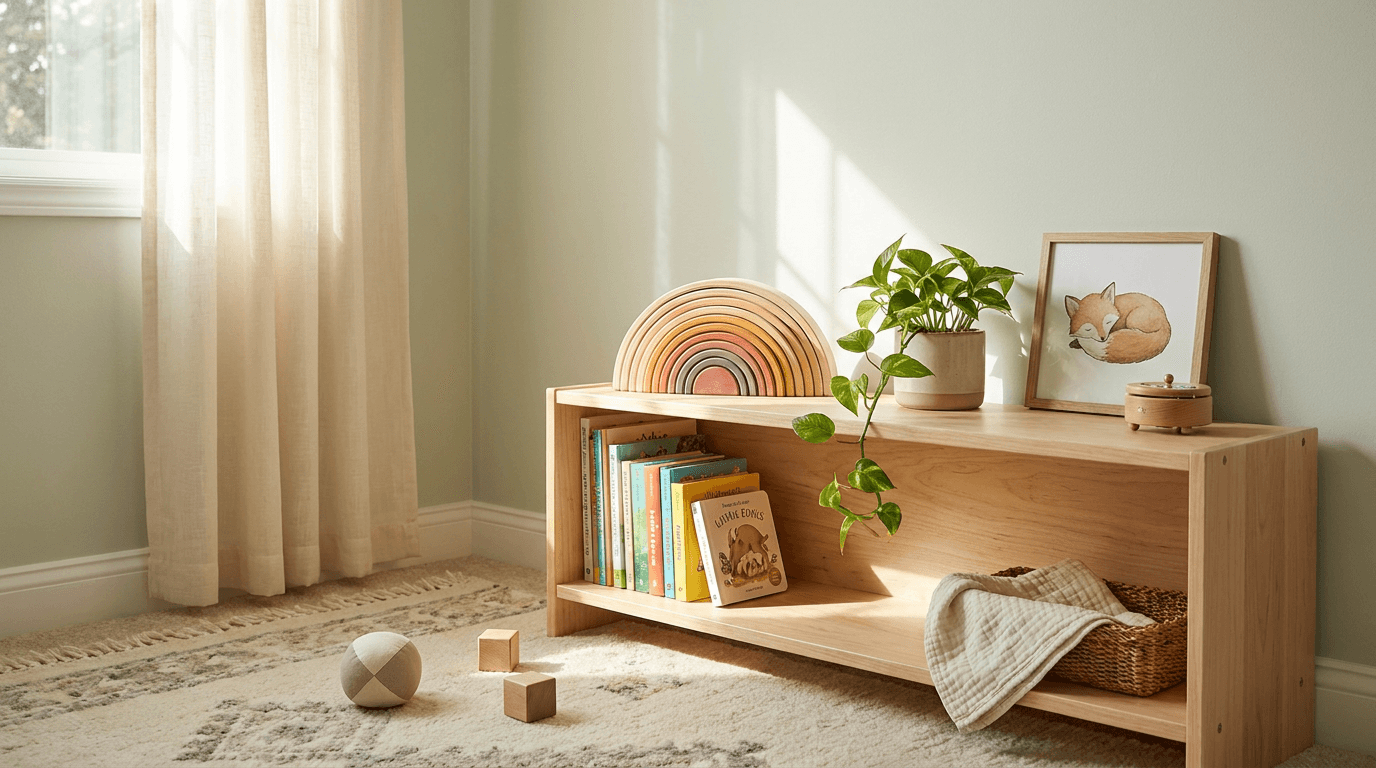
Prompt:
warm nursery lifestyle photograph of [a children's toy beautifully integrated into a designed nursery or child's room — the toy not isolated on a studio surface but living in the bright, warm, curated environment where it will actually be: a corner of a beautifully designed nursery — the walls in a soft, warm tone (soft white, palest sage, warm cream, the lightest blush) with perhaps a simple piece of wall art (a small framed print of a gentle animal or abstract shape in muted modern colors), a shelf or low bookcase in natural light wood holds a curated arrangement: a few children's books with their colorful spines visible, the toy product positioned prominently among the shelf arrangement — a wooden stacking toy, a set of nesting blocks, a beautiful plush animal, or a row of wooden figurines — the product clearly the featured item while belonging naturally among the other curated objects in the space, other shelf elements add nursery context: a small potted plant (a trailing pothos or a small succulent in a simple ceramic pot), a tiny wooden music box, a framed family photo in a simple frame, a small woven basket holding a folded muslin cloth — each element adding the designed lived-in quality that distinguishes an aspirational nursery from a sterile showroom, the floor may be visible below the shelf — light wood or a soft, neutral rug with a subtle pattern — a few additional toys resting naturally on the rug (a couple of wooden blocks, a cloth ball, a board book on its side) creating the gentle evidence of a child who plays in this room, the lighting is natural — window light entering from one side, the specific quality of daytime light in a child's room: bright, warm, generous, safe, the light creates the long gentle shadows and bright surface illumination of a room oriented toward natural light, the curtains or window treatment (if the window edge is visible) are simple and light-filtering — a sheer white or soft cream fabric that diffuses the light into the even warmth that defines the nursery aesthetic, the overall scene communicates: this toy belongs in this beautiful room, it was chosen with the same care as every other element in this nursery, it contributes to the visual beauty and developmental richness of the child's environment — the product as an element of the curated childhood that design-conscious parents create] in a warm, atmospheric nursery-lifestyle composition, the photograph is taken from a natural standing or slightly crouched perspective — the angle of a parent entering the nursery and seeing this corner of the room, the view that reveals the designed space in its intimate, warm beauty, the composition frames a corner or section of the room — not a full room shot but a curated view that shows the shelf arrangement, a portion of wall, and perhaps some floor, the selective framing that interior photography uses to show the best angle of a designed space, the product is prominently positioned on the shelf — the eye is drawn to it through its placement (perhaps slightly forward of the other objects, or in the visual center of the shelf arrangement, or the most colorful object in a neutral context) while it belongs naturally in the curated setting, the other shelf elements provide the designed-life context — books, plants, objects, artwork — the visual vocabulary of the aspirational nursery that serves as the backdrop and the lifestyle aspiration, the wall and its art or decoration add vertical context — the room is designed up as well as across, the space is intentional in every dimension, the floor elements (if visible) add the play-in-progress warmth — the room is not a museum but a space where a child actually plays, the gentle disorder of a few toys on the rug communicating real life, the depth of field is moderate — the shelf and product in clear focus with the room background in gentle atmospheric softness, the focus shows the product detail and the shelf arrangement while the room provides warm, blurred context, the natural window light is the atmospheric driver — entering from one side, creating the warm directional quality that makes nursery photography feel inviting and real, the light falls across the shelf with gentle directional illumination — the product catching the light with its specific material response (wood grain warmth, fabric texture, color richness), the other shelf objects catching the light as supporting elements, the wall catches the light with its painted or wallpapered surface — the gentle warm tone visible in the soft illumination, the art or decoration catching its own small highlight, the floor (if visible) catches the lower light — warmer and slightly dimmer as the light angle reduces, the scattered toys in natural gentle illumination, the curtain or window edge (if visible) glows with the brightest light in the frame — the light source identified and the room's orientation toward natural brightness established, the overall light quality communicates home — the specific warm, bright, safe quality of a well-designed room where a child lives and plays, soft warm nursery wall tones (palest sage, warm cream, soft white, lightest blush) — natural light wood shelf and floor — curated book spines in mixed warm colors — product in its specific color palette as the featured element — green plant accent — warm rug in neutral pattern — natural window light warmth — gentle artwork tones — and the warm, curated, natural-material palette of a designed nursery corner with the product integrated as a lifestyle element in generous natural window light as the color palette, the mood is warmly designed aspirationally lived-in beautifully curated and the specific nursery-integration message — this product belongs in the most beautiful version of your child's room, it was designed to be both played with and looked at, it adds developmental value and visual beauty to the space you are creating for your child — the nursery photograph as the lifestyle-aspiration visual that sells both the product and the childhood it represents, professional interior and lifestyle photography with natural directional window light and moderate depth of field keeping the shelf and product in warm clear focus with the room in atmospheric supporting softness, composed as a natural-angle nursery corner showing the product integrated among curated objects on a shelf in a designed room, the curated arrangement and the natural light warmth and the aspirational room quality as the lifestyle focal points, warm neutral nursery tones with natural wood and curated color accents, no text overlays, no logos, no watermarks
Best for: Social media nursery and playroom content (extremely high engagement on Instagram and Pinterest for parent audiences), website homepage lifestyle hero imagery, email marketing lifestyle and brand-world content, paid advertising targeting design-conscious and new parents, Pinterest nursery design, playroom ideas, and children's room boards, influencer brief for home and nursery content creators, blog and editorial content about children's room design, real estate and family lifestyle content, brand identity and aesthetic positioning materials
Template 8: The Outdoor Adventure — Active Play Scene
This template positions children's products in the outdoor active-play context — the garden, the park, the beach, the trail — showing toys and products being used in the expansive, natural, physical-play environments that parents want their children to experience. Outdoor play imagery communicates health, freedom, imagination, and the nature-connected childhood that modern parents aspire to provide.
Prompt:
bright outdoor active play photograph of [an outdoor play scene with children's toys in a natural setting — the image captures the energy, freedom, and natural beauty of outdoor play: a sunny garden or park setting with bright green grass, dappled tree shade, and the generous outdoor light of a warm afternoon — the environment communicating nature, space, freedom, and the kind of outdoor play that parents value for their children's development, toys and play equipment arranged in active use on the grass: perhaps a set of colorful wooden outdoor toys — a ring toss with painted wooden rings in bright primary colors scattered on the ground and on the stake, a simple wooden balance board with evidence of active use (slightly muddy edges, grass stains — the honest marks of outdoor play), a bucket of sidewalk chalk in vivid colors with chalk drawings visible on a nearby stone path, or nature exploration equipment — a child-sized canvas backpack with a magnifying glass and a small field guide visible, a bug-catching jar, a small wooden compass — the adventure-play tools arranged on a blanket or in the grass as if the explorer has paused their expedition, a picnic blanket or a simple woven mat on the grass provides the base camp for the outdoor play — perhaps a water bottle and a snack visible, the practical elements of outdoor time with children, a child's presence is implied through the play in progress — the ring that was just tossed, the chalk drawing half-complete, the explorer's bag open and equipment in use — the child has momentarily left the frame to chase a butterfly or climb a tree, the evidence of their active play visible everywhere, the natural setting is beautiful and real — not a manicured landscape but a natural garden or park with real grass (slightly uneven, a few daisies growing), real trees (branches and leaves providing dappled shade), real light filtering through the canopy, the outdoor play area feels safe and enclosed — a garden, a familiar park, the kind of outdoor space where a parent feels comfortable letting a child explore and play independently, the overall scene communicates: this is outdoor childhood, this is what play looks like when the screens are off and the backdoor is open, these toys facilitate the kind of physical, imaginative, nature-connected play that builds strong, creative, happy children] in a bright, natural outdoor play composition, the photograph is taken from a slightly elevated natural angle — the perspective of a parent watching from nearby, or a child's own exploring-eye-level, showing the play scene spread across the grass with the natural setting rising around it, the composition is natural and organic — the toys and play elements arranged with the organic disorder of active outdoor play rather than studio precision, the grass and nature creating the frame's edges rather than hard crops, the play scene elements are spread generously across the ground — the active-play scatter that shows the toys in use rather than in their packaging, each element clearly identifiable as a product but positioned in its natural context, the picnic blanket or mat provides a visual anchor — a geometric shape on the organic grass that draws the eye and grounds the composition, the natural setting provides the backdrop — trees, grass, sky, perhaps a fence or hedge suggesting the garden boundary, the depth extends into the outdoor space — foreground grass and play elements, middle-ground active scene, background natural environment — creating the spacious feeling of outdoor play, the depth of field is moderate — the active play elements in clear focus with the natural environment in gentle natural softness that communicates the outdoor depth, the lighting is bright natural outdoor light — the specific quality of a sunny day with slight cloud diffusion or tree-canopy filtering that creates bright, even illumination without harsh midday shadows, the sunlight catches the colorful toys with maximum vibrancy — the painted wooden rings in bright primary colors vivid against the green grass, the chalk in rainbow colors vivid against the grey path, the natural materials warm in the generous light, the grass catches the outdoor light with vivid natural green — the healthy growing quality that communicates summer, nature, and the outdoors, the tree canopy filters the light with dappled patterns — spots of bright sun and gentle shade creating the natural light quality that defines outdoor play in a garden setting, the blanket or mat catches the outdoor light with its fabric texture — the woven quality visible in the bright illumination, the background trees and foliage catch the light with natural graduated depth — brighter where the light comes through, darker in the shade, the natural depth of an outdoor setting, vivid natural green grass as the dominant ground color — bright primary or curated toy colors (red, blue, yellow, or modern palette) as vivid accents on the green — warm natural wood toy surfaces in outdoor light — bright chalk rainbow on grey stone path — cream or plaid blanket on grass — natural tree canopy green above — warm sunlight overall — and the vivid, natural, outdoor palette of an active play scene in generous warm daylight with bright toy accents on natural green as the color palette, the mood is freely active naturally playful brightly adventurous and the specific outdoor-play message — these toys bring children outside, into the grass and the sun and the natural world, the play is physical and imaginative and healthy, this brand facilitates the outdoor childhood that parents want for their children and that children themselves crave when given the opportunity — the outdoor photograph as the nature-play visual that sells health, freedom, and the joy of being a child outside, professional outdoor and lifestyle photography with bright natural outdoor light and moderate depth of field keeping the play scene in vivid natural focus with the garden setting in soft supporting depth, composed as a slightly elevated outdoor play scene with toys active on grass amid a natural setting, the vivid toy colors on green grass and the natural light quality and the active-play energy as the outdoor-childhood focal points, vivid green with bright toy color accents and warm natural light, no text overlays, no logos, no watermarks
Best for: Social media outdoor play and nature content (seasonal peak in spring/summer), website homepage and brand-story outdoor lifestyle imagery, email marketing seasonal and outdoor-play campaigns, paid advertising targeting nature-conscious and active-lifestyle parents, Pinterest outdoor play ideas and nature-childhood boards, blog and editorial content about outdoor play benefits and nature education, influencer brief for outdoor family and nature-play content creators, seasonal catalog and gift guide outdoor sections
Template 9: The Creative Mess — Arts and Crafts in Progress
This template celebrates the beautiful chaos of children's creative work — the paint-splattered, crayon-scattered, glitter-dusted evidence of imagination in physical form. This is the image that communicates creative engagement and makes the "mess" look not just acceptable but beautiful and meaningful.
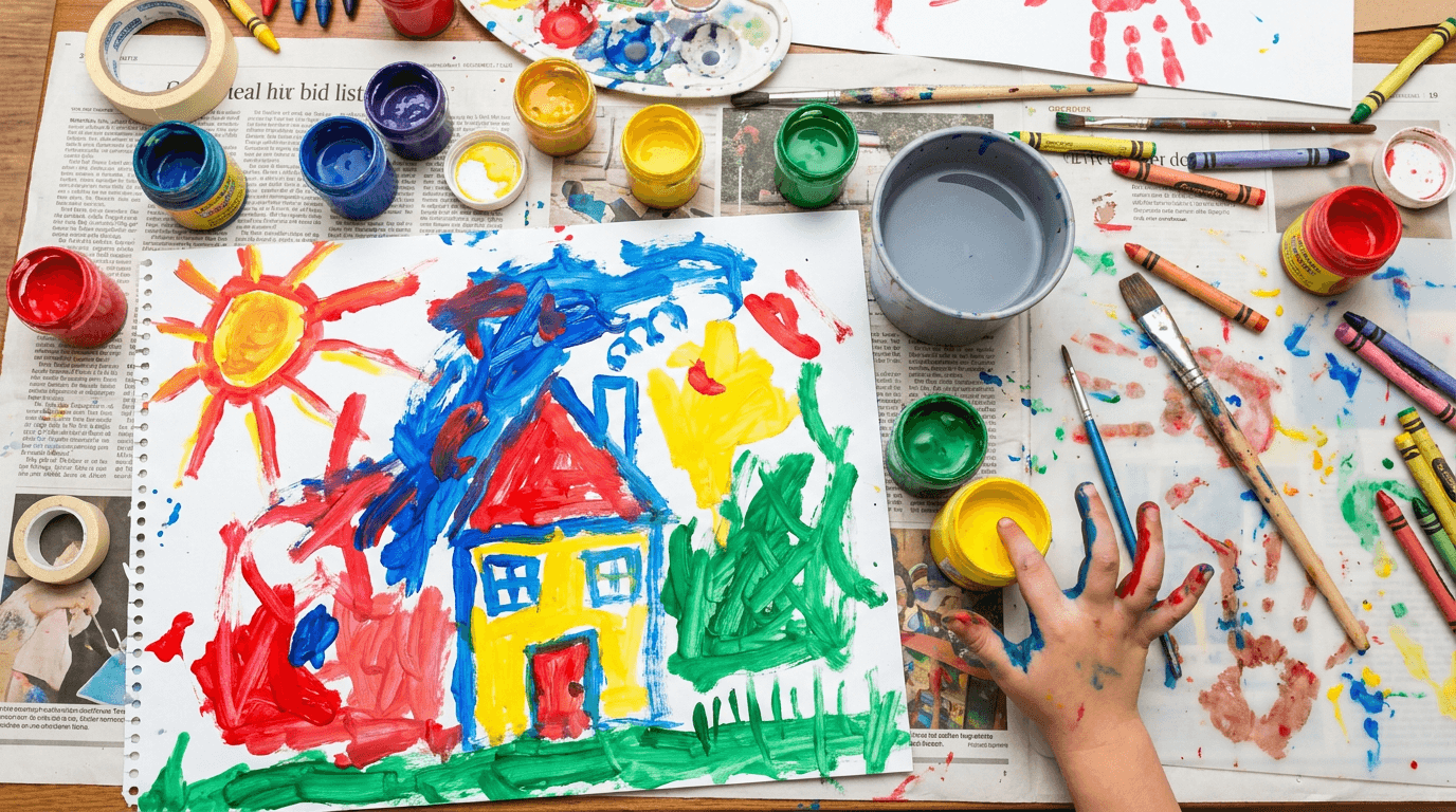
Prompt:
colorful creative mess photograph of [a children's art-making scene in beautiful, vibrant disarray — the visual celebration of creative process over finished product: a child's art workspace covered in the evidence of active creation — a low table or a protected floor surface spread with the abundant materials and results of an art session in progress, paint is the dominant medium — several small pots or cups of non-toxic children's paint in vivid colors (bright red, cobalt blue, sunshine yellow, emerald green, orange, purple, pink, white) with paint brushes of various sizes standing in the pots or lying across the surface, their bristles loaded and stained with color, the painting in progress is visible — a large sheet of thick art paper or a small canvas showing a child's painting: bold, expressive, free strokes of vivid color creating something abstract or the recognizable-if-you-squint form of a house, a sun, a family, a cat — the artwork has the specific vitality of unselfconscious child creativity that adult artists spend careers trying to recapture, paint has escaped the paper — colorful drips and small smears on the table surface, on the newspaper or protective covering beneath, perhaps a handprint in blue paint on the edge of the paper — the "mess" that is actually the evidence of full-body creative engagement, a small hand may be visible at the frame edge — fingers painted in multiple colors, holding a brush or reaching for a paint pot — the hand both evidence of the creator and scale reference for the workspace, additional art materials surround the painting: a cup of water (now tinted cloudy purple or grey from brush rinsing), a palette or paper plate used for color mixing showing the beautiful secondary colors created where primary colors met, a few crayons or colored pencils scattered among the paint supplies, a roll of tape, a glue stick — the maximalist toolkit of a child who uses everything available, the workspace surface shows its protected covering — newspaper, a plastic mat, or a dedicated art table with accumulated paint marks from many sessions — the surface communicating that this is a space where creativity is encouraged and mess is welcomed, finished or drying artwork may be visible at the edges — a painting clipped to a drying line with small clothespins, or another paper with a dried artwork resting beside the active workspace, the setting is bright and creative — a playroom corner, a kitchen table covered for art, a classroom or studio space — the environment designed to say "make whatever you want," the overall scene communicates: this is what creativity looks like when children are given materials, time, and permission — it is colorful and messy and vital and joyful, these art supplies facilitate the creative expression that builds confidence, self-expression, and the joy of making] in a bright, close-range creative-workspace composition, the photograph is taken from above or near-overhead — looking down at the art workspace in the flatlay-adjacent perspective that shows the full spread of materials, the painting, the mess, and the tools in their creative-chaos arrangement, the composition fills the frame with color and activity — the workspace extending to the frame edges, the abundance of materials and the spreading paint creating a visual field of creative energy, the painting in progress is centrally or prominently positioned — the child's artwork as the composition's narrative center, the creative output that all the materials serve, the paint pots and brushes are scattered organically — not arranged in a tidy row but in the natural positions where a working child leaves them: some upright, some tipped, some clustered, some isolated, the paint drips and smears add spontaneous color throughout — the "accidents" that are actually the most charming visual elements, the beautiful evidence of a process more important than tidiness, the child's hand (if present) adds human scale and active creation — paint-stained fingers that show the full-body engagement of children's art making, the additional materials (water cup, crayons, mixing palette) fill gaps and add variety — each element a different shape, color, and texture contributing to the visual richness, the depth of field is moderate to deep — most of the workspace in focus to show the full spread of creative activity, perhaps the very edges softening slightly, the lighting is bright and even — the generous overhead illumination that shows every color at its most vivid and every detail clearly, bright warm light makes the paint colors sing — the red vivid and warm, the blue deep and rich, the yellow brilliant and sunny, every color at maximum saturation and vibrancy in the bright illumination, the wet paint catches the light with slight glossy sheen — the freshly applied paint reflecting the overhead light with the liquid quality that communicates "just painted, still wet, still in progress," the dry paint and paper surfaces absorb the light with matte flatness — the contrast between wet and dry telling the story of the painting's progression, the child's hand (if present) catches the warm light with paint-enhanced skin — the paint on the fingers catching light differently than the skin, the combination charming rather than messy, the water cup catches the light with its tinted translucency — the cloudy colored water showing the rinsing of many colors, a beautiful accidental creation, the newspaper or protective surface catches the light with its own informational texture — the text and images of the newspaper partially visible under the paint accumulation, the overall brightness communicates joy — the visual energy of a creative session where everything is vivid, active, and alive with color, vivid rainbow paint palette — bright red, cobalt blue, sunshine yellow, emerald green, orange, purple, pink, white — against natural paper and protective surface in newspaper grey or neutral mat tone — warm wood table visible at edges — painted child's hand skin tones — cloudy water cup in mixed grey-purple — bright art paper white with vivid painting strokes — and the maximally colorful, joyfully messy palette of a children's art-making session in bright even overhead light as the color palette, the mood is joyfully creative vibrantly messy expressively free and the specific creative-play message — art-making is valuable, the mess is beautiful, the process matters more than the product, these materials invite self-expression and the confidence that comes from making something with your own hands and your own ideas — the creative-mess photograph as the process-celebration visual that makes parents see the beauty in creative chaos and want to facilitate it for their children, professional editorial and lifestyle photography with bright even overhead light and moderate-to-deep depth of field keeping the full creative workspace in vivid colorful focus, composed as an overhead creative-flatlay of an active art session with painting, paints, tools, and creative mess in full vibrant display, the paint color vibrancy and the creative-process evidence and the child-art vitality as the creative-play focal points, maximum color saturation against neutral surface, no text overlays, no logos, no watermarks
Best for: Social media creative-play content (extremely high engagement — parents love and share creative-mess imagery), website product page for art supplies and creative materials, email marketing creative-play and art-supply campaigns, paid advertising targeting creative-parenting audiences, Pinterest kids art, creative activities, and rainy-day play boards, blog and editorial content about creative development, influencer brief for parenting and kids-activity content creators, seasonal marketing for indoor play and holiday crafts, art supply brand positioning content
Template 10: The Baby and Toddler — Developmental Milestone Context
This template addresses the youngest age segment — baby and toddler products — with imagery that shows developmental toys in the context of early milestone moments (grasping, stacking, sorting, first steps) while maintaining the warm, soft, safe visual quality that the infant category demands.
Prompt:
soft developmental milestone photograph of [a baby's first-play scene with age-appropriate developmental toys in a warm, safe, intimate setting — the visual language of early childhood rendered through soft, gentle, protective imagery: a clean, soft play surface — a thick organic cotton playmat in warm natural cream or soft grey, or a round woven play rug in neutral tones — spread on a bright, clean floor, the surface communicating the soft, safe ground that parents prepare for babies learning to sit, reach, and explore, on the play surface a curated collection of baby-appropriate developmental toys: a set of smooth wooden stacking rings on a rounded post — three to five rings in graduated sizes and soft, muted modern colors (dusty rose, sage, sky blue, cream, natural wood) — the largest ring removed from the post and lying on the mat nearby, suggesting the baby's work of removing and (eventually) replacing the rings, a soft fabric sensory ball with different textures on each panel — organic cotton, linen, velvet, a crinkle panel — the ball resting where a baby has released it after exploring, a small wooden rattle or grasping toy — a simple, smooth ring or dumbbell shape that fits perfectly in a baby's fist, the wood warm and obviously safe and smooth, a board book with thick pages — perhaps partially open, showing a simple, colorful illustration — the first reading experience alongside the first play, the toys are arranged as if a baby has been playing — not in packaging configuration but in the natural scatter of a sitting baby reaching and exploring within arm's length, each toy within the radius of a seated infant's reach, a baby's presence is strongly implied but not shown — the scene has just been played with, the baby has been lifted up for a diaper change or a feeding break, the evidence of their play (the displaced stacking ring, the released ball, the opened book) telling the story of their exploration, the setting is intimately nursery — the play surface is near the base of a crib or beside a low shelf, the room elements in soft background suggesting the warm, protected environment of a baby's space, the light is soft and gentle — the quality of diffused daylight in a nursery, everything warm and low-contrast, no harsh shadows or bright spots, the protective lighting quality that matches the protective environment, the overall scene communicates: these toys are safe, they are developmentally appropriate, they are designed for tiny hands and developing minds, they are the first toys of a childhood being built with care and intention — the visual equivalent of holding a parent's hand while taking the first steps into play] in a soft, intimate developmental-play composition, the photograph is taken from a moderately elevated angle — approximately 30-45 degrees — looking down at the play surface from the perspective of a parent sitting on the floor beside their baby, the warm, close viewpoint of the caregiving presence, the composition shows the play surface as a warm, bounded world — the circular rug or rectangular mat defining the play space, the toys arranged within it, the surrounding room in soft distance, the toys are arranged in the organic scatter of baby play — within reach of an imagined center point where the baby sat, each toy at a different angle and distance, the natural randomness of a baby's exploration pattern, the stacking toy with its removed ring tells the developmental story — the ring off the post showing the grasping-and-pulling skill the toy develops, the post with remaining rings showing the stacking skill that comes next, the fabric ball and the rattle add sensory variety — different textures, different sounds, different weights, communicating the multi-sensory approach of thoughtful developmental play, the board book adds early literacy — its thick, baby-safe pages visible, its simple illustrations suggesting the first reading experience, the play surface fills most of the frame — the soft, safe ground plane that is the baby's world at this age, the room beyond is in soft blur — warm, protective, nursery-adjacent, recognizable as a safe space without specific detail, the depth of field is moderately shallow — the central toys in soft, warm focus with the mat edges and room in gentle, protective blur, the soft focus throughout (even in the "sharp" zone) maintains the gentle, baby-soft quality that this age category requires, the lighting is the softest and most diffused of any template — the gentlest possible illumination: fully diffused natural light with no directional quality, the even, wrap-around softness of light in a well-curtained nursery, no shadows at all or the most gentle, barely-visible shadows — the shadowless quality that communicates complete safety and the gentle protected world of infancy, the toys catch the soft light with their muted, gentle colors — the dusty rose and sage and sky blue of the stacking rings soft and appealing without being stimulating, the colors balanced for visual appeal and developmental appropriateness, the wooden surfaces glow with gentle warmth — the natural material catching the diffused light with smooth, even luminosity, the grain visible but soft, the surface obviously smooth and safe, the fabric ball and the textile play surface catch the light with soft material absorption — the organic cotton's gentle matte quality, the different texture panels barely distinguishable in the soft light but suggesting tactile variety, the board book's pages catch the soft light with a gentle cream luminosity — the thick pages and simple illustrations visible with clarity, the floor surface beyond the mat catches ambient warmth — the room's light, even presence suggesting a warm, lit, safe space, muted soft modern baby-toy colors — dusty rose, sage green, sky blue, warm cream, natural pale wood — against warm cream or soft grey organic cotton play surface — warm nursery background tones in softest blur — gentle natural ambient overall — and the soft, muted, warm, gentle palette of a baby developmental play scene in the most diffused and gentle natural light possible as the color palette, the mood is softly protective developmentally nurturing gently inviting and the specific baby-product visual message — these toys are as safe and gentle as the light that illuminates them, they are designed by people who understand infant development and who care about the smallest details of the smallest hands, the materials are natural and non-toxic, the colors are chosen for developing eyes, the forms are designed for developing grasps — the developmental photograph as the safety-and-care communication that parents of the youngest children need to see before they trust a brand, professional product and lifestyle photography with very soft fully diffused natural light and moderately shallow depth of field with overall gentle focus quality, composed as a moderately elevated view of a baby's play surface with developmental toys in organic play-scatter arrangement, the muted gentle colors and the soft safe surfaces and the developmental-stage appropriateness as the trust-and-care focal points, soft muted warm tones throughout with the gentle quality of infant-age imagery, no text overlays, no logos, no watermarks
Best for: Social media baby and infant content (high engagement with new and expecting parents), website product page for baby developmental toys and infant products, Amazon listing imagery for the 0-2 age category, email marketing new-parent and baby-milestone campaigns, paid advertising targeting expecting parents and new parents, Pinterest baby play, developmental activities, and nursery boards, blog and editorial content about infant development and first toys, gift guide submissions for baby shower and new-baby gifts, registry platform product imagery
Template 11: The Family Game Night — Board Game and Group Play Scene
This template captures the social play experience — board games, card games, cooperative games, and family interaction — showing the product as a vehicle for connection, laughter, and the family-together moments that parents purchase as much as the game itself.
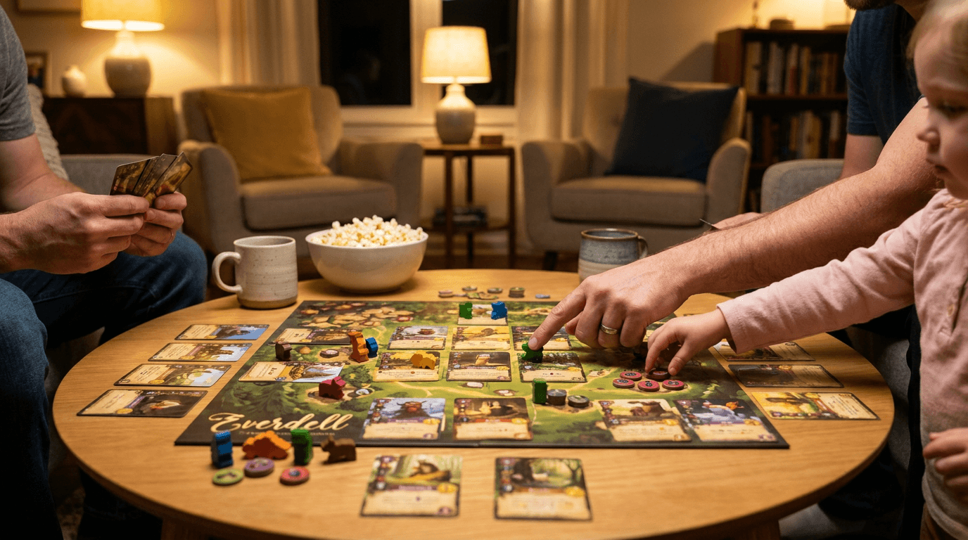
Prompt:
warm family game night photograph of [a board game or family game in active play on a living room table or floor — the scene capturing the energy, connection, and warmth of families playing together: a game spread across a warm surface — a living room coffee table in natural wood or a dining table cleared for game night, the game board visible and mid-game: pieces moved to various positions, cards drawn and held or placed, the game in a state of active play rather than fresh-from-the-box setup, the game itself is beautiful — a modern, design-conscious children's or family game with appealing artwork, quality component materials (thick cardboard tiles, wooden pieces, illustrated cards), and the visual quality that makes the game itself an attractive table object, game components are spread in the natural pattern of play — pieces on the board, cards in small piles, a dice or spinner recently used, scoring tokens arranged, the game organized but actively in use, hands are visible — adult hands and child-sized hands interacting with the game: a small hand reaching for a piece or drawing a card, an adult hand pointing at the board or holding cards, perhaps two or three pairs of hands from different people around the table, the hands communicating multi-player interaction and the inter-generational quality of family game play, the hands show scale and age range — clearly different sizes suggesting a parent and children playing together, the small hands of a young child alongside the larger hands of a parent or older sibling, around the game table the atmosphere of a family evening is established: a bowl of snacks (popcorn, pretzels, fruit) positioned beside the game, glasses of water or mugs visible at the table edge, the warm ambient lighting of an evening at home — lamps rather than overhead light, the cozy quality of family time after the day's activities, the seating arrangement is suggested through the hand positions and the table arrangement — the viewer understands that people are gathered around the game from multiple sides, the family unit assembled around a shared activity, cushions or a sofa edge visible in the background — the living room context establishing this as home, as family time, as the relaxed, connected evening that game nights create, the overall scene communicates: this game brings people together, it creates the family moments that parents value and children remember, it is designed beautifully and played joyfully, this is what screens-off family time looks like] in a warm, intimate game-night composition, the photograph is taken from above or at a slight angle over the game table — the perspective that shows the game board, the components, the hands, and the table context in the engaged overhead view of active play, the composition centers on the game — the board or playing field as the visual anchor, the components creating the narrative of a game in progress, the hands enter the frame from multiple edges — suggesting the surrounding players without showing their faces, the multi-directional hand presence communicating the gathered-around-the-table quality of game play, the game components are detailed and visible — the quality of the illustration, the material of the pieces, the design of the cards all readable as quality information, the snack bowl and drinks add the family-evening atmosphere — the comfortable, sustained quality of an activity that families settle into for the duration, the table surface provides the warm stage — its wood grain or clean surface the ground for the game world, the background shows warm, lamp-lit room — the evening atmosphere of a living room in the soft blur beyond the table edge, the depth of field is moderate — the game board and hands in clear focus with the periphery in warm evening softness, the lighting is warm evening-indoor — the specific quality of lamp light in a living room: warm, amber-toned, directional from multiple warm sources (table lamps, perhaps a floor lamp), the warm artificial light creates the cozy, intimate quality of family evening — different from the bright natural light of daytime content, the game board and components catch the warm lamp light — the colors of the game visible and vivid under the warm illumination, the quality of the components shown in the flattering evening light, the hands catch the warm light with natural skin tones — the warmth of the lamp light making the skin tones rich and glowing, the gesture and interaction visible in the directional warmth, the snacks and drinks catch the warm light with appetizing quality — the popcorn golden, the drink surfaces reflecting warm points of light, the table surface catches the warm lamp light with its material response — the wood grain enhanced by the warm directional sources, the background is in warm amber blur — the lamps as soft bright orbs, the furniture as dark warm shapes, the evening room as a cozy, contained world, warm amber evening lamp light throughout — game board and component colors as the vivid center (specific to the game: illustrated cards, colorful pieces, decorated board) — warm wood table surface — warm skin tones of multiple hands — snack bowl golden tones — drink glass reflections — warm background lamp glow — and the warm, connected, lamp-lit palette of a family game night in intimate evening indoor light as the color palette, the mood is warmly connected playfully competitive family-intimate and the specific game-night message — this game creates the moments that families value: the laughter, the friendly competition, the shared time, the screens-off connection that parents seek and children remember, buying this game is buying family time — the game-night photograph as the social-play and family-connection visual that sells the experience and the togetherness the game facilitates, professional lifestyle and editorial photography with warm ambient evening lamp light and moderate depth of field keeping the game and hands in warm detailed focus with the evening room in soft amber background, composed as an overhead or slightly angled game-table scene with active play and multi-generational hand presence, the game-in-progress energy and the warm evening atmosphere and the family-connection quality as the social-play focal points, warm amber evening tones with vivid game-component colors, no text overlays, no logos, no watermarks
Best for: Social media family and connection content (high engagement across all parent demographics), website product page for board games and family games, email marketing family activity and gift campaigns, paid advertising targeting family audiences and gift purchasers, Pinterest family game night and activity boards, influencer brief for family and parenting content creators, holiday and birthday gift guide editorial imagery, seasonal marketing for indoor play and holiday family time, Amazon A+ content family-context sections
Template 12: The STEM and Building — Construction in Progress
This template showcases building toys, construction sets, and STEM products in their most visually compelling state — mid-build, with the structure emerging and the engineering visible. The image communicates the creative-technical challenge that makes building toys engaging and the achievement that makes them satisfying.
Prompt:
dynamic STEM building photograph of [a construction toy set mid-build — the moment of engineering and creation captured as the structure emerges from the pieces: a modern building-toy system — perhaps magnetic building tiles in vivid translucent colors (blue, green, red, yellow, orange, purple — each tile a flat geometric shape: squares, triangles, hexagons — that connect magnetically at the edges), or a wooden block construction set with interlocking or stacking architectural blocks, or a creative building system with gears, axles, and panels in bright primary colors — the specific building system presented in its most architecturally impressive in-progress state, the structure is impressive and mid-construction — a tower or a bridge or a geometric dome or an elaborate vehicle taking shape, tall enough or complex enough to demonstrate the system's engineering potential, the structure is clearly child-built (slightly imperfect, creatively asymmetric, ambitiously engineered) rather than following the instruction manual precisely, some pieces are still separate — a collection of unbuilt pieces arranged nearby or scattered around the base of the structure, showing the building system's component variety and the remaining potential yet to be assembled, the translucent or colorful pieces catch the light dramatically — if the tiles are translucent, they glow with vivid stained-glass color where the light passes through them, creating the most visually stunning quality of magnetic tile construction, if opaque, they create bold color blocks that contrast and harmonize in the assembled structure, the structure sits on a clean floor or table surface — a light wood floor or a bright table providing the neutral base for the colorful construction, the building area shows the spread of active construction — the zone around the structure where pieces have been sorted, tried, and selected, the working radius of a focused young builder, a child's hands may be visible — placing a piece at the top of the structure, holding a section while adding to it, reaching for the next piece — the hands showing scale and active engineering, the moment of construction rather than passive observation, the setting is bright and airy — a well-lit playroom or living room, the natural light making the colorful construction pieces as vivid as possible, the background in soft focus showing a bright, clean room, the overall scene communicates: this building system enables serious engineering creativity, the child who plays with this is solving real spatial and structural problems, the play is deeply engaging because it combines creative vision with physical construction — and the result looks spectacular] in a bright, dynamic construction-in-progress composition, the photograph is taken from a low angle — at or slightly below the structure's mid-height — looking up at the construction with the perspective that makes it appear impressive and architectural, the same low angle a child uses when they crouch to examine and admire their creation, the structure fills the upper portion of the frame — its height and complexity the visual statement, its engineering visible in the connected pieces and the spanning forms, the loose pieces at the base provide the visual foundation — scattered with the purposeful disorder of active construction, showing the component variety and the building system's potential, the child's hands (if present) are positioned at the active construction point — the interface between completed structure and next addition, the decisive engineering moment, the floor or surface extends forward from the structure — showing the building-zone spread and providing visual ground for the vertical construction, the background is bright and clean — enough room visible to establish context without competing with the colorful structure, the depth of field is moderate — the structure in clear, detailed focus with the background and floor in gentle blur, the construction details (connection points, piece geometry, structural logic) visible in the focused area, the lighting is bright and clear — the generous illumination that makes colorful construction pieces as vivid as possible and translucent pieces as dramatic as possible, if the pieces are translucent, a strong light source from behind or to the side creates the stained-glass glow effect — the light passing through colored tiles creating vivid saturated color and warm color-cast shadows on the surface below, this backlit translucence is the most visually compelling quality of magnetic tile construction and should be maximized, if the pieces are opaque, bright even front light shows the bold colors at full saturation — each color distinct and vivid, the assembled structure a colorful architectural statement, the structure catches the light with three-dimensional modeling — the built form casting shadows within itself, the overhangs and arches and walls creating the light-and-shadow interplay that makes the construction read as real architecture, the loose pieces on the surface catch the light individually — each one a small vivid color element, the scattered pieces creating a constellation of color around the structure's base, the surface catches reflected or transmitted color — if translucent pieces are backlit, vivid color shadows fall on the light surface, creating a beautiful secondary effect, vivid saturated building-toy colors — translucent blue, green, red, yellow, orange, purple if magnetic tiles, or bright primary and secondary colors if opaque building systems — against light wood or bright neutral surface — warm child's skin tone if hands present — bright ambient room light — and if translucent pieces: the luminous stained-glass quality of backlit colored tiles with vivid color shadows on the surface as the dominant visual quality — bright, energetic, architecturally colorful palette of a STEM construction toy in dynamic bright light as the color palette, the mood is dynamically creative structurally impressive brilliantly colorful and the specific STEM-building message — this toy develops spatial reasoning, engineering thinking, and creative problem-solving through the deeply satisfying act of building something real and impressive with your hands, the play is challenging and rewarding and the results are spectacular — the construction photograph as the engineering-potential and creative-achievement visual that convinces parents of developmental value and excites children with building possibility, professional product and editorial photography with bright clear light (with backlight for translucent pieces) and moderate depth of field keeping the structure in vivid detailed focus from a low impressive angle, composed as a dynamic low-angle construction-in-progress with building-zone context, the structural impressiveness and the vivid color drama and the engineering-in-progress as the STEM-value focal points, maximum color saturation and vivid translucent drama if applicable, no text overlays, no logos, no watermarks
Best for: Social media STEM and building content (high engagement and high shareability — impressive child constructions are widely shared by parents), website product page for building toys and construction sets, Amazon listing imagery showing the system's potential beyond box art, email marketing STEM and educational content, paid advertising targeting education-focused and gift-purchasing parents, Pinterest STEM play and engineering activities boards, influencer brief for education and STEM-play content creators, gift guide submissions for STEM and construction categories, blog and editorial content about spatial reasoning and engineering play
Template 13: The Seasonal Gift — Holiday and Birthday Arrangement
This template creates the gift-context visual that drives the peak purchasing moments for children's products — holidays, birthdays, and celebrations. The image positions products within the emotional context of giving, receiving, and the joy of a child's special occasion.
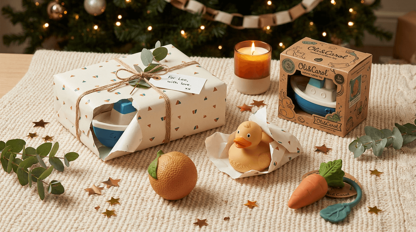
Prompt:
festive children's gift arrangement photograph of [a beautiful gift-giving scene for a child — toys arranged in a warm, celebratory context that communicates the joy and generosity of gifting quality toys: a collection of three to five toys from the same brand or in a complementary aesthetic — arranged as a curated gift assortment on a warm, festive surface: the toys are wrapped and unwrapped in various stages — one toy fully wrapped in beautiful paper (a modern, sophisticated wrapping paper in a warm pattern: perhaps a gentle geometric print, or small illustrated animals, or a simple stripe in the brand's colors — not garish holiday cliché but design-conscious gift wrapping), the wrapping paper slightly torn or being pulled back to reveal the product inside, one or two toys fully revealed — out of wrapping, their packaging visible or the toys themselves displayed, their quality and design visible as the gift-inside-the-gift, the remaining toys in their beautiful brand packaging — the boxes or containers that are themselves gift-worthy (see Template 6), the arrangement sits on a warm surface with gentle festive context: a soft knitted blanket or a plush rug in a warm tone (cream, soft gold, warm grey), a few small celebratory elements — a sprig of eucalyptus or a small branch of seasonal greenery, a simple candle in a clean holder, a few small metallic confetti pieces or stars in gold or copper scattered on the surface, a handwritten gift tag visible on one package — but the festive elements are restrained and modern, not overwhelming or garishly seasonal, the wrapping paper ribbon or twine adds a textural-festive element — natural jute twine or a simple grosgrain ribbon in a warm accent color, perhaps with a small sprig of greenery tucked into the bow, the setting beyond the gift arrangement suggests a warm home — the base of a decorated tree in soft blur (for holiday context), or a birthday table with simple paper garland visible above (for birthday context), or simply a warm, bright room with the ambient suggestion of celebration, the overall scene communicates: these gifts were chosen with care and wrapped with love, they are beautiful before they are opened and more beautiful after, the act of giving quality toys is itself a meaningful expression of love and attention — the gift arrangement as the celebration of thoughtful gifting] in a warm, festive gift-display composition, the photograph is taken from slightly above — approximately 30-40 degrees — showing the full gift arrangement from the elevated perspective of someone presenting or admiring the assembled gifts, the composition is generous — multiple products arranged with intentional spacing, each one visible and identifiable while contributing to the overall abundance of the gift assortment, the wrapped and unwrapped products create visual variety — the wrapped gifts adding pattern, texture, and the anticipation of discovery, the unwrapped products showing the quality inside, the torn-wrapping-in-progress product creating the dynamic energy of the unwrapping moment, the festive surface elements add warmth and celebration — the greenery, the candle, the confetti, the ribbon — each element small and restrained but contributing to the overall celebratory atmosphere, the gift tags and wrapping details are charming — the handwriting, the natural twine, the chosen paper — each detail communicating the care and intentionality of the gift-giver, the background festive context (tree, garland, warm room) provides the occasion-specific setting — identifiable enough to communicate "holiday" or "birthday" without dominating the gift arrangement, the depth of field is moderate — the gift arrangement in clear warm focus with the festive background in gentle, glowing blur (the Christmas tree becoming soft warm light points, the garland becoming soft color shapes), the lighting is warm and celebratory — the enhanced version of the indoor-evening warmth: warm lamp light with perhaps the additional warm glow of candles or string lights, the festive light quality that makes gifts look magical, the warm light catches the wrapping paper with its printed pattern — the paper quality visible, the design charming, the slightly torn edge creating shadow and dimension, the revealed products catch the warm light with their quality — the toy surfaces showing their material and color in the flattering festive illumination, the metallic elements (confetti, perhaps a gift-tag clip) catch the warm light with small bright highlights — tiny sparkling points that add festive energy, the greenery catches the light with natural green — a fresh, alive element in the warm composition, the knitted or plush surface catches the warm light with cozy textile texture — the soft foundation for the gift display, the overall light quality communicates celebration and warmth — the special, elevated quality of a home on a gift-giving occasion, warm festive tones — wrapping paper pattern in modern, brand-aligned colors — brand packaging colors on revealed products — product colors visible through opened wrapping — natural jute or warm ribbon accent — soft gold or copper metallic confetti sparkle — fresh green eucalyptus or greenery — warm cream or soft gold textile surface — warm amber candle or lamp light — soft warm blur of background festive context (warm tree lights or gentle garland colors) — and the warm, generous, festive palette of a children's gift arrangement in celebratory warm indoor light as the color palette, the mood is warmly generous celebratory joyful thoughtfully given and the specific gift-occasion message — these are gifts worth giving and worth receiving, chosen with care and wrapped with love, the quality of the toys matches the quality of the occasion, this brand makes products that are as meaningful to give as they are to play with — the gift photograph as the peak-occasion visual that drives holiday and birthday purchasing and communicates the emotional significance of giving quality toys to children, professional editorial and lifestyle photography with warm ambient evening-festive light and moderate depth of field keeping the gift arrangement in warm detailed focus with the festive background in soft celebratory blur, composed as a slightly elevated festive gift display with wrapped and unwrapped products in a warm celebratory setting, the gift-worthiness and the design quality and the festive warmth as the occasion-purchase focal points, warm celebratory tones with brand-aligned wrapping and product colors, no text overlays, no logos outside products and gift tags, no watermarks
Best for: Social media holiday and birthday gift guide content, email marketing holiday and seasonal gift campaigns, paid advertising during peak gift-purchasing periods (November-December, pre-birthday targeting), Pinterest gift guide and holiday boards, website holiday collection and gift guide pages, influencer brief for holiday gift guide content, Amazon storefront seasonal merchandising, blog and editorial holiday and birthday gift guide features, catalog and promotional holiday materials
Template 14: The Brand Flat Lay — Collection Display
This template showcases the brand's product collection in the classic flat-lay format — an overhead composition that displays the product range with graphic precision and visual consistency. The flat lay communicates brand completeness, aesthetic coherence, and the satisfying visual order that design-conscious parents respond to.
Prompt:
overhead brand collection flat lay photograph of [a complete collection of children's toys and products from a single brand, arranged in a graphic, satisfying overhead composition — the product range displayed as a visual catalog of the brand's world: the products are laid out on a large, clean surface — warm natural linen or light wood or clean matte white paper — with each item given deliberate space and position in the overall composition, the collection includes a curated range of the brand's products: perhaps five to eight items including a wooden stacking toy, a set of wooden blocks, a plush animal, a wooden vehicle, a set of crayons or art supplies in the brand's aesthetic, a board book, a sensory rattle, and a small fabric storage bag — the range demonstrating the brand's breadth while maintaining unmistakable aesthetic coherence, every product shares a consistent design language — the same wood types, the same color palette (a curated set of five to seven colors used across all products: perhaps warm terracotta, sage, dusty blue, sunshine yellow, cream, and natural wood), the same typography style on any packaging or printed material, the same quality standard visible in every piece, the arrangement is geometric and satisfying — products placed in deliberate relationship to each other, aligned on invisible grids, spaced with consistent breathing room, the overall composition balanced and symmetrical or deliberately asymmetric in a design-intentional way, some products are grouped by category or function — the blocks together, the art supplies together — while others are placed individually to show their specific form and design, small detail elements fill spaces between products — a few loose blocks, a couple of crayons, a small piece of twine, a leaf — the small elements acting as visual punctuation that prevents the composition from feeling rigid, the brand's visual identity is visible throughout — not just in individual products but in the overall chromatic consistency, the material coherence, and the design intelligence of the range as a whole, every edge is clean, every surface is pristine — the flat lay communicates quality control and brand standards through the perfection of the arrangement, the overall composition communicates: this is a complete brand world, every product designed with the same care and the same aesthetic intelligence, a parent who buys one product can trust the entire range — the flat lay as the brand portfolio displayed with graphic precision] in a precise overhead flat-lay composition, the photograph is taken from directly overhead — the true flat-lay angle that shows every product's top or face, creating the graphic, catalog-like quality that this format requires, the composition is structured — products placed on invisible grid lines or in a balanced arrangement that reads as intentionally designed, the mathematical quality of the spacing and alignment communicating the brand's design thinking, every product faces upward — labels up, faces up, identifying features up — each product identifiable and distinguishable in the overhead perspective, the spacing between products is consistent — the breathing room equal across the arrangement, creating visual rhythm and the satisfying order of a well-organized collection, the edge elements (loose blocks, crayons, small pieces) add organic warmth to the geometric structure — preventing the composition from feeling sterile while maintaining the overall order, the surface extends to the frame edges — the clean ground creating the boundary-less quality that suggests the brand's world continues beyond the visible frame, the arrangement has a clear visual center — perhaps the largest or hero product positioned centrally with others radiating or organized around it, or a symmetric arrangement that balances evenly across the frame, the depth of field is very deep — everything in the flat lay in equal, consistent sharp focus from edge to edge, the true overhead perspective combined with deep focus creating the graphic quality that flat-lay photography depends upon, the lighting is bright, even, and shadow-minimal — the overhead lighting that shows every product clearly and consistently, no directional shadows that would create hierarchy or hide details, even illumination means every product at every position in the frame receives the same light quality — the same brightness, the same color temperature, the same shadow-free clarity, the surface catches the even light with its uniform quality — the linen weave or wood grain or paper texture visible but consistent across the entire frame, each product catches the even light with its specific material response — the wood with warm grain visibility, the fabric with soft textile quality, the paper with matte illustration clarity — each material identifiable under the even illumination, the brand's color palette is shown to maximum effect under even light — every terracotta is the same terracotta, every sage is the same sage, the color consistency across the range visible and satisfying, the overall brightness communicates clarity and openness — the visual equivalent of the brand showing everything it makes with nothing hidden, curated brand color palette repeated consistently across all products (terracotta, sage, dusty blue, sunshine yellow, cream, natural wood — or brand-specific palette) against warm natural linen or light wood or clean white surface — consistent wood tones across wooden products — consistent fabric tones across soft products — small punctuation elements in brand colors — and the graphic, cohesive, palette-consistent overhead flat-lay composition of a complete children's brand collection in even bright overhead studio light as the color palette, the mood is graphically satisfying brand-complete aesthetically cohesive and the specific brand-range message — this is a complete design world for children, every product shares the same quality standard and aesthetic intelligence, the brand thinks systematically about play and design, you can trust the whole range because every piece demonstrates the same care — the flat-lay photograph as the brand-portfolio and visual-identity statement that communicates completeness, consistency, and design authority, professional overhead flat-lay photography with bright even studio lighting and very deep depth of field for consistent edge-to-edge focus, composed as a structured overhead collection display with deliberate spacing, alignment, and visual balance, the palette consistency and the material coherence and the graphic arrangement precision as the brand-identity focal points, curated brand palette against clean surface with consistent material tones, no text overlays, no logos outside products, no watermarks
Best for: Website homepage collection showcase and brand-story hero, social media brand introduction and "meet the range" posts, email marketing brand introduction and new subscriber welcome, paid advertising brand-awareness creative, Amazon storefront and brand-store hero imagery, wholesale and retail buyer presentations, Pinterest brand and product collection boards, PR and media kit brand overview imagery, investor and partner presentation materials, print advertising and catalog brand-range spread, influencer brief brand-overview reference
Template 15: The Parent-Perspective Trust — Quality and Safety Visual
This template addresses the parent audience directly with imagery designed to build trust through quality demonstration, material transparency, and the visual evidence of safety and care. This is the image that reassures the evaluating parent that this brand is worthy of their child's hands.

Prompt:
trust-building quality detail photograph of [a close-up examination of children's toy quality — the visual evidence of safety, craftsmanship, and material integrity that reassures parents: a pair of adult hands holding and examining a wooden toy — the hands gently holding a beautifully crafted wooden toy (a car, a stacking piece, a building block, a figurine) at close range, the fingers positioned to show specific quality details: one hand supporting the toy while the other runs a thumb along the edge demonstrating the smooth, rounded, safe edge-finishing — no sharp corners, no splinters, no rough surfaces, the edge quality that matters most to parents of mouthing-age children, the toy in the hands is pristine — the wood surface flawlessly smooth, the paint finish even and consistent, the overall form precise and well-proportioned, the quality visible at this intimate, examining distance, the hands are adult hands — the hands of a parent or a craftsperson, the size difference between the adult hands and the child-sized toy reinforcing the protective, evaluative perspective: an adult is checking this product before a child plays with it, the wood grain is visible beneath the finish — the natural material communicated through visible grain that says "real wood, not plastic or composite," the grain adding warmth and natural beauty, the paint or finish on the toy is visibly non-toxic in quality — thin enough to show grain, matte or satin rather than glossy plastic-like, the warm muted tone (if painted) that characterizes non-toxic milk paint or plant-based finishes, specific quality details are visible at this close range: the precision of the machining or carving, the consistency of the paint application, the smoothness of the sanded surfaces, the clean meeting of painted and unpainted areas, the weight and substance of the piece (suggested through the way the hands hold it — it has heft, it is solid, not hollow or flimsy), the surface beneath is clean and bright — a light wood work surface or a white table, the examination happening in good light where details are clearly visible, additional toy pieces may be visible on the surface nearby — other pieces from the set showing the consistency of quality across multiple pieces, the setting suggests a quality-control or careful-selection context — the bright, clean examination of a product by someone who knows what quality looks like, perhaps with a simple magnifying glass or a quality-inspection feeling to the scene, the overall scene communicates: look at this quality, feel this smoothness, notice this precision — this product has been made with care by people who understand that children deserve the safest and best-crafted objects, we are confident enough to show you this close because the quality holds up to the closest examination] in an intimate close-range quality-examination composition, the photograph is taken at close range and a slightly elevated angle — looking at the toy in the hands from the perspective of the examiner's own eyes, seeing what they see: the quality detail, the smooth edge, the material integrity, the composition is tight — the hands and the toy fill most of the frame, the viewer drawn into the intimate, close examination with no distracting peripheral elements, the adult hands provide both the examination context and the scale — the toy is child-sized in adult hands, the protective quality of adult evaluation visible in the gentle, careful hold, the specific quality detail being demonstrated is the clear focus — whether it is the smooth edge, the paint finish, the wood grain, the joint precision, or the overall form — the viewer's eye is directed to the exact quality point the image communicates, the surface and any additional pieces provide supporting context — the examination environment and the consistency evidence, the depth of field is shallow — the quality detail point in crisp, detailed focus with the hands and the background in gentle supporting softness, the focused area shows the quality at maximum resolution: the wood fibers, the paint surface, the edge smoothness — visible in full detail, the lighting is clear, bright, and quality-revealing — the examination-quality illumination that shows surfaces honestly: bright enough to reveal any imperfection (and showing none), even enough to show the full surface without shadows hiding details, slightly directional to reveal the three-dimensional surface quality, the light catches the smooth surface with the gentle sheen of well-finished wood — the absence of roughness visible in the way light glides smoothly across the surface, the paint finish catches the light with its material response — the matte non-toxic paint absorbing light softly rather than reflecting with the harsh sheen of synthetic finishes, the wood grain catches the light with fine natural detail — the grain lines visible at this close range, communicating real wood rather than painted-over composite or printed veneer, the adult hands catch the warm light with natural skin tones — the warmth of the hands holding the toy communicating care and the human element of quality assessment, the overall light quality communicates transparency and honesty — the brand showing its product under the most revealing illumination possible, confident that the quality holds up, warm natural wood tones in close detail — visible grain lines — non-toxic paint finish in soft curated color (brand-specific muted tone) — warm adult skin tones — clean bright examination surface — clear bright quality-revealing light — and the honest, detailed, warm palette of a craftsmanship-quality examination in revealing close-range light as the color palette, the mood is honestly detailed quality-confident parent-reassuring and the specific trust-building message — we show you this close because we are proud of this quality, we understand that you are putting this in your child's hands and that nothing matters more, the smoothness you see is the smoothness your child will feel, the material quality is real and the craftsmanship is genuine — the quality-detail photograph as the parent-trust visual that says this brand deserves your confidence, professional macro and product photography with bright clear quality-revealing light and shallow depth of field keeping the quality detail in intimate sharp focus within hands-holding-toy context, composed as a close-range quality examination with adult hands and quality detail emphasis, the surface smoothness and the material honesty and the craftsmanship precision as the parent-trust focal points, warm natural wood and skin tones in detailed close-up, no text overlays, no logos, no watermarks
Best for: Website product page quality and safety sections, Amazon A+ content quality-detail and trust sections, social media quality-communication and behind-the-craft content, email marketing trust-building and brand-story content, paid advertising targeting safety-concerned parents, blog and editorial content about toy safety and quality standards, wholesale and retail buyer quality-demonstration materials, PR and media coverage quality-focused stories, Instagram and social media "why we're different" brand positioning content
How to Customize These Prompts for Your Specific Children's Brand
The templates generate compelling children's product visuals, but the most effective content reflects your actual brand — its genuine products, its specific aesthetic, its real materials, its authentic play philosophy, and the particular age range and parent demographic it serves. Customization transforms these templates from generic toy photography into content that accurately represents your brand's unique identity.
Replace generic product descriptions with your actual toy designs. If your products are silicone stacking cups rather than wooden rings, specify the material, the translucent quality, the specific silicone colors, the nesting form. If you make fabric dolls with specific character designs, describe the actual doll: the face embroidery style, the fabric choices, the clothing, the hair material, the size. If your building blocks are a specific geometric interlocking system, describe the connection mechanism, the piece shapes, and the engineering approach. The generated imagery should look like your products or your prototyped designs, not a generic toy brand.
Specify your brand's curated color palette precisely. The single most important customization for children's brand visual consistency is the color palette. If your palette is Scandinavian-minimal (natural wood, soft grey, white, with a single mustard accent), every prompt should specify those exact tones. If your palette is rainbow-modern (saturated primaries and secondaries but in specific calibrated hues), specify each color precisely. If your palette is pastel-soft (blush, sage, sky, cream, lavender), those tones should dominate every composition. Color consistency across all fifteen template types is the fastest path to brand recognition.
Match the age range to visual safety and complexity cues. Products for infants (0-12 months) require the softest, most diffused, most protective visual treatment — everything rounded, everything soft, everything communicating safety for the most vulnerable age. Toddler products (1-3) can show more activity, more color variety, and more developmental challenge. Preschool products (3-5) can include more complex play scenes, more detailed environments, and more creative mess. School-age products (5+) can show sophisticated engineering, structured games, and more detailed lifestyle contexts. The visual treatment must match the age, and the age signal must be clear to the parent evaluating developmental appropriateness.
Adjust the parent-demographic targeting through environment and surface choices. If your brand targets design-conscious urban parents, the nursery and lifestyle settings should reflect modern, architectural, design-forward spaces with high-end materials (marble, brass, Italian plywood). If your brand targets nature-connected, sustainability-focused parents, the settings should lean toward natural materials (raw wood, organic textiles, handmade ceramics), outdoor environments, and visible sustainability cues (cloth rather than plastic, wood rather than MDF, natural finishes rather than synthetic). If your brand serves a broad market, the settings should be clean and warm without strong aesthetic-tribe signaling — attractive to the widest parent audience.
Incorporate your actual packaging design for unboxing and gift templates. Your real packaging — the box design, the tissue paper color, the logo placement, the interior presentation, the card design — should be described precisely in Templates 6 and 13. The packaging experience is a significant brand touchpoint for children's products (especially in the gift context), and the generated imagery should accurately represent your actual design or your aspirational packaging direction.
For your actual products, photograph and enhance rather than replace. Generate AI imagery to establish your visual benchmarks and style guides — the standard of quality, composition, and atmosphere that your real product photography should achieve. Then photograph your actual products (real toys, real materials, real textures, real packaging) in environments and lighting informed by the generated references. Use the Image Inpainting tool to enhance your real product photographs to professional standard — improving lighting uniformity, cleaning up surface imperfections, enhancing background consistency, or adding subtle atmospheric quality while preserving your authentic products and materials. This workflow gives you the authenticity of real product photography with the visual quality of professional commercial imagery.
Platform-Specific Deployment for Children's Brands
Each platform where children's brands compete has specific visual requirements, display contexts, and parent-audience behaviors. Deploying the right content type in the right format optimizes conversion at every touchpoint.
Amazon product listing optimization for toys. Amazon is the dominant discovery and purchase platform for children's products. Its listing image requirements are specific: the primary image must show the actual product on a pure white background, but the gallery images and A+ content sections allow lifestyle, play-scene, and quality-detail imagery. Use Template 1 (adapted to white-background requirements) for the primary listing image, and deploy Templates 2 (play scene), 3 (educational context), 7 (nursery integration), 12 (building in progress), and 15 (quality detail) across the additional image slots and A+ content sections. For toys specifically, Amazon prioritizes listings that show the product at different angles, demonstrate the play experience, and include scale reference (a child's hand). Generate product images at 1:1 (1000x1000 minimum, 2000x2000 recommended) for Amazon compliance.
Shopify and DTC website deployment. For brands selling directly through their own e-commerce site, every template has a deployment position: Template 1 as the product page hero, Template 14 as the homepage collection showcase, Templates 2 and 7 as homepage lifestyle sections, Template 6 as the packaging and gift-readiness demonstration, Templates 3 and 12 as educational-value communication, Template 15 as the quality-trust section, and Template 13 as the seasonal gift-guide hero. The website is the brand's most controlled visual environment and should represent the highest quality and most consistent brand expression. For comprehensive e-commerce visual strategies, additional guidance covers DTC-specific optimization.
Instagram feed and grid strategy for children's brands. The children's brand Instagram grid functions as a visual portfolio and lifestyle-aspiration platform for parents. Maintain a grid ratio of approximately 30% product and collection shots (Templates 1, 4, 14, 6), 35% play scenes and lifestyle content (Templates 2, 7, 8, 9, 11), 20% educational and developmental content (Templates 3, 10, 12), and 15% seasonal and community content (Templates 13, 5, 15). Alternate between close-up product detail and wider lifestyle scenes to create visual rhythm across the grid. Use 4:5 for feed posts to maximize screen real estate. The grid should be visually coherent — consistent color temperature, consistent editing style, consistent brand presence. For Instagram-specific strategies, additional guidance covers platform optimization.
Pinterest for children's product discovery. Pinterest is one of the most important platforms for children's product discovery — parents use Pinterest to plan nurseries, find gift ideas, discover educational activities, and curate their aspirational parenting aesthetic. The most effective pin formats are 2:3 vertical images showing nursery integrations (Template 7), play scenes (Templates 2, 8, 9), product collections (Template 14), and gift arrangements (Template 13). Supplement-related searches on Pinterest — "wooden toys for toddlers," "nursery shelf ideas," "educational toys 3 year old," "kids art supplies" — drive significant direct traffic and sales for children's brands. Pin with keyword-rich descriptions including product type, age range, material type, play type, and room context.
TikTok and Reels for children's product content. Short-form video is increasingly important for children's brands — play demonstrations, unboxing reveals, "a day with our toys" routines, crafting and building time-lapses, and educational play demonstrations. Use these templates as thumbnail references and opening-frame compositions for video content. The Text2Shorts tool produces short-form play demonstration and product feature content. The Cinematic Video Generator creates atmospheric product and lifestyle videos. For TikTok-specific content, additional strategies cover short-form optimization.
Email marketing for children's brands. Email serves multiple functions for children's brands: welcome sequences introducing the brand world (Templates 1, 14, 7), age-milestone campaigns suggesting appropriate products as children grow (Templates 3, 10, 12), holiday and birthday gift campaigns (Templates 6, 13), play-inspiration and educational content (Templates 2, 9, 11), and subscription renewal and cross-sell (Templates 14, 5, 4). Each email type requires specific visual content, and the visual quality must be consistent across all email touchpoints.
Paid advertising creative across platforms. Facebook and Instagram ads perform best with Templates 2, 7, and 8 (play scenes and lifestyle content that stops the parental scroll), while retargeting ads use Templates 1, 4, and 15 (product-focused creative for audiences already familiar with the brand). Google Shopping uses white-background product shots (Template 1 adapted). Pinterest ads perform well with Templates 7, 13, and 14 (lifestyle, gift, and collection content). TikTok ads perform best with dynamic, authentic-feeling play content (Templates 2, 8, 9, 12). Each platform's algorithm rewards creative that generates engagement, and professional-quality children's product photography consistently achieves lower cost-per-click and cost-per-acquisition than amateur alternatives.
Retail and wholesale presentation materials. For brands with or seeking retail distribution, buyer presentations require specific visual content: Template 14 (collection flat lay) demonstrates the range, Template 6 (packaging) shows shelf-ready presentation, Template 1 (hero product) shows individual product quality, Templates 7 and 2 (lifestyle and play scene) demonstrate the brand's visual-marketing capability and the content that will drive consumer demand, and Template 15 (quality detail) communicates manufacturing standards.
Common Mistakes in Children's Brand Visual Content
Children's product photography fails in specific ways that directly impact parental trust, child appeal, and brand positioning. These mistakes are particularly costly because parents are making safety-and-quality decisions for their most precious audience — their children.
Using overly saturated or garish colors that signal "cheap." The most common color mistake in children's product photography is maximum saturation across random colors — the neon-bright, every-color-at-once approach that signals cheap mass-market products to design-conscious parents. Premium children's brands use curated color palettes with intentional relationships between colors. Even brands with vivid, saturated palettes (primary colors, rainbow ranges) achieve sophistication through consistency, intentional pairing, and the careful calibration of each specific hue rather than default-maximum-saturation randomness.
Photographing products in cluttered, realistic environments. While parents live with the reality of cluttered playrooms and toy-strewn floors, they do not aspire to that reality. Product photography that shows toys in cluttered, realistic environments triggers the visual fatigue that parents feel when looking at their own toy-overrun homes. The aspirational approach — beautiful, curated, clean-but-warm environments — sells the elevated version of childhood play that parents want to create. Show enough evidence of play to communicate real use, but maintain the visual beauty and order that aspirational marketing requires.
Failing to show the product in use or in a play context. Static product shots on white backgrounds are necessary for Amazon primary images and product identification, but they should not be the only imagery a children's brand creates. Products that are never shown in play context appear inert and unengaging. Parents need to see what the toy does — the tower it builds, the story it tells, the game it plays, the creative result it enables. At least half of a children's brand's visual content should show the product in a play or use context.
Neglecting material texture and quality detail. Parents of young children care deeply about material quality — the smoothness of wood, the safety of paint, the softness of fabric, the durability of construction. Photography that fails to show these material qualities (because of poor lighting, insufficient resolution, or too-distant framing) fails to communicate the quality information parents need to make a purchase decision. Every product should have at least one close-range image showing material texture and craftsmanship detail.
Using inconsistent visual quality across platforms. A children's brand with a beautiful Instagram grid but amateur Amazon listing photos creates a trust disconnect. The parent who discovers the brand through a gorgeous Instagram post and then finds poorly-lit, cluttered Amazon photos questions which version of the brand is real. Visual quality must be consistent across every platform, every listing, every email, and every advertisement.
Age-inappropriate visual treatment. Products for babies photographed with the bright, energetic, complex visual treatment appropriate for school-age products create an immediate mismatch — the parent unconsciously senses that the brand does not understand their child's developmental stage. Products for older children photographed with the soft, gentle, protective treatment appropriate for infant products appear condescending or inappropriately infantilizing. The visual treatment must match the age range of the target audience.
Over-relying on stock photography and generic child images. Stock photographs of children playing with toys are available but widely used, creating the same brand-inauthenticity problem that generic stock creates in any category. When parents see the same stock photo of a smiling child on multiple toy brands, trust in all of them erodes. Custom imagery — whether real photography with proper model releases or AI-generated product and environment shots — is essential for brand differentiation.
Ignoring the gift-purchase context. A significant portion of children's product purchases (especially in the premium segment) are gifts, and gift buyers evaluate products differently than primary-use buyers. Gift buyers need to see packaging quality, gift-readiness, price-justified visual substantiality, and the "wow factor" that makes a gift feel special. Brands that only create product-use imagery and neglect packaging and gift-context imagery miss the gift buyer entirely.
Using dark, dramatic, or adult-aesthetic lighting for children's products. The moody, dark, high-contrast photography that works effectively for adult consumer products (fashion, spirits, luxury goods) is wrong for children's products. Dark photography signals environments that are not safe for children, and the unconscious parental safety scan rejects dark-lit children's products. Children's product photography should be bright, warm, and well-lit — the visual equivalent of a safe, happy, well-monitored environment where children thrive.
Building a Complete Children's Brand Visual Content Pipeline
A successful children's brand requires an ongoing visual content ecosystem that supports product launches, seasonal campaigns, developmental-stage marketing, gift-occasion peaks, and the evolving brand narrative as products and ranges develop.
Establish the foundational product photography library first. Every product needs a core set of images: the clean hero shot (Template 1), a play-in-use scene (Template 2 or appropriate play template), a material-quality detail shot (Template 4 or 15), and an age-appropriate lifestyle context (Template 7 or 10). This foundation — four to six strong images per product — provides the minimum visual asset base for e-commerce listings, website product pages, and basic marketing deployment.
Build the brand-level visual library second. Beyond individual products, the brand needs imagery that communicates brand-level messages: the collection flat lay (Template 14), the packaging and gift-readiness (Template 6), the creative-play philosophy (Template 9), and the developmental-value positioning (Template 3). This brand-level library supports homepage content, about pages, brand story, investor materials, and advertising creative that promotes the brand rather than individual products.
Plan seasonal content well in advance. Children's product sales have extreme seasonal peaks: the November-December holiday season accounts for a disproportionate share of annual revenue for most toy brands, and birthday-gift purchasing creates a secondary steady baseline. Plan and generate holiday gift content (Template 13 variations) by September, outdoor play content (Template 8) by early spring, back-to-school and educational content (Templates 3, 12) by midsummer, and indoor-play and creative content (Templates 9, 11) by early fall. Having platform-ready visual content before the seasonal demand peaks ensures maximum advertising efficiency during the most competitive purchasing periods.
Create content for age-transition marketing. One of the most powerful marketing strategies for children's brands is age-transition communication — suggesting the next developmental product as the child grows. "Your baby is turning one — here's what they're ready for" campaigns require visual content that shows the developmental appropriateness of the next product stage. Templates 3 and 10 adapt naturally to this age-transition marketing, showing the developmental context that helps parents select the right product for their child's emerging skills.
Develop video content for emerging channels. Short-form video — play demonstrations, construction time-lapses, art-making processes, unboxing reveals, and educational play moments — is the fastest-growing content format for children's product discovery. The Cinematic Video Generator creates atmospheric product and lifestyle videos in the warm, bright quality these prompts establish. The Text2Shorts tool produces play-demonstration and product-feature short-form content. The AI Music Generator creates custom playful background audio — warm, bright, childlike but not childish, the specific sound quality that matches the visual warmth of premium children's brand content. The AI Clipping tool extracts key play-moments from longer videos into platform-optimized clips.
Maintain content freshness through regular generation cycles. Plan monthly content generation cycles that produce new imagery for social posting, email marketing, and advertising creative rotation. Vary the play scenes, the product arrangements, the seasonal contexts, and the environmental settings while maintaining the consistent brand palette, material quality, and warm lighting that define your visual identity.
Emerging Trends in Children's Brand Visual Marketing
The children's product visual landscape is evolving as parent demographics shift, platform behaviors change, and new aesthetic and commercial patterns emerge.
The "heirloom quality" visual trend. A significant and growing segment of the parent market prioritizes products designed to last — not just through one child's use but through siblings, cousins, and generations. The visual language of heirloom quality (warm wood, timeless design, visible craftsmanship, absence of trend-specific elements) communicates this lasting value. Brands that adopt heirloom-quality visual treatment position their products as investments rather than consumables, justifying premium pricing and building the long-term brand loyalty that intergenerational recommendation creates.
Sustainability communication through visual evidence. Eco-conscious parents increasingly expect sustainability not just in products but in visual communication. Photographs that naturally show sustainable materials (unfinished wood, organic cotton, recycled packaging, minimal plastic, plant-based inks), natural environments, and minimal-waste design communicate values through visual evidence rather than claims text. The visual presence of natural materials and the visual absence of plastic and excess packaging speak directly to the sustainability-conscious parent.
Inclusive play representation. Toy brands are creating products and visual content that represent diverse families, abilities, and play styles. While AI-generated imagery should avoid generating identifiable child faces, the environments, settings, hand models, and play contexts in brand photography can reflect the diversity of the families the brand serves. Inclusive visual content is both an ethical imperative and a commercial strategy, as parents increasingly choose brands that visually represent the diversity of the world their children are growing up in.
Screen-free play as a positioning statement. As parental concern about screen time intensifies, toy brands that visually position themselves as the screen-free alternative gain significant positioning advantage. Visual content that shows the rich, engaging, creative play happening with physical toys — implicitly contrasting with the passive screen consumption parents worry about — taps directly into one of the strongest motivations in the current parent market. Every play-scene photograph that shows deep engagement with physical toys is an implicit argument for screen-free childhood.
The "less toys, better toys" philosophy. The minimalist parenting movement — fewer, higher-quality toys rather than mountains of cheap plastic — influences both purchasing behavior and visual content strategy. Brands that visually present small, curated collections of beautiful, versatile toys (rather than vast ranges of single-purpose products) align with this philosophy. The flat-lay template (Template 14) adapts naturally to this positioning, showing a deliberately small but beautiful range rather than an overwhelming product catalog.
Video-first discovery for parent audiences. TikTok and Instagram Reels have become primary toy-discovery channels for millennial and Gen Z parents. Short-form video showing toys in use — the "watch this toy in action" format — drives more discovery and conversion than static imagery for many product categories. Brands investing in video content alongside still photography are positioned for the continued shift toward motion-content discovery.
Grandparent-accessible digital content. Grandparents represent a significant purchasing audience for children's products, and their digital engagement patterns differ from primary-parent demographics. Visual content must be clear, well-labeled, and quality-communicating enough to work for an audience that may be less familiar with the brand and evaluating quality primarily through visual impression. The clean hero shot (Template 1), the gift arrangement (Template 13), and the quality detail (Template 15) are particularly important for grandparent-targeted channels and campaigns.
How Miraflow AI Supports Your Children's Brand Visual Workflow
Every prompt in this post can be generated inside Miraflow AI. Open the AI Image Generator, paste your customized prompt with your specific brand's product designs, material types, color palette, age range, and play philosophy, select the appropriate aspect ratio for your target platform, and generate. Multiple aspect ratios including 1:1, 4:5, 5:4, 16:9, 9:16 are available, covering every deployment from Amazon product listings to Instagram feed posts to website heroes to Pinterest pins to email headers.

For the most effective children's brand visual workflow, these AI-generated images serve as style guides, mood boards, and compositional references for your actual product photography. They establish the lighting quality, the surface choices, the play-scene styling, the atmospheric approach, and the compositional standard that your real product photographs should achieve. When you photograph your actual toys, games, art supplies, and packaging, use these generated images as your benchmark — match the warmth, the cleanliness, the playful energy, and the premium quality that these templates establish as the standard.
For your real product photographs that need targeted enhancement — improving the background consistency behind a product shot, correcting the color temperature across a set of images for catalog consistency, removing an unwanted object that crept into a styled play scene, cleaning up surface dust or minor imperfections visible on a wooden toy at close range, or enhancing the warmth and atmosphere of a flat lifestyle photograph — the Image Inpainting tool allows precise editing of specific image regions while preserving your authentic products, materials, and designs. This tool is particularly valuable for children's brands because product authenticity is essential — parents must see your real products and real materials, but those products should be presented at the highest possible visual quality.
The recommended workflow operates in three phases. The reference phase uses these AI prompts to generate visual benchmarks for every content type — showing you what professional children's product photography looks like for each template category. The photography phase captures your actual products (real toys, real materials, real textures, real packaging) in environments and lighting informed by the generated references — matching the surfaces, compositions, and atmospheric quality demonstrated in the AI imagery. The enhancement phase uses inpainting to bring your real photographs to the professional standard — adjusting lighting, removing imperfections, and optimizing visual quality while maintaining authentic product representation.
For brands building a complete content ecosystem beyond still photography, Miraflow's suite extends the capability significantly. The Cinematic Video Generator creates atmospheric brand videos — slow-motion play reveals, product-beauty cinematics, lifestyle nursery scenes, and craft-quality storytelling in motion. The Text2Shorts tool produces short-form play-demonstration and product-feature content for TikTok and Reels — the play-scene-in-action, the building time-lapse, the creative-process capture, the unboxing reveal. The AI Music Generator creates custom playful soundscapes for brand videos — warm, bright, child-friendly audio that avoids generic stock music and reinforces brand personality. The AI Clipping tool extracts key play-moments from longer content into platform-optimized clips with captions. The YouTube Thumbnail Maker creates thumbnails for play demonstration, review, and educational content. Together, these tools allow a children's brand to produce a complete visual and audio marketing library that maintains the warm, playful, premium quality that converts browsing parents into loyal customers.
FAQ
Can I use AI-generated imagery as my actual Amazon product listing photos?
Amazon's primary product image must show the actual product (real photograph of your real product on a white background). However, the secondary listing images and A+ content sections allow lifestyle, play-scene, and contextual imagery where AI-generated visuals can be deployed. Use real product photography for the primary listing image and direct product shots, and use generated or enhanced imagery for the play-scene, nursery-integration, and brand-story sections of your listing. Always ensure that any generated imagery accurately represents your actual product design, materials, and proportions.
How do I photograph small wooden toys to look as premium as these generated references?
The key elements: use a clean, warm surface (invest in a piece of light wood, a sheet of quality linen, or craft paper), photograph in bright indirect natural light (near a large window, ideally on a slightly overcast day for the most even illumination), ensure the toy is clean and free of dust or fingerprints (visible at macro range), shoot from slightly above for hero shots and at eye-level for character portraits, use the widest aperture your camera allows for the warm-background-blur quality, and — critically — show the wood grain clearly by using directional light from one side rather than flat frontal light. A smartphone with a newer camera, a $15 small tripod, a piece of linen, and good window light will produce professional-quality children's toy photography.
What is the most impactful visual content type for children's toy conversion?
Data across DTC children's brands consistently shows that play-scene content (Templates 2, 8, 9, 11, 12) drives the highest discovery and engagement because it shows parents what the product does rather than just what it looks like. Clean hero product shots (Template 1) and nursery-lifestyle integrations (Template 7) drive the highest direct conversion on product pages because they show quality and aspirational context respectively. The combination — play scenes for discovery, hero shots and lifestyle for conversion — outperforms either approach alone. Quality detail (Template 15) is particularly important for premium-priced products where parents need to see the craftsmanship that justifies the price.
How should I approach visual content for products spanning multiple age ranges?
If a product serves multiple ages (like a toy that grows with the child), create age-specific visual content for each developmental stage. Show the simplest play mode in the baby-appropriate visual treatment (Template 10 style), the developing-skills play mode in the toddler treatment (Template 3 style), and the most complex play mode in the older-child treatment (Template 12 style). Each set of images targets the parent of that specific age range with age-appropriate visual cues, and the multi-age content together communicates the product's long lifespan and developmental growth.
How do I maintain visual brand consistency across a large product range?
Consistency is achieved through controlling the repeating variables: the same background surfaces for all hero shots, the same lighting temperature for all photography, the same color palette appearing across all products and compositions, the same camera angles, the same editing style (color grading, contrast, warmth). Create a brand photography style guide that specifies these constants: "All hero shots on natural maple surface, warm window light from upper left, 20-degree elevation, with the brand's sage-and-terracotta palette visible in every frame." This guide ensures visual coherence whether you photograph products over weeks or months.
How important is video content for children's brands in 2026?
Video has become essential for children's product discovery. Short-form video — play demonstrations, construction time-lapses, craft processes, and unboxing reveals — drives the majority of toy-brand discovery on TikTok and Reels. Parents want to see the toy in action before purchasing, and video delivers this information more effectively than still photography. The minimum viable video strategy includes: product demonstration (15-30 seconds showing the toy in play), unboxing reveal (15-30 seconds), and play-scene documentation (30-60 seconds of a child's creative result). Professional-quality video does not require a production team — a smartphone with good lighting and your actual products produces content that performs well when the composition and warmth match your still-photography standard.
Should I show children in my visual content?
Showing children engaging with products significantly increases content relatability and conversion. However, for AI-generated content, avoid generating identifiable child faces — use hands, implied presence through play evidence, or behind/partial figures. For real photography featuring children, always use proper model releases, obtain parental consent, and ensure compliance with child-image regulations in your market. Many of the most effective children's product photographs show play evidence rather than children themselves — the built tower, the art in progress, the arranged play scene — allowing parents and children to project themselves into the scene.
How do I differentiate from competitors in a saturated market?
Visual differentiation for children's brands comes from three sources: a distinctive, consistently-applied color palette that becomes your brand's immediate visual signature, a specific material story that your photography emphasizes (your particular wood species, your unique fabric choices, your distinctive finish quality), and a characteristic compositional approach (always the same surface type, always the same warm lighting temperature, always the same ratio of product to environment). Brands that develop even one distinctive visual element — a signature surface material, a unique color palette, a characteristic play-scene styling approach — create instant recognition in a scrolling environment.
How do I handle seasonal photography for holiday marketing?
Begin planning and generating holiday visual content by September to ensure platform-ready imagery when November advertising budgets activate. Create a core set of gift-context images (Template 13 variations) that work across the full holiday season, then supplement with holiday-specific variations (adding a decorated tree in the background for Christmas, birthday elements for general gift-giving). The holiday imagery should maintain your brand's year-round visual identity — the same palette, the same warmth, the same quality standard — with seasonal elements added as context rather than replacing your core aesthetic.
Conclusion
The child reaches for the toy — small fingers wrapping around the smooth wooden shape, the weight of it satisfying in their palm, the color catching their eye, the form inviting exploration. In this moment, the toy fulfills its promise. But the child cannot reach for a toy they never see, and the parent cannot choose a toy they do not trust. Everything that precedes this moment of play — the social media scroll where the parent first notices the brand, the Amazon search where the listing thumbnail earns the click, the product page where the quality is evaluated, the gift-guide recommendation where the visual impression creates desire, the nursery-design board where the toy is imagined in the child's space — every step in this journey is mediated by visual content. The image precedes the object. The impression precedes the experience. The photograph determines whether the play moment ever happens.
This is why visual content for children's brands carries such weight. It is not decoration applied to a product listing. It is the mechanism through which two audiences — the evaluating parent and the desiring child — are simultaneously served. The parent sees material quality, safety signals, developmental value, brand sophistication, and the aspirational childhood aesthetic. The child (or the child-appeal assessment the parent makes) sees bright colors, interesting shapes, play potential, character warmth, and the visual promise of fun. Both responses must happen in the same image, from the same composition, under the same light. The dual-audience challenge is the defining creative constraint and the defining commercial opportunity of children's product photography.
The 15 templates in this post address the full range of visual content a children's brand needs to compete effectively: the clean hero shot that establishes product quality, the imaginative play scene that sells the experience, the educational moment that communicates developmental value, the material beauty shot that proves craftsmanship, the plush character portrait that creates emotional connection, the packaging display that demonstrates gift-worthiness, the nursery integration that positions the product in the aspirational home, the outdoor adventure that communicates physical play, the creative mess that celebrates artistic expression, the developmental milestone context that addresses the youngest audience, the family game night that sells togetherness, the STEM construction that shows engineering potential, the seasonal gift arrangement that drives peak purchasing, the brand flat lay that communicates collection coherence, and the parent-perspective quality shot that builds trust at the point of evaluation.
Copy the templates relevant to your brand. Customize them with your actual product designs, your genuine materials, your specific brand palette, your real age range, and the authentic play philosophy that makes your brand worth choosing. Use them as visual references when photographing your real products — matching the warmth, the brightness, the clean backgrounds, the play-scene energy, and the premium quality that these templates establish as the standard. Generate them inside Miraflow AI to create your visual benchmarks, then photograph your actual products to that standard, and enhance your real photography with the Image Inpainting tool to bridge any gap between what your camera captures and what professional commercial photography achieves.
The parent scrolling Instagram sees dozens of children's brands in their feed. The parent searching Amazon for "wooden stacking toy" sees hundreds of competing products. The grandparent browsing a gift guide sees multiple options at every price point. In every one of these discovery moments, the visual quality and warmth of your brand's content is the first impression that determines whether you earn the consideration, the click, and ultimately the purchase. The brand whose visual content communicates premium quality, warm playful energy, material integrity, developmental thoughtfulness, and the beautiful, intentional childhood that parents aspire to create — that brand earns the child's small hand reaching for the toy.
The investment in professional visual content for children's brands is not aesthetic vanity. It is the dual-audience trust mechanism that earns the parent's credit card and the child's imagination simultaneously. It is the brightness and warmth that communicate safety. It is the material detail that proves quality. It is the play scene that sells the experience. It is the brand consistency that builds recognition. And it is the visual promise that the toy — once it reaches the child's hands — will be everything the photograph suggested: well-made, beautiful, and the beginning of play that matters.
Make the play visible. Make the quality visible. Make the warmth visible. The child will do the rest.