AI Prompts for Florist & Plant Shop Content: 15 Botanical Visuals That Sell (Copy & Paste)
Written by
Jay Kim

15 copy-paste AI prompts for florist and plant shop marketing photography. Signature bouquet hero shots, shop interior atmospherics, seasonal arrangements, wedding floral showcases, houseplant lifestyle scenes, dried floral compositions, workshop captures, gift box presentations, storefront charm, botanical flat lays, and selling visuals for independent florists, flower shops, plant nurseries, wedding florists, dried flower artisans, subscription services, and botanical boutiques.
15 copy-paste AI prompts for florist and plant shop marketing photography. Signature bouquet hero shots, shop interior atmosphere portraits, seasonal arrangement showcases, single-stem botanical portraits, wedding and event floral displays, houseplant and greenery lifestyle scenes, wreath and dried floral compositions, workshop and class promotional visuals, gift box and delivery packaging content, window display and storefront captures, floral flat lay art compositions, potted arrangement and planter still lifes, behind-the-scenes florist at work moments, sympathy and ceremony floral content, and seasonal campaign botanical visuals designed for independent florists, flower shops, plant nurseries, garden centers, botanical boutiques, wedding florists, event floral designers, dried flower artisans, plant stylists, subscription flower services, online plant retailers, floral arranging instructors, succulent and terrarium specialists, farmers market flower growers, botanical gift shops, and wholesale floral suppliers.
A flower dies. That is the first and most important thing to understand about the business of selling flowers. Unlike a piece of furniture that will last decades, unlike a garment that will be worn for seasons, unlike a meal that at least sustains the body for hours, a bouquet of fresh flowers is a purchase with a visible expiration date. The petals will brown. The stems will soften. The water will cloud. Within a week — sometimes within days — the thing that was purchased will be composted or binned. And yet people buy flowers. They buy them constantly, compulsively, joyfully, and often at prices that would seem absurd if measured against the longevity of the product. They buy them because flowers are not purchased for what they are — organic matter, reproductive structures of angiosperms, bundles of cellulose and pigment and water — but for what they do. They transform a room. They transform a moment. They carry an emotion that words cannot carry: the apology that is too large for language, the love that is too daily for grand gestures, the grief that has no adequate expression, the celebration that needs a physical form. A bouquet of peonies on a Tuesday afternoon is not a product. It is a feeling made physical. It is the visible evidence that someone — the buyer, or the person who sent them — cared enough to spend money on something beautiful that will not last, and that the impermanence is not a flaw but the entire point.
This is why the visual content of a florist or plant shop is not merely important — it is existential. The flower itself is a visual experience. Its beauty is its function. Its color, its form, its texture, its arrangement, the way it catches light, the way it fills space, the way it interacts with the vessel that holds it and the room that receives it — these visual qualities are the product. A photograph of a bouquet is not a representation of the product; it is the product experienced through a different medium. And the quality of that photographic experience — whether it transmits the lushness, the color depth, the textural richness, the compositional artistry, and the emotional warmth of the actual arrangement — determines whether the viewer scrolling through Instagram at lunch or browsing a website on a Saturday morning will feel the pull, the desire, the impulse to order, to visit, to pick up the phone and say "I'd like something like that."
The challenge for florists and plant shops is that botanical photography is among the most technically demanding genres of commercial photography. The subjects are three-dimensional, irregularly shaped, highly textured, extraordinarily varied in color, translucent and opaque simultaneously, reflective in some areas and matte in others, and — perhaps most problematically — alive, which means they move, they wilt, they change by the hour. Professional floral photography has historically required dedicated studio setups, specialized macro lenses, precise lighting rigs, and the ability to work quickly before the product deteriorates. For the independent florist who is simultaneously the designer, the shopkeeper, the delivery driver, the bookkeeper, and the social media manager, this level of photographic production is rarely achievable with the time and resources available. The result is a gap between the extraordinary beauty of the product and the ordinary quality of its visual representation — bouquets photographed on countertops under fluorescent light, arrangements captured at arm's length with an iPhone, plant collections documented in cluttered corners of the shop. The product is art. The photograph of the product is a snapshot.
If you have worked with AI prompts for product photography, e-commerce content, or social media visuals, the workflow will be familiar. Copy the prompt, adjust the details to match your shop's aesthetic, your signature arrangements, your brand palette, your vessel style, your specific botanical specialties, or your target occasion, generate, and deploy. What makes these prompts distinct from general product photography is that every element has been engineered specifically for the botanical context: the soft, directional lighting that reveals petal translucency and textural depth without washing out delicate color, the compositions that balance organic irregularity with intentional structure, the backgrounds and surfaces that complement rather than compete with the botanical subject, the color relationships that honor the natural palette of the flowers rather than imposing artificial vibrancy, the environmental details — the shop interior, the workbench, the vessels, the wrapping materials — that communicate the artisan craftsmanship behind the arrangement, and the overall mood that says this is not a commodity purchased from a cooler in a grocery store but a work of ephemeral art created by someone who understands beauty and cares about the moment it will inhabit. These are not still-life photography prompts with a flower keyword substituted. They are images designed to make a viewer feel the particular pull that only flowers create — the sudden, irrational, irresistible desire for something beautiful and alive and temporary.
A note on botanical accuracy and honest representation: These prompts generate atmospheric botanical scenes with floral and environmental context. AI generators produce visually compelling arrangements but may combine botanical elements in ways that are not seasonally accurate, may generate species that do not naturally coexist, or may depict proportions that are not quite true to life. For showcasing your actual arrangements, your real shop, and your genuine design work, photograph your real creations and use the Image Inpainting tool to enhance the lighting, clean up backgrounds, or adjust the color grading while preserving the authentic arrangement and the real botanical material. This approach gives you the credibility of real product with the visual polish of professional studio photography. When using fully AI-generated imagery, use it for atmospheric and brand-building content rather than as direct representations of specific arrangements available for purchase, ensuring customer expectations align with what you can genuinely deliver.
Why Professional Visuals Are Essential for Florists and Plant Shops
The relationship between visual quality and sales in the floral and plant industry is not merely correlational — it is causal. The beauty of the product is the product, which means the quality of the photograph is the quality of the product as the customer perceives it.
The purchase decision is almost entirely visual. When a customer orders flowers — whether for themselves, for a gift, for a wedding, for a sympathy arrangement, or for a weekly subscription — they are buying a visual outcome. They are buying color, form, texture, and composition. Unlike a meal where taste matters more than presentation, or clothing where fit and comfort complement appearance, flowers are evaluated on visual beauty alone. The photograph on the website, the image on Instagram, the picture in the lookbook — these visual representations are the primary decision-making inputs. A stunning photograph of a lush, artfully arranged bouquet communicates value, skill, and beauty. A dim, flat photograph of the same arrangement communicates mediocrity. The flowers are identical. The perceived value is not.
Flowers are impulse purchases driven by emotional triggers. A significant portion of flower purchases are not planned — they are triggered by a visual or emotional stimulus. The Instagram post of a gorgeous spring arrangement that makes someone think of their mother. The website homepage bouquet that catches a buyer's eye while they are searching for a birthday gift. The shop window display glimpsed from the sidewalk that pulls a passerby through the door. Each of these conversion moments is initiated by a visual experience that is compelling enough to interrupt the viewer's current activity and redirect their attention and their wallet toward flowers. Professional visual content maximizes the frequency and intensity of these impulse triggers.
Price justification in the floral industry depends on perceived artistry. A supermarket bouquet costs twelve dollars. A florist's hand-tied bouquet costs sixty. The botanical material may overlap significantly. What justifies the price difference is the artistry — the selection of stems, the color harmony, the textural composition, the vessel, the wrapping, the overall design sensibility. But the customer who has never held both bouquets side by side cannot feel this difference. They can only see it — in the photographs. Visual content that communicates artistry, intentionality, and design sophistication justifies premium pricing. Visual content that makes an artisan bouquet look like a supermarket bunch destroys the price premium that sustains the independent florist's business.
Social media is the florist's primary portfolio. For florists, Instagram functions less like a social media platform and more like a living portfolio — a continuously updated gallery of the florist's best work, their design range, their seasonal offerings, their aesthetic sensibility. Potential clients — particularly wedding clients and event planners — evaluate a florist primarily through their Instagram grid. A grid of consistently beautiful, well-composed, atmospherically lit floral photography communicates a florist whose work is at the level the client requires. A grid of inconsistent, poorly lit snapshots communicates a florist who may produce beautiful work but cannot be trusted to deliver the visual standard that a wedding or event demands. The grid is the portfolio, and the portfolio is the sales tool.
Wedding and event work — the highest-margin segment — is sold almost entirely on visual precedent. Wedding floral design represents the highest-margin work for most florists, and wedding clients choose their florist based almost entirely on visual portfolios. The couple planning their wedding scrolls through Instagram, Pinterest, and florist websites looking for the aesthetic that matches their vision. If a florist's portfolio visually matches the couple's dream — the color palette, the style, the scale, the quality — the couple inquires. If the visual portfolio does not communicate the right aesthetic, no amount of skill or experience matters. The portfolio must show the work at its best, in its best light, in settings that communicate the context the wedding client is imagining.
E-commerce flower delivery depends on visual trust. The online flower delivery market has grown dramatically, and the consumer's biggest concern is the gap between what they see on the website and what arrives at the door. Professional product photography that is both aspirational and honest — showing the arrangement at its genuine best without misrepresenting the scale, the density, or the species — builds the trust that drives online conversion. Every e-commerce product image is a visual promise, and the florist's reputation depends on keeping that promise.
Plant shops compete on curation and atmosphere. For houseplant and indoor plant retailers, the competitive advantage is not the plants themselves — the same pothos, monstera, and fiddle-leaf fig are available at dozens of retailers — but the curation, the styling, the atmosphere of the shop, and the expertise offered. Visual content that communicates this curated, knowledgeable, design-forward identity — styled plant vignettes, shop interior atmospherics, plant care educational content, styled home-setting plant photography — differentiates the independent plant shop from the big-box garden center.
Subscription and recurring revenue models require aspirational consistency. Flower subscription services — weekly or biweekly deliveries of fresh arrangements — depend on visual content that communicates both the beauty of individual deliveries and the variety across a subscription period. The subscriber needs to see enough variety that they trust each delivery will feel fresh and new, while seeing enough consistency that they trust the quality will be maintained. Professional visual content showing a range of seasonal arrangements in consistently beautiful styling serves both needs simultaneously.
The Visual Language of Floral and Botanical Photography
Botanical photography has its own visual vocabulary, distinct from other product photography genres. The subject matter — living, organic, three-dimensional, textured, translucent, colorful, irregular — demands specific technical and aesthetic approaches that honor the unique visual qualities of plant material.
Light should reveal translucency and texture simultaneously. The most distinctive quality of flower petals — the quality that distinguishes a real petal from a silk replica — is translucency. When light passes through a petal, the internal structure becomes visible, the color deepens and glows, and the petal takes on a luminous quality that is immediately perceived as alive. Backlight and side-light reveal this translucency, while front-light flattens it. The ideal floral lighting uses soft directional light from behind or to the side of the arrangement, allowing some petals to glow with transmitted light while others are illuminated with reflected light that shows surface texture — the velvet of a rose petal, the papery thinness of a ranunculus, the waxy sheen of a tulip. The interplay between translucent glow and surface texture is the visual signature of professional floral photography.
Color must be honored, not enhanced. The natural colors of flowers are extraordinary — the saturated coral of a garden rose, the dusty mauve of a lisianthus, the electric violet of an anemone, the soft blush of a peony. These colors need no enhancement. Over-saturation — the most common editing mistake in floral photography — pushes the natural colors into artificial territory, making the flowers look like candy rather than living material. The color treatment should be warm, accurate, and faithful to the natural palette, with enough richness to communicate the depth and variety of the arrangement but not so much that the colors feel synthetic. The viewer should believe they could see these exact colors if they stood in front of the arrangement.
Backgrounds should complement, not compete. The background of a floral photograph must be chosen with the same care as the flowers themselves. The most effective backgrounds for floral photography are surfaces and settings with texture and warmth but without pattern or visual complexity: weathered wood, natural linen, raw plaster, aged stone, simple ceramic, matte-painted walls in warm neutrals. White backgrounds can work for e-commerce but tend to flatten the arrangement's dimensionality. Busy backgrounds — patterned fabrics, detailed wallpaper, visually complex environments — compete with the flowers for visual attention, and the flowers should always win.
Compositional structure should balance organic asymmetry with intentional design. The beauty of a floral arrangement lies in its balance between the natural irregularity of organic material and the intentional design of the arranger. A perfectly symmetrical arrangement photographed from directly in front looks stiff and artificial. A wildly asymmetrical arrangement with no visual logic looks accidental. The photograph should capture the arrangement at the angle that reveals its intentional asymmetry — the way the designer placed a reaching stem to break the outline, angled a face bloom toward the viewer, tucked a textural element beneath a focal flower, and balanced visual weight across the composition. The camera angle is as much a design decision as the placement of the stems.
Scale should be communicated through context. A bouquet photographed in isolation against a white background communicates nothing about its size. Is it a petite posy or a grand statement arrangement? The viewer cannot tell. Including scale references — a hand holding the bouquet, a vase on a table, the arrangement on a mantelpiece, the bouquet next to a doorway — communicates the arrangement's actual scale and helps the customer understand what they are purchasing. For e-commerce, this scale communication is functionally critical. For social media, it provides the lifestyle context that makes the arrangement feel real and desirable.
Vessel and wrapping are part of the design. The container — the vase, the pot, the basket, the box, the wrapping paper — is not separate from the arrangement but part of its visual identity. A lush garden-style arrangement in a vintage brass urn communicates a different aesthetic than the same flowers in a clear glass cylinder or a modern matte ceramic vessel. The photograph must capture the vessel as intentionally as the flowers — its material, its color, its form, its interaction with the arrangement above it. For shops that use signature vessels or wrapping styles, consistent visual representation of these elements across all content builds brand recognition.
Negative space allows botanical forms to breathe. Flowers, with their complexity of form and color, need visual breathing room. An arrangement photographed with tight cropping and no surrounding space feels cramped and denies the viewer the ability to appreciate the arrangement's outline, its reaching stems, its overall shape. Generous negative space — empty wall, open table surface, clear air around the arrangement's silhouette — allows the eye to travel the arrangement's perimeter, appreciate its proportions, and rest before returning to the visual complexity of the blooms. The negative space is the visual silence that allows the flowers to speak.
Seasonal specificity communicates freshness and expertise. The educated flower buyer knows which flowers are in season — peonies in late spring, dahlias in late summer, chrysanthemums in autumn, amaryllis in winter. Photographs that show seasonally accurate arrangements communicate the florist's connection to the natural calendar, their commitment to fresh seasonal product, and their knowledge of the botanical world. Mixing midsummer dahlias with spring cherry blossoms in a single arrangement photograph signals inauthenticity to the knowledgeable buyer. Seasonal accuracy is both an aesthetic choice and a credibility signal.
Imperfect beauty signals authenticity. The most beautiful floral arrangements include elements that are not conventionally perfect: a slightly drooping head that adds movement, a petal with a natural color variation, a stem that reaches away from the arrangement's center, a bud that has not yet opened alongside blooms in full display. These imperfections signal real flowers rather than silk replicas, and they communicate the florist's confidence in natural beauty — the willingness to let the flowers be themselves rather than forcing them into artificial perfection.
15 AI Prompt Templates for Florist & Plant Shop Marketing
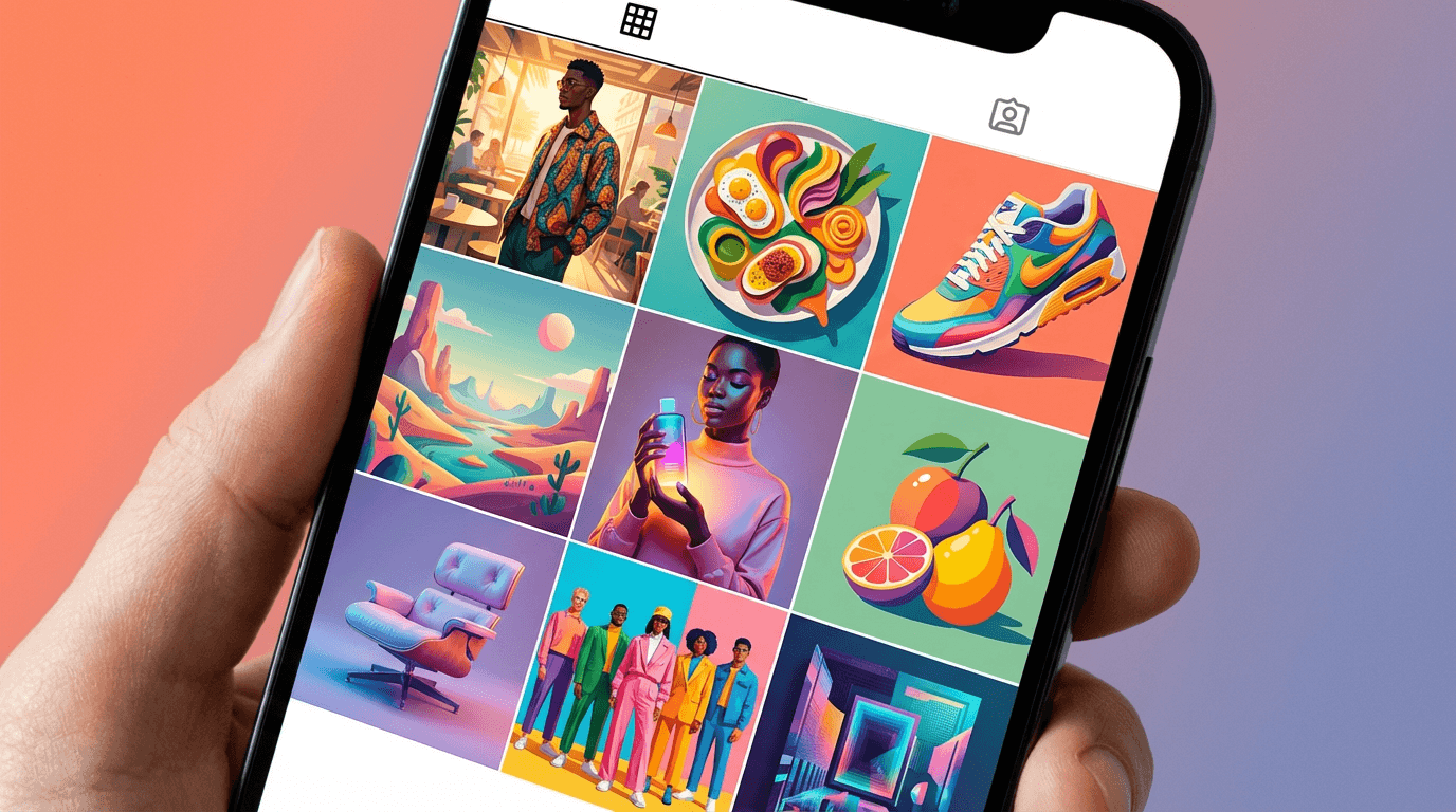
Each template includes a content concept, the full copy-paste prompt, and deployment guidance. All prompts are formatted for the Miraflow AI Image Generator and compatible with any high-quality text-to-image tool. Adjust the bracketed descriptive elements in each prompt to match your shop's specific aesthetic, your signature arrangement style, your vessel preferences, your botanical specialties, or your brand identity. Generate at 4:5 for Instagram feed posts, 1:1 for profile images and product thumbnails, 9:16 for Stories and TikTok, 16:9 for website banners and YouTube thumbnails, and 5:4 for print materials.
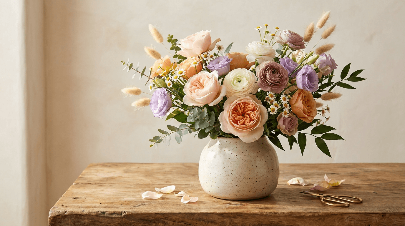
Template 1: The Signature Bouquet Hero — Flagship Arrangement Portrait
This is the foundational florist marketing image: a single, stunning bouquet or arrangement presented as the centerpiece of a warm, atmospheric composition. This photograph communicates the florist's skill, aesthetic sensibility, and the irresistible beauty that draws the viewer's hand toward the order button.
Prompt:
stunning florist bouquet hero photograph of [a lush hand-tied bouquet in a beautiful ceramic vase on a warm natural surface — the bouquet features a rich, layered combination of flowers in a warm romantic palette: large garden roses in soft blush and warm peach as the focal blooms, ranunculus in creamy white and dusty mauve providing secondary layered rosette forms, lisianthus in soft lavender adding airy height, sprigs of chamomile or feverfew providing delicate white textural filler, eucalyptus in muted silver-green and Italian ruscus in deep green providing foliage structure and cascading greenery, dried bunny tail grass in warm cream adding soft textural movement at the arrangement's edges, the bouquet has a generous organic form — not tightly packed but loosely structured with visible depth and airiness, some stems reaching slightly higher than others creating an asymmetric dome silhouette that looks designed but not rigid, the variety of petal textures is visible — the ruffled layers of the ranunculus, the velvety fullness of the garden roses, the papery delicacy of the lisianthus, the feathery softness of the bunny tails, the arrangement is in a handmade ceramic vase — a warm stoneware vessel in a matte speckled cream or soft sage or warm terracotta with a slightly irregular form that signals handmade craftsmanship, the vase has a gently curved profile that complements the organic shape of the bouquet above it] in a warm atmospheric hero composition, the arrangement is the undisputed visual center — positioned slightly off-center with the bouquet occupying the upper two-thirds of the frame and the vase and surface anchoring the lower third, the surface beneath is a warm natural material — a thick slab of weathered wood, a linen-draped table, a warm stone counter, or a vintage wooden surface with visible grain and gentle patina — providing organic texture that grounds the arrangement without competing with it, the background is soft and warm — a plaster wall in warm cream or pale clay, or a soft warm gradient that falls gently out of focus behind the arrangement, there is enough background visible to create depth but not so much that it distracts, a few quiet contextual items may be visible at the edge of the frame — a pair of brass scissors, a small spool of natural twine, a few loose stems or petals that have fallen to the surface, a second small bud vase with a single stem — these details add the florist's-studio authenticity without cluttering the composition, the lighting is the atmospheric centerpiece — soft directional natural light from one side, perhaps from a window just outside the frame, creating gentle modeling across the arrangement, the light enters from the side and slightly behind so that some petals — particularly the thinner ranunculus and lisianthus petals — are backlit with a luminous translucent glow while the fuller garden roses are lit from the side with soft warm reflected light that reveals their velvet surface texture, the light creates gentle shadows on the surface beneath the vase — the arrangement's shadow is soft and organic, adding dimensional depth, the directional light also creates gentle highlights on the ceramic vase surface — a soft curved catch of light that reveals the glaze texture and the vessel's form, the light falls off gently toward the far side of the composition creating a natural warm gradient — brighter where the light enters and softly dimming across the frame, warm blush and peach garden rose tones dusty mauve and creamy white ranunculus soft lavender lisianthus warm cream bunny tail texture silver-green and deep green foliage warm speckled ceramic vase tone warm wood or stone surface warm cream or clay background soft directional warm light with translucent petal glow and the rich warm botanical palette of a lush hand-tied bouquet in natural sidelight as the color palette, the mood is romantically lush quietly luxurious warmly alive and the specific visual pull that great floral photography creates — the desire to lean in and smell the roses, to touch the petals, to have this arrangement on your own table in your own light, the photograph as an experience of beauty that generates the impulse to possess it, professional floral and still life photography with soft warm directional natural sidelight and moderate depth of field keeping the arrangement in clear dimensional focus from front blooms to back foliage with the background falling to soft warm blur, composed with the arrangement as the luminous center and the surface and background as supporting warmth, the translucent backlit petals and the velvet surface-lit blooms as the dual lighting focal points, warm natural floral tones with ceramic and surface accents, no text, no logos, no watermarks
Best for: Instagram primary feed content and grid anchor, florist website homepage hero, e-commerce featured arrangement or best-seller image, Google Business profile primary product image, social media brand-defining content, print brochure and promotional materials hero, email marketing header imagery, shop signage and window display print, wedding and event portfolio cover image, press and editorial feature imagery
Template 2: The Shop Interior — Botanical Atmosphere Portrait
The flower shop or plant shop itself is a destination — a sensory environment of color, fragrance, and living beauty. This template captures the shop as an atmospheric experience, inviting the viewer to imagine stepping through the door and being surrounded by flowers.
Prompt:
atmospheric flower shop interior photograph of [a beautiful independent florist shop interior filled with flowers and plants — the space is warm, layered, and richly botanical: the main display area features multiple buckets and vessels at varying heights holding bunches of fresh flowers organized by variety and color — galvanized metal buckets on a tiered wooden stand hold bunches of garden roses in peach and blush, stocks in soft white and lilac, snapdragons in warm coral, tulips in creamy yellow, eucalyptus bunches in silver-green, along one wall open shelving displays finished arrangements in various vessels ready for purchase — a lush centerpiece in a warm ceramic bowl, a tall architectural arrangement in a clear glass vase, a petite posie in a bud vase, a rustic arrangement in a woven basket, a hanging display of dried flower bundles hangs from the ceiling or a beam — bunches of dried lavender, dried roses, preserved eucalyptus, and dried grasses hanging upside down in an aesthetically charming installation, the shop counter is a warm worn wooden surface — perhaps a reclaimed wood counter or a vintage shop counter — with the florist's tools visible: scissors, ribbon spools in muted satins and natural linens, rolls of kraft paper and tissue, twine, a vintage cash register or a simple point-of-sale setup, the floor is aged wood or worn tile with visible character, potted plants — ferns, trailing ivy, small citrus trees — are placed at floor level and on shelves adding green depth at every level from floor to ceiling, the shop has tall windows or a glass-fronted entrance that allows natural light to flood the space, the overall impression is of abundance that has been carefully curated — many flowers, many colors, many textures, but organized with an eye that understands visual harmony and spatial rhythm] in a wide atmospheric interior composition, the photograph is composed from one end of the shop looking through the depth of the space — revealing the layered abundance of flowers, the varying heights and surfaces, the hanging dried installation, the counter area, and the window light that illuminates the entire scene, the camera is at standing eye level — the perspective of a customer walking through the door and seeing the shop in its full beauty for the first time, the depth of the shop is important — the eye should travel from near elements in the foreground through the middle ground of the main displays and counter to the back of the shop or the window at the far end, creating a sense of discovery and invitation to explore, the abundance of botanical material is the visual statement — flowers at every level, in every direction, in every shade — but the organization keeps it from feeling chaotic, the curated display has rhythm and logic even in its lushness, the lighting is rich and natural — daylight pouring through the shop windows illuminating the front displays with bright warm light while the deeper areas of the shop are lit in softer ambient warmth, the light enters the flowers throughout the space — backlit stems near the windows glow while deeper arrangements are lit in the warm reflected light bouncing off surfaces and walls, the light catches the galvanized metal of the flower buckets with matte industrial highlights, catches the glass vases with transparent sparkle, catches the worn wood surfaces with warm grain detail, and catches the hanging dried bundles with warm textural depth, the hanging dried flowers are lit from above and behind by the window light — they create a warm overhead installation that adds atmospheric canopy to the scene, multicolor fresh flower palette throughout — peach and blush roses soft white and lilac stocks warm coral snapdragons creamy yellow tulips silver-green eucalyptus — warm worn wood surfaces galvanized metal industrial accents glass vessel transparent highlights dried flower warm muted tones overhead green foliage at multiple levels warm window light flooding through the front kraft paper and natural twine warm material tones and the rich layered abundant palette of a beautiful independent flower shop interior bathed in natural light as the color palette, the mood is abundantly inviting botanically immersive warmly curated and the particular joy of walking into a good flower shop — the assault of color and beauty and living fragrance from every direction, the sense that you could spend an hour just looking, the feeling that whoever designed this space loves flowers as much as you do, the photograph as a door that is already open, professional interior and commercial photography with rich natural window light and deep depth of field keeping the entire shop in warm detailed focus from foreground displays to background depth, composed as a wide interior perspective showing the shop's full botanical abundance and design character with the window light and the layered floral displays as the compositional elements, the abundance and the curation as the dual atmospheric statements, rich warm natural tones with full botanical color range, no text, no logos, no watermarks
Best for: Google Business profile interior and atmosphere images, florist website about page and shop page, Instagram shop and space content, social media grand opening and renovation reveals, Yelp and review platform business gallery, print brochure and promotional materials, real estate and location marketing, press and editorial shop features, local business directory and community features, event hosting and workshop venue marketing
Template 3: The Seasonal Arrangement — Time-Specific Design Showcase
Seasonality is the heartbeat of the flower business — the palette shifts, the varieties rotate, the design sensibility evolves with the calendar. This template captures the specific beauty of a seasonal arrangement that communicates the florist's connection to the natural calendar and the urgency of the limited seasonal window.
Prompt:
seasonal spring floral arrangement photograph of [a lush spring arrangement celebrating the season's most coveted blooms — the arrangement features peonies as the stars: three or four large garden peonies in various stages of bloom from tight bud to fully open ruffled globe, in soft blush pink and warm cream, their layered petals creating extraordinary textural depth and the lush romantic quality that makes peonies the most requested spring flower, surrounding the peonies are sweet peas in soft lilac and pale pink providing airy delicate height and the suggestion of fragrance through their ruffled butterfly-like petals, lily of the valley with its small white bell-shaped flowers on graceful arching stems adding refined elegance and botanical luxury, viburnum or snowball flowers in soft green-white providing round textural contrast to the peonies' ruffled forms, hellebores in soft mauve and sage green adding unusual botanical interest and sophisticated color depth, clematis vine or jasmine trailing from the arrangement with small star-shaped flowers adding wildness and movement, the foliage is spring-fresh — bright green fern fronds, silver-green dusty miller, fresh mint with visible leaves adding herb-garden authenticity, the overall composition is abundant but not overwhelmed — the peonies command attention while the supporting flowers create a rich botanical ecosystem around them, the arrangement is in a vintage vessel — perhaps a weathered terracotta pot, a aged brass urn, or a footed compote in warm patinated metal — the vintage character of the vessel communicating history and craftsmanship] in a warm seasonal showcase composition, the arrangement is positioned on a warm natural surface with the spring light quality as the atmospheric element — the particular bright, fresh, slightly cool-warm quality of spring light that is different from the heavy golden light of summer or the amber light of autumn, the surface beneath is a weathered garden table or a linen-draped surface — something that suggests a garden room or a conservatory or a sun-filled kitchen where spring flowers would naturally be placed, the background is simple and light — a bright warm wall, a sunlit window, or an airy blur of greenery suggesting a garden beyond — the background says spring without being distractingly specific, a few spring-specific details at the periphery — perhaps a few loose peony petals fallen on the surface with their tissue-paper delicacy, a small garden tool or glove, a packet of seeds, a few stems of fresh herbs tied with twine — these seasonal anchors place the arrangement firmly in the spring moment, the lighting is bright and fresh but still soft — the quality of spring sun filtered through light clouds or sheer curtains, bright enough to illuminate the full color range of the spring palette without the intensity that would create harsh shadows, the light enters the peonies from the side and behind revealing their extraordinary petal layering — the outer petals backlit with translucent pink glow while the dense center petals are lit with soft reflected light showing their ruffled depth, the sweet peas' thin petals are almost entirely translucent in the light — glowing like stained glass in pale pink and lilac, the lily of the valley's small white bells catch the light with gentle gleaming highlights, the fresh green foliage is illuminated with the vivid spring green that only new growth achieves, soft blush pink and warm cream peonies pale lilac and pink sweet peas white lily of the valley bells soft green-white viburnum mauve and sage hellebores bright spring green foliage warm patinated vintage vessel surface warm weathered wood or linen fallen peony petals soft pink fresh herb green accents spring-bright fresh natural light and the lush romantic fresh palette of peak spring florals in bright seasonal light as the color palette, the mood is seasonally exuberant romantically lush freshly alive and the specific emotional power of spring flowers — the return of beauty after winter, the luxury of peonies' brief window, the fleeting delicacy of sweet peas and lily of the valley, the urgency of blooms that will not wait — the photograph as a seasonal invitation that carries the implicit message: this beauty is available now, and only now, professional floral and seasonal photography with bright fresh natural sidelight and moderate depth of field keeping the arrangement in rich dimensional focus from the nearest peony to the trailing clematis with the background in soft seasonal blur, composed with the peonies as the focal center and the supporting spring flowers creating a rich seasonal ensemble around them, the spring light quality and the seasonal bloom specificity as the time-anchoring elements, bright fresh spring tones with warm vintage vessel and surface accents, no text, no logos, no watermarks
Best for: Instagram seasonal content and timely posting, florist website seasonal collections and availability pages, social media seasonal bloom announcements (peony season, dahlia season, tulip season), email marketing seasonal campaigns, seasonal pre-order and limited-availability promotions, print seasonal lookbook and catalog content, Pinterest seasonal floral boards, wedding seasonal consultation reference imagery, press and editorial seasonal flower features, seasonal workshop and class promotional materials
Template 4: The Single-Stem Botanical — Flower Portrait Art
The single-stem botanical portrait is the florist's equivalent of a headshot — an intimate, detailed study of a single flower that reveals the extraordinary beauty, texture, and form that exists in a single bloom. This minimalist approach creates striking, shareable, educational content that demonstrates the florist's deep botanical knowledge and appreciation.
Prompt:
intimate single-stem botanical portrait photograph of [a single garden rose in full, open bloom — a large, many-petaled variety in a warm dusty pink or soft antique blush, the kind of rose with dozens of spiraling petals that create an almost impossibly complex textural center, the bloom is fully open and at peak display — the outer petals have relaxed outward into a generous open cup revealing the dense spiral of inner petals that tighten toward the center in a mesmerizing geometric pattern, a few outer petals show the slightest natural aging — a gentle crinkle at the edges, a barely perceptible deepening of color at the petal tips — communicating that this is a real flower at its peak moment rather than a wax replica, the stem is long and slightly curved — a natural gentle arc rather than a rigid straight line — with a few remaining leaves in deep green providing scale and botanical context, the thorns on the stem are visible — small, natural, the rose being fully itself rather than sanitized for display, the stem is cut cleanly at the base — the fresh green of the cut visible as evidence of recent harvest] in a minimalist botanical portrait composition, the single stem is the sole subject — positioned vertically or at a gentle diagonal in the frame with generous negative space surrounding it, the background is a solid warm tone — a deep warm clay, a soft warm grey, a dark sage green, or a rich warm cream — chosen to complement the rose's specific pink and create maximum visual impact through color contrast, the background is slightly textured — perhaps a matte plaster or a fine linen — rather than a sterile smooth gradient, adding warmth and substance, the rose bloom is positioned in the upper portion of the frame with the stem extending downward — the natural growth direction honored in the composition, the bloom is large enough in the frame to reveal extraordinary petal detail — the spiral pattern, the textural variation between outer and inner petals, the color gradation from the warm pink edges to the deeper tones in the shadowed depths between petals, the negative space around the stem and bloom is the compositional counterpoint — the empty warm background providing the visual rest that makes the botanical detail of the bloom more striking by contrast, the lighting is precise and revelatory — a soft directional light from one side creating gentle modeling across the petal surfaces, the directional light creates a three-dimensional quality — petals facing the light are warmly illuminated showing their surface texture while petals curving away are in gentle shadow creating depth and dimension within the bloom, the light catches individual petal edges with fine bright lines — the translucent edges of the petals glow where they thin to near-transparency, the spiral center of the bloom is lit with particular care — enough light to reveal the geometric petal pattern but enough shadow between the tightly packed petals to create the depth that makes the center feel infinite, the stem and leaves catch the same directional light — the leaf surfaces show both the reflective upper surface catching highlights and the matte underside in softer shadow, the thorns cast tiny fine shadows on the stem, warm dusty pink or antique blush rose petals with deeper tones in the shadowed center deep green leaves and stem natural thorn detail fresh cut stem base warm complementary background tone — clay or grey or sage or cream — soft directional sidelight with translucent petal-edge glow and dimensional shadow and the intimate botanical palette of a single rose in precise revelatory light against a warm complementary ground as the color palette, the mood is botanically intimate contemplatively detailed quietly reverent and the particular visual pleasure of looking closely at a single flower — seeing the extraordinary complexity of form that is usually taken for granted, the mathematical precision of the petal spiral, the textural richness of a single surface, the color variation within what we casually call pink — the photograph as an invitation to look more carefully at the beauty that passes through our hands every day, professional botanical and fine art photography with precise soft directional light and very shallow depth of field keeping the bloom in sharp detailed focus with the stem gradually softening and the background in smooth warm blur, composed as a centered or rule-of-thirds botanical portrait with the bloom as the detailed subject and the negative space as the compositional structure, the petal detail and the translucent light edges as the revelatory focal points, warm rose tones against warm complementary background, no text, no logos, no watermarks
Best for: Instagram high-engagement botanical art content, Pinterest botanical and flower boards, studio website gallery and design portfolio, social media flower-of-the-week educational series, print poster and wall art (these botanical portraits translate beautifully to large format prints), botanical education and flower identification content, press and editorial botanical features, florist brand-building and design sensibility content, social media content designed for saves and shares, wedding consultation flower variety reference imagery
Template 5: The Wedding and Event — Bridal Floral Showcase
Wedding floral design is the highest-margin, most aspirational segment of the floral business. This template creates the portfolio-quality imagery that communicates the florist's ability to execute the complete wedding floral vision — from bouquet to centerpiece to ceremony installation — with the romantic atmospheric quality that wedding clients are searching for.
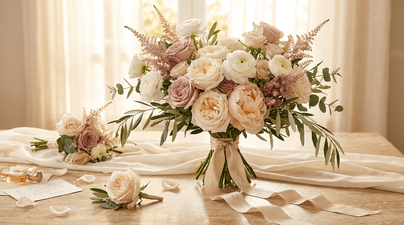
Prompt:
romantic wedding floral showcase photograph of [a bridal bouquet and surrounding wedding floral elements in a warm romantic composition — the bridal bouquet is the hero: a lush, generously proportioned hand-tied bouquet in a romantic neutral palette of warm whites, soft blush, pale peach, and touches of dusty rose, featuring garden roses in full bloom as the focal flowers with their ruffled petal-dense heads in warm cream and soft blush, ranunculus in pale peach and white providing layered rosette detail, peonies or peony roses in soft blush pink adding lush fullness if available, delphinium or astilbe in pale mauve providing airy textural height, clematis or sweet pea tendrils providing wild romantic trailing movement, the foliage is soft and silvery — olive branches with their grey-green leaves, dusty miller with its pale silver felted leaves, and seeded eucalyptus adding draping organic texture, the bouquet is tied with a long silk ribbon in a muted champagne or ivory that cascades in soft tails from the binding point, the bouquet is positioned as the central element alongside complementary wedding floral pieces: a matching boutonniere on a surface nearby — a single garden rose bud with a sprig of eucalyptus and a tiny accent bloom tied with matching ribbon, a small bridesmaid's version of the bouquet — similar palette but smaller and slightly simpler — resting alongside, perhaps a glimpse of a centerpiece element or a candle arrangement in the background suggesting the larger wedding floral design] in a warm romantic wedding editorial composition, the bridal bouquet is the central hero with the surrounding wedding floral pieces creating context — communicating that this florist designs the complete wedding floral package, not just a single bouquet, the surface beneath the arrangement is romantic and textured — perhaps a marble tabletop with soft warm veining, a draped satin or silk fabric in warm ivory, a vintage vanity surface, or a weathered French farmhouse table — the surface communicating the aesthetic world of the wedding, the background is soft and warm — perhaps a bright window with sheer curtains creating a luminous romantic backdrop, or a neutral plastered wall in warm cream, or a soft blur of a beautiful venue interior — the background says wedding without being a specific venue that might conflict with a client's vision, styling details communicate the wedding context — a few loose stems or petals scattered on the surface, the silk ribbon trailing gracefully, perhaps a perfume bottle or a pair of earrings or a handwritten vow card at the edge of the frame suggesting the bride's preparation, the lighting is romantic and soft — the warm directional light that the best wedding venues provide, soft enough to flatter every petal and surface but directional enough to create the gentle modeling that gives the bouquet dimension and the petals their translucent glow, the light on the bouquet creates the signature effect of great bridal floral photography — the outermost petals backlit with a luminous warm glow while the dense center of the bouquet is lit with soft reflected warmth that reveals the layered depth of flowers within flowers, the silk ribbon catches the light with a gentle lustre — the sheen of the silk communicating quality and luxury, the boutonniere and the bridesmaid bouquet are lit with the same warm quality but are slightly further from the light source — secondary elements in complementary warmth, warm white and soft blush and pale peach garden roses creamy and white ranunculus soft blush peony roses pale mauve delphinium or astilbe grey-green olive and silver dusty miller eucalyptus champagne silk ribbon lustre warm marble or satin or ivory surface romantic background warm blur bridal styling detail accents and the lush warm romantic neutral palette of a complete bridal floral design in soft directional wedding light as the color palette, the mood is romantically exquisite softly luxurious warmly bridal and the emotional center of wedding floral marketing — the photograph that makes the bride-to-be see her own wedding in these flowers, feel the moment of holding this bouquet, imagine this palette against her dress and in her venue and in her photographs — the image that converts a browser into a consultation booking, professional wedding and editorial floral photography with soft warm directional natural light and moderate depth of field keeping the bridal bouquet in rich detailed focus with the supporting floral pieces and styling elements in warm complementary focus and the background in soft romantic blur, composed as a romantic editorial grouping with the bridal bouquet as the visual hero and the surrounding wedding elements as the narrative context, the petal translucency and the silk ribbon lustre and the romantic styling as the luxury-communicating focal points, warm romantic neutral wedding tones with soft blush and sage accents, no text, no logos, no watermarks
Best for: Instagram wedding content and portfolio, florist website wedding and events page, Pinterest wedding floral boards (the single most important platform for wedding floral discovery), wedding planning platform portfolio (The Knot, WeddingWire, Zola), social media wedding season campaign content, wedding consultation and proposal presentation imagery, print wedding lookbook and portfolio, bridal magazine and editorial submissions, wedding fair and showcase promotional materials, email marketing wedding campaign content
Template 6: The Houseplant Lifestyle — Green Living Scene
For plant shops, the most effective marketing shows the plant not in the shop but in the home — thriving, styled, and contributing to a beautiful living environment. This template captures the aspirational indoor plant lifestyle that motivates plant purchases by showing customers what their home could look like.
Prompt:
aspirational houseplant lifestyle photograph of [a beautifully styled corner of a bright, airy living space featuring a collection of indoor plants as the design focal point — a large statement plant anchors the grouping: a tall fiddle-leaf fig in a warm textured ceramic pot or a woven basket planter, its broad sculptural leaves reaching upward and outward creating a dramatic green canopy in the upper portion of the frame, around the base of the statement plant a curated collection of smaller plants creates a layered botanical vignette at varying heights: a trailing pothos or string of pearls on a high shelf or plant stand with its vines cascading downward, a monstera deliciosa in a mid-height ceramic pot showing its characteristic split leaves, a cluster of small succulents or cacti in an assortment of small handmade pots on a low shelf or table, a snake plant in a tall narrow pot providing architectural vertical contrast, a small fern — perhaps a Boston fern or maidenhair — in a hanging planter or on a high bracket adding delicate textural contrast to the bolder tropical leaves, the plants are arranged in a grouping that feels collected over time rather than purchased and placed all at once — varying pot styles, varying plant sizes, the natural accumulation of a plant lover's growing collection, the room around the plants is warm, bright, and well-designed — a comfortable modern sofa or reading chair partially visible, a warm woven rug on a light hardwood or pale concrete floor, a stack of books on a side table, a throw blanket draped over the furniture — the room is a home that has been enhanced by plants rather than a plant display in a sterile setting] in a warm lifestyle interior composition, the photograph is composed to show the plant grouping as part of a living room or bedroom corner — the plants are the visual subject but the surrounding home environment provides the lifestyle context that helps the viewer envision these plants in their own space, the room is bright and naturally lit — large windows or glass doors allow generous natural light that both illuminates the plants (communicating their light requirements and health) and creates a warm airy atmosphere in the room, the varying heights of the plants — from the tall fiddle-leaf to the trailing pothos to the low succulents — create vertical visual rhythm that fills the corner from floor to near-ceiling, the trailing plants add organic movement — the cascading vines of the pothos or string of pearls create natural flowing lines that soften the geometric edges of the shelves and furniture, the pot and planter variety adds material interest — ceramic in various glazes, woven baskets, concrete planters, perhaps a vintage terracotta — the variety communicating personal collection rather than retail display, the furniture and room elements are visible enough to communicate the home context but do not compete with the plants — the sofa or chair, the rug, the books are supporting cast, the lighting is the bright, generous natural light of a plant-friendly home — the light that explains why these plants are thriving, it enters through the windows and illuminates the leaves from behind and from the side, the large fiddle-leaf leaves are dramatically backlit — the sunlight through their broad surfaces reveals the internal leaf structure and creates a luminous green glow that is the visual equivalent of photosynthesis made visible, the smaller plants receive softer ambient light — the monstera's split leaves create interesting shadow patterns on the wall behind, the trailing pothos catches highlights on its glossy leaves as the vines curve through the light, the overall light quality communicates a bright warm home with exactly the kind of light that plants and people both love, vivid tropical greens in multiple shades from the deep green fiddle-leaf to the bright lime new monstera growth to the silvery sage succulents to the delicate fern fronds warm ceramic and woven planter earth tones warm wood floor neutral rug texture sofa fabric in warm neutral books and throw blanket warm accents bright natural window light with dramatic leaf backlighting and the lush green living palette of a plant-filled bright airy home interior as the color palette, the mood is aspirationally green warmly alive brightly inviting and the specific motivation that houseplant marketing must create — the vision of the viewer's own home transformed by plants, the green corner that makes the room feel alive and cared for and connected to nature, the photograph answering the question what would my home look like if I committed to becoming a plant person with the most appealing possible answer, professional interior and lifestyle photography with bright generous natural window light and moderate depth of field keeping the plant grouping in clear focus with the room environment in warm contextual clarity, composed as a lifestyle interior corner view with the plants as the design focal point and the room as the aspirational living context, the leaf backlighting and the curated collection variety as the green-lifestyle focal points, bright warm green-rich interior tones with warm neutral home accents, no text, no logos, no watermarks
Best for: Instagram plant and green lifestyle content, plant shop website lifestyle and inspiration pages, Pinterest houseplant and interior design boards, social media plant styling tips and inspiration, email marketing plant lifestyle campaigns, plant care blog and content marketing imagery, home and interior design cross-promotional content, social media content designed for saves and plant-lover engagement, seasonal plant collection promotional materials, corporate and office plant styling portfolio
Template 7: The Wreath and Dried Arrangement — Preserved Botanical Art
Wreaths and dried floral arrangements represent a growing segment — products that combine the beauty of botanical material with longevity that fresh flowers cannot offer. This template captures the warm, textural, artisanal quality of dried and preserved botanical designs.
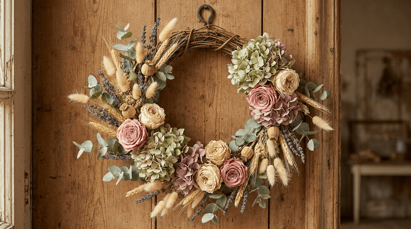
Prompt:
artisanal dried floral wreath photograph of [a handcrafted dried flower wreath displayed on a warm textured surface — the wreath is a generous circle of dried and preserved botanical materials in a warm, muted, sophisticated palette: dried garden roses in dusty pink and warm antique cream retaining their ruffled petal structure in a beautiful preserved state, dried hydrangea clusters in soft sage green and muted mauve providing generous textural mass, bunny tail grass in warm cream adding soft fuzzy texture and gentle movement, dried lavender sprigs in muted purple adding color depth and the suggestion of lingering fragrance, preserved eucalyptus in silver-green providing structural foliage that connects the elements, dried wheat or oat stems in warm golden tones adding agricultural warmth, small dried seed pods or poppy heads in warm brown adding organic sculptural detail, the wreath base is a natural grapevine or willow form — visible in places where the botanical material is more sparse, adding rustic structural honesty, the wreath has a generous, slightly wild quality — not perfectly symmetrical but organically balanced, with some elements reaching outward from the circle and others tucked closely, the overall impression is of a permanent garden captured and preserved — the colors muted by the drying process into a warm antiqued palette that is sophisticated rather than faded] displayed against a warm textured background in a centered compositional portrait, the wreath is hung on or leaned against a warm textured wall — an aged wood plank, a lime-washed plaster wall, a soft warm linen backdrop, or a vintage wooden door — the background texture complements the dried botanical textures without competing, the circular form of the wreath is the compositional anchor — the ring creating a strong geometric shape that contrasts beautifully with the organic irregularity of the dried materials that compose it, the wreath is centered or positioned according to the rule of thirds — its circular form creating a natural focal point that the eye circles, traveling along the ring of botanical materials and discovering different textures and tones as it moves, the background shows enough texture and warmth to communicate a home or studio context — this is where the wreath would hang, how it would look on your wall, in your space, on your door, a few contextual details may appear at the periphery — a small nail or hook from which the wreath hangs, a portion of a door frame, a glimpse of a room beyond — these details anchor the wreath in a real domestic context, the lighting is warm and even — a soft ambient light that illuminates the wreath's full circle without dramatic shadow, with gentle directionality that creates soft depth between the overlapping dried elements, the light reveals the specific textures of dried materials — the papery thinness of the dried rose petals, the powdery matte surface of the hydrangea clusters, the fuzzy softness of the bunny tails, the fine stems of the lavender, the smooth waxy surface of the preserved eucalyptus, each material catches the warm light differently, the dried roses are particularly beautiful in warm light — their preserved petals have a matte translucency that is different from fresh petals but equally lovely, catching the light with a soft warm glow that communicates the preservation of beauty across time, dusty pink and antique cream dried roses soft sage and muted mauve hydrangea warm cream bunny tails muted purple lavender silver-green preserved eucalyptus golden dried wheat warm brown seed pods natural grapevine base warm textured wall background — aged wood or plaster or linen — and the muted warm sophisticated palette of preserved botanicals in soft even light as the color palette, the mood is artisanally crafted warmly enduring naturally sophisticated and the particular appeal of dried and preserved botanical art — the beauty of flowers that will not wilt, the warmth of natural materials that improve with time, the craft of creating something that holds the garden's beauty through every season — the photograph as proof that beauty can be preserved and that the preserved form has its own quiet sophisticated dignity, professional still life and artisan product photography with warm even ambient light and moderate depth of field keeping the wreath in clear textural focus with the background in warm supporting softness, composed as a centered or near-centered wreath portrait with the circular form as the geometric anchor and the varied botanical textures as the subject, the textural variety and the muted warm palette as the artisanal quality focal points, warm muted sophisticated botanical tones against warm textured background, no text, no logos, no watermarks
Best for: Instagram dried floral and wreath content, florist website dried and preserved collection pages, e-commerce dried flower product listings, Pinterest wreath and dried floral boards (extremely high-performing category on Pinterest), social media seasonal wreath promotions, holiday and seasonal wreath campaign content, Etsy and handmade marketplace product imagery, print lookbook and catalog content, workshop and DIY class promotional materials for wreath-making classes, home decor and interior design cross-promotional content
Template 8: The Workshop Moment — Floral Arranging Class Scene
Workshops and floral arranging classes represent a growing revenue stream and community-building opportunity for florists. This template captures the hands-on, social, creative energy of a workshop in progress with the warmth and approachability that encourages enrollment.
Prompt:
warm floral workshop photograph of [a floral arranging workshop in progress at a long wooden table — four to six participants are seated around a rustic farm table or a long wooden workbench, each with their own workspace featuring a partially completed arrangement in progress, each participant's workspace includes a vessel — matching ceramic vases or mason jars in warm tones — with an arrangement at a different stage of completion, stems of flowers and foliage spread across the table surface between the workspaces, the abundance of botanical material on the table is a key visual element — loose garden roses, ranunculus, spray roses, eucalyptus branches, filler flowers — strewn across the weathered wood surface creating a lush, colorful, abundant botanical still life that is the raw material of the workshop, the participants are engaged in the process of arranging — hands visible in the act of placing a stem, trimming with scissors, adjusting a bloom's position, stepping back to evaluate the composition, one participant in the near foreground has their hands in clear view — one hand holding a stem of garden rose, the other positioning it in their vessel among other already-placed stems, the hands are the focal point of the action: the physical, tactile engagement with the botanical material, the instructor may be visible — leaning in to guide a participant's placement, demonstrating a technique with a stem in hand, or walking along the table offering encouragement with a warm attentive expression, the table surface between the workspaces shows the beautiful mess of creation — snipped stem ends, scattered leaves, a few fallen petals, scissors and pruners resting between uses, small piles of twine or ribbon — the honest evidence of hands-on creative work] in a warm overhead-angle workshop composition, the photograph is taken from a slightly elevated angle — looking down across the table at approximately 45 degrees — showing the full length of the table, the multiple workspaces, the scattered botanical material, and the participants' hands at work, this elevated angle reveals the rich botanical tapestry of the table surface — the flowers and foliage spread across the weathered wood creating an unintentional but beautiful pattern of color and texture, the length of the table creates a linear compositional rhythm — repeating workspaces with their vessels, each slightly different in arrangement progress, creating the visual narrative of a creative process in multiple stages simultaneously, the participants' hands and arms are the human elements — their engagement with the materials visible without individual faces being the focus (the angle naturally emphasizes hands and workspace over faces), the studio or shop setting is visible at the edges — the surrounding shelves of flowers, the warm walls, the window light, the general atmosphere of a creative floral workspace, the lighting is bright, warm, and generous — the workshop requires good light for the participants to work by, and the photography benefits from the same bright warm natural light, the light illuminates the table surface and all its botanical abundance — every petal, every leaf, every stem end visible in the warm generous light, the flowers scattered on the table catch the overhead-angle light with a natural beauty — stems and leaves creating organic lines and patterns on the warm wood surface, the vessels and their arrangements are lit from above and from the side — the flowers in the vessels show their faces to the elevated camera with open, welcoming displays of color, multicolor fresh flower palette scattered across warm weathered wood table — roses in pinks and peaches ranunculus in whites and creams spray roses in warm tones eucalyptus silver-green filler flower accents — warm ceramic or glass vessel tones at each workspace participants' hands as warm human elements scissors and tools metallic accents scattered green leaves and stem ends warm snipped petal and leaf debris warm workshop studio setting and the abundantly colorful warmly creative palette of a floral workshop in bright natural progress as the color palette, the mood is creatively joyful warmly communal hands-on abundant and the particular energy of a floral workshop — the combination of creative expression, physical engagement with beautiful materials, social connection with fellow flower lovers, and the guided confidence of learning a new skill in a supportive environment — the photograph as an invitation to the experience that says you could be at this table with your hands in these flowers creating something beautiful, professional workshop and editorial photography with bright warm natural overhead-angle light and moderate depth of field keeping the table surface and workspaces in clear detailed focus with the participants and background in warm supporting context, composed from an elevated angle across the long table showing the creative abundance and the multiple workspaces in progress, the scattered botanical material and the working hands as the workshop-energy focal points, bright warm natural tones with full botanical color range on warm wood surface, no text, no logos, no watermarks
Best for: Instagram workshop promotion and community content, florist website workshop and events page, social media workshop announcement and enrollment content, email marketing workshop campaign materials, Eventbrite and event platform listing imagery, social media post-workshop recap and participant sharing content, corporate team-building and private event marketing, bachelorette party and group event promotional materials, gift certificate and experience-gift marketing, press and editorial creative workshop features
Template 9: The Gift Box and Delivery — Packaging and Presentation Content
The gift experience extends beyond the flowers themselves — the packaging, the presentation, the unboxing moment, the delivery experience. This template captures the florist's gift and delivery offering with the presentation quality that justifies the premium and communicates the care that goes into every order.
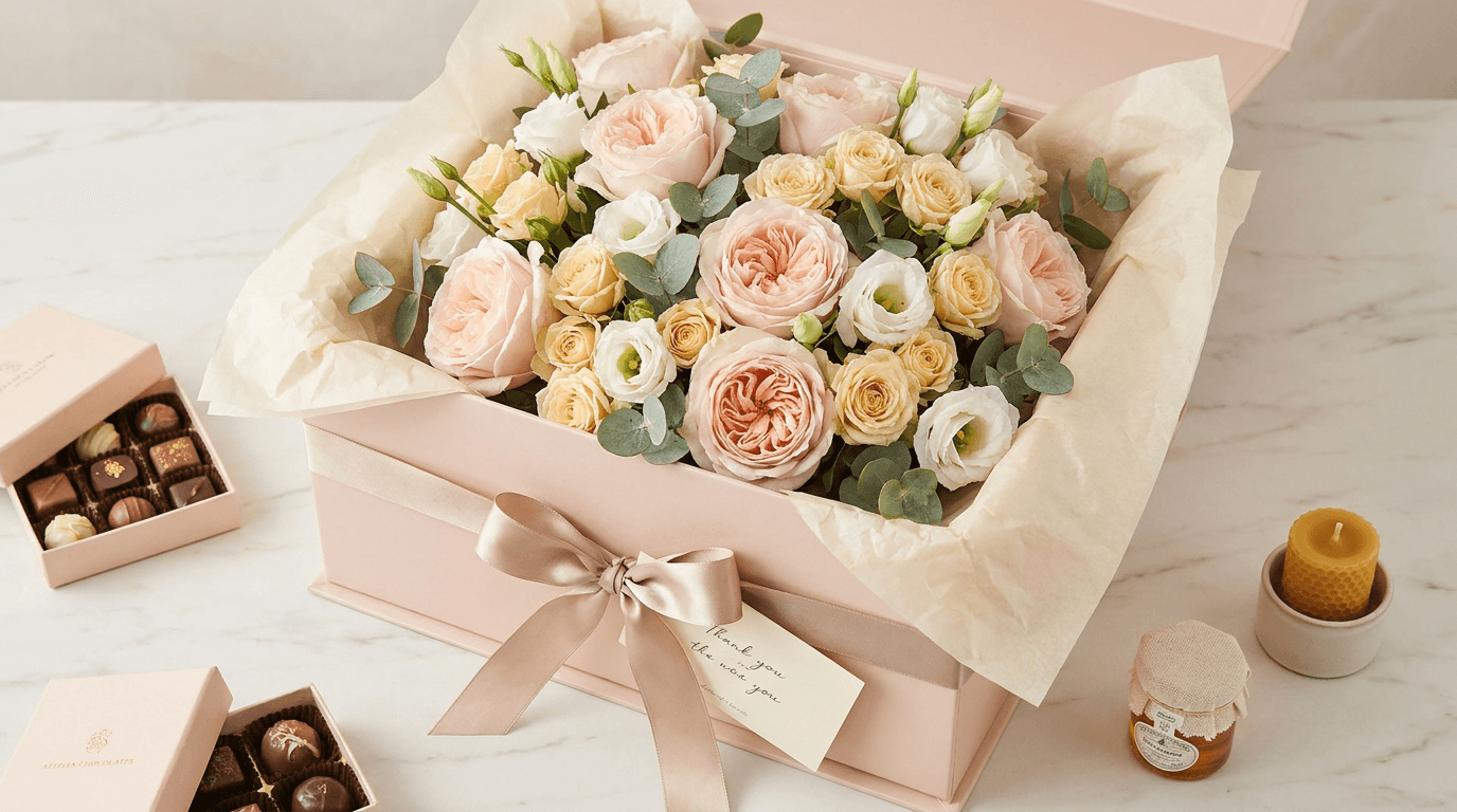
Prompt:
elegant floral gift box and delivery photograph of [a beautifully packaged flower arrangement ready for delivery or gift-giving — a lush bouquet nestled inside an elegant gift box or wrapped in premium packaging: the flowers are visible from above — a compact, dense arrangement of garden roses in soft blush, spray roses in warm cream, lisianthus in soft white, and eucalyptus sprigs in silver-green, the blooms are densely packed and at peak freshness, their faces turned upward creating a field of petals visible from the overhead perspective, the packaging is premium and branded — perhaps a sturdy kraft or matte black or soft blush-pink box lined with tissue paper in a complementary tone, the box has a sophisticated simple design, or alternatively the bouquet is wrapped in premium kraft paper with soft tissue paper visible inside, tied with a natural linen ribbon or a satin ribbon in a muted tone — the wrapping is neat and intentional with the ribbon tied in a generous soft bow, a small gift card or tag is tucked into the arrangement or attached to the ribbon — a simple card in a warm cream or kraft tone with handwritten-style text suggesting a personal message, a few accent items surround the primary arrangement — perhaps a small box of artisan chocolates with visible confections, a small jar of honey with a fabric-covered lid, a beeswax candle in a small vessel, a small sachet of dried lavender, or a small bottle tied with twine — these gift add-ons communicate the florist's curated gift-giving service and the ability to create a complete gift experience beyond flowers alone, the entire presentation sits on a warm surface — a light marble counter, a linen-draped table, or a pale wood surface — with the packaging elements arranged with the casual elegance of a gift being prepared or just received] in a warm gift-presentation composition, the photograph is taken from a slightly overhead angle — approximately 30 to 45 degrees — showing the blooms from above, the packaging structure, the ribbon bow, the gift card, and the surrounding accent gifts, this angle reveals the density and beauty of the flowers from above — their faces open to the camera, creating a field of petal color within the frame of the box or wrapping, the packaging materials are prominent and intentional — the box or wrapping paper, the tissue, the ribbon, the card, the overall presentation quality communicating care, luxury, and the premium experience that distinguishes a florist's delivery from a grocery store bouquet, the accent gifts arranged around the primary arrangement add retail value and visual interest — their small scale and artisan quality complementing the flowers, the surface provides a clean, warm stage — enough visible surface around the gift arrangement to communicate the complete presentation without clutter, the lighting is soft, bright, and even — the quality of light that makes colors accurate and surfaces appealing, important for gift and e-commerce photography where the customer needs to see exactly what they are ordering, the light illuminates the blooms from above and from the side — the overhead angle catches the flowers' open faces with bright, clear light that shows their color accurately while the side component creates enough shadow to give the box and packaging three-dimensional presence, the ribbon catches the light with a gentle sheen — if satin, a lustre, if linen, a matte texture — either communicating quality material, the tissue paper's delicate crinkled texture is visible in the soft light, the gift card's surface catches a gentle highlight, the accent gifts are lit with the same clear warm quality — the chocolate, the honey, the candle, each visible and appetizing in the generous light, soft blush and warm cream roses soft white lisianthus silver-green eucalyptus premium box or wrapping in kraft or matte black or soft blush tissue paper complementary tone muted ribbon with gentle sheen warm cream gift card artisan accent gift warm tones warm surface — marble or linen or pale wood — bright even warm overhead-angle light and the carefully curated premium palette of a beautiful floral gift presentation in clear appealing light as the color palette, the mood is thoughtfully curated generously premium gift-ready and the emotional core of flower gifting — the anticipation of the recipient's delight, the satisfaction of sending something beautiful and personal and curated with care, the florist's gift box as a container not just of flowers but of the sender's intention and affection — the photograph as the visual promise that this gift will arrive beautifully and make someone feel loved, professional product and gift photography with bright warm even lighting and moderate depth of field keeping the arrangement and packaging in clear commercial focus with the surrounding items in warm sharp supporting detail, composed from a slightly elevated angle showing the open blooms and the complete gift presentation, the packaging quality and the curated accent gifts as the premium-value focal points, bright warm commercial tones with premium material accents, no text, no logos, no watermarks
Best for: E-commerce gift and delivery product pages, florist website delivery and gift-giving pages, Instagram gift and delivery content, social media holiday and occasion gift promotions (Valentine's Day, Mother's Day, birthdays, thank-you), email marketing gift campaign materials, Google Shopping and marketplace product imagery, social media Stories gift-idea and unboxing content, corporate gifting promotional materials, subscription box and recurring delivery marketing, print gift menu and catalog materials
Template 10: The Window Display and Storefront — Street-Level Invitation
The shop window and storefront are the florist's most visible marketing surfaces — seen by every person who walks or drives past. This template captures the storefront with the atmospheric charm that converts passersby into customers and communicates the shop's character from the sidewalk.
Prompt:
charming florist storefront and window display photograph of [an independent flower shop storefront viewed from the sidewalk — the shop has a warm, inviting facade: a traditional shopfront with a painted wood exterior in a warm tone — perhaps a deep sage green, a warm dusty blue, a muted terracotta, or a classic warm cream — with clean trim and the shop's name in simple warm lettering above the window or on a hanging sign, the shop window is the visual centerpiece — a large display window showcasing the florist's artistry: the window display features an abundant, curated arrangement of the current week's offerings arranged at multiple heights, large statement arrangements in varied vessels are placed at the center, smaller bud vases and potted plants are arranged at the sides and front, seasonal elements appropriate to the time of year are woven through — spring bulbs and garden roses in spring, sunflowers and dahlias in summer, warm chrysanthemums and dried elements in autumn, evergreen and amaryllis in winter, the display has a collected, abundant quality — many types of flowers, many vessels, many heights — that makes the window look like a botanical treasure cabinet viewed from outside, flanking the entrance door are additional displays — galvanized buckets or wooden crates on the sidewalk holding wrapped bouquets and potted plants available for grab-and-go purchase, the sidewalk display extends the shop's botanical abundance outward into the street, creating an inviting transition from public sidewalk to private shop, the entrance door is visible and inviting — perhaps a wooden door with a glass panel, propped open or ajar suggesting welcome, a small chalkboard sign or a sandwich board on the sidewalk announces the day's specials or a warm greeting] viewed from across the narrow street or the opposite sidewalk in a warm street-level composition, the photograph captures the full storefront — from the sidewalk display to the shop window to the signage above — in a composition that communicates the complete street-level experience of discovering this shop, the perspective is that of a pedestrian approaching from an angle — not dead-center but slightly off-axis, the natural perspective of someone walking along the sidewalk who turns their head and sees this beautiful shop, the sidewalk and a portion of the street may be visible in the foreground — adding urban or neighborhood context, the shop is clearly identified as an independent business — the hand-painted sign, the curated window, the sidewalk display, the overall character distinguishing it from a chain retailer, the surrounding streetscape adds context without competing — perhaps a portion of neighboring storefronts, a tree, a bench, a lamppost — enough urban environment to communicate the neighborhood character, the lighting is the bright, generous light of a good day — the shop's facade is warmly lit, the window display is illuminated both by daylight and by the shop's interior lighting creating a bright, inviting glow from within, the flowers in the window display and on the sidewalk are lit by daylight — their colors vivid and appealing in the natural outdoor light, the shop interior visible through the window glows with warm ambient light — the interior warmth visible through the glass communicating a cozy, inviting space within, the painted facade catches the daylight with a warm matte finish that shows the paint color beautifully, the chalkboard sign is legible enough to communicate a message without the specific text being the focus, warm painted facade — sage green or dusty blue or terracotta or cream — clean trim bright window display with abundant multicolor flowers galvanized and wooden sidewalk display elements warm wood entrance door hanging sign warm lettering bright daylight on exterior warm interior glow through window multicolor flower abundance throughout warm chalkboard accent and the charming warm street-level palette of an independent flower shop on a bright day as the color palette, the mood is charmingly inviting abundantly beautiful neighborly warm and the particular appeal of discovering an independent flower shop on a neighborhood street — the shop that makes you cross the road, the window that makes you stop walking, the sidewalk display that makes you lean in and smell, the open door that pulls you inside — the photograph as the visual experience of that discovery moment, professional architectural and commercial photography with bright natural daylight and deep depth of field keeping the entire storefront in clear warm focus from sidewalk display to signage, composed from a pedestrian's slightly angled street-level perspective showing the complete storefront character, the window display abundance and the warm painted facade as the charm focal points, bright warm daylight tones with warm painted exterior and abundant floral color, no text, no logos, no watermarks
Best for: Google Business profile storefront and exterior images, florist website visit-us and location page, Instagram shop and storefront content, Yelp and review platform business gallery, local press and neighborhood features, print promotional and advertising materials, grand opening and reopening marketing, local business directory and community features, real estate and neighborhood marketing materials, social media seasonal storefront change content
Template 11: The Floral Flat Lay — Overhead Botanical Art
The flat lay composition — flowers, tools, and materials arranged on a surface and photographed from directly above — creates the highly shareable, visually striking content that performs exceptionally well on Instagram and Pinterest. This template captures the flat lay with the artful composition and rich botanical detail that transforms working materials into visual art.
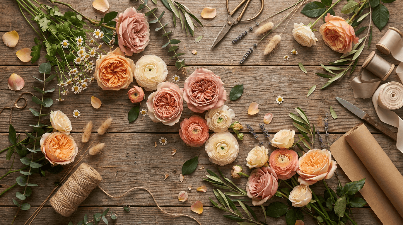
Prompt:
botanical flat lay art photograph of [an overhead composition of flowers, foliage, and florist's tools arranged on a warm natural surface — the arrangement is a carefully composed scatter of botanical elements spread across a weathered wooden surface or a natural linen backdrop: the flowers are arranged in a loose organic pattern — not in rigid rows but in a flowing composition that suggests natural abundance: fully open garden roses in warm peach and dusty pink, ranunculus in cream and soft coral, spray roses in warm white, small chamomile or wax flowers providing delicate filler, sprigs of lavender and dried bunny tails adding textural variety, individual eucalyptus branches and olive branch sprigs providing structural foliage lines, the flowers are arranged at various angles — some showing their open faces to the overhead camera, others turned to reveal their profile or the back of their heads, some still in bud form showing the tight spiral before opening, this variety of angles and stages creates botanical interest and natural authenticity, interspersed with the flowers are the florist's tools and materials: a pair of aged brass or copper scissors catching the light, a spool of natural twine partially unwound with its end trailing across the surface, a few short lengths of satin ribbon in muted tones, a small knife or pruning blade, a roll of kraft paper partially visible at one edge, a few stems with their cut ends visible showing fresh green cuts, scattered individual petals that have fallen from the arrangements creating organic color accents on the surface, a few small leaves and bits of greenery adding natural debris authenticity] viewed from directly overhead in a flat lay art composition, the photograph is taken from directly above — the camera parallel to the surface, every element visible in its position on the flat plane, the surface fills the entire frame — the weathered wood grain or the linen weave providing a warm, textured ground for the botanical composition, the arrangement fills the frame generously but not completely — there is enough surface visible between elements to see the beautiful ground material and to allow each botanical element its own visual space, the composition follows a deliberate organic flow — the elements are not symmetrically placed but are balanced with the intuitive eye of someone who understands visual weight and rhythm, larger blooms create focal anchors while smaller flowers, foliage, and tools fill the spaces between with varying density, the tools add narrative — the scissors, the twine, the ribbon, the knife tell the story of the florist's craft, their placement among the flowers communicating that these beautiful things are made by hands with tools, the scattered petals and leaves are the small imperfections that communicate authenticity — the natural fallout of working with real botanical material, the lighting is even and warm from directly above or from a soft overhead window — flat lay photography requires even illumination to prevent strong directional shadows that would obscure elements on the surface, the even overhead light reveals every petal's surface texture, every leaf's vein pattern, every tool's material surface — the flat lay is a catalog of textures illuminated with democratic evenness, the flowers' faces turned upward to the overhead camera catch the light with their full petal displays — the concentric petal patterns of the roses and ranunculus visible in their complete geometric beauty from above, the tools catch the light with material-specific highlights — the brass scissors with a warm metallic gleam, the twine with a matte fibrous texture, the ribbon with a gentle sheen, the knife blade with a sharp bright highlight, warm peach and dusty pink garden roses cream and soft coral ranunculus warm white spray roses delicate chamomile white muted lavender purple warm cream bunny tails silver-green eucalyptus grey-green olive foliage warm brass or copper scissors natural twine spool muted ribbon accents kraft paper edge warm weathered wood or natural linen surface scattered petals and leaves organic accent debris and the abundantly warm botanical palette of a florist's flat lay on a natural surface in even overhead light as the color palette, the mood is artfully abundant creatively intimate botanically rich and the particular visual pleasure of the flat lay — seeing beauty organized on a plane, the birds-eye view that reveals patterns and relationships invisible from any other angle, the florist's materials elevated from working elements to art through composition and light — the photograph as botanical art and as a window into the florist's creative world, professional flat lay and art photography with even warm overhead lighting and moderate depth of field keeping all elements in sharp focus on the flat plane, composed as a full-frame overhead arrangement with organic flow and balanced asymmetry, the variety of petal textures and the narrative presence of the tools as the flat lay's subject, warm even overhead light on natural surfaces and botanical materials, no text, no logos, no watermarks
Best for: Instagram high-engagement art and visual content, Pinterest floral and botanical boards (flat lays are among the highest-performing pin formats), social media shareable and save-worthy artistic content, florist website gallery and portfolio imagery, print poster and wall art, brand partnership and editorial imagery, social media seasonal palette reveals and variety showcases, blog and content marketing hero imagery, workshop and class promotional materials showing materials, florist brand-building and design-sensibility content
Template 12: The Potted Arrangement — Planter and Container Garden Still Life
Potted arrangements, planted containers, and dish gardens represent a growing category — living gifts that last longer than cut flowers and provide ongoing beauty. This template captures the potted arrangement with the warmth and lifestyle context that positions it as both a gift and a home design element.
Prompt:
warm potted arrangement still life photograph of [a beautifully planted container garden or dish garden in a handsome vessel — a wide shallow ceramic bowl or a vintage terracotta pot or a modern concrete planter contains a carefully composed planting of complementary species: a small upright succulent or small tropical as the height element — perhaps a small echeveria rosette, a haworthia, or a compact fern, a trailing element that spills over the vessel's rim — string of pearls, creeping fig, or trailing sedum cascading softly over the edge, a ground-cover element that fills the soil surface — moss, small-leaf ground cover, or decorative pebbles providing a finished, intentional look to the soil surface, the planting may include decorative natural accents — a few small polished stones, a piece of driftwood, a small quartz crystal, a tiny ceramic mushroom or bird — whimsical details that add personality without overwhelming the botanical design, the vessel is a key element — a handmade ceramic piece with a warm glaze and organic form, or a vintage terracotta pot with its characteristic warm orange-brown and chalky patina, or a modern matte concrete planter in warm grey — the vessel communicates the design intention and positions the planting as a deliberate interior object, the soil is not visible in raw form — it is covered or finished with moss, pebbles, or the ground cover, creating a polished top surface that looks intentional rather than unfinished] in a warm still life and lifestyle composition, the potted arrangement is positioned on a warm surface — a natural wood table, a stone counter, a vintage shelf, a windowsill — in a setting that communicates how this piece would live in someone's home, the surface and the setting provide domestic context — a portion of a bookshelf behind, a warm wall, a window allowing natural light, a few companion objects nearby: a stack of books, a small framed photograph, a ceramic catchall dish, a candle — the arrangement is at home in a home, the vessel's form and material are prominently visible — the photograph shows the complete planted arrangement from the rim of the pot to the tallest plant, with the vessel itself as an important design element, the trailing element that spills over the rim creates an organic connection between the arrangement above and the surface below — the vessel is not a barrier between plant and environment but a meeting point, the scale is intimate — this is a close-medium composition that allows the viewer to see both the overall composition and the individual plant detail within it, the lighting is soft and warm — a gentle natural light from a window nearby, the quality of indoor light that houseplants actually live in, the light catches the different plant textures with appropriate material response — the glossy succulent leaves with bright small highlights, the delicate fern fronds with a soft translucent green glow, the trailing strings with gentle rhythmic highlights along their cascading length, the moss or ground cover with a soft matte green surface, the vessel catches the light with material-appropriate response — the ceramic glaze with a soft warm sheen, the terracotta with a matte chalky surface, the concrete with a subtle aggregate texture — each material communicating handcraft and quality, the decorative accents — the stones, the driftwood, the crystal — catch small gentle highlights that add visual interest within the planted surface, varied green tones from deep succulent to bright fern to trailing silver-green to soft moss green warm vessel tone — ceramic glaze or terracotta orange-brown or concrete grey — natural decorative accent tones warm wood or stone surface warm background with domestic context elements soft natural indoor light with varied plant texture response and the intimate warm green palette of a carefully planted arrangement in gentle domestic light as the color palette, the mood is carefully cultivated warmly domestic botanically intimate and the appeal of the potted arrangement as a living design object — something that combines the beauty of a floral arrangement with the longevity of a houseplant, the gift that keeps growing, the table centerpiece that evolves, the windowsill composition that rewards daily attention — the photograph as the vision of a living beautiful thing that will be part of someone's home, professional still life and product photography with soft warm natural indoor light and shallow to moderate depth of field keeping the arrangement and vessel in clear detailed focus with the domestic setting in warm atmospheric context, composed as a close-medium still life with the planted arrangement as the detailed subject and the home environment as the lifestyle narrative, the vessel quality and the varied plant textures as the design-object focal points, warm intimate green and earth tones with domestic accents, no text, no logos, no watermarks
Best for: E-commerce planted arrangement and dish garden product pages, florist website potted arrangement and living gift pages, Instagram plant and indoor garden content, social media gift-alternative and lasting-gift content, Pinterest planted arrangement and indoor garden boards, corporate gifting and office plant arrangement marketing, seasonal planted gift promotions, workshop and planted-arrangement class promotional materials, print catalog and lookbook content, home decor and interior design cross-promotional content
Template 13: The Florist at Work — Behind-the-Scenes Artisan Portrait
The behind-the-scenes workshop photograph humanizes the brand by showing the hands, the tools, the concentration, and the craft that go into every arrangement. This template captures the florist as an artisan — skilled, focused, creative — building the human connection that differentiates a florist from a flower vending machine.
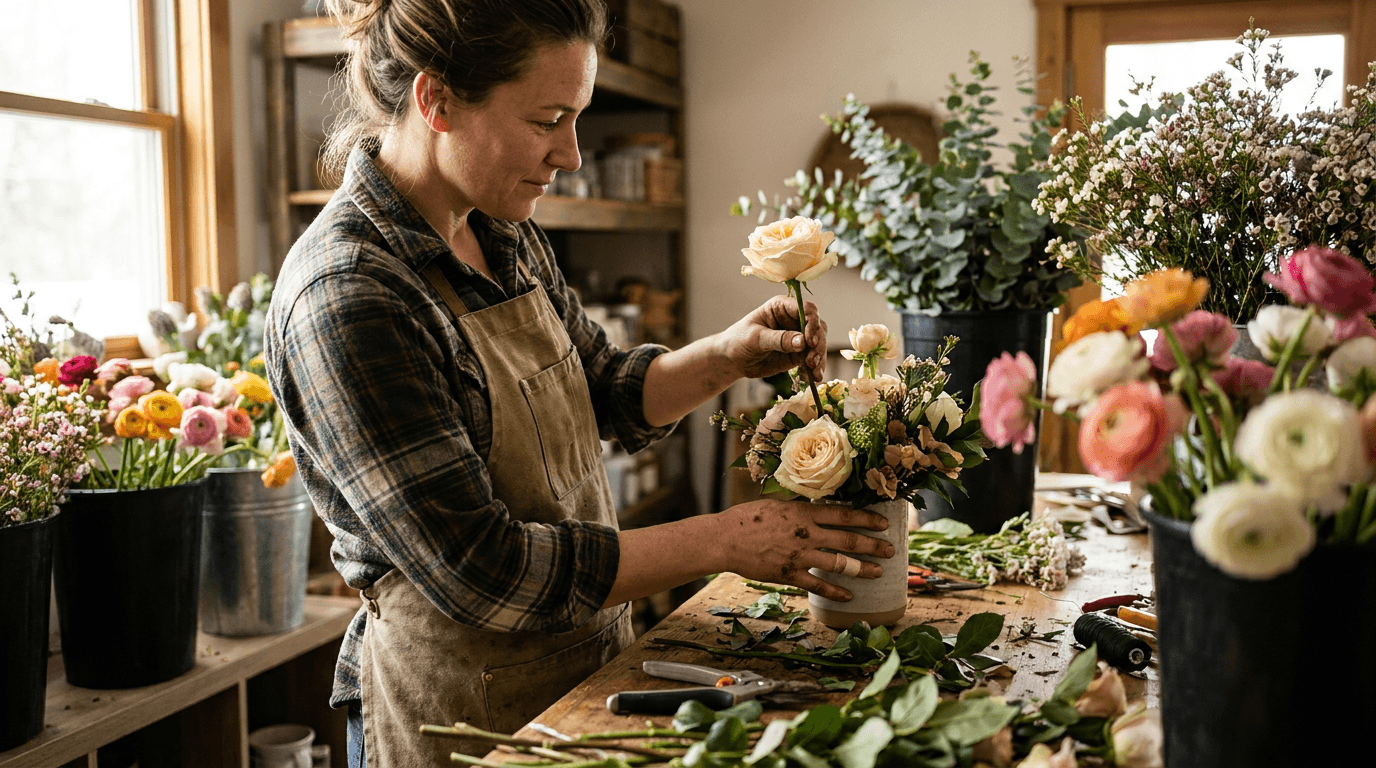
Prompt:
behind-the-scenes florist portrait photograph of [a florist at work at their studio bench — the florist stands at a worn wooden workbench creating an arrangement, captured in a candid working moment rather than a posed portrait, the florist's hands are the visual focus — one hand holds a stem of garden rose being positioned in a developing arrangement, the other hand steadies the vessel or adjusts surrounding stems, the hands are skilled and confident in their movement — the particular quality of hands that know exactly how to hold a stem, where to cut, how much pressure to apply, the hands show the evidence of the work — perhaps a small thorn scratch, a trace of green on a finger, the authentic markers of someone who works with botanical material every day, the florist's expression — visible in profile or three-quarter view — shows the focused concentration of someone engaged in creative problem-solving: evaluating the developing composition, deciding where the next stem should go, seeing the arrangement both as it is and as it will be, the expression is intent but not tense — the comfortable focus of someone doing the work they love, the workbench around the florist is a rich visual environment — buckets of flowers waiting to be used hold roses, ranunculus, eucalyptus, and filler flowers in various colors, snipped stem ends and fallen leaves litter the work surface with the honest debris of creation, tools are scattered within reach — scissors, a knife, wire, tape, ribbon — the organized chaos of an active workspace, the arrangement in progress is visible — partially completed, perhaps half-built, showing the structural mechanics before the final flowers conceal them — this in-progress state communicates the skill and construction knowledge that the finished arrangement hides, the florist wears a simple work apron — canvas or linen in a warm neutral tone — over simple clothing, the apron adding the artisan costume that signals craft and profession] in a warm candid workshop composition, the photograph is composed from the side or slightly behind the florist — a perspective that shows the working hands, the in-progress arrangement, the workbench, and the florist's profile in a single frame, the foreground may include a soft blur of botanical material — stems, leaves, a bucket of flowers — creating a layered depth that places the viewer inside the workshop rather than observing from outside, the workbench is the stage — its worn surface, its scattered materials, its organized-chaos character communicating the daily reality of the craft, the flower buckets behind or beside the workbench create a backdrop of color and botanical abundance — the raw materials of the trade in their pre-arranged state, the workshop or studio setting is visible beyond the immediate workbench — shelves, tools, more flowers, perhaps a window allowing natural light, the general atmosphere of a working floral studio, the lighting is natural and warm — the quality of light in a real workshop, perhaps from a large window or a glass door, directional enough to model the florist's hands and face with warm dimension but soft enough that the workshop does not look harsh or cold, the light on the hands is the key detail — the fingers and the stem and the bloom they hold are warmly lit and in sharp focus, the working moment frozen with clarity and warmth, the light on the developing arrangement shows its current state — the partially built structure, the stems already placed, the spaces waiting for the next addition, the in-progress transparency that shows the viewer what goes into making something beautiful, the light on the workbench catches the scattered materials — the stem ends, the leaves, the tools — with warm honest detail, warm skin tones in natural workshop light canvas or linen apron neutral tone warm garden rose in working hand developing arrangement warm tones workbench worn wood surface scattered green stem ends and leaves metallic tool accents multicolor flower buckets in background warm studio setting and the honestly warm artisan palette of a florist at work in natural studio light as the color palette, the mood is skillfully focused creatively immersed honestly artisan and the human story behind the flowers — the reminder that every arrangement that arrives at a door or sits on a table was made by a person's hands with skill and care and creative intention, the florist not as a retailer but as an artist, not as a shopkeeper but as a craftsperson — the photograph as the introduction of the person behind the beauty, professional documentary and artisan portrait photography with warm natural directional workshop light and shallow depth of field keeping the working hands and the in-progress arrangement in sharp warm focus with the workshop environment in rich atmospheric blur, composed from a side perspective showing the florist at work with the hands as the visual and narrative center, the working moment and the in-progress arrangement as the artisan-craft focal points, warm natural workshop tones with botanical color accents, no text, no logos, no watermarks
Best for: Instagram behind-the-scenes and artisan content, florist website about page and artisan story, social media meet-the-maker and florist introduction content, brand partnership and press feature imagery, social media content designed for engagement and human connection, YouTube and video channel artisan portrait thumbnails, email marketing personal and brand-story content, print brochure and promotional about-the-florist materials, workshop and class instructor marketing, local press and artisan profile features
Template 14: The Sympathy and Ceremony — Reverent Floral Content
Sympathy arrangements, funeral flowers, and ceremony florals represent a significant and sensitive segment of the floral business. This template creates imagery that communicates the florist's ability to handle these occasions with the reverence, warmth, and quiet beauty they require.
Prompt:
reverent sympathy floral arrangement photograph of [a refined sympathy or ceremony arrangement in a quiet, dignified composition — the arrangement is elegant and restrained in a palette of warm whites, soft creams, and deep greens with subtle touches of very pale blush or soft lavender: white garden roses in full bloom providing the primary focal flowers with their pure, generous, ruffled forms, white hydrangea clusters providing generous soft mass and textural depth, cream-colored lisianthus adding delicate layered detail, white stock or white delphinium providing gentle vertical height, soft pale blush or very light lavender roses or spray roses providing the subtlest warm color accent — not enough to read as colorful but enough to prevent the arrangement from feeling sterile or cold, the foliage is deep and green — lemon leaf with its glossy dark surface, Italian ruscus with its cascading structure, perhaps a few branches of variegated pittosporum adding textural variety — the deep greens providing grounding contrast to the whites and creams, the arrangement is in a vessel appropriate to the occasion — perhaps a simple elegant ceramic vase in matte white or soft cream, or a classic urn-style vessel in warm pewter or brushed silver, or a low wide bowl for a ceremony table arrangement — the vessel is dignified without being ornate, elegant without being showy, the arrangement has a quality of quiet generosity — full and lush enough to communicate significance and care but composed with restraint rather than exuberance, the overall aesthetic is peaceful rather than somber] in a quiet dignified still life composition, the arrangement is positioned on a simple surface — a marble table, a draped linen in soft white or cream, a polished wood console — in a setting that communicates reverence and warmth without being morbid or heavy, the background is very soft and simple — a warm neutral wall, a gentle gradient, a soft blur — the background is deliberately minimal so that nothing competes with the arrangement's quiet dignity, the overall composition is still and calm — there is no casual scatter, no playful mess, no loose petals or scattered tools, the environment around the arrangement is as composed and intentional as the arrangement itself, a single subtle contextual element may be present — a candle in a simple holder, a small framed photograph placed face-down or angled away from the camera, a piece of elegant stationery — suggesting the occasion without making it explicit, the lighting is very soft, very even, and very gentle — the most restrained and respectful lighting of all the templates, the light wraps around the white and cream blooms with even warmth — no dramatic shadows, no bright highlights, the gentlest possible illumination that reveals the flower forms without dramatizing them, the white flowers are the most technically challenging to light — they require enough light to show their petal detail and prevent them from reading as blank white shapes, but not so much light that they blow out to featureless brightness, the ideal quality is a soft warm glow that illuminates from within — the white petals seeming to generate their own gentle light, the deep green foliage absorbs the light and provides the tonal anchor — the dark leaves creating the contrast that gives the white flowers their visual presence, pure white and soft cream roses warm white hydrangea cream lisianthus white stock or delphinium palest blush or lavender subtle accent deep green glossy and matte foliage matte white or cream or warm pewter vessel soft marble or linen or wood surface gentle warm neutral background very soft even light with internal white-flower glow and the quietly warm dignified palette of a reverent sympathy arrangement in the gentlest possible light as the color palette, the mood is quietly reverent warmly dignified gently beautiful and the particular quality that sympathy floral imagery requires — the communication that this florist understands the weight of the occasion, that they will create something beautiful enough to honor the moment and the person, that the flowers will carry the love and the grief and the respect that the sender feels, with visual grace and quiet dignity — the photograph as assurance that the most important arrangements will be made with the most care, professional still life and ceremony photography with very soft even warm light and moderate depth of field keeping the arrangement in clear gentle focus with the setting in soft supporting warmth, composed as a quiet centered still life with the arrangement as the sole visual subject and the minimal setting as the dignified context, the white-flower glow and the deep-green tonal contrast as the quiet aesthetic focal points, very soft warm white and cream and deep green tones, no text, no logos, no watermarks
Best for: Florist website sympathy and ceremony page, Google Business profile service category imagery, funeral home and cemetery partnership materials, e-commerce sympathy and condolence product pages, email marketing compassionate outreach content, print sympathy service brochure and catalog, social media (used sparingly and with sensitivity) service-awareness content, church and ceremony venue partnership materials, corporate bereavement service offerings, hospice and care facility partnership marketing
Template 15: The Seasonal Campaign — Holiday and Occasion Botanical Branding
Seasonal campaigns drive the largest revenue spikes in the floral business — Valentine's Day, Mother's Day, Christmas, Thanksgiving, Easter, wedding season. This template creates campaign-ready atmospheric content that ties the florist's offerings to the season's emotional and aesthetic character.
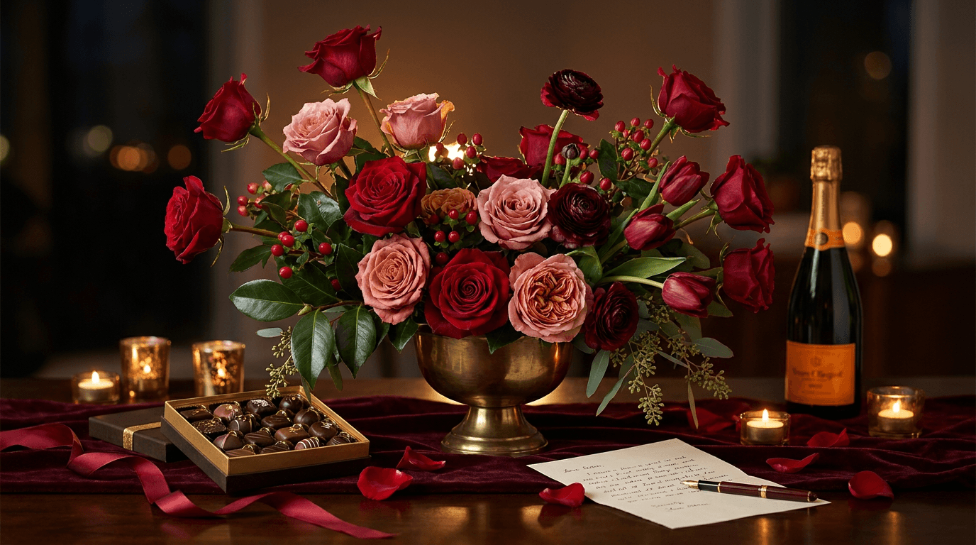
Prompt:
seasonal Valentine's Day floral campaign photograph of [a romantic Valentine's Day themed floral scene — a lush, passionate arrangement of red and deep pink roses as the hero: a generous bouquet of long-stemmed red roses in classic Valentine's crimson — deep, saturated, velvety red roses at various stages from tight elegant buds to fully open blooms displaying their dark spiral centers, mixed with garden roses in deep warm pink and dusty rose adding dimensional color depth beyond monochrome red, a few stems of burgundy ranunculus providing dark, richly layered textural contrast, deep red tulips with their elegant chalice shapes adding variety within the red palette, sprigs of red hypericum berries adding small round punctuation accents, the foliage is deep and lush — dark green camellia leaves providing glossy contrast, seeded eucalyptus in dark sage adding cascading texture, the arrangement is in a romantic vessel — perhaps a vintage brass or gold-toned urn providing warm metallic contrast to the reds, or a rich matte black ceramic vase providing dramatic contrast, or a deep burgundy glass vessel creating monochrome depth, the overall arrangement is passionate and generous — this is not a restrained, minimal arrangement but a full-hearted declaration of beauty in the language of red roses, around the arrangement Valentine's-specific elements create a campaign scene: a box of artisan chocolates in dark chocolate and gold wrapping partially open showing the confections, a bottle of champagne or wine with a warm label visible but not readable, a handwritten love letter or card on warm cream paper with a fountain pen resting across it, a few scattered rose petals on the surface — the classic Valentine's gesture of petals fallen from abundance, a few small candles in gold or brass holders providing warm ambient points, a silk ribbon in deep red or warm gold trailing from the arrangement across the surface] in a warm romantic campaign composition, the photograph brings together the floral hero and the Valentine's contextual elements in a rich, layered scene that communicates the complete romantic occasion, the surface is warm and sumptuous — a dark wood table, a marble surface with warm veining, a draped velvet or silk in deep burgundy or warm gold — the surface adding to the richness and the romantic weight of the scene, the background is warm and dark — a deep warm tone or a soft dark gradient that allows the rich reds to glow against it with maximum visual impact, the darker background creates a evening-atmosphere quality — Valentine's Day is an evening occasion, a dinner, a date, a candlelit moment, and the photography should feel like nightfall rather than noon, the arrangement is the hero but the surrounding elements create the narrative — the chocolates, the champagne, the letter, the petals, the candles together tell the story of a Valentine's evening that is both aspirational and achievable, the campaign message is implicit: this florist can provide the centerpiece of your romantic evening, and the experience will look and feel like this, the lighting is warm, rich, and dramatic — warmer and more dramatic than other templates, the quality of candlelight and evening glow, the light illuminates the roses with particular attention to their velvet texture — the deep red rose petals have a unique surface quality that is matte in diffused light but shows a subtle velvet sheen in directional light, the photography should capture this sheen, the backlighting through a few red petals creates an extraordinary effect — the deep crimson becoming translucent and luminous like stained glass, the darkest, richest glow in the botanical palette, the candle flames provide small warm points of light that add ambiance and reflect in the vessel's surface — if brass or gold, the warm metallic reflection of candlelight is a key atmospheric detail, the champagne bottle and the chocolate box catch warm highlights that communicate luxury and occasion, the scattered petals on the surface catch the warm light with their velvet surfaces, deep crimson and warm red garden roses deep warm pink and dusty rose garden roses dark burgundy ranunculus deep red tulips dark green glossy foliage dark sage eucalyptus warm brass or gold or matte black vessel rich dark surface — wood or marble or velvet — dark chocolate and gold wrapping champagne warm label cream love letter gold or brass candle holders warm candlelight glow scattered red petals deep red and warm gold silk ribbon accents and the rich dramatic passionate palette of Valentine's Day florals in warm evening-atmosphere light as the color palette, the mood is passionately romantic richly generous warmly dramatic and the specific emotional frequency of Valentine's Day — the grand gesture, the declaration, the one day of the year when extravagance in the name of love is not only permitted but expected — the photograph as the visual argument that flowers are the language of love and this florist speaks it fluently, professional campaign and editorial floral photography with warm dramatic directional and candlelight-quality illumination and moderate depth of field keeping the arrangement and the primary campaign elements in rich detailed focus with the dark atmospheric background creating dramatic warmth, composed as a campaign scene with the red rose arrangement as the hero and the Valentine's contextual elements as the occasion narrative, the velvet rose texture and the dramatic warm lighting as the romantic-campaign focal points, rich warm dramatic reds and golds against dark warm background, no text, no logos, no watermarks
Best for: Instagram seasonal Valentine's Day campaign, florist website Valentine's Day landing page, social media Valentine's Day countdown and promotion, email marketing Valentine's Day campaign hero, e-commerce Valentine's Day collection page, print Valentine's Day promotional poster and flyer, social media Stories Valentine's Day countdown content, social media advertising seasonal campaign creative, Google and Facebook advertising seasonal campaign imagery, press and editorial Valentine's Day gift guide features
How to Customize These Prompts for Your Shop
The templates generate compelling botanical imagery, but the most effective content reflects your specific shop, your actual design style, your signature aesthetic, and the genuine character that makes your business unique. Customization transforms these templates from generic floral photography into content that is unmistakably yours.
Describe your actual signature style. If your design aesthetic is wild and garden-gathered, replace the structured descriptions with looser, more organic compositions featuring meadow flowers, herbs, and untamed greenery. If your style is refined and architectural, specify tighter compositions with deliberate stem placement and cleaner silhouettes. If your style is romantic and lush, emphasize abundance, petal density, and overflowing forms. If your style is minimal and Japanese-influenced, specify fewer stems, more negative space, and the deliberate asymmetry of ikebana. The generated content should look like arrangements you would actually create.
Specify your actual flower sourcing. If you specialize in locally grown, seasonal flowers, describe the specific varieties your local growers provide — the particular garden roses, the specific dahlias, the heirloom varieties that distinguish your work from imported-flower competitors. If you work with tropical flowers, specify the anthuriums, the proteas, the orchids, the birds of paradise that define your tropical palette. If you focus on dried and preserved flowers, adjust the templates to feature your specific dried materials and the particular muted palette of preservation. Your flower sourcing is part of your brand story, and the visual content should reflect it.
Match vessels and wrapping to your actual brand. If your shop uses a signature vessel — a specific style of ceramic vase from a local potter, a particular type of brass container, recycled glass bottles, vintage vessels sourced from flea markets — describe that specific vessel in the prompts. If your wrapping style is distinctive — brown kraft with a specific ribbon color, printed tissue in your brand pattern, fabric wrapping in the Japanese furoshiki style — include those wrapping details. Consistency in vessel and wrapping across all visual content builds the brand recognition that makes your content identifiable without a logo.
Adjust the color palette to your brand identity. If your brand is defined by a warm romantic palette of blush, peach, and cream, describe those specific tones consistently across all templates. If your brand is bold and modern with jewel tones and dramatic contrasts, specify those deeper, more saturated colors. If your brand is wild and natural with green-heavy, herb-and-wildflower arrangements, describe that green-dominant, meadow-inspired palette. Color consistency is the single most powerful visual branding tool for florists, and every generated image should reinforce your specific palette.
For showcasing your actual arrangements, composite real photography. The most credible florist marketing shows real arrangements. Photograph your actual creations — your real bouquets, your real centerpieces, your real shop — and use the Image Inpainting tool to enhance the background, improve the lighting quality, adjust the color accuracy, or clean up the workshop surface while preserving the authentic arrangement. This approach gives you the credibility of real product with the visual quality of professional studio photography. Customers who see a real arrangement and receive the same quality build the trust that generates repeat orders and referrals.
Platform-Specific Deployment for Florists and Plant Shops
Each platform serves a different function in the customer journey — from inspiration and discovery to product selection and purchase. Deploying the right image type on the right platform maximizes conversion at every stage.

Instagram is the florist's primary portfolio and sales channel. For florists, Instagram is simultaneously a gallery, a portfolio, a shop window, and a sales channel. The grid should communicate the florist's aesthetic range and design quality at a glance: signature bouquets (Template 1), seasonal arrangements (Template 3), wedding work (Template 5), and artisan behind-the-scenes content (Template 13) create a portfolio that attracts both individual customers and event clients. Use 4:5 for feed posts, 9:16 for Stories showing daily shop content and arrangement process, and Reels for short-form process and finished-product content. For additional Instagram content strategies, the dedicated guide covers platform-specific optimization.
Pinterest drives wedding and event client discovery. Pinterest is the single most important platform for wedding floral client acquisition. Brides search Pinterest for floral inspiration, and the florist whose images appear in those searches gains access to the highest-margin client segment. Templates 5 (Wedding), 3 (Seasonal), 1 (Signature Bouquet), 7 (Wreath), and 11 (Flat Lay) perform exceptionally well on Pinterest, where rich, visually detailed, well-composed botanical imagery earns saves and clicks at high rates. Pin with keyword-rich descriptions linking to your portfolio, wedding page, or consultation booking.
Google Business profile drives local walk-in and delivery orders. When someone searches "florist near me" or "flower delivery [city name]," Google Business profile images are the first visual impression. Prioritize the storefront (Template 10), the shop interior (Template 2), signature bouquets (Template 1), and the florist at work (Template 13) for Google Business. These images answer the searcher's primary questions: is this a real shop, what does the work look like, and is this a professional operation? Update Google Business images seasonally to reflect current offerings.
The florist website converts browsers into buyers. The website's visual hierarchy should guide the visitor from appreciation to purchase. The homepage hero needs a stunning, brand-defining arrangement image (Template 1 or Template 3). The shop page benefits from product-style images of available arrangements. The wedding and events page needs portfolio-quality bridal and event imagery (Template 5). The about page needs the artisan-at-work portrait (Template 13) and the shop interior (Template 2). The sympathy page needs reverent, dignified imagery (Template 14). Each page's visual content should serve the specific emotional and informational needs of the visitor who arrives there.
E-commerce platforms demand accurate, appealing product imagery. Whether you sell through your own website, through a marketplace, or through a delivery platform, each product listing needs imagery that is both visually appealing and honestly representative. Templates 1 (Signature Bouquet), 9 (Gift Box), and 12 (Potted Arrangement) provide the visual foundation for e-commerce listings. The key principle is accuracy — the generated or photographed image should honestly represent what the customer will receive, particularly regarding scale, density, variety, and overall design quality.
TikTok reaches younger customers and creates viral floral content. Floral content — particularly arrangement process videos, shop tours, and flower education — performs exceptionally well on TikTok. The platform rewards authentic, personality-driven content over polished production. Templates 13 (Florist at Work), 2 (Shop Interior), 8 (Workshop), and 3 (Seasonal Arrangement) provide the visual foundations for TikTok content. The Text2Shorts tool can create short-form arrangement and shop atmosphere content, and the AI Clipping tool extracts the most engaging moments from longer workshop or process videos. For TikTok content strategies, the dedicated guide covers short-form optimization.
Facebook serves community and local marketing. For florists, Facebook remains valuable for local community engagement, seasonal promotions, and maintaining relationships with existing customers. Shop and storefront images (Templates 2, 10), workshop promotions (Template 8), and seasonal campaigns (Template 15) perform well on Facebook, where the audience tends to be local community members and repeat customers.
Email marketing drives seasonal and occasion purchasing. Email campaigns aligned to floral occasions — Valentine's Day, Mother's Day, Easter, Thanksgiving, Christmas, wedding season — keep the florist top-of-mind during peak purchasing periods. Use the seasonal campaign template (Template 15) for holiday email headers, the signature bouquet (Template 1) for general email branding, and the gift box (Template 9) for gift-focused campaigns.
YouTube for process, education, and brand storytelling. Arrangement tutorials, shop tours, flower care education, and behind-the-scenes content build authority and create the long-form content that supports SEO and brand trust. The YouTube Thumbnail Maker ensures every video has a professional, brand-consistent thumbnail, and the channel banner art guide covers brand extension across YouTube.
Common Mistakes in Florist and Plant Shop Photography
Botanical photography fails in genre-specific ways that directly impact customer perception and purchasing decisions. These common mistakes are worth identifying because correcting them immediately improves the effectiveness of your visual content.
Shooting under overhead fluorescent light. The single most destructive lighting mistake in floral photography is using the overhead fluorescent or LED lights that illuminate most shops. Fluorescent light has a green or blue color cast that deadens warm tones, flattens dimension, and makes every flower look like a cheaper version of itself. Red roses turn brownish. Blush pinks turn greyish. Warm peaches turn sallow. The solution is natural light — move the arrangement near the biggest window in the shop, turn off the overhead lights, and photograph in the natural daylight. Even on a cloudy day, natural window light produces warmer, more dimensional, more beautiful floral photography than any overhead fluorescent. If natural light is not available, a simple portable daylight-balanced LED panel provides a vastly superior alternative.
Shooting against cluttered or competing backgrounds. A gorgeous arrangement photographed against a background of other arrangements, shop clutter, refrigerator doors, receipt printers, and stacked delivery boxes loses its visual impact entirely. The viewer cannot distinguish the featured arrangement from the visual noise behind it. Before photographing, isolate the arrangement — move it to a clean surface, find a simple wall, drape a cloth behind it, or simply step outside and photograph against a building wall or a fence. The thirty seconds spent clearing the background dramatically improves the photograph's ability to communicate the arrangement's beauty.
Using a harsh flash that kills petal texture. The built-in camera flash produces hard, flat, frontal light that eliminates the subtle surface textures that make flowers visually interesting — the velvet of a rose, the paper-thin translucency of a ranunculus, the waxy sheen of a tulip, the matte softness of a dahlia. Flash also creates harsh shadows behind the arrangement and bright reflective hot spots on shiny leaves. Never use direct flash for floral photography. Natural light, bounced light, or a diffused continuous light source all produce vastly superior results.
Oversaturating colors in editing. The temptation to push the saturation slider to make flowers "pop" is strong, but oversaturation produces an artificial, candy-like color quality that the educated buyer recognizes as dishonest. A garden rose that is naturally dusty pink should not be edited to hot pink. A cream ranunculus should not be pushed to bright yellow. The viewer who orders based on an oversaturated image and receives an arrangement in naturally muted tones will be disappointed, and the disappointment will cost the florist a repeat customer. Edit for accuracy: warm the white balance slightly, increase contrast gently, but leave the saturation close to what the eye actually sees.
Photographing arrangements past their peak. Flowers have a visual peak — the moment when the bloom is fully open but the petals are still firm, the color is saturated, and the stem is strong. Photographing after this peak — when petals are softening, edges are browning, stems are bending — communicates diminished quality even if the arrangement was stunning twenty-four hours earlier. Photograph arrangements within an hour of completing them. If the arrangement is for a specific order, photograph it before it goes in the cooler. The freshest version of the arrangement is the version that should represent the brand.
Inconsistent styling across content. An Instagram grid that shows one arrangement on a marble surface with studio lighting, the next on a shop counter under fluorescent light, the third on a delivery van seat with no styling, and the fourth on a kitchen table at someone's home — this inconsistency creates visual chaos that undermines brand identity. Establish two or three standard surfaces (a warm wood board, a linen cloth, a marble slab), use the same general lighting approach (natural window light), and maintain a consistent color grading across all images. This consistency creates a cohesive visual brand that is immediately recognizable.
Ignoring the vessel as part of the design. The vase, pot, box, or wrapping is not a neutral container — it is part of the design and part of the customer's purchase. Photographing a beautiful arrangement in a generic clear glass vase that the shop uses as a holding vessel — rather than in the actual vessel the customer will receive — misrepresents the product. Always photograph in the delivery or display vessel, and ensure the vessel is clean, unchipped, and consistent with the arrangement's aesthetic quality.
Failing to show scale. A photograph of a bouquet against a white background communicates nothing about its size. Is it a petite $35 arrangement or a grand $200 statement piece? The customer cannot tell, and the confusion leads to either disappointment (the small arrangement that looked large in the photo) or missed sales (the grand arrangement that looked ordinary without scale context). Include a scale reference in at least some product images — a hand holding the bouquet, the arrangement on a table next to recognizable objects, a full-room shot showing the arrangement in spatial context.
Neglecting the shop itself as content. The shop interior, the window display, the sidewalk presentation, the workbench, the flower cooler — these environmental images communicate the florist's professionalism, aesthetic sensibility, and the experience of visiting in person. Many florists post only product shots and neglect the shop-as-subject content that builds the local brand and drives foot traffic. Templates 2 (Shop Interior) and 10 (Storefront) exist specifically for this purpose and should be part of the regular content rotation.
Building a Complete Florist & Plant Shop Content Pipeline
A florist producing content for daily Instagram, periodic TikTok, a website, e-commerce platforms, email marketing, and seasonal campaigns needs a systematic approach that maintains high visual quality while accommodating the reality that most of the day is spent designing, delivering, and managing the shop.
Establish your visual brand standards first. Before generating or photographing any content, define the visual parameters: your color palette (the three to five tones that define your brand — perhaps blush, cream, sage, and warm wood), your vessel style (modern ceramic, vintage brass, rustic terracotta, glass), your surface materials (marble, wood, linen), your composition style (abundant and wild, refined and minimal, romantic and lush), and your lighting quality (bright and airy, warm and moody, natural and honest). These standards become the consistent visual language that makes every piece of content identifiably yours.
Build a seasonal content calendar around the floral calendar. Map your content needs to the floral business's natural rhythm: Valentine's Day campaign content in January and February, spring bloom celebrations in March through May, wedding season portfolio content in April through October, Mother's Day campaign content in April and May, summer garden and outdoor content in June through August, autumn harvest and Thanksgiving content in September through November, holiday and Christmas campaign content in November and December. Layer in your specific shop events — workshops, pop-ups, collaborations — and generate promotional visual content two to three weeks before each event. Template 15 adapts to any holiday or occasion by changing the seasonal elements and the campaign-specific props.
Photograph daily, deploy daily. Unlike many businesses where content can be batched months in advance, the florist's best content is fresh — today's arrangements, this week's seasonal arrivals, the bouquet being built right now. Establish a daily photography habit: photograph at least two or three arrangements each day in consistent lighting and styling conditions. This takes five to ten minutes and produces the authentic, fresh content that the florist's audience values most. Use the Image Inpainting tool to enhance the lighting, remove background clutter, or adjust the color grading of these real photographs to match your brand's visual standards.
Batch generate atmospheric and campaign content monthly. Set aside one session per month to generate the atmospheric, brand, and campaign content that supplements your daily real product photography. Use the 15 templates to produce a library of eight to fifteen images covering the content types that do not require real product: shop atmosphere (Templates 2, 10), lifestyle context (Template 6), botanical art (Templates 4, 11), seasonal campaigns (Templates 3, 15), and artisan portraits (Template 13). This library provides the brand-building and atmospheric content that fills the content calendar between daily product posts.
Extend still imagery to video content. The most engaging florist content on Instagram and TikTok is process video — the arrangement built from first stem to finished bouquet, the shop opening in the morning, the flower unboxing from the wholesaler, the wreath being wired. The Cinematic Video Generator produces atmospheric shop and arrangement video content — slow panning reveals of finished arrangements, close-up petal and texture detail sequences, shop atmosphere cinematics. The Text2Shorts tool creates short-form arrangement-process and shop-reveal content. The AI Music Generator produces custom ambient or gentle acoustic tracks that match the shop's atmospheric brand — soft acoustic for romantic arrangements, fresh upbeat for bright seasonal content, gentle ambient for shop atmosphere reveals.
Create occasion-specific content libraries in advance. For the major floral occasions — Valentine's Day, Mother's Day, Christmas — generate the campaign visual content well in advance. Produce a suite of images for each occasion: the campaign hero (Template 15), the product showcase (Template 1), the gift presentation (Template 9), and the seasonal arrangement (Template 3), customized with occasion-specific flowers, colors, and props. This library can be deployed across the entire promotional campaign: announcement, early-order promotions, countdown, last-minute ordering, and post-occasion thank-you.
Repurpose across platforms with format-specific optimization. A single strong arrangement photograph can serve Instagram feed (4:5), website product page (1:1 or 4:5), Pinterest pin (2:3), email header (600px wide), Google Business (1:1), Facebook (16:9 or 1:1), and e-commerce listing (1:1 or 4:5) — but each deployment requires its own crop and framing. Generate originals at the highest resolution and in your primary aspect ratio, then crop and reframe for secondary platforms. The primary focal point — the arrangement itself — should remain central and clear in every crop.
Emerging Trends in Floral and Plant Shop Marketing
The floral and plant industry's visual landscape is evolving with broader cultural shifts in aesthetics, sustainability, consumer behavior, and the role of nature in daily life.
Sustainability and eco-consciousness are reshaping floral branding. Consumers increasingly evaluate florists on environmental practices — locally grown versus imported flowers, seasonal availability versus forced greenhouse production, compostable versus plastic wrapping, reusable versus disposable vessels, foam-free mechanics versus traditional floral foam. Visual content that communicates sustainable practices — locally grown wildflower arrangements, kraft paper and twine wrapping, vintage or reusable vessels, foam-free mechanics, compostable packaging — resonates strongly with environmentally conscious consumers. The material descriptions in these prompts deliberately emphasize natural and sustainable materials for this reason.
The "wild" and "garden-gathered" aesthetic continues to dominate. The tight, structured, concentric-circle bouquet of traditional floristry has given way to the looser, more organic, garden-gathered aesthetic that emphasizes natural movement, textural variety, and the deliberate inclusion of elements that were once considered unconventional: herbs, grasses, seedpods, branches, unripe fruits, and foraged botanical material. Visual content that communicates this naturalistic design philosophy — loose silhouettes, reaching stems, mixed textures, herb and foliage integration — reflects the dominant contemporary aesthetic and appeals to the design-conscious buyer.
Dried and preserved flowers have moved from niche to mainstream. What was once a small segment — dried flowers for craft projects — has become a mainstream design category offering permanent botanical beauty, sustainability (no water, no waste), and the particular warm, muted aesthetic that dried materials provide. Template 7 (Wreath and Dried) serves this category, but dried elements can be incorporated into nearly every template to reflect this growing market.
Houseplants remain a lifestyle category, not just a retail product. The houseplant market continues to thrive not because people need plants but because plants have become lifestyle accessories — design elements, personal care rituals (watering, repotting, propagating), social media content, and identity markers. Template 6 (Houseplant Lifestyle) captures this positioning, showing plants not in the shop but in the home where they become part of the customer's designed life. Plant shops that position their products as lifestyle elements rather than inventory items earn premium positioning and customer loyalty.
Subscription and recurring delivery models continue to grow. Weekly or biweekly flower subscriptions — delivered to home or office — represent a growing revenue stream that provides predictable cash flow and ongoing customer relationships. Visual content for subscriptions should emphasize variety (different arrangements over time), quality consistency (every delivery meets the visual standard), and the lifestyle benefit (always having fresh flowers in your space). Seasonal arrangements (Template 3) and signature bouquets (Template 1) adapted to show a rotating seasonal variety serve subscription marketing effectively.
Short-form video dominates florist content discovery. TikTok and Instagram Reels have become the primary discovery channels for younger floral customers. The "arrangement process" video — watching a skilled florist build a bouquet from first stem to finished product in a sixty-second time-lapse — is among the most popular content formats in the floral category. Studios that produce regular short-form video content reach audiences that static photography alone cannot access, and the video format allows the artisanal skill that static images only imply to be demonstrated in full.
Corporate and office plant services are growing. Corporate office plant programs — designed, installed, and maintained plantscapes for commercial spaces — represent a significant B2B opportunity for plant shops. Visual content that shows plants in professional office environments, reception areas, conference rooms, and commercial lobbies communicates the plant shop's ability to serve corporate clients. Template 6 (Houseplant Lifestyle) adapted with commercial-space descriptions supports this marketing.
Floral design is increasingly recognized as art. The elevation of floral design from service craft to recognized art form — through Instagram, through editorial features, through large-scale installation work, through gallery exhibitions of botanical art — has created a new aspirational dimension for florist marketing. Templates 4 (Single-Stem Botanical), 11 (Flat Lay), and 5 (Wedding) can serve this art-forward positioning by presenting botanical material with the visual reverence and compositional care typically reserved for fine art photography.
For more on visual trends and content strategies across product, lifestyle, and brand categories, the product photography prompts guide and the real-world-looking photo prompts collection offer additional templates and techniques.
How Miraflow AI Supports Your Floral & Plant Content Workflow
Every prompt in this post can be generated inside Miraflow AI. Open the AI Image Generator, paste your customized prompt with your specific floral design style, your vessel preferences, your shop character, your brand palette, and your botanical specialties, select the appropriate aspect ratio for your target platform, and generate. Multiple aspect ratio options including 1:1, 4:5, 9:16, 16:9, and 5:4 are available, covering every platform from Instagram feed to e-commerce listing to website banner to print catalog.
For images that need targeted refinements — adjusting the flower varieties to match your actual availability, modifying the vessel to match your signature containers, changing the color palette to reflect your brand tones, swapping seasonal elements, or compositing your real arrangement photographs into enhanced atmospheric settings — the Image Inpainting tool allows precise editing of specific image regions while preserving the overall composition. This is particularly valuable for florist marketing where the most credible content combines real arrangements with professional visual quality — photograph your actual bouquets, your real shop, and your genuine design work, then use inpainting to enhance the background, improve the lighting quality, adjust the color accuracy, or add atmospheric elements while keeping the authentic arrangement and the real botanical material.
The recommended workflow for floral and plant content production operates on two complementary tracks. The daily authenticity track documents real arrangements, real shop moments, and real botanical material through daily photographs enhanced with inpainting for visual consistency and professional quality. The atmospheric brand track uses these AI prompts to generate the campaign content, the lifestyle context, the seasonal branding, the occasion-specific marketing, and the brand-building atmospheric imagery that supplements the daily real product content. Together, these two tracks produce a complete content library that combines the credibility of real product — these are flowers I actually arranged today — with the atmospheric aspiration that builds the brand and drives premium purchasing.
For florists and plant shops building a complete content ecosystem, Miraflow's suite extends beyond static photography. The Cinematic Video Generator produces atmospheric arrangement and shop videos — slow-motion petal details, shop atmosphere reveals, finished arrangement cinematic portraits, seasonal window display sequences. The Text2Shorts tool creates short-form arrangement process and shop atmosphere content for TikTok and Reels — the sixty-second bouquet build, the morning shop opening, the seasonal flower arrival. The AI Music Generator produces custom ambient, acoustic, and nature-sound tracks that match the shop's brand — soft romantic acoustic for wedding and Valentine's content, fresh upbeat for spring and summer seasonal content, warm ambient for shop atmosphere and brand content, gentle nature sounds for garden and outdoor botanical content. The AI Clipping tool repurposes longer workshop recordings and process videos into platform-ready clips with captions. Together, these tools allow a florist or plant shop to produce a complete marketing content library across photography, video, and audio, maintaining the visual beauty, the warmth, and the artisanal quality that defines the botanical brand and that communicates, in every frame, the invitation that is at the heart of every flower shop's message: there is beauty here, it is alive, it was made for you, and it will not last forever — which is precisely what makes it precious.
FAQ
Can AI-generated images replace photographs of my real arrangements?
AI-generated images are excellent for atmospheric content, campaign materials, seasonal branding, lifestyle context, and brand-building visuals. However, for your actual arrangements and products — the specific bouquets customers will order — real photographs are essential because they set accurate expectations and demonstrate your genuine design skill. The strongest approach combines both: real photography of your daily arrangements for product content and authenticity, and AI-generated imagery for atmosphere, campaigns, and brand-building. Use inpainting to bridge the gap — enhance real arrangement photographs with better backgrounds and lighting while preserving the authentic botanical material.
How should I photograph flowers with just a phone and natural light?
Find the biggest window in your shop. Move your arrangement to a surface within three feet of that window. Turn off all overhead lights so the window is your only light source. If the sunlight is direct and harsh, place a piece of white tissue paper or a sheer curtain over the window to diffuse it. Place a piece of white foam board or a white sheet on the opposite side of the arrangement from the window to bounce light into the shadows. Use a simple background — a wooden board, a piece of linen, a blank wall. Photograph from slightly above and to the side, not straight on. Use your phone's portrait mode for natural background blur. This basic setup produces dramatically better photographs than the overhead-fluorescent shop-counter standard.
What is the most important content type for a florist?
The signature bouquet hero (Template 1) is the single most important content type because it communicates the core value proposition — the beauty, the skill, and the design quality of your floral work. This is the image that should anchor your Instagram grid, lead your website, and represent your brand everywhere. Beyond this, the next most important types depend on your revenue mix: if wedding work is significant, Template 5 (Wedding) is critical; if retail and delivery are primary, Templates 9 (Gift Box) and 3 (Seasonal) drive purchasing; if foot traffic matters, Template 10 (Storefront) drives visits.
How often should a florist post on social media?
For Instagram, five to seven feed posts per week with daily Stories is ideal. Floral content has a built-in advantage: it is inherently beautiful and visually engaging, which means well-photographed flower content receives higher engagement than most product categories. Post your best arrangement each day as a feed post, use Stories for behind-the-scenes process content and daily shop updates, and use Reels for arrangement process videos. For TikTok, two to three process or shop videos per week is a strong cadence. The key is that floral content should be fresh — ideally photographed and posted the same day for maximum seasonal relevance and authenticity.
How do I handle the color accuracy problem in online flower sales?
Color accuracy is the florist's most persistent visual challenge because monitor calibration, screen brightness, and ambient lighting all affect how the customer perceives color. The best approach is threefold. First, photograph in natural light, which provides the most accurate color rendering. Second, edit gently — warm the white balance slightly but do not push saturation or shift hues. Third, include honest descriptions alongside images — note that colors may vary naturally and that seasonal availability affects specific varieties. The customer who understands that they are buying an artisan's interpretation of a palette, not an exact color match, is a customer who will be delighted rather than disappointed.
Should I show prices on product images?
In general, do not include prices on the image itself — it limits the image's usability across platforms and locks you into a price that may change seasonally. Instead, clearly communicate prices in the post caption, on the product page, or in the product listing. The exception is social media advertisements where including the price in the ad creative can improve conversion by setting expectations before the click. For ad-specific images, add the price in a clean overlay rather than generating it as part of the image.
What aspect ratios work best for florist content?
Use 4:5 for Instagram feed posts — the vertical format allows the full height of a tall arrangement to be visible. Use 1:1 for e-commerce product listings, Google Business images, and product thumbnails. Use 9:16 for Instagram Stories and TikTok — the full-screen vertical format is immersive and allows tall arrangements and vertical compositions to fill the screen. Use 2:3 for Pinterest — the vertical format that Pinterest rewards. Use 16:9 for website banners and YouTube thumbnails. Use 3:2 for print materials. For flower arrangements, the vertical 4:5 and 2:3 formats generally work best because they accommodate the vertical proportions of most arrangements without cropping the tallest stems.
How do I create visual content for wedding inquiries specifically?
Wedding clients discover florists primarily through Pinterest and Instagram, and they are searching for a specific aesthetic match. Create a wedding portfolio in your Instagram highlights and on your website that shows a range of wedding work in your signature style: bridal bouquets, centerpieces, ceremony installations, boutonnieres, and reception details. Template 5 provides the campaign-style hero, but actual wedding work photographs are even more valuable — photograph every wedding you do (with client permission) and build a real portfolio that grows with each event. Use Pinterest actively, pinning your wedding work with detailed keyword descriptions (bouquet style, color palette, venue type, season) that help brides find you through search.
Conclusion
The flower shop occupies a unique position in the commercial landscape. It sells something that is simultaneously a luxury and a necessity, a commodity and a work of art, the most temporary of purchases and one of the most emotionally permanent. The bouquet that arrives at a hospital room after a birth, the centerpiece that anchors a wedding table, the arrangement that sits on a desk through a difficult week, the handful of garden roses purchased on the walk home for no reason other than beauty — these transactions are not retail events. They are emotional events that happen to involve a purchase. The flowers carry what cannot be spoken. They celebrate what is too large for words. They console what cannot be consoled. They mark moments that the buyer and the recipient will remember long after the petals have dried and the stems have been composted. The flowers are temporary. What they carry is not.
The 15 templates in this post are designed to communicate this extraordinary weight through the ordinary medium of a photograph on a screen. Each one encodes not just a visual composition but a specific emotional quality designed to trigger the particular pull that only flowers create: the signature bouquet hero that makes the viewer want those flowers on their table, the shop interior that makes the viewer want to walk through that door, the seasonal arrangement that communicates the urgency of a fleeting bloom window, the single-stem botanical that reveals the extraordinary complexity of a single flower, the wedding showcase that makes the bride see her own wedding in those blooms, the houseplant lifestyle that makes the viewer imagine their home transformed by green, the wreath and dried arrangement that communicates beauty preserved beyond its season, the workshop moment that invites the viewer to put their own hands in the flowers, the gift box that communicates the care and delight of receiving, the storefront that functions as a visible invitation from the sidewalk, the flat lay that transforms working materials into overhead art, the potted arrangement that offers living beauty that endures, the florist at work who reveals the skilled hands behind the beauty, the sympathy arrangement that carries grief and love with quiet dignity, and the seasonal campaign that ties the flowers to the moment and the occasion.
Copy the templates that align with your shop's specific character. Customize them with your actual design style — whether romantic and lush or minimal and modern or wild and garden-gathered — your specific botanical specialties, your signature vessels and wrapping, your brand's palette and personality, and the genuine quality that makes your shop different from the supermarket flower section and the online delivery service. Generate them inside Miraflow AI, and deploy them across every surface where a potential customer might encounter your shop: your Instagram grid, your website, your Google Business profile, your Pinterest boards, your e-commerce listings, your Facebook page, your TikTok account, your email campaigns, your print materials, your wedding planning platform profiles, your shop window, and your delivery packaging. Build a visual presence that communicates, in every frame and on every platform, the singular message that every flower shop exists to deliver: life is brief, beauty is real, and there is no wrong day to fill your home or someone else's with something alive and extraordinary and temporary and therefore absolutely, urgently, irresistibly worth having.