AI Prompts for Wine & Spirits Brand Content: 15 Premium Visuals (Copy & Paste)
Written by
Jay Kim
15 copy-paste AI prompts for wine and spirits brand visual content. Hero bottle portraits, pour and liquid-in-motion shots, cocktail and serve-suggestion lifestyle builds, label and packaging detail close-ups, vineyard and distillery origin landscapes, barrel room and aging-process atmospherics, tasting flight and lineup presentations, glassware and ritual details, maker portrait contexts, seasonal and limited-release launches, bar and restaurant on-premise scenes, ingredient and botanical stories, gift and occasion presentations, brand heritage and archive compositions, and social media promotional graphics designed for wineries, distilleries, bourbon and whiskey producers, gin and vodka brands, tequila and mezcal houses, and any wine or spirits brand building premium visual content that communicates quality, craft, and the story behind the bottle.
15 copy-paste AI prompts for wine and spirits brand visual content. Hero bottle portrait compositions, pour and liquid-in-motion action shots, cocktail and serve-suggestion lifestyle builds, label and packaging detail close-ups, vineyard and distillery origin landscapes, barrel room and aging-process atmosphere shots, tasting flight and comparative lineup presentations, glassware and ritual detail compositions, brand founder and maker portrait contexts, seasonal and limited-release launch visuals, bar and restaurant on-premise environment scenes, ingredient and botanical story compositions, gift and occasion presentation setups, brand heritage and archive compositions, and social media promotional and campaign announcement graphics designed for wineries and vineyard estates, craft distilleries and micro-distillers, bourbon and whiskey producers, vodka and gin brands, tequila and mezcal houses, rum distillers, brandy and cognac houses, premium and luxury spirits labels, wine négociants and cooperatives, sparkling wine and champagne producers, natural and biodynamic wine makers, cider and mead producers, ready-to-drink cocktail brands, non-alcoholic spirit alternatives, single-malt and blended scotch producers, sake and rice wine brewers, amaro and liqueur producers, celebrity and founder-led spirits brands, private-label and contract-distilled brands, wine clubs and subscription services, spirits importers and distributors, craft cocktail brands and bar concepts, wine and spirits e-commerce and direct-to-consumer operations, regional and appellation-specific wine producers, fortified wine and port producers, and any brand that puts a liquid into a bottle and asks someone to pay a premium for the story, the craft, and the experience contained within.
The bottle stands on the shelf at eye level, shoulder to shoulder with forty others in the same category. The liquid inside is invisible — amber or ruby or clear or golden, it does not matter because no one can see it through the glass or behind the label from three feet away under fluorescent retail lighting. The consumer standing in the aisle, scrolling the wine app, browsing the spirits e-commerce site, flipping through the cocktail menu, encountering the Instagram ad at 7:14 on a Friday evening — the consumer does not taste the liquid before choosing. Does not nose the bourbon. Does not swirl the pinot. Does not evaluate the botanical balance of the gin. The consumer sees. The consumer sees the bottle, the label, the color of the liquid if it is visible, the brand imagery that has accumulated in their memory through every prior visual touchpoint. The consumer chooses with the eye. The purchase decision for wine and spirits is, in the moment of commitment, a visual decision — a judgment made on the basis of what the brand looks like, what the bottle communicates, what the imagery promises about the experience inside.
This is not a casual observation. It is the operational reality of an industry where the product is sealed, the tasting requires purchase, and the competition is measured in shelf facings, search results, and scroll-stopping milliseconds. The visual identity of a wine or spirits brand is not the packaging around the product. It is the product, from the consumer's perspective, until the moment the seal is broken and the liquid meets the glass. Everything before that moment — every impression, every craving, every aspiration, every quality judgment, every price-justification — is built on the visual. The label. The bottle form. The photography. The social content. The advertising. The menu presence. The recommendation visual that the sommelier or bartender or algorithm surfaces. Every link in the chain from awareness to purchase is visual, and the quality of the visual determines whether the chain holds or breaks.
If you have worked with AI prompts for product photography, food and beverage brand content, or social media visuals, the methodology will be familiar. Copy the prompt, adjust the details to match your specific wine or spirits brand — your product type (still wine, sparkling, rosé, bourbon, rye, scotch, Irish whiskey, vodka, gin, tequila, mezcal, rum, brandy, cognac, liqueur, amaro, sake, non-alcoholic spirit, ready-to-drink cocktail, cider, mead), your specific bottle and label design, your brand colors and visual personality, your positioning (luxury and prestige, artisan and craft, heritage and tradition, modern and disruptive, approachable and everyday, adventurous and experimental), your origin story and production method, your retail context (on-premise bar and restaurant, off-premise retail and liquor store, direct-to-consumer and wine club, e-commerce, tasting room), and the specific visual identity that distinguishes your bottle from every other bottle on the shelf, on the screen, and in the feed — generate, and deploy. What distinguishes these prompts from general product photography templates is that every element has been engineered specifically for the wine and spirits context: the hero bottle portraits that capture the glass form, the label detail, the liquid color, and the premium material quality that justifies the price (the single most important image in the entire spirits brand visual ecosystem), the pour and liquid-in-motion shots that communicate the sensory experience through the visual dynamism of flowing liquid, the cocktail and serve-suggestion lifestyle builds that show the consumer exactly how to experience the product and connect it to the aspirational occasion, the label and packaging detail close-ups that celebrate the design craft that is itself a premium signal, the vineyard and distillery origin landscapes that ground the product in a place and a tradition, the barrel room and aging-process atmosphere shots that communicate the time and the patience invested in the product, the tasting flight and comparative lineup presentations that position the product within a portfolio or a comparative context, the glassware and ritual detail compositions that celebrate the specific drinking ritual of the category, the maker portrait contexts that humanize the brand through the winemaker or distiller or blender, the seasonal and limited-release launch visuals that create urgency and collectibility, the bar and restaurant on-premise environment scenes that sell the social context, the ingredient and botanical story compositions that reveal the raw materials, the gift and occasion presentation setups that sell the gifting and celebration use case, the brand heritage and archive compositions that ground the product in history and tradition, and the social media promotional and campaign announcement graphics that convert attention into purchase. These are not generic beverage photography prompts applied to alcoholic products. They are premium-positioning visual systems designed to solve the specific challenge of making a sealed, untasteable, highly competitive, story-dependent product irresistible through a screen.
Why Visual Premium Is the Defining Competitive Advantage for Wine & Spirits Brands
The wine and spirits industry operates through purchase-decision mechanisms that are fundamentally different from most other consumer categories. Understanding how consumers discover, evaluate, aspire to, and commit to a wine or spirits purchase reveals why visual premium — the visual communication of quality, craft, origin, exclusivity, and the promise of a specific drinking experience — has become the decisive factor in a category where the product cannot be experienced before purchase and the competition for the consumer's attention, trust, and aspiration is relentless.
The product is invisible until it is opened. A bottle of wine or spirits on a retail shelf is a sealed container. The liquid inside — its color, its viscosity, its clarity, its visual character — is largely invisible behind the glass and the label. The consumer evaluating seven bourbons or twelve pinot noirs or twenty gins is choosing based entirely on visual signals: the bottle shape, the label design, the brand imagery recalled from prior exposure, the shelf talker or rating card, the mental image from the Instagram ad or the cocktail recipe post or the friend's recommendation accompanied by a photograph. The visual does the selling because the product cannot sell itself from behind glass and a sealed closure.
Wine and spirits are aspiration purchases. Unlike commodity beverages purchased for hydration, wine and spirits are purchased for experience, for occasion, for identity, for aspiration. The consumer buying a bottle of single malt is purchasing an evening ritual, a self-image, a story to tell when someone asks what they are drinking. The consumer buying a bottle of wine for a dinner party is purchasing a statement about their taste, their knowledge, their generosity. The visual identity of the brand must communicate the specific aspiration the consumer is purchasing — the luxury, the craft, the sophistication, the adventure, the tradition, the modernity — because the aspiration is what justifies the premium over commodity alternatives. The visual is the aspiration made visible.
Price justification is visual before it is gustatory. A $60 bottle of bourbon must look like a $60 bottle of bourbon. A $150 bottle of wine must look like a $150 bottle of wine. The consumer cannot taste the difference between a $30 and a $60 bourbon before purchasing — the price justification must come from the visual signals: the bottle weight and form, the label design quality, the closure type, the photography and brand imagery, the overall visual impression of quality, care, and premium intent. Visual premium is not vanity; it is a pricing mechanism. The same liquid in two different visual presentations will command two different price expectations. The brands that master the visual communication of quality can support higher price points because the consumer has already accepted the premium before the first sip.
The category is saturated and hyper-competitive. The number of wine and spirits brands available to the consumer has expanded dramatically as craft distilleries, boutique wineries, celebrity brands, international imports, and category-crossing innovations have entered the market alongside legacy producers. The consumer faces an overwhelming number of choices in every category. In a saturated market where many products are well-made and competently priced, the visual brand identity — the quality of the photography, the consistency of the aesthetic, the premium-signaling power of the imagery — is the primary differentiator that determines which bottle the consumer reaches for. The best whiskey with the weakest visual identity loses to the good whiskey with the strongest visual identity, because the consumer cannot taste either one before the visual decision is made.
Social media has become the primary discovery and aspiration engine. Instagram, TikTok, Pinterest, and spirits-focused content platforms have become the primary channels through which wine and spirits brands build awareness, generate aspiration, and drive purchase behavior. The visual content on these platforms does not merely promote the product — it creates the aspiration that sends the consumer to the retail shelf, the e-commerce checkout, or the bar menu with a specific brand in mind. A single beautifully photographed bottle in a lifestyle context, a perfectly shot cocktail, or a moody barrel-room atmosphere image can generate more brand desire than months of traditional advertising. The brands that master the visual content on social platforms dominate the aspiration cycle that precedes every purchase.
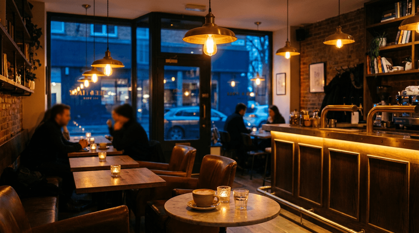
On-premise is won visually before it is won verbally. In bars and restaurants, the consumer encounters the spirits brand through the back bar display, the cocktail menu imagery, the wine list design, and the visual presentation of the served drink. Before the bartender's recommendation, before the sommelier's suggestion, the consumer's eye has already scanned the back bar and formed impressions. The brands that are visually prominent — the distinctive bottle shape recognizable at a distance, the label design that catches the eye from across the bar, the brand imagery on the menu that communicates the aspiration — have already entered the consideration set before the verbal interaction begins. Visual prominence on-premise is not decoration; it is distribution effectiveness.
Packaging is the permanent brand ambassador. The bottle is the wine or spirits brand's single most important visual asset. It stands on the shelf, on the back bar, on the consumer's home bar, on the dinner table, in the Instagram photo, in the gift bag. The bottle form, the label design, the closure, the capsule or wax seal, the glass color and weight — every physical element of the packaging communicates the brand's positioning. And the photography of that packaging — the way the bottle is lit, styled, composed, and presented across every visual touchpoint — determines whether the packaging's premium intent is communicated successfully to consumers who will never hold the bottle before choosing.
The drinking experience is multisensory, but the purchase decision is visual. Tasting wine or spirits engages the eye (color, clarity, legs), the nose (aroma, bouquet, volatiles), the palate (flavor, texture, finish, complexity), and even the hand (the weight of the glass, the temperature). But the purchase decision — the moment of commitment at the shelf, in the app, on the menu — is almost entirely visual. The imagery must communicate what the other senses would: the quality communicated through the bottle's premium visual weight, the flavor complexity communicated through the liquid's visible color and clarity, the craftsmanship communicated through the label's design quality, the experience communicated through the lifestyle imagery that surrounds the product. The image must make the viewer taste the whiskey with their eyes, smell the wine through the photograph, feel the weight of the glass through the screen.
Heritage and provenance are communicated visually. A winery's 150-year history, a distillery's five generations of family ownership, a bourbon's specific mashbill and rickhouse location, a wine's specific vineyard plot and vintage conditions — these stories are the brand's competitive moat, and they are communicated primarily through visual elements: the vineyard landscape, the barrel room atmosphere, the vintage archive, the founder portrait, the architectural heritage of the production facility. The consumer who encounters these visual stories develops a relationship with the brand that transcends the liquid and creates the loyalty that sustains premium pricing across vintages and releases.
The Visual Language of Wine & Spirits Photography
Wine and spirits brands that successfully communicate premium quality and generate aspiration through visual content employ a specific visual vocabulary — a set of aesthetic conventions, lighting approaches, styling techniques, and compositional strategies that communicate the craft, the quality, the origin, and the specific brand personality that distinguishes one bottle from the sea of competition.
The bottle is the icon. The bottle — its shape, its glass color, its label, its closure, its overall form — is the most recognizable visual element of a wine or spirits brand. The bottle is the brand made physical. The hero bottle portrait — a perfectly lit, beautifully composed, detail-revealing photograph of the bottle — is the foundational image of every wine and spirits visual identity. The bottle shape carries category and quality signals: the tall, slender Riesling bottle versus the broad-shouldered Bordeaux bottle versus the squat, heavy bourbon bottle versus the elegant, long-necked gin bottle — each shape communicates category identity and quality expectations before the label is even read. The glass color carries its own signals: the deep green of tradition, the clear glass that reveals the liquid color, the amber glass that communicates whiskey heritage, the frosted or matte-finish glass that communicates modern premium. The hero bottle portrait must capture the specific form, the glass quality, the label design, and the overall premium character of the physical package.
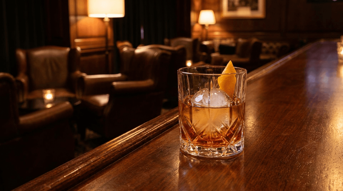
Liquid color is the sensory bridge. The color of the liquid — visible in the glass, through the bottle, or in the pour — is the primary visual channel through which the consumer "experiences" the product before tasting. The deep amber of a well-aged bourbon communicates warmth, complexity, and the years of barrel aging that developed the color. The ruby depth of a cabernet communicates body, tannin, and fruit intensity. The pale gold of a chardonnay communicates elegance and measured richness. The crystal clarity of a premium vodka communicates purity and precision. The liquid color in wine and spirits photography is not merely aesthetic — it is a flavor, age, and quality communication system. The photography must render the liquid color at its most accurate and most beautiful, which requires specific backlighting techniques, specific glass selection, and specific attention to the color's relationship with the surrounding visual environment.
Light through liquid is the signature technique of spirits photography. The defining visual technique of wine and spirits photography — the element that separates category-specific expertise from general product photography — is the use of backlight or side-backlight transmitted through the liquid. When light passes through wine or spirits in a glass or a bottle, it illuminates the liquid from within, revealing the color depth, the clarity, and the luminous quality that makes the liquid look alive, precious, and desirable. This transmitted light — the warm amber glow of bourbon backlit against a dark background, the ruby luminosity of wine with light passing through the glass, the crystal clarity of gin or vodka with light revealing absolute purity — is the single most powerful visual tool in the category. It communicates quality (a clear, beautiful liquid with no flaws), age (the color depth developed over time), and the sensory experience (the visual warmth of the color anticipating the warmth of the drink).
Glass and surface reflections communicate premium materiality. Wine and spirits photography involves an unusual density of reflective and transparent materials: glass bottles, glass labels, metallic closures, foil capsules, crystal or glass drinkware, liquid surfaces, ice, and often reflective styling surfaces. The management of reflections and highlights across these materials is what separates premium spirits photography from ordinary product photography. The highlight on the bottle's shoulder that communicates the glass weight and form. The specular reflection on the label's foil element. The bright point on the rim of a crystal glass. The wet highlight on a just-poured liquid surface. Each reflection communicates material quality and premium craftsmanship. The photography must manage these reflections deliberately — placing them to communicate dimension, quality, and the specific material character of every element in the composition.
Dark backgrounds communicate premium positioning. The dark background — deep black, near-black charcoal, dark wood, dark stone — is the dominant background choice in premium wine and spirits photography. The dark background does several things simultaneously: it creates the contrast that makes the bottle's form pop from the background, it provides the dark field against which backlit liquid glows most dramatically, it communicates the sophisticated, adult, evening-context positioning of wine and spirits, and it creates the moody, atmospheric quality that distinguishes spirits photography from the bright, clean aesthetic of general food-and-beverage photography. The dark background is not merely a convention; it is a positioning tool that immediately communicates "this is a premium adult product" and separates the visual language of wine and spirits from adjacent categories.
The pour is the kinetic moment. The pour — liquid leaving the bottle and entering the glass — is the wine and spirits equivalent of the ice cream drip: the moment of motion that introduces dynamism, freshness, and the narrative of imminent consumption into an otherwise static product image. The pour adds the dimension of time and action to the composition. The liquid stream, catching the light as it arcs from bottle to glass, communicates the viscosity and character of the product: the slow, thick pour of an aged port or a cream liqueur, the clean, crisp stream of a gin or vodka, the splashing, dynamic pour of a cocktail mixer hitting ice. The pour communicates that this product is about to be consumed, right now, and the experience is beginning.
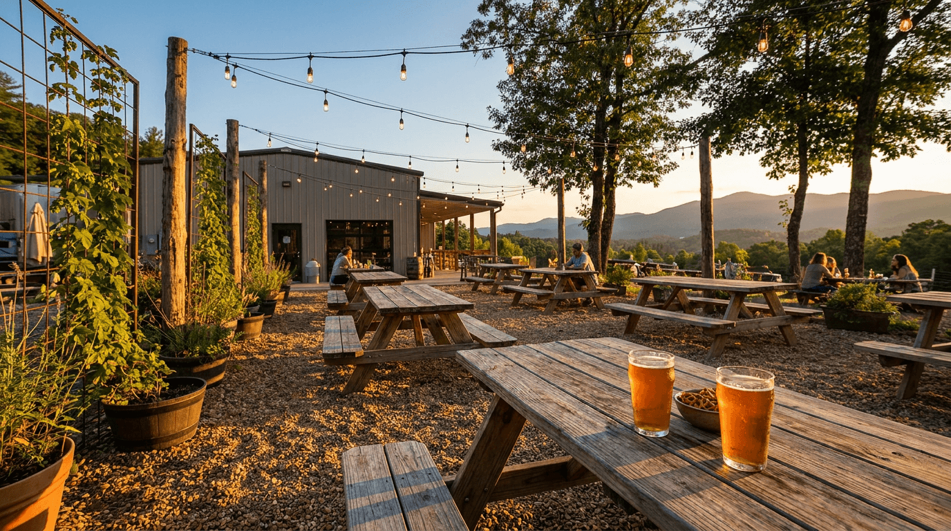
The cocktail is the product in context. For spirits brands, the cocktail is the primary consumption format — the way most consumers actually experience the product. The cocktail photograph communicates the complete experience: the spirit as the foundation, the mixers and garnishes as the supporting elements, the glassware as the ritual vessel, the ice as the temperature and dilution context, the garnish as the finishing detail. A well-photographed cocktail sells the experience of drinking the spirit, not just the spirit itself. The cocktail is also the most shareable, most aspirational, most lifestyle-communicating visual format for spirits brands on social media.
The vineyard and the distillery are the origin proof. The landscape of origin — the vineyard rows stretching toward a horizon, the distillery building with its distinctive architecture, the barrel warehouse stretching into shadow — provides the visual proof that the product comes from a real place, is made by real people, and carries the specific character of its origin. The origin landscape communicates terroir for wine and production philosophy for spirits. It answers the consumer's question "where does this come from?" with a visual answer that creates the geographic and emotional connection that commodity products cannot offer.
The barrel room is the time signature. The barrel room, the rick house, the cellar, the cave — the aging environment where time transforms the product — is one of the most visually powerful settings in wine and spirits photography. The rows of barrels stretching into atmospheric perspective, the dark wood against stone or brick, the ambient light filtering through the space, the implied passage of time — the barrel room communicates patience, tradition, investment, and the specific quality that only time can create. The barrel room image is a visual argument for why the product is worth its price: this liquid has been waiting here, in this place, for this long, developing the complexity that you are about to experience.
The ritual communicates the respect the product deserves. Every wine and spirits category has its ritual: the swirl and nose of wine, the neat pour and slow sip of whiskey, the precise cocktail build, the champagne toast, the sake ceremony. The photography of these rituals communicates the respect and the attention that the product deserves — it tells the consumer "this is not something you gulp, this is something you experience." The ritual imagery establishes the consumption context that supports the premium pricing: a product that comes with its own ritual is worth more than a product that is merely consumed.
Typography and label design quality signal brand investment. In wine and spirits, the label design — the typography, the illustration, the print technique, the material quality — is a critical quality signal. The consumer reads the label not just for information but for design quality: custom typography communicates investment and intention; foil stamping, embossing, or letterpress techniques communicate tactile premium; minimalist design communicates modern sophistication; elaborate illustration communicates heritage and craft; the overall label design quality communicates how much the brand cares about every detail of the experience. The photography must capture and celebrate this design quality, rendering the typography sharply, the print techniques visibly, and the label's material quality with the dimensional detail that honors the design investment.
15 AI Prompt Templates for Wine & Spirits Brand Content
Each template includes a content concept, the full copy-paste prompt, and deployment guidance. All prompts are formatted for the Miraflow AI Image Generator and compatible with any high-quality text-to-image tool. Adjust the bracketed descriptive elements in each prompt to match your specific wine or spirits brand — your product type, your bottle and label design, your brand colors and personality, your positioning, your origin story, your retail context, and the particular visual identity that distinguishes your brand. Generate at 1:1 for social media and profile images, 4:5 for Instagram feed, 16:9 for website banners and YouTube, 9:16 for Stories and vertical content, 3:2 for e-commerce and portfolio, and 2:3 for poster and promotional art.
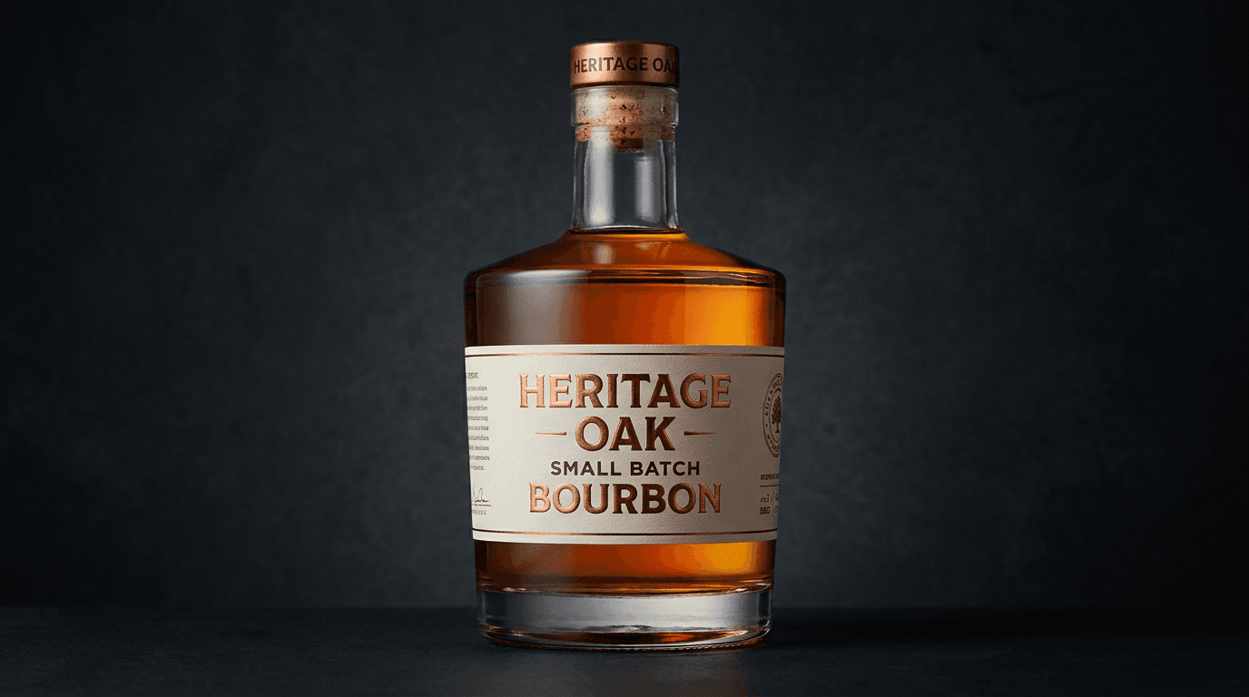
Template 1: The Hero Bottle — Signature Product Portrait
This is the foundational image of the wine or spirits brand — the single, perfectly lit, impeccably composed bottle portrait that introduces the consumer to the product's physical presence, label design, and premium material quality. The hero bottle portrait is the image upon which every other visual in the brand ecosystem is built.
Prompt:
hero bottle portrait of [a single, perfectly lit, premium-communicating wine or spirits bottle — the bottle presented as the definitive visual statement of the brand's quality, craftsmanship, and market positioning: the bottle is a specific product — the particular wine, spirit, or beverage that is the brand's hero or flagship offering: the bottle shape communicates the category and the quality — specify the exact bottle form: the tall, slender form of a white wine or Riesling bottle; or the broad-shouldered, authoritative form of a Bordeaux or Napa Cabernet bottle; or the slope-shouldered, elegant form of a Burgundy or Pinot Noir bottle; or the heavy, squat, wide-based form of a premium bourbon or rye bottle with its thick glass walls communicating weight and substance; or the tall, cylindrical, clean-lined form of a premium gin or vodka bottle communicating modern precision; or the distinctive, angular or organic form of a tequila or mezcal bottle communicating craft and cultural identity; or the classic, broad-shouldered, long-necked form of a cognac or brandy bottle communicating heritage and luxury; or the unique, proprietary bottle shape that is the brand's specific design — the bottle form itself as a quality and category signal, the glass color and finish communicate quality — clear glass revealing the liquid color inside (the golden bourbon, the pale wine, the crystal vodka visible through the glass); or deep green glass communicating wine tradition; or amber glass communicating whiskey heritage; or frosted, matte, or etched glass communicating modern premium; or black or opaque glass communicating luxury exclusivity — the glass itself as a material-quality signal, the label is the brand's identity rendered on the bottle — the specific label design with its typography, its color palette, its illustration or graphic elements, its print technique: describe the label's specific character — clean, minimal typography on a white or cream ground for a modern, restrained brand; or elaborate illustration with fine line work and traditional typography for a heritage brand; or bold, graphic, contemporary design for a disruptive brand; or textured, handmade-feeling label with letterpress or debossed elements for an artisan brand; or gold and dark tones with embossed or foil elements for a luxury brand — the label design visible and readable, the typography sharp, the print quality apparent, the design investment visible in every detail, the closure communicates the quality tier — a natural cork with a foil capsule (specify color: [gold, black, burgundy, brand color]) for wine; or a heavy, branded cap or cork-and-cage closure for spirits; or a wax seal dripping down the neck for a premium, handcrafted spirit; or a screw cap with a premium-quality finish — the closure visible at the top of the bottle and contributing its quality signal, the liquid may be visible — if the glass is clear or translucent, the liquid color is visible through the glass: the warm amber of aged whiskey, the pale straw-gold of a white wine, the deep ruby of a red wine, the crystal clarity of a gin or vodka — the liquid color providing the sensory bridge that connects the visual to the anticipated tasting experience, the bottle has dimensional presence — the heavy glass catching light with its material quality, the bottle occupying space with weight and authority, the physical object communicating the premium that the consumer will feel when they hold the bottle, the overall impression is unmistakably premium — the viewer should feel the quality, the craft, the investment, the story behind this bottle, the visual communicating that this is not a commodity but a considered, crafted, worthy product — the hero bottle portrait as the foundational premium-communicating image that establishes the brand's visual standard and justifies the price point] in a tight, bottle-focused, premium portrait composition, the bottle fills the primary frame — the full form visible from base to closure, the height and the proportions and the dimensional presence of the bottle commanding the composition, the bottle is vertical and authoritative — standing with the weight and the gravity that a premium bottle deserves, the label is readable and prominent — the brand name, the product designation, the key label elements visible and sharp, the glass quality is visible — the weight, the color, the material character of the glass communicating its premium quality, the liquid color (if visible through the glass) adds the sensory dimension — the warm or cool or vivid tone of the liquid providing the flavor anticipation, the closure is visible and quality-appropriate — the capsule, the cork, the wax, the cap contributing its tier signal, the background is dark and premium-establishing — a deep, rich, dark background that creates the contrast, the sophistication, and the premium atmosphere: deep black or near-black charcoal that isolates the bottle dramatically and creates the high-end, adult, serious positioning that premium wine and spirits demand; or a dark, textured surface (dark wood, dark stone, dark fabric) that adds material richness to the dark atmosphere — the dark background the positioning statement that says "this is a premium product in a premium context," the depth of field is moderately shallow — the bottle label in razor-sharp focus at the front plane, the typography and design elements crisply readable, with the bottle's sides, the rear, and the background falling into smooth, atmospheric depth that isolates the bottle and creates the dimensional quality that makes the product feel three-dimensional and physically present, the lighting is the specific quality that makes wine and spirits bottles premium — the deliberate, sculpting, material-revealing illumination that is the hallmark of professional spirits photography: a directional key light positioned to one side and slightly behind or to the side of the bottle — the lighting setup that creates the defining characteristics of premium bottle photography: the key light illuminating the label from a position that creates readable, dimensional typography — the light raking across the label's surface to reveal any embossing, foil, or texture, the type readable and sharp, the design elements vivid and accurate in color, the label design quality honored by the precision of the illumination, the key light sculpting the bottle's form — the cylindrical glass shape modeled by the directional light with a bright highlight zone on one side that catches the glass surface and communicates its weight and material quality, the light transitioning across the curved glass into a gradually deepening shadow that creates the three-dimensional presence, the form of the bottle readable as a solid, heavy, premium object, a backlight or transmitted light through the liquid (if the glass allows) — the signature technique of spirits photography: light positioned behind or to the side-rear of the bottle, passing through the liquid to illuminate it from within, the liquid glowing with its specific color — the warm amber luminosity of aged spirit, the ruby transmitted light of red wine, the golden clarity of white wine, the crystal-clear light transmission of vodka or gin — the backlit liquid one of the most powerful visual elements in the composition, communicating quality, age, and the sensory character of the product, the closure catching the light with its material quality — the foil capsule reflecting a bright highlight that communicates its metallic quality, or the wax seal catching the light with its textured, handcrafted surface, or the branded cap showing its quality in the illumination, a subtle rim light or edge light separating the bottle from the dark background — the luminous outline along the bottle's edge that provides the dimensional separation and the professional quality that prevents the dark glass from merging into the dark background, the rim light defining the silhouette, the glass surface catching the directional light with its specific reflective quality — the clean, sharp specular highlights on the glass that communicate its polished, premium surface, the reflections controlled and deliberate rather than chaotic, hero bottle palette — the label's specific brand colors (specify: [your label colors, e.g., cream and gold, black and silver, deep burgundy and white, forest green and copper]) — the glass color (clear, green, amber, frosted, black) — the liquid color if visible (specify: [e.g., warm amber bourbon, pale gold chardonnay, deep ruby cabernet, crystal clear gin]) — the closure tone (gold foil, black capsule, red wax, brand-color cap) — the dark, premium background tone — warm-to-neutral directional lighting with the transmitted-liquid backlight — and the premium, material-rich, brand-specific palette of a wine or spirits hero bottle in professional dark-field lighting as the color palette, the mood is unmistakably premium quietly authoritative crafted-quality-visible and the specific bottle message — this is the definitive presentation of this product, the quality is visible in every detail of the glass, the label, the closure, and the liquid, the premium is communicated through the material and the light and the composition — the hero bottle as the foundational brand image that establishes the visual standard and justifies the positioning, professional spirits and wine product photography with directional sculpting light and liquid-transmitted backlight against a dark premium background with moderately shallow depth of field, composed as a full-bottle portrait with the label readability and the glass quality and the liquid color as the primary premium focal points, dark premium palette with brand-specific label colors and liquid luminosity, no text overlays, no watermarks
Best for: Website homepage hero and product page primary imagery, e-commerce and direct-to-consumer product listings, retail and distribution sell sheets and sales materials, paid advertising primary creative, Instagram and social media signature product content, email marketing header and product features, print advertising primary product imagery, menu and wine-list imagery for on-premise partners, press and media kit primary product visual, wholesale and distributor presentation materials, awards and competition submission imagery
Template 2: The Pour — Liquid in Motion
This template captures the pour — the liquid leaving the bottle and entering the glass — the kinetic moment that introduces dynamism, sensory anticipation, and the narrative of imminent consumption that transforms a static product into a living experience.
Prompt:
wine or spirits pour and liquid-in-motion photograph of [the specific wine or spirit being poured from its bottle into the appropriate glass — the liquid in mid-air between bottle and glass, the pour capturing the dynamic moment of transition from sealed product to open experience: the pour involves a specific product and a specific glass — the particular wine or spirit flowing into its category-appropriate vessel: a whiskey pour — bourbon, rye, scotch, or Irish whiskey pouring from the bottle into a rocks glass or a Glencairn nosing glass, the amber liquid in a clean, controlled stream, the stream catching the light with its warm, translucent, amber-to-golden color, the liquid hitting the glass and creating the dynamic interaction — the splash, the ripple, the settling surface; or a wine pour — red or white wine flowing from the bottle into the appropriate wine glass, the liquid stream showing its specific color (the deep ruby of a red pouring into a large-bowled glass, or the pale gold of a white pouring into a narrower glass), the pour at the elegant, controlled angle that communicates proper service; or a gin or vodka pour — the clear spirit pouring in a crisp, clean stream into a coupe, a martini glass, or a tumbler, the crystal clarity of the liquid visible against the background; or a tequila or mezcal pour — the spirit flowing into a traditional vessel or a modern glass, the liquid's slight color or clarity visible in the stream; or a cocktail pour — the finished cocktail being strained or poured into the serving glass, the liquid's mixed color creating the cocktail's specific visual character, the bottle is visible and identifiable — the brand label readable on the bottle from which the pour originates, the brand identity connected to the dynamic action, the consumer seeing both the product and the experience simultaneously, the glass receives the pour — the appropriate glass type for the category, the glass partially filled or just receiving the first of the pour, the glass showing the liquid that has already arrived with its specific color and the fresh pour adding to it, the liquid stream is the hero element — the arcing, flowing, gravity-pulled stream of liquid between bottle and glass, the stream catching the light with the specific visual character of the product: the warm amber translucency of whiskey, the deep ruby of red wine with its light-catching density, the crystal clarity of white spirit showing perfect transparency, the stream showing the liquid's viscosity and character in its flow behavior, the overall composition communicates: this experience is beginning now, the seal has been broken, the liquid is flowing, the pour is the threshold between the bottle and the glass and the first sip — the pour as the kinetic, experience-initiating visual that bridges the product and the consumption moment] in a medium-close, pour-focused composition, the bottle, the stream, and the glass form a visual path — the eye traveling from the bottle through the pour to the glass, following the liquid's journey, the liquid stream is the visual centerpiece — the flowing, light-catching, dynamically suspended liquid commanding the viewer's attention at the composition's kinetic center, the bottle is identifiable — the label visible and readable, the brand connected to the action, the glass shows the liquid's character — the color, the clarity, the surface dynamics of the just-poured product visible in the glass, the background is dark and non-competing — the dark, premium field that isolates the pour action and provides the contrast for the liquid's light-catching quality, the depth of field captures the pour in sharp detail — the liquid stream and the glass in crisp focus, with the bottle and the background in softer atmospheric context, the stream frozen in sharp detail with its specific liquid character visible, the lighting is dramatic, liquid-revealing, and pour-enhancing — the specific illumination that makes a liquid pour look its most dynamic and beautiful: directional side-to-back lighting — the dramatic illumination positioned to one side and slightly behind the pour, the light transmitting through the liquid stream to reveal its color, clarity, and character from within — the transmitted light making the stream glow with the product's specific color: the amber stream of whiskey illuminated from behind showing its warm, honeyed, translucent quality; the ruby stream of wine backlit to show its deep, saturated, light-dense color; the clear stream of gin or vodka backlit to show its absolute purity and crystal transparency — the backlit stream the single most dramatic visual element in the composition, the liquid entering the glass catching the dramatic light — the splash, the ripple, the surface interaction illuminated to show the dynamic energy of the pour's conclusion, the glass catching the light with its own material quality — the crystal or glass reflecting and refracting the light, the glass walls showing their clarity, the liquid inside the glass beginning to glow with the transmitted light, the bottle catching the side light with its label readability and its dimensional form, pour palette — the liquid's specific color at luminous, transmitted-light intensity (specify: [your product's liquid color, e.g., warm amber bourbon, deep ruby cabernet, pale gold chardonnay, crystal clear gin]) — the bottle and label tones — the glass clarity — the dark, premium background — dramatic side-to-back lighting with liquid transmission — and the dramatic, liquid-luminous, kinetically alive palette of a wine or spirits pour in backlit motion as the color palette, the mood is dynamically flowing experience-initiating sensory-anticipating and the specific pour message — the seal is broken, the liquid is flowing, the experience begins now, the pour is the transition from product to moment — the pour as the kinetic, experience-initiating visual that creates immediate desire and sensory anticipation, professional spirits and beverage photography with dramatic side-to-back lighting transmitting through the liquid pour against a dark premium background with sharp pour-focused depth of field, composed as a bottle-to-glass pour action with the liquid stream as the kinetic center, the flowing liquid and the transmitted color and the dynamic glass interaction as the pour focal points, dark dramatic palette with luminous liquid color, no text overlays, no watermarks
Best for: Instagram and social media hero and engagement content, website product and experience sections, paid advertising primary action-oriented creative, menu and cocktail-list imagery, social media Reels and short-form video cover frames, email marketing featured-product hero imagery, food and spirits editorial submissions, bar and restaurant promotional materials, brand launch and product-introduction campaigns, print advertising dynamic imagery
Template 3: The Cocktail Build — Serve Suggestion and Lifestyle
This template presents the finished cocktail, the wine-by-the-glass, or the served drink — the complete consumption format that shows the consumer exactly how to experience the product and connects the spirit or wine to the aspirational social occasion.
Prompt:
cocktail and serve-suggestion lifestyle photograph of [a finished cocktail, a wine glass perfectly poured, or a spirits serve presented as the aspirational consumption moment — the drink as it would appear in the best version of the consumer's imagined evening: the drink is a specific, visually compelling serve — the particular cocktail or serving format that showcases the product at its most aspirational: a crafted cocktail — an Old Fashioned with a large clear ice sphere and an orange peel twist, the bourbon's amber visible through the crystal-clear ice and the peel's oil-expressing curl; or a Negroni with its distinctive ruby-amber color in a rocks glass, the orange slice garnish; or a gin and tonic in a copa glass with botanicals visible, the effervescence catching light; or a Margarita in a salt-rimmed coupe or rocks glass with a lime wheel; or a Martini in a classic glass with an olive or a twist, the crystalline clarity of the drink communicating precision; or a wine serve — a glass of red wine at the proper fill level in a large-bowled glass, the wine's color deep and inviting; or a glass of white wine or rosé showing its specific pale-gold or salmon-pink color in a tulip-shaped glass; or a spirits neat or on the rocks — a pour of whiskey over a single large ice cube in a heavy rocks glass, the amber liquid catching light through and around the ice; the specific drink built with care and styled to perfection, the garnish is deliberate and beautiful — the specific garnish adding the finishing visual detail that elevates the drink: the expressed citrus peel twisted into a precise curl, the herb sprig (rosemary, thyme, mint) adding the green, aromatic element, the dehydrated citrus wheel adding the artisan, considered detail, the edible flower adding the unexpected beauty, the olive on a pick adding the classic elegance — the garnish communicating the care and the intention behind the serve, the glassware is category-appropriate and quality-communicating — the specific glass matching the drink: the heavy rocks glass for whiskey, the coupe or martini glass for stirred cocktails, the tall glass for long drinks, the wine glass for wine, the glass quality visible in its clarity, its weight, its rim quality, the glass itself a quality signal, the ice is intentional — a large, clear, slow-melting ice sphere or cube for spirits (communicating the premium, craft-cocktail standard), or crushed ice for a julep or swizzle, or no ice for a served-up cocktail or wine — the ice format matching the drink and communicating the care of the preparation, the drink sits in a lifestyle context — the bar top, the dinner table, the home bar, the outdoor terrace, the cocktail party — the environment communicating the specific social occasion: a moody, atmospheric bar setting with soft ambient light and dark surfaces communicating the evening, sophisticated, going-out occasion; or a warm, candlelit dinner table communicating the intimate, celebration, paired-with-food occasion; or a bright, outdoor, sun-drenched terrace communicating the relaxed, social, daytime occasion; or a sleek, well-appointed home bar communicating the at-home, personal-ritual, hosting occasion — the environment establishing the aspirational life moment that the consumer imagines when they see the drink, the brand's bottle may be visible in the background or beside the drink — the product and its served form together in the frame, connecting the bottle on the shelf to the experience in the glass, the overall composition communicates: this is how you enjoy this product, this is the experience it creates, this is the occasion it belongs to, this is the life in which this drink exists — the cocktail serve as the aspirational-experience, occasion-setting visual that bridges the product and the lifestyle] in a medium-close, drink-focused lifestyle composition, the finished drink is the hero — the cocktail or serve visible in its full, garnished, styled glory, the glass quality is visible — the clarity, the weight, the rim, the specific glass character communicating its quality, the garnish adds the finishing visual detail — the specific garnish adding color, texture, and intentionality, the ice (if present) is quality-appropriate — the clear ice or the crushed ice or the absence of ice matching the serve, the lifestyle context provides the aspirational atmosphere — the bar, the table, the environment blurred but identifiable and mood-setting, the brand may be present — the bottle in the background or the label visible at the composition's edge, connecting product to experience, the depth of field is moderately shallow — the drink in sharp focus with the lifestyle environment in atmospheric, mood-establishing bokeh, the lighting is atmospheric, warm, and occasion-appropriate — the specific illumination that matches the social occasion being depicted: warm, atmospheric, occasion-specific lighting — the illumination quality of the aspirational moment: warm, low, ambient bar lighting for the evening-out occasion (the golden, candlelight-influenced, intimate quality of a well-designed bar); or soft, warm, multiple-candle dinner-table lighting for the dining occasion; or bright, golden, natural sunlight for the outdoor daytime occasion; or warm, designed, atmospheric home lighting for the at-home occasion — the light temperature and quality matching the lifestyle moment and creating the mood that makes the viewer want to be in this scene, the drink catches the atmospheric light with its liquid beauty — the cocktail's color visible and inviting in the ambient illumination, the ice catching highlights, the glass reflecting the environmental light, the garnish detailed and fresh in the warm light, the liquid surface catching the ambient light with its specific character — still or effervescent, clear or colored, opaque or translucent, the environment catches the atmospheric light with its lifestyle quality — the bar surfaces, the table, the background elements creating the ambient mood that places the drink in the aspirational occasion, cocktail lifestyle palette — the drink's specific liquid color (specify: [your cocktail or serve color, e.g., amber Old Fashioned, ruby Negroni, crystal Martini, deep-ruby Cabernet, pale-gold Chardonnay]) — the garnish tones (citrus orange, herb green, berry red, flower vivid) — the glass clarity — the ice clarity — the lifestyle environment tones (dark bar moody, warm dinner golden, bright outdoor natural, home-bar designed) — warm, atmospheric, occasion-appropriate lighting — and the aspirational, lifestyle-rich, drink-centered palette of a crafted serve in atmospheric occasion-specific lighting as the color palette, the mood is aspirationally social occasion-worthy sophisticatedly inviting and the specific cocktail message — this is the experience, the drink is perfectly made, the occasion is the one you want, the lifestyle is within reach — the cocktail serve as the aspiration-building, occasion-connecting visual that makes the viewer want to order, to pour, to host, to live the moment pictured, professional cocktail and lifestyle photography with atmospheric occasion-specific lighting and moderately shallow depth of field, composed as a drink-focused lifestyle scene with the serve and the garnish and the environment creating the aspirational narrative, the drink quality and the occasion atmosphere and the lifestyle aspiration as the cocktail focal points, warm atmospheric lifestyle palette with drink-specific liquid color, no text overlays, no watermarks
Best for: Instagram and social media lifestyle and cocktail content (highest engagement for spirits brands), website cocktail and serve-suggestion sections, paid advertising lifestyle-aspiration creative, menu and cocktail-list imagery for on-premise partners, Pinterest cocktail and entertaining content, TikTok and Reels cocktail-build and lifestyle content, email marketing recipe and serve features, food and spirits editorial submissions, influencer content direction and mood boarding, seasonal marketing and occasion-specific campaigns
Template 4: The Label Detail — Packaging Craft Close-Up
This template zooms into the label, the closure, and the packaging details — the close-up that celebrates the design craft, the print technique, and the material quality of the packaging as a premium signal in its own right.
Prompt:
wine or spirits label and packaging detail close-up photograph of [the label, the closure, and the packaging detail elements of the brand's bottle examined at intimate, craft-revealing, material-quality-communicating close range — the design and print quality visible as a premium signal: the label is the primary subject — the specific label design examined at a scale where the craft is visible: the typography is sharp and intentional — the specific typeface or custom lettering visible at close range, the letterforms showing their design quality, the ink quality visible, any hand-drawn or custom elements showing their unique character, the weight and the spacing of the type communicating the brand's personality (serif elegance for heritage, sans-serif clean for modern, script personality for craft, bold impact for disruptive), the print technique is visible — the specific production method that adds tactile and visual dimension to the label: foil stamping showing its metallic reflective quality at close range, the foil catching light with its precise, heat-transferred, luminous character; or embossing or debossing showing its raised or recessed three-dimensional texture, the letterforms or design elements lifted from or pressed into the paper surface; or letterpress showing its impression into the paper, the slight texture of the pressed type; or screen printing showing its ink deposit; or thermography showing its raised, resinous quality — the specific print technique visible and communicating the investment in production quality, the paper or label material is visible — the specific substrate communicating its quality: cotton or textured paper with visible fiber and tooth communicating artisan, tactile quality; smooth, bright white or cream stock communicating clean, modern precision; metallic or specialty material communicating luxury; the material quality visible at the close-up scale, any additional label elements — secondary labels (back label, neck label, strip label), regulatory information styled with the same design care as the primary label, vintage or lot numbers, appellation or origin designations — contributing to the overall packaging-design completeness, the closure is examined — the foil capsule with its color and its crisp, cut edge; or the wax seal with its handcrafted, dripped, stamped-impression quality; or the branded cork visible at the bottle's mouth; or the premium cap with its knurled grip and its brand embossing — the closure contributing its quality signal at close range, the bottle glass near the label shows its material quality — the glass thickness, the color, the surface finish visible at the intimate scale, the glass providing the physical context of the label's application, the overall composition communicates: this packaging was designed with intention and produced with craft, every detail communicates quality, the label is not merely informational but is a premium-quality designed object — the label detail close-up as the craft-celebrating, quality-communicating image that honors the packaging design investment] in an extreme close-up, macro-scale, detail-revealing composition, the label fills the frame — the design elements at a scale where the typography, the print technique, and the material quality are the visible subjects, the craft is readable — the specific print technique, the paper quality, the design precision, the material character all visible at the intimate scale, the closure may share the frame — the capsule, the wax, the cork, or the cap visible and contributing its quality detail, the bottle glass provides the physical context — the glass visible near the label's edge, the material quality apparent, the depth of field is very shallow — the nearest label surface in razor-sharp focus with the surrounding elements falling into smooth, atmospheric softness, the very shallow depth isolating specific design details and creating the intimate, quality-examining quality of the macro perspective, the lighting is precise, detail-revealing, and material-flattering — the close-up illumination that makes label details look their most premium: precise, directional, detail-enhancing light — the close-range illumination that reveals every detail of the label's design and production: the directional light raking across the label surface at a low angle to reveal any embossing, debossing, or texture — the raised or recessed elements casting tiny shadows that communicate their three-dimensional quality; the light catching any foil elements with their reflective, metallic, luminous character — the foil's specular highlight one of the most premium visual elements in close-up label photography; the light revealing the paper or material's texture — the fiber, the tooth, the surface quality of the substrate visible under directional illumination; the typography catching the light with its ink quality — the type sharp, the ink dense and well-defined, the letterforms showing their design intention, the closure catching the precise light with its specific material quality — the foil capsule with its metallic reflection, the wax with its textured, handcrafted surface, the cork with its natural, compressed-bark texture, the branded cap with its machined precision, label detail palette — the label's specific design colors (specify: [your label palette, e.g., cream and gold foil, black with silver emboss, deep navy with copper letterpress, white with raised blind emboss]) — the paper or material tone — the foil or metallic tones if present — the closure material tone — the glass color visible at the edge — precise, directional, detail-revealing lighting — and the craft-celebrating, material-quality, design-intimate palette of label details in precise directional lighting as the color palette, the mood is design-crafted detail-intimate premium-materiality and the specific label message — this packaging was made with the same care as the liquid inside, the design craft communicates the product craft, the label quality signals the brand quality — the label detail as the craft-celebrating, quality-signaling image that honors the packaging design and communicates the premium investment to the visually literate consumer, professional macro and detail product photography with precise directional lighting and very shallow depth of field, composed as a label-detail close-up with the typography and the print technique and the material quality as the craft-communicating focal points, design-specific palette in precise detail lighting, no text overlays, no watermarks
Best for: Instagram and social media design-appreciation and detail content, website packaging-design and brand-craft sections, packaging design portfolio and awards submissions, paid advertising premium-detail creative, email marketing brand-craft and quality features, Pinterest design and typography content, wholesale and retail partner presentations (packaging-quality positioning), press and media kit design-detail imagery, brand-book and style-guide reference imagery, print advertising detail-focused creative
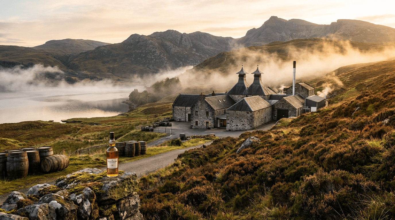
Template 5: The Vineyard & Distillery — Origin Landscape
This template places the product in its landscape of origin — the vineyard rows, the distillery grounds, the terroir, the specific geography that grounds the wine or spirit in a place and a tradition that commodity products cannot claim.
Prompt:
vineyard or distillery origin landscape photograph of [the landscape of origin — the specific geographic and environmental context where the wine is grown or the spirit is produced, the place that gives the product its provenance, its terroir, its origin story: the landscape is the specific production environment — the particular geography that defines the brand's origin: a vineyard landscape — the rows of vines stretching across the terrain, the specific viticulture visible: trellised vines with their green canopy in growing season, or dormant vines in winter's bare-branch beauty, or harvest-time vines heavy with fruit clusters — the vineyard rows creating the geometric, perspective-drawing lines that are the visual signature of wine-country landscapes, the terrain communicating the specific appellation or region: rolling hillsides for a Burgundian or Tuscan setting, flat valley-floor expanses for a Napa or Marlborough setting, steep slopes for a Mosel or Douro setting, coastal proximity for a Sonoma Coast or South African setting — the terrain and the landscape communicating the specific environmental character that shapes the wine; or a distillery landscape — the production facility in its geographic setting: a Scottish distillery amid the heathered Highland or island landscape, or a Kentucky bourbon distillery with its rick houses against rolling bluegrass, or a Mexican tequila distillery surrounded by blue agave fields, or a craft distillery in its urban or rural American setting, or a cognac chateau amid the Charente vineyards — the facility's architectural character visible within the landscape, the buildings communicating heritage and production capability, the surrounding landscape communicating the region's character, the product's bottle may be present in the landscape — the bottle positioned within the origin context, the product physically connected to its source landscape, the brand's packaging visible against the geography that produced the liquid inside, the human element may be present — the vineyard workers, the winemaker walking the rows, the distiller at the facility — the human connection to the land and the production visible, the seasonal quality is specific — the golden light of harvest season in the vineyard, the green lushness of growing season, the atmospheric mist of a distillery at dawn, the snow-covered dormant vines of winter, the specific seasonal character adding temporal dimension to the origin story, the overall composition communicates: this is where it comes from, this place is real and beautiful, the product carries the character of this specific geography — the origin landscape as the provenance-proving, terroir-communicating image that connects the consumer to the land and the tradition behind the bottle] in a wide, landscape-encompassing composition that reveals the full geographic context, the landscape fills the frame — the vineyard rows, the distillery grounds, the surrounding terrain and sky creating the full origin picture, the geographic character is visible — the terrain, the vegetation, the architectural elements, the regional identity readable, the product (if present) connects to the landscape — the bottle in the environment, the brand tied to the geography, the sky and the light communicate the season and the mood — the atmospheric quality of the specific time and place, the depth of field is deep — the full landscape from foreground elements to distant horizon in readable focus, the wide-angle perspective communicating the scale and the beauty of the origin, the lighting is natural, atmospheric, and landscape-specific — the illumination quality of the specific place and time: natural, atmospheric, golden-hour or seasonal-specific light — the natural light of the origin landscape at its most beautiful: the warm, golden, low-angled light of late afternoon or early morning casting long shadows across vineyard rows and creating the depth and the warmth that landscape photography uses to communicate beauty and emotional connection; or the soft, misty, atmospheric light of a cool morning with fog moving through the vineyard or around the distillery, the mist adding the romantic, mysterious quality that origin landscapes use to communicate tradition and mystique; or the bright, high, clear light of midday that shows the landscape in its full geographic detail and its unromantic honesty — the light quality matching the emotional register of the brand's origin story (warm and golden for heritage and romance, misty for tradition and mystery, bright for honest and modern), the landscape catching the natural light with its specific character — the vine rows creating light-and-shadow patterns in the directional light, the facility's architecture showing its dimensional form, the terrain showing its contours, the sky adding its atmospheric drama, origin landscape palette — the specific landscape tones of the origin (the green and gold of a vineyard in growing season; the amber and brown of harvest; the gray and green of a Scottish Highland; the blue and green of an agave field; the warm earth and green of a Kentucky distillery setting; the specific regional palette of your origin) — the sky's atmospheric tones — the facility or vineyard's architectural tones — any product packaging colors if the bottle is present — natural, atmospheric, golden-hour or season-specific lighting — and the geographic, origin-communicating, landscape-specific palette of the production environment in natural atmospheric light as the color palette, the mood is origin-grounded geographically authentic place-connected and the specific landscape message — this is where it comes from, the land is beautiful, the place gives the product its character, the origin is real and proud — the origin landscape as the provenance and terroir image that connects the consumer to the geography behind the bottle, professional landscape and architectural photography with natural atmospheric lighting and deep depth of field, composed as a wide origin landscape with the vineyard or distillery and the surrounding geography as the visual subject, the geographic beauty and the origin authenticity and the place-product connection as the landscape focal points, natural regional landscape palette in atmospheric light, no text overlays, no watermarks
Best for: Website about and origin-story sections, Instagram and social media origin and brand-story content, paid advertising provenance and terroir creative, email marketing origin-story features, YouTube and video content origin tours, press and media kit origin imagery, wine-club and DTC materials origin sections, print advertising landscape and origin creative, wholesale and retail partner presentations (origin-story positioning), travel and wine-tourism marketing, tasting-room and visitor-center display imagery
Template 6: The Barrel Room — Aging and Time
This template captures the barrel room, the rick house, the cellar, the cave — the aging environment where time transforms the product, communicating patience, tradition, and the investment of time that justifies the premium.
Prompt:
barrel room and aging environment atmosphere photograph of [the aging space — the cellar, the barrel room, the rick house, the cave where wine or spirits age, time passing in the dark, the product developing the complexity that only patience can create: the aging environment is a specific, visually dramatic space — the particular facility where the brand's product matures: a wine cellar or cave — the rows of oak barrels stacked in the cool, stone or brick underground space, the barrel heads showing their round forms receding into the perspective of the long room, the stone walls or arched ceiling creating the architectural context of a traditional cellar, the cool, damp, underground quality of the space palpable in the visual atmosphere; or a bourbon or whiskey rick house — the towering racks of barrels stacked floor to ceiling in the massive, cathedral-like wooden structure, the rick house's height and the industrial scale of barrel storage creating visual drama, the gaps between barrels showing the depth of the storage, the wooden structure of the racks visible; or a spirits aging warehouse — the barrels in their specific storage arrangement, the facility showing its particular character; or a winery barrel hall — an above-ground barrel room with the barrels in neat rows, the ceiling architecture visible, the room's designed atmosphere intentional, the barrels are the visual anchor — the rows of oak barrels creating the repeated geometric forms that recede into perspective, the barrel heads showing their round forms (bung-side or head-side, depending on orientation), the barrel staves showing the curved, coopered construction, the oak color warm and rich and showing the specific character of new oak (lighter, golden) versus used barrels (darker, stained, wine-marked), the barrels communicating both the quantity of aging product and the time invested, the atmospheric perspective creates visual depth — the barrels receding into the room's depth, each successive row slightly smaller, the far end of the room lost in shadow or mist, the perspective communicating the scale and the abundance of the aging inventory, the ambient atmosphere is specific and evocative — the cool, slightly misty quality of a cellar; the warm, dry, wood-scented atmosphere of a rick house; the particular environmental character of the specific aging space palpable in the visual quality of the light and the air, the brand identity may be present — branded barrel heads, stenciled barrel identification, the brand's name or logo visible on the barrels or in the facility, connecting the atmospheric space to the specific product, the human element may be present — the winemaker or distiller checking barrels, sampling with a thief, monitoring the aging — or the space may be empty, the barrels and the time doing their work alone, the overall composition communicates: time is at work here, the product is developing, patience is an ingredient, the investment of time is the investment that justifies the premium — the barrel room as the visual argument for why aged products cost more and taste better] in a wide-to-medium, atmosphere-and-depth-communicating composition, the barrel rows create the perspective — the repeated forms drawing the eye into the room's depth, the architectural space provides the frame — the walls, the ceiling, the floor defining the aging environment, the atmospheric quality is visible — the cool mist, the warm air, the ambient character of the specific aging space, the depth of the room communicates the scale — the barrels receding, the storage quantity implied, the depth of field is moderate to deep — the nearest barrels in sharp detail with the room's depth visible and gradually atmospheric, the lighting is atmospheric, dramatic, and naturally motivated — the illumination that exists or could exist in the aging space: atmospheric, low, naturally motivated lighting — the dramatic, low-level illumination of an aging space where light is limited and deliberate: the soft, warm light entering from a doorway, a window, or an artificial source at one end of the room, the light falling across the nearest barrels with warm, raking quality that shows the barrel texture and the coopered construction, the light diminishing as it penetrates deeper into the room, the far barrels in darker atmospheric shadow — the light gradient creating the dramatic depth that is the visual signature of barrel-room photography, the barrels catching the atmospheric light with their specific wood quality — the oak surface showing its grain, its curve, its cooperage joinery, the barrel heads showing their flat circular faces, the hoops showing their metal character — the warm-toned wood glowing in the atmospheric light with the quality of a surface that has been in contact with wine or spirits for years, the architectural elements catching the light with their material character — the stone walls, the brick arches, the wood structure, the floor — each surface contributing to the atmospheric whole, barrel room palette — warm oak barrel tones (golden new oak to dark stained used barrels) — the architectural material tones (stone gray, brick warm, wood brown) — the atmospheric light gradient from warm foreground to dark background — low, atmospheric, naturally motivated lighting — and the warm, deep, time-communicating, dramatically atmospheric palette of an aging environment in low motivated lighting as the color palette, the mood is time-rich patiently aging atmospherically deep and the specific barrel room message — time is working here, the product is developing in the dark, the patience and the investment and the tradition of aging are visible in the barrels and the space — the barrel room as the time-investment and quality-justification image that communicates why aged products carry their premium, professional architectural and atmosphere photography with low atmospheric motivated lighting and moderate-to-deep depth of field, composed as a barrel-room perspective view with the rows and the depth and the atmospheric light as the visual subject, the time-investment and the aging patience and the atmospheric drama as the barrel room focal points, warm atmospheric oak-and-stone palette in low motivated light, no text overlays, no watermarks
Best for: Website aging-process and production sections, Instagram and social media atmosphere and brand-story content, paid advertising heritage and time-investment creative, email marketing process and quality features, YouTube and video content facility-tour content, press and media kit production imagery, wine-club and DTC materials aging-story sections, print advertising atmosphere and heritage creative, wholesale and retail partner presentations (production-quality positioning), tasting-room and visitor-center display imagery, awards and competition submission environment imagery
Template 7: The Tasting Flight — Lineup and Comparative Presentation
This template presents the tasting flight, the product lineup, the comparative presentation — multiple products or expressions arranged together for the visual comparison that communicates range, portfolio depth, and the specific differences between expressions.
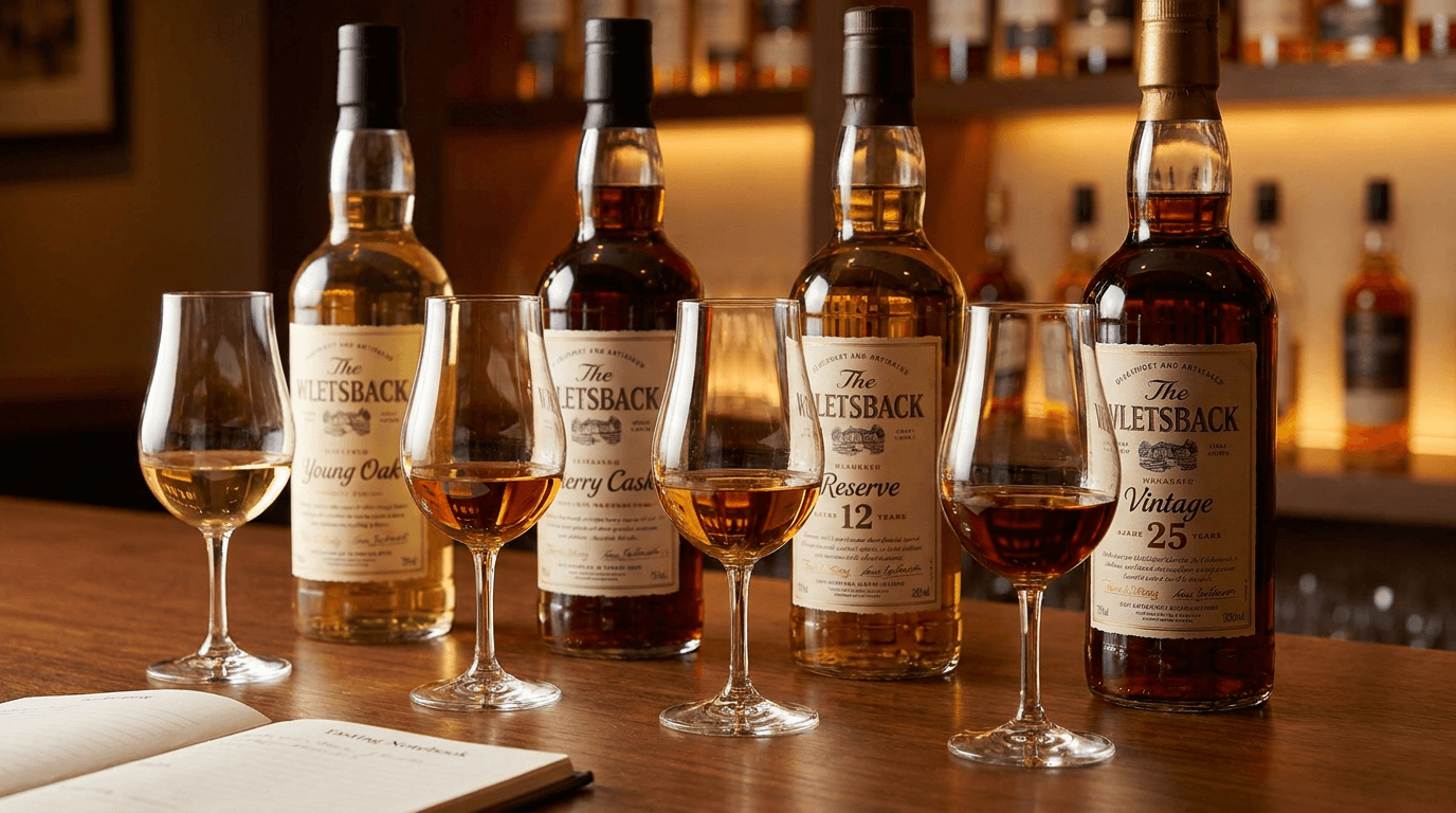
Prompt:
wine or spirits tasting flight and product lineup photograph of [multiple wines, spirits, or expressions arranged as a tasting flight or a comparative lineup — the visual presentation that shows range, depth, and the specific differences between products: the lineup includes specific products — the particular wines or spirits arranged together: a tasting flight of whiskey expressions — three or four glasses of bourbon or scotch or rye in a line, each a different expression or age statement, the liquid color graduating from lighter (younger) to deeper (older), the visual color progression telling the age story; or a wine flight — three or four glasses of wine showing the range: a vertical tasting of the same wine across vintages, or a horizontal comparison of different varietals or regions, the different colors (pale to deep, straw to gold, ruby to garnet) communicating the range; or a spirits range — the brand's full portfolio of products, each in its appropriate glass, the range of liquids showing the breadth of the brand's offering; or a bottle lineup — the brand's products standing side by side in their bottles, the label designs creating a visual family while the bottles and the liquids show the individual expression differences, the glasses are arranged with purpose — in a line, in an arc, or in a deliberate grouping that creates the comparative context, each glass at the same height and fill level for fair comparison, the arrangement communicating that these are meant to be evaluated together, the differences visible in the liquid — the color graduation, the clarity differences, the specific visual character of each expression telling its individual story while the lineup tells the collective story, the brand's bottles may accompany the glasses — the bottles standing behind or beside their corresponding glasses, connecting each liquid to its label and its specific product identity, the surface and the setting create the tasting context — a tasting room, a bar, a table, a professional evaluation setting — the environment communicating that this is a considered, intentional, evaluation-oriented experience, the overall composition communicates: this brand has range and depth, each expression is distinct, the lineup invites comparison and appreciation — the tasting flight as the portfolio-communicating, range-demonstrating, comparative-evaluation visual] in a medium, lineup-encompassing composition, the flight is the subject — the row of glasses or bottles arranged as a visual sequence, the color differences are visible — the specific liquid color of each expression readable and comparative, the arrangement creates the comparative context — the lineup or the arc or the grouping establishing the evaluation format, the brand identity connects the lineup — the bottles or the setting or the branded elements tying the expressions to the single brand, the surface and environment provide the tasting context — the table, the room, the setting appropriate, the depth of field is moderate — the full flight in readable focus with the environment in atmospheric context, the lighting is clean, color-accurate, and comparison-facilitating — the illumination that makes a tasting flight's color differences readable and the overall lineup beautiful: clean, bright, slightly directional lighting with backlight for liquid color — the illumination that prioritizes accurate liquid-color rendering: the directional light providing the dimensional quality and the overall illumination, supplemented by a backlight or transmitted light that passes through each glass to reveal the specific liquid color of each expression — the transmitted light making the color differences between expressions visible and dramatic, the lighter expression showing its pale, translucent quality while the darker expression shows its deeper, richer color — the color comparison the informational heart of the flight image, each glass catching the transmitted light with its individual liquid character — the color, the clarity, the specific visual personality of each expression visible and distinct, the surface catching the light with its specific quality — the tasting-room, the bar, the table surface supporting the flight, any bottles catching the light with their label readability and their glass quality — the bottles identifying each expression and connecting the liquid to the product, flight lineup palette — the range of liquid colors across the expressions (specify: [your lineup colors, e.g., light gold through deep amber for a whiskey range; pale straw through deep gold for whites; ruby through garnet for reds; clear through colored for a spirits range]) — the glass clarity — the bottle and label tones — the surface and environment tones — clean, bright lighting with liquid-transmitted backlight — and the comparative, range-communicating, multi-expression palette of a tasting flight in clean comparison-facilitating lighting as the color palette, the mood is comparatively evaluating range-demonstrating portfolio-proud and the specific flight message — this brand has depth, each expression is distinct, the range invites exploration and appreciation — the tasting flight as the portfolio-showcasing, comparative-evaluation visual that communicates the brand's range and invites the consumer to explore, professional wine and spirits photography with clean directional lighting and liquid-transmitted backlight and moderate depth of field, composed as a lineup or flight arrangement with the comparative liquid colors and the range and the portfolio depth as the visual subject, the color comparison and the range demonstration and the brand identity as the flight focal points, multi-expression comparative palette in clean comparison light, no text overlays, no watermarks
Best for: Website portfolio and range sections, Instagram and social media lineup and collection content, tasting-room and visitor-center display imagery, paid advertising portfolio and range creative, email marketing collection and range features, wholesale and distributor portfolio presentations, wine-club and DTC materials range sections, press and media kit portfolio imagery, retail partner shelf-set and display materials, awards and competition submission range imagery
Template 8: The Glassware Ritual — Pouring, Swirling, Nosing Detail
This template captures the drinking ritual — the swirl, the nose, the hold, the sip — the intimate, detail-focused moment that communicates the respect and the attention that the product deserves.
Prompt:
wine or spirits glassware and drinking ritual detail photograph of [the intimate, ritual moment of consuming wine or spirits — the human interaction with the glass, the liquid, and the sensory experience, captured at close, detail-revealing, ritual-celebrating scale: the ritual moment is specific — the particular step in the drinking ritual that reveals the care and the attention: the swirl — a hand holding a wine glass at the stem, the liquid inside in mid-swirl, the wine climbing the inside wall of the glass in a thin, beautiful film, the legs or tears beginning to form on the glass wall above the wine surface, the swirl communicating the act of evaluation and appreciation, the hand's hold on the stem communicating the correct, temperature-respecting wine-service technique; or the nose — a face approaching the glass, the nose at or just above the rim, the eyes closed in concentration, the glass tilted slightly toward the face, the intimate, sensory, evaluative moment of assessing the aroma before tasting, the human face and the glass in an intimate relationship; or the pour into a specific glass — the measured, careful pour from bottle to glass, the liquid entering the glass at the precise point of the ritual, the specific pour (neat whiskey, wine at the proper fill level) communicating the correct service; or the hold — a hand holding a glass with authority and comfort, the specific hold communicating the drinker's knowledge: the wine glass held at the stem, the rocks glass cradled in the hand, the Glencairn held at the base, the hold communicating both the ritual knowledge and the human presence; or the sip — the glass tilted to the lips, the liquid about to meet the mouth, the anticipatory moment before the first taste, the ritual approaching its purpose, the glass is the ritual vessel — the specific glassware showing its quality and its category-appropriateness: the thin-rimmed wine glass with its crystal clarity, the heavy-bottomed rocks glass with its weight and its authority, the Glencairn with its tulip-shaped concentration form, the coupe with its elegance, the specific glass communicating both the category and the quality tier, the liquid in the glass shows its character — the wine's color and viscosity, the spirit's amber depth and clarity, the liquid as the subject of the ritual's attention, the overall composition communicates: this product deserves this attention, the ritual is the respect, the care of the consumption reflects the care of the production — the glassware ritual as the attention-and-respect image that elevates the drinking experience from casual consumption to intentional appreciation] in a close, detail-focused, ritual-intimate composition, the ritual moment fills the frame — the hand, the glass, the liquid, the human interaction at intimate scale, the glass quality is visible — the crystal clarity, the rim quality, the form specific to the category, the liquid shows its character at close range — the color, the viscosity, the clarity visible, the human element provides the warmth — the hand, the face, the human presence connecting the ritual to a person, the depth of field is shallow — the ritual's point of focus (the glass rim, the liquid surface, the hand on the stem) in sharp detail with the surrounding elements in atmospheric softness, the lighting is warm, intimate, and ritual-enhancing — the illumination that makes the ritual moment feel private, considered, and respectful: warm, soft, intimate lighting — the low, warm, directional illumination that creates the private, considered atmosphere of a tasting or a personal ritual: the warm light catching the glass with its crystal quality, the liquid within showing its color through the transmitted warm light, the hand catching the warm illumination with its human, living quality, the face (if present) in soft, flattering warm light that communicates the concentration and the pleasure of the ritual moment, ritual detail palette — the liquid's specific color in the glass (specify: [your product's color in glass, e.g., warm amber whiskey, deep ruby wine, pale gold white wine]) — the glass clarity and crystal tone — the human skin tone in warm light — the warm, intimate, low-light ambient tones — soft, warm, intimate lighting — and the private, ritual-celebrating, detail-intimate palette of a drinking ritual in warm intimate light as the color palette, the mood is ritually intimate attentively appreciating sensory-focused and the specific ritual message — this product deserves attention, the ritual communicates respect, the consumption is intentional and appreciative — the glassware ritual as the respect-communicating, attention-celebrating image that elevates the product from a beverage to an experience deserving of mindful consumption, professional detail and lifestyle photography with warm intimate lighting and shallow depth of field, composed as a ritual-detail close-up with the hand and the glass and the liquid in the intimate moment, the ritual care and the glass quality and the liquid character as the ritual focal points, warm intimate ritual palette, no text overlays, no watermarks
Best for: Instagram and social media intimate and ritual content, website tasting and experience sections, paid advertising experience and ritual creative, email marketing tasting-note and experience features, content marketing and blog tasting-guide articles, wine-club and DTC materials tasting-experience sections, print advertising intimate and editorial creative, food and wine editorial submissions, influencer content direction for tasting experiences, social media story and Reels ritual-moment content
Template 9: The Maker Portrait — Winemaker, Distiller, Blender
This template humanizes the brand through the person who makes the product — the winemaker, the master distiller, the blender, the founder — the human face and presence that connects the consumer to a craftsperson rather than a corporation.
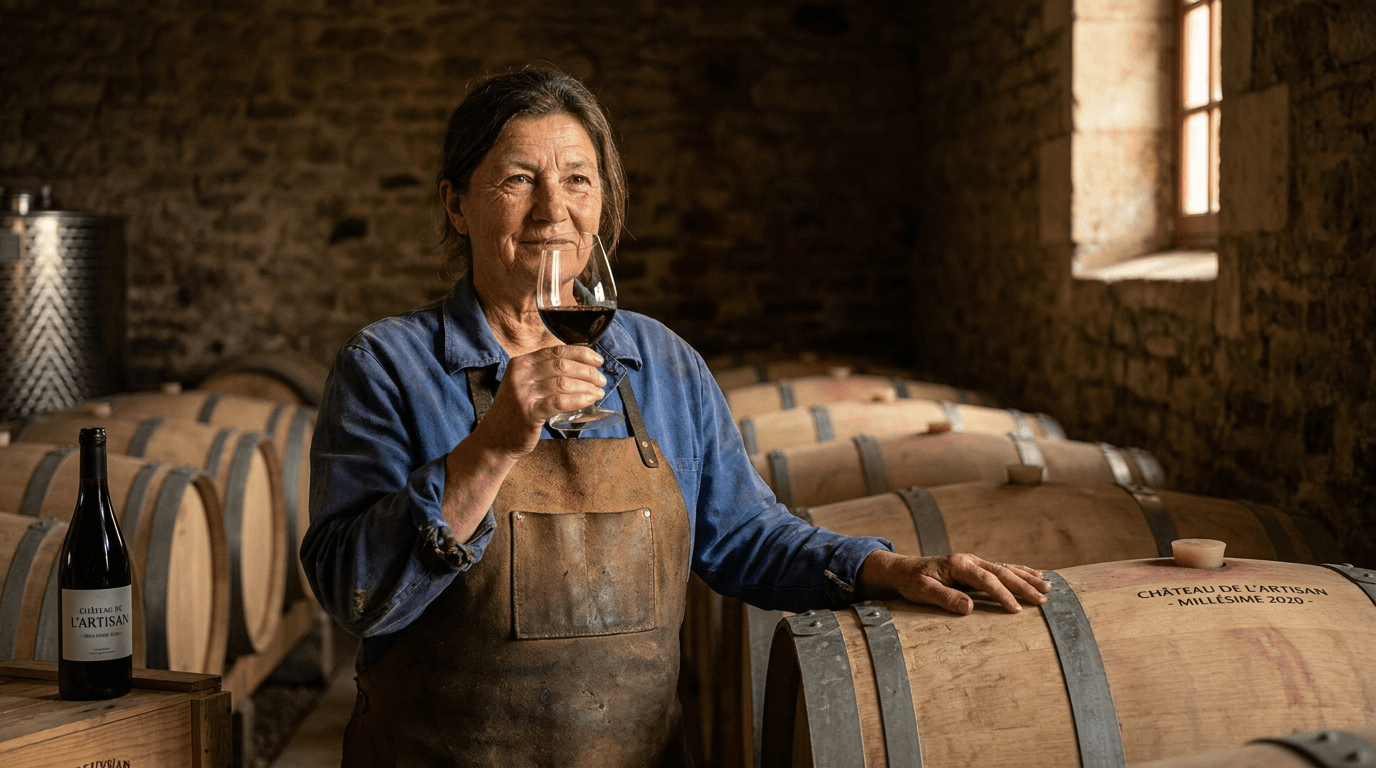
Prompt:
winemaker or distiller maker portrait in production context photograph of [the person who makes the product — the winemaker, the master distiller, the master blender, the founder — presented in their production environment as the human embodiment of the brand's craft and quality: the person is the brand's maker — the specific individual whose skill, knowledge, experience, and passion are responsible for the quality of the liquid: the maker is in their production environment — the winemaker in the cellar or the vineyard, the distiller beside the still or in the barrel house, the blender at their evaluation station, the founder in the facility they built — the person physically connected to the place where the product is made, the environment providing the professional context that establishes their expertise, the maker shows their professional character — the clothing appropriate to their role (the winemaker in work clothes or a clean work shirt in the cellar; the distiller in their work environment attire; the founder in the balance between approachable and authoritative), the posture and the expression communicating quiet confidence, experience, and the specific personality that the brand wants to convey (serious and traditional, passionate and expressive, casual and approachable, authoritative and expert), the maker interacts with the product or the process — holding a glass of the product, evaluating from a barrel sample, touching the vines, checking the still, examining a barrel — the physical interaction connecting the person to the craft and establishing their hands-on relationship with the production, the production environment is visible and identifiable — the barrels, the vines, the still, the equipment, the facility architecture visible around and behind the maker, the environment establishing the professional context and the scale of the operation, the brand identity connects the person to the product — the brand's bottle may be present in the composition, or the brand's name on the facility, or the label visible, or the product in the maker's hand — the connection between the person and the brand explicit, the overall composition communicates: this is who makes it, the quality has a human source, the brand is not a corporation but a person with expertise and care — the maker portrait as the human-connection, authenticity-building image that gives the brand a face and a story] in a medium, environmental portrait composition, the maker is the subject — the person prominently placed in the frame, their face readable and their character visible, the production environment provides the context — the cellar, the vineyard, the distillery, the facility visible around the maker, establishing the professional credibility, the interaction with the product or process is visible — the maker's hands engaged with a glass, a barrel, the vines, the equipment, the brand connection is present — the product, the brand name, the branded elements tying the person to the brand, the depth of field is moderate — the maker in sharp focus with the production environment in softer but readable context, the environmental depth providing the professional setting without competing with the human subject, the lighting is warm, dimensional, and portrait-flattering in the production environment — the illumination that makes a person look their best in a working environment: warm, directional, environmentally motivated portrait lighting — the warm, dimensional illumination that flatters the human subject while revealing the production environment: the key light on the maker warm and directional, creating the dimensional quality that models the face with flattering highlight and shadow, the light warm in tone to communicate the human warmth and the approachability of the maker, the face well-lit and readable while the environment is in slightly lower light, creating the natural hierarchy of human subject in environmental context, the maker's face catches the warm directional light with flattering dimensional quality — the features modeled by the warm key light with the portrait-photography dimensional quality that makes the subject look three-dimensional, present, and engaging, the expression readable and the character visible in the warm illumination, the production environment catches the ambient and motivational light — the barrels in their warm oak tones, the equipment in its industrial character, the facility in its atmospheric quality, each environmental element in its appropriate lower-light context while the maker is in the portrait-lit foreground, the product or the glass (if present) catching the light with its liquid beauty — the wine or spirit in the maker's hand showing its color and its character, the product present as the tangible result of the maker's work, maker portrait palette — the maker's natural skin tone and clothing in warm portrait light — the production environment's material tones (barrel oak, stone, steel, brick, vine green) — the product's liquid color if visible — the brand colors if the brand identity is present — warm, directional, portrait-flattering environmental lighting — and the human-warm, environment-contextual, maker-focused palette of a craftsperson portrait in their production space as the color palette, the mood is quietly expert humanly connected craft-proud and the specific maker message — this person makes the product, their expertise is visible, their connection to the craft is real, the brand has a human heart — the maker portrait as the human-connection and authenticity image that gives the brand a face, a story, and the credibility of a named craftsperson, professional environmental portrait photography with warm directional lighting and moderate depth of field, composed as a maker-in-environment portrait with the person and the production space together telling the craft story, the human presence and the professional expertise and the environmental context as the maker portrait focal points, warm portrait palette in production environment, no text overlays, no watermarks
Best for: Website about and team and maker sections, Instagram and social media founder and maker content, press and media kit founder and maker portraits, email marketing brand-story and maker features, YouTube and video content interview and profile contexts, wholesale and distributor presentations (the human story), wine-club and DTC materials maker-profile sections, print advertising and editorial maker features, brand-book and identity documentation, hiring and team-culture content, social media story and behind-the-scenes maker moments
Template 10: The Seasonal Release — Limited Edition and Vintage Launch
This template creates the seasonal, limited-edition, vintage, or special-release launch visual — the dramatic, urgency-communicating, collector-minded image that announces a new offering with the visual impact that drives immediate acquisition.
Prompt:
seasonal limited-edition wine or spirits release launch visual of [a dramatic, urgency-and-exclusivity-communicating composition that announces a new vintage, a limited release, a special edition, or a seasonal offering — the visual creating the excitement and the scarcity signal that drives immediate acquisition: the limited release is the visual hero — the new product presented with maximum visual impact and exclusivity signaling: the product shows the specific limited-edition or seasonal release — the bottle in its full, premium, special-edition glory: the packaging may have limited-edition elements — a special label design for the vintage or edition, a different closure treatment (a wax seal on a bottle that normally has a capsule, a numbered label, a signed label), a special-edition box or presentation container, a unique bottle format, limited-edition tissue or wrapping — the packaging details that communicate "this is not the regular release, this is special," the bottle shows its premium qualities amplified — the glass, the label, the closure, the liquid color all at maximum visual impact, the limited release looking like an enhanced, elevated version of the brand's standard offering, the exclusivity context surrounds the product — elements that communicate scarcity, collectibility, and the time-sensitivity of the offering: the vintage year prominently visible, the limited-edition numbering or identification, the seasonal context (harvest elements for a new vintage wine release, holiday elements for a seasonal spirit, spring or summer elements for a warm-weather release), the presentation materials (a wooden box, a branded case, a tissue-wrapped reveal), the small-production signals (the hand-numbered, the individually signed, the single-barrel designation), the release context communicates the occasion — the visual treatment establishing whether this is a vintage launch (the product of a specific year, now ready), a holiday or seasonal release (the time-limited offering tied to a specific period), a collaboration or special edition (the partnership product with its distinctive identity), a barrel-select or single-cask offering (the individual-container, unique-expression release), the overall composition communicates: this is new, this is limited, this is the offering that rewards the loyal and the attentive, this is available now and will not be available once it is gone — the limited-release visual as the scarcity-signaling, urgency-creating, collectibility-communicating image that drives immediate acquisition] in a medium, product-hero composition with exclusivity context, the limited-edition product is the hero — the special release visible, premium, and distinct from the regular line, the exclusivity signals surround and contextualize — the vintage year, the numbering, the presentation materials, the seasonal elements creating the scarcity context without overwhelming the product, the brand identity is prominent — the brand name, the logo, the established visual identity providing the recognition framework for the new release, the premium quality is amplified — the product looking its most luxurious and special, the depth of field is moderate — the product in detailed focus with the exclusivity context in atmospheric supporting depth, the lighting is dramatic and premium-amplified — the illumination that makes the limited release look like the most premium expression of the brand: dramatic, rich, premium-elevated lighting — the warm, directional, high-contrast lighting that takes the hero-bottle illumination and adds dramatic intensity: the key light more directional, the shadows deeper, the contrast stronger, the overall effect more dramatic and more premium than the standard hero bottle — the elevated lighting communicating that this is the special release, the limited edition, the expression that justifies even greater attention, the bottle catching the dramatic light with amplified premium quality — the glass, the label, the liquid, the closure all rendered at maximum visual impact under the elevated illumination, the exclusivity elements catching the dramatic light — the vintage year, the numbering, the presentation materials showing their quality in the premium illumination, limited release palette — the limited-edition packaging colors (specify: [your release's special packaging palette]) — the liquid color at dramatic depth — the exclusivity-element tones (vintage year, numbering, seasonal elements) — the presentation-material tones (box, tissue, wrapping) — dramatic, warm, premium-elevated lighting — dark, rich background — and the dramatic, scarcity-signaling, premium-amplified palette of a limited-edition release in elevated dramatic lighting as the color palette, the mood is exclusively available limitedly offered dramatically premium and the specific release message — this is new, this is limited, this is the expression that rewards the attentive, act now — the limited-release visual as the scarcity-and-urgency image that drives immediate acquisition and communicates the special nature of the offering, professional premium product photography with dramatic elevated lighting and moderate depth of field against a dark rich background, composed as a limited-edition product hero with exclusivity signals and seasonal or vintage context, the premium amplification and the scarcity communication and the brand identity as the release focal points, dramatic premium palette with limited-edition colors, no text overlays, no watermarks
Best for: Instagram and social media release and launch announcements, paid advertising limited-edition and vintage campaign creative, website new-release and vintage sections, email marketing launch and announcement features, wine-club and DTC materials vintage and special-release sections, wholesale and distributor new-product presentations, press and media kit release imagery, print advertising limited-edition creative, tasting-room and retail point-of-sale seasonal signage, collector and enthusiast community content
Template 11: The Bar Scene — On-Premise Environment and Social Context
This template showcases the on-premise environment — the bar, the restaurant, the lounge, the social setting where the brand's products are consumed in the aspirational social context that drives on-premise sales and brand desire.
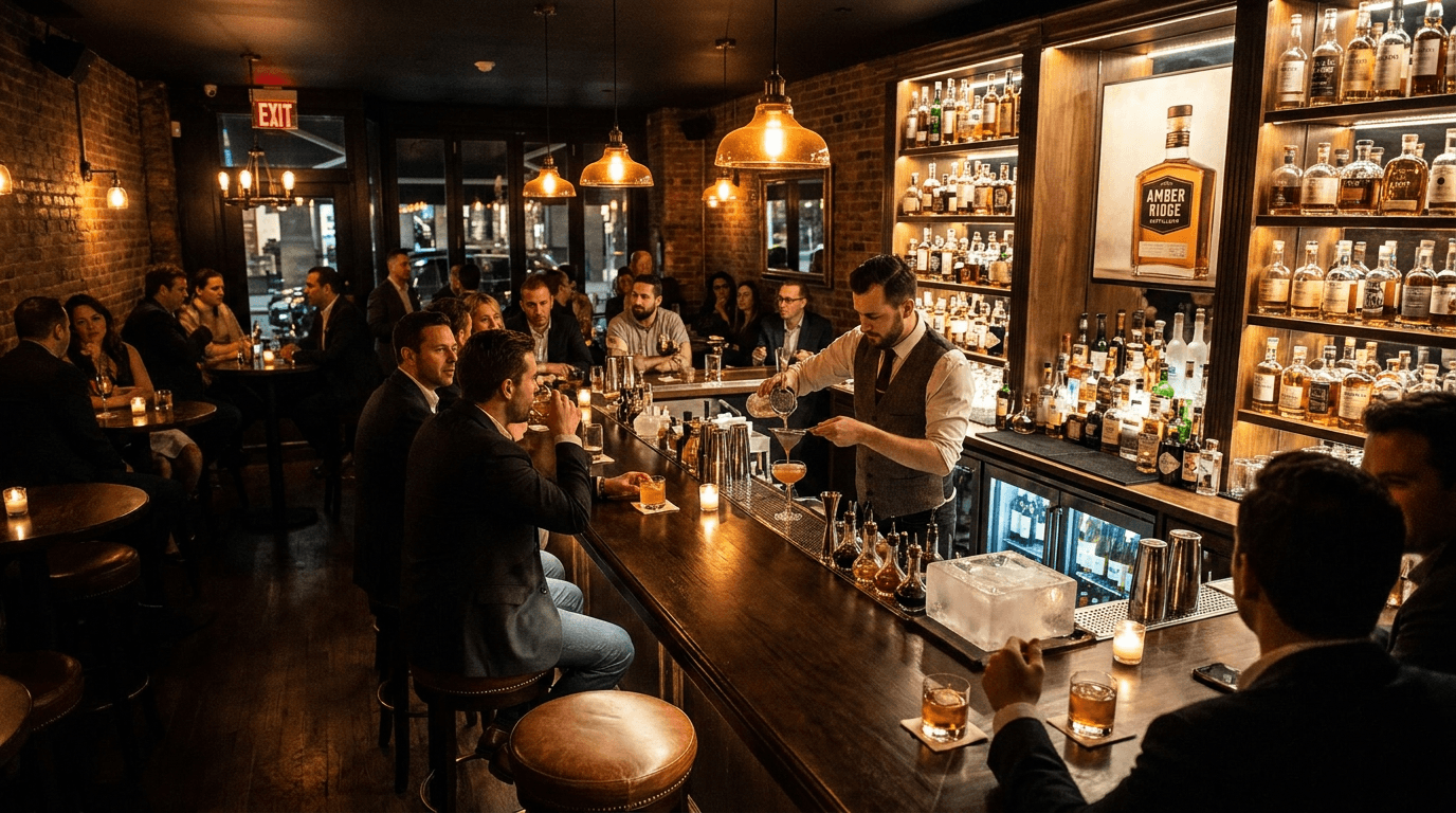
Prompt:
bar and restaurant on-premise environment scene photograph of [the on-premise environment — the bar, the restaurant, the lounge, the social space where the brand's wine or spirits are consumed, the physical context that represents the aspirational social experience of drinking the product: the on-premise environment is a specific, visually compelling space — the particular bar or restaurant setting that matches the brand's on-premise positioning: a craft cocktail bar — the long, polished bar with its stools, the back bar displaying spirits bottles (the brand's bottle prominent among them), the bartender at work behind the bar, the cocktail tools and the glassware and the ice program visible, the moody, designed, atmospheric quality of a serious cocktail bar with its specific aesthetic (dark and moody, sleek and modern, vintage and speakeasy, industrial and urban), the space communicating the cocktail-culture context that premium spirits aspire to; or a fine-dining restaurant wine service — the dining room with its table settings, the sommelier or the server presenting or pouring wine at a table, the wine list or the bottle visible, the elegant, candlelit, service-driven atmosphere of the fine-dining wine experience; or a wine bar — the relaxed, social, wine-focused space with its by-the-glass offerings, the wall of bottles, the communal atmosphere; or a hotel bar or lounge — the designed, luxurious, social space with its premium atmosphere and its sophisticated clientele; or a neighborhood bar or pub — the warm, welcoming, social space with its community atmosphere, the back bar is the brand's stage — the spirits bottles arrayed on the back bar, the brand's bottle visible and prominent in the display, the back bar as the visual inventory of the spirits world, the brand present among its peers; or the wine wall or wine display is the brand's showcase — the bottles in the restaurant's wine display, the brand's presence in the curated collection, the environment is populated — bartenders making drinks, servers carrying glasses, patrons at the bar or at tables, the social energy of the on-premise experience visible in the human activity, the space alive and active, the mood atmospheric and social, the brand's product is present — the bottle on the bar, the cocktail in someone's hand, the wine glass on the table, the brand visible in the consumption context, the overall composition communicates: this is where the product is experienced in its ideal social context, the environment is aspirational, the brand belongs in this space — the on-premise scene as the social-context, aspiration-building image that sells the experience of consuming the product in the best possible setting] in a wide-to-medium, environment-establishing composition, the bar or restaurant environment fills the frame — the space, the people, the activity, the social energy visible, the back bar or the wine display provides the product context — the bottles, the brand's presence, the curated environment, the human activity creates the social energy — the bartenders, the servers, the patrons, the social life of the space, the brand is present — the bottle, the drink, the brand identity visible in the on-premise context, the atmospheric quality is specific — the moody bar, the elegant restaurant, the relaxed wine bar, the specific atmosphere of the depicted environment, the depth of field is moderate — the foreground elements in detail with the environment in atmospheric but readable depth, the lighting is atmospheric, on-premise-authentic, and mood-establishing — the illumination that makes on-premise environments look their most inviting: warm, atmospheric, on-premise-motivated lighting — the natural illumination of the specific on-premise environment: the warm, low, amber-toned light of a cocktail bar (under-counter glow, pendant lights, candle flicker, the moody, designed lighting program of a serious bar); or the soft, warm, multi-source light of a fine restaurant (candlelight, accent light on art and wine, the overall warm glow of designed hospitality lighting); or the relaxed, warm ambient of a wine bar — the light creating the inviting, atmospheric, social quality that makes the viewer want to be in the space, the back bar catches the atmospheric light with its spirits-display quality — the bottles on the back bar reflecting the ambient light, the brand's bottle visible among the display, the bar surface catches the light with its polished or textured quality — the wood or the stone or the metal of the bar top in the warm ambient illumination, the human subjects catch the warm ambient light with natural, candid, in-the-moment quality — the bartender, the patrons, the social interaction lit by the environment's atmosphere, on-premise palette — the specific on-premise environment's designed palette (specify: [your target on-premise type, e.g., dark cocktail bar with amber lighting and polished wood, elegant restaurant with warm neutrals and white tablecloths, relaxed wine bar with exposed brick and warm light]) — the spirits or wine bottle tones on the back bar — the warm, amber, atmospheric on-premise lighting — and the atmospheric, socially charged, aspiration-building palette of an on-premise consumption environment in warm atmospheric lighting as the color palette, the mood is socially atmospheric aspirationally inviting evening-energy and the specific on-premise message — this is where the brand lives in its social context, the environment is aspirational, the consumption experience is better here — the on-premise scene as the social-aspiration and consumption-context image that makes the viewer want to visit the bar, order the drink, experience the social moment, professional interior and lifestyle photography with atmospheric on-premise lighting and moderate depth of field, composed as an environment scene with the bar or restaurant space and the social activity and the brand presence creating the aspiration narrative, the social atmosphere and the brand presence and the environmental quality as the on-premise focal points, warm atmospheric on-premise palette, no text overlays, no watermarks
Best for: Instagram and social media lifestyle and on-premise content, website trade and on-premise sections, paid advertising on-premise-aspiration creative, on-premise partner sales materials, Pinterest lifestyle and bar content, email marketing on-premise occasion features, trade and hospitality marketing materials, brand-book on-premise identity documentation, social media story and Reels on-premise content, PR and media feature on-premise imagery
Template 12: The Botanical & Ingredient — Raw Material Story
This template reveals the raw ingredients — the grapes, the grain, the botanicals, the agave, the water source, the specific materials — that communicate the brand's ingredient quality and production authenticity.
Prompt:
wine or spirits ingredient and botanical story composition of [the raw materials, the botanicals, the agricultural source ingredients that define the product — the natural elements arranged as an ingredient-story visual that communicates quality, sourcing, and the connection between earth and bottle: the ingredients are the specific raw materials — the particular source materials that define the product: grapes — the specific varietal on the vine or freshly harvested: clusters of wine grapes showing their individual berries with their specific color (the deep blue-purple of Cabernet Sauvignon, the translucent gold of Chardonnay, the thin-skinned, pale red of Pinot Noir), the clusters heavy with fruit, the vine leaves providing the green context, the grapes on the vine or in a harvest bin or on a sorting table — the agricultural origin of wine visible and beautiful; or grain — the corn, the rye, the wheat, the barley, the malted barley that forms the mashbill of the spirit: sheaves or kernels or whole grain in its agricultural beauty, the golden or amber or pale tones of the grain, the agricultural origin of the spirit visible; or botanicals — the juniper berries, the coriander, the citrus peel, the angelica root, the orris root, the cassia bark, the specific botanical recipe of a gin or an herbal spirit: the individual botanicals arranged to show their diversity, their natural beauty, their aromatic character implied by their visual specificity; or agave — the piña of the blue agave, freshly harvested, its massive, fibrous, sugar-rich core showing its raw, agricultural power, or the agave plant in the field; or fruit — the specific fruits that make fruit spirits, fruit wines, or flavored products: the plums, the apples, the pears, the cherries in their freshly harvested state; or the specific raw materials of your product type, the ingredients are styled with natural, agricultural beauty — not processed, not refined, but in their raw state, their natural character and their agricultural origin visible, the arrangement communicating both the quality of the source materials and the connection between the earth and the finished product, the finished product provides the connection — the brand's bottle positioned near or among the raw ingredients, the visual relationship between source materials and finished product explicit, the consumer seeing the transformation from raw to refined, the surface and styling communicate the positioning — a rustic, agricultural surface (raw wood, stone, earth) for a terroir-focused, agricultural brand; or a clean, designed surface for a modern brand; or a dark, premium surface for a luxury brand, the overall composition communicates: this is what goes into the bottle, the ingredients are real and beautiful, the quality of the raw materials is the foundation of the product's quality — the ingredient story as the sourcing-and-quality image that connects the natural world to the finished product] in a close-to-medium, ingredient-display composition, the raw ingredients fill the primary frame — the grapes, the grain, the botanicals, the agave, the fruit arranged beautifully, the ingredients show their natural beauty — the colors, the textures, the agricultural character visible and compelling, the finished product provides the transformation context — the bottle visible and connecting the source to the product, the surface communicates the brand positioning — the material character appropriate to the brand's aesthetic, the depth of field is moderately shallow — the nearest ingredients in sharp focus with the supporting elements in softer context, the lighting is warm, natural, and ingredient-celebrating — the illumination that makes agricultural and natural ingredients look their most beautiful: warm, natural, side-directional light — the warm, dimensional illumination that reveals the color, the texture, and the natural beauty of raw ingredients: the grapes showing their deep, saturated berry color and their individual shape and skin quality under the warm directional light; the grain showing its golden, agricultural, sun-dried quality; the botanicals showing their diverse shapes, textures, and colors; the agave showing its massive, fibrous, sugar-rich character; each ingredient rendered at its natural best in the warm, food-photography-standard illumination, the finished product catches the warm light with its premium quality — the bottle and the liquid connecting the raw to the refined, ingredient story palette — the natural colors of the specific raw ingredients (specify: [your ingredients, e.g., deep purple-blue wine grapes, golden corn and amber rye grain, diverse green-and-brown botanicals, blue-green agave]) — the finished product's bottle and label tones — the surface material tone — warm, natural, side-directional lighting — and the agricultural, sourcing-proud, ingredient-story palette of raw materials and finished product in warm natural light as the color palette, the mood is sourcing-proud ingredient-authentic earth-to-bottle and the specific ingredient message — this is where the product begins, the raw materials are real and beautiful, the quality of the source is the quality of the product — the ingredient story as the sourcing and raw-material image that communicates the agricultural or botanical origin of the product and connects the consumer to the materials that make the liquid, professional food and ingredient photography with warm natural side light and moderately shallow depth of field, composed as an ingredient-story still life with raw materials and finished product, the natural beauty and the agricultural quality and the source-to-product connection as the ingredient focal points, natural agricultural ingredient palette in warm directional light, no text overlays, no watermarks
Best for: Website ingredient and production sections, Instagram and social media ingredient-story and harvest content, packaging design ingredient-illustration reference, paid advertising sourcing and quality creative, email marketing ingredient and production features, Pinterest food and ingredient content, content marketing and blog ingredient-origin articles, wholesale and retail partner presentations (ingredient-quality positioning), sustainability and sourcing-philosophy marketing, harvest and vintage content (tied to the agricultural calendar)
Template 13: The Gift Presentation — Occasion and Gifting
This template presents the product as a gift — boxed, wrapped, ribboned, or otherwise presented as the gift-occasion purchase that represents a significant revenue stream for wine and spirits brands during holidays, celebrations, and corporate gifting seasons.
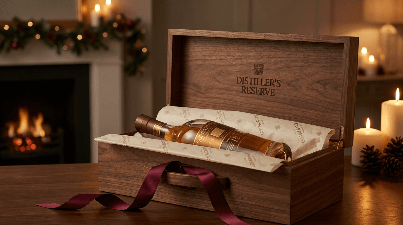
Prompt:
wine or spirits gift and occasion presentation photograph of [the product presented as a gift — beautifully boxed, wrapped, or styled as the premium gift-occasion purchase that says "this is a considered, quality gift from someone with good taste": the gift presentation is specific — the particular gift format and occasion context: a boxed presentation — the brand's bottle in its gift box: a wooden presentation box with the brand's logo on the lid, the box open to reveal the bottle nestled in branded tissue or a fitted interior, the box itself a premium object that communicates the gift's quality before the bottle is even seen; or a branded gift bag — the bottle in the brand's gift bag with tissue paper, the bag showing the brand's visual identity; or a wrapped bottle — the bottle wrapped in decorative paper or fabric, a ribbon or bow at the neck, the wrapped-gift form suggesting the bottle shape beneath the wrapping; or a gift set — the bottle accompanied by branded glasses, a cocktail set, or complementary items in a curated gift arrangement; or the product styled in a celebration context — the bottle among celebration elements: champagne flutes ready for a toast, a holiday table setting, a birthday or anniversary context, corporate gift packaging, the gift wrapping and presentation communicate premium quality — the materials are quality-appropriate: the box showing real wood or substantial construction, the tissue showing its fine, branded quality, the ribbon showing its premium material (satin, grosgrain, branded), the wrapping showing its considered, thoughtful quality — the presentation materials as quality signals that match the product inside, the occasion context may be present — elements that communicate the specific gifting moment: holiday elements (subtle, elegant, not kitschy — the holiday styling appropriate to the premium positioning of the product), celebration elements (confetti, candles, floral), corporate elements (clean, professional, brand-appropriate), personal elements (a handwritten card, a personal note), the elements communicating the specific occasion without overwhelming the product, the brand identity is prominent — the label visible, the brand name and logo visible on the box or the bag or the wrapping, the gift communicating the specific brand identity of the enclosed product, the overall composition communicates: this is a gift worth giving and worth receiving, the presentation matches the quality of the product, the gift is a statement of the giver's taste — the gift presentation as the occasion-and-gifting image that drives holiday, celebration, and corporate gift sales] in a medium, gift-focused, presentation-emphasizing composition, the gift presentation fills the frame — the box, the bag, the wrapping, the gift set visible and premium, the product is visible within or beside the gift packaging — the bottle identifiable and the brand readable, the presentation materials show their quality — the box, the tissue, the ribbon, the wrapping at premium-communicating quality, the occasion context (if present) provides the gift moment — the holiday, the celebration, the corporate elements suggesting the occasion, the depth of field is moderate — the gift presentation in detailed focus with the occasion context in atmospheric supporting depth, the lighting is warm, premium, and occasion-appropriate — the illumination that makes a gift presentation feel special and desirable: warm, soft, premium-gifting lighting — the warm, slightly directional, softened illumination that makes gift presentations look their most luxurious and desirable: the light warm and inviting, communicating the warmth of the giving occasion, the gift materials catching the warm light with their premium quality — the box wood glowing, the tissue catching soft highlights, the ribbon showing its material sheen, the product catching the warm light with its premium quality — the bottle and the label and the liquid visible and beautiful within the gift context, the occasion elements catching the warm light with their festive or celebration quality, gift presentation palette — the brand's packaging colors — the gift-material tones (warm wood, white tissue, ribbon color, wrapping tones) — the occasion-context tones (holiday, celebration, corporate) — warm, soft, premium-gifting lighting — and the premium, occasion-appropriate, gift-desirable palette of a wine or spirits gift presentation in warm gifting light as the color palette, the mood is gift-worthy premium occasion-perfect and the specific gift message — this is the gift that communicates taste, quality, and consideration, the presentation matches the product — the gift presentation as the gifting-occasion image that drives seasonal, holiday, celebration, and corporate gift sales, professional product and lifestyle photography with warm premium-gifting lighting and moderate depth of field, composed as a gift-presentation scene with the product in its gifting context, the premium presentation and the brand identity and the occasion appropriateness as the gift focal points, warm premium gifting palette, no text overlays, no watermarks
Best for: Website gift and shop sections, Instagram and social media holiday and gifting content, paid advertising holiday and gift-season campaign creative, email marketing holiday gift-guide features, e-commerce and direct-to-consumer gift listing imagery, corporate gifting catalog and presentation materials, print advertising holiday and occasion creative, Pinterest gift and holiday content, retail partner gift-section display materials, holiday and seasonal promotional signage
Template 14: The Brand Heritage — History, Archive, and Tradition
This template tells the brand's history through visual composition — the heritage, the archive, the founding narrative, the generational tradition that grounds the wine or spirit in a story that transcends the current product and creates the brand depth that justifies premium positioning.
Prompt:
wine or spirits brand heritage and archive composition of [a visually narrative, history-communicating composition that tells the brand's story through heritage elements — the visual evidence of time, tradition, and generational commitment to craft: the heritage elements are specific to the brand's history — the particular visual evidence of the brand's past and its continuity: vintage packaging — the brand's historical labels, bottles, or packaging designs alongside the current versions, the evolution of the brand's visual identity visible across decades or generations, the historical elements showing their aged, authentic, time-marked character; or historical production equipment — vintage cooperage tools, antique distilling equipment, historical winemaking implements alongside or in contrast with modern equipment, the evolution from traditional to contemporary methods visible; or archival photographs or documents — the founders, the historical facility, the early-era imagery of the brand in its youth, the photographic evidence of the brand's human history, vintage photographs in frames or arranged with current brand elements; or the facility's architectural heritage — the original building, the historical stonework or brickwork, the architectural elements that have survived from the brand's founding era, the physical structure as the historical evidence; or generational artifacts — the founder's tools, the family records, the original recipe documentation, the physical objects that connect the current operation to its origin; or awards and recognition — historical medals, competition awards, critical recognition from across the brand's history, the accumulated evidence of quality over time, the modern product is present — the current bottle, the contemporary expression, the present-day product connected to the heritage elements, the visual relationship between past and present explicit, the viewer seeing the continuity of the brand across time, the arrangement communicates continuity — the historical and the contemporary elements together in a composition that reads as "this has always been here, this continues, the quality is not new but inherited," the overall composition communicates: this brand has history, the tradition is real, the quality has been sustained across time, the heritage is the emotional depth that commodity brands cannot offer — the heritage visual as the tradition-and-depth image that grounds the brand in time and creates the loyalty that history inspires] in a medium, heritage-narrative composition, the heritage elements and the contemporary product together fill the frame — the past and the present in visual conversation, the historical elements show their authentic age — the patina, the wear, the time-marked quality of genuine artifacts, the contemporary product shows its current quality — the modern bottle, the contemporary label, the current expression in its best light, the continuity is the story — the visual relationship between then and now readable and meaningful, the brand identity bridges the eras — the name, the logo, the visual identity visible in both historical and contemporary forms, the depth of field is moderate — the primary heritage and product elements in focus with supporting context in atmospheric depth, the lighting is warm, nostalgia-evoking, and history-communicating — the illumination that makes heritage stories feel genuine and emotionally warm: warm, soft, golden, nostalgia-toned lighting — the warm, diffused, time-evoking illumination that communicates memory, tradition, and the emotional warmth of heritage: the light golden and soft, suggesting the amber tone of memory and the warm character of stories told across time, the heritage elements catching the warm light with their aged, authentic quality — the vintage labels showing their faded, time-marked surfaces, the historical equipment showing its patina, the archival photographs showing their sepia or black-and-white character within the warm ambient, the contemporary product catching the warm light with its current premium quality — the modern bottle showing that the heritage continues in an excellent current product, heritage palette — the aged, time-marked tones of the historical elements (sepia, warm cream, faded ink, darkened wood, aged metal) — the contemporary product's current packaging colors — warm, golden, amber-toned nostalgia lighting — and the warm, time-layered, heritage-communicating palette of a brand history narrative in nostalgic warm lighting as the color palette, the mood is historically grounded tradition-proud heritage-rich and the specific heritage message — this brand has a history worth knowing, the tradition is real, the quality has been sustained and earned across time — the heritage visual as the brand-depth and tradition image that creates the emotional connection beyond the product, professional editorial and still-life photography with warm nostalgic lighting and moderate depth of field, composed as a heritage-narrative arrangement with historical and contemporary elements in visual conversation, the historical authenticity and the brand continuity and the emotional warmth of tradition as the heritage focal points, warm nostalgia heritage palette, no text overlays, no watermarks
Best for: Website about and history sections, Instagram and social media brand-story and heritage content, packaging design heritage-element reference, email marketing brand-story and milestone features, press and media kit brand-history imagery, wholesale and distributor presentations (heritage and credibility positioning), wine-club and DTC materials brand-story sections, print advertising heritage and tradition creative, brand-anniversary and milestone campaign content, tasting-room and visitor-center display imagery, brand-book and identity documentation heritage pages
Template 15: The Social Promo — Campaign and Announcement Canvas
This template creates the promotional-ready visual canvas — the atmospheric, text-ready composition designed to carry product launches, seasonal campaigns, event announcements, tasting invitations, and brand messages while maintaining the wine or spirits brand's premium visual identity.
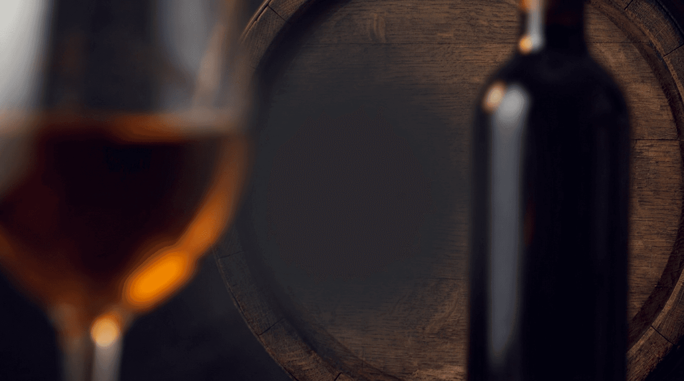
Prompt:
wine and spirits brand promotional announcement visual canvas of [an atmospheric, text-ready composition designed as the premium background for wine or spirits brand promotions — the visual foundation that carries product launches, vintage releases, tasting events, seasonal specials, and brand messaging while maintaining the brand's premium visual identity and category authenticity: the image provides a dramatic, brand-consistent, text-supporting background — atmospherically layered with the visual vocabulary of wine and spirits premium and the brand's specific identity: a background built from the brand's visual world — atmospheric, blurred, or partially abstracted wine or spirits elements: the soft, out-of-focus glow of amber spirit in a glass, the atmospheric suggestion of bottles on a dark surface, the warm oak tones of barrel wood as a textural background, the deep ruby or amber or golden tones of the brand's liquid as abstract color fields, the dark, premium, spirits-photography atmosphere as the dominant visual quality, the brand colors blended with the category's premium dark palette to create an immediately identifiable yet text-supportive atmosphere, the brand colors are prominently integrated — the specific brand palette (specify: [your brand colors, e.g., deep burgundy and gold, navy and copper, forest green and cream, black and amber]) present as dominant atmospheric tones, the colors consistent with the brand's label design, packaging, and existing visual identity, providing immediate visual identification, the premium category atmosphere is maintained — the viewer recognizes the image as belonging to a wine or spirits brand, the dark, sophisticated, adult-context visual vocabulary of spirits photography providing the category identification and the premium positioning even without a sharply focused product, the composition is deliberately zoned for text — a large, clear, consistent-tone area where promotional text will sit with strong legibility: the text zone sufficient for a headline ("Single Barrel Release | Winter 2026"), a supporting line ("Limited to 500 bottles | Barrel-strength"), a call-to-action ("Reserve yours at the link"), and the brand logo — the text hierarchy accommodated, the background tone in the text zone consistent and dark enough for light text or light enough for dark text, ensuring readability, the canvas works across promotional types — flexible enough to support a vintage release, a tasting event invitation, a seasonal campaign, a new product launch, a cocktail recipe share, a trade announcement, an award notification, or any wine or spirits brand communication, the overall composition communicates: this is an official communication from a premium wine or spirits brand, the visual quality matches the product quality, the promotion is worth attention — the promotional canvas as the brand-consistent, premium-maintaining visual foundation for every brand communication] in a text-ready, atmospherically-zoned premium composition, the composition is structured for text overlay — clear text zones and atmospheric visual zones deliberately arranged, the brand colors dominate alongside the category's dark premium atmosphere — the brand's specific palette integrated with the wine or spirits visual vocabulary, the wine and spirits visual vocabulary is atmospheric — dark tones, liquid amber or ruby, oak warmth, glass reflections in supportive atmospheric rendering, the text zone is clearly defined — large, consistent, high-legibility area for promotional content, the depth of field is atmospheric — all elements in soft-to-deep focus preventing competition with overlaid text, the lighting is atmospheric, dark, and premium — the illumination that maintains the brand's premium positioning: warm, atmospheric, premium-maintaining lighting — the low, warm, directional illumination that maintains the wine or spirits brand's dark, sophisticated, premium visual quality even in a text-supporting promotional composition, the atmospheric elements catching the light with their premium, category-authentic quality, the text zone receiving consistent illumination for overlay legibility, promotional canvas palette — the brand's specific colors as the dominant chromatic identity (specify: [your brand colors]) — atmospheric wine or spirits tones (amber, ruby, oak, dark) — text-zone consistent tonality — warm, atmospheric, premium-maintaining lighting on dark background — and the branded, premium-maintaining, promotion-ready palette of a wine or spirits brand announcement canvas as the color palette, the mood is premium-branded promotionally ready darkly sophisticated and the specific promotional message — this is an official brand communication, the visual quality matches the product quality, the promotion deserves attention — the promotional canvas as the text-ready, premium-consistent, brand-identified foundation for every wine or spirits brand promotion and announcement, professional atmospheric photography with premium-maintaining lighting and atmospheric depth of field in a text-zone-structured composition, designed for multi-purpose promotional text overlay, the text readability and the brand identity and the premium consistency as the canvas focal points, dark premium palette with brand-color accents in atmospheric light, no text overlays in this base image (text to be added for specific promotions), no watermarks
Best for: Instagram and social media promotional posts and announcements, paid advertising campaign backgrounds, email marketing promotional headers and banners, website promotional banners and popup backgrounds, tasting and event invitation graphics, trade and wholesale announcement materials, seasonal and holiday campaign graphics, new-release and vintage announcement canvases, cross-platform promotional consistency, retail and on-premise point-of-sale promotional materials
How to Customize These Prompts for Your Specific Wine or Spirits Brand
The templates produce compelling wine and spirits content, but the most effective imagery reflects your actual brand — your specific product type, your real bottle and label design, your production methods, your brand personality, your positioning, and the particular visual identity that differentiates you from every other bottle competing for the same consumer.
Specify your product type and category precisely. Bourbon, scotch, Irish whiskey, Japanese whisky, rye, gin, vodka, tequila, mezcal, rum, brandy, cognac, amaro, liqueur, still wine, sparkling wine, rosé, natural wine, fortified wine, sake, cider, and non-alcoholic spirits each have distinct visual languages, bottle shapes, glass traditions, production environments, and consumer expectations. A bourbon brand's hero bottle should show the squat, heavy, American whiskey bottle with its specific label design and its amber liquid. A gin brand's hero should show the tall, clean-lined bottle with its specific botanical reference. Define your category precisely in the prompt and the generated imagery will reflect the correct visual conventions.
Replace generic descriptions with your actual bottle and label design. Your label is your identity. "A cream-colored label with a crest in gold foil, serif typography in deep burgundy, and a 750ml Bordeaux-shaped bottle in dark green glass" generates dramatically different imagery than "a wine bottle." Describe your actual packaging: the bottle shape and glass color, the label's layout, typography style, color palette, and any print techniques (foil, emboss, letterpress), the closure type and color, and any distinctive design elements. The specificity produces imagery that represents your actual brand.
Define your brand personality and positioning with precision. Your brand's visual personality dictates every element of the image. "A heritage-driven, old-world, traditional wine brand with dark tones, serif typography, and architectural imagery" produces fundamentally different content than "a modern, disruptive, accessible spirits brand with bold graphics, sans-serif type, and bright lifestyle imagery." Specify the personality: luxury and prestige, artisan and craft, heritage and tradition, modern and disruptive, approachable and everyday, adventurous and experimental, or the specific personality blend that defines your positioning.
Match the liquid color to your actual product. The color of your wine or spirit is a critical visual element. "Warm amber with deep copper highlights" produces a very different image than "pale straw gold" or "deep, almost opaque ruby-garnet." Describe your liquid color accurately — this is the sensory bridge that connects the visual to the anticipated tasting experience.
Match the production environment to your actual facility. If you have a stone-walled, barrel-vaulted cellar, describe that. If you have a modern, stainless-steel production facility, describe that. If you are an urban distillery in a converted warehouse, describe that. The production environment communicates your brand's specific character — the AI imagery should reflect or complement your actual facility's visual identity.
Match the on-premise context to your target environment. If your brand's aspirational on-premise presence is a high-end cocktail bar, describe that context. If it is a casual wine bar, describe that. If it is a fine-dining restaurant, describe that. The on-premise visual context should match the specific environment where your target consumer would ideally encounter and consume your product.
For hero product shots, photograph your actual bottle. Use the AI-generated compositions as lighting, styling, and atmospheric references, then invest in a professional product photography session with your actual bottles. The Image Inpainting tool can enhance the atmosphere, adjust the lighting quality, and bring the production standard of your actual product photography up to the premium standard that the generated references establish, while preserving the authentic product appearance that consumers will encounter on the shelf.
Platform-Specific Deployment for Wine & Spirits Brands
Each platform where wine and spirits brands build awareness, generate aspiration, and drive purchases has specific content expectations, audience behaviors, and format requirements.
Instagram is the primary aspiration-generation and brand-building platform for wine and spirits. The visual-first nature of Instagram makes it the ideal platform for luxury and premium brand building. The content mix should maintain approximately 30% hero product content (Templates 1, 2, 4, 10 — the premium product imagery), 25% lifestyle and occasion content (Templates 3, 8, 11 — the aspirational, social, experiential content), 20% origin and craft content (Templates 5, 6, 9, 12 — the provenance, production, and maker content that builds brand depth), 15% engagement and portfolio content (Templates 7, 14 — the comparative, heritage, and brand-story content that generates saves and deep engagement), and 10% promotional content (Templates 10, 13, 15 — the launch, gift, and promotional content). Use 4:5 for feed posts, 9:16 for Stories and Reels, 1:1 for maximum compatibility. For Instagram-specific strategies, additional guidance covers platform optimization.
TikTok is the highest-reach platform for wine and spirits discovery. TikTok has become a significant discovery platform for wine and spirits, particularly among younger legal-drinking-age consumers. Templates 2 (pour shots), 3 (cocktail builds), 8 (ritual details), 9 (maker profiles), and 12 (ingredient stories) produce content optimized for TikTok's vertical, full-screen, discovery-driven format. The satisfying quality of spirits content — the smooth pour, the cocktail build, the ice placement, the swirl — performs well on TikTok. Use 9:16 exclusively. Ensure all content complies with platform alcohol-advertising policies.
Pinterest drives discovery and aspiration for wine and cocktail content. Pinterest is exceptionally strong for wine and spirits brands because the platform's audience actively seeks cocktail recipes, entertaining ideas, gift inspiration, and aspirational lifestyle content. Templates 3 (cocktail serves), 5 (origin landscapes), 7 (tasting flights), 12 (ingredient stories), and 13 (gift presentations) perform particularly well on Pinterest. Use 2:3 vertical format for Pinterest optimization.
YouTube serves long-form brand storytelling and production content. YouTube is where wine and spirits brands build deeper brand narratives through production tours, maker interviews, origin documentaries, tasting education, and cocktail instruction. Templates 5 (origin landscape), 6 (barrel room), 9 (maker portrait), and 14 (brand heritage) serve YouTube's long-form content needs. Use 16:9 for all YouTube content.
The brand website is the conversion and premium hub. The website should deploy Template 1 (hero bottle for the homepage and product pages), Template 3 (cocktail for the serves and recipes section), Templates 5 and 6 (origin and barrel room for the production and about sections), Template 7 (flight for the portfolio and collection section), Template 9 (maker for the team and about sections), Template 13 (gift for the shop and gifting section), Template 14 (heritage for the history section), and Template 15 (promotional for campaigns). The website's visual quality represents the brand's most controlled premium environment and should reflect the highest standard.
Wine and spirits e-commerce and DTC platforms require specific product photography. Platforms like the brand's own shop, Drizly, ReserveBar, Wine.com, and Vivino require clean, accurate product photography that represents the bottle the consumer will receive. Templates 1 (hero bottle) and 4 (label detail) provide the product-accuracy imagery these platforms demand. Use 1:1 or the platform's specified aspect ratio.
Trade and distribution materials require a specific visual approach. Materials for distributors, retailers, on-premise buyers, and trade presentations need to balance the brand's premium visual identity with the practical, commercial information that trade audiences require. Templates 1 (hero bottle), 7 (tasting flight for portfolio presentations), 6 (barrel room for production positioning), and 10 (limited release for new-product sell-in) serve trade communication needs effectively.
Email marketing drives wine-club retention and DTC conversion. Regular email communications should feature Template 1 for product features, Templates 10 and 15 for releases and promotions, Templates 5, 6, and 14 for brand storytelling, Templates 3 and 8 for cocktail and serve-suggestion content that adds value for the consumer, and Template 13 for holiday and gifting campaigns. Visual consistency in email maintains the premium brand relationship across communications.
Common Mistakes in Wine & Spirits Visual Identity
Wine and spirits brands fail in specific, identifiable visual ways that directly impact premium perception, shelf competition, on-premise presence, and long-term brand equity.
Using flat, even lighting on bottles. The most common and most damaging visual mistake in spirits photography is illuminating the bottle with flat, non-directional light that eliminates the dimensional quality, the glass highlights, and the liquid luminosity that make bottles look premium. Flat lighting makes a premium bottle look like a commodity product photograph. The directional, sculpting light with transmitted liquid backlight described in Template 1 is the specific technique that makes bottles look premium — the dimensional modeling, the glass highlights, the backlit liquid glow, and the dark-field contrast. Without this specific lighting approach, even the most beautiful bottle will look flat, ordinary, and unworthy of its price point.
Ignoring the liquid color communication. Many wine and spirits images treat the liquid as invisible, focusing on the label and the packaging while neglecting to show the consumer the color of what is inside. The liquid color — the amber, the ruby, the gold, the crystal clarity — is the sensory bridge, the visual element that allows the consumer to anticipate the tasting experience. Templates 1, 2, 3, 7, and 8 all prioritize liquid-color visibility. If the glass allows light transmission, the lighting should illuminate the liquid from behind or from the side-rear to reveal its color at maximum beauty.
Over-brightening the background. Wine and spirits brands — particularly those from the wine category — sometimes photograph their products against bright, light backgrounds that are appropriate for food, beauty, or fashion but undermine the premium, sophisticated positioning of an adult beverage. The dark background is the dominant convention in premium spirits photography for a reason: it creates the contrast that makes the bottle pop, provides the dark field for liquid luminosity, and communicates the sophisticated, evening-context positioning that supports the premium. There are exceptions (rosé, sparkling wine, and lighter spirits sometimes work with bright backgrounds), but the default for premium wine and spirits should be dark.
Neglecting the glass quality in cocktail and serve photography. The glass is not a neutral vessel — it is a quality signal. A thin-rimmed, crystal wine glass communicates a dramatically different quality level than a thick, casual tumbler. A heavy, cut-crystal rocks glass communicates premium in a way that a standard barware glass does not. Templates 3 and 8 emphasize glassware as a quality signal. The glass used in every serve and cocktail image should match or exceed the quality positioning of the brand it contains.
Inconsistent styling across the product portfolio. A brand with multiple expressions (a core range, a reserve, a single barrel, a limited edition) photographed in entirely different visual styles — different lighting approaches, different surfaces, different backgrounds, different compositional formats — fails to communicate the brand family relationship. Establish a visual template for your product photography (consistent background tonality, consistent lighting approach, consistent compositional format) and apply it across the portfolio. The individual expressions should be visually distinct (different label designs, different liquid colors) but stylistically unified as a family.
Over-styling with props that compete with the product. Elaborate still-life arrangements with excessive props — too many garnishes, too many books, too many candles, too many lifestyle elements — can bury the product. The bottle or the glass should be the hero. Every other element should support the product's premium positioning without competing for attention. If the viewer's eye is drawn to the styling rather than to the bottle, the styling has failed.
Failing to show the production environment and the origin. Wine and spirits brands that skip the origin landscapes, the barrel rooms, the production environments, and the maker portraits are leaving their most powerful brand-building imagery unmade. These images — Templates 5, 6, 9, 12, and 14 — provide the provenance proof, the craft credibility, and the emotional depth that create the brand loyalty transcending any single product. Commodity brands skip these stories because they have none to tell. If you have a real origin, a real facility, and a real maker, show them.
Posting cocktail content with poor ice quality. In cocktail photography, ice quality is a primary visual signal of the overall preparation standard. Cloudy, irregular, mass-produced ice cubes in a cocktail image communicate casual, unserious preparation. Clear, large-format ice — the sphere, the large cube, the hand-cut block — communicates the premium, craft-cocktail standard that supports the brand's quality positioning. Template 3 specifies intentional, quality-communicating ice for exactly this reason.
Failing to comply with alcohol advertising regulations. Wine and spirits visual content must comply with all applicable advertising regulations, platform-specific alcohol advertising policies, and age-gating requirements. Ensure all content is appropriate for the platforms on which it appears and that the brand's visual content practices meet or exceed industry self-regulatory standards. This is a legal and ethical requirement, not a creative one, but its neglect can result in content removal, account restriction, and brand damage.
Building a Complete Wine & Spirits Visual Identity System
A successful wine or spirits visual identity is a cohesive system that communicates premium quality, builds brand aspiration, establishes provenance and craft credibility, and drives the purchase behavior that sustains the business across retail, on-premise, DTC, and e-commerce channels.
Establish your visual positioning before building content. Define the core positioning decisions: your product type and its visual conventions, your brand personality (luxurious, artisan, heritage, modern, approachable, adventurous), your visual aesthetic (dark and moody, warm and rich, clean and modern, rustic and natural), your brand colors (the specific palette from label to social to collateral), your styling vocabulary (the surfaces, the glassware, the props that define your visual world), your photographic mood (dramatic and premium, warm and inviting, bright and accessible, moody and atmospheric), and the competitive visual context (what the brands you compete with look like, and how you differentiate visually). Document these decisions and apply them rigorously across every visual touchpoint.
Build a content calendar that balances product and story content. A wine or spirits visual identity is not built through bottle shots alone. The identity requires product content (the bottles, the pours, the serves that show the product at its most premium), lifestyle content (the cocktails, the occasions, the on-premise moments that connect the product to the aspirational experience), craft content (the origin, the barrel room, the ingredients, the maker that give the brand depth and credibility), and promotional content (the launches, the limited releases, the campaigns that drive acquisition). Balance these across a monthly content calendar, with the mix weighted toward the content types that serve your primary sales channel (product-heavy for e-commerce, lifestyle-heavy for on-premise, origin-heavy for wine club and DTC).
Invest in a professional spirits photography session. A single professional photography session — four to six hours with a photographer who specializes in spirits and wine photography and understands the specific lighting techniques (transmitted light, dark-field contrast, glass management) — can produce hero bottle portraits across your portfolio, pour and serve photography, label detail close-ups, and lifestyle context images that serve as the visual foundation for months of content. Use the AI-generated templates as shot-list references. Spirits photography requires specific equipment (backlight setups, gradient backgrounds, specialized glass-management techniques) that most general product photographers do not regularly use — working with a specialist or providing the AI references to a skilled product photographer produces significantly better results.
Create multi-format versions of every key visual. Every important image should exist in 1:1, 4:5, 9:16, 16:9, 2:3, 4:3, and print-ready formats. A single hero bottle image reformatted for Instagram feed, Instagram Story, website banner, e-commerce listing, trade presentation, retail shelf talker, and on-premise menu maintains visual consistency across every consumer and trade touchpoint.
Develop video content for the ritual-and-craft platforms. Wine and spirits video content — the pour, the cocktail build, the swirl, the barrel room walkthrough, the harvest, the maker interview — is compelling on TikTok, Instagram Reels, and YouTube. The Cinematic Video Generator creates atmospheric video from wine and spirits sequences. The Text2Shorts tool produces promotional short-form content. The AI Music Generator creates mood-appropriate audio — sophisticated jazz for a cocktail brand, acoustic warmth for a winery, dramatic orchestral for a premium spirits launch. The AI Clipping tool extracts compelling moments from production and event footage. Visual consistency between still and video content reinforces the premium brand identity.
Track which visual content drives actual purchase and engagement behavior. Monitor which content types drive website visits, e-commerce conversion, tasting-room visits, and social media saves (a strong indicator of aspiration and future purchase intent for wine and spirits). In most wine and spirits brands, hero product imagery and cocktail lifestyle content drive the most direct purchase behavior, while origin, barrel room, and maker content builds the long-term brand relationship that sustains loyalty and supports premium pricing over time. Understanding the difference allows you to optimize content for both immediate conversion and long-term brand equity.
How Miraflow AI Supports Your Wine & Spirits Visual Identity Workflow
Every prompt in this post can be generated inside Miraflow AI. Open the AI Image Generator, paste your customized prompt with your specific product type, bottle and label design, brand colors, positioning, production environment, and brand personality, select the appropriate aspect ratio, and generate. Multiple aspect ratios including 1:1, 4:5, 16:9, 9:16, and 5:4 are available, covering every deployment from Instagram feed to website hero to trade presentation to retail shelf talker.

For the most effective wine and spirits visual workflow, these AI-generated images serve as visual direction, mood boards, styling references, quality benchmarks, and supplementary atmospheric content for your complete visual system. They establish the lighting approach, the styling direction, the compositional standard, the dark-field premium atmosphere, and the liquid-luminosity quality that your real product photography should achieve. When you invest in a professional photography session, share these generated references with your photographer as the visual standard — the lighting quality, the composition, the styling approach, the mood, the specific transmitted-light-through-liquid technique — that the session should target. The references communicate what words alone cannot: the exact premium visual quality the brand requires.
For your real product photography and existing visual content that needs targeted enhancement — improving the liquid color luminosity of a bottle shot, adjusting the background darkness and consistency of a product image, extending a composition's background for a wider format, removing an unwanted reflection or element from an otherwise strong product image, or enhancing the atmospheric quality of a barrel room or tasting room shot — the Image Inpainting tool allows precise editing of specific image regions while preserving the authentic photographic content. This tool is particularly valuable for wine and spirits brands because the most credible content is the real product photography — your actual bottle, your actual label, your actual facility — and the enhancement brings the quality up to the premium standard without replacing the authentic product appearance.
The recommended workflow operates in three phases. The conceptual phase uses these AI prompts to generate visual direction for every content type — establishing the lighting approach, the dark premium atmosphere, the compositional standard, and the liquid-luminosity benchmark before any production begins. The production phase creates your actual brand content — the professional spirits photography session for hero bottles and serves, the ongoing content production for social media and marketing, the real-product-focused content informed by the generated visual direction. The enhancement phase uses inpainting to bring your production materials to the highest premium standard — adjusting liquid luminosity, improving dark-field consistency, optimizing glass highlights, and maintaining brand consistency across the visual ecosystem.
For brands building a complete visual ecosystem including motion and audio content, Miraflow's suite extends the capability. The Cinematic Video Generator creates atmospheric video from wine and spirits sequences. The Text2Shorts tool produces promotional short-form content for social platforms. The AI Music Generator creates audio that matches the brand's personality — sophisticated for a luxury brand, rustic for a craft brand, contemporary for a modern brand. The AI Clipping tool extracts compelling moments from production, harvest, and event footage. The YouTube Thumbnail Maker creates thumbnails for brand video content. Together, these tools allow a wine or spirits brand to produce a complete visual and motion identity system that maintains premium quality and brand consistency across every platform and format.
FAQ
Can AI-generated images replace real product photography for my wine or spirits brand?
For supplementary applications — mood boards, atmospheric content, promotional canvases, conceptual direction, social media atmospheric posts — AI-generated images provide exceptional visual quality. However, for your most consumer-facing applications — the hero bottle on your website, the product image on your e-commerce listing, the label shot on your retail sell sheet, the bottle that consumers will compare to what they receive — real product photography remains essential because the consumer expects to see the actual bottle, the actual label, the actual liquid they are purchasing. Wine and spirits consumers are particularly label-literate and will notice discrepancies between imagery and reality. AI-generated imagery excels as visual direction (showing your photographer exactly the lighting, composition, and mood you want), atmospheric content (backgrounds, environments, promotional canvases), and quality benchmarks (setting the premium standard). The Image Inpainting tool bridges the gap by enhancing your real product photography to meet the premium standard.
What is the single most important visual for a wine or spirits brand?
The hero bottle portrait (Template 1) of your flagship product. This is the image that establishes your brand's premium standard, communicates the label and packaging quality, and serves as the foundational visual across every platform and material. If you invest in one professionally photographed, perfectly lit product image, make it the hero bottle portrait — the dark-field, directionally lit, liquid-luminous bottle that communicates the full premium promise of your brand. Every other visual builds from this foundation.
How do I photograph bottles with glass reflections and dark backgrounds?
This is the fundamental technical challenge of spirits photography. The dark-field technique uses a dark background with controlled light sources that illuminate the bottle from specific angles. The key light provides the label illumination and the dimensional modeling. The backlight or transmitted light passes through the liquid. Gradient cards or flags control the reflections on the glass surface. Strip lights or edge lights create the rim separation from the dark background. Professional spirits photographers use these specific techniques; general product photographers often do not. The AI-generated references from these templates are particularly valuable because they show the desired final result — the exact lighting quality, the exact dark-field atmosphere, the exact liquid luminosity — so a skilled photographer can reverse-engineer the setup.
How do I make liquid color look beautiful in photographs?
Liquid color in wine and spirits photography is primarily a function of transmitted light — light that passes through the liquid rather than reflecting off it. Position a light source behind or to the side-rear of the bottle or glass so the light transmits through the liquid, illuminating it from within. The liquid will glow with its natural color: amber whiskey becomes luminous amber, ruby wine becomes luminous ruby, clear spirits become crystalline. The darker the surrounding environment (dark background, dark surfaces), the more dramatic the transmitted-light effect. This is why dark-field photography is the standard for premium spirits: it provides the contrast that makes the liquid luminosity visible and dramatic.
Should I use the same visual style for my entire portfolio?
Your visual template — the lighting approach, the background tonality, the overall mood, the compositional format — should be consistent across your portfolio. The individual product characteristics — the bottle shape, the label design, the liquid color, any expression-specific styling — should vary by product. This creates a portfolio that is instantly recognizable as one brand (the consistent premium template) while allowing each expression its individual visual identity. The consistency is particularly important for wine and spirits because consumers often encounter multiple expressions from the same brand (on the back bar, on the retail shelf, in a tasting flight), and the visual family relationship reinforces the brand identity.
How should I handle on-premise versus off-premise visual content?
On-premise content (Templates 3, 8, 11) should emphasize the social context, the occasion, the served drink, and the environment — the aspiration of the on-premise experience. Off-premise content (Templates 1, 4, 10, 13) should emphasize the product, the packaging, the label, and the take-home quality — the purchase decision at the retail shelf or online. Both should share the brand's fundamental visual identity (same brand colors, same premium standard, same overall aesthetic), but the emphasis shifts from product-forward (off-premise) to experience-forward (on-premise).
How do I create visual urgency for limited releases?
Template 10 addresses limited-release visual urgency specifically. The key elements are: amplified premium lighting (more dramatic than the standard hero), exclusivity signals (vintage year, batch number, limited-edition packaging elements), presentation materials (the box, the numbered certificate, the special wrapping), and seasonal context (harvest elements, holiday elements) that communicate time-sensitivity. The visual should communicate "this is more special than usual" through elevated production quality, not through text or graphics overlaid on the image.
What about regulatory compliance for wine and spirits visual content?
Wine and spirits visual content is subject to regulatory requirements that vary by jurisdiction, platform, and distribution channel. Ensure all content complies with applicable alcohol advertising regulations, that any social media content is age-gated where required, that content does not depict underage consumption or irresponsible drinking behavior, and that all required legal statements are present where applicable. These templates produce atmospheric and product-focused content that does not inherently raise compliance concerns, but the brand is responsible for ensuring all content meets or exceeds the regulatory standards of every jurisdiction and platform where it appears. Consult your compliance counsel or industry trade association for specific guidance.
Conclusion
The bottle stands on the shelf. The glass sits on the bar. The label faces the consumer. The liquid waits inside, invisible, untasteable, unknowable through any sense but sight until the moment of purchase commitment has already passed. The winemaker's five-generation family tradition. The distiller's carefully maintained mashbill. The botanist's seventeen-ingredient gin recipe. The vineyard manager's forty-year-old vines on that specific slope with that specific soil in that specific microclimate. The barrel selection from that particular location in the rick house where the temperature and the humidity produce the profile that the master blender is searching for. The blending decisions made across dozens of samples until the final expression matches the brand's standard. The years — the actual calendar years of waiting while the liquid sits in oak in the dark, developing the complexity that cannot be rushed.
All of this. The entire enterprise — the agriculture, the science, the craft, the tradition, the patience, the investment, the knowledge accumulated across decades and generations and sometimes centuries — is represented to the consumer at the moment of purchase by a visual. The bottle's shape. The label's design. The imagery that has accumulated in the consumer's memory. The photograph that stops the scroll. The premium quality communicated through the light passing through the amber liquid, the dark background that isolates the bottle in sophisticated contrast, the glass highlight that catches the eye and communicates the weight and the quality of the vessel, the lifestyle image that places the product in the life the consumer desires.
The visual does not replace the liquid quality. Nothing replaces the liquid quality. A brand that invests in premium imagery and produces mediocre liquid will fail once the consumer tastes the product. But the brand that produces extraordinary liquid and invests in mediocre imagery will never get the chance to prove the liquid's quality, because the consumer will never reach for the bottle. The visual is the gate. The premium visual opens the gate. The liquid quality keeps the consumer on the other side.
The 15 templates in this post address the complete premium visual identity system a wine or spirits brand needs: the hero bottle portrait that establishes the premium standard, the pour that creates sensory anticipation, the cocktail serve that connects the product to the aspirational occasion, the label detail that celebrates the packaging craft, the origin landscape that proves the provenance, the barrel room that communicates the investment of time, the tasting flight that demonstrates portfolio depth, the glassware ritual that elevates the consumption experience, the maker portrait that humanizes the brand, the limited release that creates acquisition urgency, the on-premise scene that sells the social context, the ingredient story that reveals the raw materials, the gift presentation that drives occasion sales, the brand heritage that establishes historical depth, and the promotional canvas that converts attention into action.
Copy the templates that serve your brand. Customize them with your actual product type, your real bottle and label design, your specific liquid color, your genuine production environment, your authentic brand story, and the particular premium positioning that makes your wine or spirit the one worth choosing. Generate them inside Miraflow AI to establish your visual direction, use them as references when you invest in the professional spirits photography that captures your actual bottles, your actual pours, your actual barrel room, and the real products that your consumers will hold in their hands. Enhance your production photography with the Image Inpainting tool to achieve the premium quality that the generated references establish.
The bottle is on the shelf. The light is on the label. The liquid glows amber through the glass. The consumer's eye finds the bottle, reads the visual, evaluates the premium, imagines the experience, and reaches. Everything the brand has built — every vintage, every distillation, every barrel, every generation, every decision — arrives at this visual moment. The product is ready. Make the visual worthy of what is inside. The premium starts with the eye.