AI Prompts for Email Header Images: 15 Templates That Boost Open Rates
Written by
Jay Kim
15 copy-paste AI prompts for email header images that boost click-through rates. Campaign-specific templates for sales, newsletters, product launches, events, and more.
Your email header image is doing the heaviest visual lifting in your entire email marketing operation. It is the first thing a subscriber sees after clicking through a subject line, and it determines within a fraction of a second whether they continue reading or close the message. The header is the first visual element subscribers see, and it needs to communicate your brand identity and the email's purpose instantly.[4] In a channel where nearly 400 billion emails are sent and received worldwide every day in 2026[2], your header image is the critical bridge between a successful open and a wasted click.
The data makes the case clearly. The design of your email plays a big role. Emails with images get about 4.84% CTR, compared to just 1.6% for text-only messages.[4] That is a threefold difference in click-through rate driven by the visual quality of your email design. And the stakes are rising. The use of generative AI for image creation in email jumped 340% year over year, making it one of the fastest-growing workflows in email marketing.[2] Marketers who adopt AI-generated header imagery are already seeing higher engagement, faster production cycles, and more consistent visual branding across campaigns.
AI image generation has fundamentally changed the economics of email design. Instead of sourcing stock photos that every competitor also uses, commissioning custom photography, or spending hours in Photoshop for each campaign, you can generate unique, on-brand header visuals in minutes. The header image provides the mood, the visual anchor, and the emotional context. You then add your headline, CTA, and branding elements in your email builder or design tool where you maintain full control over typography, layout, and responsive behavior.
This post gives you 15 ready-to-copy AI prompt templates for email header images across the most common email campaign types. Each prompt is engineered to produce a wide-format image that works within the technical constraints of email clients, leaves appropriate space for overlay text and branding, and matches the visual conventions that subscribers in your segment expect. If you have used similar prompt-based workflows for other visual content such as YouTube thumbnails, podcast cover art, or blog featured images, the process will feel familiar. But email headers operate under unique constraints around landscape aspect ratio, aggressive file size limits, dark mode rendering, and the reality that many recipients will never see the image at all, which require carefully adapted prompts.
Why Email Header Images Matter More Than Most Marketers Realize
The email header occupies the most valuable real estate in your campaign. It sits in the "above the fold" zone, the top 300–500 pixels of the email, which is what recipients see before they scroll. Your most important message, offer, or call to action should live here.[5] If your header fails to engage, the rest of your email never gets seen.
From a marketing perspective, the banner opening an email is a critical part of the newsletter format. If you use an appealing image, highlight your discounts, or provide the user with the menu they are likely to click due to the high resonance of categories, the top part of the email can definitely make readers pay attention.[1] The header does not just decorate your email. It communicates your offer, reinforces your brand, and creates the emotional context that drives the reader to scroll and click.
Adding a quality image in your header breaks the monotony and nudges the reader to scroll to know more.[5] And critically, avoid stock images. Instead, use professional shots that relate to your email content.[5] AI-generated header images solve this problem entirely. Every image is unique, every visual can be tailored to the specific campaign, and no competitor will ever use the same image in their inbox.
Beyond engagement, your header serves a brand recognition function. Consistency in brand visuals builds trust and familiarity for readers. If a reader consistently sees the same color palette in every email design, they will become accustomed to it and immediately recognize your brand's campaigns when they see those colors.[10] Using AI prompts with consistent color and style parameters allows you to maintain this visual consistency across hundreds of campaigns without requiring a designer for every send.
Technical Specifications for Email Header Images in 2026
Email is a technically constrained medium. Unlike a web page or social media post, your email header has to render correctly across dozens of email clients, each with its own rendering quirks. Getting the technical specifications right is not optional. It is the foundation that determines whether your carefully designed header looks professional or broken.
Email header images should be 600px wide with a height of 150–200px and a file size under 200KB for fast loading and broad compatibility.[2] However, for retina display crispness, you should design at 2x resolution. When you design a hero image at 1,200px wide and export it, then constrain it to 600px in the email, it renders at 2× resolution — crisp on retina screens. The template container should still be 600–640px.[5]
For the AI prompts in this post, generate your images at a 16:9 landscape aspect ratio in the Miraflow AI Image Generator. This gives you retina-ready resolution that will display crisply when constrained to the 600px email width in your HTML. After generation, export as JPEG at 70-80% quality to stay well under the 200KB file size limit.

Maintain a text-to-image ratio of 60:40 to enhance readability and reduce the risk of emails being flagged as spam.[7] This means your header image should be one visual element within a well-balanced email, not the entire message. A poor text-to-image ratio — like relying heavily on visuals with minimal text — raises suspicion because spammers commonly hide text in images to bypass detection. Aim for a 60:40 split (text to images) or even 80:20 for better deliverability.[1]
File format matters significantly in email. PNG offers the best quality, especially for logos or transparent images, but it may have a larger file size. JPEG is ideal for photos and detailed images because it compresses well, keeping the file size small without compromising too much on quality. GIF is best for simple animations or small icons, adding interactivity without significantly increasing the file size.[4] For photographic AI-generated header images, JPEG is almost always the right choice for keeping file sizes email-friendly.
Always include descriptive alt text for your header image. Always include descriptive alt text for your header image. Many email clients, including Outlook, block images by default. Alt text ensures your header's message communicates even when the image doesn't load, and it also signals to spam filters that your email is legitimate and properly built.[2]
One more critical constraint: Gmail clips email HTML at 102 KB and shows a "View entire message" link. Everything below the clip point is hidden until the reader clicks that link — which most won't.[5] Keep your total email HTML lean by hosting images externally rather than embedding them, and compress your header image aggressively.
Design Principles That Make Email Headers Convert
Effective email header design follows principles that are specific to the email channel. Understanding these principles ensures the AI-generated visuals you create actually perform in real inboxes.
Simplicity survives every inbox. Headers filled with numerous components, various fonts, and gradient colors can become difficult to read. Since your readers should grasp the message at a glance, keeping the design as simple as possible is crucial.[10] Every prompt in this post specifies a single visual concept with clean composition because complex imagery degrades across email clients and devices.
Design for dark mode from the start. Over 82% of users prefer dark mode on at least one device. That means optimizing for dark mode is no longer optional, it's essential to maintain readability, engagement, and deliverability.[7] Dark mode creates specific challenges for email header images. One of the primary challenges with dark mode is color inversion. Many email clients automatically invert colors when switching to dark mode, turning light backgrounds dark and dark text light.[1] Every template in this post accounts for dark mode by avoiding pure white backgrounds and maintaining sufficient contrast in both light and dark viewing contexts.
Design mobile-first. 55% of emails are opened on mobile devices.[5] When sending mobile-friendly emails, companies see a 15% increase in clicks.[7] Your header image will often be viewed on a screen 320-480 pixels wide. The visual concept must be clear and impactful at that reduced scale.
Keep the height controlled. A header that's too tall pushes your offer below the fold before the reader has a reason to scroll.[5] For mobile-friendly emails, consider headers no taller than 200 pixels to ensure they display properly without excessive scrolling.[9] All templates below generate images at a wide 16:9 ratio to maintain visual impact while keeping the header height proportional.
Leave space for overlay content. Your header image is not the final design. It is the visual foundation over which you will layer your headline, CTA button, and branding in your email builder. All prompts include clear areas, typically on one side or in the center, where text overlay will read cleanly against the generated background.
15 AI Prompt Templates for Email Header Images
Each template includes the campaign type, the visual concept, the ready-to-copy prompt, and customization notes. All prompts are designed for wide landscape format and optimized for the Miraflow AI Image Generator. Generate at a wide landscape aspect ratio, then export at 16:9 aspect ratio for retina-ready email headers.
Template 1: Seasonal Sale / Discount Promotion
Promotional sale headers need to communicate urgency, value, and excitement instantly. The visual language uses bold, high-energy colors, dynamic compositions, and a strong celebratory atmosphere that signals a can't-miss deal to the subscriber.
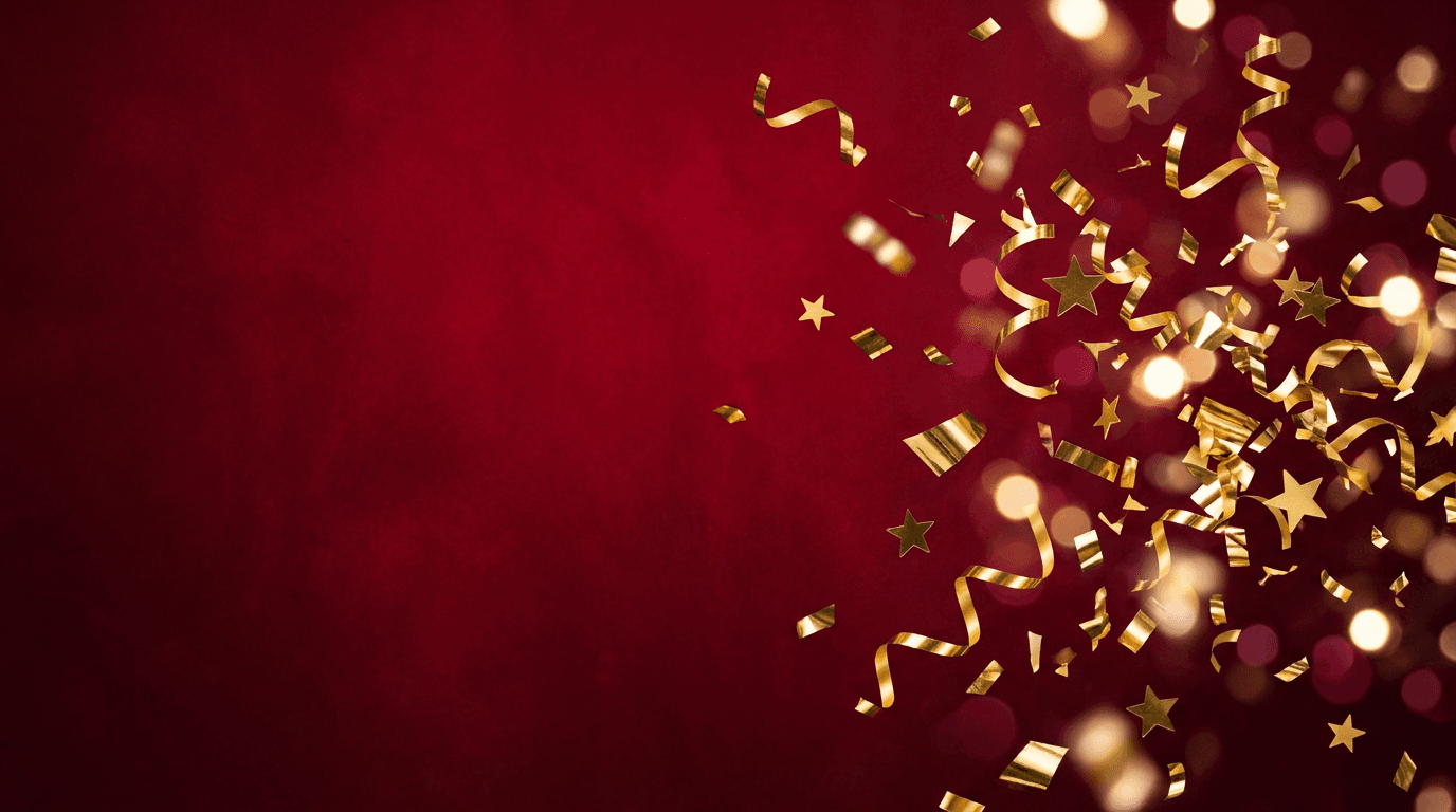
Prompt:
vibrant wide landscape composition of an abstract celebration scene with dynamic confetti and geometric shapes bursting from the right side of the frame, bold metallic gold confetti pieces ribbon curls and angular fragments are captured mid-flight against a rich deep crimson red background, the left two-thirds of the frame features a clean gradient of the deep red background with subtle texture providing ample space for white or gold promotional headline text and a CTA button, the right third concentrates the visual energy with dense confetti bursts and scattered star shapes creating movement and excitement, small bokeh light effects add sparkle and premium quality throughout, the color palette uses deep crimson as the dominant background with metallic gold warm white and touches of deep burgundy creating a luxurious yet energetic promotional aesthetic, the overall composition feels like the moment of a grand reveal or celebration
Best for: Flash sales, Black Friday, seasonal clearance, anniversary sales, limited-time offers, holiday promotions, end-of-season discounts
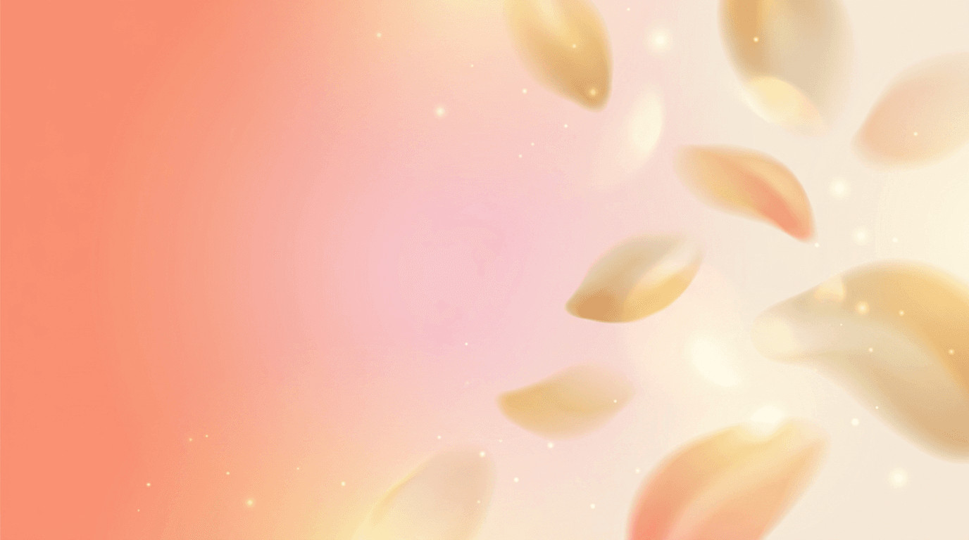
Template 2: Welcome Email / Onboarding
Welcome emails have the highest open rates of any email type and set the tone for the entire subscriber relationship. The header should feel warm, inviting, and premium, communicating that the subscriber has made a smart decision and belongs to something valuable.
Prompt:
warm inviting wide landscape composition of an abstract soft gradient background transitioning from warm coral peach on the left through soft blush pink in the center to gentle warm cream on the right, delicate abstract organic shapes in translucent warm tones float softly through the composition like gentle petals or soft light flares adding visual interest without competing for attention, the left half of the frame features the cleanest gradient area with minimal visual elements providing generous space for a welcoming headline and brand logo, subtle golden light particles and soft warm highlights create a feeling of warmth and premium quality, the overall aesthetic is clean modern and inviting like opening the door to a beautifully designed space, the composition maintains simplicity and breathing room throughout emphasizing the feeling of a fresh start, the color palette uses only warm soft tones including coral peach blush cream and gentle gold creating an emotional response of warmth and welcome
Best for: Welcome sequences, onboarding emails, new subscriber greetings, membership activation, account confirmation, loyalty program enrollment
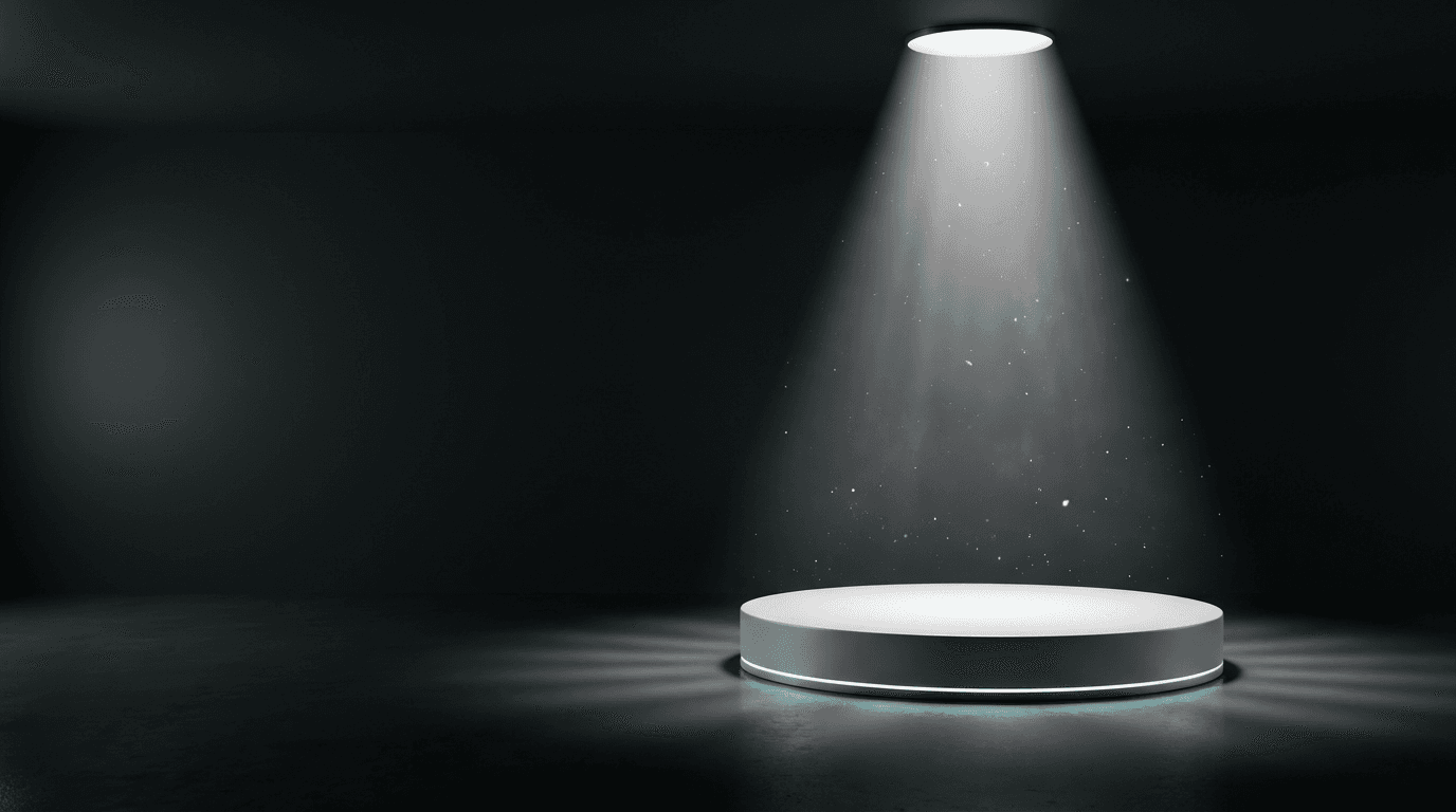
Template 3: Product Launch / New Arrival
Product launch headers need to generate excitement and curiosity for something new. The visual approach communicates innovation, anticipation, and the premium quality of the product being introduced. This visual approach shares DNA with the kind of scroll-stopping visual backgrounds that perform well across digital channels.
Prompt:
sleek modern wide landscape composition of an abstract product reveal scene, a dramatic spotlight creates a bright cone of clean white light from above illuminating a centered circular platform or pedestal rendered in matte white against a deep dark charcoal background, the spotlight creates a beautiful gradient of light on the platform surface with soft shadows radiating outward, the left portion of the frame maintains the deep dark background with subtle ambient light providing space for headline text in white or bright accent color, delicate floating particle effects and soft light motes drift through the spotlight beam adding atmosphere and anticipation, a very subtle teal or electric blue accent light glows along the base of the platform adding a hint of futuristic premium color to the otherwise monochromatic scene, the composition suggests something remarkable is about to be revealed on the platform creating narrative tension and curiosity, the color palette uses deep charcoal and black with bright white spotlight and subtle teal accent creating a cinematic product reveal atmosphere
Best for: Product launches, new arrivals, feature announcements, collection reveals, tech product releases, exclusive previews, pre-order announcements
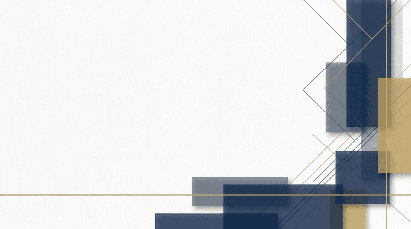
Template 4: Newsletter / Weekly Digest
Newsletter headers need to be visually engaging while maintaining the professional consistency that builds long-term brand recognition. The design should feel editorially refined, immediately recognizable, and versatile enough to work with varying content each week.
Prompt:
clean editorial wide landscape composition of an abstract geometric pattern in a sophisticated color palette, overlapping translucent rectangles and thin angular lines create a layered minimal composition reminiscent of a modern magazine layout, the geometric elements are rendered in soft navy blue slate gray and muted gold on a clean white background with generous negative space, the pattern concentrates along the right edge and bottom of the frame creating a decorative border effect while the left two-thirds remains predominantly white providing a clean canvas for newsletter title and date text, the geometric shapes have subtle shadow and depth creating a sense of dimension without heaviness, a single thin gold horizontal line near the bottom provides elegant structure to the composition, the overall aesthetic is polished editorial and intellectually engaging like the masthead of a premium publication, the color palette uses only white navy slate and warm gold creating a timeless professional newsletter identity
Best for: Weekly newsletters, content digests, industry roundups, editorial emails, company updates, curated link collections, thought leadership newsletters
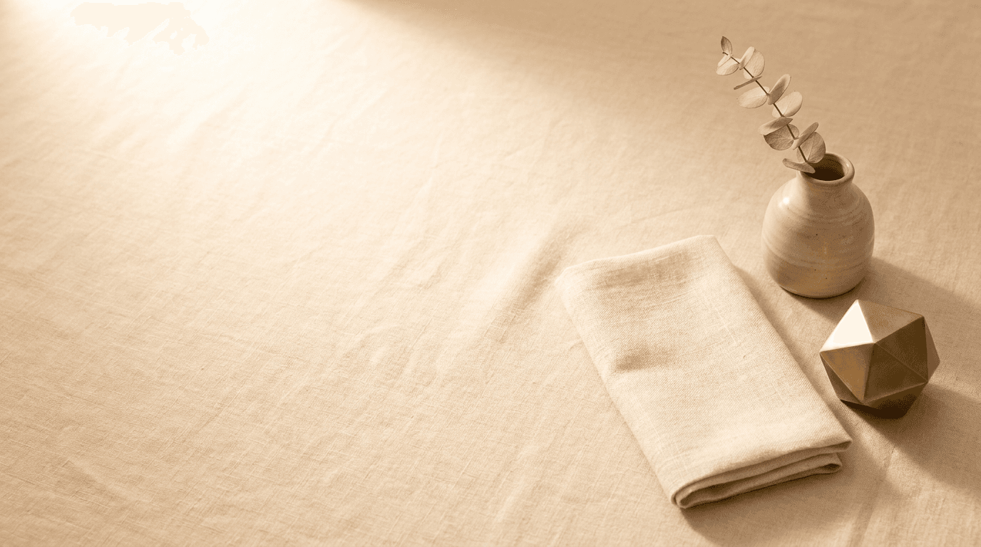
Template 5: E-commerce Product Showcase
E-commerce headers need to create desire for the product category while maintaining enough visual space for price points, product names, and CTA buttons. The imagery should be aspirational yet commercial, with a lifestyle quality that elevates the products beyond simple catalog imagery. The visual principles here connect to the same audience engagement strategies used in effective Facebook ad creatives.
Prompt:
warm lifestyle wide landscape composition of a beautifully styled flat lay arrangement on a soft neutral linen surface, three to four minimal lifestyle objects are arranged with editorial spacing on the right side of the frame including a small ceramic vase with a dried botanical sprig a folded neutral fabric swatch and a minimalist brass object, warm soft natural light from the upper left creates gentle shadows and beautiful warm tones across the textured linen surface, the left half and center of the frame features predominantly clean linen surface with beautiful natural texture and warm light providing generous space for product headline and shop CTA, the arrangement feels curated and intentional like a premium lifestyle brand editorial shoot, the color palette uses warm natural tones including soft cream warm sand light clay and muted brass creating an elevated everyday luxury aesthetic, every element is placed with precision and breathing room creating a feeling of quality and taste
Best for: E-commerce promotional emails, product collections, new inventory alerts, fashion emails, home goods promotions, gift guides, curated product showcases
Template 6: Event Invitation / Webinar
Event headers need to communicate the energy and importance of a gathering while providing clear visual space for event details like date, time, and registration CTA. The visual language should feel exciting and slightly formal, signaling something worth attending.
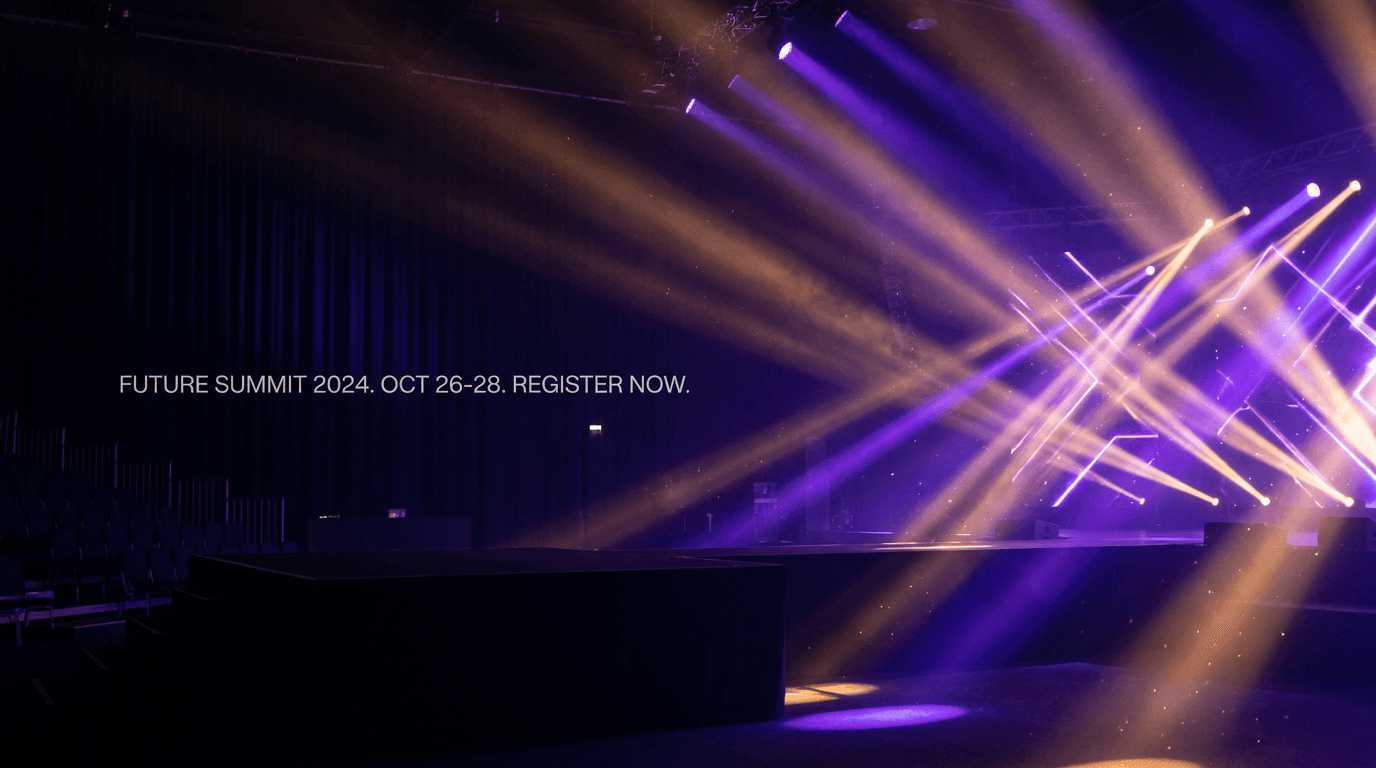
Prompt:
dynamic elegant wide landscape composition of an abstract event atmosphere with dramatic stage lighting effects, multiple colored spotlights in deep purple and warm amber project intersecting beams through atmospheric haze against a rich dark background, the light beams create beautiful angular geometric patterns as they cross in the right portion of the frame, the left half maintains a darker cleaner area where the haze is less dense providing space for event title date and registration CTA text in white or bright colors, subtle lens flare effects and light particles floating in the beams add authentic atmosphere and energy, the overall scene evokes the anticipation of a premium event or conference about to begin, the color palette combines deep black and dark navy with dramatic purple amber and touches of warm white light creating an atmosphere of exclusive exciting events, the mood is anticipatory energetic and professionally refined
Best for: Webinar invitations, conference promotions, virtual event reminders, live event announcements, workshop registrations, community meetups, speaker announcements
Template 7: SaaS / Technology Update
Tech and SaaS email headers should feel clean, intelligent, and forward-looking. The visual approach communicates innovation and precision without being cold or overly abstract. This visual style relates to the kind of AI and technology content that resonates with technical audiences.
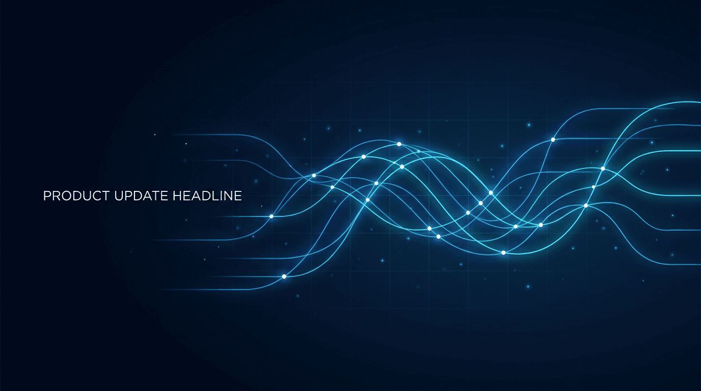
Prompt:
clean futuristic wide landscape composition of a subtle abstract data visualization on a deep dark background, a series of thin luminous lines in electric blue and soft cyan form a gentle flowing wave pattern or abstract network graph across the center of the frame, the lines are thin and elegant with small bright nodes at intersection points pulsing with slightly brighter light, the pattern flows from left to right creating directional movement, the left third of the frame features cleaner darker space with fewer visual elements providing area for product update headline text in white or cyan, subtle grid lines in very faint dark blue create underlying structure beneath the flowing pattern, tiny floating light particles add atmospheric depth without cluttering the composition, the overall aesthetic feels like a premium dashboard or intelligent system visualization, the color palette uses only deep dark navy and near-black with electric blue bright cyan and touches of white creating the distinctive visual language of modern technology
Best for: Product updates, feature releases, platform announcements, SaaS newsletters, developer updates, tech company communications, integration announcements, API updates
Template 8: Health and Wellness
Wellness email headers need to communicate calm, vitality, and positive transformation. The palette runs toward soft, natural tones that feel nurturing and authentic, creating an emotional response of care and wellbeing that aligns with what wellness brands promise. The visual approach shares principles with the kind of fitness and wellness brand content that performs well visually.

Prompt:
serene calming wide landscape composition of a soft natural scene with gentle morning light, a peaceful gradient of soft sage green at the left transitioning through warm cream in the center to gentle golden sunlight warmth at the right, abstract organic shapes resembling soft leaves or natural forms in translucent lighter sage tones float delicately through the composition adding gentle movement without breaking the peaceful mood, subtle light rays from the right side create warm golden highlights where they interact with the organic shapes, the center-left area of the frame features the cleanest portion of the gradient providing calm open space for wellness headline and CTA text, the overall feeling is like the first breath of morning air in a sunlit garden, dewdrop-like sparkles of light add subtle freshness, the color palette uses only soft sage green warm cream gentle gold and touches of natural white creating a palette that immediately communicates health vitality and inner calm
Best for: Wellness newsletters, health coaching emails, meditation app updates, nutrition campaigns, fitness program invitations, mental health content, self-care promotions
Template 9: Real Estate / Property
Real estate email headers need to communicate aspiration, trust, and the promise of a dream home or investment opportunity. The visual language uses architectural elements, warm natural light, and clean modern aesthetics that make properties feel both luxurious and attainable.
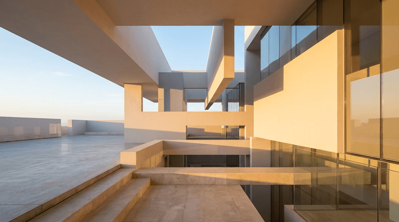
Prompt:
bright aspirational wide landscape composition of an architectural abstract featuring clean modern building lines and warm sunlight, geometric shapes inspired by contemporary architecture including clean horizontal planes overlapping rectangular forms and a suggestion of large glass surfaces are rendered in soft warm white light gray and warm sandstone tones, warm golden hour sunlight enters from the right creating long beautiful shadows and warm highlights across the architectural surfaces, the left half of the frame features a cleaner simpler area where the architectural forms are less dense providing space for property headline or listing CTA text, subtle reflections on implied glass surfaces add life and depth, a hint of blue sky visible between architectural planes adds aspiration and openness, the overall aesthetic feels like standing in a beautifully designed modern space bathed in warm natural light, the color palette uses warm white soft gray warm sandstone golden sunlight and clear blue sky tones creating a premium real estate aesthetic
Best for: Property listings, new development launches, real estate newsletters, open house invitations, market reports, luxury property showcases, real estate agent updates
Template 10: Food and Restaurant
Food and restaurant email headers need to be warm, appetizing, and sensory. The imagery should make the reader hungry and create an immediate emotional connection to the dining experience. The visual approach connects directly to the principles behind great food photography prompts.
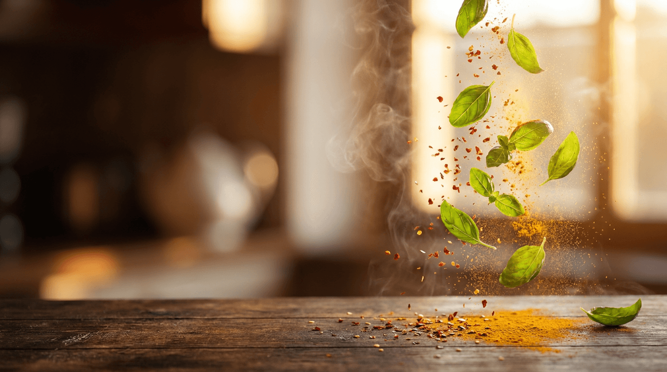
Prompt:
warm appetizing wide landscape composition of an artistic close-up food scene with beautiful shallow depth of field, in the right portion of the frame fresh herbs and spice elements including vibrant green basil leaves scattered red chili flakes and golden turmeric powder are captured mid-motion as though just tossed into the air above a warm dark wood surface, the herbs and spices are backlit by warm golden light creating a beautiful glow around their edges and highlighting their fresh natural colors and textures, the left half of the frame shows the warm dark wood surface receding into soft focus with beautiful warm bokeh creating a rich atmospheric area for restaurant name or menu headline text in cream or gold colors, aromatic steam or haze adds depth and the sensory suggestion of cooking, the color palette is rich and warm with deep brown wood tones vibrant fresh greens warm gold light rich red spice and soft cream creating maximum appetite appeal, the mood is warm artisanal and deliciously inviting
Best for: Restaurant promotional emails, menu updates, food delivery promotions, recipe newsletters, cooking class invitations, food subscription boxes, seasonal menu launches
Template 11: Travel and Hospitality
Travel email headers need to trigger wanderlust and the excitement of escape. The visual language uses stunning destination imagery with warm, inviting light that makes subscribers want to book immediately. The emotional power of travel imagery makes it one of the highest-performing header categories in email marketing.
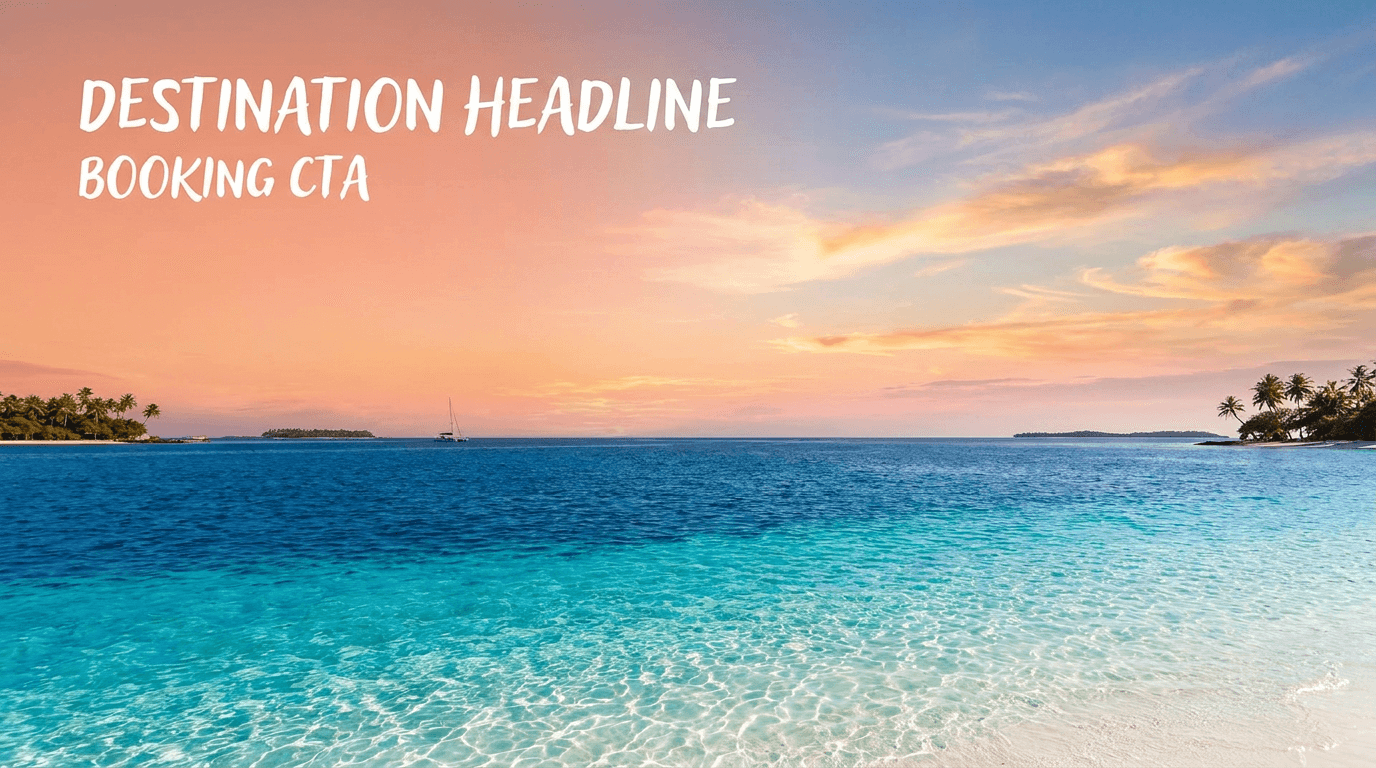
Prompt:
breathtaking wide landscape composition of a dramatic tropical ocean view at golden hour, crystal clear turquoise water occupies the lower third of the frame with gentle waves creating beautiful light patterns on the sandy seabed below, the water transitions from bright turquoise in the foreground to deep sapphire blue toward the horizon, the sky above fills the upper two-thirds with a stunning sunset gradient from warm peach and coral near the horizon through soft pink to gentle warm blue above, a few wispy clouds catch the golden light creating bright warm highlights against the sky, the left portion of the frame features the cleanest section of sky with the most even gradient providing space for destination headline and booking CTA text in white, the composition emphasizes the vastness and beauty of the scene creating an overwhelming desire to be there, the color palette uses turquoise ocean warm coral sunset golden peach soft pink and gentle blue creating the ultimate travel aspiration palette
Best for: Travel promotions, hotel booking offers, airline deals, vacation packages, resort invitations, loyalty program travel offers, destination features, cruise promotions
Template 12: Education and Online Course
Education email headers need to communicate knowledge, growth, and the excitement of learning something new. The visual approach balances intellectual credibility with approachability, signaling that the content is both valuable and accessible.
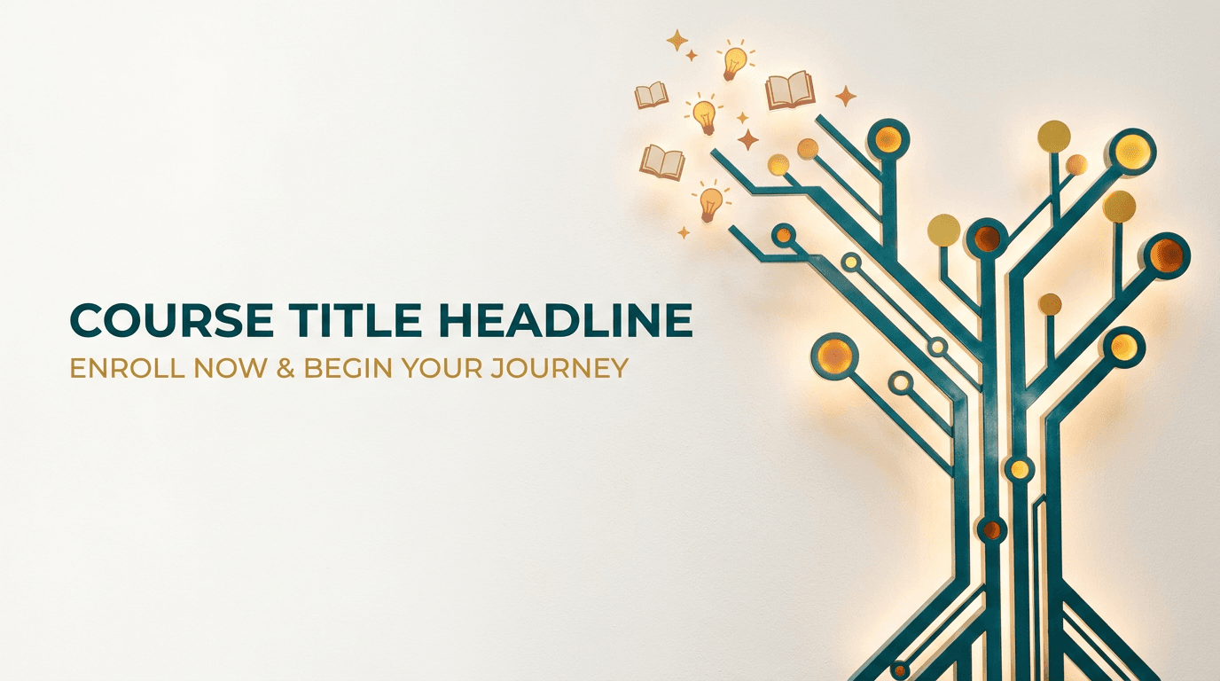
Prompt:
bright inspiring wide landscape composition of an abstract knowledge and growth visual on a clean light background, a stylized abstract tree or upward-branching structure rendered in rich deep teal grows from the right side of the frame with branches made of clean geometric lines and nodes that suggest a knowledge graph or learning pathway, the branches spread upward and leftward with small bright circles at key points suggesting milestones or achievements, the structure is rendered in deep teal with accent nodes in warm amber and golden yellow providing pops of energy and accomplishment, the left two-thirds of the frame features the clean off-white background with subtle warm grain texture providing generous space for course title headline and enrollment CTA text, small subtle icons or abstract shapes suggesting books lightbulbs and stars float near the branch tips adding meaning without clutter, the color palette uses clean off-white deep teal warm amber and golden yellow creating an educated yet energetic aesthetic, the mood is intellectually stimulating aspirational and warmly encouraging
Best for: Online course promotions, educational newsletters, workshop invitations, certification programs, learning platform updates, academic announcements, coaching programs, masterclass invitations
Template 13: Finance and Fintech
Finance email headers must balance trust and authority with modernity and accessibility. The visual language uses structured, clean aesthetics that communicate financial intelligence and security without feeling cold or intimidating.
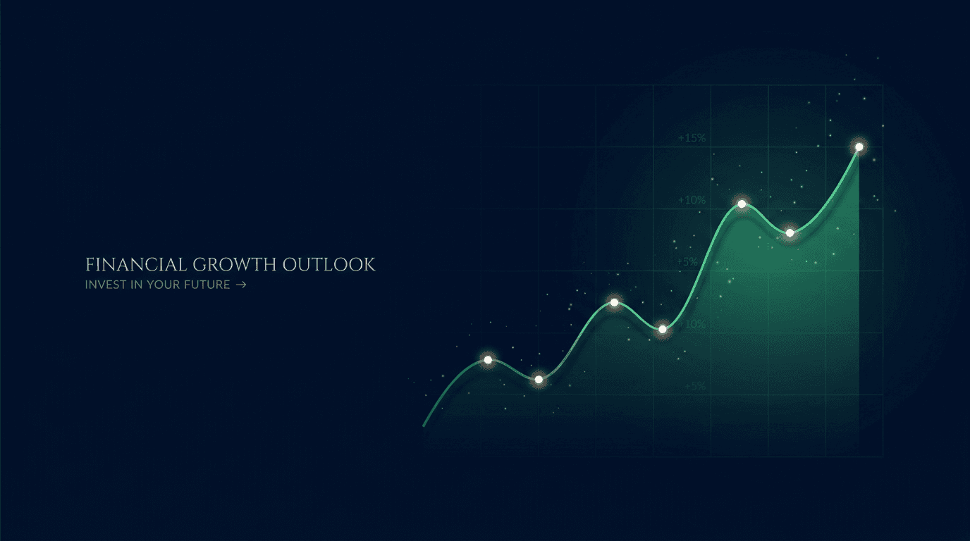
Prompt:
sophisticated clean wide landscape composition of an abstract financial growth visualization on a rich deep navy background, a subtle upward-trending line chart rendered as a thin luminous emerald green line moves from the lower-left toward the upper-right across the right half of the frame, the line has elegant smooth curves with small bright data points at key positions, a soft translucent green gradient fills beneath the line creating depth and suggesting positive growth territory, faint grid lines in very subtle dark blue create structured order beneath the chart, the left half of the frame features the deep navy background with minimal visual elements providing clean authoritative space for financial headline and CTA text in white or green, tiny particles of light float around the ascending portion of the chart suggesting momentum, the overall aesthetic feels like a premium financial dashboard or market performance display, the color palette uses deep navy near-black with emerald green and touches of warm white creating the distinctive visual language of financial success and trust
Best for: Financial newsletters, investment updates, fintech product emails, banking promotions, market analysis emails, loan offers, financial planning emails, crypto updates
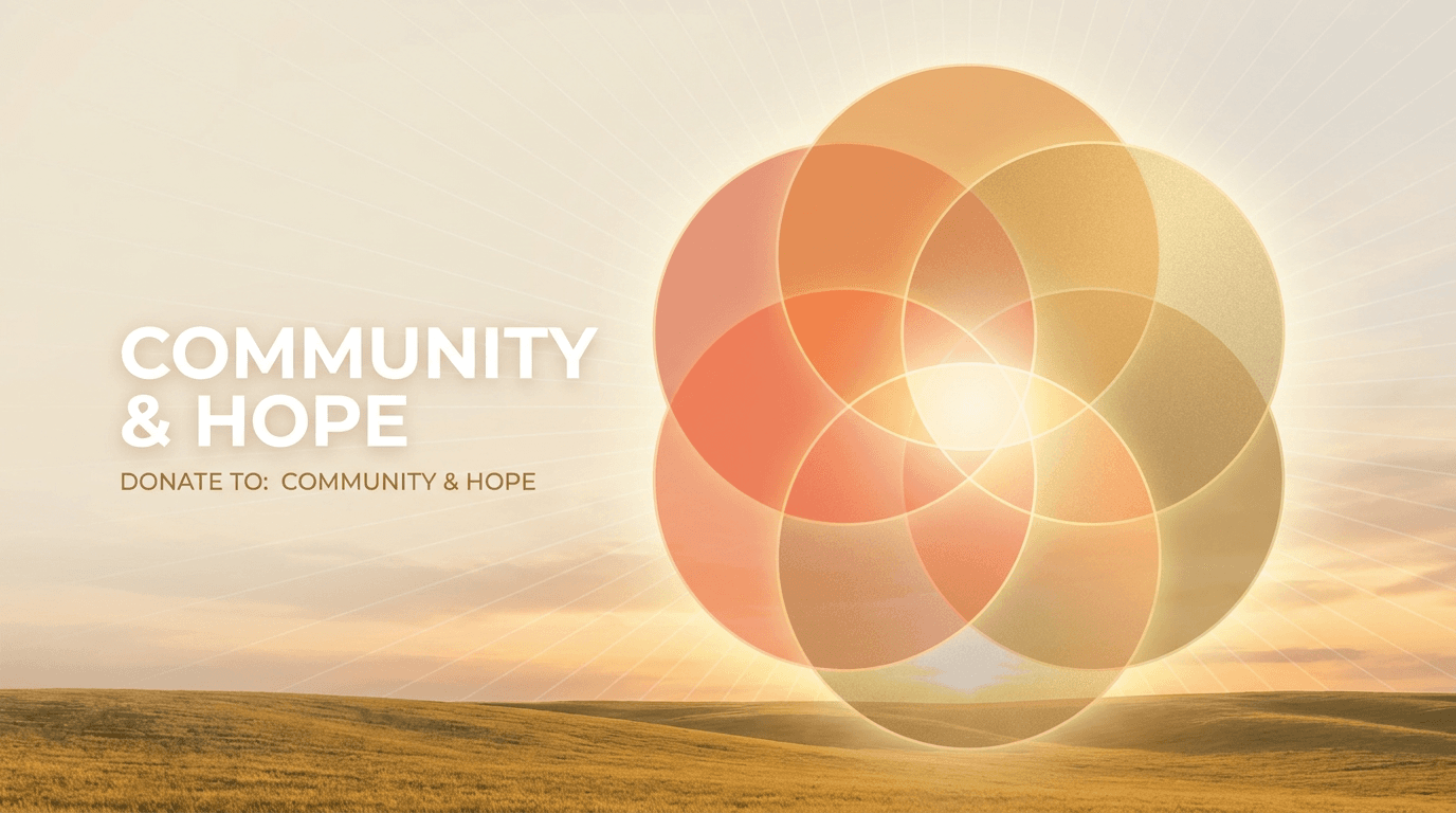
Template 14: Nonprofit and Cause-Based
Nonprofit email headers need to connect emotionally while maintaining professional credibility. The visual language communicates hope, community, and impact, creating an emotional bridge between the reader and the cause they support.
Prompt:
warm emotional wide landscape composition of an abstract representation of connected community and hope, multiple overlapping circles of varying sizes in translucent warm tones create a Venn-diagram-like pattern in the center-right of the frame suggesting interconnection and shared purpose, the circles are rendered in soft warm sunset orange gentle coral and bright warm gold with translucent overlapping areas creating beautiful color blending where they intersect, the circles radiate outward from a warm bright center suggesting growth and expanding impact, the left portion of the frame features a gentle warm cream to soft white background providing clean space for mission headline and donation CTA text, subtle radiating lines from the central intersection point suggest energy and positive momentum, the overall composition feels hopeful connected and purposeful, the color palette uses warm cream soft white sunset orange gentle coral and bright gold creating an emotionally warm and uplifting visual language of community and positive change
Best for: Donation appeals, fundraising campaigns, impact reports, volunteer recruitment, nonprofit newsletters, awareness campaigns, annual reports, community updates
Template 15: Luxury and Premium Brand
Luxury brand email headers must feel exclusive, refined, and unmistakably premium. Every visual element should communicate quality, taste, and the elevated experience that the brand delivers. The palette runs dark, the accents are metallic, and the composition breathes with intentional negative space.
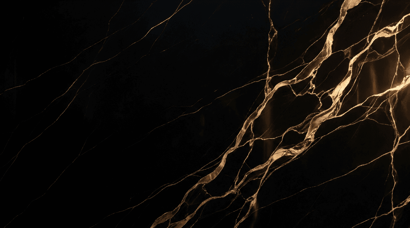
Prompt:
elegant luxurious wide landscape composition of an abstract premium texture study on a rich deep black background, a subtle pattern of organic marble veins in warm gold runs through the right portion of the frame creating beautiful natural flowing lines against the dark surface, the gold veins are rendered with subtle metallic shimmer and varying thickness creating depth and organic beauty, the veining pattern is concentrated in the right third of the frame and thins gradually toward the center, the left two-thirds features the clean deep black surface with perhaps one or two very subtle gold vein wisps providing an expansive premium dark canvas for brand headline text in gold or crisp white, the overall texture has a polished stone quality suggesting nero marquina marble or dark onyx, the metallic gold catches subtle light sources creating gentle highlights along the veins, the color palette uses only rich deep black and warm metallic gold creating the ultimate expression of luxury exclusivity and timeless refinement
Best for: Luxury brand campaigns, VIP customer communications, exclusive previews, premium product launches, high-end fashion, jewelry promotions, premium membership emails, concierge service updates
Customizing These Templates for Your Brand
These templates provide campaign-type calibrated visual foundations. Transforming them into headers that feel uniquely yours requires adjusting along several key dimensions.
Map your brand colors into the prompt. Every prompt specifies a color palette. Replace those colors with your brand's palette to create immediate visual consistency. Incorporate colors from your logo or website design to help reinforce brand identity and improve recognition.[8] If your brand uses a specific shade of blue, replace "deep navy" with your exact color description. Color consistency across email, website, and social media creates compounding brand recognition over time.
Adjust imagery for your specific campaign. The templates provide genre-level visual concepts, but your specific campaign may require more targeted imagery. If you are a travel company promoting a specific mountain destination rather than a beach, swap the ocean scene for alpine elements while keeping the same composition principles, warm lighting, text space on the left, and aspirational mood.
Test across email clients before sending. Test key email header dimensions on devices and email clients (Gmail, Outlook, Apple Mail) using preview tools.[4] Email rendering varies significantly across clients. What looks perfect in Gmail may break in Outlook. Tools like Litmus and Email on Acid provide cross-client previews that catch problems before they reach your subscribers. You can also use the AI image inpainting tool to fix specific areas of a generated image that are problematic, such as cleaning up a busy section where you need to overlay your CTA button.
Generate multiple variations for A/B testing. Testing different elements of your emails, such as subject lines and call-to-action buttons, can show better performance. The A/B testing method can increase email marketing ROI by up to 83%.[4] Generate three to five header variations from each prompt. Test different visual treatments against each other to identify which aesthetic drives the highest click-through rates for your specific audience.
Handling Dark Mode for Email Header Images
Dark mode is no longer an edge case. Dark mode is three different problems: Apple Mail inverts aggressively, Outlook (desktop) barely changes anything, Gmail partially inverts only some palettes.[8] Your header image needs to look good across all these rendering behaviors.
Avoid pure black (#000000) and pure white (#FFFFFF). These colors often trigger unwanted color inversion. Use dark gray (#1A1A1A) and off-white (#F5F5F5) instead.[3] The AI prompts in this post specify "deep" and "rich" dark tones rather than pure black, and "warm cream" or "off-white" rather than pure white, specifically to handle dark mode rendering more gracefully.
For header images specifically, images with light backgrounds can blend in with the darker email background, potentially causing them to become invisible or difficult to see.[6] This is why several templates in this post use darker backgrounds. If you use a light-background header, ensure there is sufficient contrast at the image edges, or add a subtle border or padding in your HTML that provides visual separation in dark mode.
Avoid embedding text in images, as it can become unreadable when background colors shift.[3] This reinforces the approach used throughout this post: generate text-free visual backgrounds with AI, then add all text as live HTML in your email builder. This way, your text colors can adapt to dark mode through CSS while your background imagery maintains its intended appearance.
Adding Headlines, CTAs, and Branding
The AI-generated image is your header's visual foundation. The final production step is adding your campaign headline, CTA button, and brand elements. Here is the workflow that produces professional results.
Layer your image in your email builder. Most modern email builders like Mailchimp, HubSpot, Klaviyo, or Campaign Monitor support background images with overlaid HTML text. This is the preferred approach because it keeps your text as live HTML that is selectable, accessible, and adaptable to dark mode, rather than embedded in the image.
Use web-safe fonts for maximum compatibility. Stick with web-safe or system fonts (Arial, Helvetica, Georgia). Headlines should be 20–30 pt for desktop; body-level text in the header (if any) around 14–16 pt.[4] Custom web fonts are unreliable across email clients, and your beautiful custom typeface may fall back to Times New Roman in Outlook.
Keep the header focused. Resist the temptation to overload with text or multiple calls to action. If including a navigation bar or social icons, make sure they're spaced well and tappable on mobile.[4] Your header should have one headline, one optional sub-line, and one CTA at most. Multiple competing messages dilute every message.
Ensure CTA buttons use HTML, not images. Avoid placing critical information like promo codes or offer deadlines inside the image file itself. Use HTML text wherever possible so the information is searchable, copy-pasteable, and visible even when images are blocked.[2] A CTA button inside your header image is invisible when images are blocked, rendering your most important conversion element useless for a significant portion of subscribers.
Creating Consistent Header Systems Across Campaigns
The most effective email programs maintain visual consistency across campaigns while varying the specific imagery for each send. Building a header image system rather than creating one-off designs creates compounding brand recognition.
Start by defining your header template parameters: the position of your headline (left, center, or right), the position of your logo, the color treatment of your text, and the general composition structure. Then generate AI imagery that fits within those parameters for each campaign. The visual changes but the structural DNA stays the same, and your subscribers develop an unconscious recognition pattern that builds trust with every send.
For brands sending weekly or daily emails, consider generating a library of header variations in a single session. Create ten to twenty variations from your primary template, store them in your media library, and select the appropriate visual for each send. This approach is more efficient than generating individual images per campaign and ensures visual quality stays high across every email.
Cross-Platform Visual Consistency
Your email header imagery should connect visually to your broader marketing presence. Subscribers who see your Instagram content, land on your website, receive your emails, and encounter your YouTube thumbnails should experience a cohesive visual brand across every touchpoint.
The AI prompts in this post can be adapted for adjacent formats. The same visual concept that works for an email header can be reformatted for Instagram post images at 1:1, blog featured images at 16:9, or social media ads with the same campaign aesthetic. Maintaining the same color palette, visual style, and mood across these formats creates a unified campaign experience that reinforces your message at every touchpoint.

If your campaigns include video content, Miraflow's Text2Shorts tool can turn written content into short-form promotional videos that share the same visual energy as your email headers. For brands that produce long-form content, the AI Clipping tool can help repurpose video into email-promotable clips. Background music for promotional video content can be generated using the AI Music Generator to match your brand's tone and energy.
Common Mistakes That Kill Email Header Performance
Understanding the most frequent header design errors helps you evaluate your AI-generated images critically before they reach inboxes.
Image-only emails with no live text. All-image emails (a single image with no live text) are the real deliverability killer — they trigger spam filters and are invisible to screen readers.[2] Your header image should always be accompanied by substantial live HTML text in the email body. The AI-generated header is one element in a balanced email, never the entire message.
Oversized file weights that slow loading. Keep the email header image size under 1 Mb because at least half of your customers read their emails on mobile devices. In case it takes an email long to load, people will just close it.[1] Target under 100KB for your header image specifically, and under 200KB for all images in the email combined. Compress aggressively.
Headers that push content below the fold. A header image that dominates the screen means your subscriber has to scroll before they see your offer, CTA, or any readable text. Keep the image height no higher than 350px. This way, you can create an effective email header with 3 important elements "above-the-fold".[6]
Missing alt text. Provide alternative text for your email header image to ensure accessibility and maintain context if images are blocked.[4] When your header image does not load, which happens frequently across email clients, the alt text is the only thing the subscriber sees. Make it descriptive and action-oriented.
Inconsistent branding across campaigns. Don't keep changing. If the design of your email header changes frequently, your emails will be less recognizable, causing some readers to wonder if it's really you.[2] Use the same prompt template structure with consistent colors for every send to maintain brand recognition while keeping individual campaign imagery fresh.
FAQ
What size should email header images be?
The ideal email banner size is 600x200 pixels for headers. This width ensures compatibility across email clients while providing sufficient height for impactful visuals without dominating the email. Standard email header sizes range from 600x150 to 600x200 pixels, with 600 pixels being the optimal width for most email clients.[9] For retina display crispness, design at 2x resolution (1200×400px) and constrain to 600×200 in your HTML.
What file format and size should I use for email header images?
Optimize image sizes to under 100KB and use standard formats like JPEG, PNG, or GIF to ensure fast load times and compatibility across devices.[7] JPEG works best for photographic AI-generated headers. PNG works best for headers with transparency. Keep total email image weight under 200KB.
Should I put text directly in my email header image?
No. Generate a text-free visual background using the prompts in this post, then add your headline and CTA as live HTML text in your email builder. Avoid putting text in images. Besides the fact that most email clients block images by default, the text will appear blurry on retina devices if the images don't have high-enough resolution.[7] Live HTML text is selectable, accessible, adaptable to dark mode, and visible when images are blocked.
How does the text-to-image ratio affect email deliverability?
Emails with too many images and not enough text often end up in spam folders. Spam filters analyze the balance of text and images to determine whether an email is legitimate. A poor text-to-image ratio — like relying heavily on visuals with minimal text — raises suspicion because spammers commonly hide text in images to bypass detection.[1] Aim for a 60:40 split (text to images) or even 80:20 for better deliverability.[1]
How do I make sure my header image looks good in dark mode?
Avoid pure black (#000000) and pure white (#FFFFFF). These colors often trigger unwanted color inversion. Use dark gray (#1A1A1A) and off-white (#F5F5F5) instead.[3] Test your emails in dark mode previews across Gmail, Outlook, and Apple Mail before sending. All prompts in this post avoid pure black and pure white specifically for dark mode compatibility.
What is retina-ready email imagery and why does it matter?
For an image to display crisply on a high-PPI screen, marketers need to create images that are twice as wide and twice as high as the size at which they want them to be displayed in the email.[1] For a 600×200 display header, generate at 1200×400. The larger image is then constrained in HTML, providing 2x pixel density that looks sharp on high-resolution screens.
What aspect ratio should I use in the AI image generator?
Generate at a wide landscape aspect ratio, approximately 16:9. The Miraflow AI Image Generator supports landscape format options.
Does the email header image affect open rates?
The header image itself does not affect open rates because recipients must open the email before seeing it. However, the header dramatically affects click-through rate, scroll depth, and overall engagement, all of which are critical metrics. While open rates measure initial interest, click-through rates reveal actual engagement. Open rates might tell you how far your email reaches, but CTRs reveal how effective your content is at driving action.[5] A strong header image keeps readers engaged after the open and drives them toward the CTA.
How many images should I include in a single email?
Keep it balanced. Using numerous images can work well if each supports the main message and adds value. Space images properly and pair them with text to help readers stay focused.[7] Avoid image-only emails. Emails should always include readable text to explain the message clearly. Some email clients block images by default, which can leave image-only emails blank and increase spam filtering or delivery problems.[7]
Can I use the same header image across all my email campaigns?
You can use a consistent header template structure across campaigns, but varying the specific imagery for each send keeps your emails feeling fresh and relevant. Leverage seasonal themes: Update your newsletter header design for holidays or events with small thematic accents that don't clash with core branding.[4] The AI prompts in this post make it easy to generate campaign-specific variations that maintain brand consistency while keeping visual interest high.
Conclusion
Your email header image operates in one of the most technically constrained and competitively saturated visual environments in digital marketing. It needs to load fast, render correctly across dozens of email clients, survive dark mode color inversion, look sharp on retina screens, leave room for accessible HTML text, maintain deliverability-friendly image ratios, and ultimately convince a busy subscriber to keep reading and click your CTA. The headers that drive real engagement achieve all of this through simple, bold, campaign-appropriate visual concepts with clear composition and intentional space for text overlay.
The 15 templates in this post give you a production-ready system for generating professional email header backgrounds across the campaign types that dominate email marketing: promotional sales, welcome sequences, product launches, newsletters, e-commerce showcases, event invitations, SaaS updates, wellness campaigns, real estate, food and restaurant, travel, education, finance, nonprofit, and luxury brand communications. Each template is built around the visual conventions and emotional triggers that subscribers in each category respond to, with compositions designed for the wide landscape format and retina-ready resolution that email demands.
Copy the template that matches your campaign type, customize the colors and imagery for your brand, generate it inside Miraflow AI, add your headline and CTA in your email builder, and send a header that earns clicks and communicates exactly what your campaign delivers. Test across email clients, validate in dark mode, compress aggressively, and always include descriptive alt text. The inbox is crowded. Your header is how you stand out.