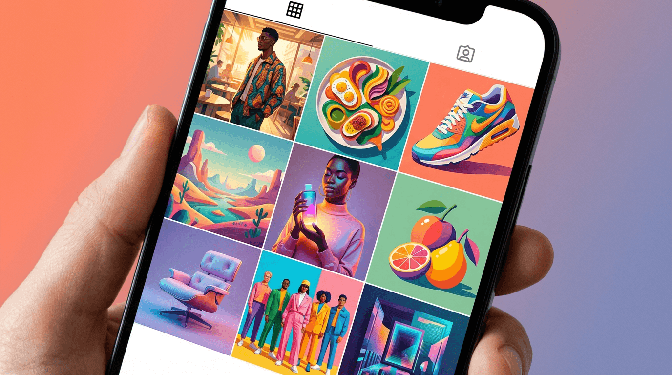
AI Prompts for Pottery & Handmade Ceramics Content: 15 Artisan Visuals (Copy & Paste)
Written by
Jay Kim
15 copy-paste AI prompts for pottery and handmade ceramics visual content. Hero product shots, studio atmospheres, wheel-throwing process action, glaze detail macros, collection displays, kiln firing behind-the-scenes, table setting lifestyle scenes, raw material spotlights, collaboration visuals, packaging presentations, market booth event imagery, studio exteriors, food and drink styled-use companions, artist portraits, and social media announcements designed for studio potters, ceramic artists, handmade ceramics brands, Etsy sellers, craft fair vendors, galleries, workshops, and any creative professional building a ceramics brand's visual identity from studio to shelf to screen.
15 copy-paste AI prompts for pottery and handmade ceramics visual content. Hero product on natural surface photography, studio atmosphere and workspace environment compositions, wheel-throwing process and hands-at-work action shots, glaze detail and surface texture macro close-ups, collection and range lineup displays, kiln and firing process behind-the-scenes production visuals, table setting and lifestyle styled scene compositions, raw clay and material ingredient spotlights, collaboration and artist partnership visuals, packaging and shipping presentation showcases, market and craft fair booth event imagery, storefront and studio exterior sense-of-place shots, food and drink styled-use companion visuals, artist portrait and maker story compositions, and social media announcement and launch graphics designed for independent ceramic artists, studio potters, pottery cooperatives, handmade ceramics brands, functional ware producers, sculptural ceramicists, glaze chemists, ceramic educators and workshop hosts, pottery subscription services, craft fair vendors, gallery-represented ceramic artists, Etsy and online marketplace sellers, wholesale ceramics suppliers, pottery tool and supply companies, ceramic studio rental operators, pottery experience and team-building businesses, interior designers sourcing handmade ceramics, restaurant and hospitality buyers commissioning custom ware, home goods retailers stocking artisan ceramics, and any creative professional building or supporting a handmade ceramics brand's visual identity from the studio to the shelf to the screen.
The mug sits on the table. Before the coffee is tasted, before the handle is gripped, before the rim meets the lip, the hands have already wrapped around the form and made a judgment that has nothing to do with the liquid inside. The weight — heavier than expected, the density of stoneware communicating substance and earthiness, or lighter than expected, the thinness of porcelain communicating refinement and skill. The surface — the smooth, glassy plane of a well-applied glaze, cool to the touch and slightly slippery, or the rough, unglazed stoneware where the clay body meets the fingers with the warmth and friction of fired earth. The form — the belly of the mug, the way it swells and contracts, the foot where it meets the table, the handle pulled or extruded or hand-built with the specific curve and thickness that determines whether this mug feels like holding a tool or holding a hand. The glaze — its color, its depth, the way it breaks over edges and pools in recesses, the places where the clay body shows through, the interaction between the glaze chemistry and the fire that created a surface no factory and no formula could precisely replicate. Every one of these tactile details is first perceived visually — in the photograph, on the screen, in the scroll. The viewer sees the weight before they feel it. They see the texture before they touch it. They see the form before they hold it. For handmade ceramics, the visual is not a substitute for the tactile. It is the invitation to it.
This visual primacy presents the central challenge and the central opportunity of ceramics marketing. Handmade pottery is, perhaps more than any other consumer product category, defined by its physical presence — its weight, its texture, its temperature, its tactile intimacy. A ceramic piece is designed to be held, used, touched, lived with. And yet the vast majority of discovery, evaluation, and purchase decisions for handmade ceramics now happen on screens — on Instagram, on Etsy, on personal websites, at online craft markets, through email newsletters — where the physical object must be communicated entirely through visual means. The photograph must make the viewer feel the weight they cannot hold, see the texture they cannot touch, understand the form they cannot turn in their hands, and desire the object enough to commit to a purchase based entirely on what their eyes tell them. This is not an impossible task — it is the task that great ceramics photography has always accomplished — but it requires visual content that is specifically engineered for the unique material, formal, and cultural qualities of handmade pottery.
If you have worked with AI prompts for product photography, brand content, or social media visuals, the methodology will be familiar. Copy the prompt, adjust the details to match your specific ceramics practice — your clay bodies, your glaze palette, your forming techniques, your firing methods, your studio environment, your brand personality, your aesthetic references, your functional or sculptural orientation, your regional identity, your particular story — generate, and deploy. What distinguishes these prompts from general product photography or handmade-goods content is that every element has been engineered specifically for the ceramics context: the product shots that communicate the specific visual physics of clay and glaze (surface texture, glaze depth, form weight, foot and rim detail), the studio atmospheres that honor the particular workspace culture of ceramic artists, the process shots that capture the extraordinary visual drama of wheel-throwing and hand-building, the macro close-ups that reveal the glaze chemistry and surface detail that make each piece unique, the collection displays that showcase a potter's range and aesthetic coherence, the kiln and firing visuals that document the transformative heat that is ceramics' defining process, the lifestyle scenes that place the work in the domestic and culinary contexts where functional ware lives, the material spotlights that tell the story of clay as an ancient and elemental material, the collaboration visuals that celebrate the cooperative spirit of the ceramics community, the packaging presentations that communicate the care of shipping handmade objects, the market and fair imagery that captures the direct-to-customer energy of craft commerce, the studio exterior shots that establish sense of place, the food-and-drink styled-use visuals that show the work in active service, the artist portraits that put a human face on the making, and the social media announcement graphics that deliver news within the visual identity. These are not generic handmade-product prompts applied to ceramics. They are visual identity systems designed to solve the specific challenge of making handmade pottery visible, desirable, and emotionally resonant across every platform and context where the work appears.
Why Visual Identity Is the Defining Challenge for Handmade Ceramics
The handmade ceramics market operates through visual mechanisms that are simultaneously more challenging and more rewarding than most other product categories. Understanding how customers discover, evaluate, choose, and develop loyalty to ceramic artists and brands reveals why visual identity has become the decisive factor in a field defined by physical objects.
The screen is the new shelf, and tactile information must be translated into visual information. A customer browsing Etsy, scrolling Instagram, or visiting a ceramicist's website cannot pick up the mug, feel its weight, run a thumb across the glaze, or test the handle's ergonomics. Every piece of information that would be instantly available in a physical retail environment — the heft of stoneware, the translucency of porcelain, the tooth of an unglazed surface, the smoothness of a satin matte finish, the depth of a layered ash glaze — must be communicated through light, composition, and photographic technique. The visual content must activate the viewer's haptic imagination — the ability to feel through seeing. This requires photography and visual content that is more specific, more textural, more materially articulate than generic product photography. The light must reveal the surface. The angle must communicate the form. The context must suggest the weight. The detail must imply the touch.
Instagram is the primary gallery, marketplace, and community for contemporary ceramics. The ceramics community on Instagram is one of the platform's most active and visually sophisticated creative communities. Ceramic artists use Instagram as their primary portfolio, their primary sales channel (through link-in-bio shops, DM sales, and shoppable posts), their primary networking tool (connecting with other artists, galleries, retailers, and press), and their primary educational platform (sharing process, technique, and studio practice). The quality and consistency of a ceramicist's Instagram grid directly determines their visibility, their sales volume, their wholesale and gallery opportunities, and their position within the professional ceramics community. A strong visual identity on Instagram is not a marketing advantage — it is the baseline requirement for professional viability.
Etsy and online marketplace success is photograph-dependent. On Etsy — the dominant online marketplace for handmade ceramics — the product photograph is the single most important factor in click-through rate, conversion rate, and search ranking. Etsy's algorithm favors listings with high engagement, and engagement begins with the photograph that stops the scroll. The first listing image must communicate the object's form, surface quality, scale, and desirability in the fraction of a second the customer allocates to each listing in a search-results grid. A beautiful ceramic piece with poor photography will be invisible on Etsy. A well-photographed piece captures attention, earns the click, and begins the conversion process.
Wholesale, gallery, and retail buyers evaluate visual professionalism first. A gallery director reviewing submissions, a boutique buyer sourcing new makers, a restaurant owner commissioning custom tableware, or an interior designer selecting pieces for a project — all of these professional buyers encounter the work visually before they encounter it physically. The quality of the portfolio images, the consistency of the visual presentation, the professionalism of the website, and the atmospheric quality of the studio and process documentation all contribute to the professional impression that determines whether the buyer requests samples, schedules a studio visit, or moves on. Visual professionalism opens professional doors.
The handmade premium depends on visible evidence of the hand. Handmade ceramics command a price premium over factory-produced alternatives — a premium that is justified by the skill, the time, the material quality, and the individual attention that each piece receives. But the customer must see the evidence of the hand to accept the premium. Visual content that shows the throwing marks, the slight asymmetry, the glaze variation, the finger impressions, the trimming lines, the unique-to-this-piece qualities that distinguish handmade from manufactured — this visual evidence is the justification for the price. Content that is too polished, too uniform, too factory-perfect inadvertently undermines the handmade value proposition. The visual identity must communicate craft — the beautiful imperfection, the evidence of process, the marks of the maker.
Ceramics is a collector culture, and visual identity drives collector loyalty. Serious ceramics collectors follow specific artists, track their work across exhibitions and releases, build coherent collections, and develop deep loyalty to makers whose aesthetic vision resonates with their own. This collector behavior is driven by visual identity — the recognizable glaze palette, the distinctive formal vocabulary, the consistent aesthetic sensibility that makes a piece identifiable as the work of a specific artist across a room or across a screen. A strong visual identity creates collector recognition, and collector recognition creates the sustained demand and pricing power that support a ceramics practice long-term.
The visual narrative of process is uniquely compelling in ceramics. Among all craft disciplines, ceramics may have the most visually dramatic process. The sight of clay rising on the wheel, the transformation of a shapeless lump into a vessel through the pressure of hands and the rotation of the wheel, the loading of a kiln, the opening of a kiln after firing to discover what the heat has done — these processes are inherently visual, inherently dramatic, and inherently engaging. Process content is among the highest-performing content types for ceramicists on social media, and the quality of that process documentation — the lighting, the angle, the atmospheric quality — determines whether the content merely documents or truly captivates.
The Visual Language of Handmade Ceramics
Handmade ceramics has developed a rich, specific visual language — a set of aesthetic conventions, material vocabularies, and compositional traditions that communicate information about technique, material, firing method, aesthetic philosophy, and quality standard. Understanding this language is essential for creating visual content that communicates effectively within the ceramics context.
Surface is the primary visual information. The surface of a ceramic piece — its glaze, its texture, its finish — is the most immediate and most information-rich visual element. The surface tells the viewer about the clay body (stoneware, porcelain, earthenware, each with distinct visual qualities), the glaze chemistry (the specific minerals, oxite, and fluxes that create the color, texture, and optical quality), the firing temperature (the maturity and vitrification of the surface), the firing atmosphere (oxidation producing clean, predictable colors; reduction producing the complex, often unpredictable surfaces that many potters prize), and the application method (dipping, pouring, brushing, spraying, trailing — each leaving distinct visual evidence on the surface). In photography, the surface must be revealed with absolute clarity and maximum beauty. Lighting that flattens surface texture, that fails to show glaze depth, that obscures the difference between matte and gloss, that does not communicate the material quality of the surface — this lighting fails the fundamental visual task of ceramics photography.
Form communicates function, tradition, and personal vocabulary. The form of a ceramic piece — its profile, its proportions, its volume, the relationship between its parts (foot, belly, shoulder, neck, rim, handle, spout, lid) — communicates its functional purpose, its relationship to ceramic traditions, and the maker's personal formal vocabulary. A mug's proportions communicate its intended capacity and its hand-feel. A bowl's depth and width communicate its intended use (cereal, soup, salad, serving). A vase's profile communicates its relationship to historical forms and the maker's interpretation of that lineage. Photography must communicate form through the angle of view, the quality of light that creates dimensional modeling, and the compositional placement that allows the viewer to read the full three-dimensional form from a two-dimensional image.
The foot and the rim are the connoisseur's details. In ceramics, the foot (the base where the piece meets the surface) and the rim (the top edge where the piece meets the user's lips or serves as the visual terminus) are the details that communicate the maker's skill and attention. A well-trimmed foot — the clay carved away on the wheel to create a deliberate, refined base, the foot ring that lifts the piece slightly off the surface and creates the shadow-line that communicates quality — tells the knowledgeable viewer that this maker pays attention to every detail, including the parts that most users never consciously examine. A refined rim — thinned, shaped, and finished to be comfortable against the lip and visually elegant — communicates the same care from the opposite end of the piece. In photography, showing the foot (through slightly elevated angles or secondary detail shots) and the rim (through close-ups or angles that reveal the lip profile) communicates quality to the educated buyer and creates the visual interest that even casual viewers respond to.
Color in ceramics is glaze-specific and fire-dependent. The colors of handmade ceramics are not painted on — they are the product of chemical reactions between minerals and oxides in the glaze, activated by extreme heat in the kiln, and influenced by the atmosphere (oxidation or reduction) during firing. This means that ceramic colors have a depth, a complexity, and an unpredictability that distinguish them from any manufactured color. A celadon green is not a flat green — it is a translucent, pooling, depth-variable green that shifts from pale where the glaze is thin to deep where it pools, with the clay body visible beneath the translucent glass. A tenmoku brown-black is not a uniform dark surface — it breaks to amber and rust where the glaze thins over edges, with the iron-saturated surface creating a complex, micro-crystalline depth. A Shino glaze is not a single color — it is a landscape of orange, cream, carbon-trapped grey, and flash-marked warmth that varies across the surface in response to kiln atmosphere. Photography must capture this color complexity — the way glaze color changes across the surface, the way depth and thickness affect color intensity, the way the clay body and the glaze interact at the edges — rather than reducing it to a flat, uniform color impression.
The marks of making are the visual evidence of value. Throwing rings — the concentric lines left by the potter's fingers as the clay rises on the wheel. Trimming marks — the spiral lines carved into the foot during the trimming process. Finger impressions — the subtle indentations where the maker's hands shaped the piece. Handle pull marks — the longitudinal texture left when a handle is pulled from a lump of clay. Chattering marks from trimming tools. The slight asymmetry of hand-formed work. The variation in glaze thickness from hand-dipping. The kiln marks — the wadding spots, the flash marks, the places where flame or ash touched the surface during firing. All of these marks are the visual evidence that a human being made this object by hand, and they are the marks that justify the handmade premium. Visual content should reveal and celebrate these marks, not minimize or obscure them.
The material palette of ceramics environments communicates craft philosophy. Ceramic studios and the environments where ceramics are photographed use a vocabulary of materials that resonates with the clay itself: raw wood (shelving, work surfaces, display platforms), natural stone (display surfaces, architectural elements), linen and cotton textiles (backdrops, wrapping, styled-use elements), concrete and plaster (studio surfaces, mold-making evidence), and natural materials (dried plants, stones, organic matter). These materials communicate the earthy, natural, handmade values that define the ceramics world. The specific combination and treatment of these materials — rough versus refined, minimal versus abundant, Japanese-influenced versus Scandinavian versus rustic — differentiates individual makers within the shared material vocabulary.
Light quality defines the visual perception of ceramic surfaces. The characteristic lighting of ceramics photography falls into several distinct modes that each reveal different aspects of the work. Soft, directional side light — the light that creates gentle shadows and gradual tonal transitions across the curved surface of a vessel, revealing form without harsh contrast. Raking light — the low-angle, directional light that crosses the surface at a steep angle, catching every texture, every ridge, every mark with dramatic shadow that makes the surface three-dimensional. Backlight through translucent porcelain — the light that passes through thin porcelain walls, revealing the translucency and the wall thickness that communicate the maker's skill. Warm, ambient natural light — the soft, even illumination of a north-facing studio window, the classic potter's light that is gentle enough for throwing and beautiful enough for photography. Each lighting mode communicates a different aspect of the ceramic work, and the visual identity should deploy the appropriate mode for each content type.
15 AI Prompt Templates for Pottery & Handmade Ceramics Content
Each template includes a content concept, the full copy-paste prompt, and deployment guidance. All prompts are formatted for the Miraflow AI Image Generator and compatible with any high-quality text-to-image tool. Adjust the bracketed descriptive elements in each prompt to match your specific ceramics practice — your clay bodies, your glaze palette, your forming techniques, your firing methods, your studio environment, your aesthetic references, your functional or sculptural orientation, your regional identity, and your brand personality. Generate at 1:1 for social media and marketplace listings, 4:5 for Instagram feed, 16:9 for website banners and YouTube, 9:16 for Stories and vertical content, 3:2 for editorial and print, and 2:3 for poster and catalogue art.
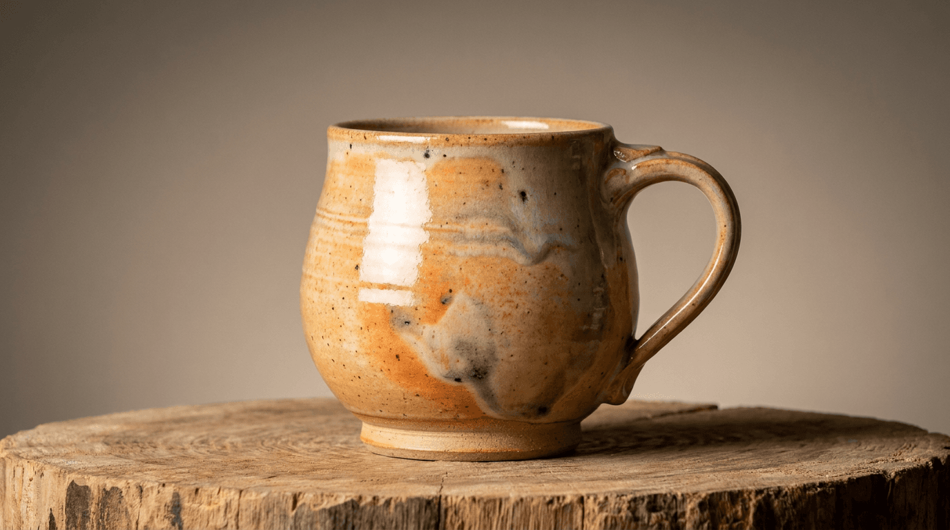
Template 1: The Hero Product — Single Piece on Natural Surface
This is the foundational ceramics image — the single piece photographed with reverence and precision on a natural surface, the visual equivalent of holding the object in your hands and turning it slowly to understand its form, surface, and character.
Prompt:
hero product ceramics photograph of [a single handmade ceramic piece presented at its absolute visual best — the form, the glaze, and the light working together to communicate the object's full material, tactile, and aesthetic character: the piece is a specific functional or sculptural form — a mug with a pulled handle and a generous belly, a bowl with a wide rim and a foot that lifts it gently off the surface, a vase with a thrown body and an altered lip, a plate with a wide flat well and a subtle rim, a teapot with a thrown body and assembled spout and handle and lid, a cup without a handle in the Japanese yunomi tradition, a sculptural vessel that exists at the boundary between function and art — the specific form communicating its purpose, its tradition, and the maker's personal formal vocabulary, the piece shows its clay body — the specific material visible where it is unglazed: the warm buff of a stoneware body, the stark white of a porcelain body, the earthy red-brown of a terracotta body, the speckled grey of a recycled or iron-bearing clay — the clay body visible at the foot, at the base, at any unglazed band or area, the exposed clay communicating the material foundation that the glaze rests upon, the glaze is the piece's surface personality — rendered with complete fidelity to its actual visual character: a glossy glaze that reflects light with a bright, liquid-glass surface, the reflection sharp and clear, the color vivid and deep beneath the glass layer, the pooling in recesses creating darker, more saturated concentrations of color; or a matte glaze with its soft, light-absorbing, velvety surface, the color present but without the bright reflection of gloss, the surface inviting touch with its dry, tactile quality; or a satin matte between the two extremes, with a soft sheen that catches light gently without the sharp reflections of full gloss; or a textured glaze — crawling, crater-forming, crystalline, or volcanic — with a dimensional surface that catches light in complex patterns of highlight and shadow, the texture adding a landscape-like quality to the surface; the glaze color is specific — the precise tone and character of this maker's palette: a warm white with the faintest hint of blue or cream, a rich tenmoku brown-black that breaks to amber at the edges, a deep celadon green with jade-like translucency, a carbon-trapped Shino with its orange-cream-grey complexity, a cobalt blue that ranges from pale sky to deep midnight depending on thickness, a copper red that shifts from blood-red to purple to green at the thinnest edges, a clear glaze over the bare clay body that lets the material speak for itself — the glaze color rendered with the depth and complexity that distinguishes kiln-born color from manufactured pigment, the piece shows the marks of making — the throwing rings visible as subtle concentric ridges on the interior or exterior, the trimming lines carved into the foot, the slight asymmetry that proves this form was made by hands on a wheel rather than poured into a mold, the finger impressions or tool marks where the maker shaped the piece, the handle attachment showing the join where pulled clay meets thrown body, the glaze revealing its application — the drip line where a dipped piece emerged from the glaze bucket, the overlap where a second glaze was applied over the first, the bare ring at the foot where the piece sat on the kiln shelf — every detail a chapter in the story of how this object was made, the piece sits on a natural surface — a material that resonates with the clay: a slice of raw, untreated wood with visible grain and perhaps bark at the edge, communicating the organic, natural origin that pottery shares with wood; or a linen or cotton textile in a neutral tone (undyed, oatmeal, soft grey), the soft, woven fabric providing the gentle, domestic context of a table or a shelf; or a stone surface (slate, marble, limestone) with its mineral quality echoing the mineral nature of clay and glaze; or a simple, handmade wooden board or platform that lifts the piece slightly and creates the shadow-line beneath the foot — the surface providing both physical support and material context, the background is minimal and non-competing — a gradient of soft, neutral tone (warm grey, pale linen, soft earth) that recedes behind the piece without visual noise, the background smooth and unbroken, allowing the piece to be the sole focus of visual attention, the overall composition communicates: this object was made by hand with skill and intention, the form is considered, the surface is complex and beautiful, the material is honest, the making is visible — the hero product shot as the primary visual representation that drives desire, communicates quality, and makes the viewer want to hold this object in their hands] in a clean, reverent, single-subject ceramics composition, the piece occupies the commanding position — centered or placed at a slight rule-of-thirds offset, the object the undisputed visual subject, the placement confident and allowing the form to read completely within the frame, the piece is photographed from the optimal angle for its form — for a mug: a three-quarter front view that shows the body, the handle, the rim, and suggests the foot, the handle's curve and the body's profile both readable in a single view; for a bowl: a slightly elevated view that reveals both the interior glaze (visible as the well of the bowl) and the exterior form, the depth of the bowl communicated through the perspective; for a vase: a straight-on or slightly below eye-level view that emphasizes the vertical profile, the rim, the shoulder, and the proportion; for a plate: an elevated view that shows the full circular form, the rim, and the well, with a slight angle that preserves the dimensional quality rather than flattening into a pure plan view; for a teapot: a three-quarter view that shows the body, the spout, the handle, and the lid in a single comprehensive composition — the angle chosen to maximize the form-reading, the surface beneath provides the horizontal ground plane — the material visible, the texture present, the natural quality contributing to the material narrative without competing with the piece, the background recedes cleanly — the neutral, gradient, or softly textured backdrop falling away behind the piece, the non-competing quality of the background pushing all visual attention onto the ceramic object, the depth of field is the critical technical element — moderately shallow, the piece in crisp focus from the nearest surface to the furthest edge (the full depth of the ceramic form), the surface beneath in focus where it meets the foot and softening toward the frame edges, the background in smooth, clean blur — the shallow depth isolating the object with the visual language of considered product photography while maintaining enough depth to show the complete piece in sharp detail, the lighting is the composition's primary tool — soft, directional, and specifically calibrated to reveal the ceramic surface: a primary soft light source from one side — the side lighting that creates the gentle shadow-to-highlight transition across the curved surface of the piece, the dimensional modeling that communicates the three-dimensional form of the vessel, the soft, directional quality revealing every surface variation: the throwing rings catching the side light with tiny shadow-lines that trace the rotation of the wheel, the glaze surface responding to the light with its specific reflective character (glossy surfaces showing a soft, graduated highlight that moves across the curve; matte surfaces absorbing the light with a gentle tonal transition but no sharp reflection; textured surfaces catching the side light with a complex pattern of micro-highlights and micro-shadows that reveal the dimensional surface), the light revealing the glaze's color depth — where the glaze is thick (in recesses, at the base of forms, in the interior of bowls) the color is deeper and more saturated, and the light communicates this depth by the way the thicker areas absorb more light; where the glaze is thin (over edges, at rims, at the high points of texture) the color is lighter and the clay body may show through, and the light catches these thin areas with a different quality — the subtle color shift from thick to thin glaze one of the most beautiful visual characteristics of handmade ceramics, a subtle fill light from the opposite side — not a second directional source but a gentle ambient fill that prevents the shadow side from going completely dark, maintaining detail and readability in the shadows while preserving the directional quality of the primary light, a soft overhead component — the light from above that illuminates the interior of bowls, the top of the rim, and the upper surface of the piece, the overhead quality providing the downward illumination that shows the interior glaze and the rim profile, the foot catches a shadow beneath — the piece sitting on the surface with a shadow that is soft, directional, and proportional, the shadow grounding the object on the surface and communicating its physical weight and presence, the shadow not harsh or hard-edged but graduated and natural, glaze-specific color palette centered on the piece's actual surface character — [describe your specific glaze: warm white, tenmoku brown-black, celadon green, Shino orange-cream, cobalt blue, copper red, clear over clay body] as the chromatic anchor — exposed clay body tone (buff, white, red-brown, speckled grey) visible at foot and unglazed areas — natural surface material tone (wood grain, linen, stone) — neutral, receding background — soft directional shadow — and the clean, material-honest, surface-celebrating palette of a handmade ceramic piece in considered product lighting as the color palette, the mood is quietly reverent materially intimate quality-communicating and the specific hero-product message — this object was made by hand by someone who understands clay and fire and form, the surface is complex and beautiful in ways that only kiln-born surfaces can be, the form is considered and refined, every mark tells part of the making story, this piece deserves to be held and used and loved — the hero shot as the primary product photograph that drives desire, communicates quality, and makes the viewer want this object in their life, professional ceramics and product photography with soft directional side lighting and moderately shallow depth of field keeping the piece in crisp detailed focus against a clean background, composed as a single-subject product presentation with the form and the surface and the making marks all visible and celebrated, the glaze quality and the form character and the material honesty as the product focal points, glaze-specific palette with natural surface and neutral background, no text overlays, no watermarks
Best for: Website homepage hero image, Etsy primary listing photograph, Instagram product feature posts, wholesale and gallery portfolio imagery, print catalogue and lookbook hero shots, press kit product photography, craft fair pre-show promotional materials, email marketing product features, online marketplace primary images, competition and award submission photography
Template 2: The Studio Atmosphere — Workspace Environment Composition
This template captures the ceramic studio as a complete environment — the workspace that communicates the maker's practice, values, aesthetic sensibility, and the particular character of a space organized around the transformation of clay.
Prompt:
atmospheric ceramics studio interior photograph of [a pottery studio rendered as a warm, creative, lived-in workspace — the environment that communicates who the maker is and how the work is made: the studio reveals its character through the accumulated evidence of an active practice — this is not a showroom but a working space, and the evidence of work is everywhere: the wheel is the studio's center of gravity — a potter's wheel (kick wheel with its heavy flywheel and the romance of foot-powered rotation, or an electric wheel with its smooth, precise, adjustable speed) positioned in the working area, the wheel head perhaps bearing the evidence of recent throwing — clay residue, a splash pan with slurry, the intimate messiness of a tool that is used daily, shelving dominates the walls — ware boards and wooden shelves loaded with work in various states of completion: greenware (unfired pieces in raw, bone-dry clay, their surfaces pale and chalky, the forms waiting for the kiln), bisqueware (once-fired pieces in the porous, matte, light-absorbing state between raw and glazed, awaiting their glaze application), and finished glazed pieces (the completed work, the surfaces transformed by fire, the colors vivid, the maker's full vision realized) — the shelves as a visual timeline of the ceramic process from raw clay to finished piece, tools are visible in their working positions — wire cutters hanging from hooks, trimming tools in jars, ribs and scrapers and sponges and needle tools in their customary places, the tools worn and clay-stained with the patina of long use, each tool positioned where the maker's hand reaches for it without looking, bags or blocks of clay are stored in their working area — the raw material visible in its pre-thrown state, the grey or brown or white blocks wrapped in plastic to maintain moisture, the weight and density of the clay apparent even in visual form, a wedging table may be visible — the sturdy surface (plaster, canvas-covered wood, or concrete) where clay is kneaded and prepared, the surface stained and worn from thousands of cycles of preparation, buckets and containers of glaze sit in the glazing area — the liquid glazes in their mixing containers, the glaze colors visible on the bucket rims and the dripped surfaces around the glazing station, the chemistry of surface made tangible in liquid form, finished pieces may be displayed or staged in one area — a section of the studio where completed work is arranged for photography, packing, or simply appreciation, the finished work the culmination of everything else in the studio, the studio's physical space communicates its character — the walls (exposed brick, painted concrete block, raw plaster, or wood), the floor (concrete, stained and marked with the evidence of clay and glaze), the ceiling (exposed joists, industrial fixtures, or the low, intimate ceiling of a converted domestic space), the windows (letting in the natural light that potters depend on for seeing color and form accurately), the overall space modest in scale but rich in purpose, every surface bearing the evidence of the creative work that happens here, the overall composition communicates: this is where the work is made, this studio is organized by the needs of the practice, the evidence of process is everywhere, the accumulated tools and materials and works-in-progress tell the story of a committed, active, serious maker — the studio photograph as the authenticity visual that invites the customer into the making space and creates the personal connection between the buyer and the process] in a wide, atmospheric, workspace-environment composition, the photograph is taken from a natural standing perspective — the eye-level viewpoint of someone who has just entered the studio and is taking in the space, the viewer positioned as a visitor experiencing the environment, the composition shows the full depth of the studio — from the nearest tools or work surface in the foreground through the wheel and primary work area in the midground to the shelves and storage in the background, the spatial depth creating the immersive quality that makes the viewer feel present in the workspace, the wheel or the primary work area occupies the compositional anchor position — the functional heart of the studio visible and prominent, the tool that defines the practice established as the visual center, the shelves of work-in-progress provide the visual density — the accumulated pieces in various states creating the rich, varied, visually compelling display that communicates productivity and commitment, the tools and materials add the working detail — the specific instruments of the craft visible as supporting elements that tell the process story, the depth of field is moderate to deep — enough depth to read the wheel detail and the nearest shelves while the deeper studio space provides atmospheric context with gentle softness, the overall space in focus enough to be present and legible, the lighting is the studio's own natural illumination — the quality of light that ceramic studios are built around: natural light from windows (ideally north-facing for consistent, non-direct illumination) providing the soft, even, cool-to-neutral light that potters need for accurate color perception and comfortable working conditions, the natural light entering through the windows as soft, diffused, directional illumination — the window-light quality that is gentle enough to avoid harsh shadows on the work yet directional enough to provide the modeling that shows form and texture, the light falling on the wheel and the work area with the particular quality of studio daylight, the greenware and bisqueware on the shelves catch the ambient light with their specific surface qualities — greenware with its dry, chalky, light-absorbing surface; bisqueware with its porous, matte, slightly warmer surface; glazed finished pieces with their reflective, color-rich, light-responsive surfaces — the three surface states coexisting on the shelves and each responding differently to the same ambient light, the tools catch the ambient light with their various materials — metal tools with small bright reflections, wooden handles with warm, worn surfaces, sponges and natural materials with their absorbent, textured quality, the clay blocks and bags absorb the light with their dense, heavy materiality — the raw material appearing substantial and grounded in the ambient light, the floor and walls catch the ambient light with their architectural materiality — the concrete or wood or brick surfaces providing the physical envelope of the space, the material quality of the studio itself visible in the soft, even illumination, studio material palette — raw clay grey, brown, white, or red-brown as the foundational material tone — greenware pale and chalky — bisqueware warm and matte — finished glazed pieces providing color accents in the maker's glaze palette — worn wood shelving and work surfaces — concrete or brick or plaster walls — metal and wood tool tones — natural window light providing cool, even illumination — and the earthy, process-rich, naturally-lit palette of a working ceramic studio as the color palette, the mood is creatively active authentically working warmly intimate and the specific studio message — this is a real working studio where clay becomes art, the evidence of process is the evidence of commitment, the tools and the materials and the accumulated work tell the story of a serious practice, come into this space and understand the making — the studio photograph as the authenticity-establishing, practice-communicating visual that invites customers into the creative environment and builds the personal connection between buyer and maker, professional interior and workspace photography with natural window light and moderate-to-deep depth of field showing the full studio environment, composed from a natural visitor's perspective with the wheel and work area as the compositional anchor and the full material evidence of the practice visible, the workspace character and the process evidence and the natural light as the studio focal points, earthy studio palette with natural window-light quality, no text overlays, no watermarks
Best for: Website about/studio and process sections, Instagram studio and behind-the-scenes content, Google Business Profile and Google Maps imagery (for studios open to visitors or offering classes), press kit environment and studio photography, workshop and class marketing, email marketing story and studio features, documentary and editorial content, studio-tour marketing, artist-residency and fellowship applications, wholesale and gallery submissions
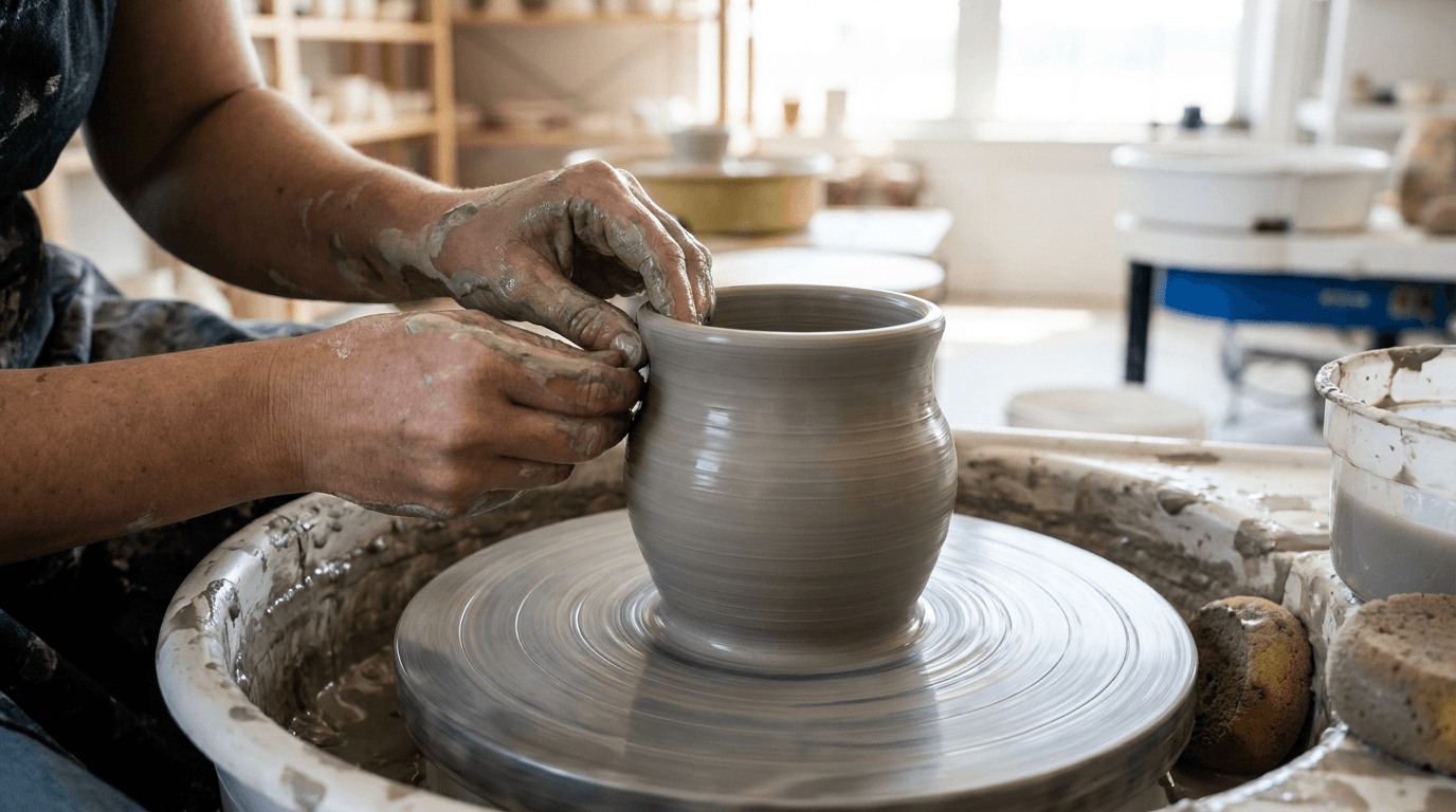
Template 3: The Wheel-Throwing Process — Hands at Work
This template captures the most visually dramatic moment in ceramics — hands on clay on the wheel, the act of forming that transforms a lump of earth into a vessel. This is the quintessential process image, the visual that captivates non-potters and resonates deeply with the ceramics community.
Prompt:
wheel-throwing process photograph of [hands actively shaping clay on a potter's wheel — the most visually dramatic and emotionally compelling image in all of ceramics: the hands are at work on the clay — not posed but captured in the act of forming: the fingers pressed into the spinning clay, the thumbs opening the center, the hands pulling the wall upward, the fingers shaping the rim — the specific gesture of a throwing technique captured at its most visually compelling moment, the clay is wet and responsive — the surface of the clay on the wheel glistening with the water that lubricates the throwing process, the wet clay catching the light with its smooth, slippery, alive quality, the grey or brown or white material in its most plastic, most workable, most visually expressive state, the form is emerging — the vessel is mid-creation, somewhere between the centered lump and the finished form: perhaps the walls have been pulled up and the basic cylinder is established but the final shaping has not begun, the potential of the form visible in the proportions already achieved, or perhaps the form is nearly complete — the belly swelling, the rim thinning, the profile approaching its intended shape — the near-finished state communicating the skill that has brought the clay to this point, the wheel is spinning — the rotation communicated through the slight blur of the wheel head's edge (if the exposure allows), the circular symmetry of the emerging form, and the concentric lines on the clay surface where the hands have guided the spinning material, the rotation the invisible force that makes throwing possible, the hands show the evidence of the work — clay-covered to the wrists, the fingers and palms coated in wet slip, the skin visible through the clay coating at the knuckles and the nail beds, the hands looking like tools that have been immersed in their material, the physical intimacy between maker and material absolute, the hands may also show the character of the maker — strong, experienced hands that have thrown thousands of forms, the confidence of the grip and the delicacy of the touch coexisting, the hands the physical instrument through which knowledge, skill, and intention become form, clay slurry and slip surround the immediate work area — the splash pan or bat with its accumulated residue, the water bucket nearby, the sponge within reach, the working evidence of an active throwing session, the overall composition communicates: this is the moment of creation, the transformation of raw earth into intentional form through the direct application of human skill and the physics of rotation, the hands and the clay and the wheel form a closed circuit of making — the throwing process photograph as the mesmerizing, craft-celebrating, skill-communicating visual that captivates both potters and non-potters and creates the emotional connection to the handmade] in a close, hands-focused, process-action composition, the hands and the clay are the composition's subject — framed tightly to show the point of contact between fingers and clay in detail, the hands and the emerging form filling the frame with the intimate scale of the making, the perspective is close and slightly above — looking down at the wheel head from a position near the potter, the viewer placed close to the action as if sitting beside the maker, the angle that shows the form emerging from above while the hands work from the sides, the emerging form is visible in its current state — the clay vessel on the wheel readable as a form-in-progress, the walls, the rim, and the interior all visible from the elevated angle, the wheel head and the immediate working environment provide context — the bat or wheel surface, the splash pan, the nearby tools and water, the working environment framing the hands-and-clay action, the depth of field is tight and shallow — the hands and the clay in crisp, detailed focus, the background and the surrounding studio in soft, atmospheric blur, the shallow depth creating the intimate, absorbed quality that mimics the maker's own focused attention on the point of contact, the lighting is warm, directional, and natural — the studio-window light that illuminates the hands and the clay with soft, dimensional quality: natural side light from the studio windows — the directional quality that crosses the hands and the clay surface with gentle shadow-to-highlight transitions, the wet clay catching the light with reflective highlights that show its moisture and plasticity, the hands catching the light with their clay-covered skin quality — the light revealing the texture of the fingers, the clay coating, the knuckles and tendons working, the human physicality of the act, the emerging form catches the side light with its dimensional quality — the curves and the walls of the vessel showing the soft tonal transitions that communicate the three-dimensional form on the spinning wheel, the throwing rings catching the light as concentric ridges of highlight and shadow, the water and slip on the surface catch the light with their liquid quality — the wet surfaces reflecting the window light with bright, small highlights that communicate the moisture essential to the process, the slurry in the splash pan catching ambient light with its clay-water mixture quality, the wheel head and tools catch the light with their working-surface materials — the metal or wood or plaster surfaces worn and clay-stained, the light revealing their used, honest quality, clay and skin and water palette — wet clay in its specific body color (grey, brown, white, red-brown), glistening with water highlights — skin tones visible through clay coating — wheel head and working surface tones — soft, blurred studio ambient in the background — natural window-light quality — and the intimate, process-focused, hands-and-clay palette of a wheel-throwing session in studio daylight as the color palette, the mood is absorbed creative physically intimate transformative and the specific process message — this is the moment of making, the hands know the clay and the clay responds to the hands, the skill is in the touch, the form rises from the rotation and the pressure and the intention, this is the craft that makes each piece a one-of-one — the throwing process photograph as the mesmerizing, skill-communicating, handmade-celebrating visual that captivates viewers and creates the emotional foundation for the handmade premium, professional process and editorial photography with natural studio window light and shallow depth of field keeping the hands and clay in intimate detailed focus, composed as a close hands-at-work action shot with the point-of-contact and the emerging form as the visual subjects, the physical intimacy and the skill evidence and the clay responsiveness as the process focal points, wet clay and skin tones in natural studio light, no text overlays, no watermarks
Best for: Instagram highest-engagement content type for ceramics, website process and story sections, social media Reels and Stories (as still or as reference for video), press kit craft-credentials imagery, workshop and class marketing (showing what students will learn), email marketing process and story features, wholesale and gallery submissions (demonstrating making skill), educational content, brand identity content for any platform, print editorial and feature content
Template 4: The Glaze Detail — Surface Texture Macro Close-Up
This template reveals the surface of the ceramic work at intimate, macro-level detail — the glaze texture, the color depth, the interaction between glaze and clay body, and the micro-landscape of the fired surface that makes each piece unique.
Prompt:
macro glaze detail photograph of [the surface of a ceramic piece at intimate, close-range detail — the glaze revealed as a micro-landscape of color, texture, and chemical complexity: the glaze surface fills the frame — a close section of the piece's surface rendered at a scale where the eye can see details invisible at arm's length: the individual texture of the glaze visible — the smooth, glass-like surface of a glossy glaze with its tiny bubbles trapped beneath the surface, the light penetrating the glass layer and revealing the depth of the glaze like looking into shallow water; or the soft, granular, velvet-like surface of a matte glaze where the crystalline structure of the devitrified surface catches the light in thousands of tiny, soft-focus points; or the dramatic, three-dimensional surface of a textured glaze — crawling (the glaze pulled apart during firing to reveal the clay beneath in islands and channels), cratering (the glaze surface punctuated with small volcanic-like openings), crystalline (geometric crystal formations visible within the glaze surface like frozen flowers), or volcanic (the glaze surface bubbled and hardened into a rough, lava-like terrain) — each texture a product of specific chemistry and specific fire, the color variation across the close surface is visible — the way the glaze shifts from thick (in recesses, where the surface curves inward) to thin (over edges, at the top of throwing rings, at any high point), the thick areas deeper and more saturated in color, the thin areas lighter, more transparent, perhaps showing the clay body through the glaze — this thick-to-thin color variation one of the most beautiful and most characteristic visual qualities of hand-glazed ceramics, the interaction between glaze and clay body is visible — where the glaze meets the unglazed clay: the glaze line (the edge where the dipped or poured glaze ended), the clay body visible below the glaze line with its fired, unglazed surface quality (the rough, warm, toasted-earth surface of unglazed stoneware, or the smooth, white, porcelain-like surface of unglazed porcelain), the meeting of the two materials — the fluid, glass-like glaze and the solid, earthy clay — creating a visual contrast that communicates the two-material nature of ceramics, if multiple glazes are present — the overlap zone where two glazes interact: the area where glaze A meets or overlaps glaze B, the chemical interaction between the two glazes creating a third visual quality at their boundary: a color blend, a textural change, a break or a run that exists only where the two materials met in the fire — this interaction zone one of the most prized and most unpredictable elements of the glazed surface, the throwing rings or marks of making are visible at this scale — the concentric ridges of the throwing process, each ring catching the light and the glaze differently, the rings creating a rhythmic, wave-like pattern across the surface that records the rotation of the wheel and the movement of the hands, kiln effects may be visible — the subtle flash marks (warm blushes of color from flame contact or kiln atmosphere), the wadding marks (small bare spots where the piece sat on kiln furniture), the ash deposits (in wood-fired ceramics: the thin, natural glaze of melted ash from the wood fuel, creating a rough, golden, amber, or green surface that no formulated glaze can replicate) — the evidence of the fire that transformed the piece, the overall composition communicates: this surface is a landscape, a record of chemistry and fire, impossibly complex at close range, every millimeter unique, the depth and beauty visible only at this intimate scale — the glaze detail as the surface-appreciation, quality-revealing visual that shows the viewer what their fingers will feel and their eyes will discover when they hold this piece in their hands] in an intimate, macro-scale, surface-revealing composition, the frame is filled with the ceramic surface — a close section of the piece at a scale equivalent to holding the object a few inches from the eye, the surface details commanding the entire visual field, the surface curvature is visible — the slight curve of the vessel wall providing the dimensional context that this is a three-dimensional surface on a three-dimensional object, the curve preventing the image from reading as flat and maintaining the objectness of the piece, the glaze-to-clay transitions are visible — the meeting points between glazed and unglazed, or between thick and thin glaze, the material interactions readable at close range, the marks of making are visible — throwing rings, tool marks, application evidence, kiln effects — all readable at the macro scale as the record of the making process, the depth of field is extremely shallow — only the immediate surface in sharp focus, the areas slightly nearer or farther falling into soft blur, the extremely shallow depth creating the macro-photography quality that focuses all attention on the surface detail at the precise focal distance, the lighting is directional and surface-revealing — specifically calibrated to show the maximum surface detail and glaze character: raking side light at a low angle — the lighting angle that crosses the surface at a steep approach, catching every texture, every ridge, every glaze variation with maximum visual drama: throwing rings become emphasized ridges of highlight and shadow at their micro-scale, glaze texture (matte, glossy, or three-dimensional) is maximally revealed as the low-angle light catches every surface variation, the thick-to-thin glaze transition is illuminated as a tonal and color gradient across the surface, the clay body at unglazed areas catches the raking light with its rough, granular, earthy texture — the unglazed surface three-dimensional and tactile under the low-angle illumination, the glaze surface catches the raking light with its specific reflective character — glossy surfaces showing a bright, elongated highlight that stretches across the curve; matte surfaces showing a broad, soft tonal shift without sharp reflection; textured surfaces showing a complex field of micro-highlights and micro-shadows that reveal every dimensional detail of the surface, any crystalline formations, crawl patterns, or crater textures catch the low-angle light with dramatic, landscape-like quality — the three-dimensional surface features casting tiny shadows and catching bright highlights at the raking angle, the overall illumination creates the "surface as landscape" quality — the ceramic surface rendered with the dimensional, topographic drama of aerial landscape photography, every surface feature revealed as terrain, glaze-specific surface palette — the intimate colors of the specific glaze at close range: [describe your specific glaze surface: the blue-grey of a celadon with jade-green pooling; the amber-to-black of a tenmoku with iron-crystal shimmer; the orange-cream-grey of a Shino with carbon-trapped areas; the pure white of a porcelain glaze with glass-clear depth; the multi-layered complexity of overlapping glazes] — clay body tone at unglazed areas — the warm, earthy contrast between glaze and bare clay — the subtle color shifts from thick to thin glaze — and the intimate, surface-detailed, glaze-specific palette of a ceramic surface in raking directional light as the color palette, the mood is intimately detailed surface-celebrating materially complex and the specific glaze-detail message — this surface is a world unto itself, every square centimeter unique, the color and the texture are the product of chemistry and fire and cannot be replicated by any machine or any formula, this is what your eyes will discover and your fingers will feel when you hold this piece — the glaze detail as the surface-quality, connoisseur-level visual that communicates the uniqueness and the material beauty of handmade ceramics at the most intimate scale, professional macro and detail photography with raking directional side light at a low angle and extremely shallow depth of field keeping only the immediate surface in sharp textural focus, composed as an intimate surface study with the glaze character and the making marks filling the frame, the glaze complexity and the surface texture and the clay-glaze interaction as the detail focal points, intimate glaze-specific palette, no text overlays, no watermarks
Best for: Instagram detail and texture content (strong engagement for the ceramics community), website product detail and glaze-story sections, Etsy secondary listing images (detail shots), wholesale and gallery portfolio detail images, press kit detail and quality photography, educational glaze and surface content, competition and award submission detail imagery, print catalogue and editorial close-up imagery, social media educational and connoisseur content, marketing materials emphasizing uniqueness and handmade quality
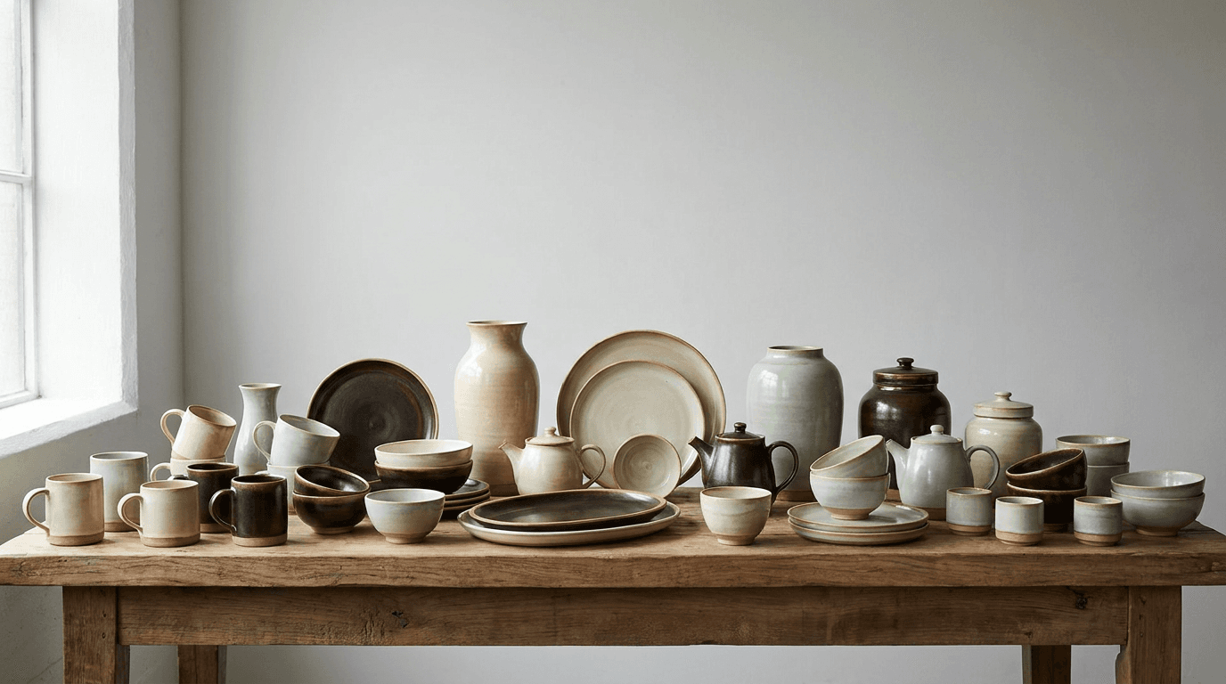
Template 5: The Collection Display — Range and Lineup Presentation
This template presents a group of pieces together — the collection, the range, the lineup that showcases the maker's aesthetic coherence and productive breadth, the visual equivalent of walking into a gallery and seeing an exhibition of the artist's work.
Prompt:
ceramics collection display photograph of [a group of handmade ceramic pieces arranged together as a cohesive body of work — the collection that demonstrates the maker's range, aesthetic consistency, and productive depth: the collection includes multiple forms — a considered selection from the maker's range: mugs, bowls, plates, vases, cups, serving dishes, teapots, creamers, jars — the specific combination reflecting the breadth of the maker's functional vocabulary, the forms vary in size and proportion while sharing the maker's distinctive formal language — the recognizable proportions, the consistent foot treatment, the characteristic rim profile, the handle style that identifies the work as belonging to a single maker even across different forms, the glaze palette ties the collection together — the maker's signature color range applied across the forms: perhaps all pieces in a single glaze (the power of consistency, the impact of a unified surface across varied forms) or in a deliberate palette of two to four complementary glazes (the range within a considered color system), the glaze palette the chromatic signature that identifies the work, the pieces are arranged with display intention — not in a grid or a line but in a considered, visually rhythmic grouping: taller pieces toward the back, smaller pieces in front, the arrangement creating visual depth and a natural scanning path, the spacing between pieces deliberate — close enough to read as a collection, far enough apart for each piece to maintain its individual presence, the variety creates visual rhythm — the repetition of the maker's forms at different scales and in complementary glazes creating the visual pattern that communicates productive range, the differences between pieces (size, form, glaze) creating the variation within unity that makes a collection more compelling than a single piece, some pieces may be rotated to show different views — a mug turned to display its handle, a bowl tilted slightly to reveal its interior, a plate angled to show its well — the varied orientations adding dimensional variety to the display, the surface beneath the collection is a display-appropriate platform — a long wooden table or shelf, a linen-draped surface, a concrete or stone display platform — the surface unified and continuous beneath all pieces, the shared surface communicating that these pieces belong together as a body of work, the background is clean and non-competing — a studio wall, a gallery-like neutral space, or a gradient backdrop that allows the collection to be the sole visual focus, the overall composition communicates: this maker produces a coherent body of work, the range is impressive, the aesthetic consistency is the signature, each piece belongs to the same family while maintaining its individual character — the collection display as the range-showing, aesthetic-identity-establishing visual that communicates the breadth and depth of the maker's practice] in a wide, collection-presenting, display-oriented composition, the collection fills the frame — the group of pieces arranged across the width (and depth) of the composition, the collective body of work commanding the visual field, the arrangement creates compositional rhythm — the alternation of heights, the spacing, the color distribution across the arrangement creating a visual flow that moves the eye across the collection, the individual pieces are identifiable — each form readable as a specific object within the group, the individual character maintained within the collective display, the surface provides the unified ground — the continuous platform connecting all pieces as a single body of work, the background recedes — clean, non-competing, allowing the work to be the sole focus, the depth of field is moderate — enough to show the front pieces in sharp detail and the back pieces in slightly softer but still legible resolution, the collective depth creating the layered, dimensional quality of a physical display, the lighting is even and collection-appropriate — soft, diffused, directional light that illuminates the full group consistently while maintaining the individual surface character of each piece: soft, broad, directional light from one side — even enough to illuminate the full width and depth of the collection without dramatic fall-off, the broad light source providing consistent illumination across all pieces while maintaining the directional quality that reveals surface texture and form dimension, each piece catches the directional light with its specific surface — glossy pieces showing graduated highlights, matte pieces showing soft tonal transitions, the varied glaze surfaces creating the visual variety within the consistent lighting, the taller pieces cast gentle shadows onto the smaller pieces behind them — the inter-piece shadows adding to the dimensional quality and the layered depth of the display, the surface catches the soft, broad light — the display platform evenly illuminated, the material quality visible, the unified ground reading cleanly, the background catches minimal light — the backdrop remaining neutral and non-competing, the reduced illumination on the background pushing the eye to the foreground collection, collection glaze palette as the chromatic identity — the maker's specific palette across all pieces: [describe your glaze palette: a range of warm whites from cream to snow; a tenmoku family from amber to black; a celadon spectrum from pale jade to deep green; a multi-glaze system of complementary colors] — clay body tone visible at feet and unglazed areas — neutral display surface — clean background — and the palette-coherent, range-showing, display-quality arrangement of a ceramics collection in even directional light as the color palette, the mood is aesthetically coherent productively impressive collection-celebrating and the specific collection message — this maker produces a body of work, the aesthetic range is impressive, the consistency is the signature, each piece is unique but all are family, this is a practice worth collecting — the collection display as the range-communication, aesthetic-identity, portfolio-quality visual that establishes the maker's productive breadth and design coherence, professional product and display photography with soft broad directional lighting and moderate depth of field keeping the full collection legible, composed as a wide collection arrangement with rhythmic spacing and dimensional depth, the aesthetic coherence and the range variety and the glaze-palette identity as the collection focal points, maker's glaze palette with neutral display and background tones, no text overlays, no watermarks
Best for: Website homepage and shop-overview sections, Instagram collection and range posts, Etsy shop banner and promotional imagery, wholesale and gallery portfolio presentations, craft fair and market pre-show promotional content, email marketing collection features and launches, print catalogue covers and spread imagery, press kit body-of-work imagery, exhibition marketing and gallery show announcements, brand identity content for all platforms
Template 6: The Kiln and Firing — Behind-the-Scenes Transformation Visual
This template captures the kiln and the firing process — the transformative heat that is ceramics' defining technology, the moment when chemistry and fire convert raw clay and mineral glazes into permanent, vitrified, beautiful objects.
Prompt:
kiln and firing process photograph of [the kiln and the firing as the transformative heart of the ceramic process — the heat, the equipment, and the evidence of fire that converts fragile raw materials into permanent, beautiful objects: the kiln is the visual subject — the specific type of kiln communicating the maker's firing philosophy: an electric kiln — the insulated box with its interior coils visible (when open) or its closed, brick-and-steel exterior radiating the industrial-domestic quality of the most common studio kiln, the kiln's exterior clean and utilitarian, the controls (manual kiln-sitter or digital controller) showing the interface between the maker and the fire; or a gas kiln — the larger, more dramatic fuel-burning kiln with its burner ports, its damper, its chimney stack, the kiln visible as a purpose-built structure of firebrick and steel, the gas kiln communicating reduction firing and the atmospheric effects that many potters prize; or a wood-fired kiln — the most visually dramatic of all kilns: a long, arched, catenary or cross-draft or anagama form built of firebrick, the stoking ports visible, the chimney rising, the kiln as an architectural presence, a structure built to contain and direct fire over days, the wood kiln communicating the most primal, most ancient, most labor-intensive firing tradition, the kiln is shown in one of three compelling states: LOADING — the kiln door open, the interior visible with its shelves and posts and the careful arrangement of raw or bisqued or glazed ware stacked and placed with the precise spacing that kiln-loading requires (each piece positioned for optimal heat circulation, the arrangement a three-dimensional puzzle of maximizing capacity while ensuring each piece fires properly), the open kiln as a window into the process; or FIRING — the kiln in operation, the fire within: if an electric kiln, the coils glowing orange-red in the peephole or through the slightly cracked lid, the heat made visible as incandescent color; if a gas kiln, the flame visible at the burner ports, the heat shimmer above the kiln, the glow in the peepholes; if a wood kiln, the dramatic scene of active stoking — flame visible through the stoking ports, the fire roaring, the ember bed glowing, the heat distortion visible in the air above the kiln, the drama of controlled combustion at extreme temperature — the firing state the most visually dramatic of all ceramic process moments; or UNLOADING — the post-firing reveal: the kiln door opened after cooling, the fired pieces visible inside, their surfaces transformed, the first sight of what the fire has done — the revelation moment that every potter lives for, the transition from anticipation to discovery, kiln furniture is visible as supporting detail — the shelves (silicon carbide or cordierite), the posts (cylindrical supports between shelves), the wadding (balls of refractory material that separate pieces from shelves), the stilts (pointed supports for glazed work) — the infrastructure of the kiln interior communicating the technical knowledge that loading and firing require, the studio or firing environment surrounds the kiln — the outdoor setting of a wood kiln with its cord of split firewood stacked nearby, the studio interior of an electric or gas kiln with the surrounding evidence of the ceramic practice, the environment placing the kiln in its working context, the overall composition communicates: the kiln is where the transformation happens, the fire is the partner that the potter cannot fully control, the loading is a skill, the firing is a commitment, the unloading is a revelation — the kiln visual as the transformation-documenting, process-completing image that communicates the ancient, elemental relationship between clay and fire that defines ceramics] in an atmospheric, kiln-focused, process-documentation composition, the kiln occupies the compositional center — the firing structure prominent, its form and materiality visible, the kiln as the visual anchor, the kiln's state (loading, firing, or unloading) is the narrative — the specific moment communicated through the visible evidence: open door and arranged ware for loading, glowing fire and heat for firing, revealed pieces and first-sight discovery for unloading, the kiln furniture and technical detail add craft-knowledge context — the supporting infrastructure visible as evidence of the skill involved in firing, the surrounding environment provides the working context — the studio or the outdoor firing area visible as the setting, the depth of field is moderate — the kiln in detailed focus with the surrounding environment in softer atmospheric context, the kiln commanding attention while the environment provides the setting, the lighting is state-specific and dramatic — each kiln state offering distinct, compelling lighting opportunities: LOADING lighting — the interior of the kiln illuminated by ambient studio light, the kiln cavity visible with its shelves and ware, the cool interior of an unfired kiln showing the raw, expectant state of the work waiting for fire; FIRING lighting — the most dramatic lighting in all of ceramics photography: the incandescent glow of the interior — the orange-red-yellow radiance of materials at extreme temperature, the glow visible through peepholes, through cracked lids, through stoking ports — the color of heat itself, ranging from dark red (lower temperatures) through bright orange to white-hot (the highest stoneware and porcelain temperatures), the radiant glow of the firing casting warm, ember-like light onto the kiln's exterior, onto the faces of those tending the fire, onto the nearby walls and surfaces, the glow dominating the scene with its primal, elemental quality — the light of the kiln fire is one of the most emotionally powerful light sources in any craft discipline; if wood-firing, the active flame adds dynamic, flickering quality — the fire visible and alive, the flame forms constantly changing, the ember bed casting deep, rich, red-orange light upward — the wood kiln in operation as a visual and emotional experience that is almost impossible to capture without conveying its power; UNLOADING lighting — the ambient studio light falling into the cooling kiln interior, revealing the fired pieces with their new surfaces, the first glimpse of glaze results under the cool, discovery-moment illumination — the neutral light showing the true colors and surfaces for the first time, kiln-fire palette centered on the specific state — LOADING: cool kiln interior, raw or glazed ware in pre-fire colors, studio ambient tones — FIRING: incandescent orange-red-yellow glow from the interior, warm cast on all surrounding surfaces, fire-colors dominating the scene, the specific chromatic intensity of extreme heat — UNLOADING: neutral ambient revealing new glaze colors, the post-fire palette of transformed surfaces, the warm residual tones of a recently cooled kiln — firebrick orange-tan, kiln-shelf grey, kiln furniture white — and the specific, state-dependent palette of a kiln moment in its characteristic lighting as the color palette, the mood is elementally transformative dramatically powerful process-completing and the specific kiln message — the fire changes everything, the kiln is where chemistry becomes beauty, the loading is careful and knowing, the firing is powerful and humbling, the unloading is the reveal — the kiln visual as the transformation-documenting image that communicates the elemental, fire-dependent nature of ceramics and the skill and commitment that firing requires, professional process and editorial photography with state-specific lighting (fire-glow for firing, ambient for loading and unloading) and moderate depth of field keeping the kiln in focus, composed as a kiln-centered process document with the specific firing state as the narrative subject, the transformative fire and the kiln presence and the process drama as the kiln focal points, state-specific fire or ambient palette, no text overlays, no watermarks
Best for: Instagram highest-drama process content (kiln-opening content in particular generates exceptional engagement), website process and story sections, social media Reels and Stories (kiln opening as video reference), press kit process and craft-credentials imagery, workshop and educational content, email marketing story and process features, documentary and editorial content, exhibition and gallery narrative content, artist statement and portfolio context, brand identity content communicating the fire-dependent craft
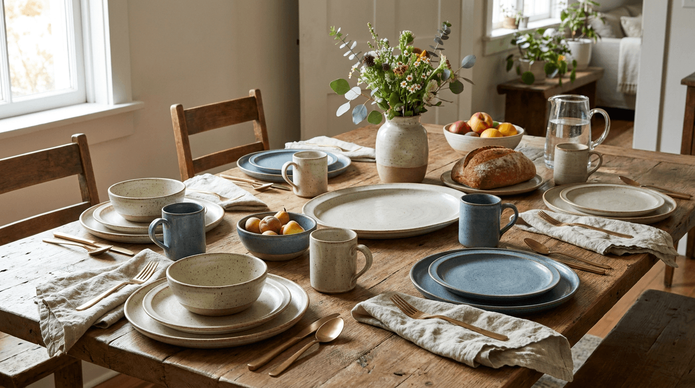
Template 7: The Table Setting — Lifestyle and Styled-Use Scene
This template places the ceramics in their intended domestic context — the table, the kitchen, the dining scene where functional ware comes to life in active use. This is the lifestyle image that helps the customer imagine the work in their own home and their own daily rituals.
Prompt:
styled table setting lifestyle photograph of [handmade ceramic pieces arranged in a beautiful, intentional table setting or domestic scene — the functional ware in its intended context, showing how the work inhabits and elevates daily life: the table setting uses the maker's ceramics as the primary tableware — dinner plates, salad plates, bowls, mugs, cups, serving pieces, and perhaps a vase with flowers — all from the same maker, the cohesive glaze palette and formal vocabulary creating the unified table that demonstrates the maker's full functional range, the setting is styled with casual elegance — not the formal rigidity of fine dining but the warm, intentional, lived-in beauty of a table set for a meal that will be enjoyed by people who care about what they eat and what they eat it from: linen napkins (in natural tones: undyed, oatmeal, soft grey, muted earth) folded or loosely draped beside each setting, simple, quality flatware (matte stainless, brushed brass, or hand-forged iron), glassware that complements without competing (clear, simple forms), the table surface is natural and characterful — a raw or oiled wooden table with visible grain and the warmth of real wood, or a linen tablecloth in a neutral, textile-rich tone, or a stone surface with mineral coolness — the surface providing the horizontal foundation that connects all the ceramic pieces and sets the material tone, food or the suggestion of food adds the culinary context — a loaf of rustic bread torn and placed on a board, a bowl of seasonal fruit, a pitcher of water or a pot of tea, a composed salad in a serving bowl, the food styled with the same casual-elegant intention as the setting, the food communicating "a meal is about to happen or is in progress," flowers or natural elements add organic beauty — a vase of seasonal flowers (wildflowers, garden-cut stems, dried arrangements) in one of the maker's vases, a small plant, a branch of foliage — the natural element connecting the organic quality of the ceramics to the natural world, the table occupies a domestic or indoor-outdoor space — a dining room with natural light, a kitchen table near a window, an outdoor dining area on a patio or in a garden — the setting communicating the specific domestic context where this tableware will live, the overall composition communicates: these ceramics are made for real life, they elevate the daily rituals of eating and drinking and gathering, the table set with handmade ware is more beautiful and more personal and more meaningful than a table set with factory products — the table setting as the lifestyle-aspiration visual that helps the customer imagine the work in their own home and their own daily rituals] in a wide, styled, overhead-to-angled table composition, the photograph is taken from either a direct overhead position (the flat-lay perspective that shows the full table layout as a graphic composition: each plate, bowl, cup, napkin, and utensil visible in its placement, the complete setting readable as a designed arrangement) or from a slightly elevated angle (approximately 30-45 degrees, the natural seated-at-the-table perspective that shows both the table surface and the dimensional forms of the ceramic pieces rising from it — the bowls with depth, the mugs with height, the vases with their profiles visible), the full setting is visible — the complete table arrangement within the frame, the scope of the maker's functional range communicated through the assembled collection, the styling details are readable — the napkins, the flatware, the food elements, the flowers — each contributing element visible and adding to the composed quality of the scene, the table surface provides the continuous ground — the material (wood, linen, stone) visible and unified, the natural surface supporting the entire composed setting, the domestic context adds environmental depth — the room, the window, the kitchen or dining space visible in the background with soft atmospheric quality, the setting placed in a real, livable environment, the depth of field is moderate — for overhead: deep enough for the full table surface to be in focus; for angled: moderately shallow, with the nearest pieces in sharp focus and the furthest pieces in gentle softness, the styled quality maintained across the focal range, the lighting is warm and natural — the domestic-interior light quality that makes a table setting look its most inviting: soft, warm, natural light from a window or from the outdoor environment — the diffused, golden-warm illumination that makes food look appetizing, ceramics look warm, and table settings look inviting, the light entering from one side or from above, creating the gentle directional quality that adds dimension without harsh shadows, the ceramic pieces catch the warm light with their glaze-specific surfaces — the plates showing their wide glaze fields, the bowls showing interior and exterior surfaces, the mugs showing their form and handle, each piece responding to the warm natural light with its specific surface quality (gloss, matte, texture), the food catches the warm light with appetizing, food-photography quality — the bread crusty and golden, the fruit vivid and ripe, the composed elements looking edible and inviting, the linen and flatware catch the warm light with their textile and metallic qualities — the napkin's woven texture visible, the flatware catching small bright reflections, each element adding to the material richness of the scene, the flowers catch the light with their natural, organic beauty — the petals translucent or softly reflecting, the stems and leaves green and alive, the natural element luminous in the warm illumination, the table surface catches the warm light with its material quality — the wood grain, the linen texture, or the stone surface illuminated with the warm tone that is the chromatic foundation of the scene, maker's glaze palette in domestic context — the specific glaze colors across the table-setting pieces — linen and natural textile tones — wood or stone surface warmth — food and botanical natural colors — domestic interior ambient tones — warm natural window-light quality — and the warm, domestic, lifestyle-aspirational palette of handmade ceramics in a styled table setting as the color palette, the mood is warmly domestic casually elegant lifestyle-aspirational and the specific table-setting message — this is what your table could look like, these handmade ceramics elevate the everyday meal into something beautiful and personal and intentional, the coherent glaze palette and the considered forms create a table that is art you eat from — the table setting as the lifestyle visual that drives desire for the full range, inspires the customer's domestic imagination, and positions the work as essential to a beautiful, intentional home, professional lifestyle and food styling photography with warm natural window light and moderate depth of field in a styled domestic setting, composed as a full table arrangement from overhead or elevated angle with the complete functional range visible, the domestic beauty and the lifestyle context and the cohesive collection as the styled-use focal points, maker's palette in warm domestic tones, no text overlays, no watermarks
Best for: Instagram lifestyle and styled content (second-highest engagement category for functional ceramics), website homepage and collection sections, Etsy shop banner and lifestyle listing images, Pinterest (the highest-converting platform for home goods), email marketing lifestyle features, print catalogue and lookbook spread imagery, wholesale and retail buyer presentations, interior design and hospitality marketing, gift guide and registry features, collaboration content with food and lifestyle brands
Template 8: The Raw Materials — Clay and Ingredient Spotlight
This template showcases the raw material of ceramics — clay in its pre-thrown, elemental state, and the mineral and organic ingredients that constitute glazes. The material spotlight communicates the earthiness, the naturalness, and the geological foundation of the ceramic art.
Prompt:
raw clay and ceramics material spotlight photograph of [the elemental materials of ceramics — clay, minerals, and the raw ingredients that constitute the entire craft, presented as beautiful, geological, ancient materials: the primary material subject is clay in its raw, pre-thrown state — a block or lump or slab of plastic clay presented with the reverence appropriate to a material that humans have shaped for tens of thousands of years: the clay shows its specific body character — the grey-blue of a wet stoneware body, the white of porcelain (the finest, whitest, most translucent clay), the warm red-brown of earthenware or terracotta, the dark brown-grey of a dark stoneware, the speckled character of a body with sand or grog inclusions — the clay's specific color and texture communicating its mineral composition and its intended use, the clay is presented in a state that communicates its plasticity and workability — a freshly cut block showing the smooth, dense, moist interior where the wire cut through, the surface slightly sticky with moisture, the material obviously soft and ready to be shaped; or a lump that has been partially wedged, showing the spiral pattern of kneading; or a slab rolled to even thickness showing the smooth, flat, workable surface; or a coil pulled and lying in a soft, rope-like form — the clay in whatever state communicates its essential quality: this is earth that can be shaped by hands, additional raw materials may surround the clay — dry glaze ingredients in their powdered mineral forms: feldspar (white, crystalline powder), silica (fine, white, sandy powder), various metal oxides (iron oxide in its warm rust-red, cobalt oxide in its intense dark blue, copper oxide in its green-black, manganese dioxide in its deep purple-brown) — the raw minerals that, when combined and fired, produce the glazes that cover the finished work, the powdered minerals presented in small containers or measured on scales, their colors vivid against the neutral studio surface, wood ash may be present as a glaze ingredient — the fine, grey, powdered residue of combustion that, in ceramics, becomes a beautiful, natural glaze component, the ash communicating the connection between wood-firing culture and glaze chemistry, natural materials used in ceramics may be present — rocks and minerals that are ground to make local glazes, plant materials that produce ash for ash glazes, the geological and botanical sources that connect ceramics to the specific landscape where the clay is dug and the materials are gathered, the materials sit on a surface that communicates their elemental, geological context — a stone surface, a wooden studio table, a concrete slab, a natural linen — the surface matching the earth-and-mineral quality of the materials themselves, the overall composition communicates: ceramics begins here, with earth and minerals and the geological gifts of the planet, the raw materials are beautiful in themselves, the transformation from this to the finished piece is the journey of the craft — the material spotlight as the origin-story, elemental-beauty visual that communicates the natural foundation of the ceramic art] in a close, textural, still-life-style material composition, the materials fill the frame with their geological and mineral beauty — the clay, the powders, the minerals presented at close range, their textures and colors visible in intimate detail, the surface and context provide the natural, geological foundation — the organic, earthy materials (stone, wood, linen) grounding the ceramic materials in their elemental context, the depth of field is moderately shallow — the nearest materials in detailed, textural focus with the background and edges softening, the shallow focus creating the intimate, still-life quality that makes raw materials look beautiful and worthy of attention, the lighting is warm, natural, and directional — the soft, studio-window-quality light that reveals the materials with honesty: warm, directional natural light from one side — the light that reveals the texture and color of every material: the wet clay catching the light with its smooth, slightly reflective, moist surface — the surface quality communicating plasticity and readiness; the dry mineral powders catching the light with their fine, granular, matte surfaces — each oxide and mineral with its specific color vivid under the directional illumination; the wood ash catching the light with its fine, powdery, grey texture; the natural rocks and minerals catching the light with their geological surface qualities — the raw materials luminous and beautiful in the studio light, material-specific geological palette — wet clay in its body color (grey-blue, white, red-brown, dark grey) as the primary material — dry mineral oxides in their vivid powder colors (rust iron, blue cobalt, green copper, purple manganese) — white feldspar and silica powders — grey wood ash — natural stone and wood surface tones — warm natural studio light — and the earthy, mineral, geological-beauty palette of raw ceramic materials in directional natural light as the color palette, the mood is elementally beautiful materially honest geologically connected and the specific materials message — ceramics begins with earth and minerals, the raw materials are ancient and beautiful, the craft is a collaboration between the maker and the geological gifts of the planet, from this clay and these minerals comes everything you see in the finished work — the material spotlight as the origin-and-foundation visual that communicates the natural, elemental basis of the ceramic art and the quality of the materials that become the finished work, professional still-life and material photography with warm directional natural light and moderately shallow depth of field keeping the materials in textural detail, composed as an intimate material study with geological and mineral beauty filling the frame, the material textures and the mineral colors and the elemental quality as the material focal points, earth and mineral palette in warm natural light, no text overlays, no watermarks
Best for: Website material and process story sections, Instagram educational and process content, social media clay and material features, email marketing story and material content, press kit material and sourcing information, educational and workshop content, exhibition and gallery narrative context, artist statement and philosophy content, sourcing and sustainability storytelling, collaboration with clay and material suppliers
Template 9: The Collaboration — Artist Partnership Visual
This template creates the visual for a collaboration — a project made in partnership with another ceramicist, a different-medium artist, a brand, or a community organization. Collaboration is central to the ceramics community, and the visual must communicate partnership, mutual respect, and the creative synergy of combined practices.
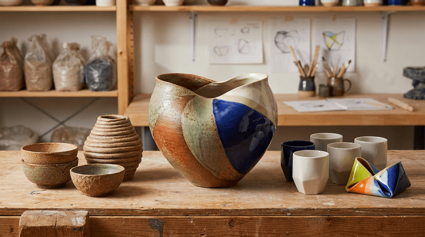
Prompt:
ceramics collaboration visual of [a composition communicating artistic partnership — two practices, two perspectives, one project: the collaboration is presented through the combined work — pieces that represent both artists or both practices displayed together: ceramics from both collaborators side by side, showing the dialogue between two aesthetic approaches; or a single collaborative piece that embodies both makers' contributions; or ceramics paired with work from another medium (textiles, woodwork, metalwork, food, floral design) — the cross-medium collaboration showing how the ceramic work exists in conversation with another craft, the collaborative work occupies the center of the composition — the combined creation or the paired objects prominently displayed, the product of the partnership the visual focus, elements representing each collaborator are recognizably present — the distinctive glaze palette, the characteristic form, the individual aesthetic signature of each participant visible and identifiable within the collaborative whole, the setting communicates the collaborative context — a shared studio space, a co-designed display, a styled scene that combines both makers' environments, or a neutral setting that belongs equally to both, the overall composition communicates: these two creative practices came together and made something that neither could make alone, the collaboration is genuine, the partnership is respectful, the combined vision is greater than the sum — the collaboration visual as the partnership-celebrating image that generates community excitement and cross-audience engagement] in a balanced, partnership-communicating composition, the composition distributes visual weight equally — neither collaborator's work dominates, the balance communicating mutual respect, the collaborative work is the focal center — the combined creation in the primary position, the individual elements flanking or supporting, the depth of field keeps the collaborative work in crisp focus — the partnership product sharp and detailed, the supporting elements and context in complementary softness, the lighting is even and balanced — warm, natural, studio-quality light that treats both contributors' work with equal quality and attention: soft, even, directional light illuminating the collaborative work and both partners' elements consistently — the ceramics catching the light with their specific surface qualities, any other-medium work catching the light with its material character, the balanced illumination communicating the equal-partner nature of the collaboration, combined or blended aesthetic palette — merging the visual signatures of both collaborators: [describe your palette] alongside the collaborator's aesthetic — warm, even natural light — partnership-context surface and setting tones — and the balanced, dual-practice, partnership-showing palette of a ceramics collaboration in studio-quality light as the color palette, the mood is creatively collaborative mutually enriching community-spirited and the specific collaboration message — these two practices came together in creative partnership, the result enriches both, the ceramics community thrives on this cooperative spirit — the collaboration visual as the partnership-celebrating, cross-audience image that generates excitement and positions both makers within the collaborative culture of the ceramics community, professional product and editorial photography with balanced natural lighting and partnership-focused depth of field, composed as a balanced dual-practice display with the collaborative work central, the partnership balance and the combined aesthetic and the collaborative spirit as the focal points, blended palette with warm natural tones, no text overlays, no watermarks
Best for: Social media collaboration announcements and features, both collaborators' channels simultaneously, email marketing collaboration features, website collaboration and community sections, exhibition and show marketing for collaborative exhibitions, press and media collaboration coverage, cross-promotional content for both partners' audiences, craft fair and market collaborative booth marketing, gallery submission for collaborative work, community and creative-network engagement content
Template 10: The Packaging and Shipping — Care in Transit Visual
This template presents the packaging — the wrapping, the boxing, the protective care that communicates the maker's attention to every stage of the customer experience, from the studio to the doorstep. For online sellers, the unboxing experience is a critical brand touchpoint.
Prompt:
ceramics packaging and shipping presentation photograph of [handmade ceramic pieces being carefully packaged for shipping — the wrapping and boxing process that communicates the maker's care for the work at every stage, including the journey to the customer: the packaging scene shows a ceramic piece in the process of being wrapped — the work partially visible through the packaging materials, the piece identifiable as a specific, beautiful ceramic object being prepared for its journey: the wrapping material is natural and considered — tissue paper in white or a brand-coordinated color, kraft paper in its honest brown, undyed cotton or linen fabric wrapping, or recycled and sustainable packing materials that communicate environmental responsibility, the wrapping material itself an aesthetic choice that extends the brand's material vocabulary, protective materials surround the wrapped piece — bubble wrap, crinkled kraft paper, shredded paper fill, or molded pulp cushioning — the protective layers communicating the care taken to ensure the fragile ceramic arrives safely, the box is visible — a corrugated shipping box in natural brown or a branded box with the maker's identity printed or stamped on the surface, the box open and mid-packing, the interior organized with the piece nested safely within its protective layers, branded elements enhance the unboxing experience — a handwritten thank-you note or a printed card with the maker's branding, a sticker or stamp with the studio logo, a care instruction card explaining how to care for the ceramic piece, perhaps a small wrapped sample (a tiny ceramic piece, a tea sample, dried flowers) — the personal touches that transform a delivery into an experience, the packing surface is the studio workspace — a clean section of the worktable, the packing station where finished work is prepared for shipping, tape, scissors, labels, and packing tools visible as the practical instruments of the shipping process, additional finished pieces may be visible nearby — a stack of wrapped pieces ready to ship, a row of boxed orders awaiting pickup, the evidence of productive output and active commerce, the overall composition communicates: this maker cares about every stage of the customer experience, the packaging is as considered as the making, the piece will arrive safely and beautifully, the unboxing is part of the experience — the packaging visual as the care-communicating, unboxing-anticipation-building image that signals quality at every touchpoint] in a styled, mid-process packaging composition, the packaging action is the subject — the ceramic piece being wrapped or boxed, the process of preparation visible and in progress, the branded elements are visible — the cards, the stickers, the personal touches that extend the brand into the unboxing, the surrounding context provides the studio-packing station environment — the workspace, the tools, the other pieces ready to ship, the depth of field is moderate — the primary packaging scene in focus with the surrounding studio context in softer atmospheric quality, the lighting is warm and natural — the studio light that makes the packaging materials and the ceramic piece both look their best: warm, natural studio light illuminating the packing scene — the packaging materials catching the light with their specific textures: tissue paper with its translucent, soft quality; kraft paper with its warm, fibrous, honest surface; the ceramic piece visible through or emerging from the wrapping with its glazed surface catching a warm highlight that reminds the viewer of the finished piece within, the branded elements catching the light with their printed or handwritten surfaces — the thank-you card, the logo sticker, the care instructions legible and present, the box catching the light with its corrugated or printed surface — the shipping vessel visible with its practical-and-branded quality, packaging material palette — white or colored tissue paper — warm brown kraft paper — natural protective materials in neutral tones — branded elements in the maker's color palette — ceramic glaze visible through the packaging — warm studio ambient tones — and the warm, care-communicating, brand-extending palette of a ceramics packaging scene in studio light as the color palette, the mood is carefully attentive brand-conscious gift-like and the specific packaging message — every stage of the experience is considered, the packaging protects and delights, the unboxing will be a moment of pleasure, the care in the packing matches the care in the making — the packaging visual as the care-and-quality signal that builds unboxing anticipation and communicates attention to the complete customer experience, professional lifestyle and product photography with warm studio light and moderate depth of field, composed as a mid-process packaging scene with branded elements and the ceramic piece visible, the care quality and the brand extension and the unboxing anticipation as the packaging focal points, warm natural packaging tones with brand accents, no text overlays outside the branded packaging elements, no watermarks
Best for: Instagram shipping and behind-the-scenes content, Etsy shop story and process content, website shipping and customer-experience sections, email marketing shipping and care content, social media order-fulfillment and "packing orders" content (high engagement content type), unboxing experience documentation, customer communication and expectation-setting, brand-standards documentation for team training, wholesale packaging-standards communication, sustainability and packaging-philosophy content
Template 11: The Market and Craft Fair Booth — Event and Direct Sales Visual
This template captures the craft fair or market booth — the direct-to-customer selling environment where the maker meets the buyer, the work is displayed in its most accessible public context, and the energy of live commerce creates community.
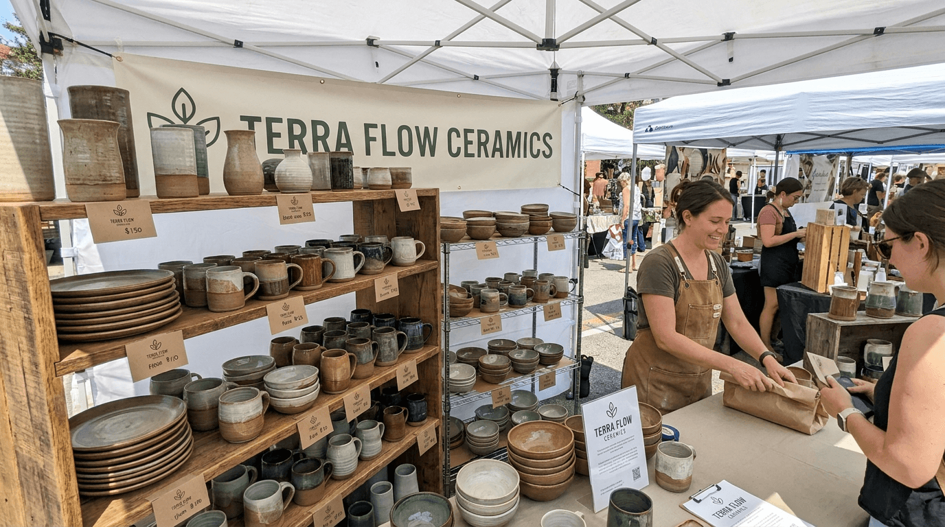
Prompt:
pottery market booth and craft fair display photograph of [a ceramicist's booth at a craft fair, artisan market, or outdoor pottery sale — the display that presents the work in the direct-to-customer context where maker and buyer meet face to face: the booth is designed as a miniature gallery — the display communicating the same aesthetic intention and brand identity as the maker's studio, website, and packaging, but adapted for the outdoor or market-hall context: display shelving creates vertical dimension — wooden shelves (raw wood, painted, or stained in the brand's material vocabulary), metal display racks, or a combination — arranged to present the work at varying heights, the vertical display creating visual impact and making the full range visible from across the market aisle, the ceramics are arranged by form and function — mugs grouped together, bowls in their sizes, plates stacked or displayed on stands, vases arranged at varied heights, the organization allowing the customer to scan the offerings and identify what they are looking for, while the overall arrangement creating the visual richness of an abundant, productive display, price tags or small signs identify the work — handwritten or printed cards with form name and price, the information presented in the maker's typographic and design language, the pricing transparent and accessible, the booth's branded identity is visible — the studio or brand name displayed on a banner, a sign, or printed materials: the logo and the name identifying this booth as a specific maker among the market's many vendors, the branded presence consistent with the maker's other visual touchpoints (website, packaging, social media), the market context surrounds the booth — the adjacent booths of other makers, the canopy or tent structure providing shelter, the stream of visitors browsing the aisle, the communal energy of a craft market in operation, the maker may be present — standing behind or beside the display, greeting customers, wrapping a purchase, having a conversation about the work — the human presence connecting the objects to their maker, the direct-to-customer relationship that is one of craft commerce's most meaningful qualities, the overall composition communicates: this maker takes the direct-to-customer relationship seriously, the booth display is as considered as the studio and the website, the work is presented with pride and organization, the market context is alive with the energy of craft commerce — the market booth visual as the event-documenting, direct-sales-celebrating image that captures the energy of live craft commerce and positions the maker as an active participant in the artisan marketplace community] in a slightly wide, booth-encompassing market composition, the booth fills the primary frame — the display shelving, the arranged ceramics, the signage, and the booth structure visible as a complete presentation, the ceramics are the visual density — the abundant display of work creating the rich, attractive, full-booth impression that draws customers from across the market, the branded signage identifies the booth — the maker's name and identity visible and prominent, the market environment provides context — the adjacent booths, the overhead canopy, the market aisle visible at the edges, the energy of the setting communicated through the surrounding activity, the maker's presence (if included) adds the human connection — the artist visible and engaged within their display, the depth of field is moderate to deep — the booth display in comprehensive focus with the market context in softer atmospheric background, the lighting is natural, outdoor-market quality — the daylight of an outdoor market (bright, diffused by canopy or tent, even) or the interior lighting of a market hall: natural daylight diffused through the booth's canopy — the even, bright, outdoor illumination that shows the ceramics with accurate color and clear visibility, the canopy filtering the direct sun into a soft, even, shadow-free illumination that is ideal for displaying handmade work, the ceramics catch the diffused natural light with their varied surface qualities — each piece visible with its glaze character, the full range of the maker's palette readable under the even outdoor light, the signage and branded elements catch the outdoor light with their printed or painted surfaces — the brand identity legible and visible, the market environment catches the natural light with its outdoor or market-hall quality — the broader scene bright and active around the focused booth, outdoor market natural palette — ceramic glaze palette across the displayed range — warm wood or the booth's specific display material tones — branded signage colors — natural outdoor daylight quality — market environment neutral-to-warm ambient — and the bright, varied, display-rich palette of a ceramics booth at an outdoor market in diffused natural daylight as the color palette, the mood is energetically commercial community-engaging proudly displayed and the specific market-booth message — this maker shows up, the display is beautiful, the work is abundant, the direct relationship between maker and customer is alive and well here, come and meet the artist and take something home — the market booth visual as the event-and-commerce image that documents market participation, drives attendance at upcoming markets, and communicates the maker's active presence in the craft marketplace community, professional event and editorial photography with diffused outdoor natural light and moderate-to-deep depth of field showing the full booth in market context, composed as a booth-wide market display with arranged ceramics and branded signage visible, the display quality and the product abundance and the market energy as the booth focal points, glaze palette with market-natural outdoor tones, no text overlays outside the booth signage, no watermarks
Best for: Social media market and event documentation and promotion, website markets and events sections, email marketing upcoming-market announcements, Facebook and event-listing platform event imagery, post-market documentation and community-engagement content, market-application portfolio imagery, press and media craft-fair coverage, community and artisan-market marketing, local-tourism and event-guide features, seasonal and holiday market promotional content
Template 12: The Studio Exterior — Architecture and Sense of Place
This template captures the studio's exterior — the building, the signage, the physical presence that establishes the maker's practice within a specific place, architecture, and community.
Prompt:
ceramics studio exterior photograph of [the studio building and its surroundings as seen from outside — the physical home of the practice that a visitor encounters on arrival: the building communicates the studio's character through its architectural form — a converted outbuilding, barn, or shed repurposed as a ceramics studio: the original rural or domestic architecture visible in the form (small scale, simple lines, honest materials), the ceramics identity layered onto the building through signage and evidence of the practice; or a dedicated studio space within an artisan complex or creative district: the building part of a larger creative community, the studio's identity marked by its specific storefront or entrance; or a purpose-built studio: a structure designed for the ceramic practice, with the kiln shelter, the clay storage, and the studio proper organized for the workflow; or a home studio with a visible, inviting separate entrance or studio space — the domestic-creative hybrid that many ceramic artists work within, the studio signage identifies the space — a hand-painted sign, a carved wooden marker, a simple printed placard, or a ceramic sign (the maker's own medium used for their own identification, the sign itself an example of the work), the sign displaying the studio name and perhaps the discipline with the understated, craft-appropriate quality that says "artist's studio" rather than "retail store," the entrance is visible and welcoming — the door that a visitor, a customer, a student, or a wholesale buyer would approach, the entryway communicating accessibility (an "open" sign, a welcoming path, visible work through a window) or the productive privacy of a working space, the studio's surroundings communicate its sense of place — the garden, the landscape, the street, the rural setting, the urban block, the creative district, the geographic and cultural context that roots this practice in a specific location, evidence of the ceramic practice may be visible from outside — a kiln shelter adjacent to the studio, stacked kiln shelves, clay-stained surfaces, planters made by the studio potter lining the entrance, seconds or test pieces arranged as garden decoration, the visible spill of the practice into the exterior environment, the time of day and season create atmospheric character — perhaps early morning with soft, fresh light; or golden hour with warm, raking illumination gilding the building; or a moody overcast day with even, cool light that makes the building's materials rich and saturated, the overall composition communicates: this is a specific place where a specific person makes ceramics, the building and its setting are part of the maker's story, the physical presence of the studio grounds the practice in place — the exterior as the sense-of-place visual that locates the maker within architecture, landscape, and community] in a composed exterior-and-environment composition, the building is framed to show its character — the studio facade, the entrance, and the immediate surroundings visible and communicating the sense of place, the signage is visible and legible — the studio identity clear, the entrance is inviting — the access point visible, the sense of welcome or productive presence communicated, the surroundings provide context — enough landscape, streetscape, or setting visible to ground the studio in its specific place, the depth of field is deep — building, signage, and surroundings in focus, the full spatial context readable, the lighting is natural and atmospheric — the quality of daylight that makes the building and its setting look their most characterful: golden-hour or soft natural light that gilds the building surfaces — the warm, directional, low-angle light (if golden hour) that rakes across the building materials and reveals their texture: wood siding, stone walls, metal roofing, painted surfaces all catching the warm light with dimensional quality; or the soft, even, overcast light that saturates the building's colors and the surrounding greenery without harsh shadows, the signage catches the light with its handmade or printed quality — the studio identification visible and characterful in the natural illumination, the surroundings catch the light with their specific environmental quality — the garden, the landscape, the street, the adjacent structures all visible and contributing to the sense-of-place narrative, natural exterior palette — building materials (wood, stone, metal, painted surface) in their specific tones — garden and landscape greens and earth tones — signage colors — sky and ambient light quality — and the place-specific, architecturally-grounded palette of a ceramics studio exterior in natural light as the color palette, the mood is place-grounded quietly inviting authentically established and the specific exterior message — this is the place, this building holds the studio, the architecture and the surroundings are part of the story, the sense of place grounds the practice — the exterior as the location-establishing visual that positions the maker within a specific geography and community, professional architectural and exterior photography with natural light and deep depth of field, composed to show the building, signage, entrance, and surroundings, the architectural presence and the sense of place and the studio identity as the exterior focal points, natural place-specific palette, no text overlays outside the studio signage, no watermarks
Best for: Google Business Profile and Maps imagery (for studios open to visitors), website visit and studio sections, social media location and visit-driving content, workshop and class marketing (showing where classes are held), press kit location photography, tourism and creative-destination marketing, studio-tour and open-studio event marketing, artist residency and fellowship context, local and community marketing, real estate and tenancy context documentation
Template 13: The Food and Drink Companion — Styled-Use Visual
This template presents a single ceramic piece in active use with food or drink — the mug with coffee, the bowl with soup, the plate with a composed dish — the styled-use image that shows the work fulfilling its functional purpose with beauty.
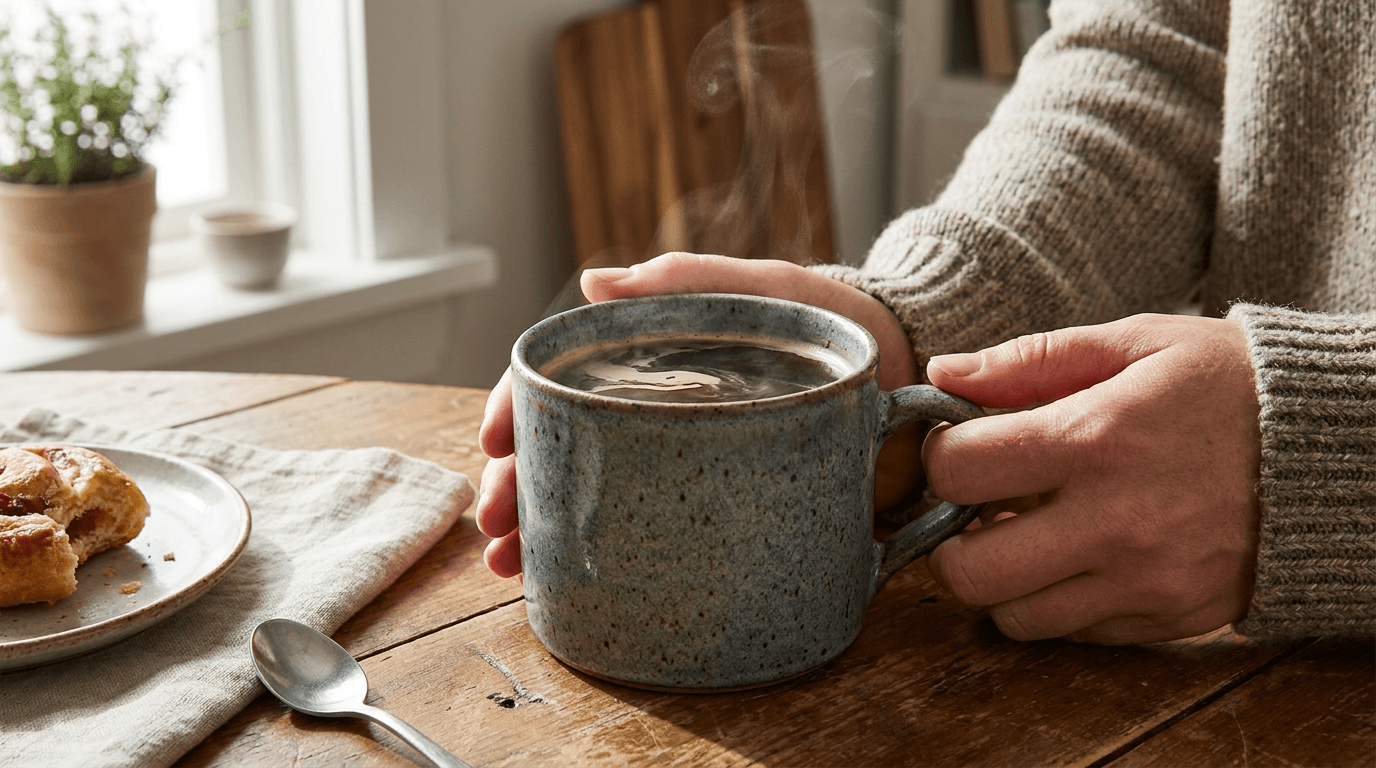
Prompt:
ceramics food and drink styled-use photograph of [a single ceramic piece in active service with food or drink — the functional ware fulfilling its purpose, the handmade object elevated by its contents and its contents elevated by the handmade object: the ceramic piece is in use — not empty and displayed but filled and functioning: a mug holding coffee or tea, the dark liquid visible against the interior glaze, steam rising gently from the surface; or a bowl holding a composed meal — a grain bowl, a soup, a salad, oatmeal, ramen — the food styled with casual-elegant intention, the ingredients visible and appetizing within the bowl's interior; or a plate bearing a plated dish — a slice of toast with toppings, a composed dinner plate, a pastry on a dessert plate — the food presented on the ceramic surface with the natural, unstaged quality of actual eating; or a cup without a handle holding tea in the Japanese tradition — the intimate, two-handed vessel with its warm liquid; or a serving bowl or platter with food arranged for a table — the communal serving piece in its social function, the food or drink is real and appetizing — not a prop but a genuine culinary subject: the coffee dark and steaming, the soup rich with visible ingredients, the composed dish colorful and textured, the food styled with honesty (imperfect, real, edible-looking) rather than with the over-produced perfection that reads as false, the ceramic piece shows its character through use — the glaze interior visible beneath or through the food, the rim showing where lips meet or hands serve from, the exterior form visible from the side, the handle (if present) suggesting the grip — the piece readable as a functional object through the evidence of its function, the surface and setting are domestic and natural — a wooden table, a linen napkin, a cutting board, a simple kitchen surface — the setting communicating morning routine, a quiet meal, a shared table, the domestic rituals where ceramic ware lives, supporting elements add to the scene — a spoon resting in a bowl or beside it, a pair of chopsticks, a honey dipper, a small pitcher, a second piece of the maker's ware (a small dish, a cream pitcher) — the supporting elements adding to the composed-but-natural quality, the overall composition communicates: this ceramic piece was made for this — for holding food, for holding drink, for being part of the daily ritual of nourishment and pleasure, the handmade vessel makes the meal more beautiful and the meal makes the vessel come alive — the styled-use visual as the function-celebrating image that drives purchase by showing the customer exactly how the piece will inhabit their daily life] in a close, product-and-food balanced, styled-use composition, the ceramic piece and its contents share equal visual weight — the vessel and the food (or drink) both visible and both compelling, neither dominating the other, the piece is photographed from an angle that shows both the contents and the exterior form — for a mug: a three-quarter view showing the liquid surface, the interior glaze, and the exterior form; for a bowl: a slightly elevated view showing the food within the bowl's interior while the rim and exterior are visible; for a plate: a moderate angle showing the food on the surface with the rim framing the composition, the surface and supporting elements provide the domestic context — the table, the textile, the utensil, each contributing to the lived-in quality, the depth of field is moderately shallow — the piece and its contents in sharp focus, the surrounding elements and background in soft blur, the close, intimate quality of a still-life, the lighting is warm and natural — the kitchen or dining-room window light that makes both food and ceramics look their most inviting: warm, directional, natural side light — the illumination that makes food look appetizing and ceramic surfaces look their most beautiful simultaneously, the food catches the warm light with culinary appeal — the steam catching the light as a fine, luminous haze above hot food or drink (the steam one of the strongest visual cues for freshness, warmth, and comfort), the food surfaces reflecting and absorbing the warm light with their specific qualities (the glossy surface of soup, the matte surface of bread, the vivid colors of vegetables), the ceramic piece catches the warm light with its glaze-specific surface — the interior glaze visible through or beneath the food, the exterior surface showing its form and glaze character in the warm directional light, the rim catching a fine edge-light highlight, the handle (if present) casting a small shadow that adds to the dimensional quality, the surface catches warm reflected light — the wood or linen or stone visible with its material quality, the shared surface connecting the ceramic piece to its domestic environment, the supporting elements catch the light with their various materials — the metallic glint of a spoon, the woven texture of a napkin, the natural quality of any additional ceramics, ceramic-and-food combined palette — interior glaze tone beneath or through the food — food colors (deep coffee brown, rich soup amber, fresh vegetable greens, golden toast tones) — exterior glaze color — domestic surface warmth (wood, linen) — warm natural side-light quality — and the warm, appetizing, function-celebrating palette of handmade ceramics in styled culinary use as the color palette, the mood is warmly domestic function-celebrating quietly nourishing and the specific styled-use message — this is what the piece is for, the handmade mug makes the morning coffee a ritual, the handmade bowl makes the simple meal an occasion, the function and the beauty are inseparable — the styled-use visual as the purchase-driving, daily-life-imagining image that shows the customer exactly how this piece will live in their home and their hands, professional food and product photography with warm natural side light and moderately shallow depth of field, composed as a close styled-use composition with the ceramic piece and its food or drink contents in balanced visual prominence, the functional beauty and the culinary context and the domestic warmth as the styled-use focal points, ceramic-and-food combined palette in warm natural light, no text overlays, no watermarks
Best for: Instagram highest-conversion content type for functional ceramics, website product listing and shop sections, Etsy listing lifestyle images, Pinterest (highest platform for food-and-ceramics intersection), email marketing product features, food and drink collaboration content, recipe and culinary partnership content, morning-routine and daily-ritual content, gift guide and registry features, restaurant and hospitality use-case documentation
Template 14: The Artist Portrait — Maker Story Composition
This template creates the atmospheric portrait of the maker — the ceramicist in their studio, the human face and presence behind the work, the personal connection that transforms a brand into a person.
Prompt:
atmospheric ceramicist portrait of [the maker in their studio environment — a person presented as the skilled, creative, human being behind the ceramics, the portrait creating the personal connection that transforms a brand into a story: the figure is positioned in the studio — at the wheel, beside the shelves of work, near the kiln, at the glazing station — in the specific working environment that defines their practice, the location communicating "this person works here, this is where the work comes from," the figure's relationship to the environment is one of belonging — the posture relaxed, the positioning natural, the comfort of someone in a space they have shaped to suit their practice over months or years, the figure may be in a moment of work — hands on clay, examining a finished piece, holding a tool, loading a kiln — the engagement with the materials communicating active practice and physical skill; or in a moment of pause — standing in the studio with a finished piece, seated at the wheel in a moment of consideration between throwing sessions, looking at the camera with the expression of someone who is engaged and present — the pause communicating the reflective, thoughtful quality of a creative practice, the attire is studio-appropriate — a clay-stained apron, a simple work shirt or sweater, practical clothing that shows the evidence of working with clay: the splashes, the stains, the dust that accumulate during a day in the studio, the clothing communicating work rather than performance, the expression is natural and engaged — the face of someone who takes their work seriously and finds meaning in it, the eyes communicating intelligence and warmth, the expression neither forced nor distant but present, the studio environment provides the portrait's context — the wheel, the shelves of work, the tools, the kiln, the materials — the visible elements of the practice surrounding the maker and telling the story of what they do, the light from the studio windows falling on the figure and the environment with the same quality that illuminates the throwing and the glazing, personal details may be visible — the specific hands of the maker (showing their individual character, perhaps with traces of clay), the studio arranged with the maker's particular organization, the finished work visible on shelves as evidence of the maker's aesthetic, the overall portrait communicates: this is a real person who makes beautiful things with their hands, they are skilled and thoughtful and dedicated, the personal connection to the maker is the personal connection to the work — the artist portrait as the person-behind-the-brand visual that creates trust, loyalty, and the emotional relationship between customer and maker] in a composed environmental portrait composition, the figure occupies the primary position — prominently placed, the face and expression readable, the body language visible, the figure as the undeniable subject, the studio environment surrounds and supports — the visible practice context behind and beside the figure, the environment telling the story without competing with the human subject, the work may be visible — finished pieces on shelves, work in progress nearby, the ceramic output of the practice present as supporting narrative, the depth of field is portrait-standard — the figure in crisp focus, the environment in moderate to soft atmospheric blur behind, the human subject isolated with editorial portrait language while maintaining the legible studio context, the lighting is the studio's natural illumination — the window light that ceramic studios are built around: soft, directional, flattering natural window light from one side — the light falling on the face with the dimensional, gentle modeling that portrait photography requires, the window light creating the classic studio portrait quality — warm enough to flatter skin, directional enough to model features, soft enough to avoid harshness, the face catches the primary light with portrait quality — the eyes receiving a catchlight from the window, the expression illuminated with dimensional warmth, the skin tones natural and accurate, the studio environment catches the ambient light with its workspace quality — the wheel, the shelves, the tools visible in the atmospheric background illumination, the materials and the evidence of practice readable in the ambient light, any visible ceramic pieces catch the ambient light with their glazed surfaces — the finished work providing color accents and the visual evidence of the practice, warm studio-portrait palette — natural skin tones under window light — studio-work attire in neutral, practical tones — clay and glaze traces on hands and clothing — studio environment earth tones and material surfaces — ceramic work providing glaze-palette accents — natural window-light quality — and the warm, personal, environmentally grounded palette of a maker portrait in studio daylight as the color palette, the mood is personally authentic creatively dedicated warmly present and the specific portrait message — this is the person who makes the work, they are real and skilled and passionate, the human connection is the foundation of the brand, know the maker and you know the work — the portrait as the personal-connection visual that humanizes the practice and creates the trust and the emotional bond that drives loyalty and lifetime collecting, professional editorial portrait photography with natural studio window light and portrait depth of field, composed as an environmental portrait with the maker in their working space, the personal expression and the studio context and the craft-life authenticity as the portrait focal points, warm skin and studio tones in natural window light, no text overlays, no watermarks
Best for: Website about/artist and story sections, press kit and media headshot and editorial imagery, social media maker and team features, email marketing story and personal content, exhibition and gallery artist-statement imagery, wholesale and gallery submissions (artist context), workshop and class instructor imagery, media interviews and editorial features, artist residency and fellowship applications, community and creative-network profile content
Template 15: The Social Media Announcement — Launch and News Visual
This template creates the announcement-ready visual canvas — the atmospheric, text-ready composition designed to carry shop updates, new collection launches, market dates, workshop announcements, and brand news while maintaining the maker's visual identity.
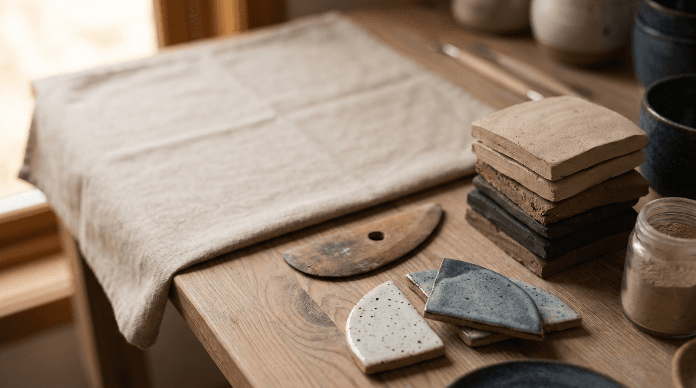
Prompt:
ceramics announcement visual canvas of [an atmospheric, text-ready composition designed as the background for maker announcements — the visual foundation that carries shop-update dates, new collection launches, kiln-opening announcements, market schedules, workshop registrations, and studio news while maintaining the maker's visual atmosphere: the image provides a rich but text-supporting background — atmospherically layered with ceramic studio textures and materials: a background built from the maker's visual world — the warm wood grain of the studio shelf, the raw clay texture of a wedging table surface, the soft, neutral linen that the maker uses for display and packaging, the smooth, glazed surface of ceramic shards or test tiles, the earthy, mineral quality of raw materials — one or more of these textures providing the visual foundation, captured at close range or deliberately softened to create rich-but-text-compatible background fields, the maker's glaze palette is integrated — the specific colors that define the work (the signature white, the characteristic blue, the warm earth tones, the specific glaze range) present through subtly placed ceramic elements: a fragment of a glazed piece, a test tile, a small bowl at the edge of the frame — the glaze colors providing the brand's chromatic signature within the atmospheric field, the composition is deliberately zoned for text — a relatively uniform area (upper portion, center, or a clean field within the frame) where overlaid text will sit with strong legibility, while other areas contain the richer visual texture of the ceramic materials and studio elements, the overall design works across announcement types — flexible enough to support a shop update ("New work available this Friday"), a market announcement ("Find us at [Market Name] — Date"), a workshop offering ("Beginner Wheel-Throwing — Dates — Registration"), a kiln-opening announcement ("Kiln coming out Friday — stay tuned"), or a general studio communication — the atmospheric foundation adapting to any text because its primary function is visual identity maintenance and brand-atmosphere support, the overall composition communicates: this is an official communication from this ceramics studio, the visual quality signals that the news matters, the atmospheric consistency maintains the maker's identity — the announcement canvas as the brand-consistent visual foundation for every piece of studio news] in a text-ready, atmospherically-zoned announcement composition, the composition is structured for text overlay — clear text zones and atmospheric visual zones, the ceramic textures and materials provide visual interest without text interference — the studio materials and glaze-palette elements creating mood in the supportive zones, the brand elements provide subtle identification — the maker's glaze colors and material vocabulary recognizable within the atmospheric field, the depth of field is atmospheric — everything in moderate-to-soft focus preventing any background element from competing with overlaid text, the lighting is warm and brand-consistent — the same natural, studio-window quality that characterizes the maker's other visual content: warm, even, atmospheric illumination across the composition — the text zones receiving predictable, even light for text legibility, the atmospheric zones receiving warmer, more textured light for visual interest, the ceramic materials and studio textures catch the soft light with their specific qualities — the glaze surfaces, the wood, the linen, the clay all responding with their characteristic material qualities in soft, atmospheric focus, warm studio-brand palette — maker's signature glaze colors as the chromatic identity — warm earthy studio material tones (wood, clay, linen) — natural window-light quality — text-zone areas in manageable, consistent tonality (dark enough for light text or light enough for dark text, consistent with the maker's design language) — and the atmospheric, text-supporting, brand-consistent palette of a ceramics announcement canvas as the color palette, the mood is quietly atmospheric brand-consistent announcement-ready and the specific announcement message — this is important news from a maker you follow and care about, the visual quality maintains the brand even in informational content — the announcement canvas as the text-ready, brand-consistent visual foundation that maintains the maker's visual identity across every social media announcement, email header, and digital communication, professional atmospheric photography with warm even brand-consistent lighting and soft atmospheric depth of field in a text-zone-structured composition, designed for multi-purpose text overlay with brand-consistent atmosphere, the text readability and the brand atmosphere and the multi-purpose flexibility as the announcement focal points, warm maker palette in atmospheric focus, no text overlays in this base image (text to be added for specific announcements), no watermarks
Best for: Social media shop-update and drop announcements, market and event date announcements, workshop and class registration posts, kiln-opening and new-work teasers, milestone and celebration posts, seasonal and holiday announcements, email marketing headers, website homepage banner updates, digital display and studio signage, cross-platform news and update communications
How to Customize These Prompts for Your Specific Ceramics Practice
The templates produce compelling ceramics content, but the most effective imagery reflects your actual work — your specific clay bodies, your real glaze palette, your genuine studio environment, your forming techniques, your firing methods, and the particular aesthetic vision that makes your work yours.
Replace generic ceramic descriptions with your actual work. If you throw porcelain, not stoneware, the visual should reflect porcelain's specific qualities — its whiteness, its potential translucency, its refined, smooth surface, its fine foot details. If your forms are altered rather than round, describe the specific alterations. If your handles are pulled rather than extruded, that distinction affects the visual character. Name your actual glazes (even if only by their appearance: "a satin matte white with a faint blue blush at the thinnest points"), your actual clay body, and your actual forms.
Define your glaze palette with precision. Your glaze palette is your primary visual signature — the colors and surfaces that identify your work across a room or a screen. Describe your glazes with the specificity they deserve: not just "blue" but "a satin-finish blue that pools to deep navy in recesses and breaks to soft lavender over edges, with a subtle crystalline shimmer where the glaze is thickest." The AI generation will respond to this specificity with more accurate and more compelling results.
Specify your studio's actual material environment. Every ceramic studio has a specific character — the combination of wood, clay, tools, light, and accumulated evidence of practice that makes the space unique. If your studio has whitewashed brick walls and a north-facing skylight rather than exposed wood and side windows, describe that specific environment. If your kiln is a soda kiln built from soft brick and fired outdoors, that is a very different visual than an electric kiln in a basement studio. The specificity of your real environment makes the generated content more authentic and more useful as visual direction for photographing your actual space.
Match the visual treatment to your aesthetic philosophy. If your work is influenced by Japanese wabi-sabi and the beauty of imperfection, your visual treatment should reflect that — soft, natural, understated, finding beauty in the irregular. If your work is clean, modern, and design-forward, the visual treatment should reflect that precision. If your work is rustic, earthy, and connected to traditional craft, the visual treatment should honor that groundedness. The photographic style is an extension of the aesthetic philosophy.
For portraits of yourself or your team, photograph yourselves and enhance. Use the AI-generated portrait imagery as reference for lighting, composition, and atmospheric quality, then photograph yourself in your real studio with those references guiding the shoot. The Image Inpainting tool can enhance the atmospheric quality of real photographs while preserving the authentic faces and spaces that customers connect with. Authenticity is essential — your customers want to see you, in your real studio, with your real hands and your real work.
Platform-Specific Deployment for Ceramicists
Each platform where ceramics are discovered, evaluated, and purchased has specific requirements and audience expectations.
Instagram is the primary platform for contemporary ceramics. The ceramics community on Instagram is exceptionally active, visually sophisticated, and commercially important. The grid should maintain approximately 30% product content (Templates 1, 4, 5), 25% process content (Templates 3, 6, 8), 20% lifestyle and styled-use content (Templates 7, 13), 15% studio and maker content (Templates 2, 12, 14), and 10% announcements and community content (Templates 9, 11, 15). Use 4:5 for feed posts, 9:16 for Stories and Reels, and 1:1 for maximum compatibility. For Instagram-specific strategies, additional guidance covers platform optimization. Process content — particularly wheel-throwing video and kiln-opening content — generates the highest engagement in the ceramics community.
Etsy requires specific, multi-image listing optimization. Each Etsy listing should include five to ten photographs covering: the hero product shot (Template 1 as the primary listing image), detail and glaze close-up (Template 4), scale reference (the piece next to a common object or in use), styled-use or lifestyle image (Template 7 or 13), alternate angles showing the handle, the foot, the interior, and any notable details, and (optionally) a process or studio image (Template 3 or 2) to communicate handmade authenticity. The primary listing image is the most critical — it must stop the scroll in search results and earn the click.
Pinterest drives significant traffic for home goods and handmade ceramics. Pinterest users are actively searching for home decor, tableware, and handmade goods. Templates 7 (table setting), 13 (food and drink styled-use), 5 (collection display), and 1 (hero product) perform best on Pinterest. Use 2:3 vertical format for maximum Pinterest visibility. Rich pins with pricing and availability drive direct purchase from Pinterest.
The maker's website is the visual identity hub. The website should deploy Templates 1 and 5 (product for the shop), 2 and 12 (studio and exterior for the about and visit sections), 3 and 6 (process for the story and craft sections), 14 (portrait for the about section), 7 (table setting for the homepage lifestyle imagery), and 11 (market booth for the events section). The website's visual quality should match or exceed the Instagram quality, as wholesale buyers, press, and galleries will visit the website as their primary evaluation.
Email marketing builds the direct relationship. Monthly or biweekly newsletters should feature Template 15 for announcement headers, Template 1 or 5 for product features, Template 3 or 6 for process stories, and Template 11 for upcoming market announcements. The visual consistency of email marketing reinforces brand recognition and builds the direct customer relationship that is essential for ceramics sales.
Google Business Profile matters for studios open to visitors. Studios that welcome visitors, offer classes, or sell from the studio should optimize their Google Business Profile with Template 12 (exterior for wayfinding), Template 2 (studio interior for experience preview), and Template 1 (product for the work preview). The Google listing is often the first visual encounter for local customers.
Common Mistakes in Ceramics Visual Identity
Ceramics visual identity fails in specific, identifiable ways that directly impact sales, gallery opportunities, social media growth, and brand perception.
Flat, front-lit photography that fails to communicate surface texture. The single most damaging technical mistake in ceramics photography is flat, frontal lighting that eliminates surface texture. Ceramic surfaces — particularly matte glazes, textured glazes, and unglazed clay — communicate their character through texture, and texture is only visible when light crosses the surface at an angle. Side lighting, raking light, and directional light are essential for ceramics photography. Front-flash or flat overhead light makes even the most beautiful glaze look like a painted surface and erases the dimensional, tactile quality that defines the work.
Cluttered, inconsistent backgrounds that undermine the work. A ceramic piece photographed on a messy desk, against a distracting patterned background, or in front of a cluttered shelf competes with its own environment for visual attention. The background should be simple, natural, and non-competing — the clean backdrops and natural surfaces specified in these templates — allowing the piece itself to command all visual attention.
Scale ambiguity in product photography. Without a scale reference, a photograph of a mug and a photograph of a large vase can look identical in proportions. Customers need to understand the physical size of the piece before purchasing, especially online. Including at least one image per listing that communicates scale — through a hand holding the piece, the piece on a table with common objects nearby, or the piece in a styled-use context that implies size — prevents the returns and the disappointment that come from scale miscommunication.
Color inaccuracy from poor white balance. Glaze color is the primary visual signature of most ceramic work, and inaccurate color reproduction in photographs — from incorrect white balance, from mixed lighting sources, from heavily filtered images — misrepresents the work and creates customer disappointment when the received piece does not match the photograph. Natural daylight or daylight-balanced lighting produces the most accurate color representation. If in doubt, include a note about potential screen-to-reality color variation.
Neglecting the foot and the bottom of the piece. The foot of a ceramic piece — the trimmed base where the piece meets the surface — is one of the most telling quality indicators and one of the details that educated buyers and collectors specifically look for. Neglecting to show the foot in product photography misses an opportunity to communicate craftsmanship. Include at least one angle that reveals the foot, the bare clay at the base, and the trimming detail.
Over-editing that removes the evidence of the handmade. Aggressive retouching, heavy filtering, or overly processed images can smooth out the very qualities that make handmade ceramics valuable — the slight asymmetry, the glaze variation, the throwing marks, the individual character. The visual content should celebrate these handmade qualities, not minimize them. Light editing for color accuracy and atmospheric quality is appropriate; editing that makes the work look machine-made is counterproductive.
Inconsistent visual identity across platforms. A maker with a beautiful, cohesive Instagram grid but an amateur-quality Etsy listing and a dated website creates confusion about the brand's quality standard. The visual identity — the lighting quality, the surface choices, the background treatment, the overall atmospheric character — should be consistent across every platform where the work appears.
Building a Complete Ceramics Visual Identity System
A successful ceramics visual identity is a cohesive system that supports every aspect of the practice — from product sales through gallery submissions through workshop marketing through community building.
Establish your visual foundation before building content. Define the core visual elements: your glaze palette (document every glaze with accurate photographs as color references), your background and surface vocabulary (the specific woods, linens, stones, and neutrals that define your photographic world), your lighting approach (the specific quality and direction of light that best serves your work), your compositional style (close and intimate or wider and contextual), and your overall atmospheric character (warm and domestic or clean and gallery-like or rustic and earthy). Document these decisions and apply them consistently across every piece of content.
Build a content calendar aligned with your production cycle. Map visual content needs across the year: shop updates and new-work drops (Templates 1, 5, 15), market and fair season preparation and documentation (Templates 11, 15), workshop offerings (Templates 2, 3, 14), kiln openings (Template 6 — among the highest-engagement content in ceramics), seasonal and holiday content (Templates 7, 13, 15), process documentation throughout the year (Templates 3, 4, 6, 8), and the evergreen studio and lifestyle content (Templates 2, 7, 12, 14) that can be deployed between time-specific posts.
Create multi-format versions of every key visual. Every important image should exist in 1:1 (Instagram, Etsy), 4:5 (Instagram feed maximum height), 9:16 (Stories, Reels, TikTok), 16:9 (website banners, YouTube), 2:3 (Pinterest), and print-ready format (300 DPI for postcards, sell sheets, catalogues, and exhibition materials).
Develop video content from your visual identity foundation. Video content is increasingly important for ceramics — the satisfying visual of clay rising on the wheel, the dramatic reveal of a kiln opening, the meditative quality of glazing or trimming — these are among the most engaging video subjects in the handmade space. The Cinematic Video Generator creates atmospheric video from the established visual identity. The Text2Shorts tool produces short-form content for social platforms. The AI Clipping tool extracts compelling moments from longer studio video. The AI Music Generator creates meditative or atmospheric audio for studio video content where the ambient sounds of the studio are not sufficient. The visual consistency between still and video content reinforces the brand identity across formats.
Invest in the photogenicity of your studio and your displays. A few deliberate choices — a dedicated photography surface (a large wooden board, a linen-draped platform, a clean section of the studio with good natural light), a consistent background area, clean shelving for works in progress, and good natural light — transform the quality of both your planned photography and the spontaneous content you capture during daily studio work.
How Miraflow AI Supports Your Ceramics Visual Identity Workflow
Every prompt in this post can be generated inside Miraflow AI. Open the AI Image Generator, paste your customized prompt with your specific clay bodies, glaze palette, studio environment, forming techniques, and brand personality, select the appropriate aspect ratio, and generate. Multiple aspect ratios including 1:1, 4:5, 16:9, 9:16, and 5:4 are available, covering every deployment from Instagram posts to Etsy listings to website banners to Pinterest pins to print materials.

For the most effective ceramics visual identity workflow, these AI-generated images serve as visual direction, mood boards, and quality benchmarks for your complete visual content system. They establish the lighting approach, the compositional style, the color treatment, and the atmospheric quality that your real photography should achieve. When you photograph your actual ceramics, your real studio, and your genuine process, use these generated references as the shared visual standard that guides every shoot.
For your real product photography and existing visual content that needs targeted enhancement — improving the lighting quality of a product shot, adjusting the color balance for accurate glaze representation, extending a composition's background for a wider format, removing an unwanted element from an otherwise strong photograph, or enhancing the atmospheric quality of a studio interior shot — the Image Inpainting tool allows precise editing of specific image regions while preserving the authentic photographic content. This tool is particularly valuable for ceramicists because authenticity is the core value proposition — customers must see your real glazes, your real forms, and your real studio, but those real elements should be presented at the highest possible visual quality.
The recommended workflow operates in three phases. The conceptual phase uses these AI prompts to generate visual direction for every content type — establishing the lighting, the composition, and the atmospheric standard before any production photography begins. The production phase creates your actual brand content — photographing your real ceramics, your real studio, your real process, and your real kiln openings — informed by the generated visual direction. The enhancement phase uses inpainting to bring your production materials to the highest standard — adjusting atmosphere, correcting color, and optimizing visual impact while maintaining the authenticity that handmade ceramics demands.
For ceramicists building a complete visual ecosystem including motion and audio content, Miraflow's suite extends the capability. The Cinematic Video Generator creates atmospheric video content — wheel-throwing loops, studio atmosphere sequences, and kiln-opening reveals. The Text2Shorts tool produces promotional short-form video. The AI Music Generator creates ambient audio for studio video content. The AI Clipping tool extracts key moments from longer content into platform-optimized clips. The YouTube Thumbnail Maker creates thumbnails for any ceramics video content. Together, these tools allow a ceramic artist to produce a complete visual and motion identity system that maintains atmospheric and aesthetic consistency across every platform and format.
FAQ
Can AI-generated ceramics images replace photographs of my actual work for product listings?
No — and this point is especially important for ceramics. Each handmade piece is unique, and customers purchasing handmade ceramics expect to receive the specific piece shown in the listing photograph (or a piece nearly identical to it for production ware). AI-generated images should serve as visual direction, mood content, and atmospheric reference, not as product-listing photographs that represent specific pieces for sale. Use AI imagery to establish your visual style and quality standard, then photograph your actual work at that standard. The Image Inpainting tool can enhance your real product photographs to match the atmospheric quality of the generated references while preserving the authentic representation of your actual work.
How important is showing the bottom of pots in product photography?
Very important for educated buyers, collectors, and wholesale accounts. The foot — the trimmed base where the piece meets the surface — communicates the maker's skill, the clay body, the firing method, and the overall quality standard. Showing the foot is a mark of confidence and transparency. Include at least one angle per product listing that reveals the foot, and for your portfolio or wholesale materials, the foot detail should be a standard inclusion.
What background colors and surfaces work best for ceramics?
Natural, neutral surfaces that resonate with the earthy, material quality of clay: raw or light-toned wood, natural linen or cotton textiles, light-colored stone, and clean neutral backdrops in soft grey, warm white, or pale earth tones. The surface should provide contrast with the work (a dark piece on a light surface, a light piece on a medium-toned surface) without competing visually. Avoid highly textured, brightly colored, or patterned backgrounds that distract from the ceramic surface. The rule is: the background supports; the piece commands.
How do I photograph highly reflective glossy glazes versus matte surfaces?
Glossy and matte surfaces require different lighting approaches. Glossy surfaces need broader, more diffused light sources to control reflections — large softboxes, scrim-diffused window light, or overcast natural light produce gentle, graduated highlights that show the glossy quality without harsh, distracting reflections. Matte surfaces benefit from more directional, raking light that creates the shadows and tonal transitions needed to show the surface texture that matte glazes hide under flat light. Many potters work with both surface types, so developing the ability to adjust lighting for each is essential. These prompts specify the lighting approach for each surface type — use the generated images as reference for the light quality each surface needs.
How can I communicate the scale and weight of my work in photographs?
Scale is communicated through context. The most effective methods are: a hand holding or touching the piece (communicating both scale and the tactile quality), the piece in a styled-use setting with known objects (a mug next to a book, a bowl on a plate, a vase on a table), and the piece in an environmental context where spatial references provide size information (on a shelf with other objects, on a table with place settings). Template 13 (food and drink styled-use) is particularly effective for communicating scale because the food provides the immediate size reference. Weight is communicated through the visual cues of wall thickness (visible at the rim and foot), the density implied by the clay body (stoneware looks heavier than porcelain), and the substantial shadow that heavier pieces cast on the surface beneath them.
How do I build a visual identity that is consistent across my whole range?
Consistency comes from the fixed elements: your lighting approach (always the same direction, quality, and temperature), your surface and background choices (always from the same material vocabulary), your compositional style (always the same distance, angle, and framing approach), and your post-processing treatment (always the same color grading and atmospheric quality). These fixed elements create the visual signature that remains constant while the variable elements — the specific piece, the specific glaze, the specific form — change with each photograph. Establishing and documenting your fixed visual elements (even informally, as reference photographs pinned to a board) ensures that every image you create belongs to the same visual family.
Conclusion
The mug is on the screen. The scroll is in motion. In the fraction of a second that the viewer's thumb allocates to this frame before continuing its downward trajectory, the image must accomplish something extraordinary: it must make the viewer feel the weight of the clay, the temperature of the surface, the texture of the glaze, the curve of the form — all through light and color and composition alone. It must translate the most tactile of all consumer objects into a purely visual experience that is compelling enough to stop the scroll, earn the click, and begin the journey from seeing to wanting to holding.
This is not an argument that visual identity matters more than the work itself. The work is everything. A ceramicist with stunning photographs and mediocre pots will fail because the promise the visual makes will be broken by the first touch. But a ceramicist with exceptional work and poor visual content will struggle because the work never gets the chance to be held — the customer never stops scrolling, never clicks the listing, never visits the studio, never finds the booth at the market. The visual identity is not more important than the work. It is the mechanism through which the work gets its chance.
The 15 templates in this post address the complete visual identity system a ceramics practice needs: the hero product shot that makes the piece look its most beautiful, the studio atmosphere that invites the customer into the making space, the wheel-throwing action that captures the mesmerizing drama of the forming process, the glaze macro that reveals the surface complexity invisible at arm's length, the collection display that showcases range and coherence, the kiln visual that documents the transformative fire, the table setting that places the work in its domestic life, the raw material spotlight that tells the elemental story, the collaboration that celebrates community, the packaging that communicates care in transit, the market booth that captures the energy of direct commerce, the studio exterior that establishes sense of place, the food-and-drink companion that shows the work in service, the maker portrait that humanizes the practice, and the announcement canvas that delivers news within the visual identity.
Copy the templates relevant to your practice. Customize them with your specific clay bodies, your actual glaze palette, your real studio environment, your genuine forming techniques, your authentic firing methods, and the particular aesthetic vision that makes your work unlike any other. Generate them inside Miraflow AI to establish your visual direction, and use them as the shared reference when photographing your real ceramics, your real studio, and your real process. Enhance your production photography with the Image Inpainting tool to achieve the atmospheric quality and technical standard that the generated references establish.
The customer scrolling through Etsy scans hundreds of listings. The gallery director reviewing submissions flips through dozens of portfolios. The Instagram user scrolls past thousands of images. The boutique buyer evaluates a grid of potential makers. In each of these moments, your visual identity either stops the scan, earns the attention, and gets the chance to let the work speak — or it does not. The glaze may be extraordinary. The form may be perfect. The studio may be the warmest, most creative space in the county. But none of that matters if the visual identity fails to create the first impression that brings the eye to the work, the click to the listing, the hand to the piece.
The work deserves a visual identity as beautiful as the glaze. These prompts help you build it.