AI Prompts for Presentation Slides: 20 Professional Visuals for Pitch Decks
Written by
Jay Kim
20 ready-to-copy AI prompts for professional pitch deck slide visuals — from cover gradients and traction charts to market landscapes, team compositions, and closing slides. Designed for startup founders, presenters, and business leaders.
A pitch deck is not a document. It is a filtering machine — a compressed information artifact that must survive the most hostile attention environment in professional communication. Raising money in 2026 is brutal. Investors are busier, pickier, and more distracted than ever. They're opening more decks, scanning faster, and bouncing at record rates.[5] Investors spend an average of 3 minutes 44 seconds reading a deck (DocSend data).[2] Research reveals that investors dedicate just 10 seconds to each slide on average.[1] In that compressed window, the visual design of every slide determines whether an investor leans forward or closes the tab.
The stakes have never been higher. February 2026 shattered every record in venture history: $189 billion raised in a single month, with AI-related startups capturing 90% of that capital. Three companies — OpenAI, Anthropic, and Waymo — took home $156 billion between them.[3] That leaves early-stage founders competing for attention in a market where everyone wants a piece, but only a few get it.[5] Only 1% of pitch decks clinch the funds. While investors glance at about 10% of decks, a mere fraction, less than 1%, get the green light.[8]
The presentation software market reflects the scale of this demand. The presentation software market size has grown rapidly in recent years. It will grow from $8.23 billion in 2025 to $9.65 billion in 2026 at a compound annual growth rate (CAGR) of 17.2%.[1] Nearly 72% of enterprises use presentation software for internal communication, training, and strategic reporting. Approximately 65% of marketing teams depend on advanced presentation tools for visual storytelling and product demonstrations.[10]
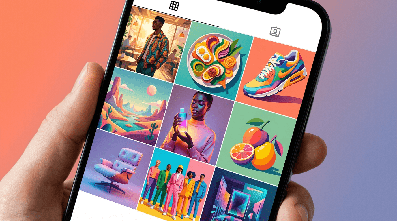
This post gives you 20 ready-to-copy AI prompt templates for generating professional visual assets for pitch deck slides — from abstract backgrounds and data visualization scenes to team composition layouts, product mockups, and market opportunity visuals. Each prompt is engineered for the Miraflow AI Image Generator and designed to produce a slide-ready visual that communicates the message of each critical pitch deck section without text, without watermarks, and without requiring a graphic designer. If you have used similar prompt workflows for blog featured images, Instagram post images, or email newsletter headers, the approach will feel familiar — but pitch deck visuals carry unique demands for professionalism, clarity, and investor psychology that require carefully calibrated prompts.
Why Visual Design Determines Pitch Deck Success
The visual design of a pitch deck is not decoration layered on top of content. It is the delivery mechanism that determines whether investors absorb your logic or abandon your deck. In 2024–2025, design has become a cognitive delivery system — the mechanism that determines whether the investor absorbs your logic or abandons the deck. In a world where the average investor spends ~2 minutes 24 seconds reviewing a deck, the design doesn't just support your message — it carries it.[3]
The research is unambiguous about the relationship between visual quality and funding outcomes. Powerful narrative framing makes a measurable difference. Pitch decks with a compelling narrative receive 27% more follow-up inquiries from investors. Investing in strong storytelling increases your chances for next-level engagement.[10] In 93% of cases reviewed, design flaws hindered founders. Ineffective visuals undermine storytelling and impact investor reception.[1]
Investors process pitch decks fundamentally differently from other documents. Complex slides increase cognitive load → investors feel friction → friction becomes negative signal → deck gets closed. Investors assume: "How you build a deck = how you build a product = how you run your company."[3] Investors scan before they analyze. They look for structure, signal, and coherence, long before they study the numbers in detail.[5] Every visual element on every slide either reduces cognitive friction and builds trust, or introduces noise and destroys credibility.
The financial investment in professional pitch deck design reflects this reality. The short answer is: Pitch deck cost ranges from $0 (DIY) to $50,000+ (premium agencies), but most founders spend $2,000–$5,000 for professional service.[1] For a Seed round, expect to pay $3,000–$8,000 for a vision-focused deck. Later-stage startups (Series A+) typically invest $10,000–$20,000+.[2] AI-generated visual assets provide a way to achieve professional-quality slide visuals at a fraction of this cost — particularly for early-stage founders prototyping their visual direction, iterating on slide concepts, and building decks before committing to agency-level investment.
2026 Presentation Design Trends That Shape Pitch Deck Visuals
Understanding the dominant presentation design trends ensures your AI-generated slide visuals feel current, professional, and aligned with what investors expect. These trends directly inform the visual language of every prompt template in this post.
Warm tones and softer shapes replace sterile white slides. Clean layouts remain popular in 2026, but the style has evolved. Warmer tones, softer shapes, and intentional accent colors have replaced the plain white slides of previous years.[6] Warm neutrals, earthy greens, and deep purples ground the story, while Transformative Teal highlights what matters.[1] AI prompts that specify warm color palettes and organic shapes will generate visuals that feel aligned with current design expectations.
Tactile depth replaces flat design. The "Flat Design" era has evolved into Post-Minimalism. In 2026, we are seeing the rise of "Glassmorphism 2.0" and "Digital Tactility." This aesthetic uses depth, soft shadows, micro-interactions, and 3D textures to make digital slides feel tangible and high-fidelity.[5] Prompts that specify subtle depth, soft shadows, and layered compositions will produce visuals that feel contemporary rather than dated.
Human-centric and authentic visuals build trust. In a digital-forward world, incorporating human-centric design gives audiences a sense of authenticity through utilizing "imperfect" styles. Think hand-drawn graphics and typography, organic shapes, earthy colors, and tactile imagery that present a warm and emotional tone. If you're creating a presentation that needs a strong narrative and to instill a sense of trust, incorporating these elements will resonate with audiences.[4]
Data storytelling replaces raw data display. The era of "Raw Data" on slides is over. In a world saturated with information, 2026 users no longer want to see a bar chart and be told to interpret it; they demand Contextual Data Storytelling. The trend has moved from "Data Visualization" (showing the numbers) to "Narrative Scaffolding" (explaining the meaning).[5]
Bold typography dominates. In 2026, your slide title isn't just a label; it is the main image. We are seeing a 300% spike in downloads for decks that use massive, bold, sans-serif fonts that take up 50% of the screen.[8] This means slide background visuals must support, not compete with, large headline typography.
Slides must work across all viewing contexts. Slides now need to work across three contexts: live in a room, in emails and shared links, and on-the-go on a mobile screen.[6] On average, 32% of decks are opened on a mobile device.[5] Every visual asset must read clearly at both projected and mobile screen sizes.
How AI-Generated Visuals Serve Pitch Deck Creators
AI-generated slide visuals serve multiple practical purposes across the pitch deck creation workflow, each with distinct creative and financial advantages.
Custom background images for every slide. Instead of using the same template background across all slides, founders can generate unique, thematically appropriate backgrounds for each section of the deck — a different visual energy for the problem slide versus the traction slide versus the team slide. This creates visual variety while maintaining a consistent brand aesthetic.
Conceptual illustrations that replace stock photography. In 2026, VCs pattern-recognize AI-generated decks instantly — use these tools for layout speed, not content.[4] However, unique AI-generated conceptual visuals avoid the generic feel of stock photography while creating custom imagery that precisely matches the founder's narrative. The key is using AI visuals for atmosphere and concept, not for fake product screenshots or team photos.
Rapid visual prototyping across style directions. Before committing to a visual direction for the deck, founders can generate slide visuals in multiple styles — dark mode tech aesthetic, warm editorial, bold maximalist, minimal corporate — to test which approach best serves their story. This pre-visualization step transforms an abstract design decision into a concrete visual comparison.
Marketing materials beyond the deck. Pitch deck creators also need visual assets for social media announcements, blog posts about their company, email outreach headers, and investor update reports. AI-generated visuals in a consistent style can power the entire visual communication ecosystem around a fundraise.
Cost savings for early-stage founders. AI design tools are compressing commodity pricing. What cost $2,000 from a junior freelancer in 2024 now costs $500–$1,000 from an AI tool in 2026.[1] For pre-seed founders testing investor appetite, AI-generated slide visuals can bridge the gap between a DIY deck and a professional-quality presentation without requiring agency-level investment.
20 AI Prompt Templates for Pitch Deck Slide Visuals
Each template includes the slide type it serves, the visual concept, the ready-to-copy prompt, and customization notes. All prompts are optimized for the Miraflow AI Image Generator. Generate at landscape (16:9) for standard slides, or square (1:1) for social media repurposing. Each prompt creates a visual asset designed to serve as a slide background, hero image, or section visual — never as the entire slide itself. You will overlay your text, data, and branding on top of these generated visuals.
Template 1: Cover Slide — Abstract Light Gradient
The cover slide is the most critical visual in your entire deck. Across all pitch decks analyzed, 82% of investors who reach slide 4 finish the entire presentation. That means the real battle is in those first three slides.[5] This abstract light gradient creates a premium, modern first impression.

Prompt:
professional presentation slide background with a sophisticated abstract light gradient, smooth flowing curves of warm light transitioning from deep navy blue on the left through rich teal in the center to a warm amber glow on the right, the gradient has subtle depth with soft luminous particles floating through the composition like distant stars, the light curves create a sense of forward motion and momentum sweeping from left to right, the overall composition is clean and uncluttered with ample dark space on the left side for text placement, the gradient transitions are buttery smooth with no harsh color breaks, subtle grain texture adds tactile quality preventing a sterile digital look, the color palette feels premium and contemporary suitable for a technology or innovation brand, professional pitch deck visual style with cinematic lighting quality, 16:9 aspect ratio, no text no watermarks no logos
Best for: Cover slide, title slide, section dividers, opening slides for SaaS, fintech, AI, and deep tech pitch decks
Template 2: Problem Slide — Visual Tension and Urgency
The problem slide must make the pain feel real and urgent. This visual creates a sense of friction and unresolved tension that primes the investor to want the solution.
Prompt:
abstract conceptual image representing a complex business problem, a dense tangled network of thin glowing lines in cool blue and gray creating a sense of complexity and friction against a dark charcoal background, the tangled network is concentrated in the center of the composition creating visual tension, small red-orange accent points appear at key intersection nodes suggesting pain points and friction within the system, the outer edges of the composition fade into clean dark space providing room for text overlay, the overall feeling is of complexity that needs to be untangled and a system that is not working efficiently, the lines have subtle depth with some appearing closer and brighter and others fading into the background creating dimensional layering, the composition suggests data flow or process workflow that has become overly complicated, professional abstract visualization style with subtle glow effects, dark moody color palette with strategic warm accents, 16:9 aspect ratio, no text no watermarks no logos
Best for: Problem statement slides, market friction visualization, complexity and inefficiency narratives, pain point slides for B2B SaaS and enterprise pitch decks
Template 3: Solution Slide — Clarity Emerging from Complexity
This visual serves as the counterpoint to the problem slide — showing order emerging from chaos, simplicity from complexity, clarity from confusion. The visual metaphor reinforces the narrative arc from problem to solution.

Prompt:
abstract conceptual image representing a clear elegant solution, a single bright luminous pathway of warm golden-white light cuts cleanly through a softly blurred background of cool blue-gray abstract shapes, the pathway flows from the lower left to the upper right suggesting forward progress and upward trajectory, the golden path is smooth and wide with soft glowing edges that illuminate the surrounding space, small geometric nodes along the path pulse with gentle light suggesting key milestones or features, the background elements that were tangled and chaotic are now organized and faded suggesting problems resolved, the composition has generous clean space on the right side for text placement, the overall feeling is of elegant simplicity and clear direction after confusion, the lighting is warm and optimistic with the golden pathway serving as the dominant visual element, professional pitch deck visual with a sense of breakthrough and resolution, 16:9 aspect ratio, no text no watermarks no logos
Best for: Solution slides, product value proposition slides, "how it works" overview slides, transformation narrative slides
Template 4: Market Size Slide — Expansive Opportunity Landscape
The market size slide needs to convey scale, opportunity, and breadth. This visual creates a sense of vast, expansive territory waiting to be captured.
Prompt:
aerial abstract visualization suggesting a vast expansive market opportunity, a bird's eye view of an abstract landscape composed of thousands of tiny glowing points of light in warm amber and cool teal arranged in clusters and patterns across a dark background, the clusters vary in size suggesting different market segments with one dominant central cluster glowing brighter than the rest, connecting lines between clusters suggest market relationships and adjacencies, the composition stretches edge to edge creating a feeling of enormous scale and breadth, a subtle grid pattern underlies the landscape suggesting measurability and data-driven analysis, the outer edges of the composition fade into darkness with the brightest concentration in the center-right area, the overall feeling is of a massive addressable landscape with clear structure and segmentation, professional data visualization aesthetic with abstract geographic quality, 16:9 aspect ratio, no text no watermarks no logos
Best for: TAM/SAM/SOM slides, market opportunity slides, addressable market visualization, industry landscape overview
Template 5: Product Slide — Clean Tech Interface Glow
Product slides need to feel innovative, clean, and technically credible. This abstract tech glow creates a professional backdrop for product screenshots or demo visuals overlaid on top.

Prompt:
clean modern technology presentation background with a subtle abstract interface aesthetic, a dark slate background with faint geometric grid lines in very low opacity creating a sense of technical precision, in the center a soft rectangular glow in cool blue-white suggests a screen or interface window with gentle light emanating from its edges, subtle floating UI-like elements in very low opacity drift at the periphery including thin lines small circles and minimal geometric shapes, the composition is deliberately minimal and clean with extensive negative space especially on the left side for text and on the center for a product screenshot overlay, the color palette is limited to dark slate cool blue and clean white with no warm colors, the overall feeling is of a premium technology product environment that is sophisticated and trustworthy, the lighting is cool and precise with the central glow serving as the primary focal point, professional SaaS product presentation visual, 16:9 aspect ratio, no text no watermarks no logos
Best for: Product demo slides, feature showcase slides, UI/UX preview slides, technology platform overview slides
Template 6: Traction Slide — Upward Growth Trajectory
The traction slide is often the make-or-break moment. At $1M+ ARR, the right move in 2026 is to lead with traction. The first 4 slides get 60% of attention; if your ARR chart is buried on slide 7, you've lost the skim test.[1] This visual backdrop reinforces growth momentum beneath your actual data charts.
Prompt:
abstract visualization of powerful upward growth trajectory, a dynamic composition showing multiple translucent curved lines rising steeply from lower left to upper right in varying shades of green from deep forest through emerald to bright lime, the lines move together but at slightly different rates creating a sense of accelerating compounding growth, subtle particle effects trail behind the rising lines suggesting momentum and energy, the background is a clean dark charcoal that makes the green growth lines pop with maximum contrast, the lower portion of the composition is darker and more compressed while the upper right area opens up with light and space suggesting future potential, small glowing data-point dots appear along the growth curves at key intervals, the overall feeling is of unstoppable forward momentum and compounding success, professional financial visualization aesthetic with abstract quality, 16:9 aspect ratio, no text no watermarks no logos
Best for: Traction slides, revenue growth visualization, user growth backgrounds, KPI performance slides, month-over-month metrics
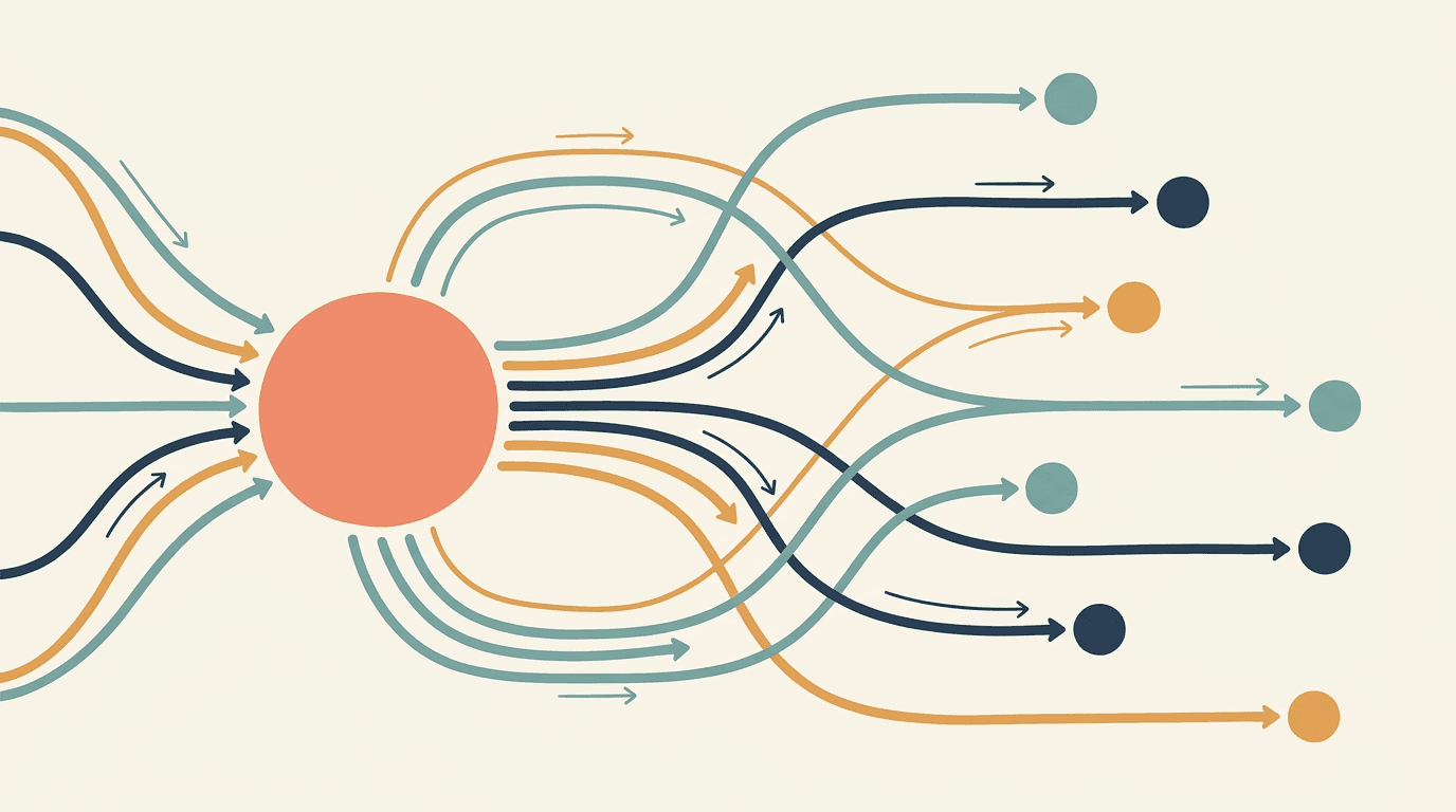
Template 7: Business Model Slide — Value Flow Network
The business model slide needs to convey how money moves through the system. This visual suggests flows, connections, and value exchange.
Prompt:
abstract business model visualization showing value flows and connections, a clean composition on a warm off-white cream background featuring a central hub of soft warm coral with multiple flowing connections extending outward to smaller nodes in teal navy and amber, the connections are smooth curved lines of varying thickness suggesting different revenue streams and value flows, arrows or directional indicators along the flow lines suggest the direction of value exchange, the central hub is larger and more prominent positioned slightly left of center with the flow network expanding rightward, the nodes at the endpoints of each flow line are clean circles in distinct colors each representing a different stakeholder or revenue channel, the overall composition is organized and readable with clear visual hierarchy, the aesthetic is modern and editorial with a hand-drawn organic quality to the connection lines, professional business diagram aesthetic with warm sophisticated color palette, 16:9 aspect ratio, no text no watermarks no logos
Best for: Business model slides, revenue model visualization, marketplace dynamics, platform ecosystem slides, value chain illustration
Template 8: Competitive Landscape — Strategic Positioning
The competitive landscape slide needs to suggest a market map where your company occupies a differentiated position. This visual creates an abstract positioning grid.
Prompt:
abstract strategic positioning visualization on a clean light background, a subtle grid of very faint gray lines creates a quadrant structure across the composition, scattered throughout the grid are softly rendered circles in muted gray and light blue of varying sizes representing competitors, one circle in the upper right quadrant stands out in vibrant warm coral-orange and is slightly larger with a soft glow around it representing the differentiated position, thin dotted lines subtly connect some of the gray circles suggesting market clustering while the coral circle stands apart, the background is a clean warm white with the faintest paper texture, the composition has generous whitespace around the perimeter for text labels and legend overlay, the overall feeling is of a well-mapped competitive landscape where one player occupies a clearly superior position, professional strategic consulting visual aesthetic, 16:9 aspect ratio, no text no watermarks no logos
Best for: Competitive positioning slides, market mapping, differentiation visualization, strategic landscape overview, competitor analysis background
Template 9: Team Slide — Collaborative Strength
The team slide needs to convey trust, competence, and collaborative energy. This abstract visual suggests a strong team dynamic as a background for actual team photos and bios.

Prompt:
abstract visualization suggesting team strength and collaborative synergy, a warm composition featuring five to seven overlapping translucent circles in warm sophisticated colors including deep navy soft gold warm coral and sage green, the circles overlap in the center creating a rich blended area where the colors combine suggesting collaboration and shared vision, each circle maintains its distinct color identity while contributing to the harmonious whole, the background is a clean warm cream with subtle linen texture, soft light emanates from the central overlap area creating a warm glow that suggests energy and alignment, the composition is balanced and centered with generous space above and below for team member names and titles, the overall feeling is of diverse complementary strengths coming together into a unified force, the aesthetic is editorial and sophisticated rather than corporate and generic, professional team composition visual with warm color palette, 16:9 aspect ratio, no text no watermarks no logos
Best for: Team slides, leadership overview, advisory board backgrounds, organizational culture slides, founding team introduction
Template 10: Financial Projections — Confident Forward Vision
Financial slides need to convey confidence, precision, and forward-looking clarity. This visual suggests structured financial planning against a premium dark background.
Prompt:
sophisticated financial presentation background suggesting confident forward projections, a dark navy background with subtle geometric grid pattern in very low opacity, in the lower third of the composition abstract bar chart silhouettes rise from left to right in progressively taller heights rendered in translucent gradients of teal and soft gold, the tallest bars on the right side glow subtly suggesting future projected growth, a thin smooth curve line traces the tops of the bar silhouettes creating an elegant growth trajectory, small diamond-shaped data points mark key positions along the curve with gentle glow effects, the upper two-thirds of the composition is clean dark space for text and actual financial data overlay, the overall feeling is of structured disciplined financial growth with clear upward trajectory, the aesthetic is premium and institutional suggesting the quality of a top-tier investment bank presentation, 16:9 aspect ratio, no text no watermarks no logos
Best for: Financial projection slides, revenue forecast backgrounds, unit economics overview, burn rate and runway slides, P&L summary backgrounds
Template 11: Why Now Slide — Moment of Convergence
Pre-2022, "Why now" was a generic slide about macro tailwinds. Post-2022 it's surgical — naming a specific technical, regulatory, or market shift that just happened and that makes the company fundable this quarter instead of last year.[1] This visual captures the feeling of converging forces creating a moment of opportunity.

Prompt:
abstract visualization of converging forces creating a pivotal moment, multiple smooth flowing light streams in warm gold deep teal and soft purple converge from different edges of the composition toward a bright focal point slightly right of center, the convergence point pulses with bright warm white light suggesting a moment of alignment and opportunity, the flowing streams have different widths and velocities suggesting different market forces technology shifts and regulatory changes all arriving simultaneously, the background is a deep rich navy that transitions to lighter values near the convergence point, subtle timeline-like horizontal markers appear along the bottom edge suggesting temporal progression toward the present moment, the overall feeling is of multiple independent forces arriving at the same point in time creating an unmissable opportunity window, professional strategic visualization with dynamic energy, 16:9 aspect ratio, no text no watermarks no logos
Best for: "Why now" slides, market timing slides, technology convergence narratives, regulatory tailwind visualization, opportunity window slides
Template 12: Go-to-Market Slide — Strategic Expansion Path
The go-to-market slide needs to convey a structured, systematic approach to customer acquisition and market penetration. This visual suggests a planned expansion strategy.
Prompt:
abstract visualization of a strategic go-to-market expansion, a central bright node in warm coral sits on the left side of a dark background with a series of expanding concentric arcs flowing rightward in progressively lighter shades of teal, along each arc small glowing nodes appear at regular intervals representing customer segments or market channels, thin connecting lines between the arcs suggest cross-channel synergies, the rightmost arcs are larger and more expansive suggesting scaling potential, a subtle funnel shape formed by the arcs suggests progressive market capture from narrow initial beachhead to broad market penetration, the dark background allows the glowing arcs and nodes to stand out with high visual clarity, the overall feeling is of a systematic calculated expansion from a strong initial position to broad market dominance, professional strategic consulting visual with clean abstract aesthetic, 16:9 aspect ratio, no text no watermarks no logos
Best for: Go-to-market strategy slides, customer acquisition funnel, market expansion roadmap, channel strategy visualization, growth strategy overview
Template 13: Product Roadmap — Forward Timeline
Roadmap slides need to convey planned evolution and intentional progression. This visual suggests a timeline moving from present accomplishment toward future vision.

Prompt:
abstract product roadmap visualization showing forward progression over time, a horizontal flowing pathway moves from left to right across a dark background transitioning from solid concrete teal on the left representing completed milestones to gradually more translucent and luminous on the right representing future plans, three to four milestone markers along the path are represented by glowing geometric shapes that increase in complexity from left to right suggesting product evolution, the leftmost shapes are simple and solid while the rightmost shapes are more elaborate and slightly blurred suggesting aspirational future features, soft connecting elements above and below the main path suggest parallel workstreams, the background fades from darker on the left to slightly lighter on the right suggesting the future opening up, the overall feeling is of intentional systematic progress toward an ambitious but achievable vision, professional product planning visual aesthetic, 16:9 aspect ratio, no text no watermarks no logos
Best for: Product roadmap slides, technology development timeline, feature release planning, vision and milestones slides
Template 14: Social Proof Slide — Trust and Validation
Social proof slides display logos, testimonials, and press mentions. The background needs to feel trustworthy and established without competing with the logos overlaid on top.
Prompt:
clean professional background for social proof and trust elements, a warm light gray background with very subtle paper texture, a soft horizontal band of slightly lighter value runs through the upper third of the composition creating gentle visual separation, thin subtle lines in very low opacity create a barely-visible grid pattern suggesting order and organization, in the corners very faint abstract geometric shapes in pale warm gold add sophisticated decorative touches without competing with foreground content, the overall composition is deliberately understated and minimal providing maximum space for logo placement and testimonial text, the color palette is strictly neutral with warm gray cream and the faintest touches of gold, the aesthetic suggests a premium annual report or institutional document with understated elegance, professional trust-building presentation background, 16:9 aspect ratio, no text no watermarks no logos
Best for: Client logo slides, press mention backgrounds, testimonial slides, partnership announcement slides, social proof and credibility sections
Template 15: The Ask Slide — Confident Investment Opportunity
The ask slide is where you request funding. The visual needs to convey confidence, clarity, and the specific energy of an investment opportunity worth taking.

Prompt:
confident and compelling investment opportunity background, a rich deep navy blue composition with a powerful warm golden accent light entering from the upper right corner creating a dramatic but professional lighting effect, the golden light illuminates the right portion of the composition while the left remains in rich shadow creating high-value contrast, subtle geometric elements in the illuminated area suggest structure and precision including thin lines and minimal angular shapes, a gentle warm gradient in the golden light area suggests optimism and value, the dark left portion provides excellent space for the funding amount and terms text, the composition has the cinematic quality of a high-end financial presentation with dramatic but controlled lighting, the overall feeling is of a premium opportunity that demands attention and commands respect, professional institutional investor presentation aesthetic, 16:9 aspect ratio, no text no watermarks no logos
Best for: "The Ask" funding request slide, investment summary, call to action slides, closing slides, term summary backgrounds
Template 16: Dark Mode Tech Background — Neon Accents
Dark Mode reduces eye strain and makes neon accents pop. It is the professional standard for tech pitches and presentations in dimly lit boardrooms.[8] This is the foundational background for technology-forward decks.
Prompt:
premium dark mode presentation background for technology pitch deck, deep true black background with subtle blue-gray undertones, a sophisticated network of very thin geometric lines in dark gray creates a subtle circuit-board-like pattern across the composition at very low opacity, one or two strategic accent elements glow in electric teal-cyan creating focal points without overwhelming the dark aesthetic, a subtle vignette effect darkens the corners creating depth and focus toward the center, micro-dot patterns in extremely low opacity add subtle texture preventing a flat digital appearance, the composition has extensive dark negative space suitable for white or light-colored text overlay, the overall feeling is premium technical and contemporary like a high-end product launch event, the color palette is strictly dark with only the teal accents providing color, professional dark mode tech presentation visual, 16:9 aspect ratio, no text no watermarks no logos
Best for: Technology company decks, AI and machine learning startups, cybersecurity pitches, developer tool presentations, any deck presented in dimly lit boardrooms
Template 17: Warm Editorial Background — Storytelling
Inspired by print and magazine design, we're seeing a rising popularity in the use of editorial aesthetics in presentation design. This is a great option for those looking to leverage minimalist approaches and a clear visual content hierarchy.[4] This warm editorial style is perfect for consumer brands, health, and impact-focused decks.

Prompt:
warm editorial presentation background inspired by premium magazine design, a soft warm cream background with visible paper grain texture creating an authentic tactile quality, an asymmetric layout composition features a large soft rectangular area of warm blush pink occupying the right two-thirds of the frame with organic slightly rounded edges, a thin elegant line in warm bronze separates content areas creating sophisticated visual hierarchy, subtle serif-inspired decorative elements in the corners add editorial elegance at very low opacity, the overall composition uses generous white space and warm neutral tones creating a calm confident and human feeling, the aesthetic references high-end lifestyle magazines and premium brand campaigns, the color palette is strictly warm including cream blush warm bronze and soft white, the lighting is even and diffused like natural window light on a printed page, professional editorial presentation design for brand-forward pitch deck, 16:9 aspect ratio, no text no watermarks no logos
Best for: Consumer brand pitch decks, health and wellness startups, D2C brand presentations, social impact pitches, lifestyle and sustainability narratives
Template 18: Data Storytelling Background — Clean Chart Space
Data slides should highlight a single insight that supports the narrative. If a chart needs a paragraph of explanation, it's doing too much.[6] This background provides the ideal clean canvas for data charts and graphs.
Prompt:
ultra-clean data-focused presentation background optimized for chart overlay, a pristine white background with the faintest warm undertone to prevent a sterile feeling, a very subtle grid of thin light gray lines creates a clean coordinate system across the composition suggesting precision and measurability, thin horizontal guide lines in extremely low opacity suggest where data labels and axis markers would align, a single subtle accent color element in soft teal appears as a very thin vertical line on the left edge creating a sophisticated margin marker, the lower right corner features a barely-visible abstract geometric shape in pale gray adding depth without distraction, the composition is deliberately sparse and minimal maximizing space for actual data visualization overlay, the overall feeling is of an institutional-quality financial document with perfect precision, professional data presentation background with maximum clarity, 16:9 aspect ratio, no text no watermarks no logos
Best for: Revenue chart slides, user growth metrics, market share analysis, financial performance data, any slide with graphs, charts, or data tables as the primary content
Template 19: Bento Grid Background — Modular Layout
Consider a Bento Grid-style layout where content is divided into modular blocks that can host a chart, a citation, an image, or a quote on the same slide.[10] This visual creates the structured card-based layout popular in 2026 decks.
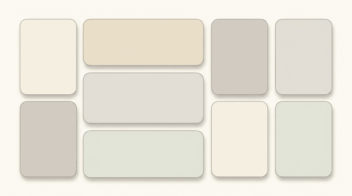
Prompt:
modern bento grid presentation background with modular card layout structure, a clean warm off-white background featuring a grid of six to eight soft rounded rectangular card shapes arranged in an asymmetric bento-box layout with varying sizes, each card has a slightly different warm neutral fill ranging from pale cream to soft light gray to very pale sage creating subtle variety within a harmonious palette, thin soft shadows beneath each card create gentle depth suggesting cards floating slightly above the background, the cards have generous rounded corners approximately 16 pixels giving a modern friendly appearance, thin hairline borders in warm gray define the card edges with precision, the spacing between cards is consistent and generous allowing the background to breathe, the overall composition suggests an organized modular information architecture, professional modular layout presentation background, 16:9 aspect ratio, no text no watermarks no logos
Best for: Multi-metric overview slides, feature comparison layouts, key statistics slides, team overview with bios, any slide presenting multiple parallel information blocks
Template 20: Closing Slide — Premium Thank You
Include what happens next: an open question session, a scheduled follow-up, or a direct way to get in touch. Adding an image of the presenter or contact person makes the closing slide feel personal and approachable.[6] The closing slide leaves the final impression — it should feel confident, premium, and inviting.
Prompt:
premium closing slide background conveying confidence and invitation, a rich composition transitioning from deep warm navy on the left to a warm amber-gold gradient on the right suggesting an opening door or new chapter beginning, the transition is smooth and cinematic with the warm light on the right side feeling inviting and optimistic, subtle abstract light rays extend from the right side leftward suggesting opportunity and next steps, the left portion of the composition provides dark space for contact information and next-steps text in light colors, the center area has a balanced blend of both tones creating a sophisticated transitional moment, very fine grain texture adds tactile premium quality throughout, the overall feeling is of a confident conclusion that naturally leads to continued conversation, the aesthetic is cinematic and aspirational like the final frame of a premium brand film, professional closing presentation visual with warm inviting energy, 16:9 aspect ratio, no text no watermarks no logos
Best for: Closing slides, thank you slides, contact information slides, next steps slides, call-to-action endings
Customizing These Templates for Your Specific Deck
These templates provide aesthetically calibrated visual foundations for the 20 most critical slide types in a pitch deck. Transforming them into visuals that serve your specific fundraising narrative requires adjustments along several key dimensions.
Align the color palette to your brand. Every prompt includes default color descriptions. Replace those color specifications with your brand colors — maintaining the same relative relationships (primary, accent, background) while swapping the specific hues. If your brand uses a deep purple primary and warm gold accent, replace "teal" with "deep purple" and "coral" with "warm gold" consistently across all 20 prompts.
Calibrate the visual energy to your sector. Technology and AI startups benefit from the darker, more technical visual aesthetics (Templates 5, 16, 13). Consumer brands and impact-focused ventures connect better with the warmer, more editorial styles (Templates 17, 9, 14). Financial and enterprise B2B companies typically want the institutional quality of Templates 10, 18, and 4. Adjust the visual temperature — cool and precise for tech, warm and human for consumer.
Maintain visual consistency across all slides. Presentation design systems standardize layouts, fonts, colors, and components to ensure brand consistency across all decks. In 2026, presentations are treated as brand assets, not disposable files.[2] Use the same color palette keywords, texture descriptions, and lighting language across all your prompts. Change only the conceptual content and compositional arrangement from slide to slide while keeping the aesthetic DNA identical.
Design for the reading context. Slides are presented live, shared asynchronously, viewed on laptops, and skimmed on mobile screens. As a result, presentation design has become more strategic, more intentional, and more audience-aware than ever before.[2] If your deck will primarily be read asynchronously on laptops (as most investor decks are), ensure backgrounds have sufficient contrast for text readability. If presenting live in a conference room, slightly bolder visual elements work better. Generate at 16:9 for standard decks, and consider also generating at 9:16 if the "Vertical Slide" (9:16 aspect ratio) is the fastest-growing category in 2026.[8]
Leave room for text. Every prompt in this post includes text placement zones — areas of clean space where your slide headlines, body copy, and data will sit. When customizing, always maintain these zones. A beautiful background that leaves no room for legible text is a failed slide visual, no matter how stunning it looks in isolation.
Technical Considerations for Pitch Deck Slide Visuals
When using AI-generated visuals in pitch decks, several technical factors determine whether the final result meets professional presentation standards.
Aspect ratio and resolution. Standard pitch decks use 16:9 (widescreen) aspect ratio. Generate slide backgrounds at a minimum of 1920 × 1080 pixels for screen presentation and 3840 × 2160 pixels for high-resolution displays and print. The Miraflow image upscaler can increase resolution for larger display requirements.
Color space for screen presentation. Pitch decks are primarily consumed on screen (laptop, projector, mobile), so RGB color space is appropriate for AI-generated visuals. However, if your deck will be printed as a leave-behind document, check how the colors translate to CMYK and adjust overly saturated elements.
File format for slide software. Export AI-generated visuals as PNG for maximum quality and transparency support. Import into PowerPoint, Google Slides, or Keynote as slide backgrounds. For full-bleed slide backgrounds, ensure the image dimensions exactly match or exceed the slide dimensions to prevent scaling artifacts.
Compression for email sharing. 81% of pitch decks are started once opened.[5] But they need to actually open — large image files bloat deck file sizes, causing email delivery failures and slow loading. After placing AI-generated backgrounds in your slide software, compress images within the deck to keep the total file size under 10 MB for email sharing. Most slide software includes built-in image compression tools.
Accessibility standards. Accessibility-first presentation design ensures slides are readable, inclusive, and usable by diverse audiences.[2] After placing text over AI-generated backgrounds, verify that text contrast meets WCAG AA standards (4.5:1 contrast ratio for normal text, 3:1 for large text). Dark backgrounds require light text; light backgrounds require dark text. Always test readability by viewing the slide at reduced size to simulate mobile viewing.
Consistency across the deck. Generate all visuals for a single deck in the same session with the same style parameters to maximize visual consistency. If you generate visuals across multiple sessions, the AI may produce subtle stylistic variations. Keep the full set of style keywords (color names, texture descriptions, lighting terms) in a reference document and paste them verbatim into every prompt.
Pitch Deck Slide Structure: Matching Visuals to Content
Slidebean's 2025 analysis of funded decks shows the median is 12 slides. Anything over 15 risks dilution; under 10 often omits investor-critical sections. The 12-slide median hasn't changed materially since 2018 — shorter is better.[4]
Understanding what content goes on each slide ensures you select the right visual template. The 20 templates in this post map to the standard pitch deck structure that investors expect, with additional utility templates for common variations.
The standard investor deck follows a proven sequence. The proven 11-slide pitch deck sequence investors expect: Slide 1 (Cover). Company name, one-line tagline, and your contact information. Keep it clean. Slide 2 (Problem). Define the pain point with data, not opinions.[7] Each slide type in this sequence has a distinct visual requirement — and a matching prompt template in this post. Use Template 1 (Cover), Template 2 (Problem), Template 3 (Solution), Template 4 (Market Size), Template 5 (Product), Template 6 (Traction), Template 7 (Business Model), Template 8 (Competition), Template 9 (Team), Template 10 (Financials), Template 15 (The Ask), and Template 20 (Closing) as the core set. The remaining templates serve section dividers, supplementary slides, and deck variations.
The decks that succeed this year are not prettier or longer — they are more honest, more specific, and more grounded in numbers than the ones that got funded in 2021.[3] Visuals support the narrative; they do not replace substance. Use these templates to elevate clear, honest, data-backed content — not to mask a lack of it.
Ethical Considerations: AI Visuals in Investor Presentations
Using AI-generated visuals in pitch decks comes with specific ethical and strategic considerations that founders should understand.
Authenticity matters more than ever. VCs pattern-recognize generic AI output in seconds. Use AI to build fast, then layer your founder voice, specific customer quotes, real product screenshots, and 2024-2026 sources.[4] AI-generated abstract backgrounds and conceptual visuals are appropriate because they serve as design elements, not as claims of reality. Never use AI to generate fake product screenshots, fabricated team photos, invented customer logos, or synthetic data visualizations that represent real numbers.
Disclosure and transparency. While abstract backgrounds and design elements generated by AI do not require disclosure in the same way that AI-generated content text does, founders should be prepared to discuss their deck creation process honestly if asked. The goal is to use AI to elevate the visual presentation of genuine business substance — not to create the illusion of professionalism that masks a lack of preparation.
Real product screenshots always win. A mockup or live demo is far more effective than descriptive text.[7] For your product and demo slides, always overlay actual product screenshots, user interface recordings, or real demo visuals on top of the AI-generated backgrounds. The background sets the aesthetic tone; the product content must be real.
Human judgment remains essential. Despite these advances, human creativity, judgment, and storytelling will remain the primary differentiators in effective presentations.[2] But here's what's not commoditizing: investor narrative strategy. AI doesn't know your investor targets' conviction triggers.[1] Use AI for visual execution; keep human judgment central to messaging, positioning, and narrative arc.
Using AI Slide Visuals Beyond the Pitch Deck
The visual assets generated from these templates serve far beyond the investor pitch deck itself. Founders and business leaders need consistent visual content across their entire communication ecosystem.
AI-generated slide visuals can power your investor update emails with professional header graphics that match your deck aesthetic. Create email newsletter headers using the same color palette and visual language. Design social media announcement graphics for funding milestones, product launches, and team updates. Build blog featured images for thought leadership content that reinforces the same visual identity investors saw in your deck.
For founders also producing video content — pitch recordings, product demos, or investor update videos — the slide backgrounds can serve as visual frames, and the AI Music Generator can create subtle, professional background audio that matches the tone of your presentation.
The strategic advantage is visual consistency without ongoing design costs. Once you establish your brand's visual direction through these prompt templates, you can generate unlimited matching assets across every touchpoint — from the first investor email to the post-funding press release.
FAQ
How long should a pitch deck be?
Decks of 11–15 slides generate the longest average reading time per slide and the highest meeting conversion rates.[2] Slidebean's 2025 analysis of funded decks shows the median is 12 slides. Anything over 15 risks dilution; under 10 often omits investor-critical sections.[4] The 20 visual templates in this post cover all standard slide types plus supplementary options — choose the 10–15 that match your specific deck structure.
How much time do investors spend reviewing a pitch deck?
According to DocSend's 2024 analysis, the average investor spends just 2 minutes and 24 seconds reviewing a startup's deck.[4] Investors typically spend just 3 minutes and 44 seconds reviewing an entire pitch deck, with only 10 seconds allocated per slide.[1] This means every visual element must communicate instantly — your slide backgrounds should reduce cognitive load, not add to it.
What aspect ratio should I use for pitch deck slides?
Standard pitch decks use 16:9 (widescreen) format. Generate all backgrounds at this ratio for consistency. If investors will view on mobile, also consider generating key slides at 9:16 vertical format, since the "Vertical Slide" (9:16 aspect ratio) is the fastest-growing category in 2026.[8]
Can AI visuals really replace a professional pitch deck designer?
AI-generated visuals handle the commodity design work — backgrounds, abstract concepts, visual atmosphere. By late 2026, I expect the standard to be: AI handles visual design (efficiency + cost), humans handle strategy (the part that actually matters for capital).[1] For pre-seed and seed rounds, AI-generated visuals combined with good content can produce a fundable deck. For Series A and beyond, most founders benefit from professional strategic support while still using AI for visual asset generation.
How much does a professional pitch deck cost?
In recent years, pitch deck pricing has ranged from $500 to $10,000.[3] DIY templates cost $50-$200, freelance designers charge $500-$5,000, specialized agencies charge $3,000-$15,000, and premium firms charge $10,000-$50,000. Most startups spend $2,000-$8,000 for professional design that balances quality and budget.[6] AI-generated visuals can reduce the design portion of this cost while founders invest more in strategic narrative development.
What are the biggest presentation design trends for 2026?
What truly differentiates 2026 is the convergence of AI-assisted creation, accessibility-first thinking, hybrid audiences, and brand-led design systems.[2] Key trends include bold typography as the primary visual driver, Glassmorphism 2.0 with tactile depth, warm restorative color palettes, Bento Grid modular layouts, data storytelling over raw data display, and design that works across live, asynchronous, and mobile contexts. All 20 prompts in this post incorporate these trends.
Should I use dark mode or light mode for my pitch deck?
It depends on context. Internal planning, reporting, and stakeholder presentations do well using minimalist slide design as the goal is information clarity.[6] If you are presenting in a dimly lit room, Dark Mode is mandatory.[8] Tech startups presenting in boardrooms often favor dark mode (Templates 1, 2, 3, 5, 6, 10, 11, 12, 13, 15, 16). Consumer and impact-focused brands often prefer light editorial styles (Templates 7, 8, 9, 14, 17, 18, 19).
What slides do investors spend the most time on?
Investors spend most time on Financials, Team and Competition slides.[10] Successful pitch decks show that investors spend 48% more time on this slide[6] referring to the business model. Ensure the visual backgrounds for these critical slides (Templates 7, 8, 9, 10) are particularly clean and uncluttered to allow the content to command full attention.
Can these prompts be adapted for other presentation types?
Yes. While optimized for investor pitch decks, these visual templates work for sales presentations, board meeting decks, keynote addresses, product launch events, and corporate strategy presentations. Adjust the color palette and conceptual keywords to match your specific audience and context. All prompts work with the Miraflow AI Image Generator and translate to other text-to-image platforms with minor adjustments.

How do I maintain visual consistency when generating multiple slide backgrounds?
Create a "style reference block" — a paragraph of consistent style keywords that you copy verbatim into every prompt. This should include your specific color names, texture preferences, lighting direction, and overall aesthetic (e.g., "dark navy background with warm gold accents, subtle grain texture, cinematic lighting from upper right, professional institutional aesthetic"). Append this block to the end of every prompt to maintain visual coherence across all generated images.
Conclusion
The visual design of a pitch deck is not an aesthetic choice layered on top of business content — it is the cognitive delivery mechanism that determines whether investors absorb your story or close the tab. In 2026, how a presentation looks directly affects how its message is understood and remembered.[2] With investors spending an average of 2–4 minutes on an entire deck and only 10 seconds per slide, every visual element must reduce friction, reinforce the narrative, and build the kind of trust that leads to a meeting.
The 20 templates in this post give you a production-ready system for generating professional slide visuals across the full spectrum of pitch deck sections: cover slides, problem statements, solution narratives, market opportunity landscapes, product showcases, traction trajectories, business model flows, competitive positioning maps, team compositions, financial projections, timing arguments, go-to-market strategies, product roadmaps, social proof backgrounds, funding asks, dark mode tech aesthetics, warm editorial narratives, clean data canvases, modular bento layouts, and confident closing visuals. Each template captures the specific visual qualities — the color temperature, compositional structure, lighting energy, and professional tone — that make each slide type communicate effectively with sophisticated investors.
Copy the template that matches your slide, customize the colors to your brand, generate it inside Miraflow AI, and overlay your content on top. Generate at 16:9 for standard decks, create several variations to compare, and build a visual library that gives your pitch deck the professional polish of a funded-deck standard. The bar in 2026 is higher, but it's not unfair. Investors are simply asking founders to prove what they're building works before writing a check.[3] Give them a deck that looks as serious as the business behind it.