10 Rules for YouTube Thumbnails That Actually Get Clicks
Written by
Jay Kim

Stop guessing why your thumbnails aren't working. These 10 rules for YouTube thumbnails break down exactly what makes viewers click—and how to apply each rule fast with AI.
Your video could be the best thing on YouTube this week. Nobody will know if your thumbnail doesn't stop the scroll.
Most creators treat thumbnails as an afterthought. The ones getting millions of views treat them as the first—and most important—part of the video. And they follow a clear, repeatable set of rules every single time.
This post breaks down the 10 rules for YouTube thumbnails that actually get clicks, with practical tips you can apply immediately. If you want to put these rules into action fast, use Miraflow's YouTube Thumbnail Maker to generate click-worthy thumbnails with AI—no design skills required.
TL;DR – The 10 Rules at a Glance
- One visual idea per thumbnail
- Use faces (and make the expression extreme)
- High contrast over everything
- Three colors maximum
- Text should be readable at 120px wide
- Create a curiosity gap with your title + thumbnail
- Use size and scale to direct the eye
- Design for mobile first
- Stay on-brand but stay bold
- Test before you commit
Keep reading for the full breakdown of each rule—and how to execute them without spending hours in Photoshop.
Rule 1: One Visual Idea Per Thumbnail
The single most common thumbnail mistake: trying to say too much.
Every great thumbnail communicates one idea in under two seconds. That's all the time you get before a viewer's eye moves to the next result.
Ask yourself: If someone glanced at my thumbnail for one second, what would they understand?
If the answer is "it depends" or "a few things," strip it back. Remove the extra icons, the secondary product, the background clutter. One subject, one message, one reason to click.
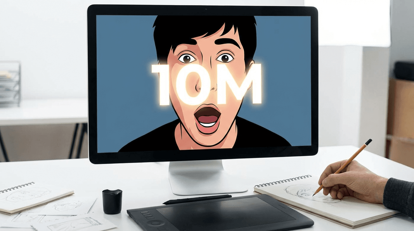
How to apply it: Before you design anything, write your thumbnail concept in one sentence: "A shocked face reacting to a huge number." That sentence is your brief. If your design can't be described in one sentence, it's too complicated.
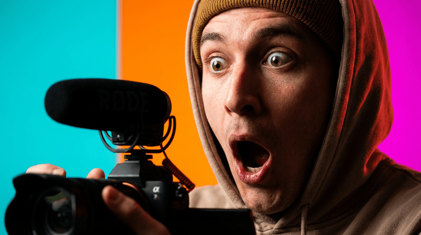
Rule 2: Use Faces—And Make the Expression Extreme
Faces are the most click-tested element in YouTube thumbnails. Human brains are wired to look at other human faces before anything else on screen—it's instinct.
But a neutral face does almost nothing. What works is exaggerated emotion: wide eyes, open mouth, genuine surprise, intense focus, or pure excitement. The more extreme, the more it registers at thumbnail size.
You don't need a professional photographer. You need one well-lit shot with a clear, big expression.
How to apply it: Upload your photo to Miraflow's YouTube Thumbnail Maker and use Image Compositing to place your face into a high-contrast, click-ready thumbnail background. Try a prompt like:
YouTube reaction thumbnail: close-up of a shocked face with wide eyes and open mouth, bright colorful lighting, high contrast, bold background, space on one side for text.
Rule 3: High Contrast Over Everything
Low contrast thumbnails disappear. High contrast thumbnails pop.
Contrast doesn't just mean dark vs. light—it means making your main subject unmistakably separate from the background. A bright subject on a dark background. A dark subject on a neon background. A person cutout placed over a flat color.
YouTube's recommended thumbnail size is 1280×720, but most viewers see your thumbnail at roughly the size of a playing card on mobile. At that size, subtle color gradations vanish. Only strong contrast survives.
How to apply it: After generating a thumbnail, zoom out your browser to 50% or open the image on your phone. If your subject still pops, you're good. If it blends in, increase the contrast between your subject and background before uploading.
Rule 4: Three Colors Maximum
More than three colors in a thumbnail creates visual noise. Top-performing thumbnails almost always work with a tight palette:
- One dominant color (background or main element)
- One accent color (subject, key element)
- One pop color (text, icon, or highlight)
Red, yellow, and white is a classic YouTube combination for a reason—it's punchy, high contrast, and reads instantly. But any three colors that contrast strongly will work.
How to apply it: When writing your AI prompt in Miraflow, specify your palette directly:
"Color palette: deep blue background, bright orange subject, white text accent. High contrast, bold, minimal clutter."
Rule 5: Text Should Be Readable at 120px Wide
Here's a practical test almost no creator uses: resize your thumbnail to 120 pixels wide—roughly the size it appears in YouTube's related video sidebar—and read the text.
Can you read it? Most thumbnails fail this test.
The rules for thumbnail text:
- Maximum 4–5 words. If you need more, cut more.
- Bold, thick font. Thin fonts disappear at small sizes.
- High contrast with the background. White text needs a dark shadow or outline. Dark text needs a light background.
- No full sentences. Fragments and punchy phrases only: "Big Mistake," "Do This Now," "It Worked."
How to apply it: In Miraflow's Thumbnail Maker, use the Thumbnail Text field for your short phrase. The tool renders it as bold display text directly on the design—no manual font work needed.
Rule 6: Create a Curiosity Gap Between Title and Thumbnail
The best YouTube thumbnails don't tell the whole story. They tell half of it—just enough to make the viewer need to know the other half.
This is the curiosity gap: your title and thumbnail work together, not redundantly.
- If your title says "I Tried Every Productivity App for 30 Days", your thumbnail should show a shocked or exhausted face—not a list of app logos.
- If your thumbnail shows a huge number like "$47,000", your title should tease why—not repeat the number.
One delivers the fact. The other delivers the emotion. Together, they create a question the viewer has to answer by clicking.
How to apply it: Write your title first. Then ask: "What's the emotional reaction to this title?" Design your thumbnail around that emotion, not around repeating the title's information.
Rule 7: Use Size and Scale to Direct the Eye
Your viewer's eye travels in a predictable path. You can control where it goes—and what it reads first—by manipulating size and scale.
Big things get seen first. If your face is large and the text is small, viewers see the face first. If a number is massive and centered, that's the first read.
The strongest thumbnails use this intentionally:
- Large: the thing you want them to notice first (usually face or main subject)
- Medium: supporting visual element
- Small or implied: background detail
How to apply it: Avoid centering everything equally. Make one element noticeably bigger than everything else. In your AI prompt, specify: "The main subject is large and centered, with supporting elements smaller in the background."
Rule 8: Design for Mobile First
Over 70% of YouTube watch time happens on mobile. Your thumbnail will be seen first—and judged—on a screen smaller than your hand.
Desktop-first thumbnail design causes two common problems:
- Text that looks fine at full size becomes unreadable on mobile
- Small details that look nice on desktop vanish completely on a phone screen
The fix: design at full resolution, but evaluate at mobile scale. Check your thumbnail on your phone before every upload.
How to apply it: After generating a thumbnail in Miraflow, download it and open it on your phone. Pinch it to the size it would appear in search results. That's the real test. If it works there, it works everywhere.
Rule 9: Stay On-Brand, But Stay Bold
Consistency builds a recognizable channel. When viewers scroll through search results and immediately recognize your style—your colors, your font treatment, your general aesthetic—they're more likely to click because they already know what to expect.
But "on-brand" should never mean "safe." The biggest mistake creators make when building brand consistency is defaulting to bland. Your brand should have a signature boldness, not just a signature font.
Pick 2–3 brand rules you'll keep consistent across every thumbnail:
- Your dominant background color
- Whether or not you always use your face
- Your text treatment (always white, always bold, always short)
Everything else can flex.
How to apply it: Build a template prompt you reuse in Miraflow. Start each session with your brand's color palette and style locked in, then customize the subject for each video. Consistency becomes automatic.
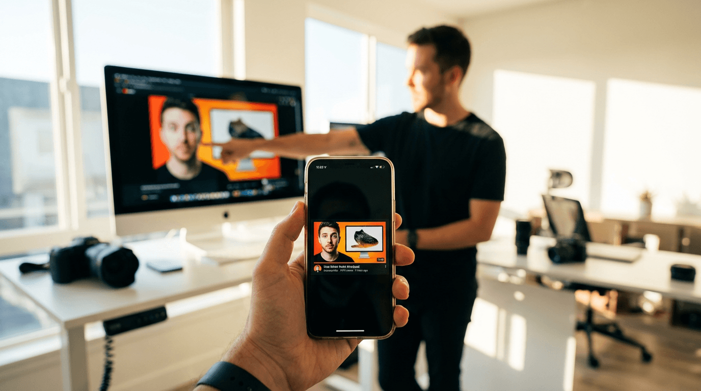
Rule 10: Test Before You Commit
The best thumbnail isn't the one that looks best to you in isolation. It's the one that performs best against real alternatives.
Top creators generate 3–4 thumbnail concepts before picking one. They compare them at small size, side by side, and pick the one that pops immediately—not the one with the most effort in it.
YouTube also offers A/B testing through its test and compare feature (available to channels that qualify). Use it when you can.
How to apply it: Generate at least 2–3 variations in Miraflow's YouTube Thumbnail Maker before settling. Change one variable at a time—try a different expression, a different background color, or a different text phrase. Then compare them at thumbnail size. The one that wins your attention in under two seconds wins your upload slot.
How to Apply All 10 Rules Without Designing from Scratch
Following all 10 rules manually—contrast, color palette, expression, text size, curiosity gap—is a lot to hold in your head while staring at a blank Photoshop canvas.
The faster approach: describe what you want, let AI build the structure, then evaluate with these rules as your checklist.

Here's how that works in Miraflow's YouTube Thumbnail Maker:
- Go to YouTube Thumbnail Maker on Miraflow.
- Write a prompt that bakes in the rules automatically:
- Specify contrast: "high contrast, subject pops against background"
- Specify palette: "three-color palette: red, white, dark navy"
- Specify composition: "face large on the left, space for bold text on the right"
- Specify style: "modern YouTube thumbnail style, clean, bold, mobile-readable"
- Add your Thumbnail Text—your 3–5 word phrase—in the Thumbnail Text field.
- Set Aspect Ratio: 16:9 for standard videos, 9:16 for Shorts.
- (Optional) Open Show Advanced Settings and add a Negative Prompt: "blurry, cluttered, low contrast, small text, busy background, distorted faces"
- Generate 2–3 variations and compare them at phone size before downloading.
The rules become the prompt. The prompt becomes the thumbnail. The whole process takes minutes instead of hours.
A Quick Checklist Before Every Upload
Use this before you upload any thumbnail:
If you can check every box, upload with confidence.
Conclusion
Great YouTube thumbnails aren't random. They follow rules—the same rules, applied consistently, by every creator whose videos you can't stop clicking.
The 10 rules above aren't theory. They're the practical decisions that separate a thumbnail that gets skipped from one that gets clicked:
- High contrast. Strong faces. Tight palettes. Short text. A curiosity gap between your title and image. Mobile-first evaluation. Consistent brand. Always tested.
You don't need a design degree to apply them. You need a clear process and the right tool.
Start with these rules, build your thumbnails in Miraflow's YouTube Thumbnail Maker, and check your work against the checklist above before every upload. Do that consistently, and your click-through rate will show it.