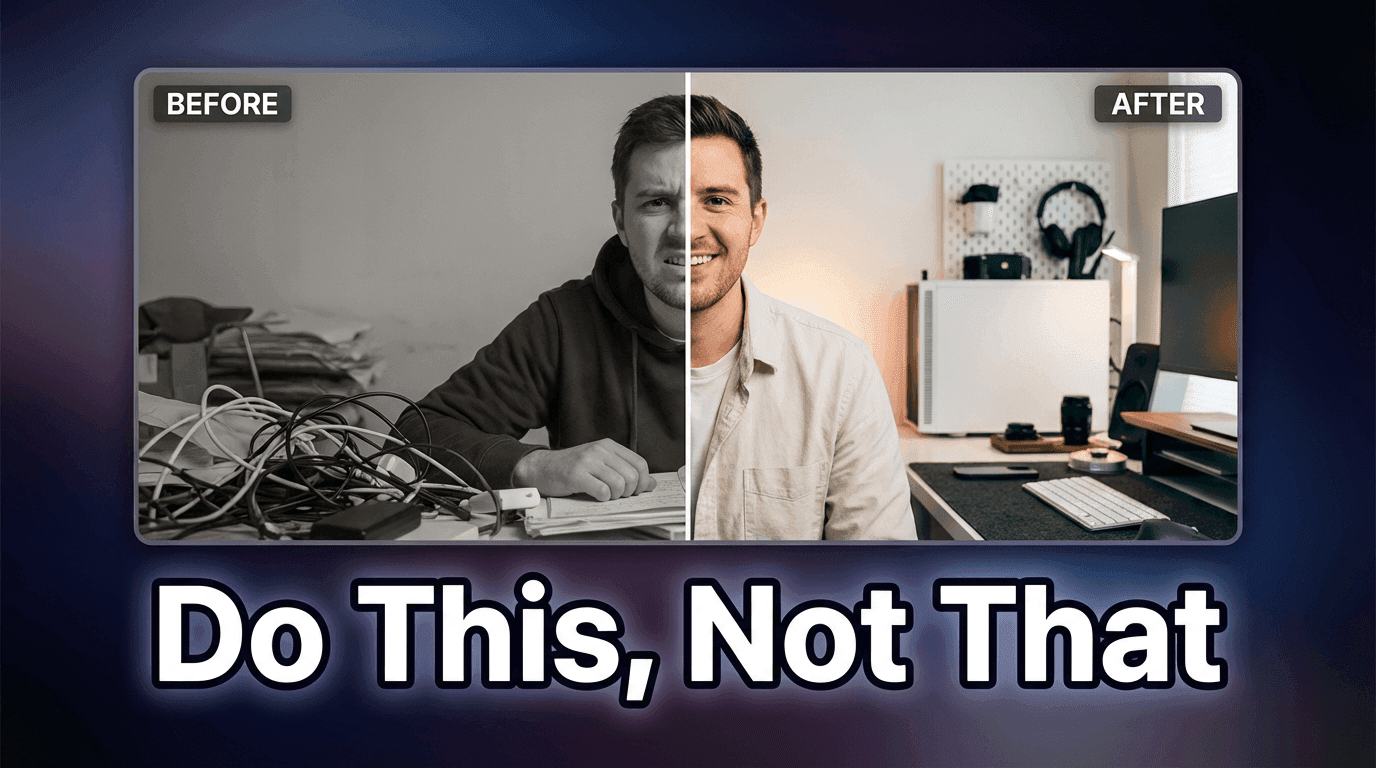
AI Prompts for Before-After YouTube Thumbnails (High CTR Pack)
Written by
Jay Kim

Before-after thumbnails consistently earn the highest click-through rates on YouTube. This prompt pack gives you 30 copy-paste AI prompts across 10 niches that generate compelling split-frame thumbnails.
Before-after thumbnails are one of the most reliable click-drivers on YouTube, and they have been for years. The format works because it communicates a complete story in a single image: here is the problem, here is the solution, here is the gap between them. Viewers do not need to read a description to understand the promise. The visual does it instantly.
The challenge is that generating before-after thumbnails with AI requires a specific kind of prompting that most creators never figure out. Generic prompts produce two images that look like they came from different photoshoots with no visual relationship between them. A strong before-after thumbnail needs contrast that is intentional, composition that works as a split frame, and a visual gap that makes the viewer feel the transformation rather than just observe it.
This guide gives you a full prompt pack of before-after thumbnail prompts across 10 of the highest-performing YouTube niches in 2026, with notes on why each structure works and how to adapt them to your specific content.
Why Before-After Thumbnails Consistently Outperform Other Formats
The psychological mechanism behind before-after thumbnails is straightforward. The human brain is trained to process change and to feel tension when a gap exists between two states. When a viewer sees a before and after in a thumbnail, they experience a small but real version of the narrative arc that the video promises to deliver. The visual tension of the gap creates a pull toward clicking that purely informational or aesthetic thumbnails do not generate as reliably.
In 2026, as the YouTube feed has become more competitive and viewers make scroll-stop decisions faster than ever, thumbnails that communicate a complete promise in less than a second of processing have a structural advantage. The before-after format is one of the few thumbnail types that can do this without relying on text, though text overlay strengthens it further when applied correctly.
YouTube's CTR data consistently shows that transformation thumbnails, which includes before-after, outperform informational thumbnails in most niches because the implied promise is specific and emotional rather than generic and intellectual. A viewer who sees a clear visual transformation feels the outcome before they click, which is more motivating than reading what the video is about.
For a deeper understanding of what drives click-through rate decisions in the current YouTube environment, YouTube CTR in 2026 covers the specific factors that affect how often viewers choose to click on a video versus scroll past.
The 3 Elements That Make Before-After Thumbnails Work
Before getting to the prompts, understanding what separates a high-CTR before-after thumbnail from a weak one helps you evaluate your outputs and know when to regenerate.
Visual contrast that reads at small sizes
Thumbnails display at roughly the size of a postage stamp in most YouTube feed contexts. The before and after sides of the composition need enough visual contrast that the difference is immediately apparent even at that small scale. Color contrast is the most powerful tool here: a desaturated or dull before state against a vibrant or bright after state creates a gap the eye reads instantly. Light versus dark, muted versus saturated, cluttered versus clean, all of these work.
Emotional register in each half
The before side should communicate a negative or neutral emotional state: struggle, confusion, stress, low energy, or simple inadequacy. The after side should communicate the positive resolution: confidence, clarity, energy, abundance, or quality. When both sides have clear emotional content that the viewer can read immediately, the thumbnail communicates not just a change but a felt transformation.
Unified visual language across the split
Both sides of a before-after thumbnail should look like they belong to the same visual world. If the before side has a photorealistic style and the after side looks like an illustration, the thumbnail feels incoherent. Using consistent composition angles, similar scale for subject elements, and matching overall lighting intensity across both sides makes the comparison feel deliberately designed rather than assembled from mismatched sources.
The 30-Prompt Before-After Thumbnail Pack
These prompts are organized by niche and each includes a before prompt, an after prompt, and a combined split-frame prompt for generators that support multi-element composition.
Category 1: Fitness and Body Transformation
Fitness before-after thumbnails are among the highest-performing on YouTube because the transformation is immediately visual and the emotional gap is universal. The key is making both sides feel authentic rather than stock-photo perfect.
Fitness transformation split frame

Prompt
split-frame thumbnail composition showing a fitness transformation, left side showing a person with slumped posture in dim unflattering lighting wearing loose casual clothes, tired expression, muted desaturated color palette, right side showing the same person with upright confident posture in bright studio lighting wearing fitted athletic wear, strong energetic expression, vibrant warm color palette, same face angle across both sides ensuring visual continuity, the split line is clean and vertical dividing the frame exactly in half, thumbnail photography style, no text no logos
Home workout space transformation
Prompt
split-frame thumbnail showing a home workout space transformation, left side showing a cluttered living room corner with pushed-aside furniture and minimal space, dim natural light, disorganized feeling, right side showing a clean dedicated home gym setup with organized equipment, bright lighting, motivating atmosphere, same room angle across both sides creating clear spatial comparison, commercial photography style, no text no logos
Category 2: Home Organization and Renovation
Home transformation thumbnails perform extremely well because the visual change is concrete and measurable, making the promise of the video impossible to misunderstand.
Kitchen organization before-after

Prompt
horizontal split-frame thumbnail showing a kitchen transformation, left side showing a messy cluttered kitchen counter with disorganized items, expired products visible, chaotic arrangement, dim lighting making the mess feel heavier, right side showing the same counter space organized and clean with matching containers, clear labels implied by arrangement, bright overhead lighting making everything feel fresh and functional, overhead camera angle consistent across both sides, interior photography style, no text no logos
Living room renovation split frame
Prompt
side-by-side split-frame thumbnail showing a living room renovation, left side showing a dated living room with worn furniture, heavy curtains blocking light, cluttered surfaces, muted browns and beiges creating a heavy atmosphere, right side showing the same room renovated with modern minimal furniture, sheer curtains letting in natural light, clean surfaces, bright neutral palette with warm accent colors, same room perspective maintained across the split, interior design photography style, no text no logos
Closet organization transformation
Prompt
split-frame thumbnail showing a closet organization transformation, left side showing an overflowing closet with clothes falling out, hangers in every direction, items on the floor, chaotic and stressful visual, right side showing the same closet space perfectly organized with matching hangers, folded items visible, clear sections, a feeling of calm and control, consistent viewing angle across both sides, home organization photography style, no text no logos
Category 3: Skincare and Beauty
Beauty transformation thumbnails require close attention to the lighting and skin quality difference between sides, since the transformation is in surface detail that needs to be visible at thumbnail size.
Skincare routine transformation

Prompt
close-up split-frame thumbnail showing a skincare transformation, left side showing a close-up portrait with visible skin texture concerns, uneven tone, tired expression, muted soft lighting that emphasizes imperfections without harsh clinical feel, right side showing the same facial angle with visibly smoother skin tone, healthy glow from within, bright soft lighting with warmth, radiant confident expression, exact same face angle and framing on both sides maintaining visual continuity, beauty editorial photography style, no text no logos
Makeup technique before-after
Prompt
split-frame thumbnail showing a makeup technique transformation, left side showing a face with unblended product, no contour definition, flat one-dimensional look, neutral expression under flat overhead lighting, right side showing the same face with expertly applied makeup showing clear sculpting, dimension, and polished finish, confident expression under warm flattering light, identical camera angle and crop on both sides, beauty photography style, no text no logos
Category 4: Personal Finance and Wealth
Finance before-after thumbnails work by making abstract financial states visual and emotional. The key is using environmental storytelling to show financial stress versus financial confidence without requiring viewers to process numbers.
Financial transformation lifestyle

Prompt
split-frame thumbnail showing a personal finance transformation through environment, left side showing a stressed person at a messy desk with bills and papers scattered, dim desk lamp, tense expression suggesting financial worry, muted color palette, right side showing a calm confident person at a clean organized desk with a laptop showing upward graphs implied by body language, bright natural light, relaxed successful expression, warm confident color palette, consistent desk angle across both frames, lifestyle photography style, no text no logos
Spending habits transformation visual
Prompt
split-frame lifestyle thumbnail showing financial mindset transformation, left side showing a person surrounded by impulse purchase items, shopping bags, credit card visible, slightly overwhelmed expression, warm retail lighting, right side showing the same person in a calm minimal environment with a savings-themed visual element suggested by organized clean setting, composed and confident expression, natural soft lighting suggesting clarity, same compositional framing on both sides, no text no logos
Category 5: Productivity and Career
Productivity transformation thumbnails communicate the shift from scattered effort to focused achievement, which is a deeply relatable contrast for working professionals and students.
Work environment transformation

Prompt
split-frame thumbnail showing a work environment productivity transformation, left side showing a disorganized desk with papers everywhere, multiple open browser tabs implied by busy screen glow, distracted anxious expression, chaotic visual energy, right side showing the same desk space clean and organized with one focused laptop, calm concentrated expression, clear intentional workspace, soft professional lighting creating focus, consistent overhead desk angle across both sides, productivity lifestyle photography, no text no logos
Morning routine transformation

Prompt
split-frame thumbnail showing a morning routine transformation, left side showing a person rushing with coffee spilling, clothes half ready, stressed and behind schedule expression, chaotic messy background, harsh unforgiving morning light, right side showing the same person calm and composed with everything ready ahead of schedule, relaxed confident expression, clean organized background, warm golden morning light, consistent environment and framing across both sides, lifestyle photography style, no text no logos
Category 6: YouTube and Creator Growth
Creator-focused before-after thumbnails have high click-through in the creator education niche because the audience is highly motivated to see channel growth transformations.
YouTube analytics transformation

Prompt
split-frame thumbnail showing a YouTube channel analytics transformation, left side showing a person looking at a laptop screen with visible low view count graphs, frustrated or confused expression, dim screen glow in dark room suggesting late night struggle, right side showing the same person looking at a laptop with upward trending graphs clearly visible on screen, excited surprised expression with raised eyebrows, bright professional lighting, same viewing angle maintained, creator lifestyle photography, no text no logos
Thumbnail design quality transformation
Prompt
split-frame thumbnail showing a thumbnail design quality transformation, left side showing a simple phone-quality blurry image used as a thumbnail displayed on a monitor, dark low contrast, hard to see at small size, right side showing the same monitor displaying a polished high-contrast professional thumbnail with clear visual hierarchy, bold colors, and clear subject, same monitor angle across both sides, creator workspace photography style, no text no logos
For more on what thumbnail design elements drive the highest CTR in 2026, AI YouTube thumbnail styles that get more views in 2026 covers the specific visual styles that are outperforming in different content categories right now.
Category 7: Weight Loss and Health
Weight and health transformation thumbnails are consistent high performers because the transformation goal is widely shared and the visual representation is immediately understood.
Energy and health transformation

Prompt
split-frame thumbnail showing a health and energy transformation, left side showing a person sitting with low energy, slumped on a couch, looking tired and uninspired, muted color palette suggesting physical depletion, dull skin tone suggested by lighting, right side showing the same person standing with high energy and vitality, bright upright posture, vibrant expression, glowing skin suggested by warm healthy lighting, vivid color palette suggesting life and energy, consistent body scale and framing across both sides, health lifestyle photography, no text no logos
Category 8: Design and Visual Arts
Design transformation thumbnails work by showing a clear quality gap that designers and aspiring creatives immediately recognize and aspire to cross.
Graphic design skill transformation

Prompt
split-frame thumbnail showing a graphic design skill transformation, left side showing a cluttered amateur design composition on a monitor with too many fonts, poor color choices, and chaotic layout, frustrated creator expression, right side showing the same monitor displaying a clean professional design with strong hierarchy, intentional color palette, and sophisticated layout, confident satisfied creator expression, same desk and monitor angle maintained, creative professional lifestyle photography, no text no logos
Photography editing transformation
Prompt
split-frame thumbnail showing a photo editing transformation, left side showing a flat underexposed photograph with poor color balance and no atmosphere on a laptop screen, right side showing the same photo beautifully color-graded with depth, warmth, and professional atmosphere on the same laptop, photographer's hands visible at the keyboard in both frames maintaining continuity, bright creative workspace photography, no text no logos
Category 9: Food and Cooking
Food transformation thumbnails have strong appetitive appeal because the visual quality difference between a poorly prepared and beautifully plated version of the same dish is immediately compelling.
Cooking skill transformation

Prompt
split-frame thumbnail showing a cooking skill transformation, left side showing a poorly plated meal that is overcooked or unappetizing, food falling apart or poorly arranged on the plate, dim kitchen lighting, right side showing the same dish beautifully plated with professional presentation, vibrant colors, garnish suggesting skill, warm studio food photography lighting, same plate angle and table surface maintained across both sides, food editorial photography style, no text no logos
Kitchen organization cooking transformation
Prompt
split-frame thumbnail showing a cooking efficiency transformation, left side showing a chaotic cooking scene with multiple pans, mess everywhere, panicked expression, cluttered countertops, right side showing a calm organized cooking scene with everything in its place, confident focused expression, clean workspace, same kitchen angle maintained, cooking lifestyle photography, no text no logos
Category 10: Business and Entrepreneurship
Business transformation thumbnails communicate the shift from struggling to scaling, which resonates strongly with the entrepreneurship and small business audience on YouTube.
Business growth transformation

Prompt
split-frame thumbnail showing a business growth transformation, left side showing an entrepreneur looking stressed at a sparse desk with few orders or activity implied by the empty space, worried expression, dim home office lighting, right side showing the same person at a busy organized desk with clear signs of activity and growth, confident energized expression, bright professional lighting suggesting momentum, consistent desk perspective across both frames, entrepreneurship lifestyle photography, no text no logos
How to Generate Strong Before-After Thumbnails in Practice
The prompts above produce the raw visual material, but applying a few practical principles during generation and selection consistently improves the final result.
Generate multiple variations and select for contrast
The single most important selection criterion is how clearly the difference reads at small sizes. After generating several variations, shrink the image down to about 100 pixels wide and see which one's before-after contrast is still immediately obvious. The versions that survive this scale test are the ones that will perform in the actual YouTube feed.
Use consistent background elements to tie both sides together
A before-after thumbnail feels intentional rather than assembled when both sides share visual elements that confirm they are showing the same person, space, or context in a different state. Background consistency, same room, same desk, same angle, is often more important than the transformation itself for making the thumbnail read as coherent.
Add text overlay strategically, not reflexively
Many before-after thumbnails add "BEFORE" and "AFTER" text labels, but this is often unnecessary when the visual contrast is strong enough. In cases where the transformation might be ambiguous without labels, a simple text element helps. In cases where the visual contrast is obvious, labels are redundant and reduce visual impact. Test both versions when you can.
Match the emotional intensity of the thumbnail to the emotional promise of the video
A thumbnail that shows a dramatic transformation for a video with a modest improvement creates a trust gap that viewers feel even if they cannot articulate it. The visual promise of the thumbnail should accurately represent the scale of transformation the video actually delivers. Overpromising in the thumbnail produces high CTR but poor watch-through rates, which ultimately hurts algorithmic distribution.
For a complete breakdown of how YouTube's CTR benchmarks have shifted in 2026 and what they mean for thumbnail strategy, YouTube CTR benchmarks for 2026 covers the current performance ranges across different content categories and channel sizes.
Why the Before Side Is as Important as the After
Most creators spend all their creative energy on the after side of a before-after thumbnail. The bright, aspirational, well-lit after version gets the most attention in production. The before side is often treated as an afterthought, just a dull or messy version of the same scene.
This is a mistake that consistently produces weaker thumbnails. The before side is actually where the click decision is made. Viewers do not click on before-after thumbnails because the after looks good. They click because the before resonates with their current situation. When the before side accurately captures a pain point, frustration, or limitation that the viewer personally feels, the thumbnail creates an emotional recognition that makes clicking feel personally relevant rather than just interesting.
The most effective before sides share specific characteristics: they show a real-feeling struggle rather than a cartoonish failure, the lighting and color palette reinforce the emotional weight of the negative state, and the subject's expression or body language communicates the feeling of being stuck, frustrated, or overwhelmed in a relatable rather than dramatic way.
Generating Before-After Thumbnails With Miraflow AI
For creators who want to produce before-after thumbnails efficiently without switching between multiple tools, Miraflow AI's image generator supports the full prompt detail needed to produce the studio-quality split-frame compositions described in this guide.
The image-to-image feature is particularly useful for before-after thumbnail generation because it lets you maintain visual consistency between the two sides. Generate a strong after image first, then use it as a reference to generate the before version in the same visual world by prompting for the negative state version of the same composition. This approach produces better visual continuity between the two sides than generating each independently from scratch.
The inpainting feature adds another layer of control, letting you select specific elements of a generated image and replace just those regions. For a before-after where the main transformation is in a specific area of the frame, changing only that region while keeping everything else consistent produces a more convincing comparison than regenerating the full image.
For YouTube-specific thumbnail generation, the YouTube thumbnail maker supports adding text overlay and composition adjustments directly on top of generated images, which makes the workflow from generated image to publish-ready thumbnail more streamlined than exporting and editing in a separate tool.
Adapting These Prompts for Your Specific Niche
Every prompt in this guide can be adapted to your specific niche by replacing the subject matter while keeping the structural elements: the contrast description, the emotional register difference between sides, the lighting direction difference, and the visual continuity instructions.
Here is the template structure underlying every prompt in this guide, extracted for your use:
Prompt split-frame thumbnail composition showing a [your niche] transformation, left side showing [description of negative/before state including: subject, setting, expression, lighting quality, color palette], right side showing [description of positive/after state including: same subject, same setting angle, expression of positive outcome, brighter/warmer lighting, vibrant/clean color palette], [specific visual continuity instruction keeping both sides recognizably the same context], [photography style reference], no text no logos
Using this template with your specific content transforms any of the principles in this guide into a prompt customized for your exact niche and video topic.
Common Mistakes That Reduce Before-After Thumbnail CTR
Transformations that are too subtle
A before-after thumbnail where the difference between the two sides requires careful inspection to notice defeats the purpose of the format. The transformation needs to be dramatic enough to register instantly at thumbnail size. When generating, always ask whether someone with half a second of attention could immediately tell that something significant changed.
Matching color palettes across both sides
When the before and after sides have similar color temperatures and saturation levels, the contrast that drives click behavior disappears. Deliberately desaturating or cooling the before side while warming and brightening the after side creates the visual gap that makes the transformation feel significant even before the viewer reads any text.
Inconsistent subject scale across the split
If the before side shows a full-body view and the after side shows a close-up, the comparison feels disorganized and confusing rather than purposeful. Maintaining consistent subject scale and viewing angle across both sides makes the comparison feel like a deliberate demonstration rather than two unrelated images placed next to each other.
Ignoring the emotional register of expressions
Expressions carry enormous weight in before-after thumbnails. A before side with a neutral expression and an after side with a slightly more positive expression communicates almost no emotional transformation. The before side expression should communicate the genuine feeling of the problem state, not just acknowledge that one exists. The after side expression should communicate genuine relief, pride, or transformation, not just satisfaction. The bigger the emotional gap between expressions, the more compelling the transformation feels.
For more on how the emotional and visual elements of thumbnails interact to drive click decisions, AI prompts for YouTube thumbnails provides a broader library of thumbnail prompt approaches organized by content type and emotional intent.
Integrating Before-After Thumbnails Into Your Channel Strategy
Before-after thumbnails are not appropriate for every video, and understanding when to use them versus other thumbnail formats makes your overall thumbnail strategy more effective.
Before-after thumbnails work best for videos that genuinely deliver a transformation, whether that is in the viewer's knowledge, their environment, their skills, or their results. They set a specific expectation that the video will show or explain a complete change from one state to another. Videos that deliver on that specific promise see strong watch-through rates alongside high CTR.
Where before-after thumbnails tend to underperform is for videos that provide information without a transformation arc, commentary or opinion content where the value is perspective rather than change, and evergreen reference content where the viewer is looking for information rather than a journey.
Building a content calendar that mixes before-after thumbnails for transformation content with other high-CTR formats for different content types gives your channel visual variety that helps different videos reach different viewer intent states. For a complete guide to planning a consistent short-form content strategy with diverse thumbnail approaches, the 30-day YouTube Shorts plan for 2026 covers how to structure content and thumbnail variety across a full posting calendar.
Conclusion
Before-after thumbnails generate high click-through rates because they do something most thumbnail formats cannot: they communicate a complete promise and create emotional resonance in less than a second of viewer attention. The format works by showing the problem, the solution, and the gap between them simultaneously, making clicking feel like a personally relevant decision rather than just a passive choice.
The 30 prompts in this guide cover the 10 highest-performing niches for before-after thumbnails on YouTube in 2026. Each prompt is built around the three structural requirements that make before-after thumbnails convert: visible contrast that reads at small sizes, emotional register difference between sides, and visual continuity that makes both sides feel like a coherent comparison rather than unrelated images.
Using these prompts as starting points and adapting the subject matter and emotional details to your specific content and audience gives you a systematically reliable approach to thumbnail generation that should produce measurably stronger CTR than generic prompts alone.
For a broader view of how thumbnail quality affects YouTube channel growth across different content strategies, YouTube Shorts thumbnail strategy for 2026 covers how to build a thumbnail approach that works across both Shorts and long-form content simultaneously.
FAQ
What makes before-after YouTube thumbnails get more clicks? Before-after thumbnails convert at high rates because they communicate a complete story instantly: a negative state, a positive outcome, and the gap between them. This format activates emotional recognition in viewers who identify with the before state, making clicking feel personally relevant rather than just curious. The more clearly the before side resonates with a real viewer pain point and the more compelling the after side looks, the higher the CTR tends to be.
How do I generate a before-after thumbnail with AI? Use a split-frame composition prompt that describes both sides of the frame including the subject, setting, lighting, color palette, and emotional register for each side, while explicitly including visual continuity instructions that keep both sides recognizably the same context in different states. Maintaining consistent subject scale, viewing angle, and background elements across both sides of the split is essential for the comparison to feel deliberate and coherent.
What niches get the highest CTR from before-after thumbnails? Fitness and body transformation, home organization and renovation, skincare and beauty, personal finance, and creator growth consistently produce strong before-after thumbnail CTR because the transformations in these niches are visual, emotional, and personally relevant to large audiences. Niches with less visual transformation potential, such as pure commentary or opinion content, tend to see less benefit from the format.
Should I include text labels like BEFORE and AFTER on my thumbnails? Text labels are helpful when the transformation might be ambiguous without context, but redundant when the visual contrast is strong enough to communicate the comparison without them. Test both versions when possible. A thumbnail with strong visual contrast often performs equally well without labels, and removing unnecessary text can improve the visual clarity of the composition at small sizes.
How do I make the before side of a thumbnail look realistic rather than staged? Prompting for genuine emotional states rather than posed performances produces more authentic before sides. Describing the physical environment, body language, and expression in terms of how a real person experiencing that problem actually looks produces more resonant before images than prompting for obviously staged negative states. Specific environmental details like bill papers on a desk, cluttered spaces, or tired lighting conditions add authenticity that generic "messy" or "bad" descriptors do not.
Can I use AI to generate both sides of a before-after thumbnail at the same time? Yes, using a split-frame composition prompt that describes both sides within a single generation prompt often produces better visual continuity between the two sides than generating each independently. Alternatively, using the image-to-image feature to generate the after side and then using it as a reference to generate the before version maintains consistent visual language across both halves.
How often should I use before-after thumbnails on my channel? Using before-after thumbnails for every video creates visual monotony and reduces the format's impact over time. Before-after works best as one of several thumbnail formats you rotate through based on content type. Transformation content, tutorials with clear outcomes, and comparison videos are the strongest matches. Opinion, commentary, and evergreen reference content often performs better with different thumbnail formats.