15 AI Prompts for Flat Lay Photography That Looks Styled by a Pro (Copy & Paste)
Written by
Jay Kim

15 copy-paste AI prompts for flat lay photography that looks styled by a professional prop stylist. Single product hero compositions, multi-product brand stories, morning routine layouts, creative workspace arrangements, culinary ingredient compositions, fashion outfit styling, travel essentials curation, skincare and beauty routine presentations, stationery and paper flat lays, seasonal and holiday compositions, curated gift guide arrangements, coffee culture compositions, fitness and wellness layouts, bookish and literary flat lays, and minimalist reductive-elegance compositions designed for product brands, lifestyle companies, beauty and fashion labels, food brands, content creators, e-commerce stores, and any professional building visual content where objects arranged on a surface from directly above must look like a prop stylist spent an afternoon creating effortless perfection.
15 copy-paste AI prompts for flat lay photography that looks styled by a professional prop stylist. Single product hero flat lays, multi-product brand story compositions, morning routine and daily ritual layouts, creative workspace and productivity arrangements, recipe and culinary ingredient compositions, fashion and outfit styling flat lays, travel essentials and journey curation, skincare and beauty routine presentations, stationery and analog creative tool arrangements, seasonal and holiday thematic compositions, curated gift guide flat lays, coffee and café culture compositions, fitness and wellness lifestyle layouts, bookish and literary culture flat lays, and minimalist reductive-elegance compositions designed for product brands and direct-to-consumer companies, lifestyle and wellness brands, food and beverage companies, fashion and accessories labels, beauty and skincare brands, stationery and paper goods companies, travel and hospitality brands, content creators and influencers, social media managers and creative directors, e-commerce stores and online retailers, subscription box companies, gift and specialty retailers, food bloggers and recipe developers, book publishers and literary brands, fitness and activewear companies, coffee and tea brands, photographers and visual content producers, marketing agencies serving lifestyle brands, editorial and magazine content teams, Etsy sellers and handmade-goods artisans, and any professional or brand whose products, tools, ingredients, or curated objects must be presented from directly above in a composition so deliberately arranged, so texturally rich, so narratively complete that the viewer's eye moves through it the way a hand moves through a drawer of beautiful things — touching everything, lingering on the details, understanding the whole through the arrangement of the parts.
The flat lay is a lie. Every flat lay is a lie. That cluster of objects arranged on a marble surface — the ceramic mug with its perfect shadow, the linen napkin folded once and placed at the precise angle, the sprig of eucalyptus trailing from the upper left corner, the gold scissors catching the light, the open notebook with handwriting that stops at exactly the right line, the three products arranged in descending size with their labels rotated to camera — none of this happened naturally. No one lives like this. No desk looks like this. No morning produces this arrangement. The flat lay is an artificial construction, a deliberate fiction, a two-dimensional stage set built from three-dimensional objects and photographed from directly above to create the illusion of casual, effortless, aspirational beauty. It is the most constructed, the most artificial, and — when done well — the most seductive composition in commercial and lifestyle photography. The paradox of the flat lay is that the more artificial the construction, the more natural it must appear. The viewer should feel that they are looking down at a beautiful life in progress, not at a stylist's precisely engineered arrangement. The eucalyptus sprig was placed with tweezers, adjusted by millimeters, and its shadow was evaluated against the shadow of the mug. The viewer should feel that it simply fell there, that someone beautiful and tasteful set it down while reaching for something else, that the arrangement is the casual residue of an aesthetically superior existence.
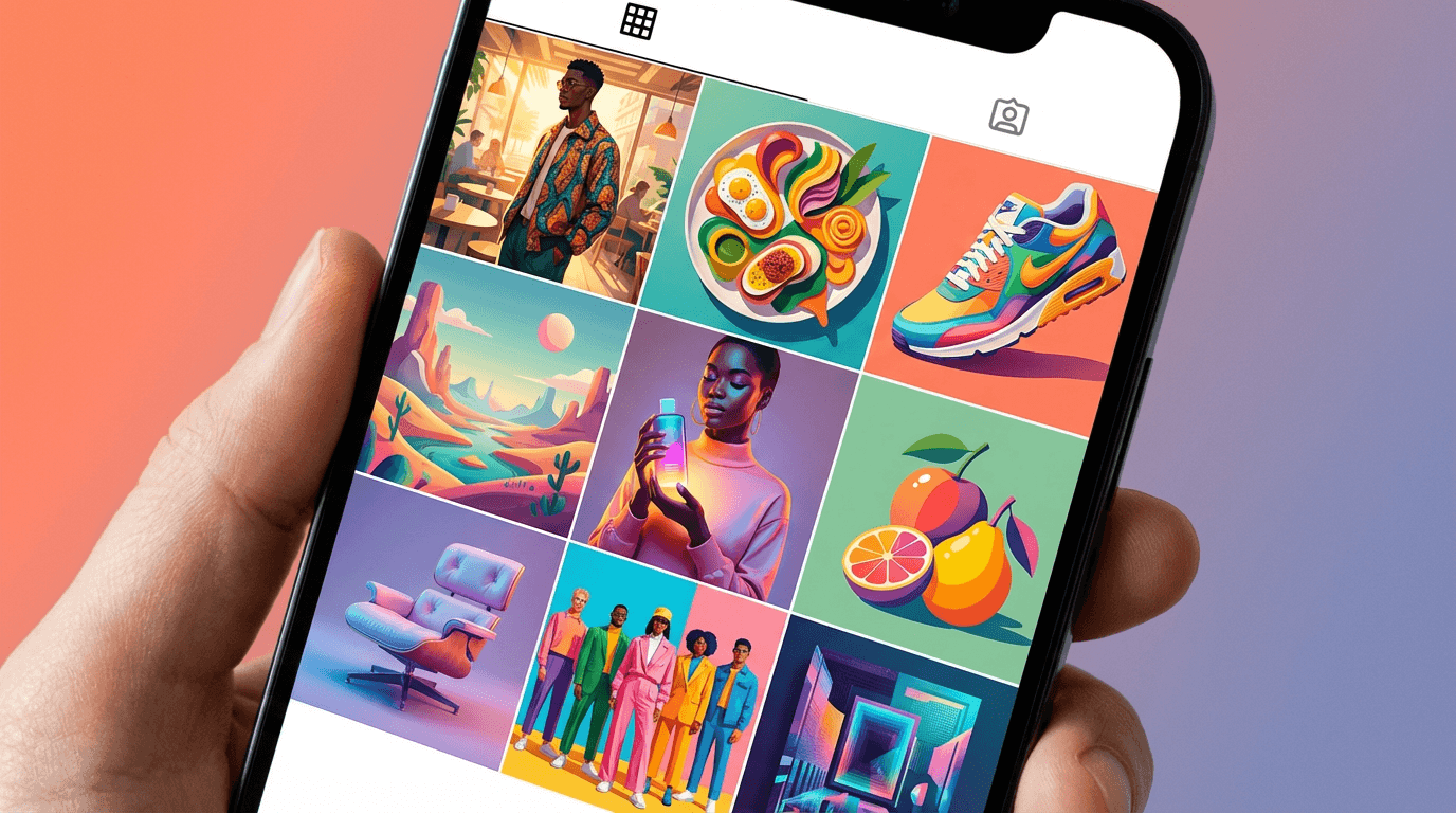
This is the fundamental operating principle of the flat lay: maximum artifice in service of the appearance of no artifice at all. The professional prop stylist — the person who builds flat lays for brands, publications, and campaigns for a living — understands this paradox completely. The stylist spends hours arranging objects that must look like they were not arranged at all. The stylist selects, positions, rotates, angles, swaps, removes, adds, and micro-adjusts every element in the composition until the overall arrangement achieves that specific quality of studied nonchalance — the composed casualness, the deliberate effortlessness, the art that conceals art — that makes the viewer feel they are seeing a lifestyle rather than a photograph. The distance between the amateur flat lay (objects centered in the frame, evenly spaced, visually static, obviously arranged) and the professional flat lay (objects asymmetrically distributed, overlapping with intention, creating visual flow and narrative, apparently spontaneous) is the distance between a retail display and a magazine editorial. It is the distance between selling a product and selling a life.
If you have worked with AI prompts for product photography, brand visual content, or architecture and interior design imagery, the methodology will be familiar. Copy the prompt, adjust the details to match your specific brand, product category, aesthetic, or content purpose — your product (the particular item or items being presented: their material, their color, their form, their packaging, their brand identity), your surface and background (the specific flat lay surface that establishes the visual world: marble, linen, wood, concrete, colored paper, terrazzo, leather, fabric — the surface as the first design decision), your prop palette (the supporting objects that create the narrative context: the tools, the ingredients, the accessories, the botanicals, the textiles, the paper goods, the personal items that surround the hero product and tell the story of who uses it and how), your color story (the specific palette — warm neutrals, cool monochromes, bold and saturated, muted and earthy, pastel and soft — that defines the composition's visual identity), your styling philosophy (minimal and spacious, abundant and layered, geometric and precise, organic and loose — the arrangement logic that governs how objects relate to each other in the frame), and the specific visual identity that distinguishes your flat lay content from every other brand competing in the same feed, the same platform, the same audience's attention — generate, and deploy. What distinguishes these prompts from general photography templates is that every element has been engineered specifically for the flat lay format: the overhead perspective, the surface-and-object relationship, the shadow direction and quality, the compositional flow that moves the eye through a two-dimensional arrangement of three-dimensional objects, the layering of textures and materials that creates visual depth on a flat plane, the negative space calibration that separates professional from amateur, the prop-to-hero balance that keeps the product visible while the narrative context enriches it. These are not product photography prompts adapted to an overhead angle. They are precision-engineered flat lay systems designed to solve the specific challenge of creating compositions that look like a professional prop stylist spent an afternoon arranging them.
Why Flat Lay Photography Has Become the Dominant Visual Format for Lifestyle and Product Content
Flat lay photography occupies a specific and increasingly dominant position in the visual content ecosystem. Understanding why the overhead composition has become the default visual language for product presentation, lifestyle storytelling, and brand content — and why the quality of the flat lay directly determines engagement, conversion, and brand perception — reveals why investing in flat lay visual quality is not an aesthetic indulgence but a commercial necessity.
The flat lay is the native format of the scroll. The vertical scroll — the primary consumption mechanic of Instagram, Pinterest, TikTok, email, and the mobile web — presents content in a continuous stream that the viewer consumes from top to bottom. The flat lay, viewed from directly above, presents its composition in the same plane as the screen — there is no perspective distortion, no vanishing point, no spatial depth to decode. The viewer's eye enters the flat lay from above (the top of the screen) and moves through it downward (as the thumb scrolls), making the flat lay composition the most natural, most friction-free, most scroll-compatible visual format. The flat lay does not ask the viewer to interpret three-dimensional space from a two-dimensional image; it presents a two-dimensional arrangement on a two-dimensional screen, creating an immediate, intuitive visual experience.
The flat lay communicates curation, and curation communicates taste. The fundamental visual narrative of the flat lay is curation — the deliberate selection and arrangement of objects that together tell a story about taste, lifestyle, and values. The viewer does not see a single product; the viewer sees a collection of objects that have been chosen by someone with specific aesthetic preferences, arranged by someone with visual intelligence, and presented as the material evidence of a particular way of living. The flat lay communicates: "This is the world this product lives in. These are the other objects it keeps company with. This is the level of taste and intention that surrounds this product." The curatorial narrative transforms a product from a commodity into a lifestyle artifact.
The flat lay shows multiple products simultaneously without the complexity of styled scenes. A traditional styled product photograph — a product on a table in a room with background elements — requires managing perspective, depth of field, background blur, spatial composition, and the complex relationship between foreground and background. The flat lay eliminates background complexity entirely. The surface is the background. The objects sit on it. The camera looks straight down. This simplification allows multiple products to coexist in a single composition without the spatial-management challenges that make multi-product styled photography technically difficult. The flat lay is the most efficient format for showing a product collection, a routine, a kit, a gift set, or any grouping of related items.
The flat lay is the most saved and shared format on Pinterest and Instagram. Platform data consistently shows that flat lay compositions generate disproportionately high save rates on both Pinterest and Instagram. The save (or pin) is the highest-value engagement action — it indicates that the viewer found the content valuable enough to return to later, often because it serves as visual inspiration, a shopping reference, or an aspirational bookmark. Flat lays generate saves because they function as visual lists — curated collections that the viewer saves as a reference for their own purchasing, styling, or creative decisions.
The flat lay scales from one product to an entire brand universe. The single-product flat lay (one hero item on a surface with minimal props) serves the product-specific sales function — the Instagram post, the product page image, the email feature. The multi-product flat lay (an entire routine, a collection, a gift guide) serves the brand-universe function — the content that communicates the brand's full range, its aesthetic coherence, its lifestyle proposition. The format scales seamlessly from focused selling to expansive storytelling.
The flat lay creates product context that product-only photography cannot. A product photographed on a white background communicates features and form. The same product arranged in a flat lay with complementary objects, textures, and props communicates the product's life — who uses it, when they use it, what else they own, what their morning looks like, what their desk contains, what their weekend involves. This contextual storytelling converts browsers into buyers by allowing the viewer to project themselves into the lifestyle the flat lay represents.
The flat lay is the most reproducible and templateable format. Unlike environmental or lifestyle photography, which requires locations, models, and complex production logistics, the flat lay requires a surface, objects, and overhead light. This relative simplicity makes it the most reproducible content format — a brand can produce consistent, high-quality flat lay content at a higher frequency and lower production cost than any other professional photography format. The templates in this post further systematize this production, creating repeatable visual frameworks that maintain quality across content cycles.
The flat lay communicates brand visual identity through repeated visual elements. When a brand consistently uses the same surface material, the same prop palette, the same color story, and the same styling approach across all its flat lay content, the flat lay becomes a brand signature — recognizable in the feed without the logo visible, identifiable by the visual language alone. This visual consistency is one of the most powerful brand-building tools in the social media environment, where the viewer encounters dozens of brands daily and remembers the ones with the most coherent, distinctive visual identity.
The Visual Grammar of Professional Flat Lay Styling
Professional flat lay photography operates according to a specific visual grammar — a set of principles governing composition, surface selection, prop curation, layering, negative space, shadow, color, and the overall arrangement logic that separates the professional prop stylist's work from the enthusiastic amateur's attempt. Understanding this grammar is essential to using the prompts effectively and to recognizing what the generated compositions should achieve.
The surface is the first design decision. The flat lay surface — the background on which everything sits — is the composition's foundational element, determining the color temperature, the texture, the reflectivity, and the overall atmospheric quality of the image before a single object is placed. The surface communicates the brand's world: white marble communicates clean luxury, warm wood communicates organic warmth, linen fabric communicates soft domesticity, concrete communicates industrial minimalism, colored paper communicates graphic boldness, terrazzo communicates contemporary design, dark slate communicates dramatic sophistication, aged wood communicates rustic authenticity. The surface is not neutral — it is the first statement about who the brand is and what world the product inhabits.
Composition follows the rule of visual flow, not symmetry. The amateur flat lay centers objects and distributes them evenly. The professional flat lay creates visual flow — a compositional path that guides the eye through the arrangement in a specific sequence: entering at one point (typically a corner or an edge), moving through the hero product, traveling through the supporting objects, and exiting at the opposite side. This flow is created through the directional placement of elongated objects (a pen, a sprig, a ribbon, a utensil), the size graduation from larger to smaller elements, the overlapping of objects that creates visual connection and path, and the strategic placement of the hero product at the composition's natural focal point (not necessarily the center, but the point where the eye naturally arrives after entering the frame).
Negative space is not emptiness — it is design. The empty surface visible between and around the objects is as important as the objects themselves. Negative space creates visual breathing room, allows each object to be individually readable, establishes the composition's density (sparse and minimal versus abundant and layered), and determines the overall feeling — generous negative space communicates calm, luxury, and restraint; minimal negative space communicates abundance, energy, and richness. The professional stylist calibrates negative space as deliberately as object placement. Too much negative space makes a composition feel empty and unfinished; too little makes it feel cluttered and overwhelming.
Layering creates depth on a flat plane. The flat lay exists on a single plane, but the professional composition creates the illusion of depth through layering — objects placed partially on top of other objects, a napkin extending beneath a plate, a book open beneath a cup, a fabric swatch draped across a corner, a ribbon trailing beneath and between objects. This layering creates visual depth, textural variety, and the narrative quality of objects existing in relationship to each other rather than in isolation. Layering also creates the overlap that the eye reads as spatial depth — the visual cue that one object is in front of another, even in a directly overhead composition.
The hero product must be visually dominant without being visually isolated. In a product flat lay, the hero product must be the composition's visual focus — the element the eye goes to first and returns to repeatedly. Visual dominance is achieved through position (the hero at the composition's natural focal point), scale (the hero as the largest or most visually prominent element), contrast (the hero lighter or darker than its surrounding props, or the hero in color against neutral props), and spacing (slightly more negative space around the hero than around other elements, creating visual separation). However, visual dominance must coexist with narrative integration — the hero should feel connected to the surrounding props, part of the same world, not dropped into an unrelated arrangement.
Props tell the story; the hero is the subject. The supporting props in a flat lay serve a narrative function — they create the context, the lifestyle, the use-case scenario that makes the hero product meaningful. A candle photographed alone is a product. A candle in a flat lay with a linen napkin, a book of poetry, a ceramic cup, dried flowers, and a cashmere throw is an evening ritual, a domestic luxury, a lifestyle proposition. The props answer the question: "What world does this product live in?" The selection of props is the editorial act that transforms product photography into lifestyle storytelling. Props should be complementary (supporting the hero without competing with it), brand-appropriate (matching the brand's aesthetic and price point), and narratively coherent (telling a single, believable story about a single moment or ritual).
Texture variety creates visual interest on a flat plane. Because the flat lay eliminates the spatial depth that creates visual interest in three-dimensional photography, surface texture becomes the primary source of visual richness. The professional flat lay combines multiple textures — the smooth and the rough, the matte and the shiny, the hard and the soft, the natural and the manufactured — to create the textural variety that keeps the eye engaged. A composition of all smooth objects on a smooth surface feels flat and uninteresting. The same objects on a textured linen surface, with a rough ceramic, a soft fabric swatch, and a natural botanical element, creates the textural complexity that makes the eye travel.
Shadow communicates light direction and object dimension. In the flat lay, shadow is the primary cue for three-dimensionality — the soft shadow beneath a mug communicates the mug's height, the shadow edge of a book communicates the book's thickness, the shadow of a botanical element communicates its delicate, three-dimensional form. Shadow direction must be consistent throughout the composition (all shadows falling the same way, indicating a single light source), and shadow quality (soft and diffused versus hard and graphic) establishes the image's atmospheric character. Soft, diffused shadows create a gentle, approachable, lifestyle quality. Hard, graphic shadows create a bold, editorial, high-contrast quality. The shadow quality should match the brand's visual personality.
Color operates in controlled palettes, not in chaos. Professional flat lay photography works within deliberate, limited color palettes — typically three to five coordinated colors that create visual harmony across the composition. The palette types include monochromatic (variations of a single hue, creating quiet sophistication), analogous (adjacent colors on the wheel, creating warmth or coolness), complementary (opposing colors creating visual energy), and neutral-plus-accent (a neutral base with one or two accent colors creating focused visual interest). The amateur flat lay often fails because its objects introduce too many unrelated colors, creating visual noise rather than visual harmony.
Scale variation creates compositional rhythm. A flat lay composed of similarly sized objects feels monotonous and visually static. The professional composition includes objects of deliberately varied scale — large anchor objects, medium supporting objects, and small detail elements — creating a visual rhythm that moves the eye from large to small, from macro to micro, from the dominant to the delicate. This scale variation also creates the impression of depth and richness that compensates for the format's flatness.
The "unstyled" elements are the most styled. The objects that appear most casual — the pen placed at a slight angle, the corner of a fabric peeled back, the handful of coffee beans scattered near the cup, the lip of a book page caught in mid-turn, the cap of a product placed beside the bottle as if just removed — are the most deliberately styled elements in the composition. These "casual" elements create the illusion of a moment interrupted, of life in progress, of the arrangement as a spontaneous state rather than a constructed one. The professional stylist adds these elements last, adjusting their placement with the obsessive precision that creates the appearance of effortlessness.
Consistency across a series creates brand recognition. The most powerful flat lay content is not a single composition but a series — a recurring visual format that the audience comes to recognize and expect. The series maintains the same surface, the same general color palette, the same styling density, the same shadow quality, and the same compositional logic across every iteration, varying only the hero product and the specific props. This consistency transforms individual flat lays into a visual language that the audience reads as fluently as they read text.
15 AI Prompt Templates for Professional Flat Lay Photography
Each template includes a content concept, the full copy-paste prompt, and deployment guidance. All prompts are formatted for the Miraflow AI Image Generator and compatible with any high-quality text-to-image tool. Adjust the bracketed descriptive elements in each prompt to match your specific brand, product, surface, prop palette, color story, and visual identity. Generate at 1:1 for Instagram feed and social media grid, 4:5 for Instagram feed (maximum feed visibility), 9:16 for Stories, Reels, and vertical social, 2:3 for Pinterest, 3:2 or 16:9 for website banners and email headers, and 4:3 for blog content and product pages.
Template 1: The Product Hero — Single Product with Styled Context
This is the foundational flat lay — a single hero product presented on a styled surface with supporting props that create the lifestyle context, the use-case narrative, and the aspirational world that transforms a product image into a brand story. The single-product hero flat lay is the workhorse of product-brand social media content.
Prompt:
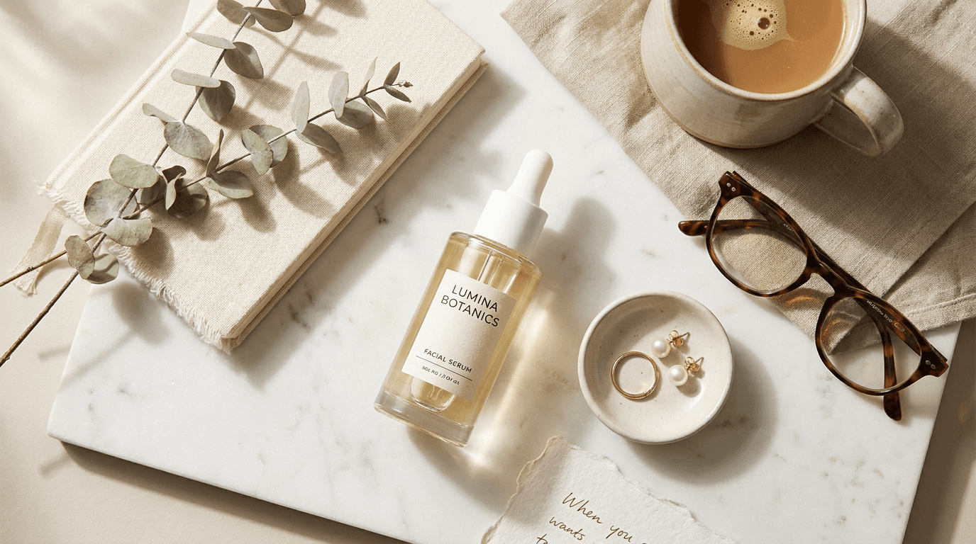
professional flat lay photograph of [a single hero product — the primary item presented as the composition's focal point, surrounded by styled props that create its lifestyle narrative: the hero product is specific and visually described — the particular product with its form, material, packaging, color, and brand character: a skincare product (a glass bottle with its specific shape — cylindrical, rectangular, dropper — its label design, its cap material, the product color visible through the glass or the opaque packaging), a candle (the vessel material — ceramic, glass, concrete, brass — the wax color, the label, the wick condition), a notebook or journal (the cover material — leather, linen, paper — the color, the closure mechanism, the page edges), a food product (the jar, the bag, the box — its material, its label, its visible contents), a piece of jewelry (the ring, the bracelet, the necklace — on a surface, on a small dish, partially on fabric), a cosmetic (the compact, the tube, the palette — its packaging material and color), a tech accessory (the case, the cable, the device — its material and finish), or any single product — the product described with enough visual specificity to generate its precise character, the hero product is positioned at the composition's natural focal point — not dead center but at the intersection of visual flow, placed where the eye arrives naturally after entering the frame: slightly off-center, slightly toward the lower half or upper third, the position creating both visual dominance and compositional dynamism, the supporting props create the lifestyle narrative — the specific objects surrounding the hero that tell the story of who uses this product and when: the props selected to create a coherent moment — a morning ritual, a creative session, a self-care evening, a cooking moment, a travel preparation — the particular prop collection (specify: [your prop selection, e.g., a ceramic mug with coffee visible inside, a folded linen napkin in a complementary neutral, a sprig of dried eucalyptus, a pair of reading glasses, a small ceramic dish with a ring, a torn piece of handmade paper]) — each prop contributing to the narrative without competing with the hero, each prop appropriate to the brand's aesthetic and price point, each prop adding a different texture to the composition, the props arranged with studied casualness — some objects overlapping slightly (a napkin extending beneath the mug, the eucalyptus crossing over the edge of a book), some angled slightly (the glasses at a casual diagonal, the paper torn with an organic edge), the arrangement looking spontaneous but carefully creating the visual flow from one element to the next] on [the specific flat lay surface — the background material that establishes the visual world: the surface described precisely — a slab of white Carrara marble with subtle gray veining, a piece of natural linen in warm oatmeal with visible weave texture, a weathered light oak board with visible grain, a sheet of warm white handmade paper with deckled edges, a concrete slab with its matte gray surface and its subtle aggregate texture, a terrazzo surface with its speckled, modern character, a dark slate with its layered, textural depth, a sheet of matte-finish colored paper or card stock in a specific color — the surface described with enough material specificity to generate its authentic texture and its exact visual character, the surface fills the entire frame — no edge of the surface visible, the surface reading as an infinite plane rather than a finite board or sheet], the overall composition creates a visual flow through the arrangement — the eye enters from a corner or edge, moves through the props, arrives at the hero product, and continues through the remaining elements in a circuit that keeps the eye within the frame, the negative space is calibrated — enough visible surface between and around the objects to create breathing room and visual clarity, each object individually readable, the composition feeling spacious rather than cluttered (approximately 40-50% of the frame as visible surface for a clean, spacious flat lay; 25-35% for a richer, more abundant flat lay), the composition from directly overhead — the camera positioned at a true 90-degree angle looking straight down at the surface, all objects visible in their plan view (the top of the mug, the cover of the book, the face of the product label), no perspective distortion, no vanishing point, the flat lay reading as a true overhead composition, the depth of field is deep — every object on the surface in sharp focus from edge to edge, the surface texture readable throughout, the lighting is soft, directional, and natural-appearing — the specific quality of light that professional flat lay photography achieves: soft, directional natural light — the quality of light from a large window source positioned to one side, creating the gentle directional illumination that makes flat lay compositions feel naturally lit and lifestyle-authentic: the light entering from one side of the frame (typically the upper left or the left), creating soft, consistent shadows that fall in one direction — each object casting its own soft shadow to the opposite side, the shadow communicating the object's three-dimensional height (taller objects casting longer, more visible shadows; flat objects casting minimal shadow), the shadow quality soft and diffused (not hard-edged graphic shadows, but the gentle, gradual, natural-light shadows that come from a large, diffused light source like a window), the light brightening the objects on the source side and creating subtle, gentle shadow on the opposite side of each object, the light revealing the surface texture (the grain of the wood, the weave of the linen, the veining of the marble catching the directional light with their three-dimensional micro-texture), the light revealing each object's material character (the glass of the bottle catching a soft highlight, the ceramic of the mug showing its matte or glossy surface, the metal catching its specific reflective quality, the paper showing its fiber texture, the fabric showing its weave), the overall illumination bright and airy (for a fresh, clean, lifestyle quality) or warm and moody (for a richer, more intimate quality) depending on the brand's atmosphere, product hero flat lay palette — the composition's deliberate, limited color palette (specify: [your color story, e.g., warm neutrals — cream, oatmeal, warm white, soft brown, with accents of dusty sage green from the eucalyptus and warm brass from the glasses frames — all on a white marble surface]) — the palette cohesive and limited, creating visual harmony across the composition, no color jarring or unrelated, the palette appropriate to the brand's visual identity, the mood is aspirationally casual editorially styled lifestyle-authentic and the specific flat lay message — this product belongs in this beautiful, curated, tasteful world, the arrangement is the material evidence of an aesthetically considered life — the single-product hero flat lay as the foundational lifestyle-brand visual, professional overhead flat lay photography with soft directional natural light and deep depth of field and true 90-degree overhead perspective, composed as a styled product flat lay with the hero product and the lifestyle narrative and the material textures creating the visual content, deliberate limited color palette on textured surface, no text overlays, no watermarks
Best for: Instagram feed product features, website product page lifestyle imagery, email marketing product spotlights, Facebook and social media product content, Pinterest product pins, blog content product features, e-commerce product page secondary lifestyle images, paid advertising product creative, product launch announcement visuals, influencer and partnership content reference
Template 2: The Brand Universe — Multi-Product Collection Story
This template arranges multiple products from the same brand into a single flat lay that communicates the brand's full range, its aesthetic coherence, its product ecosystem, and the visual argument that these products belong together — that together they constitute a designed system for a specific lifestyle.
Prompt:
professional flat lay photograph of [a multi-product brand collection — multiple products from the same brand arranged to communicate the product ecosystem, the aesthetic coherence, and the lifestyle system: the product collection is specific — the particular items and their visual descriptions: a skincare or beauty routine (the cleanser, the serum, the moisturizer, the eye cream, the SPF — each in its specific packaging, arranged in use-order or in a compositional arc that implies the routine sequence), a stationery collection (the notebook, the pen, the cards, the envelopes, the stamps, the wax seal — the brand's paper goods ecosystem), a food or pantry collection (the olive oil, the vinegar, the salt, the spice jars, the honey — the brand's culinary range), a candle collection (multiple vessels in different sizes, scents, or seasonal editions — the range communicating variety within a unified design language), a fashion accessories collection (the wallet, the card case, the key holder, the sunglasses case — the leather goods system), a wellness collection (the supplement bottles, the tea tin, the journal, the essential oil — the wellness ecosystem), or any multi-product brand range — each product described with its specific packaging, material, color, and form, the products are arranged to communicate both individual identity and collective coherence — each product readable as its own object with its own label, form, and material visible, while the arrangement as a whole communicates that these products share a design language: consistent packaging materials (all glass, all kraft paper, all matte white), consistent typography, consistent color palette — the visual argument that this is a system, not a random collection, the product arrangement follows a compositional logic — the products arranged in a deliberate pattern: a diagonal line from corner to corner, an arc or curve, a loose grid, a central cluster with radiating elements, a size-graduated sequence from large to small — the arrangement creating visual flow and rhythm rather than a static lineup, the supporting props are minimal — the brand universe flat lay relies primarily on the products themselves for visual content, with minimal additional props to avoid diluting the product focus: a surface swatch of the brand's signature material, a branded element (a card, a tag, a ribbon), a single natural element (a botanical, a citrus, a spice) that references the product's ingredients or character — the props supporting without competing, the overall composition communicates: this is a complete brand world, these products are designed together, the brand has aesthetic intelligence and product-range coherence — the multi-product flat lay as the brand-universe and collection-story visual] on [the specific flat lay surface — the surface that best represents the brand's visual world: the surface material matching the brand's aesthetic (specify: [your surface, e.g., a large slab of warm-toned travertine with natural pitting and warm beige color, or a sheet of the brand's signature kraft paper, or a piece of washed Belgian linen in warm gray])] with the products filling the primary composition — the products as the visual content, their packaging design and material quality as the primary subject, the arrangement communicating the collection's range and coherence, each product individually readable — the label, the packaging form, the material visible for each item, the compositional rhythm created by the size and shape variation across the products — the eye moving from product to product through the arrangement, the negative space is moderate — enough surface visible to separate the products and allow each to be individually identified, the composition from directly overhead — true 90-degree perspective, all labels readable, the depth of field is deep — every product in sharp focus across the frame, the lighting is the same soft directional natural quality as Template 1 — soft directional natural light from one side creating gentle consistent shadows that give each product its dimensional quality, revealing the packaging materials and the label details and the surface texture, brand universe flat lay palette — the brand's packaging palette unified on the surface (specify: [your brand palette, e.g., amber glass bottles with cream labels and black typography, kraft paper boxes, natural cork closures — on warm travertine — a palette of amber, cream, warm stone, and kraft]) — cohesive, brand-consistent, visually harmonious across all products, the mood is brand-coherent aesthetically unified range-communicating and the specific collection message — these products are a designed system, the brand's visual intelligence extends across its entire range — the multi-product flat lay as the brand-universe and product-ecosystem visual, professional overhead flat lay photography with soft directional natural light and deep depth of field and true overhead perspective, composed as a multi-product brand flat lay, brand-cohesive palette on textured surface, no text overlays, no watermarks
Best for: Instagram feed brand and collection features, website homepage and collection page hero imagery, email marketing collection announcements and range features, paid advertising brand-awareness creative, Pinterest brand and collection pins, wholesale and retail partner presentations, press and media kit brand imagery, lookbook and catalog covers, subscription box reveal content, gift guide features
Template 3: The Morning Ritual — Lifestyle and Daily Routine
This template creates the morning routine flat lay — the aspirational arrangement of the objects that constitute the beginning of a beautiful day. The morning ritual flat lay is the most universally relatable lifestyle composition, connecting products to the daily rhythms that every viewer shares.
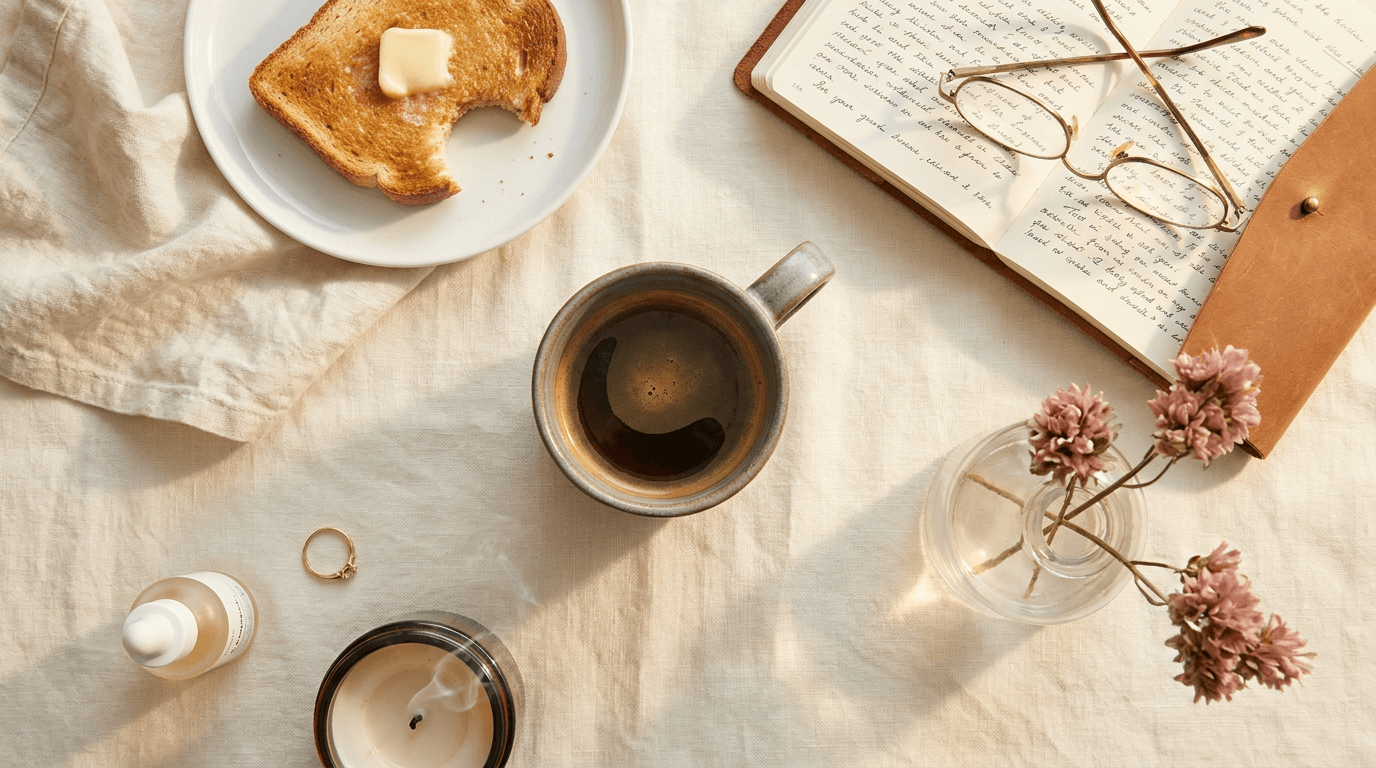
Prompt:
professional flat lay photograph of [a morning ritual and daily routine composition — the objects of a beautiful morning arranged as the material evidence of an aspirational daily practice: the morning objects are specific and lifestyle-communicating — the particular items that tell the story of this person's morning: the coffee or tea (a ceramic mug — its form, its material, its color: a handmade stoneware mug with a warm glaze, or a fine porcelain cup with a clean, minimal form — with coffee or tea visible inside, the liquid surface creating a dark, warm circle at the composition's center or anchor point; or a glass carafe or pour-over with the coffee visible; a small plate or saucer beneath), the breakfast element (a piece of toast with butter on a small ceramic plate, a halved grapefruit on a cutting board, a bowl of granola with a spoon, a croissant on parchment — the food element adding warmth and the sensory dimension of taste to the visual composition), the reading or thinking material (an open book or magazine with visible pages — the pages showing text that adds visual texture without being readable, or a newspaper folded to reveal its layout, or a journal with a few handwritten lines — the reading material communicating the morning's intellectual character), the personal care element (a skincare product — the morning serum or moisturizer — a lip balm, a small perfume bottle, a pair of glasses — the personal-care object connecting the composition to the viewer's own morning), the textile element (a linen napkin, a corner of a robe or sweater visible at the frame edge, a soft fabric adding textile warmth to the hard-object composition), the botanical element (fresh flowers — a small bunch of seasonal stems in a bud vase or lying loose, a sprig of herb from the garden — the botanical adding organic, living quality), the small detail objects (a ring or bracelet set down while washing hands, a candle with its wick recently extinguished, a phone face-down suggesting digital detachment — the small objects adding personal narrative depth), the arrangement suggests a moment in progress — the morning interrupted for the photograph: the mug half-drunk, the book open to the middle, the toast bitten, the napkin unfolded and slightly askew — the composition reading as a pause in a beautiful routine rather than a display of unused objects] on [the specific morning-appropriate surface — a surface that communicates domestic warmth and morning light: the surface (specify: [your surface, e.g., a light-toned natural linen in warm cream with visible weave, or a warm white marble with subtle veining, or a light wood tray or table surface in natural oak or maple])] with the morning objects creating an organic, natural-feeling arrangement — the objects positioned with studied casualness, some overlapping (the napkin under the plate, the book extending beneath the mug's shadow), the arrangement radiating outward from the coffee as the central anchor, the botanical element creating the organic diagonal that breaks the composition's regularity, the small personal objects scattered in the negative space at the composition's edges, the overall feeling warm, domestic, aspirational — the viewer imagining this as their own morning, the negative space is moderate to generous — the surface visible, the arrangement spacious and calm as a morning should feel, the composition from directly overhead, depth of field deep throughout, the lighting is warm, soft, and morning-specific — the particular quality of early-to-mid-morning natural light: warm, soft, gentle morning light — the quality of natural light from a window on a bright morning: the light slightly warmer in tone than neutral (the golden quality of morning east light or the warm, diffused quality of morning light reflected from warm surfaces), the light entering from one side and creating the soft directional shadows that give each object its dimension, the coffee surface catching a warm highlight, the ceramic mug showing its glaze quality, the food elements looking warm and appetizing in the morning light, the botanical elements catching the light with their translucent, living quality, the overall illumination bright and airy with a gentle warmth that communicates morning, morning ritual palette — the morning's warm, domestic, natural palette (specify: [your morning palette, e.g., warm cream linen surface, stoneware mug in warm gray-blue, dark coffee visible, golden toast with butter, white ceramic plate, cream napkin, dusty pink dried flowers, natural leather-bound journal, brass reading glasses — a palette of warm creams, soft grays, golden tones, and organic naturals]) — warm morning natural light — airy and gently warm, the mood is morning-calm ritually beautiful domestically aspirational and the specific morning message — this is how a beautiful morning begins, the objects are chosen with care, the routine is intentional and aesthetic — the morning ritual flat lay as the lifestyle and daily-routine visual, professional overhead flat lay photography with warm soft morning natural light and deep depth of field and true overhead perspective, composed as a morning routine flat lay, warm morning palette on textured domestic surface, no text overlays, no watermarks
Best for: Instagram feed lifestyle and routine content, Pinterest morning routine and lifestyle pins, blog content morning routine features, email marketing lifestyle content, coffee and tea brand product content, skincare and wellness brand morning-routine features, food brand breakfast and morning content, stationery brand morning-journaling content, brand partnerships and collaboration content, content creator and influencer daily-routine content
Template 4: The Creative Workspace — Tools and Productivity
This template presents the creative workspace from above — the desk, the tools, the materials, the project in progress — the flat lay that communicates creative process, productivity, and the visual world of someone who makes things. The workspace flat lay resonates with creative professionals, freelancers, and any audience that identifies with the aesthetic of productive work.
Prompt:
professional flat lay photograph of [a creative workspace and productivity composition — the desk surface and its tools arranged as the material evidence of creative work in progress: the workspace objects are specific to a creative discipline — the particular tools and materials that tell the story of this person's work: the primary work surface or tool (a sketchbook open to a page with visible drawings or sketches — not detailed enough to read but visible enough to communicate creative work, with a pencil or pen resting on or near the page; or a laptop partially visible at the frame edge, the screen showing work-in-progress; or a cutting mat with design tools; or a tablet with a stylus — the primary work tool communicating the creative discipline), the writing and drawing instruments (pens in a specific type — a fountain pen, a set of fine-tip markers, architectural pencils, brush pens — arranged casually: one pen resting on the sketchbook, others in a pen cup or laid on the surface; the instruments showing their specific character — the metal of the pen nib, the wood of the pencil, the color of the marker caps), the reference materials (design books or art books — one open showing a spread, others stacked with their spines visible; printed photographs or tear sheets; a mood board or reference card; material samples — the reference materials communicating research and visual intelligence), the organizational tools (a small tray or dish holding clips, pins, and small items; a roll of tape — washi tape or masking tape; sticky notes in a neutral color; a ruler or straightedge — the organizational tools communicating order within the creative process), the beverage (a coffee mug or a glass of water — the sustenance element that humanizes the workspace and suggests the long, engaged creative session), the personal objects (a pair of glasses, a phone, a small plant in a minimal pot, a candle — the personal elements that make the workspace a human place rather than a catalog display), the textile or surface detail (a piece of fabric, a leather desk mat, a coaster — a textile element adding material warmth to the hard-tool composition), the digital and analog coexistence — the workspace showing both digital tools (the laptop edge, the phone, the tablet) and analog tools (the sketchbook, the pens, the printed references) in harmonious coexistence, communicating the contemporary creative process that moves between screens and surfaces, the arrangement suggests active work — the sketchbook in mid-project, the pens recently used, the coffee half-drunk, the reference books open to working pages — the composition reading as a pause in productive creative work] on [the specific workspace surface — the desk or work surface that communicates the creative discipline's character: the surface (specify: [your surface, e.g., a warm walnut desk surface with visible grain, or a light birch plywood, or a gray concrete desktop, or a clean white laminate desk surface for a more minimal, modern workspace])] with the workspace objects arranged in the organic, in-progress configuration of an active creative desk — the objects positioned as if the creator has just stepped away, the pen left where it was set down, the book open to the working page, the coffee placed to one side, the tools distributed across the desk in the working arrangement rather than the stored arrangement, the composition anchored by the open sketchbook or primary work surface as the largest element, the surrounding tools and objects creating the visual context, the negative space is moderate — enough visible desk surface to feel organized rather than chaotic, but enough objects to feel productively active, the composition from directly overhead, depth of field deep, the lighting is clean, bright, and productivity-communicating: bright, clean, slightly cool-to-neutral natural light — the quality of natural light in a well-lit creative workspace: bright enough to work by, slightly cooler in tone than the warm morning light (suggesting midday productivity rather than morning calm), the light directional from one side creating the shadows that give the tools and objects their dimension, the paper showing its white or cream surface, the tools catching light with their material character (the metal pen nib, the wooden pencil, the glass screen), the overall illumination communicating clarity, focus, and the bright, energized atmosphere of productive creative work, workspace flat lay palette — the creative workspace's specific palette (specify: [your workspace palette, e.g., warm walnut desk surface, cream sketchbook pages, black fine-tip pens and mechanical pencil, white ceramic coffee mug, a stack of design books with minimal covers, brass paper clips in a small ceramic dish, a monstera cutting in a clear glass vase, warm gray wool coaster — a palette of warm wood, cream paper, black tools, white ceramic, with green botanical accent]) — bright clean natural workspace light — clear and productivity-communicating, the mood is creatively productive aesthetically intentional tool-beautiful and the specific workspace message — this is where considered work happens, the tools are chosen with care, the creative process is visible — the workspace flat lay as the creative-process and productivity-culture visual, professional overhead flat lay photography with bright clean natural light and deep depth of field and true overhead perspective, composed as a creative workspace flat lay, creative workspace palette on work-surface, no text overlays, no watermarks
Best for: Instagram feed creative-process and behind-the-scenes content, Pinterest workspace and productivity pins, blog content workspace and tool features, stationery and tool brand product content, tech accessory brand workspace content, content creator and freelancer personal-brand content, LinkedIn professional and creative-culture content, email marketing creative-process features, co-working and workspace brand content, online course and creative education promotional imagery
Template 5: The Ingredients — Culinary and Recipe Composition
This template arranges raw ingredients from above — the produce, the spices, the grains, the herbs, the oils — creating the culinary flat lay that communicates recipe potential, ingredient quality, and the visual abundance of cooking as a creative act. The ingredients flat lay is essential for food brands, recipe content, cooking-related products, and any brand that connects to the kitchen.
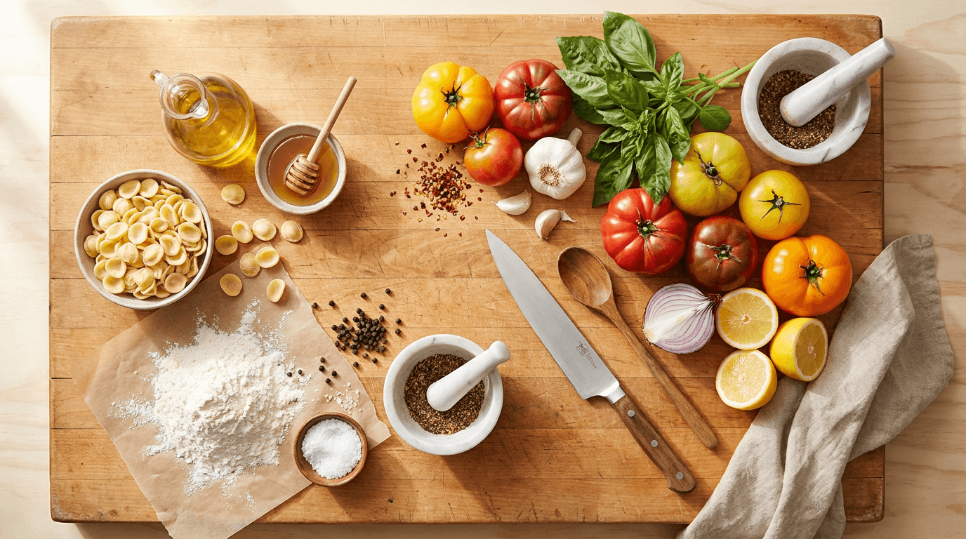
Prompt:
professional flat lay photograph of [a culinary ingredients and recipe composition — raw ingredients arranged as the visual story of a meal about to be prepared: the ingredients are specific to a recipe or a culinary theme — the particular foods and cooking elements: the primary produce (the specific vegetables, fruits, or proteins — each described with visual precision: ripe tomatoes — their red skin slightly imperfect, the stem attached, their specific variety (heirloom, cherry, Roma); fresh herbs — basil with its deep green leaves, thyme with its small delicate leaves on stems, rosemary with its needle-like structure; citrus — halved lemons showing their yellow flesh and seeds, limes, oranges; alliums — a whole garlic bulb with its papery skin and a few separated cloves, a red onion halved showing its purple rings, shallots; root vegetables — carrots with their green tops, beets with their deep red; or the specific produce for your recipe), the dry goods and pantry elements (a small bowl of dried pasta or grains, a mound of flour on parchment, a bowl of sea salt with its coarse crystals, peppercorns in a small dish, dried chili flakes, nuts or seeds — the dry goods adding textural contrast and pantry depth), the liquid elements (a cruet or bottle of olive oil, a small dish of honey with a dipper, vinegar in a glass vessel, a splash of cream or milk in a small pitcher — the liquids adding the flowing, wet dimension to the dry-and-solid composition), the herbs and botanicals (the fresh herbs described above, edible flowers, microgreens — the green, living, fragrant elements that add color and organic life), the tools (a kitchen knife — its blade visible, its handle material identifiable, a wooden cutting board partially visible at the frame edge, a mortar and pestle with ground spices, a wooden spoon, a grater, a pair of kitchen scissors — the tools communicating the cooking that is about to happen), the textiles (a kitchen linen in a neutral or complementary color, a piece of cheesecloth, a flour-dusted towel — the textile adding the domestic, handmade quality), the ingredients are arranged in an abundant, organic composition — some items grouped (the tomatoes clustered together, the herbs bundled), some items scattered (individual garlic cloves, scattered peppercorns, loose herb leaves), some items placed in vessels (the salt in a small bowl, the oil in its bottle, the spices in small dishes), some items placed directly on the surface (the produce, the loose herbs, the flour) — the arrangement creating the abundant, generous, market-fresh quality of cooking about to begin, the overall composition communicates: these ingredients are beautiful, fresh, and full of culinary potential — the recipe is about to happen, the cooking is a creative act, the ingredients are the raw materials of something delicious — the culinary flat lay as the ingredient-beauty and recipe-potential visual] on [the specific culinary surface — the kitchen-appropriate surface that communicates the cooking context: the surface (specify: [your surface, e.g., a large wooden cutting board or butcher block with warm, used character, or a cool marble pastry slab, or a matte concrete kitchen counter, or a rustic terra cotta tile surface, or a linen-covered table surface])] with the ingredients creating an abundant, organic, visually generous arrangement — the produce scattered and clustered with natural, market-fresh casualness, the small dishes and vessels creating the visual anchor points, the loose ingredients (scattered herbs, peppercorns, flour dust) creating the organic, in-progress, cooking-about-to-happen quality, the tools placed at natural angles suggesting use rather than display, the colors of the fresh ingredients creating the visual vibrancy — the reds and oranges and greens and yellows of fresh produce against the neutral surface, the negative space is moderate to minimal — the arrangement feels abundant and generous, the surface visible but not dominant, the composition from directly overhead, depth of field deep, the lighting is natural, food-specific, and appetite-communicating: bright, natural, slightly warm directional light — the quality of natural kitchen light that makes food look its most beautiful and appetizing: the light bright enough to reveal every ingredient's color and texture at its most vivid — the tomato's red at its deepest, the herb's green at its most vibrant, the citrus flesh at its most jewel-like — the light slightly warm in tone to create the appetite-stimulating warmth that food photography requires (never cool or blue-toned, which makes food look unappetizing), the light directional from one side creating subtle shadows that give each ingredient its three-dimensional quality — the rounded form of the tomato, the height of the garlic cloves, the delicate structure of the herb stems all communicated through their shadows, the liquid elements (the oil, the honey) catching the light with their translucent, luminous quality, the overall illumination abundant, warm, and food-celebrating, culinary flat lay palette — the ingredient palette unified on the cooking surface (specify: [your culinary palette, e.g., deep red heirloom tomatoes, bright green basil, golden olive oil, white garlic and sea salt, warm brown wooden board, cream linen, yellow lemon halves, black peppercorns — a palette of vivid produce colors against warm neutrals]) — bright warm natural kitchen light — abundant and appetite-stimulating, the mood is culinary-abundant ingredient-beautiful cooking-imminent and the specific culinary message — these ingredients are fresh, beautiful, and full of potential, the cooking is about to begin, the recipe is an act of creation — the ingredients flat lay as the culinary-beauty and recipe-potential visual, professional overhead flat lay photography with bright warm natural light and deep depth of field and true overhead perspective, composed as a culinary ingredients flat lay, vivid ingredient palette on kitchen surface, no text overlays, no watermarks
Best for: Instagram feed recipe and food content, Pinterest recipe pins (highest-performing food format), blog content recipe headers, food brand product-in-context content, cookbook and recipe publication imagery, email marketing recipe and food features, YouTube recipe video thumbnails, food subscription box content, farmer's market and artisan food brand imagery, cooking tool and kitchenware brand product-in-use content
Template 6: The Outfit — Fashion Styling and Wardrobe Composition
This template lays out the complete outfit from above — the garments, the shoes, the accessories, the jewelry — the fashion flat lay that communicates the styling intelligence, the wardrobe coordination, and the personal style narrative that makes the viewer want to wear exactly this combination.
Prompt:
professional flat lay photograph of [a fashion outfit styling composition — a complete outfit laid out from above as the visual presentation of styled personal fashion: the outfit is specific and style-communicating — the particular garments and accessories that create a coherent, wearable, aspirational look: the primary garment (the specific item — a cashmere sweater folded to show its texture and color, a linen shirt unbuttoned and laid open to show its interior and its casual drape, a tailored blazer arranged to show its shoulder structure and its lapel, a cotton dress laid to suggest its silhouette, a knit cardigan partially folded — the garment described with its material, its color, its fold or lay position, its tactile character visible), the bottom (if applicable — the jeans folded or rolled to show their wash and their denim character, the trousers folded to show their fabric and their cut, the skirt laid to show its length and its material — paired with the top to communicate the complete outfit), the shoes (visible at the composition's base or corner — the specific shoes: leather boots showing their material and their form, white sneakers clean and graphic, loafers showing their leather quality, heels positioned to show their profile — the shoes completing the outfit from the ground up), the bag or carry accessory (a leather tote, a crossbody bag, a clutch, a canvas market bag — the bag positioned to show its form and its material quality), the jewelry and small accessories (a watch laid on its side or face-up, a necklace coiled or draped, earrings paired, a ring, a bracelet, sunglasses — the accessories scattered near the garments they would accompany, adding the personal, finishing-touch quality), the belt (if relevant — the leather belt coiled or draped near the pants, showing its buckle and its material), the textile accessory (a scarf draped casually, a hat positioned flat — the textile accessory adding another material and another layer), the fragrance (a perfume bottle as the invisible finishing touch made visible — the bottle adding the luxury and the personal-signature dimension), the garments are arranged to suggest the body's form without a body — the shirt positioned above the pants, the shoes below, the accessories beside — the arrangement implying the person who would wear these items, the outfit readable as a complete, coordinated, wearable look, the garments laid with editorial precision — the folds deliberate, the collars shaped, the sleeves positioned, the fabric smoothed or deliberately creased to show its character, the overall composition communicates: this outfit is styled, the coordination is intentional, the fabrics and the accessories are chosen with taste — the fashion flat lay as the personal-style and wardrobe-intelligence visual] on [the specific fashion-appropriate surface — a surface that communicates the outfit's style context: the surface (specify: [your surface, e.g., a clean white background for graphic, editorial contrast, or a natural wood floor showing warm boards, or a neutral linen bedspread suggesting the getting-dressed moment, or a cool concrete surface for urban, modern styling])] with the outfit arranged in the editorial fashion-flat-lay composition — the garments positioned to suggest the body's arrangement (top over bottom, shoes at base, accessories flanking), the folds and drapes creating the fabric character and the material quality, the accessories positioned as the finishing details, the negative space is generous around the outfit — the garments and accessories framed by visible surface, each item individually readable, the composition not cramped, the overall arrangement clean and editorial, the composition from directly overhead, depth of field deep — every textile and accessory in focus, the lighting is bright, clean, and fabric-revealing: bright, even, slightly directional natural light — the clean, bright illumination that makes fabrics show their color accurately and their texture clearly: the light bright enough to reveal the true color of every garment (the exact shade of the sweater, the wash of the denim, the color of the leather) without the warm or cool color casts that shift fabric colors, the light slightly directional to create the subtle shadows in fabric folds that communicate texture and dimension (the cable knit of the sweater, the twill weave of the denim, the grain of the leather), the overall illumination bright, clean, and color-accurate, fashion flat lay palette — the outfit's deliberate color palette (specify: [your outfit palette, e.g., cream cashmere sweater, medium-wash denim, cognac leather ankle boots and matching belt, gold jewelry — delicate chain necklace, small hoop earrings, simple watch — tortoiseshell sunglasses, tan leather crossbody bag — on a white surface — a palette of cream, blue, cognac, and gold]) — bright clean natural light — color-accurate and fabric-revealing, the mood is style-confident editorially curated outfit-complete and the specific fashion message — this outfit is styled with intention, every piece is chosen to coordinate, the personal style is confident and considered — the fashion flat lay as the wardrobe-styling and personal-fashion visual, professional overhead flat lay photography with bright clean natural light and deep depth of field and true overhead perspective, composed as a fashion outfit flat lay, coordinated outfit palette on clean surface, no text overlays, no watermarks
Best for: Instagram feed outfit and styling content, Pinterest outfit and fashion pins (very high save rate), blog content outfit features and style guides, fashion brand product styling content, e-commerce outfit-pairing and styling suggestions, email marketing fashion and styling features, fashion influencer and content creator outfit content, retail brand seasonal styling content, subscription styling box reveal content, fashion editorial lookbook content
Template 7: The Travel Essentials — Journey and Adventure Curation
This template arranges the objects of travel — the passport, the map, the camera, the sunglasses, the journal — creating the travel essentials flat lay that communicates wanderlust, preparation, and the aesthetics of adventure. The travel flat lay resonates with the broad audience that connects products and brands to the aspirational experience of discovery.
Prompt:
professional flat lay photograph of [a travel essentials and journey preparation composition — the objects of travel arranged as the material evidence of an adventure about to begin: the travel objects are specific and destination-suggestive — the particular items that tell the story of this trip: the documents and navigation (a passport — its cover showing its color and its worn character, a boarding pass or printed itinerary partially visible, a paper map or guidebook open or folded to show a specific destination, a journal or travel notebook with a pen — the documents communicating the planned, intentional quality of thoughtful travel), the camera and visual tools (a film camera or a quality digital camera — its body showing its material and its design character, or a pair of quality sunglasses, or both — the visual tools communicating that this traveler sees and records), the personal essentials (a leather wallet or cardholder, a watch, a key or keychain, a small pouch for toiletries, a lip balm, a small bottle of sunscreen — the personal items communicating the practical dimension of travel), the reading material (a paperback book or a magazine appropriate to the destination — a novel, a travel guide, a cultural publication — the reading material suggesting the traveler's intellectual engagement with the destination), the comfort and style items (sunglasses, a hat positioned flat, a lightweight scarf, a pair of earbuds or headphones — the comfort items suggesting the sensory experience of travel), the destination-specific objects (a postcard, a local currency note or coins, a small souvenir, a local snack or candy, a flower or leaf from the destination's flora — the destination-specific objects giving the composition its particular geographic character), the bag (a corner of a canvas tote, a leather duffle strap, the edge of a backpack — the bag partially visible at the frame edge suggesting the packing that is in progress), the arrangement suggests departure preparation — the items spread across the surface as if being gathered and sorted before packing, some items stacked (the passport on the book), some items scattered (the coins, the keys), some items positioned for use (the sunglasses unfolded, the camera with its strap extended) — the composition reading as the moment before the journey begins, the overall composition communicates: this traveler is thoughtful, aesthetically engaged, and prepared — the travel is an experience, not just a destination — the travel flat lay as the wanderlust and adventure-preparation visual] on [the specific travel-context surface — a surface that communicates the departure or the destination: the surface (specify: [your surface, e.g., a weathered wooden table suggesting a café abroad, or a natural linen surface suggesting hotel bed packing, or a warm leather surface suggesting a luggage interior, or a vintage map as the surface itself])] with the travel objects arranged in the organic, pre-departure scatter — the items distributed as if being sorted for packing, some grouped by function (the documents together, the personal items together), some scattered individually (the coins, the key, the postcard), the camera and the passport as the compositional anchors, the destination-specific objects adding the geographic character, the negative space moderate — the surface visible but the arrangement feeling full and journey-ready, the composition from directly overhead, depth of field deep, the lighting is warm, atmospheric, and travel-evocative: warm, golden, slightly romantic natural light — the quality of late-afternoon or golden-hour light that infuses travel with its emotional, nostalgic, adventure-promising character: the light warm and golden in tone (not the bright, clinical light of a packing tutorial but the warm, atmospheric light that makes travel feel like a story), the light directional creating warm shadows that give each object its dimensional, material character — the leather of the passport and wallet rich and warm, the metal of the camera catching a golden highlight, the paper of the map and the book showing their fiber texture in the warm light, the overall illumination romantic and journey-promising, travel flat lay palette — the travel composition's specific palette (specify: [your travel palette, e.g., burgundy passport, vintage brass-bodied camera, cognac leather wallet, cream journal with leather closure, tortoiseshell sunglasses, faded paper map, foreign coins in silver and copper, dried wildflower, a handwritten postcard — on a weathered oak surface — a palette of warm leathers, brass, cream paper, and vintage naturals]) — warm golden atmospheric light — romantic and travel-evocative, the mood is wanderlust-inspired journey-ready aesthetically adventurous and the specific travel message — this trip is thoughtful, the preparation is intentional, the journey is aesthetic as well as geographic — the travel flat lay as the wanderlust and adventure-curation visual, professional overhead flat lay photography with warm golden natural light and deep depth of field and true overhead perspective, composed as a travel essentials flat lay, warm travel palette on journey-suggestive surface, no text overlays, no watermarks
Best for: Instagram feed travel and lifestyle content, Pinterest travel planning and packing pins, blog content travel preparation and packing guides, travel brand and hospitality brand content, luggage and leather goods brand product-in-context content, camera and photography brand lifestyle content, journal and stationery brand travel content, travel influencer and content creator trip features, email marketing travel and adventure features, airline and destination marketing content
Template 8: The Beauty Ritual — Skincare and Beauty Routine
This template arranges the beauty and skincare routine from above — the serums, the creams, the tools, the textiles — creating the beauty flat lay that communicates ritual, self-care, and the sensory luxury of a considered personal routine. The beauty flat lay is the highest-performing content format for skincare, cosmetic, and wellness brands.
Prompt:
professional flat lay photograph of [a skincare and beauty routine composition — the products and tools of personal care arranged as the material evidence of a luxurious, intentional beauty ritual: the beauty objects are specific and routine-communicating — the particular products and tools arranged in their ritual sequence or their aesthetic grouping: the skincare products (the specific products in their specific packaging — a glass serum bottle with its dropper cap removed and set beside it, the golden or clear serum visible through the glass; a moisturizer in its jar or tube with its specific material — frosted glass, matte ceramic, sleek plastic; a cleanser in its bottle or tube; an eye cream; a facial oil; a toner or mist in its spray bottle; a sunscreen — each product described with its packaging form, its material, its color, its label character — the products arranged in use-order suggesting the ritual sequence or in an aesthetic grouping suggesting the curated collection), the beauty tools (a jade roller or gua sha stone showing its translucent green mineral character, a facial brush, a pair of gold scissors for cutting sheet masks, a small mirror, cotton pads in a small stack — the tools adding the tactile, ritual dimension), the cosmetics if included (a lipstick in its tube — the shade visible at the tip, a compact with its case open showing the pressed powder or blush, a mascara, a brow pencil — the cosmetics adding the color and the transformative dimension), the textile elements (a soft washcloth or face towel in white or a muted tone, a piece of muslin, a silk sleep mask, a terry headband — the textiles adding the soft, spa-like, self-care dimension), the botanical and sensory elements (fresh flowers — a single peony or rose, a small bunch of lavender — or a sprig of rosemary or eucalyptus, a slice of citrus referencing a product ingredient, dried petals scattered — the botanicals connecting the products to their natural ingredients and adding the sensory dimension), the water or liquid element (a small glass of water with a lemon slice suggesting hydration, or a drop of product visible on the surface suggesting application, or a spray mist visible on the surface — the liquid adding the freshness and the cleansing dimension), the arrangement suggests the ritual in progress — a dropper cap removed, a product recently applied, the cotton pad used, the jade roller positioned as if just set down — the composition reading as a self-care session interrupted at its most beautiful moment, the overall composition communicates: this routine is luxurious, intentional, and sensory — the products are chosen with care, the ritual is a form of self-respect — the beauty flat lay as the skincare-ritual and self-care-luxury visual] on [the specific beauty-context surface — a surface that communicates the clean, luxurious, spa-like quality of the beauty routine: the surface (specify: [your surface, e.g., a white marble slab with soft gray veining for clean luxury, or a pale pink blush-toned surface for feminine softness, or a warm terrazzo for contemporary beauty, or a frosted glass surface for translucent, spa-like quality])] with the beauty products and tools arranged in the ritual-narrative composition — the products positioned to suggest use-sequence or curated collection, the tools placed near the products they accompany, the textiles layered beneath or beside the products adding the soft dimension, the botanicals creating the organic accent, the dropper caps and open containers suggesting active use, the negative space is moderate to generous — the arrangement feels clean, spa-like, and unhurried, each product individually readable and identifiable, the composition from directly overhead, depth of field deep, the lighting is soft, bright, and skin-flattering: soft, bright, diffused natural light — the clean, bright, shadow-gentle illumination that makes beauty products look their most luxurious and their packaging most readable: the light bright enough to reveal every product's packaging quality — the glass showing its transparency or its frost, the metal caps and closures showing their finish, the labels showing their typography and their design — the light diffused enough that shadows are soft and gentle (not the hard shadows that make beauty content feel harsh), the light slightly warm (never cool or blue, which makes skincare content feel clinical rather than luxurious), the overall illumination creating the bright, clean, spa-like atmosphere that beauty content requires, beauty flat lay palette — the beauty routine's specific palette (specify: [your beauty palette, e.g., clear and amber glass serum bottles, white and soft pink product packaging, jade green gua sha stone, white cotton pads and towel, a single blush pink peony, gold-capped products and brass scissors, a scattered drop of golden facial oil — on white marble — a palette of whites, soft pinks, clear glass, gold, jade green, and peony pink]) — soft bright diffused natural light — clean and spa-like, the mood is ritually luxurious self-care-intentional sensorially beautiful and the specific beauty message — this routine is an act of care, the products are chosen with intention, the ritual is a daily luxury — the beauty flat lay as the skincare-routine and self-care-culture visual, professional overhead flat lay photography with soft bright diffused natural light and deep depth of field and true overhead perspective, composed as a beauty routine flat lay, clean luxury beauty palette on spa-quality surface, no text overlays, no watermarks
Best for: Instagram feed skincare and beauty content (highest-engagement format for beauty brands), Pinterest skincare routine pins (extremely high save rate), blog content skincare routine features, beauty and skincare brand product content and routine marketing, email marketing beauty and skincare features, e-commerce beauty product page lifestyle imagery, beauty influencer and content creator routine content, YouTube beauty video thumbnails, subscription beauty box content, beauty editorial and magazine content
Template 9: The Stationery & Paper — Analog Creative Tools
This template celebrates the analog — the paper, the ink, the envelope, the stamp, the wax seal — creating the stationery flat lay that communicates the beauty of handwritten communication, paper-based creativity, and the deliberate choice of analog tools in a digital world.
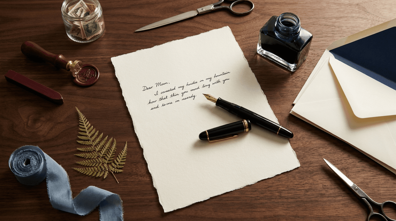
Prompt:
professional flat lay photograph of [a stationery and paper goods composition — the tools of handwritten communication and analog creative work arranged as the material evidence of a letter-writing, note-taking, creatively analog life: the stationery objects are specific and paper-beautiful — the particular items: the writing surface (a sheet of quality letter paper — its stock, its color, its weight visible: the thick, cotton-fiber character of letterpress stock, the smooth cream of fine writing paper, the textured surface of handmade paper with its deckled edges — the paper with a few handwritten lines in ink visible at the top, the handwriting suggesting a letter in progress), the writing instrument (a fountain pen — its body material visible: the resin or the metal or the celluloid, the nib catching light with its gold or silver metallic surface, the pen uncapped and resting on the letter as if just set down; or a quality ballpoint, a dip pen with its nib and its ink well), the ink (a bottle of ink — its glass bottle showing the deep color of the ink through the glass: the rich blue-black, the warm sepia, the deep burgundy — the ink bottle as a small object of beauty; or a cartridge, or an inkwell), the envelopes (a stack of matching envelopes — their flap style, their color, their lining visible: the contrast-color lining peeking out from beneath the flap, the envelope material matching the letter paper), the sealing elements (a wax seal with its stamp and a stick of colored sealing wax — the wax color rich and specific: burgundy, forest green, gold, navy — or a sheet of vintage stamps, or adhesive wax seals — the sealing adding the ceremonial, special-occasion dimension), the cards and secondary paper (thank-you cards, place cards, small note cards, postcards — the secondary paper goods adding the range and the variety), the accessories (a letter opener, a pair of small scissors, a bone folder, a ruler, a pencil — the stationery tools adding the craft dimension), the ribbons and textiles (a silk or grosgrain ribbon in a complementary color, a linen pouch or case for the pen, a fabric element adding the soft, tactile contrast to the paper), the botanical (a pressed flower, a sprig of dried lavender tucked into an envelope, a small cutting of greenery — the botanical adding the personal, romantic, time-marking dimension to the correspondence), the arrangement communicates the act of letter-writing in progress — the pen recently used, the letter mid-sentence, the envelope waiting, the seal ready — the composition as a frozen moment in the slow, deliberate, beautiful act of analog communication, the overall composition communicates: this person writes by hand, the stationery is beautiful, the act of correspondence is a creative and personal practice — the stationery flat lay as the analog-creativity and handwritten-communication visual] on [the specific stationery-appropriate surface — the surface that communicates the writing desk or the creative workstation: the surface (specify: [your surface, e.g., a rich dark walnut desk surface for traditional, warm elegance, or a cool gray linen for quiet, modern minimalism, or a vintage leather desk blotter for classic, library-study character, or a light birch surface for Scandinavian clean simplicity])] with the stationery arranged in the letter-writing-in-progress composition — the letter paper as the central anchor with the pen resting on it, the ink bottle nearby, the envelopes stacked to one side, the wax seal and secondary items distributed around the letter, the botanical and ribbon adding the decorative, personal elements, the negative space moderate to generous — the composition feeling deliberate and unhurried as letter-writing should feel, each paper element individually visible and readable, the composition from directly overhead, depth of field deep, the lighting is warm, intimate, and study-like: warm, soft, slightly intimate natural light — the quality of light in a writing room or a study: the light warm enough to make the cream paper glow and the ink look rich, slightly lower in intensity than the bright kitchen or workspace light (suggesting the quieter, more contemplative atmosphere of letter-writing), the light directional creating the soft shadows that give each paper and object its dimension — the thickness of the paper stack visible in its shadow, the pen casting its long, thin shadow, the ink bottle's glass catching a warm highlight, the wax seal showing its dimensional, embossed surface in the raking light, stationery flat lay palette — the paper and writing palette (specify: [your stationery palette, e.g., cream cotton letter paper with deckled edges, deep blue-black ink in a clear glass bottle, black resin fountain pen with gold nib, cream envelopes with navy lining, burgundy wax seal, vintage postage stamps, dried pressed fern, silk ribbon in dusty blue — on dark walnut surface — a palette of cream, deep blue-black, burgundy, gold, and dried botanical green against dark warm wood]) — warm intimate study light — contemplative and paper-celebrating, the mood is analog-intentional letter-writing-beautiful paper-luxurious and the specific stationery message — handwriting is a creative act, the stationery is chosen with care, the letter is a personal artifact — the stationery flat lay as the analog-creativity and paper-culture visual, professional overhead flat lay photography with warm intimate natural light and deep depth of field and true overhead perspective, composed as a stationery and letter-writing flat lay, warm paper-rich palette on study-appropriate surface, no text overlays, no watermarks
Best for: Instagram feed stationery and paper content, Pinterest stationery and letter-writing pins, blog content stationery reviews and writing features, stationery brand product content, pen and ink brand product-in-context content, wedding stationery and invitation content, gift and specialty retail content, Etsy and handmade goods artisan content, content creator and influencer analog-lifestyle content, email marketing stationery features and gift guides
Template 10: The Seasonal — Holiday and Thematic Celebration
This template creates the seasonal or holiday flat lay — the composition themed to a specific time of year, a specific celebration, or a specific seasonal mood, using the colors, materials, and objects associated with that season or occasion to create timely, relevant, emotionally resonant content.
Prompt:
professional flat lay photograph of [a seasonal or holiday thematic composition — objects and materials associated with a specific season or celebration arranged to communicate the spirit, the palette, and the aesthetic of that time of year: the seasonal theme is specific — the particular season, holiday, or occasion: an autumn and harvest composition (dried leaves in specific fall colors — amber, rust, burgundy, golden yellow — scattered and arranged; a small gourd or pumpkin; cinnamon sticks bundled; a warm knit textile — a cable-knit swatch, a wool scarf; a ceramic mug of apple cider or chai; a candle with a warm, spiced character; seasonal produce — figs, persimmons, pomegranates; a book with an autumn-appropriate cover; dried wheat or grasses — the autumn objects communicating the warm, rich, cozy, harvest character of fall); or a winter and holiday composition (evergreen sprigs — pine, cedar, fir with their needles and their green-against-neutral quality; a wrapped gift with specific wrapping paper and ribbon; a candle — beeswax, pillar, or votive; metallic elements — gold ornaments, brass bells, a copper star; warm textiles — a cashmere throw corner, wool mittens; a hot drink — cocoa, mulled wine, eggnog; cinnamon sticks, dried orange slices, star anise; a greeting card with an envelope — the winter objects communicating the warm, celebratory, cozy, generosity-spirited character of the season); or a spring composition (fresh flowers — tulips, ranunculus, daffodils in their specific spring colors; eggs for Easter; fresh herbs; a light scarf or cotton textile; a garden tool; seed packets; a glass of fresh juice; a light, floral candle — the spring objects communicating renewal, freshness, and light); or a summer composition (citrus, sunglasses, a straw hat, sunscreen, a linen textile, shells, a cold drink, a magazine, fresh berries, a small potted succulent — the summer objects communicating warmth, outdoor living, and relaxation); the seasonal palette is deliberate — the colors specific to the season: autumn's warm earth tones and jewel tones, winter's evergreen and metallic and cream, spring's pastels and fresh greens, summer's brights and nautical stripes and natural textures, the overall composition communicates: this is the aesthetic of this season, the objects are the material vocabulary of this time of year — the seasonal flat lay as the timely, emotionally resonant, calendar-specific visual] on [the specific seasonally appropriate surface — the surface that complements the seasonal palette: the surface (specify: [your surface, e.g., a warm, dark wood surface for autumn warmth, or a cream linen for winter softness, or a light marble for spring freshness, or a natural jute or woven surface for summer texture])] with the seasonal objects arranged in a generous, thematic composition — the objects grouped and scattered to create the seasonal atmosphere, the signature elements prominent (the pumpkin for fall, the evergreen for winter, the flowers for spring, the citrus for summer), the textiles and the botanicals creating the sensory dimension, the negative space calibrated to the season's character (more generous for spring and summer's light, open quality; less generous for autumn and winter's rich, layered quality), the composition from directly overhead, depth of field deep, the lighting matches the season's atmospheric character: warm golden light for autumn, warm candlelit-quality light for winter, bright fresh light for spring, bright warm sunlit light for summer — the specific seasonal light quality (specify: [your seasonal light, e.g., warm, golden, late-afternoon autumn light creating long shadows and rich, warm tones on the fall objects, the amber and rust colors intensified by the golden illumination]): the light direction and shadow quality consistent throughout the composition, each object catching the light with its material character appropriate to the seasonal mood, seasonal flat lay palette — the season's specific color palette (specify: [your seasonal palette, e.g., autumn: amber dried leaves, deep burgundy figs, burnt orange pumpkin, warm cinnamon brown sticks, cream knit textile, brass candle holder, golden wheat stalks — on dark walnut surface — a palette of amber, burgundy, burnt orange, warm brown, cream, brass, and golden]) — seasonal-specific lighting — emotionally resonant and thematically complete, the mood is seasonally immersive celebration-spirited aesthetically thematic and the specific seasonal message — this season has a look, a palette, a material vocabulary, and this flat lay captures its aesthetic spirit — the seasonal flat lay as the timely, calendar-aligned, emotionally resonant visual, professional overhead flat lay photography with season-specific lighting and deep depth of field and true overhead perspective, composed as a seasonal thematic flat lay, season-specific palette on complementary surface, no text overlays, no watermarks
Best for: Instagram feed seasonal and holiday content (essential for the content calendar), Pinterest seasonal and holiday pins (highest-traffic seasonal format), blog content seasonal roundups and gift guides, brand seasonal marketing campaigns, email marketing seasonal features, e-commerce seasonal landing page imagery, social media holiday campaigns, brand partnership seasonal content, retail and gift seasonal promotion, content creator and influencer seasonal content
Template 11: The Gift Guide — Curated Collection Presentation
This template arranges a curated gift selection — multiple items from potentially different brands or categories — into a single flat lay that functions as a visual shopping list, a gift guide, or a curated recommendation that communicates the editorial intelligence of the curator.
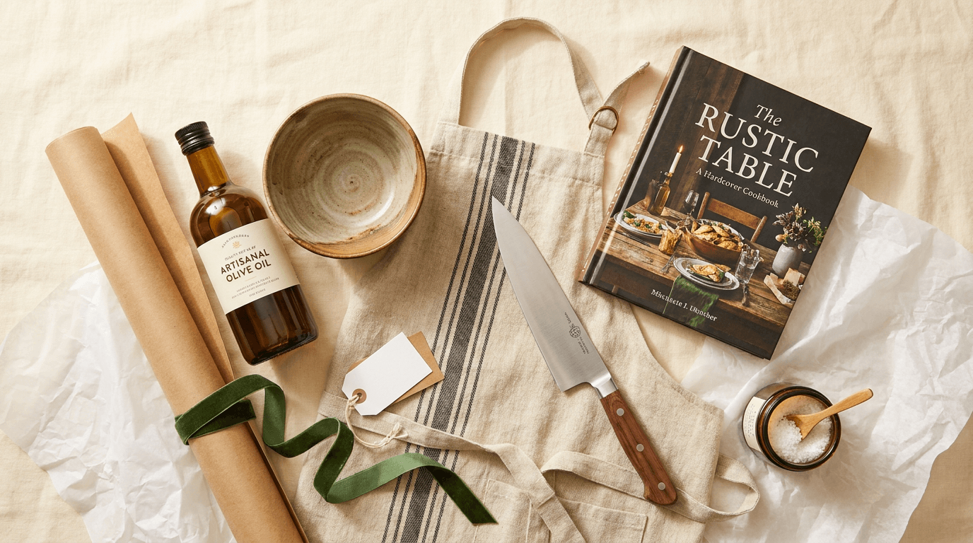
Prompt:
professional flat lay photograph of [a curated gift guide collection — multiple items selected and arranged as a visual gift recommendation for a specific recipient or occasion: the gift items are specific and curation-communicating — the particular products that together tell the story of the ideal gift: the gifts for a specific recipient type (gifts for the home cook: a quality olive oil, a handmade ceramic bowl, a linen apron, a kitchen knife, a cookbook, artisan salt — the items creating the curated, considered, taste-level-communicating collection; or gifts for the creative: a quality sketchbook, a set of colored pencils, an art book, a desk object, a candle; or gifts for the traveler: a leather passport case, a quality water bottle, a cashmere travel wrap, a guidebook, a pouch; or gifts for the reader: a book selection, a reading light, a bookplate set, a blanket, a mug; or gifts from a single brand's range: the brand's hero product, its accessories, its complementary items — the gift collection communicating the brand's giftable range), each gift item is individually identifiable and visually appealing — the items showing their specific character: the packaging visible and attractive, the product quality evident, the material and the form communicating the item's value and its aesthetic quality, the items are varied in size and scale — creating the compositional rhythm from large anchor items to small, delightful detail items, the largest item anchoring the composition, the smallest items filling the spaces and adding the surprise-and-discovery quality of a well-curated gift, the wrapping and presentation elements are present — tissue paper, ribbon, a gift tag, wrapping paper, a box — the wrapping elements adding the gifting dimension and the celebration quality, the overall composition communicates: these items have been curated with intelligence and taste, the gift is considered and personal, the selection reflects the giver's aesthetic as much as the recipient's needs — the gift guide flat lay as the curated-recommendation and shopping-inspiration visual] on [the specific gift-appropriate surface — a surface that communicates the celebratory, generous, gift-giving context: the surface (specify: [your surface, e.g., a warm cream linen for clean, modern gifting, or a kraft paper surface for artisan, eco-conscious gifting, or a white marble for luxury gifting, or a festive but sophisticated wrapping paper as the surface itself])] with the gift items arranged in a generous, discovery-encouraging composition — the items positioned to invite the eye to travel from one to the next, discovering each gift in sequence, the anchor items positioned prominently, the smaller items scattered between and around them, the wrapping elements layered through the composition (a ribbon trailing beneath items, tissue paper visible at edges), the items visually accessible — each one readable and identifiable, the negative space moderate — the composition feeling generous and abundant (gifting should feel abundant) without being cluttered, the composition from directly overhead, depth of field deep, the lighting is bright, celebratory, and gift-appealing: bright, clean, warm natural light — the quality of light that makes products look their most appealing and gift-worthy: the light bright enough to reveal every product's quality and its packaging at its most attractive, slightly warm to create the generous, celebratory, warm atmosphere of gift-giving, the light directional enough to give each item its three-dimensional quality — boxes showing their depth, bottles showing their form, fabric showing its texture — the overall illumination festive and product-celebrating, gift guide flat lay palette — the curated collection's palette unified (specify: [your gift palette, e.g., amber glass bottle, cream ceramic, natural linen, kraft paper wrapping, forest green ribbon, gold gift tag, white tissue paper, warm wood accessories — a palette of amber, cream, natural, kraft, forest green, and gold accents on cream linen]) — bright warm natural light — celebratory and product-quality-communicating, the mood is generously curated taste-level-communicating gift-ready and the specific gift message — these items have been selected with intelligence, the gift is thoughtful, the curation reflects impeccable taste — the gift guide flat lay as the curated-recommendation and editorial-shopping visual, professional overhead flat lay photography with bright warm natural light and deep depth of field and true overhead perspective, composed as a gift guide flat lay, curated collection palette on gift-appropriate surface, no text overlays, no watermarks
Best for: Instagram feed gift guide and curated collection content, Pinterest gift guide pins (highest commercial intent format), blog content gift guide roundups, email marketing gift guide features, brand holiday and occasion marketing, e-commerce gift section and bundle page imagery, influencer and content creator affiliate gift content, editorial and magazine gift guide submissions, brand partnership gift collaboration content, subscription box and curated retail content
Template 12: The Coffee Culture — Beverage and Café Composition
This template celebrates coffee (or tea) culture from above — the cup, the beans, the brewing tools, the pastry, the reading material — creating the café-culture flat lay that communicates the ritual, the craft, and the daily ceremony of the beverage moment.
Prompt:
professional flat lay photograph of [a coffee or tea culture and beverage ritual composition — the objects of the daily café ceremony arranged as the material evidence of a considered, aesthetically engaged relationship with the beverage: the beverage and its tools are specific — the particular items: the beverage itself (a ceramic cup or mug of coffee — the cup's specific character: a handmade stoneware cup with visible throwing marks and a warm glaze, or a fine porcelain espresso cup on its saucer, or a clear glass cup showing the coffee's color layers, or a matcha bowl with its bright green surface — the beverage visible, its dark surface or its frothy texture creating the warm, dark center of the composition; or a cup of tea — the tea's color visible through a glass cup, or the steam suggested by the composition's warmth), the brewing equipment (a pour-over dripper — a Chemex, a V60, a Kalita — showing its specific form and material; or a French press; or a moka pot; or an espresso portafilter; or a simple kettle — the brewing tool communicating the specific coffee-preparation method and its craft dimension), the beans (whole coffee beans — a small handful scattered on the surface, or a few spilling from a bag, or contained in a small bowl — the beans showing their dark, oily, aromatic character), the bag or packaging (a bag of quality coffee — the label visible, the kraft or specialty packaging communicating the sourcing and the roast, the bag folded or open), the accompaniment (a pastry — a croissant, a piece of chocolate, a biscotti, a slice of cake on a small plate — the food element adding the sensory dimension and the café quality), the reading or thinking material (a book, a newspaper, a magazine, a notebook with a pen — the reading material communicating the café culture of sitting, sipping, and reading or thinking), the tools and accessories (a coffee spoon, a small creamer or sugar, a linen napkin, a coaster — the accessories completing the beverage service), the botanical (a small vase with a single stem, a potted succulent, a leaf — the botanical adding the café ambiance), the arrangement suggests the ritual in its most beautiful moment — the coffee recently poured, the pastry just served, the book open, the morning light entering — the composition reading as the daily ceremony at its peak, the overall composition communicates: coffee (or tea) is a ritual, the tools and the preparation matter, the beverage moment is a daily aesthetic practice — the café flat lay as the beverage-culture and daily-ceremony visual] on [the specific café-appropriate surface — a surface that communicates the café, the kitchen counter, or the breakfast table: the surface (specify: [your surface, e.g., a warm marble café table surface with subtle gray veining, or a worn wooden table with patina suggesting a favorite café, or a terrazzo surface for a modern coffee-bar quality, or a white ceramic tile surface for a bright, clean, barista quality])] with the coffee objects arranged in the café-moment composition — the cup as the central or near-central anchor, the brewing tool positioned as the secondary feature, the beans scattered for organic, aromatic texture, the pastry on its plate adding the food dimension, the reading material creating the intellectual context, the accessories filling the composition without cluttering, the negative space moderate — the arrangement feeling comfortable and unhurried as a good coffee moment should, the composition from directly overhead, depth of field deep, the lighting is warm, café-like, and morning-appropriate: warm, soft, natural morning-light quality — the golden, warm, diffused light of a café with good windows on a bright morning: the light warm enough to make the coffee's dark surface gleam and the pastry look golden and appetizing, the ceramic mug catching a warm highlight, the coffee beans showing their dark, glossy surface, the overall illumination warm, inviting, and café-atmospheric — suggesting the comfort and the warmth of the beverage ritual, coffee culture flat lay palette — the café composition's palette (specify: [your coffee palette, e.g., dark espresso coffee in a handmade warm gray stoneware cup, whole dark roast beans scattered, kraft coffee bag with minimalist label, golden croissant on a small cream plate, cream linen napkin, open paperback book, brass spoon, single eucalyptus stem — on warm marble surface — a palette of dark coffee browns, warm gray ceramic, kraft, golden pastry, cream, and brass]) — warm morning natural light — café-atmospheric and comfort-communicating, the mood is ritually warm café-cultured morning-beautiful and the specific coffee message — this beverage is a ritual, the preparation is craft, the daily cup is an aesthetic practice — the coffee flat lay as the beverage-culture and daily-ritual visual, professional overhead flat lay photography with warm morning natural light and deep depth of field and true overhead perspective, composed as a coffee culture flat lay, warm beverage palette on café surface, no text overlays, no watermarks
Best for: Instagram feed coffee and tea content (consistently high engagement), Pinterest coffee and café pins, blog content coffee and beverage features, coffee and tea brand product content, café and restaurant brand content, food blog and recipe-adjacent content, lifestyle brand morning-routine content, kitchenware and ceramics brand product-in-context content, content creator daily ritual content, email marketing lifestyle and morning features
Template 13: The Fitness & Wellness — Active Lifestyle Layout
This template arranges the objects of physical wellness — the activewear, the water bottle, the yoga mat, the healthy snack, the recovery tools — creating the fitness flat lay that communicates the aesthetics of an active, health-conscious lifestyle and positions products within the visual vocabulary of wellness culture.
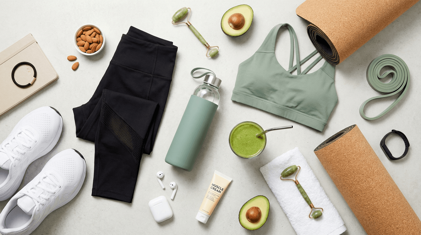
Prompt:
professional flat lay photograph of [a fitness and wellness active-lifestyle composition — the objects of physical health and active living arranged as the material evidence of a balanced, aesthetically engaged approach to wellness: the fitness objects are specific and wellness-communicating — the particular items: the activewear (a specific athletic garment — leggings or shorts in their material and color, a sports bra or tank top, a zip-up jacket or hoodie — the activewear folded or laid to show its technical fabric character, its color, its brand quality; or a pair of running shoes or training shoes positioned to show their design, their sole pattern, their material), the hydration (a quality water bottle — its specific material and design: a glass water bottle with a silicone sleeve, a stainless steel bottle in a specific color, a clear bottle showing infused water with visible fruit slices — the water bottle communicating the hydration-priority of the wellness lifestyle), the equipment (a section of yoga mat showing its color and its texture, a resistance band in its specific color, a jump rope coiled, a set of small hand weights in a modern finish, a foam roller edge — the equipment communicating the specific fitness practice), the nutrition (a healthy snack — a cut avocado, a handful of almonds, a protein bar, a green smoothie in a glass, a bowl of açai or oatmeal, a piece of fruit — the nutrition element adding the fuel-and-nourishment dimension), the recovery and care (a small towel — a quality hand towel in white or a muted color, a muscle roller or massage ball, a tube of muscle cream or natural body oil, a dry brush — the recovery tools adding the self-care-post-workout dimension), the technology (wireless earbuds in their case, a fitness tracker or smartwatch, a phone — the technology communicating the data-aware, music-fueled modern workout), the motivation and mindfulness (a journal or gratitude notebook, a motivational card, a meditation cushion edge, essential oil — the mindfulness elements expanding the definition of wellness beyond the purely physical), the personal touches (a hair tie, a sweatband, sunscreen, a cap — the small personal items adding the real, human, about-to-work-out quality), the arrangement suggests pre-workout preparation or post-workout recovery — the items assembled for activity or the towel draped and the water half-drunk suggesting completion — the composition reading as the material life of someone who prioritizes physical wellness, the overall composition communicates: fitness is aesthetic, wellness is a lifestyle, the active practice is intentional and beautiful — the fitness flat lay as the active-lifestyle and wellness-culture visual] on [the specific fitness-appropriate surface — a surface that communicates the active, clean, health-positive context: the surface (specify: [your surface, e.g., a light concrete surface for urban, modern fitness, or a natural wood surface for warm, organic wellness, or a clean white surface for bright, energetic, active vibes, or a section of yoga mat as the surface itself])] with the fitness objects arranged in an energetic but organized composition — the activewear and shoes as the anchor elements, the water bottle and nutrition positioned as the wellness-supporting elements, the technology and recovery tools distributed through the composition, the small personal items adding the real, human detail, the negative space moderate — the arrangement feeling active and purposeful without being chaotic, the composition from directly overhead, depth of field deep, the lighting is bright, clean, and energizing: bright, clean, energizing natural light — the quality of light that communicates vitality and health: the light bright and clear (not warm and moody — fitness content requires energy, not coziness), slightly cool to neutral in tone (suggesting freshness, cleanliness, and the outdoors), the light strong enough to reveal the technical fabric textures of the activewear and the material quality of the equipment, the overall illumination vibrant, health-communicating, and energy-positive, fitness flat lay palette — the active-lifestyle palette (specify: [your fitness palette, e.g., black leggings with mesh panel detail, sage green sports bra, white running shoes, eucalyptus green water bottle, natural cork yoga mat section, white towel, wireless earbuds in white case, halved avocado, glass of green smoothie, jade roller — on light concrete — a palette of black, sage green, white, natural cork, and fresh green accents]) — bright clean energizing natural light — vital and health-communicating, the mood is energetically vital wellness-intentional aesthetically active and the specific fitness message — this active life is aesthetic, the wellness practice is intentional, the fitness routine is a lifestyle — the fitness flat lay as the active-lifestyle and wellness-culture visual, professional overhead flat lay photography with bright clean natural light and deep depth of field and true overhead perspective, composed as a fitness and wellness flat lay, active-lifestyle palette on clean surface, no text overlays, no watermarks
Best for: Instagram feed fitness and wellness content, Pinterest fitness and wellness pins, blog content fitness and wellness features, activewear and athletic brand product content, wellness and supplement brand lifestyle content, water bottle and fitness accessory brand content, fitness influencer and trainer content, email marketing wellness and active-lifestyle features, gym and studio brand content, health food and nutrition brand lifestyle content
Template 14: The Bookish — Literary Culture and Reading Life
This template celebrates reading from above — the book, the bookmark, the tea, the blanket, the glasses — creating the literary flat lay that communicates the aesthetic of a reading life, the sensory experience of the book as a physical object, and the quiet luxury of time spent with literature.
Prompt:
professional flat lay photograph of [a bookish and literary culture composition — the objects of a reading life arranged as the material evidence of an aesthetically engaged relationship with books and literature: the literary objects are specific and reading-life-communicating — the particular items: the book or books (the primary book — open face-down to show its cover design, or closed with its cover visible, or open to a spread showing the pages and the typography — the book's specific visual character: a hardcover with its cloth binding and its jacket design, a well-worn paperback with its creased spine, a leather-bound classic with its gilt lettering, a contemporary novel with its graphic cover design — the book as a visual and physical object; additional books in a small stack, their spines showing their titles and their design, the stack creating the reader's-selection quality), the bookmark (a specific bookmark — a leather strip, a dried flower pressed between pages, a ribbon, a brass or enamel bookmark, a torn piece of paper used as a placeholder — the bookmark communicating the reading in progress), the beverage (a cup of tea or coffee — the cup in its specific character, the beverage visible, the cup positioned near the book suggesting the reading-and-sipping ritual), the textile (a blanket or throw — a corner of cashmere, a knit wool, a cotton waffle-weave — draped at the edge of the composition, suggesting the reading nest, the comfortable chair, the cozy reading position), the eyewear (reading glasses placed near the book — their frames showing their material and their style, the glasses communicating the physical act of reading), the light source suggestion (a candle — its warm glow quality suggested by its wick and its wax, or a reading lamp visible at the edge — the light source completing the reading environment), the botanical (a small vase with a single stem, dried flowers, a leaf used as a bookmark — the botanical adding the organic, living dimension to the paper and textile composition), the journal or notebook (a personal reading journal with a pen, where the reader records thoughts and quotes — the journal adding the active, intellectually engaged dimension to the reading life), the small personal objects (a ring, a lip balm, a small ceramic dish, a piece of chocolate — the personal objects adding the intimate, human quality), the arrangement suggests a reading session in its most beautiful moment — the book open and in progress, the tea steaming, the blanket pulled close, the glasses recently removed — the composition reading as the material life of a devoted reader, the overall composition communicates: reading is beautiful, the book is a sensory object, the reading life is an aesthetic practice — the literary flat lay as the book-culture and reading-life visual] on [the specific reading-appropriate surface — a surface that communicates the reading environment: the surface (specify: [your surface, e.g., a soft, rumpled linen bedsheet in warm white suggesting reading in bed, or a dark wood table for a library-study quality, or a cream wool rug suggesting a reading chair, or a worn leather surface for a classic, bookish character])] with the literary objects arranged in the intimate, reader's-world composition — the book as the composition's heart, the beverage positioned nearby, the textile creating the soft border, the glasses and bookmark adding the personal, in-use quality, the additional books creating the reader's-selection context, the negative space moderate to generous — the composition feeling quiet and unhurried as reading time should, the arrangement intimate and personal, the composition from directly overhead, depth of field deep, the lighting is warm, intimate, and reading-appropriate: warm, soft, intimate, slightly golden natural light — the quality of light in a reading room or a window seat on a late afternoon: the light warm and gentle (the golden-hour quality that makes reading feel like a luxury), the light slightly lower in intensity than a workspace or a kitchen (suggesting the quiet, contemplative, unhurried atmosphere of deep reading), the book pages catching warm light and showing their cream-to-white paper character, the tea surface catching a warm highlight, the textile showing its soft, tactile quality in the gentle light, the overall illumination creating the specific warm, cozy, reading-nest atmosphere that book-content audiences love, bookish flat lay palette — the literary composition's palette (specify: [your bookish palette, e.g., a hardcover novel with a muted sage green cloth cover and cream dust jacket, cream pages visible, a brown leather bookmark, a handmade ceramic tea cup in warm speckled white, a cream cable-knit throw, tortoiseshell reading glasses, a brass candle holder with a beeswax taper, a small dried rose, a burgundy leather journal — on a warm cream linen surface — a palette of sage, cream, warm brown leather, speckled ceramic, burgundy, and brass]) — warm intimate golden light — reading-atmospheric and comfort-communicating, the mood is quietly literary intimately beautiful reading-devoted and the specific bookish message — reading is a sensory experience, the book is a beautiful object, the reading life is worth protecting and celebrating — the literary flat lay as the book-culture and reading-life visual, professional overhead flat lay photography with warm intimate natural light and deep depth of field and true overhead perspective, composed as a literary flat lay, warm bookish palette on reading-environment surface, no text overlays, no watermarks
Best for: Instagram feed book and reading content (strong, engaged community), Pinterest bookish and reading pins, blog content book reviews and reading-life features, book publisher and bookshop content, tea and beverage brand reading-adjacent content, candle brand lifestyle content, knitwear and textile brand reading-environment content, Bookstagram and BookTok content, library and literary event content, content creator and influencer reading-culture content
Template 15: The Minimalist — Reductive Elegance and Negative Space
This template strips the flat lay to its essential elements — one, two, or three objects on an expansive surface, with negative space as the dominant compositional element. The minimalist flat lay communicates restraint, confidence, and the luxury of less — the visual argument that a product needs nothing but space and light to make its case.
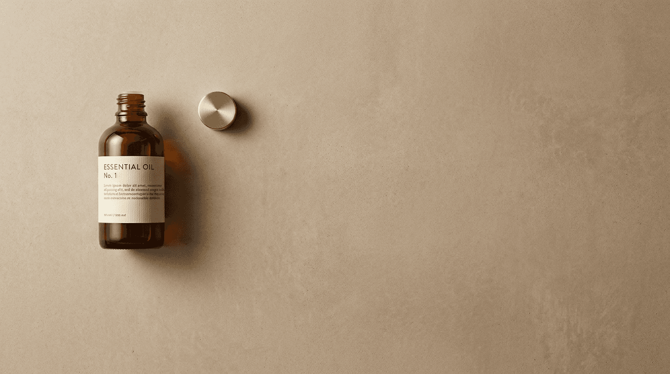
Prompt:
professional flat lay photograph of [a minimalist, reductive-elegance composition — the absolute minimum number of objects arranged on an expansive surface where negative space dominates and every element carries maximum visual weight: the minimalist objects are precisely selected — one to three items, no more: a single product (the hero product entirely alone on the surface — its form, its material, its packaging design carrying the entire visual weight of the composition, with no supporting props, no narrative context, no lifestyle accessories — the product's design quality must sustain the entire image; or two objects: the hero product and one complementary element — a product and its cap placed beside it, a product and a single botanical stem, a product and a fabric swatch — the pair creating a visual dialogue of form, material, and color; or three objects: the hero product and two supporting elements — a product, a tool, and a botanical, or a product, its box, and a single ribbon — the trio creating the minimal narrative while preserving the expansive, spacious quality), the objects are positioned with extreme compositional precision — placement is everything in the minimalist flat lay: the objects positioned off-center, creating the dynamic asymmetric balance where the visual weight of the objects is counterbalanced by the expanse of empty surface, the objects typically grouped in one area (a corner, one-third of the frame, along one edge) with the remaining surface open and breathing, the specific position feeling inevitable — as if the objects could not be anywhere else in the frame, the negative space is the hero — the visible surface occupies 60-80% of the frame, the surface's texture and color and material quality visible and design-significant: the negative space is not background — it is the primary compositional element, the silence against which the objects speak, the negative space communicating: this brand has the confidence to be quiet, the product has the quality to stand alone, less is the design philosophy, the object(s) are visually perfect at this scale — every detail of form, material, finish, and packaging design visible and quality-communicating because the eye has nowhere else to go, the overall composition communicates: elegance is restraint, confidence is quiet, design quality is visible when nothing else competes — the minimalist flat lay as the reductive-luxury and essential-design visual] on [the specific minimalist-appropriate surface — a surface with enough character to sustain the viewer's attention across its expansive visibility, but restrained enough not to compete with the objects: the surface (specify: [your surface, e.g., a smooth, warm-toned concrete with its subtle, quiet, industrial texture, or a clean white matte surface for maximum graphic impact, or a natural linen in a muted neutral for soft, organic minimalism, or a single slab of pale stone with subtle, quiet veining for understated luxury])] with the minimal objects positioned with extreme precision — the placement deliberate, the angles exact, the distance between objects (if multiple) calibrated to create the specific tension and visual relationship between them, the expansive negative surface visible and design-significant — the surface's texture, color, and material quality carrying the composition where objects are absent, the composition from directly overhead, depth of field deep — the surface in focus throughout, the lighting is clean, precise, and form-celebrating: clean, soft, precisely directional natural light — the quality of illumination that reveals form and material with the maximum clarity and the minimum distraction: the light soft and controlled (not dramatic or atmospheric — the minimalist image requires the calm, even, precise light quality that lets the object's form and material speak), the light slightly directional to create the single, soft shadow that gives the object its dimensional quality without drama — the shadow consistent, controlled, and contributing to the composition rather than competing with it, the object's material catching the clean light with its specific character — every surface quality visible because the viewer's full attention is on this single form, minimalist flat lay palette — the severely restricted palette (specify: [your minimalist palette, e.g., a single amber glass bottle with a cream label on a pale concrete surface — a palette of amber glass, cream paper, and warm gray concrete — three tones, maximum restraint, maximum visual impact]) — clean precise natural light — calm, controlled, form-revealing, the mood is confidently restrained elegantly minimal essentially beautiful and the specific minimalist message — this product needs nothing but light and space, the design is the content, the restraint is the luxury — the minimalist flat lay as the reductive-elegance and design-confidence visual, professional overhead flat lay photography with clean precise natural light and deep depth of field and true overhead perspective, composed as a minimalist flat lay where negative space dominates and object placement is compositionally precise, severely restricted palette on textured surface, no text overlays, no watermarks
Best for: Instagram feed minimalist brand content, website product page hero imagery for design-forward brands, brand identity and visual-language documentation, award-submission product imagery, editorial and publication product features, Pinterest minimalist and design pins, paid advertising premium product creative, luxury and premium brand product content, brand book and style guide visual documentation, e-commerce product page primary imagery for design-premium products
How to Customize These Prompts for Your Specific Brand and Content Needs
The templates produce compelling flat lay compositions, but the most effective content reflects your actual brand — your real products, your authentic aesthetic, your specific audience, and the particular visual identity that distinguishes your content from every other brand competing in the same feed.
Replace generic product descriptions with your actual products. "A glass serum bottle" generates a generic bottle. "A 30ml frosted glass dropper bottle with a bamboo cap, containing a golden-toned vitamin C serum, with a minimalist cream label featuring small serif typography" generates your product. Describe your actual product with enough visual specificity that the generated result resembles the real item: the exact packaging material, the exact cap or closure, the exact color, the exact label style, the exact size relative to other elements. This specificity is the difference between generic content and brand-specific content.
Select your signature surface and maintain it consistently. Your flat lay surface is your visual signature. Choose the surface that best represents your brand's world and use it consistently across your content. A skincare brand built on natural, clean ingredients might choose a natural linen. A luxury brand might choose marble. A modern, urban brand might choose concrete. An artisan brand might choose raw wood. The surface should appear in every flat lay you produce, creating the visual consistency that builds brand recognition in the feed.
Develop a consistent prop palette. Beyond the surface, your recurring props — the specific mug, the specific botanical type, the specific textile, the specific small objects — should remain consistent across content. When a viewer sees the same ceramic dish, the same type of dried eucalyptus, the same linen napkin appearing in flat lay after flat lay, they begin to recognize the brand's visual language before they see the logo or the product. This prop consistency is one of the most powerful brand-building tactics available through flat lay content.
Calibrate your color story and maintain it across all content. Define your brand's flat lay palette: the three to five colors that recur across all your flat lay content. This palette should reflect your brand identity, your packaging design, and your audience's aesthetic expectations. A wellness brand might maintain a palette of sage, cream, warm white, and natural wood. A luxury brand might maintain a palette of black, gold, cream, and white marble. A playful brand might maintain a palette of terracotta, blush pink, cream, and brass. Once defined, maintain the palette across every flat lay, selecting props and surfaces that stay within the palette's range.
Match styling density to your brand personality. A minimalist brand should produce flat lays with generous negative space and few elements (Templates 1, 15). An abundant, maximalist brand should produce flat lays with layered, rich compositions and minimal negative space (Templates 5, 10, 11). The styling density — how many objects and how much surface — should feel like your brand. If your Instagram grid currently feels too cluttered or too sparse, adjust the negative space calibration in the prompts to find your brand's specific density.
Use these prompts as photographic direction for real product shoots. The most effective workflow uses the AI-generated compositions as visual references for actual product photography sessions. Share the generated references with your photographer or your prop stylist as the compositional template, the lighting reference, the color-palette guide, and the atmospheric benchmark. The real photograph of your real product, styled by a real prop stylist guided by the generated reference, produces the most authentic, most brand-specific, most commercially effective result. The Image Inpainting tool bridges any remaining gap between the photographic result and the generated reference standard.
Platform-Specific Deployment for Flat Lay Content
Each platform where flat lay content performs has specific format requirements, audience behaviors, and content expectations.
Instagram is the primary flat lay platform. Instagram's visual feed format and its design-engaged audience make it the most important deployment channel for flat lay content. The content mix across a brand's Instagram feed should integrate flat lay with other content types, but flat lay should constitute approximately 30-40% of a product-focused brand's feed content. Use 4:5 for maximum feed visibility (the tallest format that displays fully in the feed), 1:1 for grid consistency, and 9:16 for Stories and Reels. Carousel posts featuring multiple flat lay angles (the wide flat lay, then close-up details of individual elements) generate high engagement.
Pinterest is the highest-conversion flat lay platform. Pinterest's audience uses flat lays as visual shopping lists and lifestyle-aspiration references, making flat lay content the highest-save, highest-click format on the platform. Templates 5 (culinary), 6 (fashion), 8 (beauty), 10 (seasonal), and 11 (gift guide) perform exceptionally well on Pinterest. Use 2:3 vertical format exclusively for maximum pin visibility. Flat lay pins with clear, identifiable products generate the highest click-through to product pages and brand websites.
E-commerce product pages benefit from flat lay as secondary imagery. While the primary product page image should be the product on a clean background, flat lay compositions serve as secondary lifestyle images that show the product in context. Templates 1 (product hero), 2 (brand universe), and 15 (minimalist) serve this function. The flat lay adds the lifestyle dimension that helps the browser imagine the product in their life.
Email marketing uses flat lay for visual impact and product curation. Flat lay compositions perform well as email header images, product feature visuals, and gift guide layouts. Templates 1 (product hero), 2 (brand universe), 10 (seasonal), and 11 (gift guide) serve email marketing effectively. Use 3:2 or 16:9 for email header banners, 1:1 for in-email product features.
Blog and website content uses flat lay for visual storytelling. Blog post headers, routine features, recipe content, and gift guide roundups all benefit from flat lay imagery. Templates 3 (morning routine), 5 (culinary), 8 (beauty routine), and 14 (bookish) serve blog content particularly well. Use 3:2 or 16:9 for blog post headers, 4:3 for in-article imagery.
TikTok and Reels use flat lay as a starting frame or reveal format. The overhead camera position of the flat lay translates naturally to video content — the camera looking down as hands enter the frame to arrange, open, or demonstrate products. While these prompts generate still imagery, the compositions serve as reference frames for video flat lay content.
Common Mistakes in Flat Lay Photography
Flat lay photography fails in specific, identifiable ways that the professional prop stylist avoids and that these prompts are designed to prevent.
The centered, symmetrical arrangement. Placing the hero product in the exact center of the frame with props distributed symmetrically around it creates a static, lifeless composition that reads as a product display rather than a lifestyle moment. Professional flat lays use asymmetric balance — the hero positioned off-center, the visual weight distributed dynamically, the composition creating movement and flow rather than static equilibrium.
The even-spacing grid. Distributing objects at equal distances from each other — the "organized grid" approach — creates a catalog-like, emotionless arrangement that communicates inventory rather than lifestyle. Professional flat lays vary the spacing deliberately: some objects close together or overlapping, others separated by generous space, the variation creating rhythm and the visual interest that comes from unpredictability.
Too many objects competing for attention. An overcrowded flat lay where every object is equally prominent and equally positioned creates visual noise — the eye cannot find the hero, cannot establish a viewing sequence, and becomes overwhelmed. The professional flat lay has a clear visual hierarchy: the hero product dominant, the secondary props supporting, the small detail elements filling, and the negative space providing rest.
Ignoring the shadow direction. Inconsistent shadows — some objects casting shadows to the left, others to the right, others with no shadow — reveal multiple light sources or composited elements and destroy the illusion of a naturally lit arrangement. Every template specifies consistent directional light with shadows falling in one direction, because shadow consistency is the immediate marker of professional versus amateur.
The wrong surface for the brand. A luxury skincare brand on a rustic wood plank. A handmade ceramic on a clinical white surface. An artisan food product on a cold marble slab. The surface must match the brand's aesthetic temperature and market position. Every template includes surface specification because the surface is the first brand-world decision in any flat lay.
Color chaos. A flat lay where every object introduces a different, unrelated color creates visual noise that prevents the composition from reading as a coherent, designed arrangement. The professional flat lay operates within a limited, deliberate palette — every object's color selected to contribute to the overall color harmony. Every template specifies a deliberate, limited palette.
Flat, overhead-only lighting. Light positioned directly above the arrangement (matching the camera position) eliminates all shadow, flattens all objects to two-dimensional shapes, and removes the three-dimensional quality that gives flat lays their material richness. The light must come from one side, creating the directional shadows that communicate object height, material texture, and three-dimensional form. Every template specifies directional light from one side.
Styling without narrative coherence. A flat lay that includes objects from unrelated contexts — a coffee cup, a yoga mat, a lipstick, a pair of pliers, and a banana — tells no story and confuses the viewer about who this person is and what moment this represents. Professional flat lays tell a single, coherent story about a single moment, a single ritual, or a single persona. Every template establishes a clear narrative context.
Ignoring the frame edges. Objects cut awkwardly by the frame edge — half a mug, a quarter of a book, an object barely visible at the corner — can feel accidental and poorly composed. Professional flat lays either keep objects fully within the frame or deliberately extend them beyond the frame edge in a way that suggests a larger world continuing beyond the visible composition. The deliberate frame-edge exit communicates that this is a moment within a larger life; the accidental frame-edge cut communicates careless composition.
Building a Complete Flat Lay Visual Content System
A successful flat lay content program is not a series of individual compositions but a visual system — a consistent, recognizable, brand-specific approach to overhead photography that builds visual identity across every piece of content.
Establish your brand's flat lay visual standards. Before producing content, define the core decisions: your signature surface (the specific material that appears in every flat lay), your prop palette (the recurring objects that create your visual vocabulary), your color story (the three to five colors that define your flat lay palette), your styling density (how many objects, how much negative space), your shadow quality (soft and diffused or graphic and editorial), your light temperature (warm, cool, or neutral), and your compositional approach (organic and loose or geometric and precise). Document these decisions in a visual style guide and apply them to every flat lay you produce.
Build a prop library. The professional prop stylist maintains a library of surfaces, textiles, ceramics, glassware, botanicals, paper goods, tools, and small objects that constitute the raw materials of the flat lay. Invest in acquiring the specific props that match your brand's visual standards: the right ceramic dishes (in your palette colors), the right textiles (in your materials and tones), the right botanicals (fresh or dried, in your preferred varieties), the right small objects (the accessories, the tools, the personal items that populate your brand world). This prop library is a tangible brand asset that enables consistent content production.
Create content in batches organized by template type. Rather than producing one flat lay at a time, produce content in batches — shooting all your product hero flat lays (Template 1) in one session, all your routine compositions (Templates 3, 8) in another, all your seasonal content (Template 10) in a dedicated seasonal session. Batch production maintains visual consistency within each content type and makes efficient use of the surface, props, and lighting setup.
Develop seasonal content calendars aligned to the templates. Map the fifteen templates to your annual content calendar: Template 10 (seasonal) for each major season and holiday, Template 11 (gift guide) for gift-giving occasions, Template 3 (morning routine) as evergreen lifestyle content, Template 1 (product hero) for new product launches, Template 2 (brand universe) for collection announcements. The templates become a content calendar framework that ensures variety and strategic coverage.
Generate multi-format versions of every key composition. Every important flat lay should exist in 1:1 (Instagram grid), 4:5 (Instagram feed), 9:16 (Stories and Reels), 2:3 (Pinterest), 3:2 (email header and blog), and 16:9 (website banner and presentation). The composition may need to be adjusted for each format — a wider composition for 16:9, a tighter crop for 4:5 — but the surface, the palette, the shadow quality, and the overall visual identity should remain consistent across all formats.
Invest in video flat lay content for Reels and TikTok. The overhead camera position translates naturally to video — the stop-motion flat lay (objects appearing one by one), the hands-in-frame flat lay (hands entering to arrange, open, or demonstrate), and the reveal flat lay (a product being unboxed or unwrapped from above). The still-image compositions serve as the final-frame reference for video flat lay content. The Cinematic Video Generator can create atmospheric motion from still flat lay compositions. The Text2Shorts tool produces short-form flat lay content for social platforms.
Track which flat lay types drive which business outcomes. Monitor which template types drive the specific outcomes your brand prioritizes: product hero flat lays (Template 1) typically drive the most direct product-page traffic, gift guide flat lays (Template 11) drive the highest conversion during gifting seasons, routine flat lays (Templates 3, 8) drive the deepest brand engagement, minimalist flat lays (Template 15) drive the strongest brand-perception improvement, and seasonal flat lays (Template 10) drive the highest reach and broadest audience growth. Understanding these patterns allows strategic allocation of content production effort.
How Miraflow AI Supports Your Flat Lay Visual Workflow
Every prompt in this post can be generated inside Miraflow AI. Open the AI Image Generator, paste your customized prompt with your specific product descriptions, surface selection, prop palette, color story, and brand personality, select the appropriate aspect ratio, and generate. Multiple aspect ratios including 1:1, 4:5, 4:3, 16:9, 9:16, and 5:4 are available, covering every deployment from Instagram feed to Pinterest pin to email header to website banner.

For the most effective flat lay content workflow, these AI-generated compositions serve three primary functions. As visual direction for real product photography: share the generated compositions with your photographer and prop stylist as the reference for surface, lighting, composition, color palette, and styling density. The generated reference communicates the precise visual target more effectively than verbal description. As standalone content for platforms and contexts where the visual narrative matters more than the photographic authenticity of the specific product: social media mood content, editorial content, seasonal atmospheric content, and brand-world storytelling. As compositional exploration and creative development: generating multiple variations to test different surfaces, palettes, prop combinations, and styling approaches before committing to a physical photography session.
For real product photography that needs targeted enhancement — improving the shadow quality, adjusting the color temperature for consistency across a series, extending a composition to accommodate a different format, removing an unwanted reflection, or bringing the overall production quality up to the standard the generated references establish — the Image Inpainting tool allows precise editing of specific image regions while preserving the authentic photographic content of your real products.
The recommended workflow operates in three phases. The conceptual phase uses these AI prompts to generate visual direction for each content type and each campaign — establishing the surface, the palette, the props, the density, the light quality, and the overall compositional standard. The production phase creates your actual content — the real product photography sessions, the real prop styling, the real surface and light — guided by the generated visual direction. The enhancement phase uses inpainting and post-production to bring your real product photography to the consistent, polished standard that the generated references define.
For brands building a complete visual content ecosystem, Miraflow's extended suite supports the full workflow. The Cinematic Video Generator creates atmospheric video from still flat lay compositions. The Text2Shorts tool produces short-form flat lay content for Instagram Reels and TikTok. The AI Music Generator creates ambient audio for video flat lay content. The AI Clipping tool extracts compelling moments from video flat lay footage. The YouTube Thumbnail Maker creates thumbnails for unboxing and product-review video content. Together, these tools allow a brand to produce a complete flat lay content system — still and video, across every platform and format — with consistent visual identity and production quality.
FAQ
How do I make AI-generated flat lays look like my real products?
The key is visual specificity in the prompt. Instead of "a bottle," describe your actual product: its exact shape, its exact material, its cap type, its label design, its color, its size relative to other objects. The more specific your description, the closer the generated result to your real product. For the most authentic product representation, use these generated compositions as styling references for real product photography, then use the Image Inpainting tool to enhance the real photographs to match the generated standard.
What is the single most important element in a flat lay composition?
The surface. The surface is the first thing the viewer sees (it occupies the most visual area), the element that establishes the entire mood and brand world, and the most immediately recognizable brand signature across a content series. Choose your surface with as much care as you choose your product packaging, and maintain it consistently across all your flat lay content.
How do I prevent my flat lays from looking cluttered?
Increase the negative space. The most common amateur mistake is too many objects and not enough surface. As a guideline: if you can see more objects than surface, the composition is likely too dense for most brands. Start with fewer objects than you think you need, and add only if the composition feels too sparse. The templates specify approximate negative space ratios — follow them as starting benchmarks.
Should I include my product's packaging or just the product itself?
Both have their place. The product in its packaging (Template 1, 2, 15) communicates the brand's packaging design and works for product awareness and brand building. The product out of its packaging (Template 3, 8 — where a cap is removed, a product is being used) communicates the product experience and works for routine content and use-case storytelling. A mix of both across your content calendar communicates the full product story — from shelf to skin, from package to plate.
What lighting setup do I need for real flat lay photography?
The simplest and most effective setup is a large window as your primary light source, with a white reflector on the opposite side to fill the shadows. Position your flat lay surface near a north-facing window (for consistent, diffused light) or a large window with a white curtain or diffusion fabric. The window provides the soft, directional, natural-appearing light that every template describes. Avoid direct sunlight (which creates hard, graphic shadows — useful for editorial but not for most brand content) and overhead room lighting (which creates flat, shadowless, unflattering illumination).
How often should I post flat lay content?
This depends on your platform and your content mix. For Instagram: two to four flat lay posts per week for a product-focused brand, mixed with other content types (lifestyle, behind-the-scenes, UGC, video). For Pinterest: five to ten flat lay pins per week, as Pinterest rewards volume and frequency. For email: one to two flat lay features per email, depending on the email's purpose. For your website: update flat lay imagery seasonally and with each new product launch.
Can I use the same props in every flat lay?
Yes — in fact, you should. Recurring props build your visual vocabulary and your brand recognition. The same ceramic mug, the same type of botanical, the same linen napkin appearing across your content creates the visual consistency that builds a recognizable brand. Vary the hero product and the specific arrangement, but maintain your core prop palette.
What about flat lays with hands in the frame?
Hands entering the frame — holding a product, pouring coffee, reaching for an object — add human presence and the narrative dimension of action and use. While these prompts focus on the classic "objects-only" flat lay (which is the most reproducible and templateable format), the compositions they generate serve as excellent reference frames for "hands-in" flat lay variations, which are particularly effective for video content and Reels.
Conclusion
The flat lay is a lie, and the lie is the point. No morning looks like this. No desk is this beautiful. No gift is this perfectly arranged. The flat lay constructs a fiction — a two-dimensional theater of objects arranged on a surface, lit from one side, photographed from directly above — and presents it as the casual residue of a life lived with extraordinary taste. The viewer knows it is constructed. The viewer does not care. The viewer sees the composition and feels the aspiration — the desire to own those products, to have that morning, to live that routine, to inhabit that world of curated objects and considered surfaces and beautiful light.
The paradox — maximum artifice creating the appearance of minimum artifice — is what makes the flat lay the most demanding and the most rewarding format in visual content. Every object must be chosen with curatorial precision and placed with compositional intelligence, but the result must look like someone beautiful simply set things down. The surface must be selected to communicate the brand's world. The props must tell a coherent story. The color palette must be deliberately limited but appear naturally cohesive. The shadows must be consistent and dimensional. The negative space must be calibrated to the exact density that communicates the brand's personality — generous for the minimalist, tighter for the abundant. And the hero product must dominate without isolating, the star without being a solo act.
The single-product hero that introduces the object to its lifestyle context. The brand universe that proves the collection's coherence. The morning ritual that connects products to daily life. The creative workspace that celebrates the tools of making. The culinary composition that makes ingredients into a visual feast. The fashion styling that makes the outfit into a visual argument. The travel essentials that turn objects into adventure. The beauty routine that turns products into ceremony. The stationery arrangement that celebrates analog intelligence. The seasonal composition that connects the brand to the calendar's emotional rhythm. The gift guide that transforms products into considered generosity. The coffee culture composition that turns the daily cup into a ritual. The fitness layout that turns wellness into visual identity. The literary flat lay that celebrates reading as aesthetic practice. The minimalist composition that proves the product needs nothing but space and light.
Copy the templates that serve your brand. Customize them with your real products, your authentic surface, your specific prop palette, your deliberate color story, and the visual identity that makes your content recognizable in the feed before the viewer reads the caption. Generate them inside Miraflow AI to establish your visual standard, use them as the photographic reference when you produce real product content with real products and real props and real light. Enhance your product photography with the Image Inpainting tool to achieve the consistent, polished, editorially styled quality that the generated references define.
The flat lay is a lie. Make it a beautiful one. Make it a lie so composed, so textured, so narratively complete, so atmospherically perfect that the viewer scrolls back up to look again. Make it a lie that looks like the truth about a beautiful life. The surface is chosen. The light enters from the left. The shadow falls to the right. The objects are arranged. The product catches the light. The composition is complete. Shoot it from above. Let the scroll begin.