How Top YouTubers Design Thumbnails: 7 Patterns You Can Steal
Written by
Jay Kim

Learn the 7 thumbnail design patterns top YouTubers use to get more clicks. Includes explanations, AI prompts, and copy-paste templates you can apply today.
Your video could be the best thing on YouTube, but if the thumbnail does not convince someone to click, nobody will ever see it. That is the reality every creator faces in 2026. The algorithm can push your video to millions of impressions, but impressions without clicks are meaningless.
What separates channels that grow consistently from channels that stall is almost always the same thing. The growing channels have better thumbnails. Not because they have expensive design tools or professional graphic designers on staff, but because they follow specific visual patterns that trigger clicks.
After studying thumbnails from dozens of top-performing YouTube channels across niches like tech, finance, fitness, education, entertainment, and vlogging, seven clear patterns emerge. These are not random aesthetic choices. They are deliberate design decisions that the biggest creators on the platform use repeatedly because they work.
This guide breaks down all seven patterns with real explanations, practical examples, and copy-paste AI prompts so you can apply each one to your own channel immediately.
Why Thumbnail Design Matters More Than Ever in 2026
YouTube surfaces content through several recommendation systems including Browse, Suggested, and Search. In every single one of these systems, the thumbnail is the first thing a potential viewer evaluates before deciding whether to click or scroll past. CTR directly influences how aggressively the algorithm continues to promote a video, which means a weak thumbnail can kill an otherwise excellent video before it gains any momentum.
The competition for attention has also increased significantly. More creators are publishing more frequently, especially with tools that speed up production. Channels that once posted weekly are now publishing daily Shorts alongside their long-form videos, and the feed is more crowded than it has ever been. Understanding what makes a good click-through rate in 2026 gives you a clearer picture of the benchmarks you should be targeting.
Top YouTubers treat thumbnails as a core part of their content strategy, not an afterthought. Many of them spend more time on the thumbnail than on the title. Some even design the thumbnail before filming the video, because the thumbnail concept shapes how they frame the content itself.
The seven patterns below are the ones that show up most consistently across high-performing channels.
Pattern 1: The Single Focal Face With Exaggerated Expression
This is the most common thumbnail pattern on YouTube for a reason. A single human face with a clear, exaggerated expression dominates the frame. The background is either blurred, simplified, or color-blocked to keep all attention on the face.

The reason this works comes down to basic human psychology. People are wired to look at faces before anything else in a visual field. When a face shows a strong emotion like surprise, excitement, concern, or curiosity, it creates an immediate emotional connection that pulls viewers toward the click.
Top creators who use this pattern consistently include channels across every niche from tech reviews to cooking to personal finance. The face takes up at least 40 to 60 percent of the thumbnail frame, the expression is exaggerated beyond what would look natural in person, and the eyes are almost always looking directly at the viewer or toward a key element in the thumbnail.
The most important detail is the eyes. Thumbnails where the subject's eyes are clearly visible and well-lit consistently outperform thumbnails where the face is partially obscured or the eyes are in shadow.
How to apply this pattern:
Start with a close-up photo of yourself or your subject. The expression should be pushed further than feels comfortable. What looks over-the-top in real life reads as natural at thumbnail size. Keep the background simple with one or two colors at most, and make sure the lighting on the face is bright and even with no harsh shadows cutting across the eyes.
Prompt for AI generation:
A close-up portrait of a content creator with a wide-eyed surprised expression, mouth slightly open, looking directly at the camera, bright studio lighting with soft shadows, vibrant teal gradient background, high contrast, YouTube thumbnail composition, sharp focus on face and eyes, professional quality
If you want to explore more prompt structures for thumbnails like this, the best AI prompts for YouTube thumbnails in 2026 guide has dozens of ready-to-use templates organized by niche.
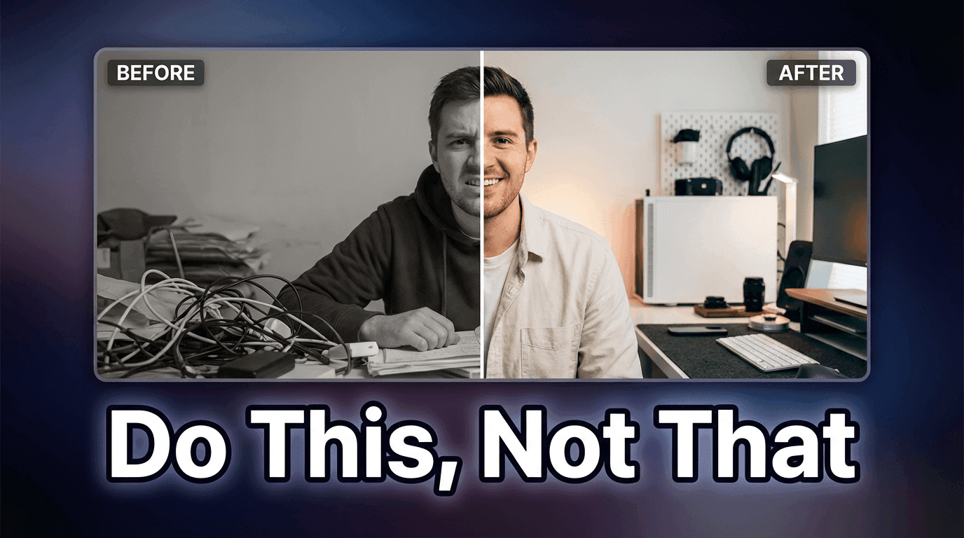
Pattern 2: The Before and After Split
This pattern uses a visual comparison to create instant curiosity. The thumbnail is divided into two halves, usually left and right, showing a clear transformation or contrast. The "before" state appears on one side and the "after" state appears on the other, with an obvious visual difference between them.
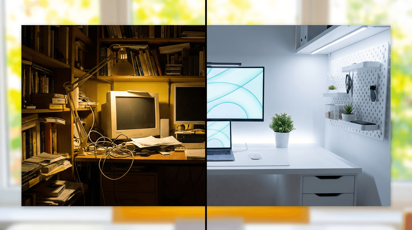
This works because it tells a micro-story in a single image. The viewer sees the starting point and the result, and their brain immediately wants to know how the transformation happened. That gap between the two states creates the curiosity that drives the click.
You see this pattern across fitness channels showing body transformations, tech channels comparing old versus new products, home renovation channels showing room makeovers, and tutorial channels demonstrating skill progression. The key is making the contrast as dramatic and obvious as possible. Subtle differences do not work at thumbnail size because viewers are scanning quickly and need to register the change instantly.
How to apply this pattern:
Choose two states that are as visually different as possible. Place them side by side with a clear dividing line or a subtle gradient transition. Use warm tones on the positive or improved side and cooler or muted tones on the starting side. Some creators add a small arrow or directional cue pointing from the before to the after, which helps guide the eye.
For creators who want to generate these comparison-style visuals with AI, the thumbnail makeover guide with before and after examples walks through the full process including prompts and editing techniques.
Prompt for AI generation:
A split-screen YouTube thumbnail composition showing a cluttered messy desk on the left side with dim lighting and a clean organized modern desk setup on the right side with bright warm lighting, clear visual contrast between both halves, vibrant colors, professional thumbnail style, bright background, no text
Pattern 3: The Object in Focus With Clean Negative Space
Some of the highest-CTR thumbnails on YouTube are also the simplest. A single object sits in the center of the frame with plenty of clean space around it. The background is either a solid color, a subtle gradient, or heavily blurred. Nothing competes with the main subject for attention.
This pattern works because it communicates clarity and confidence. When a viewer sees a clean, uncluttered thumbnail, their brain processes it faster than a busy one. At the speed people scroll through YouTube, faster processing means higher likelihood of registering the content and making a click decision.
Product review channels, unboxing channels, and tech channels use this pattern heavily. The product sits on a clean surface with professional lighting, and the thumbnail immediately communicates what the video is about without any confusion. But this pattern extends beyond products. Education channels use it with a single visual concept or diagram. Cooking channels use it with a single beautifully plated dish. The principle is the same regardless of niche.
The mistake most creators make with this pattern is not going far enough with the simplification. If there are more than two or three elements in the thumbnail, it stops being clean and starts being cluttered. The power of this pattern comes from extreme simplicity.
How to apply this pattern:
Choose one object or visual element that represents the core topic of your video. Place it in the center or slightly off-center using the rule of thirds. Light it with soft, even studio lighting so it pops against the background. Use a background color that contrasts with the object but does not compete for attention. Remove absolutely everything else from the frame.
Prompt for AI generation:
A single pair of premium wireless headphones centered on a clean white marble surface, soft studio lighting with gentle highlights and reflections, bright pastel gradient background, minimal composition with lots of negative space, product photography style, YouTube thumbnail framing, vibrant and professional
Pattern 4: The Contrast Thumbnail With Two Opposing Elements
This pattern places two contrasting elements side by side or facing each other within the same frame. Unlike the before-and-after split, this pattern is about opposition rather than transformation. Two products, two people, two ideas, or two outcomes are placed in visual tension with each other.

The reason this drives clicks is that it frames the video as a comparison or a battle, which is one of the most compelling content formats on YouTube. Viewers click because they want to know which side wins, which option is better, or how the two elements stack up against each other.
The most effective contrast thumbnails use visual cues to emphasize the opposition. Different color temperatures on each side, different lighting moods, or different scales help communicate that these two things are fundamentally different and that the video will explain why. Some creators literally use a red versus blue color split or a lightning bolt divider between the two elements.
You can see this pattern working across channels that publish comparison content, debate content, or any video where two perspectives are being evaluated. The YouTube Thumbnail Maker includes templates designed specifically for this contrast layout, including the "Rich vs Poor Challenge" template which uses exactly this opposing-elements structure.
How to apply this pattern:
Pick two elements that represent the core comparison in your video. Place them on opposite sides of the frame with roughly equal visual weight. Use contrasting color schemes for each side. If one element represents the better option or the winner, you can make it slightly larger or brighter, but do not make the difference so extreme that the comparison feels already resolved. You want the viewer to feel like they need to watch the video to get the answer.
Prompt for AI generation:
A YouTube thumbnail showing two smartphones facing each other from opposite sides of the frame, left phone has cool blue lighting and shadows, right phone has warm orange lighting and highlights, dramatic contrast between both sides, clean dark background with subtle gradient, professional product photography style, vibrant colors, high contrast composition
Pattern 5: The Text-Heavy Bold Statement
While most thumbnail advice says to minimize text, some of the highest-performing thumbnails on YouTube use large, bold text as the primary visual element. This works when the text itself is the hook, and the viewer does not need additional visual context to understand the value proposition.
Channels that cover news, commentary, finance, and self-improvement use this pattern frequently. The text on the thumbnail communicates a specific claim, number, or statement that is impossible to ignore. Think of phrases that include surprising numbers, bold claims, or provocative questions. The text is always large enough to read at the smallest thumbnail size, which means no more than four to six words.
The typography matters enormously. Top creators use thick, sans-serif fonts with high contrast against the background. Many add a slight text shadow or outline to ensure readability regardless of the background. The text color is almost always white or yellow, and the background behind the text is darkened or blurred to create contrast.
The most common mistake with text-heavy thumbnails is using too many words. If your thumbnail text requires more than a quick glance to read, it will fail at small sizes. Every word needs to earn its place.
For creators looking to find the right balance between text and imagery, the guide on YouTube thumbnail text ideas that get more clicks covers text strategy in depth.
How to apply this pattern:
Write your thumbnail text first and limit it to four to six impactful words. Choose a bold, thick font that reads clearly even at 120 pixels wide. Place the text in the upper third or center of the frame. If you include a face or secondary element, push it to one side and keep the text as the dominant visual. Use a contrasting background that makes every letter pop.
Prompt for AI generation:
A YouTube thumbnail with a confident person standing on the right side of the frame, arms crossed, bright studio lighting, left side has a large clean space with a bold dark gradient background perfect for overlaying text, high contrast vibrant composition, professional thumbnail layout, bright warm tones
Pattern 6: The Curiosity Gap Visual
This is the pattern that drives the highest CTR when executed correctly, but it is also the hardest to get right. The thumbnail shows something partially revealed, unexplained, or visually incomplete. It creates a question in the viewer's mind that can only be answered by watching the video.
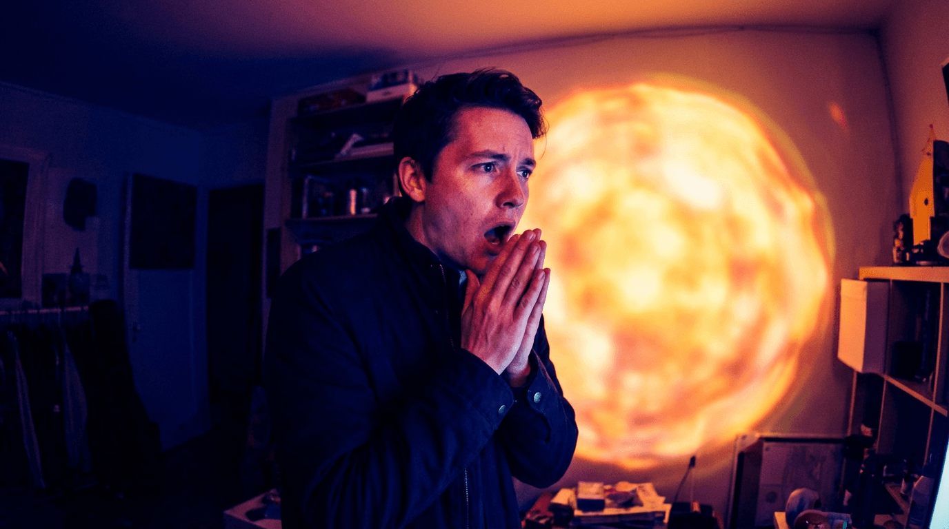
The curiosity gap works because the human brain has a strong drive to resolve incomplete information. When a thumbnail shows a blurred-out object, a censored section, a pointing arrow toward something just out of frame, or a reaction face looking at something the viewer cannot see, it triggers an itch that can only be scratched by clicking.
Top creators use this pattern in different ways depending on their niche. Some use a literal blur or pixelation effect over a key element. Others show a person looking at something off-screen with an expression of shock or disbelief. Some use arrows, circles, or highlights to draw attention to a specific detail while leaving the context ambiguous.
The critical balance with curiosity gap thumbnails is between creating curiosity and creating confusion. If the viewer cannot even tell what category of content the video belongs to, the curiosity gap fails because there is no mental framework to attach the question to. The viewer needs to understand the topic broadly while remaining uncertain about the specific answer or reveal.
How to apply this pattern:
Identify the most surprising or unexpected element in your video. Show a partial view of it or show someone reacting to it. Add a visual cue like a circle, arrow, or blur that draws the eye to a specific area while keeping the full detail hidden. Make sure the rest of the thumbnail provides enough context that the viewer understands what kind of video they are considering clicking on.
Prompt for AI generation:
A person with a shocked expression pointing at something off-frame to the right, bright colorful background with a subtle blur effect on the right edge suggesting something hidden, dramatic studio lighting, wide-eyed expression with hand gesture, YouTube thumbnail composition, vibrant saturated colors, professional quality
Pattern 7: The Consistent Brand Template
The final pattern is less about a single thumbnail and more about a system. The most successful long-running YouTube channels use a consistent thumbnail template across their videos. Every thumbnail shares the same layout structure, color palette, font style, and overall aesthetic. Only the specific content elements change from video to video.

This works because of pattern recognition. When a viewer encounters your content multiple times in their feed, the consistent visual style makes your videos instantly recognizable. Over time, viewers associate your thumbnail style with the quality and topic of your content, which builds trust and increases CTR on future uploads.
Think about channels you watch regularly. You can probably spot their thumbnails in a crowded feed without reading the title or channel name. That instant recognition is the result of consistent template design applied over dozens or hundreds of videos.
Building a consistent template does not mean every thumbnail looks identical. It means the foundational elements stay the same while the content-specific details change. The background color range stays consistent. The font style and placement stay consistent. The composition structure stays consistent. The specific face, object, or scene changes for each video, but the framework around it remains stable.
For creators who want to build this kind of visual consistency using AI, the guide to building a consistent YouTube thumbnail style explains how to create and maintain a template system that works across all your uploads.
How to apply this pattern:
Design one thumbnail layout that works for your niche. Define the placement zones for face, text, and background elements. Choose two to three brand colors that will appear in every thumbnail. Select one font that you will use consistently. Then create every future thumbnail using that same framework, changing only the content-specific details. Store your base prompt or template so you can regenerate it quickly each time you publish.
Prompt for AI generation:
A YouTube thumbnail template layout with a person on the right third of the frame, clean solid bright yellow background on the left two-thirds, professional studio lighting, consistent minimal composition with clear space for branding, sharp focus, vibrant and energetic color palette, professional thumbnail quality
How to Combine Multiple Patterns in One Thumbnail
The most effective thumbnails on YouTube often combine two or sometimes three of these patterns simultaneously. A thumbnail might use the single focal face pattern with a curiosity gap element, or combine the contrast pattern with bold text. The patterns are not mutually exclusive, and layering them can create thumbnails that are significantly more compelling than any single pattern alone.
The key is to keep one pattern as the dominant structure and use the others as supporting elements. If you try to implement all seven patterns in a single thumbnail, the result will be chaotic and confusing. Pick one primary pattern and then ask yourself whether a secondary element from another pattern could strengthen the composition without adding clutter.
For example, a fitness channel might use the before-and-after split (Pattern 2) as the primary structure, add an exaggerated expression on the "after" side (Pattern 1), and include two to three bold words of text (Pattern 5) to reinforce the transformation claim. That combination of three patterns feels intentional and clear rather than messy, because the split layout provides the organizing framework.
Creators who study thumbnails from top channels will notice that almost every viral thumbnail uses at least two patterns from this list. Understanding how different thumbnail styles affect views can help you decide which combinations work best for your specific niche and audience.
7 Copy-Paste AI Prompts to Recreate Each Pattern
These prompts are designed for generating thumbnails using AI image tools. Each one maps directly to one of the seven patterns and produces a composition that follows the same principles top YouTubers use. Upload your own face or reference image alongside any of these prompts for personalized results.
Pattern 1 Prompt: Focal Face
Great for vlogs, commentary, reactions, and any video where personality drives the click.
Prompt:
Close-up portrait of a young content creator with an excited wide-eyed expression and a big open smile, looking directly at the camera, bright ring light reflection visible in eyes, soft warm studio lighting, vivid gradient background shifting from coral to orange, shallow depth of field, YouTube thumbnail composition with the face filling most of the frame, professional quality, vibrant saturated colors
Pattern 2 Prompt: Before and After
Works well for tutorials, transformation content, makeovers, and progress updates.
Prompt:
Split composition YouTube thumbnail with a dull gray workspace on the left side featuring dim lighting and a messy cluttered desk, transitioning to a bright vibrant modern workspace on the right side with warm golden lighting and clean organized setup, dramatic contrast between both halves, professional thumbnail layout, bright vivid colors, no text
Pattern 3 Prompt: Object in Focus
Ideal for product reviews, tech content, unboxing, and any video centered around a specific item.
Prompt:
A sleek modern laptop centered on a clean minimal surface, soft professional studio lighting with gentle reflections on the screen and edges, bright gradient background in mint green to white, lots of negative space around the product, sharp focus with subtle depth of field, product photography style composed for YouTube thumbnail, vibrant and clean
Pattern 4 Prompt: Two Opposing Elements
Perfect for comparison videos, versus content, and debate-style formats.
Prompt:
Two people standing on opposite sides of the frame facing each other with arms crossed and confident expressions, left side bathed in cool blue dramatic lighting, right side bathed in warm red dramatic lighting, dark moody background with subtle spotlight effects, high contrast cinematic composition, YouTube thumbnail layout, professional vibrant quality
Pattern 5 Prompt: Bold Statement Background
Designed for finance, self-improvement, news commentary, and any video where the text is the hook.
Prompt:
A confident person standing on the right edge of the frame looking toward the left, professional studio lighting with clean bright key light, large open space on the left side with a deep navy to black gradient background ideal for text overlay, minimal composition, high contrast, YouTube thumbnail style with vibrant professional quality
Pattern 6 Prompt: Curiosity Gap
Strong for reveal content, mystery topics, investigative videos, and surprising discoveries.
Prompt:
A person in the left third of the frame with a shocked open-mouth expression and both hands raised near their face, looking and pointing toward the right side which has a bright glowing blurred mysterious shape, vibrant background with warm and cool contrast, dramatic lighting highlighting the reaction, YouTube thumbnail composition, professional saturated colors
Pattern 7 Prompt: Brand Template
Built for channels that want a reusable layout they can maintain across all uploads.
Prompt:
A clean YouTube thumbnail template layout with a person positioned on the right third of the frame with a friendly confident expression, solid bright background in electric blue on the left two-thirds with soft gradient, professional studio lighting, consistent minimal composition with structured space for recurring branding elements, sharp focus, vibrant energetic palette
You can generate all of these directly inside the YouTube Thumbnail Maker in Miraflow AI by entering the prompt, uploading your reference image, and adding any thumbnail text you want to appear.
Common Thumbnail Mistakes That Kill Your CTR
Even creators who understand these patterns can undermine their thumbnails with avoidable mistakes. The following issues show up repeatedly on channels that struggle with click-through rate despite having solid content.
The first mistake is cluttering the frame with too many elements. When a thumbnail has a face, multiple objects, background details, text, logos, and graphic elements all competing for attention, the viewer's eye has nowhere to land. Top YouTubers almost always remove elements until the thumbnail feels uncomfortably simple, because simplicity is what reads at small sizes.
The second mistake is using colors that blend together. If the subject, background, and text are all in similar tonal ranges, nothing pops. High-performing thumbnails use deliberate color contrast to create visual hierarchy. The subject stands out from the background, and the text stands out from everything.
The third mistake is designing thumbnails at full size and never checking how they look at the actual size viewers will see them. YouTube displays thumbnails as small as 120 pixels wide in some contexts. If your text is unreadable or your visual details disappear at that size, the thumbnail is not working. Always zoom out and check your thumbnail at a small scale before publishing.
The fourth mistake is inconsistency. Channels that change their thumbnail style with every upload make it harder for viewers to build recognition and trust. When a returning viewer cannot immediately spot your video in their feed, you lose the advantage of having an established audience. Building a consistent thumbnail style with AI solves this problem by giving you a reusable template system.
The fifth mistake is ignoring the relationship between the thumbnail and the title. The thumbnail and title work together as a single unit. If both are saying the same thing, you are wasting one of your two communication channels. The best-performing videos use the thumbnail to create a visual hook and the title to add context or specificity, so together they tell a more complete and compelling story than either could alone.
How to Test and Iterate on Your Thumbnails
Creating a strong thumbnail is only the starting point. The top YouTubers continually test and refine their thumbnails based on performance data. YouTube Studio provides CTR data for every video, and watching how that number changes in the first 48 hours after upload gives you direct feedback on whether your thumbnail is working.
If a video gets strong impressions but low CTR, the thumbnail is the most likely bottleneck. The algorithm is showing your video to people, but they are choosing not to click. In that situation, creating a new thumbnail and swapping it in can revive a video's performance. Many top creators have reported significant view increases simply from changing a thumbnail weeks or even months after the original upload.
The approach that works best is generating two or three thumbnail variations at the time of upload, publishing with your strongest option, and keeping the alternatives ready. If the CTR is below your channel average after 24 to 48 hours, swap in one of the alternatives and monitor the change. This iterative approach means you are never locked into a single design decision.
For a deeper understanding of how to read your analytics and identify when a thumbnail swap is needed, the YouTube Shorts analytics guide covers the key metrics and how to interpret them for both Shorts and long-form content.
Applying These Patterns to YouTube Shorts Thumbnails
Shorts thumbnails follow slightly different rules than standard video thumbnails because they display in a vertical 9:16 format and appear in different contexts across the platform. However, the core patterns still apply. Facial expressions, contrast, curiosity gaps, and clean composition all matter just as much in the Shorts feed.
The biggest difference is the vertical orientation. Elements that work in a horizontal thumbnail need to be repositioned for vertical framing. Faces should be placed in the upper third of the frame since that is where the eye naturally goes first in vertical content. Text placement shifts from left-right positioning to top-bottom positioning.
Shorts thumbnails also tend to appear at even smaller sizes than standard thumbnails in certain parts of the YouTube interface, which makes simplicity even more critical. If your Shorts thumbnail has more than two primary elements, it is probably too busy.
The YouTube Shorts thumbnail strategy guide for 2026 covers the specific layout and sizing considerations that apply to vertical content.
Frequently Asked Questions
What makes a YouTube thumbnail get more clicks?
Thumbnails that get higher CTR almost always have a clear visual focal point, strong color contrast, readable text at small sizes, and an element that creates curiosity or emotional engagement. The most effective thumbnails follow proven patterns like single focal faces with exaggerated expressions, before-and-after splits, or curiosity gap compositions where something is partially hidden. Keeping the design simple with no more than two or three primary elements ensures the thumbnail communicates quickly at the small sizes YouTube displays.
How many words should be on a YouTube thumbnail?
Most high-performing thumbnails use between zero and six words. If you use text, every word needs to be large enough to read at approximately 120 pixels wide, which is the smallest size YouTube displays thumbnails in certain contexts. Thick sans-serif fonts in white or yellow with a contrasting background work best. If your text requires more than a quick glance to process, it is too long for thumbnail use.
Should every YouTube thumbnail have a face in it?
Faces are powerful because humans are naturally drawn to look at them, but they are not required for every thumbnail. Product-focused channels, tutorial channels, and channels that use clean object-in-focus compositions can perform extremely well without faces. The key is having a single clear focal point that draws the eye immediately, whether that is a face, a product, a striking visual contrast, or a bold text statement.
How do top YouTubers keep their thumbnails consistent?
Top YouTubers create a thumbnail template system that defines consistent elements like background color range, font style and placement, composition structure, and overall aesthetic. They then apply this template to every upload, changing only the content-specific details while keeping the framework stable. This consistency builds visual recognition over time, making their videos instantly identifiable in crowded feeds. AI thumbnail tools make it easier to maintain this consistency by letting creators reuse the same base prompt with minor adjustments for each new video.
Can I change my YouTube thumbnail after uploading?
Yes, YouTube allows you to change thumbnails at any time after upload. Many successful creators take advantage of this by monitoring CTR in the first 24 to 48 hours and swapping in an alternative thumbnail if the original is underperforming. Some creators prepare two to three variations before publishing specifically for this purpose. Changing a thumbnail can significantly improve a video's performance even weeks or months after the initial upload.
What is a good CTR for YouTube thumbnails in 2026?
CTR varies significantly by niche, audience size, and traffic source. Browse features and Suggested traffic typically show CTR in the range of 2 to 10 percent for most channels, while Search traffic can be higher because the viewer intent is stronger. Rather than targeting a universal benchmark, focus on improving your own channel's average over time. If a specific video is significantly below your channel average, the thumbnail is the first thing to evaluate and potentially replace.
How do I create YouTube thumbnails with AI?
AI thumbnail generators let you enter a text prompt describing the visual composition you want, optionally upload a reference image like your face or a product photo, add any text you want displayed on the thumbnail, and generate the image in seconds. The YouTube Thumbnail Maker in Miraflow AI supports all of these features and includes pre-built templates for common thumbnail patterns like contrast comparisons, reaction faces, and bold text layouts. You can also paste a YouTube video URL to fetch and edit your existing thumbnail directly.
Do YouTube Shorts need custom thumbnails?
YouTube now lets creators set custom thumbnails for Shorts, and using them is highly recommended. A custom Shorts thumbnail gives you control over how your content appears in the Shorts shelf and in search results. Without a custom thumbnail, YouTube auto-selects a frame from your video which may not be the most compelling or click-worthy moment. Creating a deliberate vertical thumbnail with a clear focal point and strong composition can meaningfully improve your Shorts CTR.
Conclusion
The seven thumbnail patterns covered in this guide are not theories. They are observable, repeatable systems that the most successful YouTube channels use every day. Whether you are building a new channel or trying to push an established one past a growth plateau, applying even two or three of these patterns consistently will improve your CTR.
The most important takeaway is that thumbnails are a skill you develop through repetition and testing, not a single decision you make once. Generate multiple options, check your analytics, swap underperformers, and refine your approach over time. Every thumbnail you create teaches you something about what your specific audience responds to.
If you want to start applying these patterns immediately, you can generate thumbnails using the prompts in this guide directly inside Miraflow AI's YouTube Thumbnail Maker. Upload your face, enter a prompt, add your text, and have a professional thumbnail ready in seconds. For more prompt ideas beyond the ones covered here, the AI prompts for YouTube thumbnails guide has dozens of additional templates organized by niche and style.