AI Prompts for Facebook Ad Creatives: 20 High-CTR Templates You Can Copy Today
Written by
Jay Kim
20 copy-paste AI prompts for Facebook ad creatives. Product shots, lifestyle scenes, urgency visuals, testimonial layouts, and more, all designed for high click-through rates.
Facebook advertising remains the single largest paid social platform on the planet, and the creative asset attached to your ad is the most important variable determining whether someone stops scrolling or keeps moving. You can have the most precisely targeted audience, the most compelling offer, and the most optimized bidding strategy, and none of it matters if the image fails to stop the thumb. Meta's own research has consistently shown that creative quality is the dominant factor in ad performance, outweighing targeting, placement, and even offer structure in its impact on click-through rate and conversion.
The problem for most advertisers is production. Running Facebook ads at scale means you need a constant pipeline of fresh creative assets. The algorithm rewards novelty, audiences fatigue on visuals they have seen before, and best practice demands that you test multiple creative variations against each other in every campaign. That means producing five, ten, or twenty distinct ad images per campaign cycle, and doing that through traditional design workflows (hiring designers, briefing photographers, waiting for revisions) is slow, expensive, and difficult to sustain.
AI image generation solves the production bottleneck. A single well-written prompt can produce a scroll-stopping ad visual in seconds, and you can generate dozens of variations in the time it would take to brief a designer on one concept. But writing prompts that produce images specifically optimized for the Facebook ad environment is a skill most advertisers have not developed. The Facebook feed has its own visual physics: specific aspect ratios perform better, certain color and contrast profiles stop the scroll more reliably, and the composition needs to work with the text overlay and call-to-action elements that will be layered on top.
This post gives you 20 copy-paste prompt templates engineered specifically for Facebook ad creatives. Each template targets a specific ad format, industry vertical, or creative strategy that has been proven to drive high click-through rates. Whether you are running ads for e-commerce products, SaaS platforms, local businesses, coaching programs, or digital products, there are templates here built for your use case.
If you have used AI prompts before for content like YouTube thumbnails or blog featured images, the mechanics are the same. You copy the prompt, customize the details, generate the image, and deploy it. The difference is that every template below is designed around the specific constraints and opportunities of the Facebook ad placement, from composition and color to the way the image interacts with headline text and CTA buttons that appear beneath it.
Why Facebook Ad Creative Is the Performance Lever Most Advertisers Underinvest In
Advertisers spend enormous amounts of time and money on audience targeting, funnel architecture, and bid optimization. Those things matter. But they operate within a ceiling set by the quality and variety of your creative assets. A mediocre ad image shown to a perfect audience will always underperform a great ad image shown to a decent audience. The creative is the first and most decisive filter in the conversion chain, because if the image does not earn attention, nothing downstream gets a chance to work.
Facebook's auction system reinforces this dynamic. The platform assigns a relevance score to every ad based on predicted engagement, and ad creative is the primary input to that prediction. Higher predicted engagement earns lower costs per impression and better placement. This means better creative does not just improve your click-through rate; it structurally lowers your cost per result across every metric. You pay less per click, less per lead, and less per acquisition when your images perform well. Creative quality is a cost lever as much as it is a performance lever.
The challenge is creative fatigue. Even a high-performing ad image degrades over time as the same audience sees it repeatedly. Facebook's internal data suggests that creative fatigue begins setting in after an ad has been shown to the same user three to five times, and performance decay accelerates beyond that threshold. For campaigns running at any meaningful budget, this means you need to rotate in fresh creative assets every one to two weeks to maintain performance. At that cadence, traditional production methods simply cannot keep up without unsustainable budgets.
AI generation makes the required cadence achievable. You can produce a batch of twenty ad creative variations in an afternoon, test them simultaneously in your campaigns, identify the top performers, and then generate another batch informed by what worked. This test-and-iterate cycle, which the largest advertisers run with dedicated creative teams and six-figure production budgets, becomes accessible to solo advertisers and small teams when AI handles the image production.
The Visual Anatomy of a High-CTR Facebook Ad Image
Before generating any images, understanding what makes a Facebook ad image perform well is essential. The Facebook feed is a competitive visual environment where your ad is fighting for attention against friends' photos, viral videos, news articles, and dozens of other ads. The images that win that fight share specific characteristics.
High contrast and visual weight. The Facebook feed scrolls vertically with a white or light gray background on desktop and a dark background on mobile. Images that pop against both environments use strong internal contrast: bright subjects against dark backgrounds, or bold color blocks against neutral surroundings. Low-contrast, muted images blend into the feed and get scrolled past. Every prompt in this post specifies contrast and color relationships designed to create visual separation from the feed environment.
A single clear focal point. Ad images that try to communicate too many things at once communicate nothing. The highest-performing Facebook ad images have one dominant visual element that the eye goes to immediately: a product, a face, a bold graphic element, or a striking scene. Everything else in the image supports and frames that focal point rather than competing with it. Cluttered compositions with multiple equally weighted elements confuse the viewer and reduce click-through rates.
Composition that accommodates text overlay. Most Facebook ad images need text added after generation: a headline, a value proposition, a price, or a promotional callout. The raw image needs to provide clean space for that text, usually in the upper third, lower third, or one side of the composition. Prompts that generate images with important detail spanning the entire frame leave nowhere for text without obscuring the image. The templates below deliberately create compositions with built-in negative space or gradient areas where text can sit cleanly.
Warm tones outperform cool tones on average. This is not an absolute rule, but extensive ad testing data shows that warm color palettes (oranges, golds, warm reds, rich earth tones) tend to generate higher engagement and click-through rates on Facebook than cool palettes (blues, grays, silvers). The hypothesis is that warm tones feel more personal, inviting, and emotionally activating in a social feed context, while cool tones feel more corporate and emotionally distant. Several prompts below use warm-dominant palettes for this reason, though cool palettes are included where they match specific brand categories.
The 4:5 portrait ratio maximizes screen real estate. While Facebook supports multiple image ratios, the 4:5 (1080×1350) portrait format takes up the most vertical space in the mobile feed, which means it dominates more of the screen when a user scrolls past. More screen real estate means more time in the viewport and more opportunity to capture attention. For feed ads, 4:5 should be your default ratio. For Stories and Reels placements, 9:16 is the format to generate. The prompts below are written for 4:5 feed placement by default, but you can adjust the ratio in your generation settings for other placements.
Authenticity outperforms polish in many categories. A subtle but important shift has occurred in Facebook advertising over the past few years. Overly polished, obviously "designed" ad images increasingly get scrolled past because users have developed banner blindness to anything that looks like a traditional advertisement. Images that feel more organic, more like something a friend might post, often outperform studio-perfect visuals. This does not mean your images should be low quality, but it means the aesthetic should lean toward editorial realism rather than obvious graphic design. Several templates below are specifically designed to hit this "polished but authentic" sweet spot.
20 AI Prompt Templates for Facebook Ad Creatives
Each template includes the creative concept, the ready-to-copy prompt, and deployment notes explaining where and how the image performs best. All prompts are formatted for the Miraflow AI Image Generator and work with any high-quality AI image generation tool.
Template 1: Product Hero on Bold Color Block
The simplest and most effective e-commerce ad format: a single product centered against a bold, eye-catching background color. This format works because it is visually clean, immediately communicates what is being sold, and the bold background creates instant contrast against the Facebook feed. Use this for any physical product launch or promotional campaign.
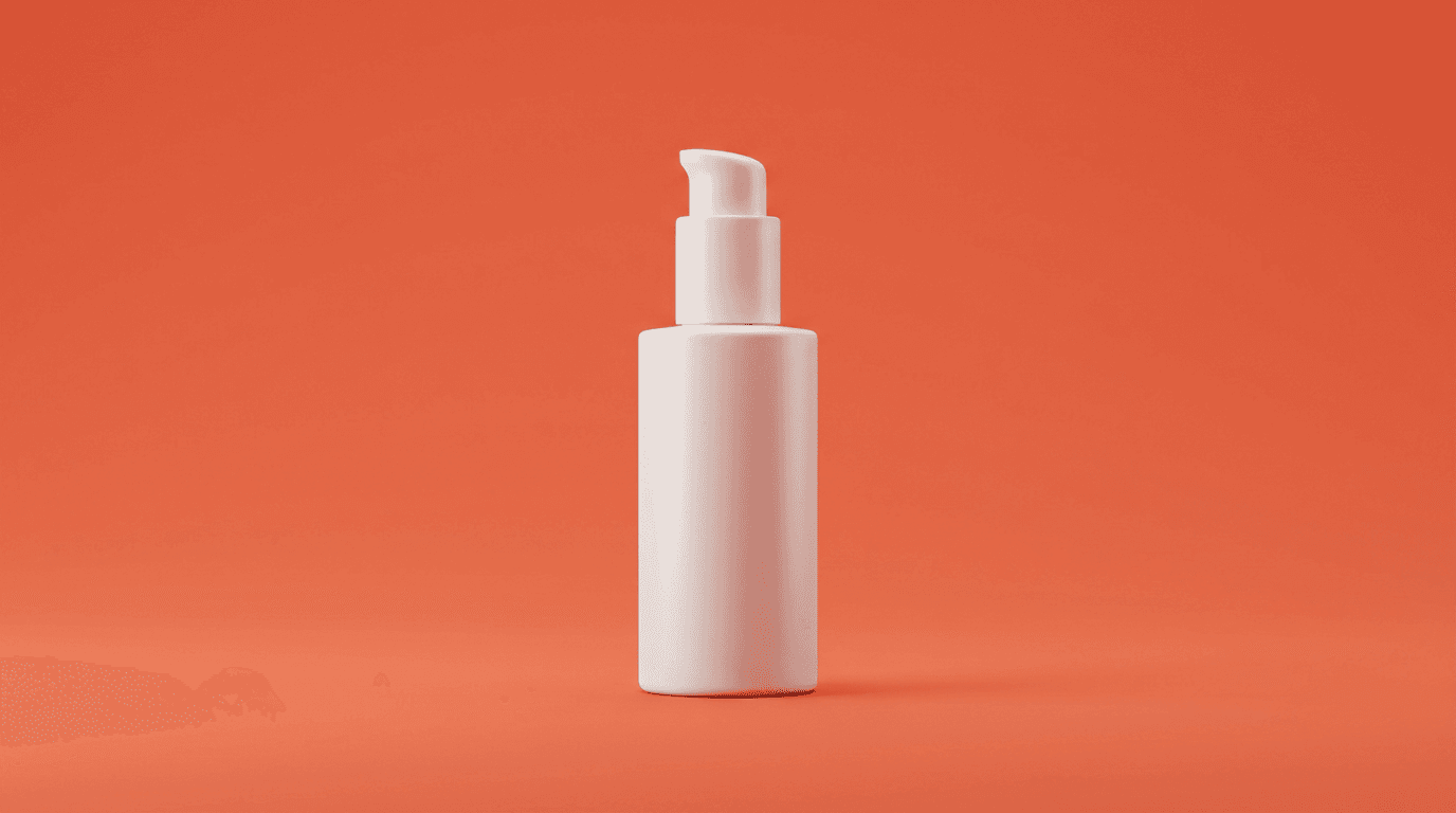
Prompt:
clean product photography of a single premium skincare bottle centered in the frame against a solid rich coral orange background, the bottle is sleek and modern with a matte white finish, soft diffused studio lighting from above and slightly in front creating gentle highlights on the bottle surface with a subtle shadow beneath it, the composition is minimal with the product occupying the center third of the frame and generous solid-color space surrounding it on all sides for text placement, the background is a smooth flat saturated coral orange with no gradients or texture, commercial product photography quality, crisp clean edges on the product, no text, no logos, no additional objects
Best for: E-commerce product ads, new product launches, single-product promotional campaigns, retargeting ads, seasonal sale creatives
Template 2: Lifestyle Product-in-Use Scene
Rather than showing the product in isolation, this template places it in a natural lifestyle context. The viewer sees someone's environment (a desk, a kitchen, a living room) with the product integrated organically. This format performs well because it helps the viewer imagine the product in their own life, which is a key driver of purchase intent.
Prompt:
warm lifestyle photograph of a cozy home office desk scene from a slightly elevated angle, a sleek laptop open on a clean wooden desk with a ceramic coffee mug steaming beside it, a small premium product box in matte navy blue sits naturally in the midground of the desk as if recently unboxed, soft warm morning light streams in from a window on the left casting gentle golden highlights across the scene, the desk has a few tasteful accessories like a small potted succulent and a leather notebook creating a lived-in but tidy aesthetic, the background shows a softly blurred bright room with white walls, warm inviting atmosphere, editorial lifestyle photography style, the product box is clearly visible but integrated naturally into the scene not artificially placed, no text, no readable branding
Best for: Lifestyle brand ads, subscription box promotions, home office product marketing, premium product positioning, warm seasonal campaign creatives
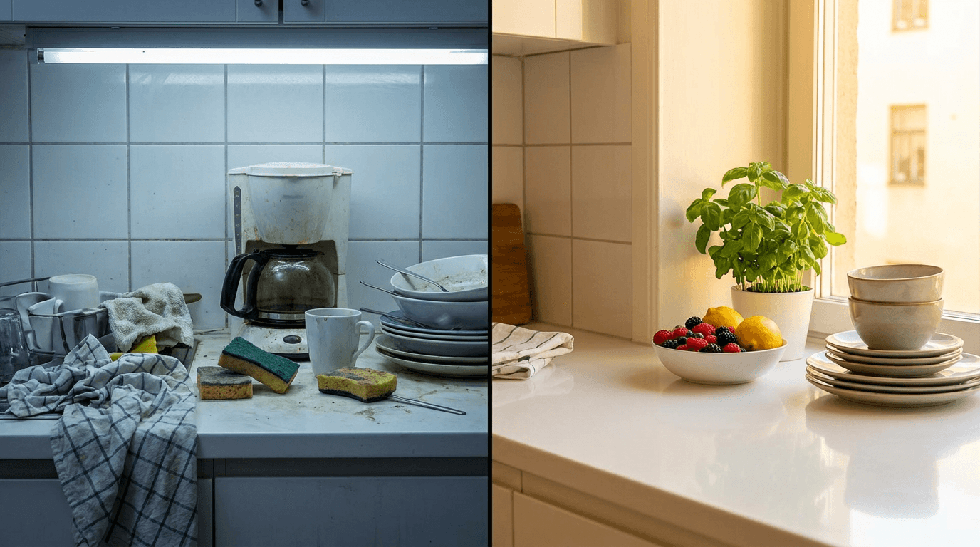
Template 3: Before-and-After Split Frame
The split-frame before-and-after is one of the highest-performing ad formats across industries because it creates instant visual tension and curiosity. The viewer's eye bounces between the two halves, which increases dwell time and engagement. This format works for any product or service that delivers a transformation.
Prompt:
wide image split cleanly into two halves by a sharp vertical dividing line through the center, the left half shows a dull cluttered kitchen countertop with stained surfaces and disorganized items in flat unflattering overhead fluorescent light with a cold desaturated gray-blue color grade suggesting neglect, the right half shows the same kitchen countertop but now clean gleaming and beautifully organized with fresh herbs in a small pot and a bowl of bright fruit under warm natural golden sunlight streaming in from a window with a vibrant warm color grade suggesting freshness and life, the contrast between the two halves is stark and immediately readable at small sizes, the dividing line is perfectly straight and centered, editorial quality on both sides, no text, no labels, no arrows
Best for: Cleaning product ads, home renovation services, coaching program promotions, meal delivery services, any transformation-based offer
Template 4: Bold Geometric Background with Product Cutout Space
A graphic, design-forward composition that creates a structured visual framework where a product image can be composited in afterward. This style signals professionalism and brand intentionality, and it works particularly well for tech products, apps, and premium consumer goods.
Prompt:
bold graphic background design for a product advertisement, abstract geometric composition with overlapping circular and angular shapes in deep navy blue and vibrant electric teal on a clean white background, the shapes create a dynamic asymmetric layout with a clear open space in the center-right area of the frame where a product could be placed, subtle gradient shading within the geometric shapes adds depth, a few scattered small gold accent dots add premium detail, the overall feel is modern clean and tech-forward, the composition has clear negative space in the upper left corner for headline text, flat design style with slight dimensional shadows, no text, no product, no photography, purely graphic
Best for: Tech product ads, SaaS promotions, app install campaigns, premium brand awareness ads, Black Friday and promotional event creatives
Template 5: Social Proof Testimonial Layout
Social proof is one of the most powerful drivers of ad performance, and this template creates a visual framework designed to showcase a customer testimonial. The image provides the emotional and environmental context while leaving clean space for the quote text that will be added in post-production.
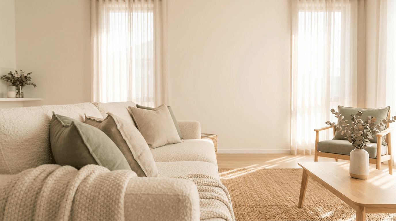
Prompt:
warm soft-focus lifestyle photograph of a bright airy living room interior shot from a comfortable conversational angle, plush sofa with textured cushions in the foreground slightly out of focus, the room beyond is bright with large windows letting in diffused natural daylight, warm cream and soft sage green color palette with natural wood accents, the overall composition has a large clean area in the upper two-thirds of the frame where the bright wall and window light create an even light-toned surface ideal for text overlay, the mood is calm trustworthy and welcoming, the lower third has the textured sofa detail adding visual interest without competing with the text zone above, residential interior photography style, no people, no text, no decorative text on walls
Best for: Testimonial-based ads, review showcase campaigns, trust-building retargeting ads, service business promotions, coaching and consulting ads
The testimonial layout shares design principles with the blog featured image templates that prioritize clean text-overlay zones, adapted here specifically for the vertical Facebook ad format.
Template 6: Urgency-Driven Sale Visual
Scarcity and urgency are proven conversion drivers, and this template creates a visual environment that communicates "limited time" or "act now" energy. The bold colors and high-energy composition prime the viewer's psychology for action before they even read the ad copy.
Prompt:
high-energy graphic composition with a dramatic deep red to dark burgundy gradient background, dynamic diagonal speed lines in a slightly lighter red radiating from the center-right creating a sense of motion and urgency, a bright golden starburst shape in the upper left area acts as a badge or callout zone with space for price or discount text, small scattered golden confetti particles add celebratory energy throughout the frame, the overall composition is bold and attention-grabbing with clear zones for headline text in the center and a callout badge in the corner, the color palette is rich saturated red gold and deep burgundy, retail sale promotion aesthetic, the mood is exciting and time-sensitive, no text, no numbers, no words anywhere in the image
Best for: Flash sale ads, limited-time offer campaigns, Black Friday and holiday promotions, clearance events, countdown-driven campaigns
Template 7: Flat Lay Product Collection
The overhead flat lay is a proven e-commerce ad format that showcases multiple products in a single organized composition. It communicates variety, curation, and completeness, making it ideal for bundles, collections, or brands with a product range they want to display.
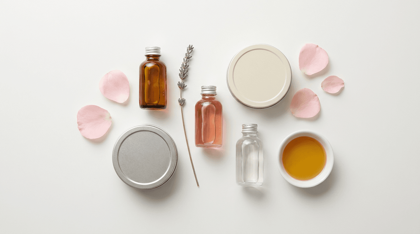
Prompt:
bright overhead flat lay photograph on a clean matte white surface, a curated arrangement of beauty and skincare items including three small glass bottles with different colored liquids in amber pink and clear, two round tin containers with closed lids, a sprig of dried lavender, a few scattered flower petals in soft pink, and a small white ceramic dish with a golden liquid, all items arranged in a balanced asymmetrical composition with intentional spacing between each object, even soft overhead lighting with minimal shadows creating a clean editorial look, the color palette is soft neutrals with muted pink lavender and warm gold accents, the arrangement feels curated and intentional not cluttered, high-end editorial product photography, no text, no readable labels on any items
Best for: Product bundle ads, collection launch campaigns, gift set promotions, beauty and skincare brand ads, curated product showcase creatives
Template 8: App Interface Mockup Environment
For SaaS companies, mobile apps, and digital products, showing the product interface in a realistic environment builds credibility and helps the viewer imagine using the product. This template creates the environment and device context, ready for a screenshot to be composited in.
Prompt:
lifestyle photograph of a modern smartphone held at a natural slight angle resting on a clean light wooden desk surface, the phone screen is a solid clean light gray placeholder color with no content on it, soft warm directional light from the upper left creates a gentle highlight on the phone screen and a soft shadow to the right, the desk surface has subtle grain texture visible, a pair of wireless earbuds in their case and a small coffee cup are positioned casually in the background slightly out of focus, the scene feels natural and unposed as if someone just set their phone down, bright modern minimal aesthetic with warm natural tones, the phone screen is the clear focal point of the composition, editorial tech lifestyle photography, no text, no UI elements on screen, no brand logos
Best for: App install ads, SaaS product demos, digital product promotions, tech startup launch campaigns, software feature announcements
Template 9: Food and Beverage Appetite Appeal
Food and beverage ads live or die on appetite appeal, that visceral reaction that makes the viewer crave what they see. This template is engineered to produce the rich colors, dramatic lighting, and textural detail that make food imagery irresistible in the Facebook feed.
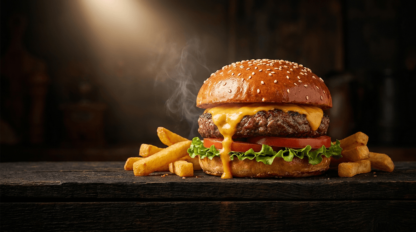
Prompt:
dramatic food photography of a gourmet burger on a dark rustic wooden board, the burger has a glossy brioche bun with visible sesame seeds and layers of fresh lettuce a thick tomato slice melted cheese dripping down the side and a perfectly seared patty, a few crispy golden fries are scattered casually beside it on the board, a single dramatic warm spotlight from the upper left illuminates the burger creating rich highlights on the glossy bun surface and deep moody shadows on the dark background, steam or heat haze rising subtly from the patty, shallow depth of field with the front of the burger tack sharp and the background falling into dark bokeh, the color palette is warm rich amber gold and deep brown against near-black background, appetizing commercial food photography quality, no text, no utensils, no hands
Best for: Restaurant ads, food delivery promotions, meal kit services, food brand awareness campaigns, menu item spotlights
Template 10: Emotional Connection Close-Up
Faces are the most powerful attention-grabbers in any visual feed. This template does not generate a specific recognizable person but rather creates a mood and environment that communicates deep emotional resonance, perfect for brands selling transformation, wellness, coaching, or any emotionally-driven product.
Prompt:
close-up photograph of a pair of hands gently cradling a warm ceramic mug, the hands are wrapped around the mug with fingers interlaced and visible warmth from the cup suggested by soft steam rising, the background is a soft warm bokeh of golden ambient light suggesting a cozy indoor evening environment, the skin on the hands looks natural and warm lit by the golden ambient glow, the ceramic mug is a simple handmade style in muted earthy sage green, shallow depth of field with the hands and mug sharp and everything beyond dissolved into warm golden circles of bokeh, the mood is contemplative peaceful and deeply personal, warm intimate color palette of golden amber and muted green, editorial portrait photography quality, no face visible, no text
Best for: Wellness brand ads, coaching and self-improvement promotions, subscription service ads, mindfulness app campaigns, emotionally-driven brand storytelling
Template 11: Outdoor Adventure Lifestyle
For brands in outdoor recreation, travel, fitness, or any category that aligns with an active lifestyle, an aspirational outdoor scene creates emotional pull and brand association. This template produces a cinematic landscape with a human-scale element that the viewer can project themselves onto.

Prompt:
cinematic wide landscape photograph of a mountain trail at golden hour, a single backpack resting against a rock at a scenic overlook point in the center foreground, the trail stretches ahead into a dramatic mountain landscape with layered ridges fading into atmospheric haze, golden sunset light illuminates the scene from the left casting long warm shadows across the rocky trail surface, the sky transitions from deep warm orange at the horizon through soft peach to deep blue overhead, wildflowers along the trail edge catch the golden light, the backpack is rugged and well-worn suggesting adventure and experience, the composition has open sky in the upper third perfect for text overlay, adventure travel photography with cinematic color grading, warm golden and cool blue complementary color palette, no people, no text
Best for: Outdoor gear ads, travel brand promotions, adventure tourism campaigns, fitness and active lifestyle brands, aspirational brand awareness ads
Template 12: Minimalist Luxury Product Presentation
For premium and luxury brands, less is more. This template creates the kind of ultra-clean, restrained composition that communicates high-end positioning. The generous negative space and subtle lighting say "this product does not need to shout" which paradoxically commands more attention and perceived value.
Prompt:
ultra-minimalist product photography on a seamless matte cream background, a single luxury watch resting on its side at a slight angle in the exact center of the frame, the watch has a clean silver case with a dark face and a leather strap draped naturally, a single soft directional light from above and slightly behind creates a delicate rim light outlining the watch edges and a precise soft shadow beneath, enormous negative space surrounding the watch on all sides with the product occupying only about twenty percent of the total frame area, the cream background is perfectly even with no visible gradient or texture, the mood is quiet confident and luxurious, ultra-clean high-end product photography, no text, no reflections other than the natural metal surface
Best for: Luxury product ads, premium brand positioning, high-ticket item promotions, jewelry and watch advertising, aspirational retargeting campaigns
Template 13: Vibrant Pop Art Product Explosion
A high-energy, visually explosive composition designed to be impossible to scroll past. This style works for brands targeting younger audiences or any product category where fun, energy, and boldness are core brand attributes. The vibrant colors and dynamic arrangement create maximum visual impact in the feed.
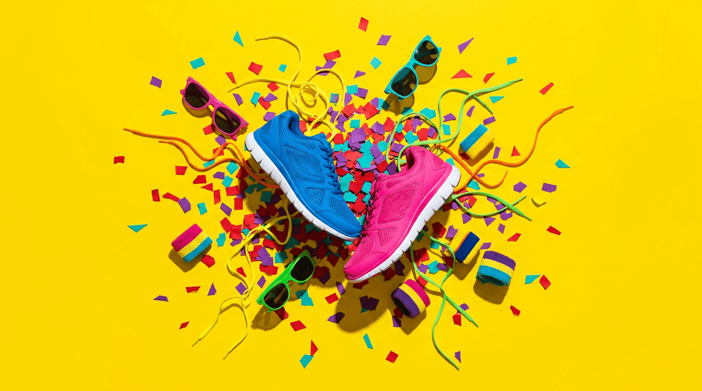
Prompt:
explosive dynamic composition of colorful sneakers and athletic accessories bursting outward from the center of the frame against a bright vivid yellow background, two sneakers in contrasting colors of electric blue and hot pink are positioned at dynamic angles as if frozen mid-air, colorful geometric shapes in red purple and teal scatter around them like confetti, small accessories like shoelaces sunglasses and wristbands fly outward adding to the explosive energy, hard clean studio lighting with bold shadows, the composition radiates outward from center creating a starburst effect, pop art meets commercial photography aesthetic, hyper-saturated vivid color palette, maximum energy and visual impact, every element is sharp and crisp, no text, no brand logos
Best for: Sneaker and streetwear ads, youth-targeted product campaigns, brand awareness for bold consumer brands, seasonal collection launches, high-energy promotional events
Template 14: Cozy Seasonal Atmosphere
Seasonal relevance boosts ad performance significantly. This template creates a warm, atmospheric seasonal scene that can be adapted for fall, winter, or holiday campaigns. The environmental warmth creates an emotional response that transfers to whatever product or offer is promoted alongside it.
Prompt:
warm atmospheric photograph of a cozy autumn scene on a rustic wooden table by a window, a chunky knit blanket draped over the edge of the table, a steaming ceramic mug of spiced latte with a cinnamon stick resting in it centered in the frame, scattered dried autumn leaves in warm orange and deep red around the base of the mug, a small stack of old books beside the mug, soft diffused overcast daylight coming through the window behind creating a gentle bright backdrop, the window shows blurred autumn trees with golden and orange foliage outside, the color palette is entirely warm with deep oranges rustic browns cream and touches of burgundy, the mood is nostalgic comforting and inviting, the composition has clean space in the upper portion near the bright window for text overlay, editorial lifestyle photography, no people, no text
Best for: Seasonal promotional campaigns, fall and winter product launches, holiday gift guide ads, cozy lifestyle brand content, subscription box seasonal promotions
If you run seasonal campaigns regularly, the seasonal trend prompts guide covers how to adapt AI prompts for different times of year, which pairs well with the seasonal templates here to keep your ad creative aligned with the calendar.
Template 15: Clean Data Visualization Background
For B2B companies, SaaS platforms, and professional services, an abstract data-inspired visual communicates intelligence, technology, and competence without showing a specific product. This style works well when the ad's value proposition is communicated through the headline text rather than the image.

Prompt:
abstract technology background with a network of softly glowing connected nodes and thin luminous lines forming an organic web pattern across a deep dark navy blue background, the nodes are small circles of soft white and pale blue light connected by thin translucent lines, the network is denser in the lower right corner and becomes sparser toward the upper left creating a natural gradient of complexity that leaves clean dark space in the upper left for text, subtle depth of field with some nodes sharp and others softly blurred suggesting three-dimensional space, the glow from the nodes creates a subtle ambient blue illumination on the dark background, futuristic but elegant data visualization aesthetic, cool blue and white color palette against near-black navy, no text, no numbers, no specific data points, purely abstract
Best for: B2B SaaS ads, technology company promotions, data analytics product marketing, professional services brand awareness, AI and machine learning product ads
Template 16: User-Generated Content Style
Some of the highest-performing Facebook ads look like they were not designed at all. They mimic the aesthetic of organic user-generated content, which triggers trust signals and bypasses the "this is an ad" mental filter that causes users to scroll past polished ad creative. This template produces that intentionally casual look.
Prompt:
casual overhead photograph of someone's kitchen counter that looks like a real smartphone photo, a meal prep spread in progress with chopped colorful vegetables on a cutting board including bright red bell peppers orange carrots and green broccoli, a glass container partially filled with prepped food beside the cutting board, a chef's knife resting on the board, the lighting is natural and slightly uneven like real kitchen light from a ceiling fixture mixed with window light, the composition is slightly imperfect and unposed as if someone just grabbed their phone to snap a quick photo of their cooking progress, the colors are natural and not overly saturated, slight warmth from the overhead kitchen light, realistic everyday photography aesthetic with none of the perfection of studio lighting, the image feels authentic and relatable, no filters, no text, no staging
Best for: Health food brand ads, meal prep service promotions, organic and natural product marketing, any ad campaign optimized for authenticity over polish, direct-response conversion campaigns
Template 17: Environmental Problem-Solution
Showing the problem your product solves creates an instant emotional connection with anyone who has experienced that problem. This template creates a relatable "problem" environment that makes the viewer feel seen, which dramatically increases ad engagement when paired with solution-oriented copy.
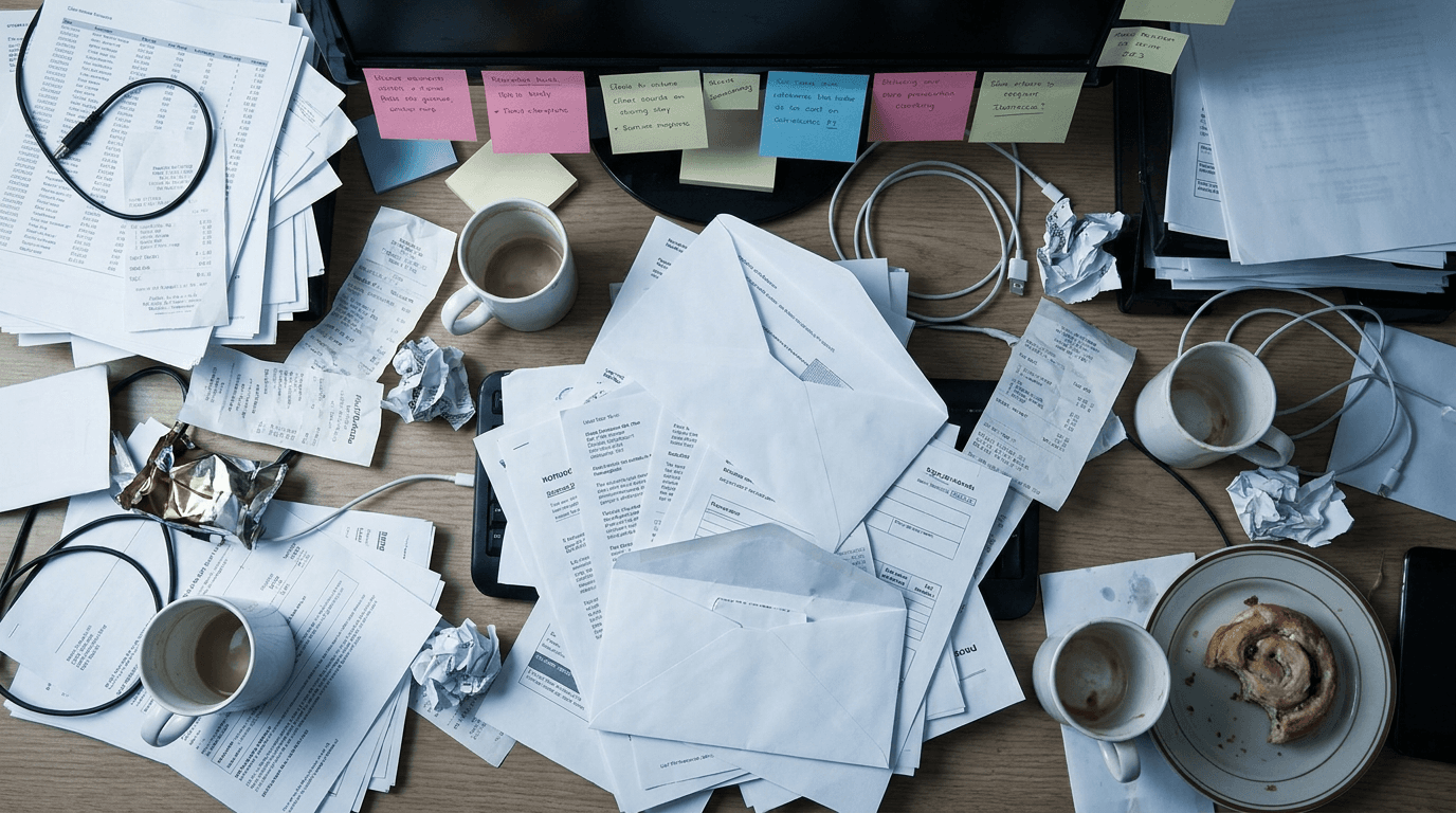
Prompt:
overhead photograph of a messy cluttered home office desk that communicates overwhelm and disorganization, papers scattered across the desk surface overlapping each other, sticky notes in various colors stuck to the edge of a monitor that is slightly visible at the top of frame, empty coffee cups and a half-eaten snack adding to the chaos, tangled charging cables, the lighting is harsh and flat like an overhead fluorescent giving the scene an unflattering stressful energy, cool desaturated color grade with slight blue-gray cast suggesting fatigue and frustration, the composition fills the entire frame with clutter so the eye has no place to rest creating visual tension, the mood is stressful and overwhelming, realistic documentary style photography, no people, no hands, no text, no readable words on any papers or notes
Best for: Productivity tool ads, organizational product marketing, coaching and consulting services, SaaS tools that solve workflow problems, course and digital product promotions targeting pain points
Template 18: Premium Ingredient or Material Close-Up
For brands whose value proposition rests on ingredient quality, material craftsmanship, or sourcing transparency, a macro close-up of the raw material communicates that quality story visually. This works for food brands, skincare companies, supplement brands, textile companies, and any category where "what it is made of" matters.
Prompt:
extreme macro close-up photograph of raw honeycomb with golden honey slowly dripping from the cells, the hexagonal wax structure is perfectly detailed showing the geometric precision of natural honeycomb, thick viscous golden honey catches dramatic warm sidelight creating luminous translucent highlights as it drips downward, the background is a soft warm dark amber bokeh suggesting more honeycomb falling out of focus behind, the texture of the wax is visible in fine detail with slight imperfections that prove it is natural, the color palette is entirely warm golden amber from light honey gold to deep dark amber, the mood is rich natural and luxurious, food macro photography with commercial lighting quality, shallow depth of field with only the front edge of the honeycomb cells in perfect focus, no text, no hands, no utensils
Best for: Natural ingredient brand ads, honey and food product promotions, skincare ingredient stories, supplement transparency marketing, premium material showcase ads
Template 19: Event or Webinar Promotional Background
Events, webinars, and live sessions are among the most common Facebook ad objectives, and they need visual frameworks that communicate "something is happening" while leaving ample space for event details. This template creates that framework with a professional, authoritative feel.
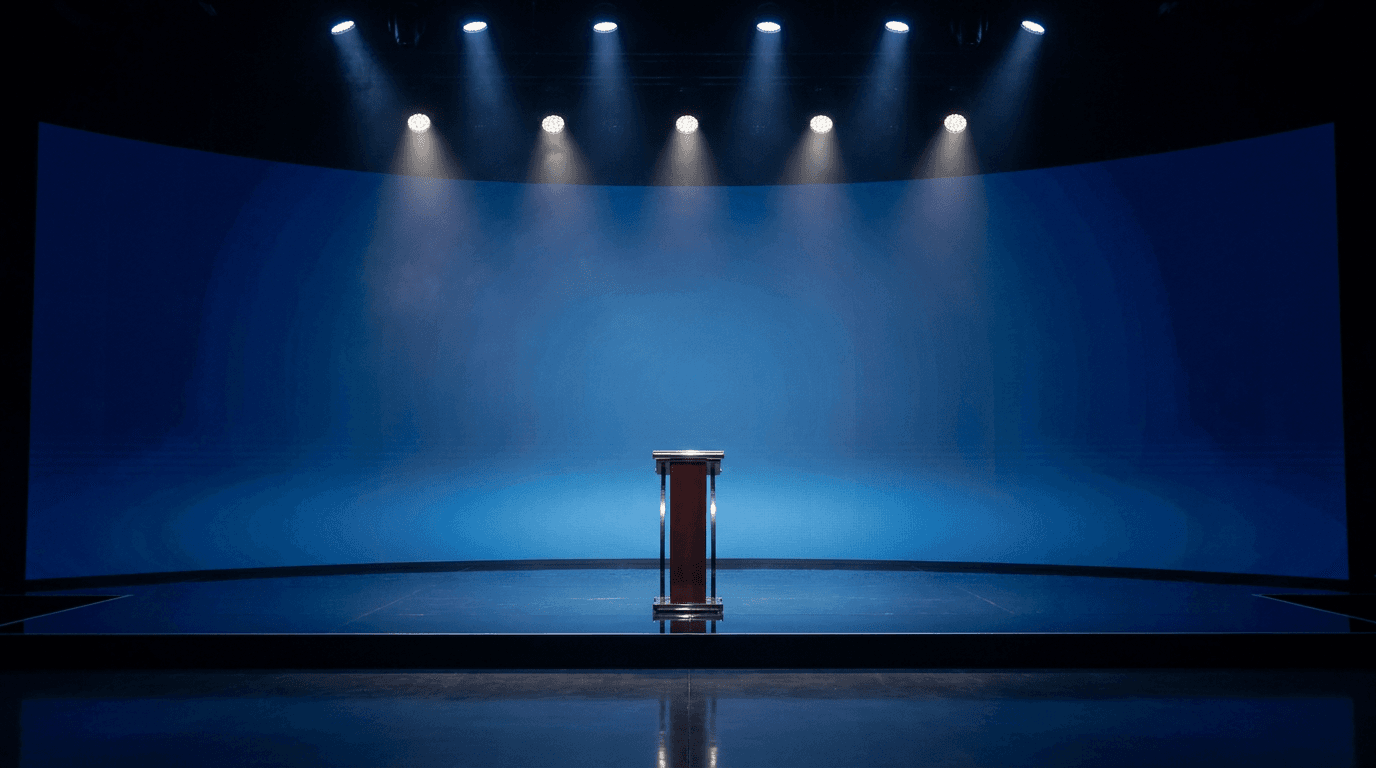
Prompt:
professional stage and presentation environment, a sleek modern stage setup with a single podium centered on a dark stage floor, dramatic overhead spotlights in cool white beam down creating pools of light on the stage and a subtle atmospheric haze in the air, the background behind the stage is a large curved LED wall displaying a soft gradient from deep midnight blue on the edges to a slightly lighter blue in the center, the stage floor is polished dark surface reflecting the spotlight beams, the overall composition has the stage and podium in the lower third of the frame with the large LED wall background filling the upper two-thirds providing a massive clean zone for text overlay, the atmosphere is professional anticipatory and important, corporate event photography style, cool blue and warm white spotlight color palette, no people, no text on the LED wall, no logos
Best for: Webinar promotional ads, conference and event marketing, speaking engagement promotions, product launch event announcements, live stream promotional creatives
Template 20: Comparison Grid Layout
The comparison format is an extremely effective ad structure for competitive positioning. This template creates a clean grid framework that communicates "us versus them" or "option A versus option B" visually, making it ideal for brands that want to highlight their advantages over alternatives.
Prompt:
clean graphic layout divided into two equal columns separated by a thin vertical line on a soft light gray background, the left column has a slightly warm peachy cream background tint and contains a centered simple iconic illustration of a wilting plant in a cracked pot rendered in muted desaturated colors suggesting something neglected or subpar, the right column has a slightly cool fresh mint green background tint and contains a centered simple iconic illustration of a thriving vibrant plant in a beautiful pot with healthy green leaves rendered in rich saturated natural colors suggesting vitality and success, both illustrations are simple clean and minimal in a modern flat illustration style, the compositions within each column mirror each other in size and placement creating perfect visual balance, ample space above and below both illustrations for text labels, clean modern infographic aesthetic, no text, no labels, no words
Best for: Competitive comparison ads, feature comparison campaigns, upgrade and premium tier promotions, before-after service ads, educational content ads
Customizing These Templates for Your Specific Brand
These 20 templates provide the structural and atmospheric foundation for high-performing Facebook ad images. To make them work for your specific brand, you need to customize four key dimensions.
Replace the product category with yours. Template 1 describes a skincare bottle, but the compositional structure (centered product on a bold color block) works for any physical product. Swap "skincare bottle" for your actual product, adjust the color and material descriptions to match, and the prompt produces the same high-performing format for your category. Template 7 shows beauty products in a flat lay, but the arrangement works equally well for tech accessories, stationery, food items, or any product collection. The compositional skeleton is the value; the specific product details are yours to change.
Inject your brand color palette. Every template specifies a color palette, and replacing those colors with your brand's palette is the single most impactful customization you can make. If your brand uses deep green and gold, rewrite the color references throughout the prompt to reflect that combination. If your brand is minimal with black, white, and a single accent color, strip out any multi-color references and simplify. Consistent color usage across all your ad creatives builds brand recognition even when the viewer does not consciously register it.
Adjust the mood to match your positioning. Templates in this set span a wide emotional range, from the warm coziness of Template 14 to the high-energy explosion of Template 13 to the quiet luxury of Template 12. Your brand probably lives in one or two emotional zones. A luxury skincare brand should lean into Templates 12, 18, and 7. A high-energy fitness supplement brand should gravitate toward Templates 6, 13, and 9. Identify the three to five templates that match your brand's emotional register and make those your core rotation.
Design for your text overlay strategy. Before generating, decide where your headline text will go in the final ad. Then verify that the prompt's composition creates clean space in that area. Most templates above are designed with text-friendly zones in the upper third or along one side, but if your ad design places the headline in the center or lower third, you may need to adjust the composition descriptors. Moving a key element from "centered" to "positioned in the lower right" opens the upper portion for text, and vice versa. This is an important consideration covered in more detail in the thumbnail composition strategies guide, where text placement within the image is equally critical.
Testing Strategy: How to Use These Templates for Maximum Performance
Generating ad images is only the first step. The real performance gains come from systematic testing. Facebook's algorithm can identify winning creative faster than human intuition, but only if you give it enough distinct variations to compare.
The most effective approach is to start each campaign cycle by generating three to five images from different templates that match your brand and objective. Load all of them into a single ad set using Facebook's dynamic creative feature, which automatically distributes impressions across variations and shifts budget toward the best performers. Within 48 to 72 hours, the data will tell you which visual approach is resonating.
Once you have a winning direction, generate five to ten variations within that template. Change the background color, adjust the lighting mood, modify the product angle, or alter the environmental details. These variations are close enough to maintain what is working but different enough to test which specific elements drive performance. This narrowing process, broad template test first, then variation testing within the winner, gives you both strategic direction and tactical optimization.
Keep a log of which templates and customizations produce your best results over time. After two to three campaign cycles, you will have a clear picture of the two or three visual approaches that consistently outperform for your audience. Those become your core creative frameworks, and you generate fresh variations within them every one to two weeks to stay ahead of creative fatigue.
For brands that also produce organic social content alongside paid ads, aligning the visual language across both channels creates a reinforcing effect. The Instagram post image templates and TikTok cover image strategies cover organic visual optimization for those platforms, and the visual consistency between your paid and organic content strengthens brand recognition.
Common Mistakes That Kill Facebook Ad Creative Performance
Knowing what to avoid is as important as knowing what to do. These are the most frequent errors that undermine AI-generated Facebook ad images.
Text baked into the generated image. Facebook's ad system has historically penalized images with excessive text coverage, and even though the strict "20% text rule" has been relaxed, images with heavy text overlay still tend to receive lower distribution. More importantly, text generated by AI within images is often misspelled, poorly kerned, or uses inappropriate fonts. Always generate images without text (all prompts above include "no text") and add your copy in a design tool afterward where you control the typography precisely.
Overly complex compositions. The Facebook feed is viewed on mobile screens that are roughly 6 inches diagonal. An image that looks detailed and interesting on a 27-inch desktop monitor becomes an indecipherable mess at mobile feed size. Every element in your ad image should be identifiable at thumbnail scale. If you cannot tell what the image is about when you shrink it to the size of a postage stamp, it is too complex. The most effective ad images have one to three distinct elements maximum, and the prompts above are designed with this constraint in mind.
Ignoring the mobile-first reality. Over 90% of Facebook ad impressions are served on mobile devices. This means your images are viewed vertically, on small screens, while the user is scrolling quickly. The 4:5 portrait ratio exists because it maximizes the mobile viewport. Generating images at landscape or square ratios for feed placement sacrifices screen real estate. Always generate at 4:5 for feed ads and 9:16 for Stories and Reels placements.
Using the same creative across all audiences. Different audience segments respond to different visual approaches. A retargeting audience that already knows your brand may respond best to product-focused close-ups (Templates 1, 7, 12), while a cold prospecting audience that has never seen your brand may respond better to emotional and environmental scenes (Templates 10, 11, 14) that build connection before asking for a click. Generate different creative sets for different funnel stages and audience segments.
Neglecting the creative-copy relationship. The ad image and the ad copy work together as a single communication unit. An image that tells the entire story makes the copy redundant, and an image that has no relationship to the copy creates cognitive dissonance. The best-performing combination is an image that creates an emotional or visual hook that the headline and body text then complete with specific information. Template 17 (problem environment) works brilliantly when paired with solution-oriented copy. Template 6 (urgency visual) amplifies copy that includes specific deadlines or limited quantities. Plan the image and copy as a unified creative concept, not as separate elements.
Creative consistency without creative variation. This sounds contradictory but it is not. Your ads need to maintain consistent brand identity (color palette, mood, quality level) while simultaneously varying enough to avoid fatigue and test new approaches. The solution is to operate within a defined set of brand-consistent templates (pick your top five from this post) and generate fresh variations within those frameworks on a regular cycle. Consistency comes from the brand constraints; variation comes from the compositional and environmental details within those constraints.
Platform-Specific Considerations for Facebook Ad Placements
Facebook ads do not appear only in the News Feed. Your creative may be shown across Facebook Feed, Facebook Stories, Facebook Reels, Instagram Feed, Instagram Stories, Instagram Reels, Audience Network, and Messenger. Each placement has different dimensions, different viewing behaviors, and different competitive environments.
For Facebook and Instagram Feed placements, the 4:5 portrait ratio is optimal. The templates above are designed for this format by default. For Stories and Reels placements across both Facebook and Instagram, you need 9:16 vertical images. The easiest approach is to generate each prompt twice: once at 4:5 for feed and once at 9:16 for Stories. The Miraflow AI Image Generator allows you to set the aspect ratio before generating, so you can produce placement-optimized versions without rewriting the prompt. Just keep in mind that the composition may shift slightly between ratios, and you should verify that key elements remain well-positioned in both versions.
Audience Network placements (ads shown on third-party apps and websites) typically require landscape or square formats and tend to perform with simpler, bolder compositions since they appear in smaller ad units. Templates 1, 4, and 6, which are the most graphically bold and simple, adapt best to these smaller placements.
If your campaigns also include video placements, the visual concepts from these templates can serve as starting frames or style references. The Cinematic Video Generator in Miraflow can produce short video clips that match the aesthetic of your static ad images, giving you a cohesive creative suite across both static and video placements.
How Miraflow AI Supports Your Facebook Ad Creative Workflow

Every template in this post can be generated inside Miraflow AI. Open the AI Image Generator, paste your customized prompt, select the aspect ratio for your target placement, and generate. If the output needs localized adjustments, such as changing a background color, repositioning an element, or modifying a single detail, the Image Inpainting tool lets you mask and regenerate specific areas without starting from scratch.
For advertisers who run campaigns across multiple platforms, Miraflow's broader toolkit can support the full creative pipeline. The YouTube Thumbnail Maker handles YouTube ad creative and organic thumbnail generation. The Text2Shorts tool converts text-based ad concepts into short-form video assets for Reels and Stories placements. The AI Music Generator produces royalty-free background audio for video ad creatives. And the YouTube channel banner art templates ensure your brand presence is visually consistent when audiences click through from ads to your YouTube channel.
The workflow that produces the best results is iterative: generate a batch of variations, test them in your campaigns, analyze performance data, and then generate a new batch informed by what worked. AI generation makes this loop fast enough to run weekly, which means your creative testing velocity can match or exceed what large agencies achieve with dedicated production teams.
FAQ
What image size should I use for Facebook ad creatives?
For feed ads, the optimal dimension is 1080×1350 pixels (4:5 portrait ratio), which maximizes screen real estate on mobile devices. For Stories and Reels placements, use 1080×1920 pixels (9:16 vertical). For carousel ads, each card should be 1080×1080 (1:1 square) for consistent display. Always generate at the highest resolution your AI tool supports and let Facebook handle compression during upload.
Can I use AI-generated images in Facebook ads commercially?
Yes. AI-generated images are generally permitted for commercial use in Facebook advertising. Meta's ad policies focus on the content of the image (no misleading claims, no prohibited content) rather than the production method. Always check the terms of service for your specific AI generation tool to confirm commercial usage rights, and ensure the generated content complies with Meta's advertising standards.
How many ad creative variations should I test per campaign?
Start with three to five visually distinct variations per ad set. Facebook's dynamic creative feature can efficiently distribute impressions across this number of variations and identify winners within 48 to 72 hours at moderate budgets. Once you identify a winning visual direction, generate five to ten variations within that template to test specific elements (color, lighting, product angle). Testing fewer than three gives you insufficient data; testing more than ten at once dilutes the budget too thinly across variations.
Should my Facebook ad images include text?
Add text in post-production using a design tool, not within the AI-generated image itself. AI-generated text is unreliable and often contains errors. All templates in this post generate text-free images specifically so you can add precise, branded typography afterward. Keep any text overlay concise and ensure it does not cover more than roughly 20% of the image area, as text-heavy images tend to receive lower distribution from the algorithm.
How often should I refresh my Facebook ad creative?
Refresh creative every one to two weeks for campaigns running at significant daily budgets, and every two to four weeks for lower-budget campaigns. Monitor your frequency metrics: when average frequency exceeds three to four impressions per user, creative fatigue is likely setting in and performance will begin to decline. AI generation makes it feasible to maintain this refresh cadence without increasing your production costs.
Which templates work best for cold audiences versus retargeting?
Cold prospecting audiences respond well to emotional, environmental, and lifestyle-oriented templates (Templates 2, 5, 10, 11, 14) that build connection and curiosity. Retargeting audiences who already know your brand respond better to product-focused, direct, and urgency-driven templates (Templates 1, 6, 7, 12, 13) that push toward conversion. The transformation template (Template 3) and social proof template (Template 5) work well across both audience types because they communicate value rather than just product features.
Can I use the same images for Facebook ads and Instagram ads?
Since Facebook and Instagram ads are managed through the same Meta Ads Manager, your creative often runs across both platforms. The 4:5 portrait ratio works well in both Facebook and Instagram feeds. However, if you want to optimize for each platform's aesthetic culture, you might generate slightly different variations. Instagram audiences tend to prefer more visually polished, editorially styled images, while Facebook audiences are more responsive to direct, product-centric, and UGC-style visuals. The Instagram post image templates provide Instagram-specific optimization if you want to tailor creative per platform.
How do I maintain brand consistency across twenty different ad image variations?
Lock in three constants across all variations: your brand color palette, your preferred lighting mood (warm versus cool, dramatic versus soft), and your composition style (minimal versus detailed, centered versus asymmetric). These three elements create a consistent visual fingerprint even when the specific subject matter and format change between templates. Write your brand's color hex codes, lighting descriptors, and composition preferences into a reference document, and apply them to every prompt you customize.
Conclusion
Facebook ad performance is won or lost at the creative level. The image is the first thing a user sees, the primary determinant of whether they stop scrolling, and the biggest single lever you have for improving click-through rates, reducing costs per result, and scaling your campaigns profitably. The advertisers who consistently produce fresh, high-quality, scroll-stopping creative assets are the ones who win the auction and the customer.
The 20 templates in this post cover the visual formats that drive performance across every major advertising use case: product showcases, lifestyle scenes, urgency-driven promotions, social proof frameworks, comparison layouts, seasonal atmospheres, problem-solution narratives, and more. Each one is built around the specific constraints of the Facebook ad environment, from the mobile-first 4:5 ratio to the composition zones that accommodate text overlay to the contrast and color profiles that create feed separation.
Copy the templates that match your brand and campaign objectives, customize them with your products, colors, and positioning, generate them inside Miraflow AI, add your text and CTA in post-production, and deploy them into your ad campaigns. Then test, analyze, and generate the next batch. The brands that win on Facebook are the ones that never run out of fresh creative, and with these templates and AI generation, you will not.