AI Prompts for Twitter/X Post Images: 15 Templates That Stop the Scroll
Written by
Jay Kim

15 copy-paste AI image prompts built for Twitter/X post images. Optimized for 16:9, high contrast, and scroll-stopping engagement in the X feed.
You just wrote the perfect tweet. Strong hook, clear value, maybe even a hot take that should get people talking. You hit post and wait for the engagement to roll in.
It doesn't.
The tweet gets buried because it had no image attached, and the X timeline moved on within seconds. On a platform where most impressions happen within the first hour, the visual attached to your post is often the difference between someone stopping to read and someone scrolling right past you.
The problem is that most creators and marketers either skip images entirely or throw together something generic in a rush. And when every other post in the feed is competing for the same split-second of attention, a weak image (or no image at all) means your content gets ignored regardless of how good the actual words are.
This post gives you 15 ready-to-use AI image prompts designed specifically for Twitter/X post images. Each one is built around a visual format that performs well in the feed, optimized for the right dimensions, and ready for you to copy, paste, and generate. Whether you are posting threads, sharing tips, promoting a product, or building a personal brand, there is a template here that fits your content style.
If you have been using AI prompts for other platforms like YouTube thumbnails or Instagram post images, you already know how much faster the workflow gets when you start with a well-structured prompt. This post brings the same approach to Twitter/X.
Why Twitter/X Post Images Matter More Than Ever in 2026
Twitter/X has always been a text-first platform. Hot takes, punchy one-liners, and real-time reactions are what it was built for. But the data tells a more nuanced story than most creators realize.
Image posts on X outperform text-only posts by roughly 30% on engagement, and tweets with images receive significantly more retweets than those without any visual. That gap has been narrowing over the past year, and images have crept up to nearly match text in engagement rate, which is a meaningful shift worth paying attention to.
X now reaches over 600 million monthly users, and the platform is processing hundreds of millions of tweets every single day. The feed moves fast. When someone scrolls past your post, you have roughly one second to register in their brain. A strong visual buys you that second.
The challenge is that X compresses images aggressively. If you upload something at the wrong dimensions, with low contrast, or with text placed near the edges, the platform will crop it awkwardly or make it look blurry. That is why having prompts that are designed around how X actually displays images matters so much. You need visuals that are bold, clean, and optimized for the 16:9 landscape format that fills the full timeline width without cropping.
What Makes a Scroll-Stopping Image on Twitter/X
Before jumping into the prompts, it helps to understand why certain images perform better than others in the X feed. The same principles that drive high CTR in YouTube thumbnails apply here, but adapted for a faster-moving, text-heavy environment.
High contrast is non-negotiable. X compresses images during upload, and that compression tends to flatten contrast and mute colors. If your source image already looks slightly muted, the final post will look washed out in the feed. You need to start with punchy, saturated visuals so they survive the compression pipeline and still pop on screen.
One clear focal point wins. The X timeline is dense. Users are scanning past dozens of posts per minute. Images with a single dominant subject perform better than cluttered compositions because they communicate their message in a fraction of a second.
Minimal or no text overlay works best on X. Unlike YouTube thumbnails where bold text is essential, X post images work better when the visual itself tells the story and the tweet text provides the context. If you do include text, keep it to three words maximum and use large, bold fonts that remain readable on mobile screens.
The 16:9 landscape format is the safest choice. The recommended X post image size is 1200 x 675 pixels with a 16:9 aspect ratio. This fills the full width of the timeline on both desktop and mobile without any cropping. While vertical 4:5 images take up more screen space on mobile, they get cropped in the timeline preview, which means your carefully designed composition might lose its impact.
These principles are built into every prompt template below, so you can generate images that are already optimized for how X displays and compresses visuals.
Image Specs Quick Reference for X in 2026
Before you generate anything, here are the dimensions you should target for your X post images:
Single image post: 1200 x 675 pixels (16:9 aspect ratio) for full-width display without cropping
Mobile-first vertical post: 1080 x 1350 pixels (4:5 aspect ratio) for maximum screen space on mobile, though the timeline crops this to a landscape preview
File format: PNG for graphics with text or sharp edges (X compresses PNG less aggressively than JPG)
Maximum file size: 5MB on mobile, 15MB on web
Multi-image grid: If posting 2-4 images, center the subject in each image because X crops to fit the grid layout
For all 15 prompts below, generate at 16:9 aspect ratio for the cleanest results. You can do this directly inside the Miraflow AI Image Generator by selecting the 16:9 aspect ratio option before generating.

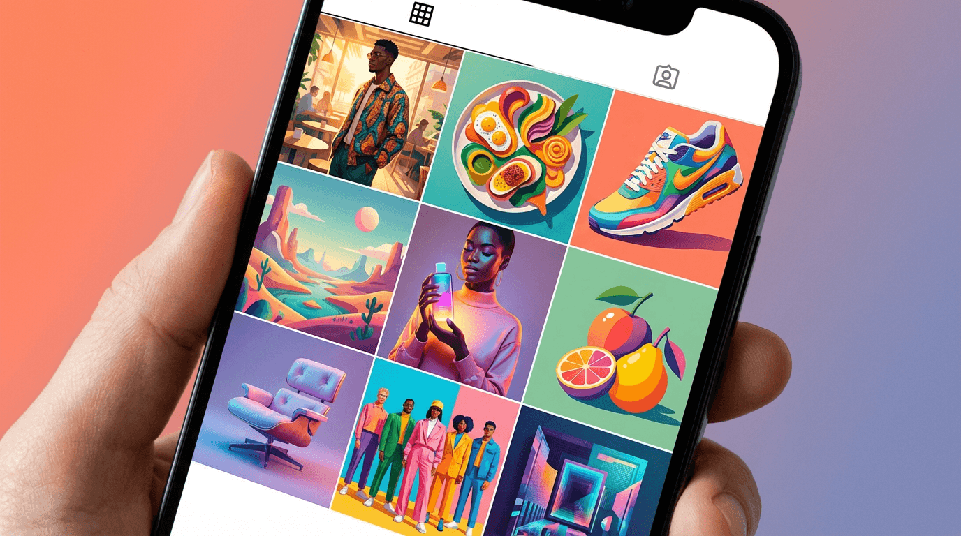
15 AI Prompt Templates for Twitter/X Post Images
Each prompt below includes a description of the visual style, the prompt you can copy and paste, and guidance on which type of tweet it works best with.
Template 1: Bold Stat Highlight Card
Use this when you are sharing a data point, research finding, or surprising statistic in your tweet. The image draws the eye with a clean, modern data visualization aesthetic.

Prompt:
clean modern infographic card design, single large bold number "47%" floating in center of frame, surrounded by subtle gradient glow, abstract geometric data visualization elements in the background, deep navy blue and bright electric blue color palette, professional corporate aesthetic, sharp edges, high contrast, no text except the number, 16:9 aspect ratio, bright studio-quality rendering
Best for: Data tweets, industry insights, research takeaways, growth updates
If you regularly share analytics content, this template pairs well with the visual strategies covered in AI prompts for LinkedIn post images since the clean infographic style crosses both platforms.
Template 2: Hot Take / Opinion Fire Starter
Use this when you are posting a controversial opinion or a bold statement that is meant to spark replies. The visual sets the tone before anyone reads the text.

Prompt:
dramatic overhead shot of a professional conference table split in half, one side pristine white with a single coffee cup, other side chaotic with crumpled papers and sticky notes, stark contrast between order and chaos, cinematic lighting from above, warm golden tones on one side and cool blue tones on the other, photorealistic, shallow depth of field, 16:9 aspect ratio, editorial magazine quality
Best for: Hot takes, "unpopular opinion" threads, debate-starting tweets, two-sided arguments
Template 3: Step-by-Step Mini Guide
Use this when you are sharing a quick tutorial, workflow tip, or process breakdown. The image communicates "this is a useful how-to" at a glance and signals structured value to anyone scrolling past.

Prompt:
isometric 3D illustration showing three connected floating platforms in a descending staircase pattern, each platform contains a simple symbolic object (lightbulb, gear, rocket), connected by glowing pathway lines, clean white background with soft shadows underneath each platform, bright saturated colors (coral, teal, golden yellow), modern tech illustration style, no text, 16:9 aspect ratio
Best for: Tip threads, workflow breakdowns, how-to tweets, listicle-style posts
This visual style works especially well if you are creating educational content and want to repurpose the same image for blog featured images or YouTube thumbnails.
Template 4: Product Showcase / Tool Spotlight
Use this when you are promoting a tool, app, SaaS product, or physical product. The visual creates a premium, aspirational feel around whatever you are featuring.

Prompt:
floating modern laptop on a sleek reflective surface with glowing purple and blue ambient light surrounding it, abstract holographic UI elements emerging from the screen, dark premium background with subtle particle effects, tech product photography style, dramatic rim lighting, ultra clean composition with lots of negative space, 16:9 aspect ratio, high-end advertising aesthetic
Best for: Product launches, tool recommendations, affiliate promotions, SaaS feature announcements
For creators who generate product visuals regularly, the AI Product Video Generator can extend this same concept into short video clips that pair nicely with your tweet as a follow-up reply.
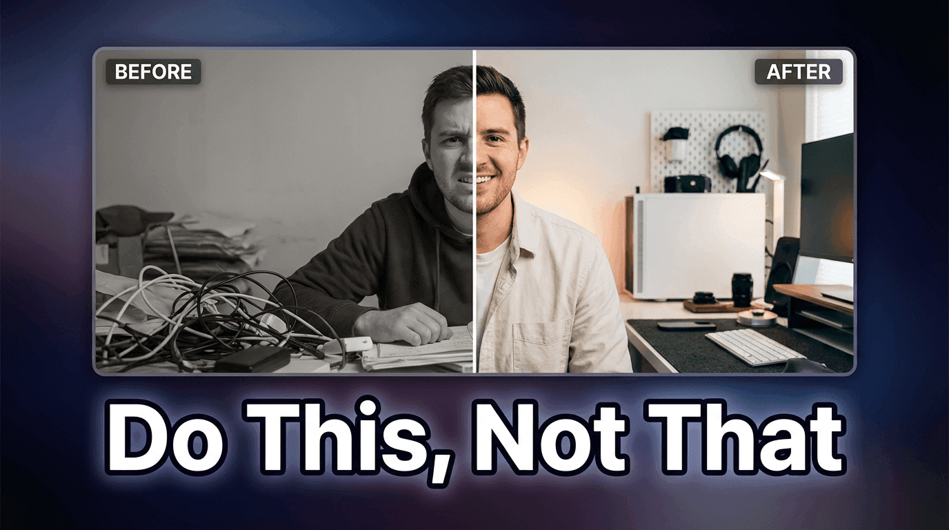
Template 5: Before / After Split Comparison
Use this when you are showing a transformation, improvement, or comparison. The split format immediately communicates "change happened" and drives curiosity about the details.

Prompt:
perfectly split image down the center, left side shows a dull gray cluttered desk with messy papers under harsh fluorescent lighting, right side shows a clean minimalist desk with a single monitor displaying colorful analytics dashboard under warm golden light, clear visual contrast between both halves, photorealistic indoor photography, 16:9 aspect ratio, crisp sharp details
Best for: Transformation stories, case studies, before/after results, growth comparisons, tool reviews
This format consistently performs well across platforms. If you want to explore more before/after visual approaches, the YouTube thumbnail makeover guide covers the psychology behind why split compositions drive higher click rates.
Template 6: Thread Opener / Series Launcher
Use this when you are starting a thread or series and want the opening image to signal that something valuable is about to unfold. The visual creates a "bookmark this" instinct.

Prompt:
top-down flat lay of an open notebook on a warm wooden desk surface, the notebook has clean blank pages with a high-quality pen resting across it, surrounded by a cup of coffee and a small succulent plant, morning sunlight streaming in from the left creating soft natural shadows, warm cozy color palette (cream, brown, soft green), lifestyle photography style, 16:9 aspect ratio, inviting and aspirational mood
Best for: Thread openers, weekly series introductions, newsletter announcements, content roundup posts
Template 7: Meme-Ready Reaction Visual
Use this when you are posting something humorous, relatable, or commentary-driven. The image acts as a visual punchline that makes people want to retweet.

Prompt:
3D cartoon character sitting at a desk with an overwhelmed expression, multiple floating notification bubbles and chat windows surrounding the character, bright colorful pop art background with geometric shapes, Pixar-inspired character design, exaggerated facial expression showing playful stress, vibrant saturated colors, clean 3D rendering, 16:9 aspect ratio, fun and energetic mood
Best for: Relatable takes, "me when" posts, commentary on trends, humorous observations
For a similar visual approach with even more character consistency, you can explore how to create consistent AI characters across multiple images so your reaction characters become recognizable to your audience over time.
Template 8: Quote Card / Thought Leadership Visual
Use this when you are sharing a personal insight, philosophy, or an excerpt from a longer piece of content. The visual elevates a simple quote into something that feels more intentional and shareable.

Prompt:
elegant minimal composition with a large speech bubble shape made of frosted glass floating over a blurred premium office environment, subtle golden light reflections on the glass surface, deep charcoal and warm amber color palette, executive boardroom atmosphere with bokeh in the background, sophisticated and authoritative mood, no text inside the speech bubble, 16:9 aspect ratio, editorial quality
Best for: Personal philosophy posts, leadership insights, keynote takeaways, book quotes, mentor advice
Template 9: Trending Topic / News Commentary
Use this when you are commenting on breaking news, industry shifts, or trending topics where being timely is critical. The visual signals urgency and relevance.

Prompt:
dynamic composition of a glowing digital globe surrounded by flowing streams of light particles representing data connections, abstract technology background with deep dark blue base and bright cyan and white accent lights, motion blur suggesting speed and movement, futuristic news broadcast aesthetic, clean and sharp with no clutter, 16:9 aspect ratio, high-tech professional quality
Best for: News commentary, industry trend analysis, "breaking" takes, market updates, tech announcements
Posts tied to trending topics on X can receive outsized engagement because the algorithm prioritizes content that connects to real-time conversations. If you want to understand how algorithms surface trending content on other platforms too, the YouTube algorithm breakdown for 2026 covers similar discovery mechanics.
Template 10: Personal Brand Builder
Use this when you are posting about your journey, sharing a lesson learned, or reinforcing your personal brand. The visual creates an aspirational, authentic feeling that builds trust over time.

Prompt:
candid-style portrait composition of a professional person working on a laptop in a bright modern co-working space, natural window light illuminating the scene from behind, warm earth tones with pops of green from indoor plants, slightly desaturated film-like color grading, environmental portrait photography style, subject positioned using rule of thirds, 16:9 aspect ratio, authentic and approachable mood
Best for: Personal journey posts, milestone celebrations, "what I learned" threads, behind-the-scenes content
If you want to take this further by creating a consistent avatar or character that represents your brand, the Create Avatar tool inside Miraflow lets you design a custom AI avatar from a selfie that you can use across all your content.
Template 11: Listicle / Resource Roundup Visual
Use this when you are sharing a curated list of tools, resources, tips, or recommendations. The visual communicates "organized value" at first glance.

Prompt:
clean flat design illustration showing a grid of six colorful app-style icons floating on a soft gradient background (light blue to white), each icon is a distinct simple shape (book, wrench, chart, lightbulb, code brackets, megaphone), subtle drop shadows underneath each icon, modern SaaS aesthetic, crisp vector-like rendering, 16:9 aspect ratio, bright and professional
Best for: Tool roundups, resource lists, recommendation threads, "my stack" posts, curated link collections
Template 12: Controversial Comparison
Use this when you are comparing two things head-to-head and want to drive replies. The visual sets up the tension before the reader even gets to your tweet text.

Prompt:
two opposing objects facing each other on a dramatic dark background, one sleek modern smartphone on the left and one vintage rotary telephone on the right, dramatic spot lighting on each object from opposite sides creating a versus showdown atmosphere, smoke or mist between them catching the light, cinematic product photography, high contrast, 16:9 aspect ratio, intense editorial quality
Best for: "A vs B" posts, tool comparisons, old vs new debates, platform comparison threads
If you create comparison content regularly, the ChatGPT vs Claude vs Gemini comparison blog is a good example of how to structure this type of content for maximum search visibility.
Template 13: Community Engagement / Question Post
Use this when you are asking your audience a question and want to maximize replies. The visual creates curiosity and invites participation.

Prompt:
large colorful question mark made of floating abstract geometric shapes (cubes, spheres, triangles) suspended in mid-air against a clean white background, each shape is a different bright color (coral, electric blue, lime green, golden yellow), soft shadows on the ground beneath, playful modern 3D illustration style, lots of white space around the composition, 16:9 aspect ratio, inviting and energetic
Best for: Audience questions, polls, "what do you think" posts, feedback requests, community discussions
Engagement-driven posts like this are one of the best ways to build an audience on any platform. If you want to dive deeper into community-building strategies, the social media marketing strategy for small businesses guide covers the fundamentals.
Template 14: Launch Announcement / Big News
Use this when you are announcing something important like a product launch, a new feature, a partnership, or a career milestone. The visual creates a sense of occasion and importance.

Prompt:
dramatic spotlight illuminating a single podium or stage platform from above in a dark venue, golden confetti particles floating in the air catching the spotlight, deep black background with warm golden light creating a premium award-show atmosphere, sleek reflective floor surface showing light reflections, celebratory yet elegant mood, photorealistic rendering, 16:9 aspect ratio, no text
Best for: Launch announcements, milestone celebrations, award recognition, partnership reveals, big updates
Template 15: AI / Tech Futuristic Concept
Use this when you are posting about AI, technology trends, or future predictions. The visual immediately signals "this is about tech" and attracts the right audience in the feed.

Prompt:
futuristic control room with multiple holographic screens displaying abstract data visualizations and neural network diagrams, deep blue and purple lighting with bright cyan accent glows, clean modern architecture with glass and metal surfaces, a single empty operator chair in the foreground suggesting the viewer is about to sit down, cinematic sci-fi aesthetic, atmospheric volumetric lighting, 16:9 aspect ratio, Blade Runner-inspired mood
Best for: AI trend commentary, tech predictions, future of work posts, tool announcements, developer audience content
If you are building content around AI topics and want to create supporting videos, the cinematic video generator inside Miraflow can turn text prompts into short cinematic clips that work perfectly as reply media on X threads.
How to Use These Prompts Effectively
Copying and pasting the prompts above will get you solid results, but a few small adjustments can make the images even more effective for your specific content.
Adjust the color palette to match your brand. If you have specific brand colors, replace the color descriptions in the prompt with your own. Consistent colors across your posts make your content instantly recognizable in the feed, and on a platform where someone scrolling past your post has about one second to register who posted it, visual consistency builds trust faster than anything else.
Swap the subject to match your niche. The objects, environments, and settings in these prompts are flexible. If you are in fitness, replace the laptop with dumbbells. If you are in real estate, replace the co-working space with a modern kitchen. The composition and lighting principles stay the same while the subject matter becomes relevant to your audience.
Generate multiple variations and test. One of the advantages of AI image generation is speed. Generate three or four variations of the same prompt with small tweaks and see which one gets the best response. Over time, you will develop a clear sense of which visual styles resonate with your specific audience.
Always check the preview before posting. After generating your image, upload it to X's compose window and check how it looks in the preview before publishing. This lets you catch any unexpected cropping or compression issues. Since X crops vertical images in the timeline preview, sticking with the 16:9 ratio from these prompts avoids that problem entirely.
For a broader approach to writing better AI prompts across all visual formats, the guide to writing effective prompts for video and image generation covers the core principles that apply to everything from thumbnails to cinematic scenes.
Common Mistakes Creators Make with X Post Images
Understanding what goes wrong is just as useful as knowing what works. Here are the patterns that consistently underperform on X.
Using the wrong dimensions and getting auto-cropped. This is the most common mistake. Uploading a vertical image means X shows a cropped landscape preview in the timeline, which often cuts off the most important part of your visual. Always design for 16:9 when you want full control over how the image appears.
Cramming too much text into the image. On YouTube, bold overlay text on thumbnails is essential. On X, the tweet itself provides the text context, so the image should be a visual complement rather than a text duplicate. If your image has three lines of text on it, most people scrolling on mobile will not be able to read any of it.
Using stock-looking, generic visuals. Abstract business handshake photos, generic office scenes with no personality, and overused motivational sunset backgrounds blend into the feed and signal "this is filler content." AI-generated images that follow specific compositional prompts stand out because they look intentional and unique.
Inconsistent visual style across posts. If every post looks completely different from the last one, your audience has no visual anchor to associate with your account. Pick two or three templates from this list and rotate between them so people start recognizing your content before they even read the text. The guide to building a consistent AI thumbnail style covers the same principle for YouTube and translates directly to how you should think about X post visuals.
Ignoring compression. X compresses images during upload, which tends to flatten contrast and wash out colors. Slightly boosting saturation and contrast in your prompt descriptions (or during post-processing) helps your images survive the compression pipeline and still look vivid in the feed.
How Miraflow AI Fits Into This Workflow
All 15 prompts in this post can be generated directly inside Miraflow AI. The AI Image Generator supports text-to-image generation with aspect ratio selection, so you can set 16:9 before generating and get images that are already sized correctly for X.
If you need to adjust part of an image after generation, such as changing a background color or swapping an object, the Image Inpainting feature lets you mask a specific region and replace only that part without regenerating the entire image. This is useful when the overall composition is strong but one element needs tweaking.
For creators who also produce short-form video content alongside their X posts, the same Miraflow platform includes Text2Shorts for turning topics into YouTube Shorts, an AI Music Generator for background tracks, and AI Clipping for turning long videos into vertical clips with auto-captions. The idea is that your entire content pipeline, from the tweet image to the supporting video to the background music, can come from one place.
Repurposing These Images Across Platforms
One of the practical benefits of generating AI images with structured prompts is that you can easily adapt the same visual concept for multiple platforms. The 16:9 images you generate for X post images can also be used as blog header images, LinkedIn post visuals, and YouTube thumbnail bases with minor adjustments.
If you also publish on Pinterest, the AI prompts for Pinterest pins and TikTok cover images guides follow the same template structure adapted for those specific platform dimensions. Rather than creating entirely new visuals for each platform, you can generate one strong concept and then regenerate it at different aspect ratios using the same core prompt.
This cross-platform approach saves hours every week while keeping your brand visuals cohesive everywhere your audience encounters you. For deeper strategies on building a presence across multiple platforms at once, the guide to going viral across platforms in 2026 covers what actually works and what is overhyped.
FAQ
What is the best image size for Twitter/X posts in 2026?
The recommended size for single-image posts on X is 1200 x 675 pixels with a 16:9 aspect ratio. This displays at full width in the timeline on both desktop and mobile without any cropping. For mobile-first visibility, some marketers use 1080 x 1350 pixels (4:5), but the timeline preview will crop it to landscape, so important content should stay centered.
Do images on Twitter/X actually get more engagement than text-only posts?
Yes. Image posts on X outperform text-only posts by roughly 30% on engagement, and tweets with images receive significantly more retweets. While X is a text-first platform, images have nearly closed the gap in engagement rate, making them an important part of any content strategy on the platform.
Can I use AI-generated images on Twitter/X?
Yes. X does not restrict AI-generated images in organic posts. As long as the content follows X's general posting guidelines and does not violate platform rules, AI-generated visuals are treated the same as any other image. Many creators and brands already use AI-generated visuals for their daily posts.
How many images should I include per X post?
For most use cases, a single high-quality image performs best because it gets the full-width preview treatment in the timeline. Multi-image posts (2-4 images) can work well for comparisons or before/after content, but each image gets cropped to fit the grid layout, so you need to design each image with centered subjects.
What file format should I upload for the sharpest images on X?
PNG files tend to look sharper on X because the platform compresses JPG more aggressively. For images with text or sharp edges, PNG is the better choice. Keep the file size under 5MB for mobile uploads to avoid additional compression from the platform.
How do I make my X post images look consistent?
Pick two or three prompt templates from this list and rotate between them consistently. Use the same color palette, similar lighting styles, and consistent composition rules across all your posts. Over time, your audience will start recognizing your content visually before they even read the tweet text.
Can I use these prompts in Miraflow AI?
Yes, all 15 prompts are designed to work directly inside the Miraflow AI Image Generator. Select the 16:9 aspect ratio before generating, paste the prompt, and generate. You can also upload reference images for more precise results or use Image Inpainting to modify specific parts of the generated image afterward.
Conclusion
Twitter/X rewards creators who pair strong text with strong visuals. The feed moves fast, impressions happen within the first hour, and you have roughly one second to make someone stop scrolling. A well-designed image attached to your post dramatically increases the chances that your content gets noticed, engaged with, and shared.
The 15 templates in this post cover the most common Twitter/X content types, from data tweets and hot takes to product showcases and thread openers. Each prompt is structured around the visual principles that perform best on the platform: high contrast, single focal points, clean compositions, and colors that survive X's image compression. Copy the ones that match your content style, generate them inside Miraflow AI, and start testing which visuals resonate with your audience.
The creators who build recognizable visual identities on X are the ones who stop getting lost in the feed. Pick your templates, stay consistent, and let the visuals do the heavy lifting while your words do the convincing.